10,000 search results
(0.023 seconds)
- Shredded - Unknown license

- Shred by Canada Type,
$24.95
- Shrek by words+pictures,
$20.00 - Sheree by Typadelic,
$14.95
- Norman by Resistenza,
$45.00
- FF Tag Team Marker by FontFont,
$68.99 - Norma by Linotype,
$29.99 - EnglishTowne-Normal - Unknown license

- Scrypticali Normal - Unknown license

- Kismet-Normal - 100% free

- Platonick-Normal - Unknown license

- WildWest-Normal - Unknown license

- FirstGrader-Normal - Unknown license

- Eklektic-Normal - Unknown license

- So Normal - Unknown license

- Heidelbe-Normal - Unknown license

- Nickerbocker-Normal - Unknown license

- Slogan-Normal - Unknown license

- Present-Normal - Unknown license

- Viking-Normal - Unknown license

- Flemish-Normal - Unknown license

- Juniper-Normal - Unknown license

- Domino normal - Unknown license

- StrangePhenomena Normal - Unknown license

- Houters-Normal - Unknown license

- Ironick-Normal - Unknown license

- Chizzler Normal - Unknown license

- DearTeacher-Normal - Unknown license

- Coliseo-Normal - Unknown license

- StrangePhenomena [normal] - Unknown license

- Slam Normal by Wiescher Design,
$12.00
- Sagata Normal by Lemonthe,
$10.00
- Fabrikat Normal by HVD Fonts,
$40.00
- CA Normal by Cape Arcona Type Foundry,
$40.00
- Tame by Suomi,
$25.00
- Tag by ITC,
$29.00 - Lam by Produce,
$29.00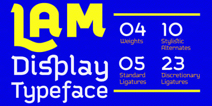
- Taz by LucasFonts,
$49.00
- Tagged by T-26,
$29.00 - Rams by TipografiaRamis,
$30.00


Page 1 of 250Next page