10,000 search results
(0.056 seconds)
- Regua by Tipos do aCASO,
$2.90Play like a child with letter forms, fill the gaps of a stencil with a ballpoint pen and work this to generate a digital type. Régua (Ruler, in Portuguese) is the result of a typographical joke with the upper cases made by Buggy, a Brazilian typographer, in 1998. - Briaroak Shire - Unknown license

- The Shire - Personal use only

- red shirt - Unknown license

- Shrag Script by Open Window,
$- Shrag script is a brand new script from Open Window. It is finer than the model that won 35,00 friends. Originating from a fat marker drawing it's a comfortable font, fine performing in every minor detail. It is the embodiment of everything a fine handwritten script should be.
 - Shire Script by Bean & Morris,
$35.00 Shire Script includes alternate characters and discretionary ligatures to help you create settings when informality is called for. Variety in the lowercase x heights and connectors give an overall effect of handwritten headings and text. However, by considered drawing, legibility is not compromised.
 - Seibi Shiba by Nihon Literal,
$169.00 Although it is an orthodox semi-cursive script, Kana is designed to be somewhat larger for better line alignment and is tailored to both horizontal and vertical typesetting. Bold can be selected for the subheading, body text, or headline. オーソドックスな行書体ですが、タテ組ヨコ組両方に適した書体となるよう、仮名をやや大きめにデザインし、ライン揃えを意識しました。独特の組み版効果が特徴です。太さに合わせて、小見出し用から本文、大見出し用に活用いただけます。一筆書きの脈絡を多用し、続け書きによる「連綿線」を持つ書体です。行書体の特徴である流れるような筆の運びを表現できるよう心がけました。同じ部首でも「へん」と「つくり」で処理が異なる字があるのは行書体の特徴でもあります。
 - Catalina Shiba by Suza Studio,
$13.00 Catalina Shiba with alternative characters is divided into several Open Type features such as Swash, Stylistic Sets, Stylistic Alternate, Contextual Alternate. The Open Type feature can be accessed using Open Type savvy programs such as Adobe Illustrator, Adobe InDesign, Adobe Photoshop version of Corel Draw X, and Microsoft Word. And this Font has provided PUA unicode (custom coded font). so that all alternative characters can be easily accessed in full by a craftsman or designer. Thank You.
 - Roche Shirt by Maulana Creative,
$11.00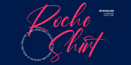 "Roche Shirt" is a stylish script font. With light contrast stroke, fun character with a bit of ligatures. To give you an extra creative work. "Roche Shirt" font support multilingual more than 100+ language. This font is good for logo design, Social media, Movie Titles, Books Titles, a short text even a long text letter and good for your secondary text font with sans or serif. Make a stunning work with "Roche Shirt" font. Cheers, MaulanaCreative
 - Shirt & Tie by Olivetype,
$18.00 Shirt & Tie is a cool, trendy looking handwritten font. This font looks fun and authentic, and it will enhance the quality of each of your posters, flyers, or print. This font is also supporting Multi-Languages, which includes: Afrikaans Albanian Catalan Danish Dutch English Estonian Finnish French German Italian Norwegian Portuguese Spanish Swedish Zulu. Thank You.
 - Shera Display by Alandya TypeFoundry,
$18.00 Shera display font are elegant and subtle with touch of luxury. Shera Display represents a classy typeface best suitable for magazines, posters, advertising or any kind of fine and sensitive design. The font includes a full set of uppercase and lowercase letters, diacritics, currency signs, numerals, Unique, playful and versatile display font with ligatures and alternates to enrich your design work.
 - Shila Script by FadeLine Studio,
$15.00 Shila Script, connecting script, designed to convey elegance and style. It is slender, feminine and friendly, let alone sexy. Shila Script will work perfectly for fashion, e-commerce brands, trend blogs, or any business that wants to appear classy and chic. The font is ideal for high-end logotypes and magazine headlines, but let’s not forget greeting cards, invitations, posters, ads and the various web usages. FadeLine Studio
 - Basquiat Irregular by Cuda Wianki,
$29.00 Basquiat Irregular is a font inspired by graffitti and children's writing. Contains 3 alternative characters for each letter, multilanguage support including cyryllic. It's perfect for creating artistic publications, writing quotes and many other designs. The family also has two fonts with frames, lines and ornaments. Its apperance is rough, hand painted and casual. Perfect for music and street art designs. Frames and lines are created by typing uppercase letters for starting or ending frame or creating an arrow and lowercase letters for typing lines.
 - Dias Irregulares by Jrmuitos,
$20.00 Dias Irregulares is a font inspired by ignorant tattoo style. Contains 2 alternative characters for each letter and 4 cute illustrations. It's perfect for artistic publications, clothing and many other things. All made by hand, such as my tattoo work.
 - FF Irregular by FontFont,
$41.99 Austrian type designer Markus Hanzer created this display FontFont in 1994. The family has 6 weights, ranging from Light to Black (including italics) and is ideally suited for editorial and publishing and poster and billboards. FF Irregular provides advanced typographical support with features such as ligatures and case-sensitive forms. It comes with proportional lining figures.
 - CC Angular by Okaycat,
$24.50 Angular is all angular. This font has no curves! Dingbat symbols & icons replace a handful of the generally unused alternate characters, to make this font extra fun & useful. Angular is extended, containing West European diacritics & ligatures, making it suitable for multilingual environments & publications.
 - Angular Alchemy by Hipfonts,
$17.00 Introducing Angular Alchemy, a font that pushes the boundaries of modern design and brings a touch of enchantment to your projects. This unique geometric typeface is a true alchemy of creativity and precision, combining sharp angles and clean lines to create a visually striking composition. With its contemporary appeal and captivating charm, Angular Alchemy captures attention and leaves a lasting impression. Whether you're crafting sleek logos, engaging headlines, or cutting-edge branding materials, this font adds a touch of sophistication and allure. Elevate your designs with the magic of Angular Alchemy and witness the transformation as it infuses your work with a sense of modernity and intrigue.
 - HaManga Irregular by Linotype,
$29.99This unusual font was designed by Alessio Leonardi, who plays with the difference between content and impression. At first glance the font looks almost like a row of pictograms or Asiatic characters. The forms become Arabic letters when the characters are set together to form words. HaManga Irregular is a good font to use when the reader is supposed to contemplate not only the text but the form of what he or she sees. - Ano Angular by Alias,
$60.00 Ano Angular was originally designed for a fashion company. It was to be used as a headline type, half way between the logo we had designed — made up of straight lines only — and our circle-based Ano typeface, which was to be used for text. Its design is based on the idea of mixing circles with triangles into letter shapes in a modular, constructed way. The effect is digital, mathematical, remeniscent of the typography of 1980s arcade games such as Asteroids.
 - Mono Hexular by PizzaDude.dk,
$20.00 A wrecked, monospaced font containing 278 ligatures and unique accented characters! You will need to use OpenType supporting applications to use the autoligatures.
 - Aracne Ultra Condensed Regular - Personal use only

- Das Reicht Gut Regular - Unknown license

- Gort's Fair Hand Regular - Unknown license

- Fire Of Ysgard Regular - Unknown license

- Queen Kelly Sword Regular by Julia Visht,
$21.00 “Queen Kelly’s Sword” - new elegant luxury bold serif from Julia Visht. Classical font serif with stylish decorative elements! Romantic and elegant, “Queen Kelly’s Sword” – is a luxury bold serif with both modern and vintage curves. “Queen Kelly’s Sword” is a must-have for your collection of fonts. Main features: Ligatures. Set of OpenType ligatures allows to make your design truly unique. Alternates. Set of stylistic alternates allows you to create even more authentic custom-feel text. OpenType Style Set. Open Type Style Sets allow to create many perfect styles of your text. Multyfunctionality. It's perfect for: elegant modern branding, web-design, posters, headers, advertising, wedding stationery, book cover designs, classy packaging, album covers, greeting cards, wall art, websites, photos, and so much more. Multylangual support. English, German, Italian, French, Danish, Norwegian, Swedish, Italian, Spanish, Filipino, Scottish Gaelic, Indonesian, Irish, Swiss German, Portuguese. Stylish font for your stylish projects! Happy creating! Designers: Julia Kruk Publisher: Julia Visht
 - Vandal Blow Graffiti Regular by Sipanji21,
$15.00 "Vandal Blow" is a 3D layered graffiti font that includes solid, shadow, and inner shadow styles, providing the tools to create a three-dimensional appearance in your text. Fonts with layered styles like this are commonly employed in graffiti art, street art, posters, and other designs where a dynamic and eye-catching 3D effect is desired. By utilizing the solid, shadow, and inner shadow layers in "Vandal Blow," you can enhance the visual impact of your text, creating a sense of depth and dimension. This font is particularly suitable for projects where you want to infuse a graffiti-style aesthetic with a three-dimensional twist, making your text stand out and grab attention.
 - Coral Candy Regular Slant by Letterhend,
$17.00 Coral Candy is a bold font with fun and playful looks. This type of font perfectly made to be applied especially in cartoon or child theme which is need a standout font, and the other various formal forms such as invitations, labels, logos, magazines, books, greeting / wedding cards, packaging, fashion, make up, stationery, novels, labels or any type of advertising purpose. Features : numbers and punctuation multilingual ligatures PUA encoded We highly recommend using a program that supports OpenType features and Glyphs panels like many of Adobe apps and Corel Draw, so you can see and access all Glyph variations.
 - I SEE SPIRALS - Unknown license

- D3 Spiralism Outline - Unknown license

- Shorai Sans Variable by Monotype,
$1,049.99 Shorai™ Sans balances the subtlety of traditional hand-drawn brushstrokes with clean, geometric outlines. An intellectual-looking sans serif, Shorai’s simplified letterforms and vast weight ranges provide creatives with a holistic branding solution. Shorai Sans was designed as a companion typeface to Avenir® Next, built to work harmoniously in modern global designs, while preserving the essence of Japanese handwriting. Shorai goes beyond existing Japanese sans serifs to provide a wide spectrum of expression and personality for designers to play with. Shorai Sans is opening new horizons in Japanese typography.
 - EF StarsN Spirals by Elsner+Flake,
$35.00 - Tribal Spiral BA by Bannigan Artworks,
$14.95This font was inspired by the swirling and spiraling art from various cultures such as the ancient Celtic and Pictish tribes of Ireland and Scotland, and the Maori moko tattoos of New Zealand. - Prismatic Spirals Pro by MMC-TypEngine,
$182.00 PRISMATIC SPIRALS PRO FONT! The Prismatic Spirals PRO is a Decorative Type-System and ‘Assembling Game’, itself. Settled in squared pieces modules or tiles, embedded by unprecedented Intertwined Prismatic Structures Design, or intricate interlaced bars that may seem quite “impossible” to shape. Although it originated from the ‘Penrose Square’, it may not look totally as an Impossible Figures Type of Optical Illusions. More an “improbable” Effect in its intertwined Design, that even static can seem like a source of Kinetical Sculptures, or drive eyes into a kind of hypnosis. Prismatic Spirals Pro has two related Typefaces both more basic or easier to use versions, the Default Family plus its “bold” braided version Prismatic Interlaces… PRO provides a more advanced, complex, and twisted Design, plus requires to be typed alternating caps. Instructions: Use the Map Font Reference PDF as a guide to learn the 'tiles' position on the keyboard, then easily type and compose puzzle designs with this font! All alphanumeric keys are intuitive or easy to induce, you may easily memorize it all! Plus, often also need to consult it! *Find the Prismatic Spirals Pro Font Map Reference PDF Here! (!) Is recommended Print it to have the Reference or open the PDF to also copy and paste, when consulting is required or when it may be difficult to access, depending on the keyboard script or language. The 2 glyphs sets are separated in colors for facilitating. Also use the Map Font with key captions or switch to it for ensure that the characters are alternating between both uppercase and lowercase letters as other Keys as numbers, marks, and punctuation along the strings, holding Shift one by one or actually two by two. As a Tiles Type-System, the line gap space value is 0, this means that tiles line gaps are invisibly grouted, so the user can compose designs, row by row, descending to each following row by clicking Enter, same as line break, while advances on assembling characters. Background History: The first sketches of my Prismatic Knots or Spirals Designs dates back then from 2010, while started developing hand-drawn Celtic Knots and Geometric Drawings in grid paper, while engage to Typography, Sacred Geometry and the “Impossible Figures” genre… I started doing modulation tests from 2013, until around 2018, I got to unravel it in square modules or tiles from the grid, then idealized it as fonts, along with other Type projects. This took 13 years to come out since the first sketches and 6 months in edition. During the production process some additional tiles or missing pieces were thought of and added to the basic set, which firstly had only the borders, corners, crossings, nets, Trivets connectors or T parts and ends, then added with nets and borders integrations. Usage Suggestions: This type-system enables the user to ornate and generate endless decorative patterns, borders, labyrinthine designs, Mosaics, motifs, etc. It can seem just like a puzzle, but a much greater tool instead for higher purposes as to compose Enigmas and use seriously. As like also to write Real Text by assembling the key characters or pieces, this way you can literarily reproduce any Pixel Design or font to its Prismatic Spirals correspondent form, as Kufic Arabic script and further languages and compose messages easily… This Typeface was made to be contemplated, applied, and manufactured on Infinite Decorative Designs as Pavements, Tapestry, Frames, Prints, Fabrics, Bookplates, Coloring Books, Cards, covers or architectonic frontispieces, storefronts, and Jewelry, for example. Usage Tips: Notice that the line-height must be fixed to 100% or 1,0. In some cases, as on Microsoft Word for example, the line-height default is set to 1,15. So you’ll need to change to 1,0 plus remove space after paragraph, in the same dropdown menu on Paragraph section. Considering Word files too, since the text used for mapping the Designs, won't make any literal orthographical sense, the user must select to ignore the Spellcheck underlined in red, by clicking over each misspelled error or in revision, so it can be better appreciated. Also unfolding environments as Adobe Software’s, the Designer will use the character menu to set body size and line gap to same value, as a calculator to fit a layout for example of 1,000 pts high with 9 tiles high, both body size and line gap will be 111.1111 pts. Further Tips: Whenever an architect picks this decorative system to design pavements floor or walls, a printed instruction version of the layout using the ‘map’ font may be helpful and required to the masons that will lay the tiles, to place the pieces and its directions in the right way. Regarding to export PNGs images in Software’s for layered Typesetting as Adobe Illustrator a final procedure may be required, once the designs are done and can be backup it, expanding and applying merge filter, will remove a few possible line glitches and be perfected. Technical Specifications: With 8 styles and 4 subfamilies with 2 complementary weights each (Regular and Bold) therefore, Original Contour, Filled, Decor, with reticle’s decorations and 2 Map fonts with key captions. *All fonts match perfectly when central pasted for layered typesetting. All fonts have 106 glyphs, in which 96 are different keys with 2 versions of each of both caps and shift keys, plus a few repeated for facilitating. It was settled this way in order for exchanging with its Prismatic relative fonts which has only 48 different keys repeated twice. Concerning tiles manufacturing and Printed Products as stickers or Stencils, any of its repeated pieces was measured and just rotated in different directions in each key, so when sided by other pieces in any direction will fit perfectly without mispatching errors. Copyright Disclaimer: The Font Software’s are protected by Copyright and its licenses grant the user the right to design, apply contours, plus print and manufacture in flat 2D planes only. In case of the advent of the same structures and set of pieces built in 3D Solid form, Font licenses will not be valid or authorized for casting it. © 2023 André T. A. Corrêa “Dr. Andréground” & MMC-TypEngine.
 - Ye Old Shire - Unknown license

- Dress Shirt JNL by Jeff Levine,
$29.00 A sample of monogram lettering entitled "Style 204 - Modern Block" (probably circa 1940s) yielded the thin Art Deco alphabet model for Dress Shirt JNL, which is available in both regular and oblique versions.
 - WEAR FAT SHIRT by TypoGraphicDesign,
$15.00 CONCEPT/ CHARACTERISTICS A display font that allows you to »Kleckern und Klotzen« (modified German proverb »to not take half-measures«) The fat and square character to the font, a bold and loud statement. The motto is square, practical, fat. The font styles ranging from high-contrast line difference "beanpole" over mediocrity "slim" to the fattest and blackest "okay" style. A font with humor ^^ APPLICATION AREA The modern, square lightweight »Fat Wear Shirt« would be happy as a display typeface in headline size on the following areas and would find this very real bold: Editorial Design (Magazine or Fanzine) or Webdesign (Headline Webfont for your website), party flyer, movie poster, music poster, clothing, fashion, t-shirts, music covers or webbanner. And and and… TECHNICAL SPECIFICATIONS Headline Font | Display Font | Fat Techno Font »Wear Fat Shirt« OpenType Font (Mac + Win) with 3 styles (okay, slim, beanpole) & 268 glyphs. Alternative letters and ligatures (with accents & €) Desktop Font (.otf) + Web Font (.svg, .eot, .woff) KONZEPT/BESONDERHEITEN Eine Display-Schrift bei der Kleckern und Klotzen erlaubt ist! (Verändertes deutsches Sprichwort »nicht kleckern sondern klotzen«) Der fette und eckige Charakter verleihen der Schrift eine plakative und laute Aussage. Das Motto lautet quadratisch, praktisch, fett. Die Schriftschnitte reichen von kontrastreichen Linienunterschied »beanpole«, über mittelmaß »slim« bis zum fettesten und schwärzesten »okay« Style. Eine Schrift mit Humor ^^ EINSATZGEBIETE Das moderne, quadratische Leichtgewicht »Wear Fat Shirt«, würde sich als Auszeichnungsschrift in Headlinegröße über folgende Einsatzgebiete sehr freuen und fände dies echt fett: Logos/Wortmarken aller Art, Flyer für fast jede Party, Platten Cover, CD-Cover und Icon Design, Plakat Design, Kleidung, T-Shirts, Comics und Graphicnovels, Game– und Videospiel Design aller Genres, als Headlineschrift für print und digitale Magazine, Bücher und Webseiten u.v.m. TECHNISCHE INFORMATIONEN Headline Font | Display Font | Fat Techno Font »Wear Fat Shirt« OpenType Font (Mac + Win) mit 3 Schriftschnitten (okay, slim, beanpole) & 268 Glyphen. Inkl. diakritisches Zeichen, alternative Buchstaben, Ligaturen & €. Desktop Font (.otf) + Web Font (.svg, .eot, .woff)
 - Stuffed Shirt JNL by Jeff Levine,
$29.00 Stuffed Shirt JNL acquires its name from a term popularized during the years when the Art Deco period flourished. The Great Depression further widened the gap between the 'haves' and the 'have nots'. Occasionally, some of those that 'had' (and some who pretended they did) came off as standoffish, egotistical and pompously arrogant. Such individuals were referred to as a "stuffed shirt"; a blowhard who thought he was better than others. In this case, Stuffed Shirt JNL is no more than a dual-line adaptation of Playwright JNL, itself an interpretation of the classic Broadway type design in a way that emulates the hand lettering of old-time sign painters.
 - Flannel Shirt BB by Blambot,
$6.00 Flannel Shirt BB is a body copy font that's warmer and cozier than most-- perfect for curling up with a laptop on a blustery New England "Nor'Easter". Flannel Shirt BB comes with four wintery weights, and has a hefty compliment of special characters.
 - Regulators Outline - Unknown license

- Regulators Italic - Unknown license


