10,000 search results
(0.071 seconds)
- Neato Serif by Adam Ladd,
$25.00 Neato Serif is a hand drawn, quirky serif font in regular and italic styles. It features stylistic alternates, standard and discretionary ligatures, and swashes to add options and flair to your typography. The typeface has a unique blend of sophistication with its high contrast of thicks and thins and also playfulness with the distinct ball terminal characters—especially evident in the lowercase "e". It is slightly condensed and great for display headlines, titles, packaging, branding, and more.
 - Londrina Serif by Tipos Pereira,
$10.00 Londrina Serif is based on my font Londrina. It's a vernacular typeface with a lot of weights and personality.
 - Hwaiting Serif by Konstantine Studio,
$20.00 Inspired by the emerging Korean culture that grabbing the worldwide actuation in so many realms of the industry. To bridge the vibes and to make it easier to consume, we found the gap to fill with simple things in life that are useful for it, and yes, it's a new day it's a new font. So without any further ado, please welcome Hwaiting Serif. 3/3 series of Korean vibes typefaces. It's a serif font with a thick and thin style of visuals, aiming the luxury and glamorous tone to catch up with high-fashion branding and today's graphic design trends Crafted with deep research about Korean traditional letters, shaped up with the approach of universal Latin letters. This is the last drop of 3 series from the Hwaiting family. Thank you for your engagement with us.
 - Absentia Serif by DR Fonts,
$19.00 The Absentia collection welcomes this modern serif option to broaden its typographic horizons and offer designers greater versatility. The new member shares the traits and proportions that sets this family apart, such as the truncated capital ‘A’ apex, the calligraphic ‘l’ and the distinctive ‘g’. Yet Absentia Serif adds its own personality to the mix, integrating forward-looking attributes into traditional letterforms. Laid out as bilateral or one-sided configurations, the transitional serifs help maintain a tight, orderly baseline. The balanced stroke contrast increases in the bolder weights and exudes an elegant appearance. This finely crafted typeface promotes legibility at the smallest sizes and makes it the ideal solution for body text. Available in ten weights with matching italics and two variable fonts, Absentia Serif is loaded with OpenType features such as stylistic alternates, fractions, superscript, subscript, as well as standard and discretionary ligatures.
 - Alarionsa Serif by Kosinsky,
$40.00 Alarionsa - font with straight horizontal serifs, vertical serifs have a slight angle of inclination. Lowercase letters are designed with somewhat inflated x-height. Perfect for both creating headlines and regular text.
 - Gart Serif by Vitaliy Gotsanyuk,
$25.00 Gart Serif is a serif font that combines traditional Antiques from the 18th century with modern solutions. Compared to other Antiques, Gart Serif stands out with its "display" metrics that enhance its character without compromising readability. With a variety of weights, Gart Serif can have an elegant demeanor seen in its thin weight or a more robust and sturdy presence in its bold rendition. It serves well for setting large amounts of text as well as for short headlines. Gart Serif comprises 5 weights, 642 glyphs, basic Cyrillic and extended Latin, several stylistic sets, ligatures, numeral sets, and a variable font.
 - Sextan Serif by deFharo,
$12.00 Sextan serif is a typographic family with 10 styles designed for editorial, corporate, advertising or web use. The excellent readability allows the use in long texts, the coherence of forms make these fonts have a great personality. The fonts have an extra set of lower case letters accessible through the Discretional Ligatures. Also support for Open Type Functions such as Old Style Number, Superiors, Inferiors, Dynamic Fractions, etc. Includes the Bitcoin symbol: b #
 - Balter Serif by Art Grootfontein,
$19.00 Balter Serif is a hand-drawn layered typeface family inspired by sign painting, 1960’s movie posters and jazz album lettering. It can look fresh and modern or exquisitely vintage. Combine upper, lowercase and alternates to create a handmade custom lettered look, then layer the styles using colors to add value and depth to your designs ! Balter Serif works perfectly in short headlines. It is suitable to create a wide range of projects from posters to branding, logos, packaging, magazines and more. Features Uppercase & Small caps Numbers & Symbols International Glyphs 60 Alternates & swashes 70 Ligatures 30 Letter combinations Quick tip for layered fonts in Adobe Illustrator : Click and drag out a text frame to start (don’t just click with the cursor on the page). Then select the stacked text frames, go to Type in the menu bar > Area Type Options > Offset: First Baseline and select “Fixed”.
 - Generis Serif by Linotype,
$29.00The idea for the Generis type system came to Erik Faulhaber while he was traveling in the USA. Seeing typefaces mixed together in a business district motivated him to create a new type system with interrelated forms. The first design scheme came about in 1997, following the space saving model of these American Gothics. Faulhaber then examined the demands of legibility and various communications media before finally developing the plan behind this type system. Generis’s design includes two individually designed styles; each of with is available with and without serifs, giving the type system four separate families. Each includes at least four basic weights: Light, Regular, Medium, and Bold. Further weights, small caps, old style figures, and true italics were added to each family where needed. The Generis type system is designed to meet both optical criteria and the highest possible measure of technical precision. Harmony, rhythm, legibility, and formal restraint make up the foreground. Generis combines aesthetic, technical, and economic advantages, which purposefully and efficiently cover the whole range of corporate communication needs. The unified basic form and the individual peculiarity of the styles lead to Generis’ systematic, total-package concept. The clear formal language of the Generis type system resides beneath the information, bringing appropriate typographic expression to high-level corporate identity systems, both in print and on screen. The condensed and aspiring nature of the letterforms allows for the efficient setting of body copy, and the economic use of the page. A range of accented characters allows text to be set in 48 Latin-based languages, offering maximal typographic free range. This previously unknown level of technical and design execution helps create higher quality typography in all areas of corporate communication. Optimal combinations within the type system: Generis Serif or Generis Slab with Generis Sans or Generis Simple. - Preto Serif by DizajnDesign,
$24.00 Preto is an extensive type family, which explores the function of serifs on readability and legibility. Preto consist of three subfamilies: Sans, Semi and Serif. Preto is designed for multilingual typesetting. All of the subfamilies have equal gray value but different texture which can be use to differentiate languages. Preto sub-families have two text weights and two bold styles (Regular -> Bold, Medium -> Black). Every weight has a companion Italic style as well. The serif version has been designed to work best at small point sizes (around 8, 9 points). You will not achieve calm, boring or invisible look of your text with Preto Serif. Its long, spiky and sharp serifs contribute to give the typeface a distinct and energetic character. It is very suitable for magazines, corporate identity, brochures or other print materials where a typeface for continuous reading is required. The ligatures in Preto Serif are very special. You can set them in different tracking values and spacing will increase/decrease consistently in the ligatures as well. Alternative characters in the font files allow you to change the feeling of the text from typical to more special (J, Q, g , &). Each font contains a full set of small caps and many alternative characters for complex typesetting.
 - Ant Serif by LNP Fonts,
$9.99 Ant Serif is a font that can be used for advertising, logo creation, webfonts and more. The font comes in two styles, Regular and Italic and has all the characters in the Latin Basic, Additional and Extended scripts. The font's design came from my love of Marvel's Ant-Man and the Wasp logo. The typeface used, which was custom, was of interest for me, so I decided to create it as a font. It's not a perfect font, but I have put work to make sure it looked as decent as possible. Hope you'll enjoy it!
 - Davies Serif by Wooden Type Fonts,
$15.00 Davies serif, a display text type.
 - RM Serif by Ray Meadows,
$19.00 A modern classic which will readily find a place in your font folder. Great effort has been taken to ensure the balance of color and weight for every glyph to promote flowing legibility. Due to the modular nature of this design there may be a slight lack of smoothness to the curves at very large point sizes (around 100 pt and above).
 - Arabetic Serif by Arabetics,
$32.00 The Arabetic Serif type family follows the guidelines of the Mutamathil type style but also illustrates the effects of adding and removing Latin-like serifs on Arabetic scripts legibility. It has only one glyph for every basic Arabic Unicode character or letter as defined in Unicode Standards version 5.1. Arabetic Serif employs variable x-height values. It includes all required Lam-Alif ligatures and uses ligature substitutions and selected marks positioning but it does not use any other glyph substitutions or forming. Text strings composed using types of this family are non-cursive with stand-alone isolated glyphs. Tatweel (or Kashida) glyph is a zero width space. Keying it before any glyph will display that glyph isolated form. Keying it before Alif Lam Lam Ha will display the Allah ligature. Arabetic Serif family includes both Arabic and Arabic-Indic numerals; all required diacritic marks, Allah ligature, in addition to all standard English keyboard punctuations and major currency symbols. Fonts are available in regular, italic, bold, and bold italic styles.
 - Dederon Serif by Suitcase Type Foundry,
$75.00Dederon Serif has been specifically designed for book setting. Preliminary sketches were drawn in 2004. Its inspiration – particularly its weight and width proportions – can be traced to the Liberta typeface from the TypoArt type foundry in former Eastern Germany. After a careful study of the model, the design of Dederon branched off into its own direction, finding its distinctive voice and becoming a wholly original type family. Dederon Serif kept most of the elements typical for the Old Style Roman lettering, such as the angle of the stress, the medium x-height, and lower contrast. In large sizes, the typical shapes of the letters stand out – the calligraphic feel characteristic for the Czech typefaces by Oldrich Menhart, the unusual serifs hinting at the angle of the pen, the shapes of the stems, or the terminals of dots and ears. Upon finishing the serif version, a Serif-serif variant called Dederon Serif was added. The construction principles are also derived from the Old Style Roman model, which lends the lettering its open, humanist feel. Yet the design also conforms to the rules of the modern Serif serif. Most characteristics of Dederon Serif match the serif version – the weight of individual cuts, the width proportions, x-height, ascenders' and descenders' length, and the slope of the italics. Each version of Dederon Open Type Std contains the standard Western Latin character set and the Central European characters; a number of basic and accented ligatures, small caps; old style, small caps and caps, table, fraction and superscript numerals; expert glyphs and alternative characters. This brings the total to a comfortable 820 glyphs per weight, permitting truly professional use in the most demanding projects. - Thawain Serif by Shape Studio,
$12.00 Introducing Thawain Serif is a bold, unique, fashionable, luxurious, modern and elegant serif with lots of ties and alternatives that will make your presentation more amazing and stand out! Thawain Serif also supports Multi Languages. and PUA has been coded! This font is a versatile font and is perfect for any modern project including branding designs, logos, invitations, wedding decorations, website designs, Instagram, business cards, and more! Feature: Give us "like" and support our work. Thank you very much. Have a nice day and Enjoy !!!
 - Quadratish Serif by Gaslight,
$20.00 QuadratishSerif is an interesting ultra black type design with serif, that contains both solid and outlined lettering styles. A third design style can be created when combining the two styles over top of each other.
 - Atto Serif by Wilton Foundry,
$29.00I set out to design a contemporary font that is condensed with thick and thin strokes. The highly structured forms of this condensed font was made more interesting and softer by giving it a slightly calligraphic tone and by adding round corners. Atto's express purpose is to be both utilitarian, compact and technical but with a friendly face. The name "atto" was adopted since it refers to the measurement of "smallness" or detail. You will no doubt discover all the many pleasant nuances within Atto. Adopted in 1964, "atto" comes from the Danish "atten", meaning eighteen. Atto - (symbol a) a SI prefix to an unit and means that it is 10 to the power- 18 times this unit. Examples are one attosecond or one attometer/attometre. Atto is available in for Mac and Windows in Postscript, Truetype and Opentype. See also the companion font Atto Sans. - Conso Serif by Larin Type Co,
$16.00 CONSO SERIF is an elegant, modern and contrast font family. It includes upright and Italic style, each of them has seven weights from thin to bold. This is a multi-purpose font that is perfect for any project, it is contrasted, modern and easy to read. With it, you can create logos, use in advertising, packaging, book covers and magazines, headings, descriptions and much more. CONSO includes stylistic alternates with a teardrop-shaped tail for uppercase and lowercase, with them, you can change the style of your project and add personality to it and make it more stylized. This font is easy to use has OpenType features and all characters in this font have PUA encoding. Full alphabet with Uppercase and Lowercase A-z Numbers, fractions Punctuation and symbols Alternates for uppercase Alternates for lowercase
 - Alma Serif by Alma Type,
$19.00 Alma Serif is a typeface that tries to combine the modern shape of serif magazines such as Times New Roman with the atmosphere of classic typefaces such as Baskerville. I was working on the universality of the typeface, so that it would be suitable for both long papers and books, but also for formatting narrow columns in magazines.
 - Senlot Serif by insigne,
$29.00 Senlot Serif is a follow-up to the technical yet elegant sans serif Senlot . In this serif edition, the original’s calligraphic tension shines through, with a moderate amount of contrast. Moreover, you can use Senlot Serif to set large amounts of text or for titling. It has a special calligraphic tension, and lends itself to luxury and design work of high quality. There’s a full set of small capitals and titling capitals and a real italic. Including thin to heavy, there are nine weights and three widths. Also included are a full set of OpenType features, super and subscript, old style numbers, and expanded Latin with support for more than 72 languages. For your next luxury campaign, the new rich text is Senlot Serif.
 - Westbourne Serif by Typetemp Studio,
$20.00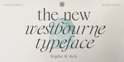 Westbourne Modern Serif Typeface is a stylish font It has both modern look. Comes with alternatives and ligatures, helps to create stunning logos, quotes, posts, blog posts. branding projects, magazine imagery, wedding invitations, and much more. WHAT'S YOU GET ? Westbourne Regular and Italic Unique Letterforms Works on PC & Mac Simple Installations Accessible in the Adobe Illustrator, Adobe Photoshop, Microsoft Word Fully accessible without additional design software. I really hope you'll get pleasure using Westbourne font and it will be perfect addition to your font collection! Contact me with an inbox message If you have any question. Thank you! Happy Creating.
 - Springsteel Serif by Paragraph,
$21.00 A companion to Springsteel (sans), this serif typeface is intended for longer text blocks and smaller sizes. Like the sans-serif, it has unusual construction using curves on the outside and straight lines inside characters, giving it quite an expressive and warm feel. It contains small caps and old-style figures, as well as superior/inferior figures and common fractions and mathematical symbols. It supports Western plus Nordic, Eastern European and Turkish languages. Excellent spacing and extensive kerning (over 2800 pairs) provided by Igino Marini/iKern. The free fonts in the Springsteel Serif Extreme family (thin and heavy weights) should only be used as display typefaces, at large size and short text blocks.
 - Vezus Serif by Tour De Force,
$30.00
- Priori Serif by Emigre,
$59.00 After the popular successes of Exocet and Mason, Emigre has once again teamed up with Jonathan Barnbrook to bring you his latest venture into type land. Priori is a logical progression from Mason, a typeface he designed around ten years ago. Where Mason was designed purely for display purposes and featured only caps, Priori includes lower case, companion serif and sans serif versions, alternates and, according to its creator, is shooting for text face status - a bold claim from a designer who loves to wear his influences on his sleeve and who has little use for typography that aspires to be "neutral" or "transparent." Like many of Barnbrook's typeface designs, Priori is based on his interest in British typography of the early 20th century. It is inspired by the work of famous British typographers, such as Eric Gill and Edward Johnston. But it also embraces all of the signage and lettering that Barnbrook observes in the streets, cathedrals, and public buildings of his London neighborhood. This mixing of native influences with a contemporary pop culture intent is what gives Barnbrook's types a distinct and unique flavor. Like its creator, Priori is a one of a kind.
 - Soyombo Serif by Letterhead Studio-VG,
$60.00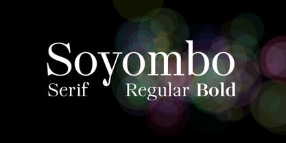 Modern Serif Typeface for any use.
 - Silk Serif by SilkType,
$47.50 Silk Serif is a high-contrast typeface with thin, pointy, heavily bracketed serifs, and ball terminals in the appropriate places, as well as bracketed junctions in various letterforms. The main feature of the typeface is the disconnection between the bowls and the stems. However, the bowl is very close to the stem, creating the illusion of connection. Silk is delicate and legible — but above all, it is sophisticated.
 - Vallejo Serif by Estudio Calderon,
$35.00 A serif display type family inspired by two popular fonts: Albertus and Friz Quadrata. We made an hybridization matching those kind of fonts that have flared and oversized serifs. Vallejo Serif is a versatile font because of the shapes that are adaptable to many sort of typographic compositions, we recommend to use it in headlines. The OpenType fonts have an extended character set to support Central and Eastern European as well as Western European languages.
 - Chelvin Serif by Dora Typefoundry,
$17.00 Chelvin - is a strong neoclassical serif font family with high contrast, cool, stylish and unique looks with alternative fonts, Ligatures and multilingual support. This font idea has a wide range of references, from vintage to classic to the modern era, making it the perfect typeface for an understated, modern, and sophisticated look. all forms of beauty and luxurious ligature suitable for brands and designs. Chelvin's wide selection of changing styles and ligatures makes this serif font incredibly versatile. Use Chelvin for your branding, magazine design, logo design, headlines, posters, packaging, cards or wedding invitations. Chelvin includes two styles (Standard / Italic) which each include 114 glyphs. OpenType features include 53 standard ligatures and a small number of character variants, and multilingual support (including multiple currency symbols). Features: • 2 Font weight • Uppercase & Lowercase • Alternative & Ligature Styles • Numbers & Punctuation • Characters with accents • Supports Multiple Languages I can't wait to see what you do with Chelvin! Feel free to use the #Dora Typefoundry tag and the # Chelvin Serif font to show what you've been up to!
 - Kangen Serif by Cooldesignlab,
$10.00 "Kangen Serif " is a powerful neoclassical font family designed for a variety of uses — from editorial and corporate design to web, interaction, and product design. It's a contemporary look with high-contrast typography that never goes out of style — defined by elegance, tradition, and timelessness. Although "Kangen Serif " seems like a display font at first glance, its proportions and design convey hard work and strong character.
 - Vecta Serif by Wilton Foundry,
$29.00I think it is one of our most useful fonts in that it doesn't draw much attention to itself while it is quite refreshingly different. Almost all shapes in Vecta are rounded to provide a friendly effect. Proportions are somewhat condensed providing economic space usage. Vecta looks equally at home in headlines as well as body text. - Nocturne Serif by Borutta Group,
$29.00 Nocturne Serif – font is inspired by the lettering on stone tablets commemorating the victims of World War II and Warsaw architecture. Nocturne is a text font that features clean geometrical shapes and high contrast, and is modernist in character. The family consists of over 750 glyphs, including: Latin, Cyrillic, small caps and many others…
 - Ravensara Serif by NaumType,
$19.00 Ravensara Serif - elegant high contrast classic serif. Style of the typeface originates in a classic Didone but took a step to simplify some letter forms and make Didone feel more contemporary. Ravensara Serif is a part of the Ravensara superfamily, united by the same anatomy, which currently also includes Ravensara Sans and Ravensara Stencil. Ravensara Serif, despite its ancient roots and due to simplified and smoothed forms, can be used in a variety of different styles. It’s a perfect choice for bold headlines, oversize typography, fashion logos, branding, identity, website design, album art, covers, posters, advertising, etc. It is available in 7 weights, including Thin, Light, Regular, Medium, SemiBold, Bold and Black. Ravensara Serif extends multilingual support to Basic Latin, Western European, Euro, Catalan, Baltic, Turkish, Central European, Pan African Latin and Afrikaans.
 - Gallery Serif by Elvina Studio,
$17.00 Modern & sophisticated font with ligatures. Font files; Upper/lowercase, numbers, punctuations, ligatures & alternates; 7 bonus logos (AI). Language support: English, German, French, Spanish, Italian, Danish, Finnish, Portuguese, Swedish, Norwegian, Dutch, Indonesian, Luxembourgish, Icelandic, Cornish, Hungarian, Filipino, Romansh, Slovenian, Estonian, Polish, Turkish.
 - Matao Serif by Identitype Co,
$15.00 Mataö is a bold and gorgeous and is great for headlines and elegant designs with a vintage and classic flair. Mataö's contrasting lines and curved terminals give a sleek, elegant look to logos, holiday cards, wedding invitations, quotes, advertisements, and more. Mataö is a versatile typeface that's full of character and one you'll come back to time and again. Make your awesome design layout with Mataö.
 - Astro Serif by Typehead Studio,
$15.00 Introducing Astro, a charming serif font designed to bring an elegant and classic touch to your designs. Crafted with meticulous attention to detail and inspired by mid-millennium Serifs, Astro seamlessly blends traditional sophistication with contemporary elements, making it suitable for a variety of design projects, both print and digital. Enchanting Letter Shape Designs: Astro exudes charm with its letter design that is heavily inspired by the mid-millennium Serifs often found in European and American designs. Each letter is carefully carved to create a charming and luxurious impression. Unique Alternative Glyphs: Astro is not just a font; it is a standout typographic masterpiece. By offering several unique alternative glyphs, such as the letters a, g, and k, Astro gives designers the freedom to express their creativity in a unique and personal way. Mid-Millennium Serif Elegance: Astro features smooth lines and proportions, creating an elegant impression characteristic of mid-millennium Serifs. This design provides a timeless classic touch making it suitable for a variety of design needs, including books, magazines, posters and other printed materials. Ease Readability: While the Astro exudes striking elegance, its design also prioritizes readability and comfort. Each letter is created with balanced proportions and optimal contrast, ensuring text appears clear and easy to read, whether on a large or small scale. Flexible Use: Astro is designed to provide flexible use across a variety of design platforms. From the logo design to the magazine layout, Astro adapts beautifully, maintaining a consistent feel that enhances the aesthetic quality of the design. European and American inspiration: Astro creates a bridge between European and American typographic styles, combining the best elements of both traditions. This makes it the perfect choice for projects that combine elements from both continents. Astro is more than just a font, it is an artistic statement that leaves an unforgettable impression on any design project. Suitable for designers who appreciate classic beauty and modern uniqueness, Astro brings a special and charming feel to every character it creates.
 - Quercus Serif by Storm Type Foundry,
$69.00 Quercus is characterised by open, yet a little bit condensed drawing with sufficient spacing so that the neighbouring letters never touch. It has eight interpolated weights with respective italics. Their fine gradation allows to find an exact valeur for any kind of design, especially on the web. Quercus serif styles took inspiration from classicistic typefaces with vertical shadows, ball terminals and thin serifs. The italics have the same width proportion as upright styles. This “modern” attitude is applied to both families and calls for use on the same page, e g in dictionaries and cultural programmes. Serif styles marked by “10” are dedicated to textual point sizes and long reading. The sans-serif principle is rather minimalistic, with subtle shadows and thinned joints between curved shapes and stems. Quercus family comprises of the usual functionality such as Small Caps, Cyrillics, diacritics, ligatures, scientific and aesthetic variants, swashes, and other bells & whistles. It excels in informational and magazine design, corporate identity and branding, but it’s very well suited for book covers, catalogues and posters as well. When choosing a name for this typeface I've been staring out from my studio window, thinking helplessly without any idea in sight. Suddenly I realised that all I can see is a spectacular alley of oaks (Quercus in Latin) surrounding my house. These oaks were planted by the builders of local ponds under the leadership of Jakub Krčín in the fifteenth century.
 - Balerno Serif by My Creative Land,
$29.99 Balerno is a modern (yet vintage) multilingual elegant Didone serif enhanced by ligatures, alternates and swashes. Balerno is a very versatile font family - with it's classic forms and modern features it covers a wide range of design projects starting from greeting cards to magazines, wedding invitations to websites etc. The amount of alternates is tremendous, from simple stylistic alternates to swashes, ligatures and their alternates. Languages supported: English, German, French, Italian, Spanish, Swedish, Portuguese, Irish, Norwegian, Luxembourgish, Basque, Breton, Corsican, Faroese, Galician, Icelandic. Free fonts contain basic latin characters set, numbers, punctuation and symbols.
 - Verse Serif by Hubert Jocham Type,
$39.00 In 2006 the art director of Emotion, a women’s psychology magazine, asked me to design a copy typeface for them. Before I actually got the job I started to work on a serif. I wanted it to be feminine but still clear and modern. On one hand there are the floral round elements and on the other hand the angular serifs. In the composition I wanted the two extremes to work together. All the other elements had to be harmonized. The proportions needed to match the magazine’s requirements. The ascenders and descenders are short enough to work in narrow columns but long enough to work in small sizes. As you can imagine, the emotion-job never happened. Verse is now a serif and a san-serif with 7 weights with italics and smallcaps. In copy you should not get heavier than Heavy. Extrabold and Ultrabold work best in display.
 - Galson Serif by Typehill Studio,
$15.00 Galson Serif attracts a typeface that is smooth, clean, unique, elegant, modern, feminine, sensual, glamorous, simple and very easy to read. Classic style is very suitable to be applied in various formal forms such as invitations, labels, menus, logos, fashion, make up, stationery, letterpress, romantic novels, magazines, books, greeting/wedding cards, packaging, labels. Galson Serif has alternative, Ligature and multilingual support.