42 search results
(0.006 seconds)
- Psuedo Saudi - Personal use only

- Psychedelic Sauce - Unknown license

- The Sauce - Unknown license

- Awesome Sauce by Hanoded,
$15.00 Awesome Sauce is a pretty awesome font. Despite its humble origins (it was made using a really cheap brush and ink), Awesome Sauce retains a rebel stylishness. Awesome Sauce comes with all the accents you want and double letter ligatures to boot!
 - Surf Sauce by Maulana Creative,
$13.00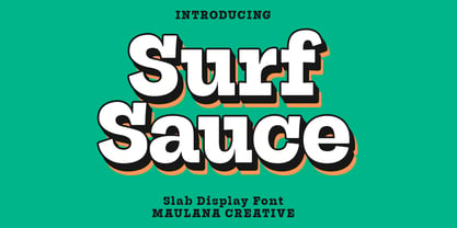 Surf Sauce is a modern slab serif font. With bold stroke, fun character. To give you an extra creative work. Surf Sauce font support multilingual more than 100+ language. This font is good for logo design, Social media, Movie Titles, Books Titles, a short text even a long text letter and good for your secondary text font with Script or sans. Make a stunning work with Surf Sauce font. Cheers, Maulana Creative
 - Fire Sauce by Vozzy,
$10.00 Introducing a vintage look label font named "Fire Sauce". This layered family includes six styles - Base, Rough, Outline, Fill, Shadow and Shine. This font will be great on any retro design like posters, t-shirts, labels, logos, and more.
 - Red Sauce by Olivetype,
$18.00 It's time to get down and red. Freshly released, Red Sauce is a fun and stylish typeface with a cool and playful vibe to it. Use our new typeface to give your design the style it deserves. From badges and logos to posters and t-shirts, Red Sauce has you covered. So what’s included : Basic Latin Uppercase and Lowercase Numbers, symbols, and punctuations Ligatures Multilingual Support. Simple Installations Works on PC & Mac
 - Hot Sauce by Letterhead Studio-YG,
$29.00 Bistro and Hot Sauce have been prepared quickly. In Bistro you will find 10 fine traces from coffee cups, and in HotSauce 10 pleasant-for-eyes stains from sauce. Both fonts are created in the 1998. OpenType revision, with extended Latin characters, made in 2009.
 - Sauce Grotesk by Creative Sauce,
$36.00 Sauce Grotesk is a compact typeface much like the classic unassuming sans serif grotesques but with softer features that shows fluidity and a sense of easiness. We wanted a typeface that can relate to a broader audience for maximum message clarity while maintaining aesthetic qualities.
 - !Futurelic Sans Souci - Unknown license

- WHOA SAUCE PERSONAL USE - Personal use only

- SuperBlack by Scannerlicker,
$22.00 SuperBlack is a saucy counterless typeface, ideal for display purposes. Whenever you need impact with a playful feel, SuperBlack will pop out.
 - Girls Girls Girls by Comicraft,
$19.00Yeah, Baby! You wanted the World’s Greatest Comic Book Fonts and we gave them to you! They're Sexy DropCaps! They're Saucy Dingbats! GIRLS!GIRLS!GIRLS! - Bistro by Letterhead Studio-YG,
$29.00 Bistro and Hot Sauce have been prepared quickly. In Bistro you will find 10 fine traces from coffee cups, and in HotSauce 10 pleasant-for-eyes stains from sauce. Both fonts are created in the 1998. OpenType revision, with extended Latin characters, made in 2009.
 - LeeorPasta MF by Masterfont,
$59.00 This is what happens when you try to write with a bottle of sauce...
 - Aguafina Script Pro by Sudtipos,
$29.00 Semi-formal and eye-catching elegance is the name of the game, says Aguafina Script, Koziupa and Paul’s latest creation. Graceful, but not too casual. Knowledgeable and artistic, but not too imposing. The characters flow into each other, making a very saucy script with appetizing color. The narrow lowercase allows for efficient use of space, while the long ascenders and descenders help maintain the legibility. A unique find among scripts, Aguafina is useful for product packaging, glossy magazine work, and book covers.
 - Thirsty for Souls - Personal use only

- Melonday Demo - Personal use only

- Velouté by Wilton Foundry,
$29.00 Velouté is named after one of the original French Mother Sauces, it is a surprisingly bold and velvety script with delicate flourishes that demand your attention. Velouté's unique mix of classic, contemporary, bold and delicate detail is ideally suited for Special Invitations, Coffee shops, Restaurants, Boutiques and Menus.
 - Carbonara by Hanoded,
$20.00 Carbonara. Nope, it's not the pasta sauce, but a nice, grungy typewriter font, made using a pre-war typewriter, some oil and a stack of old-fashioned carbon paper sheets. You can use it to give your designs some oomph. Comes with a whole bunch of contextual and stylistic alternates.
 - Nastaleeq Asc by Ascender,
$155.99Nastaleeq (Nasta?l?q) ASC is a script font supporting Urdu. Urdu is the nation language of Pakistan. The Nastaleeq ASC font is Unicode encoded. The Nastaleeq ASC font requires an application program which supports Arabic fonts (right-to-left composition). Urdu is also spoken in Afghanistan, Bahrain, Bangladesh, Botswana, Fiji, Germany, Guyana, India, Malawi, Mauritius, Nepal, Norway, Oman, Qatar, Saudi Arabia, South Africa, Thailand, the UAE, the UK and Zambia. - Soft Serve by Sentinel Type,
$24.90Looking like happy frosting on a cupcake at a twiddle bug party, this bouncy food entry from Canadian designer Haley Fiege turns the original Jellybrush type into organic happiness you can spread on pancakes, ice-cream, sorbets, sauces and condements, oh peanut butter! Yeah, all kinds of sandwich fillings. Anything really. What else? People who own rubber factories. Anybody in the food business, like green grocers or your local bakery. Thrift stores. Falling somewhere between cushions and cat food, this flexible and inviting letter mixes simplicity with organic character and humor for a wide range of uses. Soft Serve’s compact cursive forms and bouncy friendliness draw on artbrush scripts and the typo-italic model of Renaissance Vatican scribe Ludovico Arrighi. A versatile workhorse ideal for: * Dairy & beverage * Sweets & soft drink * Five minute food & sauces * Pet food & accessories * Bathroom & kitchen * Cushions, pillows, rubber & swimming pool, etc. - Moutarde by Hanoded,
$15.00 Moutarde is French for mustard. At home we don’t eat that much mustard, as it is a condiment that goes well with burgers and hotdogs. We eat Asian food a lot, so our hot sauce of choice usually is sambal. Moutarde is a good name for this fine, handmade font. Moutarde font is a rounded, easy to read, display font that comes with all the condiments - including a set of alternate a’s.
 - Kabouter by Hanoded,
$15.00 Kabouter (kaːˈbɑu̯.tər) means ‘gnome’ in Dutch. I have no particular love for gnomes (even though I have a font called Garden Gnome…), but this font had a fairytale feeling to it and the name looked good. Kabouter is a happy display font. It is fun, bouncy and quirky. Use it for your book covers, toy-packaging and home made apple sauce labels. Besides that, you now know how to say gnome in Dutch, which will leave your friends astounded! ;-)
 - Full Blast by Hanoded,
$15.00 I was cleaning out my pencil box and found an old marker pen. I wanted to throw it away, because it was leaking all over my stuff, but decided I could use it one more time. The result is Full Blast font: a ‘brush’ font (made with that leaking old marker pen). Use if for your fireworks packaging, fiery pepper sauce bottles and whoopee cushions (and just about anything else as well). Comes with an explosive amount of diacritics.
 - Flank Steak by Mysterylab,
$17.00 This duo of handlettered-style vintage Americana fonts is a versatile package that can not only provide that subtle secret sauce that transports the viewer back 60 or 70 years to the neighborhood grocery store, it's also capable of conjuring up a very forward-looking and relaxed modern vibe. Whether it's the extra bold mid-century signpainter style of the sans serif, or the quick-brush liveliness of the casual script, you'll find this versatile pair is a real go-to for a variety of great looks.
 - Kapsalon by Hanoded,
$12.00 It could be you’ve never heard of Kapsalon and I will forgive you for that. Kapsalon is a Dutch word, meaning ‘hairdresser’s’. Since 2003 it is also a very popular snack food, which consists of french fries, döner kebab, lettuce, sambal, garlic sauce and melted Gouda cheese, served in an aluminium tray. I have to admit that I have never eaten a Kapsalon myself, as I am not too fond of fast food. I named this font package Kapsalon, because, like its namesake, it consists of several unrelated elements that work really well when combined.
 - Ye Paradigma by Yinon Ezra,
$30.00 Sans-serif, with clean and fresh Character. "Ye Paradigma" has been established in order to keep its forms as simple as possible - without losing the unique character of each letter, and without simplifying too much. The process was gradual, like the ripening of a sauce that leaves it to be reduced to strengthen flavors, so the letters ripened while reducing unnecessary details, until the taste became more concentrated and uniform. The result is a clean, fresh, remarkably useful 24 fonts typeface, with a clear and stable graphic language.
 - Mayonaise by Hanoded,
$8.00 Ah, so you've noticed a typo! Mayonnaise - the sauce, is written with double 'n'! I know. This font was named after a Smashing Pumpkins song that I like very much. Mayonaise is a bit of an ugly duckling. It is strange, open and messy, and might not be love at first sight. BUT, when you spend some time with Mayonaise and get to know her, you might actually fall in love. Just like that song I mentioned earlier. Go on then, give it a try! At this price, you can't go wrong!
 - US Bill Sans by Unidaas,
$39.00 US Bill™ Sans A Humanist typefaces sans serif. US Bill Sans has 12 weights, ranging from Light to Extrabold (including italics) and is ideally suited for advertising and packaging, book text, logo, branding and creative industries, small text, wayfinding and signage as well as web and screen design. Provides with features such as ligatures, small capitals, alternate characters, fractions, and super—and subscript characters. It comes with a complete range of figure set options as well as Latin-based languages. Designed and produced by Firman Suci Ananda, Fajar Wahyu Pribadi & Irfan Ulya. Published under Unidaas® Std — Formatika Aksa IDN, 2018.
 - VLNL Spaghetti by VetteLetters,
$35.00 Originally drawn in 1999 as a college project with the ambition to make the ‘most beautiful’ alphabet in the world. After these heroic beginnings Spaghetti lay dormant in the VLNL vaults for many years, appearing to silently peter away. Now look at it! Ten years hence, it is finally being served up in glorious OpenType, precisely al dente. As automated special sauce, each lowercase character before or after a space receives a nice little ball ending to round things off. And finally, the parmesan cheese sprinkled on top is like a tasty bunch of ligatures – enough to make your mouth water.
 - Escoffier Capitaux by steve mehallo,
$19.23 Escoffier Capitaux is named for culinary legend Auguste Escoffier (1846-35) and inspired by lettering used in vintage French advertising – including the work of commercial illustrator/fashion designer Ernst Dryden (1887-1938) WITH a hearty serving of 1960s ligatures influenced by the work of Herb Lubalin (1918-81) as well as a twist of Claude Garamond (1480ish-1561) AND featuring many alternate characters and extravagant extras, Escoffier Capitaux is enough to fill out your menu, add zest to your cook book, greeting card, resume or just the right amount of sauce to your blog. DINNER IS SERVED No substitutions, please. Minimum service per person. Warning: May taste gamey.
 - Saussa by Linotype,
$29.99Patricia Pothin-Roesch's Saussa typeface began life as brush-lettered artwork for fruit salad packaging in France. After the key letters had been painted, Patricia Pothin-Roesch switched to digital tools to create the final font. True to its roots, Saussa is a real advertising face, perfect for point-of-purchase displays. Even its name is consistent with its intended area of application: Saussa sounds a lot like the word “sauce.” Saussa is an informal script; its outstrokes function almost like serifs, and the capitals have a lowercase structure. The feelings this typeface conveys are due to the hand of its creator, Patricia Pothin-Roesch, an experienced brush-letterer. - Coal Brush by Hanoded,
$15.00 Coal Brush is a bit of a misleading name. It looks as though it was made with a brush, but it was, in fact, made with a almost dried out old marker pen. But a font named ‘dried out old marker pen’ doesn’t really fly, so I decided to pimp the name. There you have it, you can’t even trust an honest typographer! Marker pen or brush, Coal Brush is a very sweet little font. It is all caps, but upper and lower case differ and can be mixed freely. Plus there’s a hidden stash of alternates for the lower case letters and an alternate ampersand! I actually threw that in to make up for my lie. So, use it for your books, your posters, your rap albums, rock operas, grilled food restaurants and designer BBQ sauces. It’s yours for the taking!
 - Tita Script by Latinotype,
$59.00 Tita is dedicated to my grandmother Hebe, witty and arrabalera 1. The font is inspired by Milonga 2 music and the fileteado porteño 3. I picture it at The Moulin Rouge, sparkling, provocative, loving. It evokes Tita Merello and my grandmum singing her music. Tita is Argentinean to its very core. A font to shout goal and dulce de leche 4 with passion! Its curves originate from polirhythmic calligraphy, which I learnt from my mentor Silvia Cordero Vega. Tita is a pedigree script that is based on hand lettering and Sandra Biondi’s calligraphy works. Font digitalisation by Daniel Hernández. Edited by Javier Quintana / Programmed by Manuel Corradine. 1. A person from the arrabal (a working class neighborhood on the outskirts of the city of Buenos Aires) 2. Musical genre originated in the Río de la Plata areas of Argentina and Uruguay 3. Decorative hand lettering and artistic style that is frequently spotted in Buenos Aires 4. Sweet milk sauce
 - Jellybrush by Sentinel Type,
$25.00Looking like gifted jelly and falling in between cushions and cat food, this plump and inviting letter mixes simplicity with organic style for a wide range of uses. Jellybrush's compact cursive forms and robust friendliness draw on artbrush scripts, blending brush effects with synthetic forms. A versatile workhorse suitable for: * Dairy & beverage * Sweets & soft drink * Five minute food & sauces * Pet food & accessories * Bathroom & kitchen * Cushions, pillows, rubber & swimming pool, etc. Jellybrush is designed to take squishing and outline treatments and still look good. Squish it down in your application of choice, the letter proportions withstand horizontal compression easily. Jellybrush italic is a subtly-slanted fully cursive variant with the character width, counter size and hanging figures required for good text performance. Designed for supplementary text for packaging and advertising comps and any application requiring readable text matching the main font. The font packages contain two (2) formats of Jellybrush, in OpenType & TrueType flavors. - Katz Pajamas JNL by Jeff Levine,
$29.00 According to Wiktionary, "the cat's pajamas" was a slang phrase coined by Thomas A. Dorgan, the well-known journalist, cartoonist and sportswriter of that era. The phrase became popular in the U.S. in the 1920s, as the word "cat" was used as a term to describe the unconventional flappers from the jazz era. This was combined with the word pyjamas (a relatively new women's fashion during that time) to form a phrase used to describe something that is the best at what it does, thus making it highly sought and desirable. Wikipedia adds that Dorgan was the first to use the terms "twenty-three, skidoo", and "yes, we have no bananas", "apple sauce" and "solid ivory", which also became part of the slang of the "Roaring Twenties". Katz Pajamas JNL is a condensed slab serif typeface based on the title lettering for the 1944 sheet music "Pretty Kitty Blue Eyes", hence the pun-laden font name paying homage to this bit of verbal Americana as well as making the pajamas a pair owned by Mr. Katz instead of the fashionable feline. Available in both regular and oblique versions.
 - Ribfest by FontMesa,
$25.00 Ribfest is a new font based on lettering found on old United States currency from the 1800’s. Named after the Ribfest held in Naperville IL over 4th of July weekend each year, this font will be perfect for your next summer barbecue party. Ribfest offers three Fill fonts that can be layered behind the main open faced fonts, the regular Fill font covers the complete opening on the main fonts while the Fill T for top and Fill B for bottom gives you the option to fill with two different colors for top and bottom. The Fill fonts for Ribfest may also be used as stand alone fonts, the Fill T and Fill B fonts when layered together creates a unique look on its own. Expand your summertime fun with Ribfest and save me some of those rib’s, with extra barbecue sauce please. Special Note: When using the Opentype format of Ribfest, if you experience some letters appearing too bold at point sizes of 36 or above please install the truetype version that came with your purchase. Due to the extra detail in this font some graphics drivers may increase the boldness of the Opentype version of this font, the solution is to uninstall the Opentype and install the Truetype version.
 - Carnero Variable by Monotype,
$209.99Carnero™ is a feisty hybrid of precise geometry and calligraphic flair; a design that walks that fine line between being sensible and a standout. In an increasingly monotone typographic landscape – Carnero has a unique pulse that moves the reader along with a new energy. Carnero gives life to simple utility with kinetic letter shapes, open apertures, and generous counters Drawn by Steve Matteson for the Monotype Studio, Carnero’s versatility is its strength. From digital ads and applications to packaging and branding, Carnero is comfortable and contemporary. The lightest and boldest weights create inviting headlines, while the middle weights read well for body copy. Used together, they build a lively brand and a clear hierarchy. Matteson infused Carnero with a modernist exterior resting on a 10th century calligraphic foundation. Delightful flourishes on the capital R and K, and lowercase a, k and l, give the design a distinctive demeanor; while the alternate italic swash caps are a saucy nod to the scribes. The result is a design that is warm, approachable – and a bit lighthearted. Matteson describes Carnero as, “transcending the static posture of the geometric sans genre.” The Carnero family is a compact collection of six distinct weights, ranging from an engaging light to an authoritative black, each with an italic counterpart. Its extended Latin character set ensures worry-free localization for eastern/western European languages. This is a design that will prove its value many times over. Matteson has drawn over 80 distinctive typeface families for major corporations, branding firms and retail sales. His passions for the outdoors and performing music balances an intense focus on work – and subtly finds its way into typefaces like Carnero. Matteson has designed custom fonts for three generations of the Microsoft Xbox® game console, the original core fonts for the Android® mobile-phone platform, in addition to branding typefaces for Toyota®, Rocket Mortgage®, and Google®. He also drew the Kootenay™ family, Monotype’s proprietary branding typeface. Matteson’s retail designs range from the elegant and utilitarian Open Serif™ (a companion to Google’s Open Sans), to a growing series of Frederic Goudy revivals. Carnero Variables are font files which are featuring one axis and have a preset instance from Light to Black. - Carnero by Monotype,
$50.99 Carnero™ is a feisty hybrid of precise geometry and calligraphic flair; a design that walks that fine line between being sensible and a standout. In an increasingly monotone typographic landscape – Carnero has a unique pulse that moves the reader along with a new energy. Carnero gives life to simple utility with kinetic letter shapes, open apertures, and generous counters. Drawn by Steve Matteson for the Monotype Studio, Carnero’s versatility is its strength. From digital ads and applications to packaging and branding, Carnero is comfortable and contemporary. The lightest and boldest weights create inviting headlines, while the middle weights read well for body copy. Used together, they build a lively brand and a clear hierarchy. Matteson infused Carnero with a modernist exterior resting on a 10th century calligraphic foundation. Delightful flourishes on the capital R and K, and lowercase a, k and l, give the design a distinctive demeanor; while the alternate italic swash caps are a saucy nod to the scribes. The result is a design that is warm, approachable – and a bit lighthearted. Matteson describes Carnero as, “transcending the static posture of the geometric sans genre.” The Carnero family is a compact collection of six distinct weights, ranging from an engaging light to an authoritative black, each with an italic counterpart. Its extended Latin character set ensures worry-free localization for eastern/western European languages. This is a design that will prove its value many times over. Matteson has drawn over 80 distinctive typeface families for major corporations, branding firms and retail sales. His passions for the outdoors and performing music balances an intense focus on work – and subtly finds its way into typefaces like Carnero. Matteson has designed custom fonts for three generations of the Microsoft Xbox® game console, the original core fonts for the Android® mobile-phone platform, in addition to branding typefaces for Toyota®, Rocket Mortgage®, and Google®. He also drew the Kootenay™ family, Monotype’s proprietary branding typeface. Matteson’s retail designs range from the elegant and utilitarian Open Serif™ (a companion to Google’s Open Sans), to a growing series of Frederic Goudy revivals. Carnero Variables are font files which are featuring one axis and have a preset instance from Light to Black.


Page 1 of 2Next page