10,000 search results
(0.014 seconds)
- Metal DD by Doffdog,
$14.00 METAL is a hand-lettered modern serif font. This all caps font includes punctuation and numerals. It is perfect for: Logos Posters Headlines Apparel & more Multilingual support Stay true! Stay metal!
 - Mustang DD by Doffdog,
$14.00 Mustang is a vintage handmade all caps font. It is perfect for: logos, posters, labels, headlines, apparel & more. It comes with characters, numbers, marks and punctuation. Enjoy!
 - Monster DD by Doffdog,
$14.00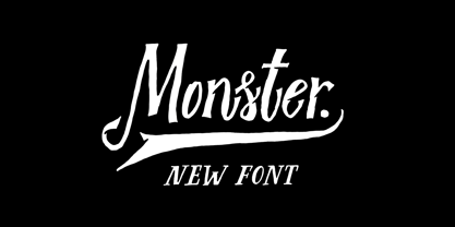 Monster DD is a decorative vintage font in modern performance. It is perfect for: Logos Posters Labels Headlines Apparel Tattoo & more Monster DD comes with upper and lowercase characters, numbers, marks and punctuation. Multilingual support Enjoy!
 - Big Fish DD by Doffdog,
$14.00 Big Fish DD is a decorative, metal and punk rock music inspired font. It is perfect for: Logos Posters Headlines Apparel Music covers & more Stay true! Stay metal!
 - Black Magic DD by Doffdog,
$14.00 Black Magic is a vintage handmade all caps font. It is perfect for: logos, posters, labels, headlines, apparel & more. It comes with characters, numbers, marks and punctuation. - Multilingual support Enjoy!
 - SAA Series EM by URW Type Foundry,
$35.00 - SAA Series D by URW Type Foundry,
$35.00 - SAA Series B by URW Type Foundry,
$35.00 - SAA Series E by URW Type Foundry,
$35.00 - SAA Series F by URW Type Foundry,
$35.00 - SAA Series A by URW Type Foundry,
$35.00
- SAA Series C by URW Type Foundry,
$35.00 - Burdigala Semi Serif by Asgeir Pedersen,
$19.99Burdigala is a clean-cut, modern yet classic typeface inspired by Didones and Aicher’s Rotis family. The Semi Serif is ideal for larger amounts of (printed) texts in brochures, magazines and books. It is slighty narrow in order to conserve space, but spacious enough to faciliate reading and overall clarity. The expanded versions of the semi serif, being wider and more open, works equally well in media intended both for print and on-screen reading, e.g. in Pdf-documents etc. Burdigala is the ancient Roman name of the city of Bordeaux France. - Rotis Semi Serif by Monotype,
$40.99 Rotis¿ is a comprehensive family group with Sans Serif, Semi Sans, Serif, and Semi Serif styles, for a total of 17 weights including italics. The four families have similar weights, heights and proportions; though the Sans is primarily monotone, the Semi Sans has swelling strokes, the Semi Serif has just a few serifs, and the Serif has serifs and strokes with mostly vertical axes. Designed by Otl Aicher for Agfa in 1989, Rotis has become something of a European zeitgeist. This highly rationalized yet intriguing type is seen everywhere, from book text to billboards. The blending of sans with serif was almost revolutionary when Aicher first started working on the idea. Traditionalists felt that discarding serifs from some forms and giving unusual curves and edges to others might be something new, but not something better. But Rotis was based on those principles, and has proven itself not only highly legible, but also remarkably successful on a wide scale. Rotis is easily identifiable in all its styles by the cap C and lowercase c and e: note the hooked tops, serifless bottoms, and underslung body curves. Aicher is a long-time teacher of design and has many years of practical experience as a graphic designer. He named Rotis after the small village in southern German where he lives. Rotis¿ is suitable for just about any use: book text, documentation, business reports, business correspondence, magazines, newspapers, posters, advertisements, multimedia, and corporate design. Today Rotis ia also available with paneuropean caracter set.
 - Sana Sans by Latinotype,
$29.00 Sana Sans is a humanist functional typeface with a modern feel. It is intended to be a face well-suited for multiple purposes, especially in publishing. Sana Sans looks perfectly legible and clean in long texts, and neat and simple in headlines. Thanks to its versatility, this font is also ideal for both screen and print usage. Sana Sans consists of 32 styles and 8 weights—ranging from Thin to Heavy—italics, small caps and an alternative family. The alternative family offers slight variants in many glyphs, some of which include the lowercase a, e, l, q, y and uppercase G, L, and Q. Sana Sans was designed by Felipe Sanzana, under the supervision of Latinotype Team.
 - Osaka-Sans Serif - Unknown license

- Vazari Sans Serif - Unknown license

- Times Sans Serif - Unknown license

- Sans Serif Shaded - Unknown license

- Arabetic Sans Serif by Arabetics,
$32.00 The Arabetic Sans Serif type family follows the guidelines of the Mutamathil type style but also illustrates the effects of adding and removing Latin-like serifs on Arabetic scripts legibility. It has only one glyph for every basic Arabic Unicode character or letter as defined in Unicode Standards version 5.1. Arabetic Sans Serif employs variable x-height values. It includes all required Lam-Alif ligatures and uses ligature substitutions and selected marks positioning but it does not use any other glyph substitutions or forming. Text strings composed using types of this family are non-cursive with stand-alone isolated glyphs. Tatweel (or Kashida) glyph is a zero width space. Keying it before any glyph will display that glyph’s isolated form. Keying it before Alif Lam Lam Ha will display the Allah ligature. Arabetic Sans Serif family includes both Arabic and Arabic-Indic numerals; all required diacritic marks, Allah ligature, in addition to all standard English keyboard punctuations and major currency symbols. Fonts are available in regular, italic, bold, and bold italic styles.
 - Egiptian Sans Serif by Intellecta Design,
$26.90a 3D version of the classic egiptian style, but in a sans serif mode - Obcecada Sans & Serif by deFharo,
$15.00 Obcecada Sans & Serif are two geometric digital typefaces in regular and bold versions, very condensed and thin with a rounded finish on the horns and joints with a modern style. They include the Cyrillic and Greek alphabet. These fonts are the result of my obstinacy for very condensed fonts, in this case I have inclined to a very fine proportion with short ascending and descending that gives them elegance decó.
 - Cut Sans Serif by Aksharasarovara,
$25.00The thought behind this font was not to join vertical, horizontal and diagonal stems. Each stem is designed separately and arranged in a good manner to create glyphs. Something different from tradition; liberal, but in the limit. - Getho Semi Sans by deFharo,
$12.00 Getho is a Semi Sans family of geometric construction with 6 weights plus the italic versions all include small letters, the symbol of Bitcoin and other monetary symbols. It is an exclusive typography with neo-grotesque modulations and maximum readability in any size. The typeface has alternative letters and numbers, small caps and advanced OpenType functions. The complete Pack includes versions of the Variable Fonts type. The drawn of the vectors is meticulous to obtain smooth curves of elegant aspect to which also contributes the subtle rounding of the corners, the thicker versions have of traps of ink in the knots of the unions to be able to use them in small sizes. The Metric and the Kerning of all the versions I have reviewed individually to obtain a fluent reading in any type of text and size.
 - Rotis Semi Sans by Monotype,
$40.99 Rotis¿ is a comprehensive family group with Sans Serif, Semi Sans, Serif, and Semi Serif styles, for a total of 17 weights including italics. The four families have similar weights, heights and proportions; though the Sans is primarily monotone, the Semi Sans has swelling strokes, the Semi Serif has just a few serifs, and the Serif has serifs and strokes with mostly vertical axes. Designed by Otl Aicher for Agfa in 1989, Rotis has become something of a European zeitgeist. This highly rationalized yet intriguing type is seen everywhere, from book text to billboards. The blending of sans with serif was almost revolutionary when Aicher first started working on the idea. Traditionalists felt that discarding serifs from some forms and giving unusual curves and edges to others might be something new, but not something better. But Rotis was based on those principles, and has proven itself not only highly legible, but also remarkably successful on a wide scale. Rotis is easily identifiable in all its styles by the cap C and lowercase c and e: note the hooked tops, serifless bottoms, and underslung body curves. Aicher is a long-time teacher of design and has many years of practical experience as a graphic designer. He named Rotis after the small village in southern German where he lives. Rotis¿ is suitable for just about any use: book text, documentation, business reports, business correspondence, magazines, newspapers, posters, advertisements, multimedia, and corporate design.Today Rotis ia also available with pan european caracter set.
 - Rotis Sans Serif by Monotype,
$45.99 Rotis is a comprehensive family group with Sans Serif, Semi Sans, Serif, and Semi Serif styles, for a total of 17 weights including italics. The four families have similar weights, heights and proportions; though the Sans is primarily monotone, the Semi Sans has swelling strokes, the Semi Serif has just a few serifs, and the Serif has serifs and strokes with mostly vertical axes. Designed by Otl Aicher for Agfa in 1989, Rotis has become something of a European zeitgeist. This highly rationalized yet intriguing type is seen everywhere, from book text to billboards. The blending of sans with serif was almost revolutionary when Aicher first started working on the idea. Traditionalists felt that discarding serifs from some forms and giving unusual curves and edges to others might be something new, but not something better. But Rotis was based on those principles, and has proven itself not only highly legible, but also remarkably successful on a wide scale. Rotis is easily identifiable in all its styles by the cap C and lowercase c and e: note the hooked tops, serifless bottoms, and underslung body curves. Aicher is a long-time teacher of design and has many years of practical experience as a graphic designer. He named Rotis after the small village in southern German where he lives. Rotis is suitable for just about any use: book text, documentation, business reports, business correspondence, magazines, newspapers, posters, advertisements, multimedia, and corporate design.
 - Microsoft Sans Serif by Microsoft Corporation,
$39.00Microsoft Sans Serif™ Regular is a very legible User Interface (UI) font. It was designed to be metrically compatible with the MS Sans bitmap font that shipped in early versions of Microsoft Windows. The original MS Sans was in the inflexible .fon bitmap format and could not be scaled. Microsoft Sans Serif Regular is much more flexible and legible as it font antialiasing and scalable user interfaces. Character Set: Latin-1, WGL Pan-European (Eastern Europe, Cyrillic, Greek and Turkish). - Sans Serif Inline by ARTypes,
$35.00Based on the 36-point design of the Amsterdam Nobel Inline capitals (1931), Sans Serif Inline™ is designed specially to meet the requirements of today's technology. - Rotis Semi Serif Paneuropean by Monotype,
$92.99Rotis¿ is a comprehensive family group with Sans Serif, Semi Sans, Serif, and Semi Serif styles, for a total of 17 weights including italics. The four families have similar weights, heights and proportions; though the Sans is primarily monotone, the Semi Sans has swelling strokes, the Semi Serif has just a few serifs, and the Serif has serifs and strokes with mostly vertical axes. Designed by Otl Aicher for Agfa in 1989, Rotis has become something of a European zeitgeist. This highly rationalized yet intriguing type is seen everywhere, from book text to billboards. The blending of sans with serif was almost revolutionary when Aicher first started working on the idea. Traditionalists felt that discarding serifs from some forms and giving unusual curves and edges to others might be something new, but not something better. But Rotis was based on those principles, and has proven itself not only highly legible, but also remarkably successful on a wide scale. Rotis is easily identifiable in all its styles by the cap C and lowercase c and e: note the hooked tops, serifless bottoms, and underslung body curves. Aicher is a long-time teacher of design and has many years of practical experience as a graphic designer. He named Rotis after the small village in southern German where he lives. Rotis¿ is suitable for just about any use: book text, documentation, business reports, business correspondence, magazines, newspapers, posters, advertisements, multimedia, and corporate design. Today Rotis ia also available with paneuropean caracter set. - Deco Semi Serif JNL by Jeff Levine,
$29.00 Deco Semi Serif JNL was modeled from the hand lettered title on the sheet music cover for the 1933 song "Another Perfect Day Has Passed Away". This interesting design blend of serif, sans serif and partial-serif characters commands attention with its eccentric mix of letter forms, and is available in both regular and oblique versions.
 - Star Series - Unknown license

- Timeless Series by Sakha Design,
$12.00 Timeless Series is a cool, bold and thick lettered display font. No matter the topic, this font will be an incredible asset to your fonts’ library, as it has the potential to elevate any creation.
 - World Series by Mans Greback,
$59.00 World Series is a retro script typeface. Drawn and created by Mans Greback in 2021, this calligraphic lettering has a unique brush style and a confident appearance. Its vintage theme does well as a logotype or any typographic art that needs to look custom made. Use underscore _ to create swashes. Example: Baseballer_ Use multiple underscores to make swashes of different lengths. (Download required) The font is built with advanced OpenType functionality and has a guaranteed top-notch quality, containing stylistic and contextual alternates, ligatures and more features; all to give you full control and customizability. It has extensive lingual support, covering all Latin-based languages, from North Europa to South Africa, from America to South-East Asia. It contains all characters and symbols you'll ever need, including all punctuation and numbers.
 - Goudy Series by URW Type Foundry,
$35.00
- Cicero Series by Alphabet Agency,
$15.00 Cicero Series is a bold decorative serif display font that exudes power, strength, magnificence, prestige. Add this grandiose piece to your font collection.
 - Display Series by Attract Studio,
$22.00 Display Series is a modern and stylish elegant serif font that will add a touch of luxury to your project style. The Display Series is perfect for branding, editorial, monograms, wedding invitations, titles and more. Featuring OpenType and PUA encoded which means you can access all glyphs and swashes easily!
 - Serid by Samuel Vicente Types,
$22.00 SERID is a display font condensed and regular designed for editorial applications. Inverted contrast, features a serif hybrid that gives a decorative character and personality to the font. Being a display type, intended for use in titles or in small blocks of text, from 24pt. The name SERID comes from the combination of words “SERif” and “hybrID”, resulting SERID.
 - Sernes by Graptail,
$15.00 Sernes was inspired by the letterforms in the film series "stranger things" with condensed letters.comes with 18 weights which includes display, alternate and italic. Also supported PUA encoded. Simply copy and paste the alternate characters using the Character Map (Windows), Font Book (Mac) or a software program such as PopChar (for Windows and Mac).
 - Sergie by Runsell Type,
$16.00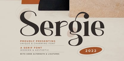 Sergie font is perfect for many of your projects like logos & branding, photography, invitations, watermarks, advertisements, product designs, stationery, wedding designs, labels, product packaging, special events and much more.
 - Aeris by Linotype,
$29.99 Aeris™ typeface is a contemporary book face created by the American designer Tom Grace. It combines the proportions and rhythm of a sans serif font with the high contrasts and flexed strokes of script faces, while the open counters also ensure optimal legibility. Tom Grace focuses on providing subtle differentiations in his cuts and, as a consequence, this font family has its own individual structure: there are A and B variants of the basic forms regular, italic, bold and bold italic, and a display version for use in titles that also comes in A and B variants. It is advisable to use the A variant for larger font sizes, while the slightly more emphasized B variant can be recommended for smaller font sizes. Where the basic forms are to be mixed together in a work, it is important to use the corresponding A/B variants throughout as their designs have been carefully coordinated. Aeris is available in the OpenType Pro format and thus includes a wide range of different glyphs. The font family can be used in various environments, such as books, magazines, advertisements and promotional materials, but it is also the perfect choice for printed corporate documentation.


Page 1 of 250Next page