33 search results
(0.013 seconds)
- Fubrica by Sakha Design,
$12.00 Fubrica is a whimsical and clean handwritten font. It can easily be matched to an incredibly large set of projects, so add it to your creative ideas and notice how it makes them stand out!
 - Rubrical by Ditatype,
$29.00 Introducing Rubrical, a script font that gives personalized feel to the design with a confident presence. This typeface is characterized by its substantial weight, giving your design a bold and impactful appearance. Rubrical maintains consistent proportions across all its letters, offering a sense of stability. It also adds a sense of warmth and personality. It has flowing and connected letterforms that are embellished with graceful swings that adorn select letters. These decorative elements, which can include ornate initials or elegant swinging flourishes, add a touch of sophistication and artistic flair to your text. They create a visual journey that is engaging, unique, and memorable. In addition, enjoy the features here. Features: Ligatures Stylistic Sets Swashes Multilingual Supports PUA Encoded Numerals and Punctuations Rubrical fits in headlines, logos, posters, flyers, branding materials, print media, editorial layouts, and many more designs. Find out more ways to use this font by taking a look at the font preview. Thanks for purchasing our fonts. Hopefully, you have a great time using our font. Feel free to contact us anytime for further information or when you have trouble with the font. Thanks a lot and happy designing.
 - Fabrica - Unknown license

- Rustica by TipoType,
$24.00 The world has changed; we want it to change. But it has a history too. Rustica draws back to the sans typeface tradition and updates it for the 21st century; we aim to go back to the humanist values without dismissing the role played by technology.It’s a GeoHumanist sans serif. Type design looks back at its past to return with renovated strength to its march to the future. Rustica is based on a humanist architecture with the addition of the determination and precision of the geometry of the classic sans of the early 20th century. Thus, a typographic conception typical of 21st century communications: returning to the human values of closeness and proximity, adding the certainty of knowledge and science. Rustica is born out of the DNA of our awarded font Rotunda, contributing to this typographic ecosystem humanist notes enhanced by the precision and discipline of geometry.
 - Fabrica by Fenotype,
$40.00 Fábrica is an exquisite display letter with flair. Its delicate curves have been carefully honed; yet its beauty is seemingly effortless. To add to its appeal, Fábrica is equipped with several handy features such as ligatures (there are plenty of them), old style figures and fractions. Its true crown jewel, however, is the finely tuned hairline accents – no longer will a diacritical mark ruin your heading. Find those under a feature called Thin accents. Use Fábrica to turn your communication into statements of divine elegance.
 - Kubrick by Quadrat,
$25.00 Kubrick is an experiment in extremes. The Light font is very tall and slender, the Black font is very massive, and Kubrick's slender counters push some of its glyphs to the edge of recognition. The thin counters and negative spaces also give text set in Kubrick a definite visual sparkle, especially in all-uppercase settings. Because of its extreme letterforms, Kubrick is recommended only for large display use. The default letterspacing is set fairly wide to keep text legible. Kubrick was a double-experiment. One part of it was to see how heavy and massive a typeface I could make while still keeping it legible. The other part was to develop a Multiple Master font. Multiple Master fonts were a format developed by Adobe that allowed the user to change things like the weight and width of a typeface. Monollith started as just such a Multiple Master typeface, but when Adobe discontinued the Multiple Master format, I stopped work on the typeface. Later I decided to continue work on it, but as five separate font weights: Light, Medium, Bold, ExtraBold and Black. Very rectilinear letterforms with extremely narrow counters and negative spaces. The five fonts go from very thin and condensed to very heavy and extended. Use in large display settings where unornamented high visual impact is desired.
 - Rubric Cubed by Elemeno,
$- - Rubic by SparkyType,
$19.00 - History Fabrica by Allouse Studio,
$16.00 Proudly Presenting, History Fabrica A Charming Script Font. History Fabrica is perfect for any titles, logo, product packaging, branding project, megazine, social media, wedding, or just used to express words above the background. History Fabrica also come with Multi-Lingual Support. Enjoy the font, feel free to comment or feedback, send me PM or email. Thank You!
 - Publica Sans by FaceType,
$- Publica Sans is a clean geometric typeface, equipped with a variety of OpenType features to give you all you need for great typography: Alternates, arrows, rare currency symbols, case sensitive forms, various sets of figures and discretionary ligatures. Publica Sans has two sisters: Publica Play and Publica Slab Take a close look at our gallery (especially ‘OpenType Features 1–6’) to discover the versatility of Publica Sans. Alternates Give your typography a certain spin with the variety of alternate letters provided. Currency You need to set prices in exotic countries? No problem: Publica Sans gives you loads of rare currency symbols. Case Sensitive Forms Sometimes you write in all caps and there are some symbols (e.g. brackets) that need some extra treatment to make it look perfect – that’s what case sensitive forms are for. Figures Publica Sans provides 6 sets of figures, like lining, tabular, oldstyle, numerators ... Discretionary Ligatures Ligatures can make your logo or headline look spicy. So there are plenty of them.
 - Publica Slab by FaceType,
$- ‘Publica Slab’ is the serifed sister of Publica Sans and Publica Play – packed with subtle open type features, tabular options, rare currencies signs and symbols and arrows, ‘Publica Slab’ provides everything you need for big design tasks like signage, corporate design and magazine design. Take a close look at our gallery (especially ‘OpenType Features 1–6’) to discover the versatility of Publica Slab. Alternates Give your typography a certain spin with the variety of alternate letters provided. Currency You need to set prices in exotic countries? No problem: Publica Slab gives you loads of rare currency symbols. Case Sensitive Forms Sometimes you write in all caps and there are some symbols (e.g. brackets) that need some extra treatment to make it look perfect – that’s what case sensitive forms are for. Figures Publica Slab provides 6 sets of figures, like lining, tabular, oldstyle, numerators ... Discretionary Ligatures Ligatures can make your logo or headline look spicy. So there are plenty of them.
 - Somuch Fabrica by Allouse Studio,
$16.00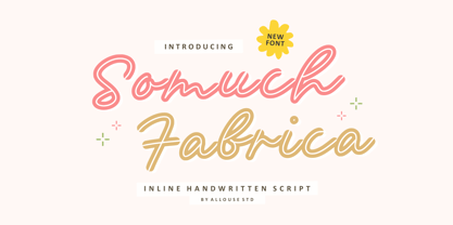 A Inline Handwritten Script. Somuch Fabrica is perfect for any titles, logo, product packaging, branding project, megazine, social media, wedding, or just used to express words above the background. Somuch Fabrica also come with Multi-Lingual Support. Enjoy the font, feel free to comment or feedback, send me PM or email. Thank You!
 - Publica Play by FaceType,
$- Publica Play is Publica Sans’ and Publica Slab’s playful sister. It comes with loads of subtle open type features, tabular options, rare currencies signs and symbols and arrows – ‘Publica Play’ has everything you need for playful design tasks. Take a close look at our gallery (especially ‘OpenType Features 1–7’) to discover the versatility of Publica Play. Alternates and Stylistic Sets Give your typography a certain spin with the variety of alternate letters provided. Explore the Stylistic Sets provided. Currency You need to set prices in exotic countries? No problem: Publica Play gives you loads of rare currency symbols. Case Sensitive Forms Sometimes you write in all caps and there are some symbols (e.g. brackets) that need some extra treatment to make it look perfect – that’s what case sensitive forms are for. Figures Publica Play provides 6 sets of figures, like lining, tabular, oldstyle, numerators ... Discretionary Ligatures Ligatures can make your logo or headline look spicy. So there are plenty of them.
 - Lemonade Fabrica by Abo Daniel,
$15.00 introducing LEMONADE FABRICA -the quirky handwritten font- It is a beautiful quirky font that perfect for a lettering project like cutting vinyl, silhouettes, t-shirt design, mugs, advertisements, book covers, posters, business cards, social media, and more. The doodles make this font so perfect. Features: - Uppercase - Lowercase - Number & Punctuations - Multilingual - Doodles - PUA encoded Hope you love it Regards, Abo Daniel Studio
 - Res Publica by Linotype,
$29.99Res Publica is a workhorse. It is quite anonymous as typeface, without any distinctive marks. But it gives a harmonious text body, well suited for large amounts of text, such as official public reports, magazines based mainly on text, school books, and so on. The public" concept is part of the name. Res Publica is Latin for "public matters". The word republic has the same origin. Res Publica was released in 1992. - Rubric Cubed Deluxe by Elemeno,
$20.00 - Sunia Rabica by Arttype7,
$15.00 Sunia Rabica is a cool looking and incredibly unique display font, inspired by the arabic art. It is defined by smooth curves and is perfect for fashion branding or editorial designs. Add it confidently to your projects, and you will love the results.
 - Publica Sans Round by FaceType,
$22.00 Publica Sans Rounded is the rounded version of Publica Sans. A clean geometric typeface, equipped with a variety of OpenType features to give you all you need for great typography: Alternates, arrows, rare currency symbols, case sensitive forms, various sets of figures and discretionary ligatures. Publica Sans Rounded has two other sisters: Publica Play and Publica Slab Take a close look at our gallery (especially ‘OpenType Features 1–6’) to discover the versatility of Publica Sans. Alternates Give your typography a certain spin with the variety of alternate letters provided. Currency You need to set prices in exotic countries? No problem: Publica Sans gives you loads of rare currency symbols. Case Sensitive Forms Sometimes you write in all caps and there are some symbols (e.g. brackets) that need some extra treatment to make it look perfect – that’s what case sensitive forms are for. Figures Publica Sans provides 6 sets of figures, like lining, tabular, oldstyle, numerators ... Discretionary Ligatures Ligatures can make your logo or headline look spicy. So there are plenty of them.
 - PB Capitalis Rustica IVc by Paweł Burgiel,
$32.00 PB Capitalis Rustica IVc is a font face designed for imitate latin writing style found in manuscripts from 1st to 9th century. All characters are handwritten by use ink and reed pen (calamus), scanned, digitized and optimized for best quality without lost its handwritten visual appearance. Character set support codepages: 1250 Central (Eastern) European, 1252 Western (ANSI), 1254 Turkish, 1257 Baltic. Include also additional characters for Cornish, Danish, Dutch and Welsh language, spaces (M/1, M/2, M/3, M/4, M/6, thin, hair, zero width space etc.) and historical characters (overlined Roman numerals, I-longa, historical ligatures for "nomina sacra" and "notae communes"). OpenType TrueType TTF (.ttf) font file include installed OpenType features: Access All Alternates, Localized Forms, Fractions, Ordinals, Superscript, Tabular Figures, Proportional Figures, Stylistic Alternates, Stylistic Set 1, Historical Forms, Historical Ligatures. Include also kerning as single 'kern' table for maximum possible backwards compatibility with older software. Historical ligatures for "nomina sacra" and "notae communes" are mapped to Private Use Area codepoints. Use of OpenType features to get historical characters: ïTo get "I-longa" use Stylistic Alternates for: "I"(U+0049), "i"(U+0069), "dotless i"(U+0131). ïTo get "nomina sacra" use Historical Ligatures and write uppercase letters: DS for: "Deus", DMS or DNS for: "Dominus" EPS for: "Episcopus", IHS for: "Iesus", PBR for: "Presbiter", SCS for: "Sanctus", SPS for: "Spiritus", XPS for: "Christus". ïTo get "notae communes" use Historical Ligatures and write: B(U+0042) + "middle dot"(U+00B7) for: "-BUS", Q(U+0051) + "middle dot"(U+00B7) for: "-QUE". ïTo get "scriptio continua" (writing without words separation) use Historical Forms (regular spaces are replaced by zero width spaces between words). ïTo get "middle dot" for separate words use Stylistic Set 1 (regular spaces are replaced by middle dot between words).
 - Diosa Rubia NF by Nick's Fonts,
$10.00This svelte type family, whose name translates as "Blonde Goddess", is ideal for creating loquacious headlines in tight spaces, as well as dense informational blocks such as movie credits. Available in three weights. This font contains the complete Latin language character set (Unicode 1252) plus support for Central European (Unicode 1250) languages as well. - QueueBrick by The Northern Block,
$16.70 QueueBrick is an 8 font family consisting of 4 weights Open & 4 weights Closed. A block-work typeface inspired by East European movie posters. Example includes Stanley Kubricks 2001: A Space Odyssey.
 - 1543HumaneJenson - Personal use only

- Bravura Pro by RMU,
$40.00 Inspired by Karl-Heinz Lange’s Publica, Bravura Pro is a versatile humanist sans font family with a slight calligraphic touch which makes it ideal for private correspondence as well as for body texts in magazines and books. All styles contain small caps and oldstyle figures.
 - Carinthia by Scriptorium,
$18.00Carinthia is derived from the style of Roman calligraphy known as Rustica, but with some features of Roman uncial added to form a complete upper and lower case character set, including variant upper case characters with decorative spurs. The result is a rather vertical, but quite stylish font which has an antique calligraphic look and good readability. - Dropsomaniacal by Proportional Lime,
$9.99 Drop Caps happen. They started off life as decorated initials way back when in the days of illuminated manuscripts. Then printing came and they became the work of the rubricators and then somewhere soon after printing began, at least by the 1490’s, they were printed directly into the text. This then is a collection of over a hundred glyphs from that closing decade of the Incunabula period. All of them are based on examples found in the works printed by Michael Wenssler in Basel. This font also contains a few useful pointing hands and a set of spacing characters.
 - P22 Basel Roman by P22 Type Foundry,
$24.95 In mid 2001, P22 was approached by a Daniel Garrison, a Classics scholar at Northwestern University about possibly digitizing a long lost "Garamond" typeface. This font was used by Johannes Herbst (a.k.a. Ioannes Oporinus) in 1543 to publish Andreas Vesalius' "On the Fabric of the Human Body" (De humani corporis fabrica) in Basel. The story of the development of this font takes a few twists and almost becomes forgotten itself over time.Forteen years later it is available to the public.
 - Octava by ParaType,
$30.00 PT Octava™ was designed at ParaType in 2001 by Vladimir Yefimov. The first (Cyrillic only) version named Scriptura Russica (1996) consisting of three styles (book, italic, bold) was commissioned by the Russian Bible Society. Lately the Latin letters and bold italic were added. Inspired by Lectura, 1969, by Dick Dooijes and Stone Print, 1991, by Sumner Stone. In spite of large x-height the typeface is both space saving and quite legible at small sizes. Expert fonts including small caps (book) and old style figures are available.
 - Rusticana by Linotype,
$29.99Rusticana is a part of the 1990 program Type before Gutenberg, which included the work of twelve contemporary font designers and represented styles from across the ages. Linotype offers a package including all these fonts on its web page, www.fonts.de. Rusticana was designed by Adrian Frutiger and appeared with Linotype in 1993. Its historical roots go back to the Roman Capitalis, the all caps engraved writing of ancient Rome which reached its peak in the first century. From this style evolved other Roman forms, and one, Rustica, proved particularly good for text on bronze, as opposed to in stone. The Rusticana of Frutiger has open, seemingly irregular forms which lend a distinctive rhythm to text. - Fabrica is an intriguing font created by Alvin Kwan, known for its distinct approach to design that marries simplicity with functionality. This typeface is an exploration of minimalism in typography,...
- Futura by URW Type Foundry,
$89.99 Futura is THE prototype of a geometric or constructed linear sans serif and the font most commonly font of its kind used to date. Futura, very much influenced by the Bauhaus movement in Germany, was designed in 1927 by Paul Renner. Although being around for almost 90 years, Futura seems eternally young and fresh which also explains its continuous popularity with designers and typographers. Futura simply means efficiency and functionality documented by both its many usages as corporate type (e.g. Volkswagen, formerly IKEA, Vuitton, Shell, formerly HP, SMA and many more) as well as in various famous film projects (e.g. Kubrick, Anderson etc.). Futura’s iconic status was probably established when it walked on the moon with the Apollo 11 crew in 1969. It was used for the lettering of the plaque that was left up there.
 - 1543 Humane Jenson by GLC,
$38.00 In 1543 the well-known “De humani corporis fabrica” treatise on anatomy by André Vesale, was printed by Johann Oporinus in Basel (Switzerland). Various typefaces were used for this work, mostly in Latin but including Greek characters. Its Jenson-type font was the one which inspired this font. It is a very elegant one, including the “long s”, a few abbreviation forms and ligatures. As it was a Latin text, there were no accented characters and a few capitals were absent. I had to reconstruct them. A render sheet, in the font file, makes all characters easy to identify on the keyboard. This font may be used as a “modern” one for web-site titles, posters and flier designs, publishing ancient texts... and anything else you want! One of the most elegant types ever cut, it stands up very well to enlargement, remaining as readable as in its original small size.
 - Futura Round by URW Type Foundry,
$39.99 Futura is THE prototype of a geometric or constructed linear sans serif and the font most commonly font of its kind used to date. Futura, very much influenced by the Bauhaus movement in Germany, was designed in 1927 by Paul Renner. Although being around for almost 90 years, Futura seems eternally young and fresh which also explains its continuous popularity with designers and typographers. Futura simply means efficiency and functionality documented by both its many usages as corporate type (e.g. Volkswagen, formerly IKEA, Vuitton, Shell, formerly HP, SMA and many more) as well as in various famous film projects (e.g. Kubrick, Anderson etc.). Futura’s iconic status was probably established when it walked on the moon with the Apollo 11 crew in 1969. It was used for the lettering of the plaque that was left up there. Now, URW has expanded its range of Futura styles by Futura Round with 14 additional styles.
 - Rotola TH Pro by Elsner+Flake,
$40.00 Karl-Heinz Lange presented his first drafts of Rotola during a Typoart® type design competition in 1985 under the name "Boutique". A year later, Norbert du Vinage, former manager of the type design department, integrated "Boutique" in his production plan. Due the Fall of the Wall, it took about 18 years until Lange finished this font family in cooperation with Elsner+Flake. Karl-Heinz Lange was born on July 29, 1929 in Wiesenkirch in West Prussia. He was enrolled in the Humanistic Gymnasium at Elbing from 1939 to 1945 and changed to the Wernigerode High School after his family had to flee to central Germany. From 1949 to 1951, Karl-Heinz Lange studied at the Werkkunstschule Halle, where one of his teachers was Professor Post. After 1951, he continued his studies at the Hochschule for Grafik und Buchkunst in Leipzig with an emphasis on book design. He received his diploma in 1955 with distinction based on his design of a hot metal typeface. From 1956 to 1961, Karl-Heinz Lange worked as a lecturer for Type and Commercial Graphics at the Hochschule für Angewandte Kunst in Magdeburg. From 1961 to 1963, he taught at the Hochschule für Grafik und Buchkunst in Leipzig, and finally as a freelance commercial designer in Magdeburg. He worked on a variety of assignments, one of which was the design of trick films. From 1969 to 1976 he took the position of Artistic Director of the Henschelverlag, Berlin; from 1976 to 1994 he was Professor of Type and Typography at the Fachschule für Werbung und Gestaltung in Berlin; and, until 2004, he taught at various institutes for advanced professional education. From 2005 to 2007 he taught at the Fachhochschule Magdeburg/Stendal. Karl-Heinz Lange was awarded the second prize at the "International Type Design Contest 1971" for a headline typeface, and, in 1984, at the XI. Biannual of Graphic Design in Brno, he won a Silver Medal for the design of his typeface family Publica. He created the telephone book typeface Minima and re-designed the Typoart Super Grotesk® (Arno Drescher, 1930) as well as the Newspaper typeface Magna® by Herbert Thannhaeuser for the use on digital typesetting systems. To the day of his death on June 29, 2010, Karl-Heinz Lange lived and worked as a type designer. Among others, he closely followed the designs of the typefaces which were developed under his guidance for Typoart®: "Publica®", "Typoart Super Grotesk®" and "Minima®" which he launched as "Publicala", "Minimala" and "Superla" in 2009. In cooperation with Elsner+Flake, he developed the Typeface family "Rotola" between 2006 and 2009 as well as the script families of the "Viabella®" series. To the end, he followed the development of his first typeface, the "Diplom Antiqua", which he also wanted to bring to market together with Elsner+Flake.

