56 search results
(0.011 seconds)
- Ronan by Mad Irishman Productions,
$22.00A bold font evoking Dark Age adventure, Ronan can be used for titles requiring Latin or Cyrillic alphabets. - Robine by Craft Supply Co,
$20.00 Introducing Robine – Condensed Sans Serif Robine – Condensed Sans Serif font is the ideal choice for creating attention-grabbing titles and headings. With its high x-height, this modern sans-serif typeface offers a sleek and contemporary appearance, ensuring your designs will stand out. Stylish and Space-Efficient: Robine – Condensed Sans Serif strikes the perfect balance between style and space efficiency. Its condensed design allows you to fit more text into tight spaces without sacrificing readability. Versatile Usage: This font is incredibly adaptable, making it suitable for a wide range of design projects. Whether you’re designing posters, logos, or web graphics, Robine – Condensed Sans Serif adds a touch of modern sophistication to your work. Exceptional Clarity: Robine – Condensed Sans Serif ensures your titles and headings remain easily readable, even at smaller sizes, thanks to its clear and legible characters. It’s designed to make a bold statement while maintaining clarity.
 - Roniq by Negara Studio,
$19.00 RONiQ is a display font. A type which should not be taken too seriously, a mixture in styles as per usual. this one is also quite juicy. Ready to be used in fun projects. Supports some languages, a lil bit multingual.
 - Roline by HansCo,
$17.00 INTRODUCING ROLINE – Modern Display typeface! ROLINE is a modern lined font with unique style that will make your design looks modern and sophisticated. You can use this font for any purpose, especially to make logotype like a technology logo brand. This typeface is comes in ALL CAPS also support multilingual in ALL CAPS only. Enjoy!
 - Angry Ronin by Artcity,
$16.00 Font designed for lettering dialogue baloons in comic books.
 - P22 Rodin by P22 Type Foundry,
$24.95 The great French sculptor August Rodin was strongly inspired by the Italian sculptor, painter and poet Michelangelo. Created in association with the Philadelphia Museum of Art, this font set is a tribute to the achievements of both extraordinary artists.
 - JMTF Robin by John Moore Type Foundry,
$55.00 JMTF Robin is a new post-modernist typeface in the spirit of Art & Crafts, born as a concept of a reformulation of a Gothic traditional building structure. Interestingly medieval structural architectural rescue form is for creating a font of traits absolutely contemporary without losing its artisan flavor. JMTF Robin is then a modular typography with very specific characteristics that provides an innovative texts while an appearance of great personality. Early versions of Robin was winners in Letras Latinas 2006. JMTF Robin representing a before and after in terms of contemporary texts composition. JMTF Robin is a typeface family that is presented in a wide variety of forms, from JMTF Robin in condensed forms to other roman proportions like Robin9, ideal for text, also JMTF Robin comes in Shadow and Double Outline. I dedicate this letter to creative genius William Morris father of modernism.
 - Ronny Catuss by Maulana Creative,
$15.00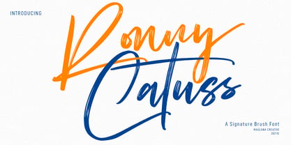 Ronny Catuss is an expressive signature brush font. With regular brush stroke, slanted and fun character with a bit of ligatures. To give you an extra creative work. Ronny Catuss font support multilingual more than 100+ language. This font is good for logo design, Social media, Movie Titles, Books Titles, a short text even a long text letter and good for your secondary text font with sans or serif. Make a stunning work with Ronny Catuss font. Cheers, MaulanaCreative
 - Santa Robin by Balpirick,
$15.00 Santa Robin is a Modern Handbrushed Font. Santa Robin is a sweet and friendly handwritten font. This playful font will look gorgeous on a variety of design ideas. It will add a joyful and romantic touch to each of your projects! Santa Robin also multilingual support. Enjoy the font, feel free to comment or feedback, send me PM or email. Thank you!
 - Calla Personal Use Only - Personal use only

- Ludwig LooseBraids - Unknown license

- Dead World - Unknown license

- Porspican Serif - 100% free

- ITC Grouch by Bitstream,
$40.99 Tom Carnase and Ronne Bonder’s freewheeling ITC adaptation of ATF’s turn-of-the-century Caslon boldfaces.
 - Eshkol MF by Masterfont,
$59.00 This font designed by Elan Ronen, consists mainly from geometric, to forms make this elegant font family a great companion for invitations and signs, indoor and outdoor.
 - P22 Michelangelo by P22 Type Foundry,
$24.95The great French sculptor August Rodin was strongly inspired by the Italian sculptor, painter and poet Michelangelo. Created in association with the Philadelphia Museum of Art, this font set is a tribute to the achievements of both extraordinary artists. - Dutch Courage by Comicraft,
$29.00Developed by Comicraft's Dutch Masters to give DC's BATMAN & ROBIN ADVENTURES a crisp, clean, Art Deco look, all four pints of DUTCH COURAGE are available as one font family. Please refrain from operating heavy machinery within one hour of partaking of these intoxicating fonts. - HVD Bodedo - Unknown license

- Arial by Monotype,
$45.99 Arial is one of the most widely used designs of the last 30 years. Drawn in 1982 by Robin Nicholas and Patricia Saunders for use in an early IBM® laser printer, Arial has become a staple for textual content. While it is widely believed that Arial's design was based on Helvetica, it is more accurate to consider Monotype Grotesque as its ancestor.
 - Ice Creamery by FontMesa,
$29.00Ice Creamery is a new variation of our Saloon Girl font family complete with italics and fill fonts which may be used to layer different colors into the open parts of each glyph. We don’t recommend using the fill fonts for Ice Creamery as stand alone solid fonts, Ice Creamery Chocolate was designed as a the stand alone solid font for this font family. Fill fonts go back to the 1850's where they would design matched sets of printing blocks and the layering of colors took place on the printing press, they would print a page in black then on a second printing they would print a solid letter in red or blue over the letters with open spaces to fill them in. Most of the time the second printing didn't line up exactly to the open faced font and it created a misprinted look. With the fill fonts in Ice Creamery and other FontMesa fonts you have the option to perfectly align the fill fonts with the open faced fonts or shift it a little to create a misprinted look which looks pretty cool in some projects such as t-shirt designs. I have some ice cream making history in my family, my Grandfather Fred Hagemann was the manager of the ice cream plant for thirty years at Cock Robin Ice Cream and Burgers in Naperville IL. In the images above I've included an old 1960's photo of the Cock Robin Naperville location, the ice cream plant was behind the restaurant as seen by the chimney stack which was part of the plant. If you were to travel 2000 feet directly behind the Cock Robin sign in the photo, that's where I started the FontMesa type foundry at my home in Naperville. My favorite ice cream flavor was their green pistachio ice cream with black cherries, they called it Spumoni even though it wasn't a true Spumoni recipe. Their butter pecan ice cream was also incredibly good, the pecans were super fresh, their Tin Roof Sundae ice cream was chocolate fudge, caramel and peanuts swirled into vanilla ice cream. One unique thing about Cock Robin and Prince Castle was they used a square ice cream scoop for their sundaes. - Nimrod by Monotype,
$29.99 An extremely versatile, intelligently restrained design by Robin Nicholas for Monotype in 1980. It works very well at small sizes thanks to its large x-height, sturdy serifs, and lack of ornament; yet it is not characterless. Nimrod has been used successfully in national newspapers and books. (The Guardian, London, from its late-1980s redesign until it was replaced by a Carter interpretation of Miller in 1998; the Concise Oxford English Dictionary in the typographically unsurpassed 1990 edition.)
 - Bella Donna by Canada Type,
$24.95The famous Italian type designer and Nebiolo director Alessandro Butti designed Rondine in 1948. Not so surprisingly - given its beauty - it quickly became quite a commonly copied metal type. But for some reason Rondine was spared during the massive “phototyping” that happened with the introduction of film type. Perhaps this is why no digital version of it ever existed until now. Bella Donna is an upright round script that can be used both formally and informally, in almost any design where an elegant script completes the equation. The almost dramatic grandeur of the majuscules is very nicely complemented by pouty low-x-height minuscules that sprout graceful and very visible ascender and descender loops. Titles, sentences and paragraphs set in Bella Donna are meant to delightfully tease the reader and make hearts skip a beat. Bella Donna can deliver a subtle promise of joyful playfulness, inviting elegance, memorable romance, sensuality, or sincere understanding. Bella Donna was redrawn and digitized from original specimen by Rebecca Alaccari, who also extended the character set with plenty of alternates and some add-on swashes built within the font. - M Ying Hei HK by Monotype HK,
$523.99 M Ying Hei™ is designed by type designer Kenneth Kwok and Robin Hui. Unnecessary details have been eliminated to pursue a minimal form. The structure of characters are well balanced, neat and dignified. Different components of a character are cooperating perfectly in an appropriate proportion. Thickness of strokes are modified according to the number of strokes, thus achieving an even texture throughout the paragraphs. Therefore a perfect choice for prints, user interface and signages. M Ying Hei™ is equipped with 7 weights, which is sufficient for various occasions like matching with different Latin typefaces and handling complex information hierarchy.
 - Hush Hush by Comicraft,
$49.00 If you thought you heard someone callin' your name just now, you might have caught the firm but soft spoken tones of Comicraft's classy balloon lettering font, HushHush. Created in the style of the newspaper strips of the 30s and 40s, HushHush captures the slick movements of the skilled hand letterers of that era. Gracing the pages of Jeph Loeb and Jim Lee's chart-topping BATMAN storyline -- which by a staggering coincidence was also called "Hush" -- these characters have brought to life the words of Two Face, The Joker, Scarecrow, Catwoman, Batman and Robin -- from every whisper to every scream.
 - M Ying Hei PRC by Monotype HK,
$523.99 M Ying Hei™ is designed by type designer Kenneth Kwok and Robin Hui. Unnecessary details have been eliminated to pursue a minimal form. The structure of characters are well balanced, neat and dignified. Different components of a character are cooperating perfectly in an appropriate proportion. Thickness of strokes are modified according to the number of strokes, thus achieving an even texture throughout the paragraphs. Therefore a perfect choice for prints, user interface and signages. M Ying Hei™ is equipped with 7 weights, which is sufficient for various occasions like matching with different Latin typefaces and handling complex information hierarchy.
 - M Young Hei PRC by Monotype HK,
$523.99 M Ying Hei™ is designed by type designer Kenneth Kwok and Robin Hui. Unnecessary details have been eliminated to pursue a minimal form. The structure of characters are well balanced, neat and dignified. Different components of a character are cooperating perfectly in an appropriate proportion. Thickness of strokes are modified according to the number of strokes, thus achieving an even texture throughout the paragraphs. Therefore a perfect choice for prints, user interface and signages. M Ying Hei™ is equipped with 7 weights, which is sufficient for various occasions like matching with different Latin typefaces and handling complex information hierarchy.
 - Rhizo by Stiggy & Sands,
$29.00 A Stylized Sans Serif with a Futuristic Flavor. The Rhizo font began as a digitization of a film typeface from LetterGraphics known simply as "Rodin". The original specimen included standard Capitals and Lowercase, Numerals and limited punctuation. We've fleshed out the original style to include alternates, ligatures and a full character set with all the trimmings. Stylish, gorgeous, a little dark, a little friendly...a variety of attitudes conveyed in this typeface. Opentype features include: Full set of Inferiors and Superiors for limitless fractions. A collection of Standard Ligatures. A small set of Stylistic Alternates Smallcaps Approx. 592 Character Glyph Set: Rhizo comes with a glyphset that includes standard & punctuation, international language support, and additional features.
 - Arial Narrow OS by Monotype,
$54.99Arial was designed for Monotype in 1982 by Robin Nicholas and Patricia Saunders. A contemporary sans serif design, Arial contains more humanist characteristics than many of its predecessors and as such is more in tune with the mood of the last decades of the twentieth century. The overall treatment of curves is softer and fuller than in most industrial style sans serif faces. Terminal strokes are cut on the diagonal which helps to give the face a less mechanical appearance. Arial is an extremely versatile family of typefaces which can be used with equal success for text setting in reports, presentations, magazines etc, and for display use in newspapers, advertising and promotions. - Arial for Ortho Clinical by Monotype,
$45.99Arial was designed for Monotype in 1982 by Robin Nicholas and Patricia Saunders. A contemporary sans serif design, Arial contains more humanist characteristics than many of its predecessors and as such is more in tune with the mood of the last decades of the twentieth century. The overall treatment of curves is softer and fuller than in most industrial style sans serif faces. Terminal strokes are cut on the diagonal which helps to give the face a less mechanical appearance. Arial is an extremely versatile family of typefaces which can be used with equal success for text setting in reports, presentations, magazines etc, and for display use in newspapers, advertising and promotions. - Arial Unicode by Monotype,
$208.99Arial was designed for Monotype in 1982 by Robin Nicholas and Patricia Saunders. A contemporary sans serif design, Arial contains more humanist characteristics than many of its predecessors and as such is more in tune with the mood of the last decades of the twentieth century. The overall treatment of curves is softer and fuller than in most industrial style sans serif faces. Terminal strokes are cut on the diagonal which helps to give the face a less mechanical appearance. Arial is an extremely versatile family of typefaces which can be used with equal success for text setting in reports, presentations, magazines etc, and for display use in newspapers, advertising and promotions. - Arial Paneuropean by Monotype,
$92.99Arial was designed for Monotype in 1982 by Robin Nicholas and Patricia Saunders. A contemporary sans serif design, Arial contains more humanist characteristics than many of its predecessors and as such is more in tune with the mood of the last decades of the twentieth century. The overall treatment of curves is softer and fuller than in most industrial style sans serif faces. Terminal strokes are cut on the diagonal which helps to give the face a less mechanical appearance. Arial is an extremely versatile family of typefaces which can be used with equal success for text setting in reports, presentations, magazines etc, and for display use in newspapers, advertising and promotions. - Scarab - Unknown license

- Planet N - Personal use only

- Planet NS - Unknown license

- Planet S - Unknown license

- Scarab Solid - Unknown license

- Planet X - Unknown license

- Beta Block - Unknown license

- Scarab Border - Unknown license

- Geis by Galapagos,
$39.00In 1978 I went to work at Mergenthaler as a letter drawer. Being an inquisitive sort I decided that I should take a stab at this type design 'stuff'. I drew 25 or 30 glyphs before the work found its way to a high shelf in a dark corner of my apartment. Just 23 years later I found the drawings on a different shelf, in a different home, in a different city and decided to finish what I had started. I'm still trying to deal with my predisposition toward procrastination but I've finished the font. The name of the font is the last name of somebody I played softball with before I moved to Beantown. Ronnie Geis was one of the courageous firefighters we lost on September 11th when the WTC collapsed.


Page 1 of 2Next page