5,068 search results
(0.024 seconds)
- Reflection by Arendxstudio,
$15.00 Reflection - Brush Font that has a distinctive character that is very thick and elegant to use Reflection is a relaxed and flowing Handwritten Font. Incredibly versatile, this font fits a wide pool of designs, elevating them to the highest levels. Add this font to your favorite creative ideas and notice how it makes them come alive! Features : • Character Set A-Z • Numerals & Punctuations (OpenType Standard) • Accents (Multilingual characters) • Ligature Multilingual Support : Afrikaans, Albanian, Asu, Basque, Bemba, Bena, Catalan, Chiga, Cornish, Danish, English, Estonian, Faroese, Filipino, Finnish, French, Friulian, Galician, German, Gusii, Icelandic, Indonesian, Irish, Italian, Kabuverdianu, Kalenjin, Kinyarwanda, Low German, Luo, Luxembourgish, Luyia, Machame, Makhuwa-Meetto, Makonde, Malagasy, Malay, Manx, Morisyen, North Ndebele, Norwegian Bokmål, Norwegian Nynorsk, Nyankole, Oromo, Portuguese, Romansh, Rombo, Rundi, Rwa, Samburu, Sango, Sangu, Scottish Gaelic, Sena, Shambala, Shona, Soga, Somali, Spanish, Swahili, Swedish, Swiss German, Taita, Teso, Vunjo, Zulu There it is! I really hope you enjoy it
 - Beauty Reflections by Letterhend,
$14.00 Beauty Reflections is a elegant script font that embodies the artistry of calligraphy with a touch of grace. The carefully crafted letterforms exquisite flourishes and intricate details, showcasing the perfect balance between elegance and opulence. It comes with regular and custome version. This font perfectly made to be applied especially in logo, and the other various formal forms such as invitations, labels, logos, magazines, books, greeting / wedding cards, packaging, fashion, make up, stationery, novels, labels or any type of advertising purpose. Features : Uppercase & lowercase Numbers and punctuation Alternates & Ligatures Multilingual PUA encoded We highly recommend using a program that supports OpenType features and Glyphs panels like many of Adobe apps and Corel Draw, so you can see and access all Glyph variations.
 - Respective - Personal use only

- Realest by Font Row,
$24.99 A great addition to every graphic designer's toolkit. Realest™ is a modern slab serif display font designed with mathematical precision. The entire typeface is crafted with consistent angles & measurements down to the smallest detail. It is built on mathematics. For this reason, it is a highly versatile display font, ideal for branding, logos, websites, ads, graphics, clothing & printable materials. What makes Realest™ stand out is its classy yet modern style. It could be classified as 'futuristic' (due to its square-shaped structure), yet the slab serif details add a touch of class that most futuristic fonts lack. This gives it a unique character, making it ready to perform well in a wide variety of creative projects. Features: • A unique fusion of Modern & Slab Serif styles. • Designed with mathematical precision. • The characters share the exact same dimensions (where possible). • Monospaced (with even spacing between characters). • Comes with a generous number of alternate glyphs & accented characters. • Available in both Regular & Extended (wide) styles. • Highly versatile Realest™ Extended is a completely free font that can be used in commercial projects.
 - Respect by Resistenza,
$39.00 Respect! Our tribute to hand lettering culture. This exuberant new script font family draws inspiration from the traditional craftsmanship of sign painting and brush pen calligraphy techniques. Our aim was to create a modern interpretation of brush script, which referenced old-school hand lettering but also adds some contemporary forms, terminations and swashes you might expect to find in street art. The slanted angles and curved steams are designed to give this font an active energy, plenty of attitude and a courageous/brave character. We recommend to combine Timberline with: Turquoise
 - Reglest by Blankids,
$25.00 Hello, Are you looking for a modern Natural handlettering script font? Do you want of creating Something that stand out and inspire creativity, imagination, and endless fun? Wait no more, we will give you the best choice. Reglest a Natural Handlettering Font Reglest a Natural Handlettering Font, Inspiring from brush lettering style typography. This font is perfect for a design that makes it more attractive and playful. made with a very good level of aesthetics making this font suitable for book cover, poster, packging, merchandise, logotype and much more. Reglest font includes Multilingual Support, among others : Afrikaans, Albanian, Asu, Basque, Bemba, Bena, Breton, Catalan, Chiga, Cornish, Danish, Dutch, English, Estonian, Faroese, Filipino, Finnish, French, Friulian, Galician, German, Gusii, Indonesian, Irish, Italian, Kabuverdianu, Kalenjin, Kinyarwanda, Luo, Luxembourgish, Luyia, Machame, Makhuwa, Meetto, Makonde, Malagasy, Manx, Morisyen, North Ndebele, Norwegian Bokmål, Norwegian Nynorsk, Nyankole, Oromo, Portuguese, Quechua, Romansh, Rombo, Rundi, Rwa, Samburu, Sango, Sangu, Scottish Gaelic, Sena, Shambala, Shona, Soga, Somali, Spanish, Swahili, Swedish, Swiss German, Taita, Teso, Uzbek (Latin), Volapük, Vunjo, Zulu FEATURES : Uppercase Lowercase Number Punctuation Multilingual PUA Encode Opentype
 - Reflector by Test Pilot Collective,
$29.00 - Eclectics by ITC,
$29.99 - Reflex by SoftMaker,
$9.99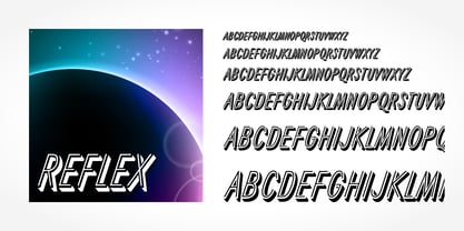 Reflex is a decorative typeface published by SoftMaker.
 - Delectables by ITC,
$29.99A former lettering artist at Hallmark Cards, Rob Leuschke now has his own thriving design businesses, Alphabytes and the new TypeSETit. Growing up in St Charles, Missouri, where he still lives, Rob showed great artistic promise at an early age. He earned a BFA in graphic design at the University of Missouri at Columbia. After graduation, his stint at Hallmark Cards gave him the opportunity to learn from and work with some of the best lettering artists in the industry. Rob struck out on his own in 1987 and now boasts a long list of clients from all over the world. Rob has created over 250 custom typefaces, and his work has been exhibited in New York. Ambiance BT is Rob’s first typeface published by Bitstream, with more to follow. - Reflex by Sudtipos,
$29.00 Reflex update: Now in 18 styles and variable version. Reflex was designed as an alternative to many overused types found on the packaging of pop culture products. Taking its inspiration from Bauhaus design roots, even in its heavy weights it maintains a soft aesthetic that can transparently convey a message of newness and understanding, as well as clarity and evenness. The Reflex set comes with a wide range of linguistic support, at no extra charge, including characters for Central European, Cyrillic, Greek, Turkish and Baltic regions.
 - reflet électrik - Personal use only

- Election by Thaddeus Typographic Center,
$40.00 - Organic Respect by Bogstav,
$17.00 Organic Respect is my monospaced and organic slab serif font. Although the font is monospaced - which may not lead your mind to something organic - I did my best to make the letters appear vibrant and lively in an organic way. I've added 6 slightly different letters for you to choose from, and they automatically cycle as you type, or you can manually select them from the glyph menu.
 - HoMicIDE EFfeCt - Unknown license

- BN Defect - Unknown license

- Good Selection by Mega Type,
$10.00 Good Selection Font Duo and Extras is a modern scripts with handwriting, decorative characters, designed to perfectly combine informal, sassy, romantic, sweet scripts. Hand-drawn design elements allow you to create many beautiful typographic designs in an instant like branding, logos, web design and editorial, prints, invitations, crafts, quotes, and more. Good Selection Font Duo and Extras features OpenType stylistic alternates, ligatures and International support for most Western Languages. To enable the OpenType Stylistic alternates, you need a program that supports OpenType features such as Adobe Illustrator CS, Adobe Indesign & CorelDraw X6-X7, Microsoft Word 2010 or later versions. How to access all alternative characters using Adobe Illustrator: https://www.youtube.com/watch?v=XzwjMkbB-wQ Good Selection is coded with PUA Unicode, which allows full access to all the extra characters without having special designing software. Mac users can use Font Book , and Windows users can use Character Map to view and copy any of the extra characters to paste into your favorite text editor/app. How to access all alternative characters, using Windows Character Map with Photoshop: https://www.youtube.com/watch?v=Go9vacoYmBw If you have any question, don't hesitate to contact me by email : megatype04@gmail.com
 - Reflex Pro by RMU,
$30.00 Reflex Pro with its two styles - Regular and Solid - is a great sans serif all-caps font family, ideal for headlines, posters and signboards. The solid style makes it easy for you to fill the letters with photographs or background patterns.
 - Defect Scam by PizzaDude.dk,
$12.00 Defect Scam could easily have been a name for a punk band. But it's not - it's the name of my stencil wannabe font. But, it was inspired by a combination of some punkband's LP cover and the vibes of that genre of music - but not overdoing it by making an obvious punk font! Well, you get 4 different versions of each letter in the Regular, Black and Fill versions, as well as multilingual support!
 - Replete Sans by Sudtipos,
$49.00 Sudtipos’ new sans serif font Replete is inspired by the mixture of aesthetics and philosophies found on the streets of metropolitan cities the world over. Buildings constructed throughout the twentieth century, including those made in the Art Deco style or influenced by the Bauhaus’s gospel, stand side-by-side as symbols of their time. Typography is one factor that bonds these vistas, and simultaneously further complexifies them. Art deco letters appear on storefronts and signage in Europe’s oldest cities and as remnants of the Golden Age of economic expansion for Latin America. Typography, like architecture, sometimes coexists in perfect harmony, and other times in ideological opposition. But it is these juxtapositions in places such as Shanghai, New York, London, Buenos Aires and Tokyo that shape each city’s identity. Replete is inspired by this mixture. We wanted to create a useful modern sans serif family – a set of 7 weights with playful geometric alternates – that allows you to combine characters including wide-width and filled letterforms. Replete is apt for long texts, and equally, for instances where letterforms can stand together like a cityscape. Replete means full, packed and abounding … it is a sans, it is grotesque, it is geometric and it is Deco. Replete is a new family that has a little of everything we like, equipped with everything you need to design anything you want.
 - Eclectic One by Altered Ego,
$45.00STF Eclectic One is a visual cornucopia of symbols, like the junk drawer in your kitchen. Stuff you'll need someday for a graphic element, bullet or dingbat application. Perfect for website icons! The Eclectic family is legendary, with a cult-like following among the inititated. As one of the first dingbat fonts available on the web, it gain popularity after its design in the early 1990s. With over 150 characters in the complete set, you'll find yourself using Eclectic One almost daily to add spice to your otherwise san-serif typographic existence. This font is essentially a soap opera of typographic image elements, created for projects when I couldn't find the "thingbat" I needed. Almost more of a collection of illustrations, there are many characters which connect to form patterns, and of course it's like a "small neutral European country" army knife for the creative community. EcOne features complete hour, quarter, and half-hour notations in an analog clock design glyph, recycled/recyclable symbols, a registration mark, a toaster, globes, sideways diamond arrows, spaceships, stoplights, the "running man," several atomic references, da buzz saw, target icons, the unusual smiley face floating in a ball (with a drop shadow, no less!), and the fish skeleton which complements the fallout shelter symbol, and more. Make your own juxtapositions! One reviewer proclaims "for whatever you do, Eclectic One is an excellent dingbat source." Available in Mac and PC formats. License it today! - Eclectic Two by Altered Ego,
$45.00STF Eclectic Two contains more of the useful and the sublime. Alarm clock time icons and many characters which connect add extra usefulness to this dingbat font. Stuff you'll need someday for a graphic element, bullet or dingbat application. Perfect for website icons! The Eclectic family is legendary, with a cult-like following among the inititated. With over 100 characters in the complete set, you'll find yourself using Eclectic Two almost daily to add spice to your otherwise san-serif typographic existence. This font is essentially a soap opera of typographic image elements, created for projects when I couldn't find the "thingbat" I needed. Almost more of a collection of illustrations, there are many characters which connect to form patterns, and of course it's like a "small neutral European country" army knife for the creative community. EcTwo features an complete architecturally-inspired alphabet, more of those smiley face variations, the eight ball, alarm clocks for the hours, the bouncing ball (with connecting dotted lines!), the paper airplane (flying and crashed!), the work dog, the chainsaw, Dorothy's slippers, the sideways arrows again, a handicapped symbol, chicken feet tracks, male/female symbols, gears, polynesian-inspired ornaments for patterns, a lighthouse, a torch, and more. Sounds twisted, eh? Make your own juxtapositionsof characters for funky borders. Available in Mac and PC formats. License it today! - Eclectic Three by Altered Ego,
$45.00STF Eclectic Three contains dingbats and a special set of glyphs which make it simple and easy to create registration and fill-in forms for print materials. Create rules with hash lines, fill-in boxes and many other variations. Also includes handicapped, recycled and arrow right/left symbols. The Eclectic family is legendary, with a cult-like following among the inititated. With over 100 characters in the complete set, you'll find yourself using Eclectic Three almost daily to add spice to your otherwise san-serif typographic existence. Available in Mac and PC formats. License it today! - Butterfly Effect by PintassilgoPrints,
$24.90 A swarm of butterflies that automagically turns into stunning patterns. This font counts 65 unique glyphs easily accessed through the keyboard (numerals, upper & lowercase plus some punctuation marks), making it possible to design patterns even in simple text editors. Just make sure to set the leading the same as the font size, as some software may override font settings. Well, in fact some glyphs don't require such accuracy and let you play with leading and letterspacing, resulting in sort of chaotic patterns. Sort of... butterfly effect.
 - Reluctant Aviator by Hanoded,
$15.00 I read something interesting the other day: in 1910 a cat called Kiddo snuck on board an airship and was found by aeronaut Walter Wellman - after he had already taken off in an attempt to cross the Atlantic Ocean. Wellman and Kiddo spent 71 hours aboard the airship, but never completed the journey, due to engine problems and foul weather. Luckily, they were both rescued. It was a funny story, so I decided to name a font after it. Reluctant Aviator is a handmade font (pen and paper). It has a rough edge, some shaky glyphs and a lot of bravado. Comes with diacritics and swashes.
 - Eclectic Web by Altered Ego,
$45.00STF Eclectic Web is the ultimate web design dingbat tool - with 80 icons designed for creating e-commerce, navigation, and interface designs. Use it as a starting point in your favorite vector program, or use the icons as is - they are optimized for sizes down to 20 point and anti-alias beautifully in all of the major applications (any smaller than that and you're on your own…) Shopping carts, directional arrows, buttons galore! It's like a pinata in font format, surprises for everyone! This font includes: a new button, order, buy, and close buttons, home, security, email, search, and a host of other icons and images to make designing your next website a breeze!. Most of the icons are shown Available in Mac and PC formats, in TrueType and Postscript formats. License it today! - Common Rejection by Dumadi,
$18.00 Common Rejection is a modern stylish font that is attractive to any project and can be applied in logos, quotes, travel titles, movie titles, blogs, show event titles, t-shirt designs, tumbler designs, community and company logos.
 - Eclectic Medley by Altered Ego,
$65.00STF Eclectic Medley is the budget-concious answer to your dingbat blues! This "best of" collection from the Eclectic One, Two and Three fonts is the ultimate grab-bag dingbat resource. Every slot in the font is filled (over 200 characters!), and includes the form-making glyphs from Eclectic Three. The Eclectic family is legendary, with a cult-like following among the inititated. You'll find yourself using Eclectic Medley almost daily to add spice to your otherwise san-serif typographic existence. This font is essentially a soap opera of typographic image elements, created for projects when I couldn't find the "thingbat" I needed. Almost more of a collection of illustrations, there are many characters which connect to form patterns, and of course it's like a "small neutral European country" army knife for the creative community. Available in Mac and PC formats. License it today! - Brandon Selection by Yoga Letter,
$16.00 "Brandon Selection" is two fonts that collaborate to become an elegant and modern duo font. This font is a combination of serif and monoline fonts that collaborate to become an elegant font. Equipped with uppercase, lowercase, numerals, punctuation, and multilingual support. It is suitable for logos, businesses, branding, banners, and more.
 - Brush Effect by NJ Studio,
$19.00 Hi...Thank for your visit :) Brush effect a handwritten brush font. It features ligatures characters that will take your projects to the next level! This font is PUA code which means you can easily access all the glyphs that are full of brush! It also features many special features including glyphs. font designs that are made for various vector designs, printing such as digital wedding blogs, online shops, social media, while printing can be used in the field of product clothing, accessories, bags, pins, logos, business cards, watermarks and many others ... so it can make your product look brush and attractive, and also Multilingual support!!! Happy design ...
 - Switching and Effects - Unknown license

- Eclectic Crumpany NF by Nick's Fonts,
$10.00 No mystery here: this monocase neon face is based on the old logotype lettering for The Electric Company TV show. This version adds a little jolt with happy outlet characters in the dagger and double dagger positions, a plug at the section mark, and a rather novel treatment of the mu character. This font contains the complete Latin language character set (Unicode 1252) plus support for Central European (Unicode 1250) languages as well.
 - Eclectic Pixel Web by Altered Ego,
$45.00Eclectic PixelWeb is a collection of three sizes of popular web icons in the pixel aesthetic. With 80+ icons designed for creating e-commerce, navigation, and interface designs. Use it as a starting point in your favorite vector program, or use the icons as is - they are optimized for sizes at 20 point and will work in Flash and other web graphics programs. Shopping carts, directional arrows, buttons galore! It's like a pinata in font format, surprises for everyone! This font includes: a new and search buttons, home, security, email, search, and a host of other icons and images to make designing your next website a breeze!. Available in Mac and PC formats, in TrueType, PostScript and OpenType formats. - Odds n Sods - Unknown license

- Averia Serif - 100% free

- Bryzhi by Gleb Guralnyk,
$15.00 Hello! Presenting an originally designed, decorative font, named Bryzhi. The main goal of this font is a flowing liquid reflection of characters. Most of the letters have five variations that switch automatically to create a seamless effect. Check out that the "Context Alternates" OpenType feature is activated to achieve the necessery result. Also simple letters without reflection effect are available using the "Stylistic Alternates" feature. Bryzhi font supports most of the European languages, please check out all the available characters on the screenshots. Thank you and wish you a peaceful sky!
 - Bazar - 100% free

- Brimborion - 100% free

- Bric-a-Braque - Unknown license

- Ransom - Unknown license


Page 1 of 127Next page