244 search results
(0.032 seconds)
- Prisma - Unknown license

- Prisma by Fontfabric,
$25.00 Prisma is a custom font which is applicable for any type of graphic design - web, print, motion graphics etc and perfect for t-shirts and other items.
 - Prissa by Corradine Fonts,
$14.95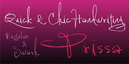
- Prima - Unknown license

- Prism by Stereotypes,
$- Prism was mainly inspired by two things, the sketches of Rudolf Koch for Prisma and the proportions of Avant Garde by Herb Lubalin. Even when the proportions and widths stay the same from ExtraLight to Black, you get the opportunity to change the weight and get a complete new look for that typeface by changing the grayscale or color. It is a modern combination for headlines, that want to have a different look.
 - Prisma Grotesk by TOMO Fonts,
$20.00 Discover TOMO Prisma Grotesk, a contemporary typeface that beautifully blends elegance and functionality, making it perfect for a wide range of applications. This typeface is a polyglot of design, speaking the language of both modernity and classic taste, ideal for corporate branding and advertising. Its geometric construction and modest design lend a sense of understated sophistication. With its sans serif styling, Prisma Grotesk is incredibly legible, suitable for everything from body text to headlines. Whether you're crafting an editorial piece or designing a magazine layout, its neutral yet striking appearance adapts seamlessly. Designed for the digital age, Prisma Grotesk is a neo-grotesque typeface, providing flexibility and adaptability across various media. It's perfect for identity and package design, where a distinctive and memorable appearance is key. In the realm of branding, Prisma Grotesk stands out with its neo-grotesque style, offering a contemporary twist on the grotesk tradition. A casual, approachable feel, suitable for both corporate and creative environments. Prisma Grotesk is not just a font but a comprehensive tool for designers seeking a reliable, elegant, and functional typeface. Elevate your design work with Prisma Grotesk – where contemporary style meets classic elegance, and versatility meets functionality. This typeface is not just a choice; it's a statement in design excellence. www.tomofonts.com
 - Karisma - Unknown license

- Karisma - Unknown license

- Plasma by Corradine Fonts,
$19.95 Plasma is a contemporary font family, characterized by its clean and geometric appeareance. As a square based style, Plasma has a technological and futuristic feeling, so is suitable for a very wide range of uses, such as editorial, corporate, packaging, posters and web design. Plasma Family consists in 21 fonts, which comes in seven weights, and three different wides. Each font has 516 characters, and can be managed by using its Open Type features, and supports Western European, Central/Eastern European, Baltic, Turkish and Romanian Languages.
 - Presta by Type Juice,
$19.00 Presta is a variable weight sans serif typeface made up of 12 fonts from thin and condensed to wide and bold. Included in the variable font are over 500 alternate glyphs for creative customization. 12 fonts total 5 font weights Upper / lowercase glyphs Multilingual Over 5000 glyphs
 - Kristas by Dora Typefoundry,
$19.00 Krista's is an elegant classy serif display font with a uniquely styled ligature character set that connects letters smoothly. It also has 100+ binders, 115+ alternatives for uppercase and lowercase letters and multilingual support. This font is perfect for your creative projects like Logotypes, printed quotes, invitations, cards, product packaging, headers, Letterheads, Clothing, Web design, Magazines, Books, etc. FEATURE: Number of Glyphs : 457 Uppercase Lowercase Punctuation and Marks Symbol Alternate Ligatures & Characters This type of family has become the work of true love, making it as easy and fun as possible.I really hope you enjoy it! Thank you and good job.
 - Primate by John Moore Type Foundry,
$20.00 Primate is a typeface family that works both as a display font for reading, casual and informal as it approaches the forms of nature, hence the name Primate. Primate's family comes in a full range of weights, from the thin Ultra Light to Heavy Black, all weights are also presented in italics and all have ornaments. Primate is a natural and fun to compose texts, giving the design work of a contemporary look.
 - Primal by Zeptonn,
$10.00 It’s time for Primal. It’s time to Rock! Primal is a polygonal typeface created with primeval times in mind. All forms have been created using few lines, angles and points. This typeface will enable you to create type that will almost scream off the page. Raaawwhrrr! Very useful for concert posters, techno parties or caveman signs. Whichever you prefer! Primal contains uppercase, smallcaps and underscored lowercase letters. By turning on standard ligatures the underscored letters will automatically connect, resulting in one single underscored line. Primal also contains a number of opentype ordinals and catchwords. The latter can be unlocked by using discretionary ligatures. This typeface is created by illustrative designer Zeptonn.
 - Prisom by Illuminaut Designs,
$10.00 I really wanted to make my own condensed typeface for memes and such. I think i have succeeded. This typeface is so average looking that no one would suspect that it is in fact very radical.
 - Purista by Suitcase Type Foundry,
$39.00Purista is a strict, orderly typeface based on a well-tried principle of geometric sans serifs from mid-20th century. Its obsession with technological precision makes it perfect for use in corporate systems and visual communications of technocratic businesses. Thanks to its broad range of cuts, it is also ideal for display advertising. - Carisma by CastleType,
$59.00 If you're in need of a sophisticated sans serif font, look no further than type designer Jason Castle’s Carisma (Paul Shaw in HOW magazine). Carisma, a CastleType Original, combines the elegance of classic capitals, the simplicity of clean-cut, geometric lowercase letters and the warmth of sensuous curves, subtle contrasts and sensitively tapered terminals, making it the perfect typeface for an understated, modern, sophisticated look. Available in two styles: Carisma Classic (the original), and Carisma Gothic, plus Carisma Inline.
 - Printa by Latinotype,
$19.00 It is inspired by mandalic structures. Its visual language is based on misregister and flaws in textiles printed by serigraph technique in the ’70s. This typeface allows you to combine two characters (front/uppercase; back/lowercase) into a single one to create print repeat patterns. This way you can get many different combinations. Printa is ideal for those who seek handmade designs.
 - Grisha by Grontype,
$14.00 Grisha is a futuristic and modern retro look. Each uppercase and lowercase letter has its own characteristics, plus some alternates and ligatures. This font is bold and tight kerning, very suitable for your design projects such logo tagline, logotype, name card, flyers invitation, magazine header etc. Features: Uppercase glyphs Lowercase glyphs Numeral and Punctuations Standard Ligatures Stylistic Alternates Thankyou for choosing this font Regard, Grontype
 - Gaisma by Lamatas un Slazdi,
$59.00 Art Nouveau typeface "Gaisma" ("Light" in Latvian) contains characters for all the European languages, Cyrillic and modern Greek as well as a huge set of contextual and stylistic alternates and historical characters to replicate the texts of the era. It draws inspiration from Vienna Secession movement and Nordic National Romanticism. The work on the design started as drawings of several characters for the graphic standard for the Jugendstil museum in Riga. To use it more effectively and to get acquainted with the possible stylistic sets download the Gaisma specimen in pdf format.
 - Prismatic Spirals by MMC-TypEngine,
$93.00 PRISMATIC SPIRALS FONT! The Prismatic Spirals Font is a decorative type-system and ‘Assembling Game’, itself. Settled in squared pieces modules or tiles, embedded by unprecedented Intertwined Prismatic Structures Design, or intricate interlaced bars that may seem quite “impossible” to shape. Although it originated from the ‘Penrose Square’, it may not look totally as an Impossible Figures Type of Optical Illusions. More an “improbable” Effect in its intertwined Design, that even static can seem like a source of Kinetical Sculptures, or drive eyes into a kind of hypnosis. Prismatic Spirals has two related families, its “bold” braided version Prismatic Interlaces and the Pro version. While the default is simpler or easier to use, as all piece’s spin in same way, PRO provides a more complex intricate Design which requires typing alternating caps. Instructions: Use the Map Font Reference PDF as a guide to learn the 'tiles' position on the keyboard, then easily type and compose puzzle designs with this font! All alphanumeric keys are intuitive or easy to induce, you may easily memorize it all! Plus, often also need to consult it! *Find the Prismatic Spirals Font Map Reference Interactive PDF Here! (!) Is recommended to Print it to have the Reference in handy or just open the PDF while composing a design with this typeface to also copy and paste, when consulting is required or when it may be difficult to access, depending on the keyboard script or language. As a Tiles Type-System, the line gap space value is 0, this means that tiles line gaps are invisibly grouted, so the user can compose designs, row by row, descending to each following row by clicking Enter, same as line break, while advances on assembling characters. Background History: The first sketches of my Prismatic Knots or Spirals Designs dates back then from 2010, while started developing hand-drawn Celtic Knots and Geometric Drawings in grid paper, while engage to Typography, Sacred Geometry and the “Impossible Figures” genre… I started doing modulation tests from 2013, until around 2018, I got to unravel it in square modules or tiles from the grid, then idealized it as fonts, along with other Type projects. This took 13 years to come out since the first sketches and 6 months in edition. During the production process some additional tiles or missing pieces were thought of and added to the basic set, which firstly had only the borders, corners, crossings, nets, Trivets connectors or T parts and ends, then added with nets and borders integrations. Usage Suggestions: This type-system enables the user to ornate and generate endless decorative patterns, borders, labyrinthine designs, Mosaics, motifs, etc. It can seem just like a puzzle, but a much greater tool instead for higher purposes as to compose Enigmas and use seriously. As like also to write Real Text by assembling the key characters or pieces, this way you can literarily reproduce any Pixel Design or font to its Prismatic Spirals correspondent form, as Kufic Arabic script and further languages and compose messages easily… This Typeface was made to be contemplated, applied, and manufactured on Infinite Decorative Designs as Pavements, Tapestry, Frames, Prints, Fabrics, Bookplates, Coloring Books, Cards, covers or architectonic frontispieces, storefronts, and Jewelry, for example. Usage Tips: Notice that the line-height must be fixed to 100% or 1,0. In some cases, as on Microsoft Word for example, the line-height default is set to 1,15. So you’ll need to change to 1,0 plus remove space after paragraph, in the same dropdown menu on Paragraph section. Considering Word files too, since the text used for mapping the Designs, won't make any literal orthographical sense, the user must select to ignore the Spellcheck underlined in red, by clicking over each misspelled error or in revision, so it can be better appreciated. Also unfolding environments as Adobe Software’s, the Designer will use the character menu to set body size and line gap to same value, as a calculator to fit a layout for example of 1,000 pts high with 9 tiles high, both body size and line gap will be 111.1111 pts. Further Tips: Whenever an architect picks this decorative system to design pavements floor or walls, a printed instruction version of the layout using the ‘map’ font may be helpful and required to the masons that will lay the tiles, to place the pieces and its directions in the right way. Regarding to export PNGs images in Software’s for layered Typesetting as Adobe Illustrator a final procedure may be required, once the designs are done and can be backup it, expanding and applying merge filter, will remove a few possible line glitches and be perfected. Technical Specifications: With 8 styles and 4 subfamilies with 2 complementary weights each (Regular and Bold) therefore, Original Contour, Filled, Decor, with reticle’s decorations and 2 Map fonts with key captions. *All fonts match perfectly when central pasted for layered typesetting. All fonts have 106 glyphs, in which 48 are different keys repeated twice in both caps and shift, plus few more that were repeated for facilitating. It was settled this way in order for exchanging with Prismatic Spirals Pro font which has 96 different keys or 2 versions of each. Concerning tiles manufacturing and Printed Products as stickers or Stencils, any of its repeated pieces was measured and just rotated in different directions in each key, so when sided by other pieces in any direction will fit perfectly without mispatching errors. Copyright Disclaimer: The Font Software’s are protected by Copyright and its licenses grant the user the right to design, apply contours, plus print and manufacture in flat 2D planes only. In case of the advent of the same structures and set of pieces built in 3D Solid form, Font licenses will not be valid or authorized for casting it. © 2023 André T. A. Corrêa “Dr. Andréground” & MMC-TypEngine.
 - Prismatic Interlaces by MMC-TypEngine,
$93.00 PRISMATIC INTERLACES TYPEFACE! Prismatic Interlaces is a decorative system and ‘Assembling Game’, itself. Settled in squared pieces modules or tiles, embedded by unprecedented Intertwined Prismatic Structures Design, or intricate interlaced bars that may seem quite “impossible” to shape. Although it originated from the ‘Penrose Square’, it may not look totally as an Impossible Figures Type of Optical Illusions. More an “improbable” Effect in its intertwined Design, that even static can seem like a source of Kinetical Sculptures, or drive eyes into a kind of hypnosis. Prismatic Interlaces has two related families, both as a kind of lighter weight versions Prismatic Spirals Default & Pro. While Default is simpler or easier to use, same way as Prismatic Interlaces, Pro provides a more complex intricate Design that requires typing alternating caps. Instructions: Use the Map Font Reference PDF as a guide to learn the 'tiles' position on the keyboard, then easily type and compose puzzle designs with this font! All alphanumeric keys are intuitive or easy to induce, you may easily memorize it all! Plus, often also need to consult it! *Find the Prismatic Interlaces Font Map Reference Interactive PDF Here! (!) Is recommended to Print it to have the Reference in handy or just open the PDF while composing a design with this typeface to also copy and paste, when consulting is required or when it may be difficult to access, depending on the keyboard script or language. As a Tiles Type-System, the line gap space value is 0, this means that tiles line gaps are invisibly grouted, so the user can compose designs, row by row, descending to each following row by clicking Enter, same as line break, while advances on assembling characters. Background History: The first sketches of my Prismatic Knots or Spirals Designs dates back then from 2010, while started developing hand-drawn Celtic Knots and Geometric Drawings in grid paper, while engage to Typography, Sacred Geometry and the “Impossible Figures” genre… I started doing modulation tests from 2013, until around 2018, I got to unravel it in square modules or tiles from the grid, then idealized it as fonts, along with other Type projects. This took 13 years to come out since the first sketches and 6 months in edition. During the production process some additional tiles or missing pieces were thought of and added to the basic set, which firstly had only the borders, corners, crossings, nets, Trivets connectors or T parts and ends, then added with nets and borders integrations. Usage Suggestions: This type-system enables the user to ornate and generate endless decorative patterns, borders, labyrinthine designs, Mosaics, motifs, etc. It can seem just like a puzzle, but a much greater tool instead for higher purposes as to compose Enigmas and use seriously. As like also to write Real Text by assembling the key characters or pieces, this way you can literarily reproduce any Pixel Design or font to its Prismatic Spirals correspondent form, as Kufic Arabic script and further languages and compose messages easily… This Typeface was made to be contemplated, applied, and manufactured on Infinite Decorative Designs as Pavements, Tapestry, Frames, Prints, Fabrics, Bookplates, Coloring Books, Cards, covers or architectonic frontispieces, storefronts, and Jewelry, for example. Usage Tips: Notice that the line-height must be fixed to 100% or 1,0. In some cases, as on Microsoft Word for example, the line-height default is set to 1,15. So you’ll need to change to 1,0 plus remove space after paragraph, in the same dropdown menu on Paragraph section. Considering Word files too, since the text used for mapping the Designs, won't make any literal orthographical sense, the user must select to ignore the Spellcheck underlined in red, by clicking over each misspelled error or in revision, so it can be better appreciated. Also unfolding environments as Adobe Software’s, the Designer will use the character menu to set body size and line gap to same value, as a calculator to fit a layout for example of 1,000 pts high with 9 tiles high, both body size and line gap will be 111.1111 pts. Further Tips: Whenever an architect picks this decorative system to design pavements floor or walls, a printed instruction version of the layout using the ‘map’ font may be helpful and required to the masons that will lay the tiles, to place the pieces and its directions in the right way. Regarding to export PNGs images in Software’s for layered Typesetting as Adobe Illustrator a final procedure may be required, once the designs are done and can be backup it, expanding and applying merge filter, will remove a few possible line glitches and be perfected. Technical Specifications: With 8 styles and 4 subfamilies with 2 complementary weights each (Regular and Bold) therefore, Original Contour, Filled, Decor, with reticle’s decorations and 2 Map fonts with key captions. *All fonts match perfectly when central pasted for layered typesetting. All fonts have 106 glyphs, in which 49 are different keys repeated twice in both caps and shift, plus few more that were repeated for facilitating. It was settled this way in order for exchanging with Prismatic Spirals Pro font which has 96 different keys or 2 versions of each. Concerning tiles manufacturing and Printed Products as stickers or Stencils, any of its repeated pieces was measured and just rotated in different directions in each key, so when sided by other pieces in any direction will fit perfectly without mispatching errors. Copyright Disclaimer: The Font Software’s are protected by Copyright and its licenses grant the user the right to design, apply contours, plus print and manufacture in flat 2D planes only. In case of the advent of the same structures and set of pieces built in 3D Solid form, Font licenses will not be valid or authorized for casting it. © 2023 André T. A. Corrêa “Dr. Andréground” & MMC-TypEngine.
 - Allin Priska by MC Creative,
$10.00 Allin Priska is monoline script font which natural movement and romance style. is perfect for branding projects, logo, wedding designs, social media posts, advertisements, product packaging, product designs, label, photography, watermark, invitation, stationery and any projects that need handwriting taste. What’s Included : Standard glyphs Ligature Works on PC & Mac Simple installations Accessible in the Adobe Illustrator, Adobe Photoshop, Adobe InDesign, even work on Microsoft Word. PUA Encoded Characters – Fully accessible without additional design software. Fonts include multilingual support for; ä ö ü Ä Ö Ü ß ¿ ¡ for questions and usage license please contact us Mohamadcandirah@gmail.com
 - Prima Sans by Bitstream,
$29.99Prima is a series of fonts designed at Bitstream by Jim Lyles (Sans and Serif) and Sue Zafarana (Sans Mono), released in 1998. The fonts have been tuned to give exceptionally good quality at low screen resolutions. The fonts are therefore suitable for sustained use in browsers and other applications where users read for long periods from the screen. Of course, Prima looks great printed out too. - Prima Serif by Bitstream,
$29.99Prima is a series of fonts designed at Bitstream by Jim Lyles (Sans and Serif) and Sue Zafarana (Sans Mono), released in 1998. The fonts have been tuned to give exceptionally good quality at low screen resolutions. The fonts are therefore suitable for sustained use in browsers and other applications where users read for long periods from the screen. Of course, Prima looks great printed out too. - Prima Script by Wiescher Design,
$24.00 »Prima Script« was designed especially for use in Menus and Cook-books. One of my sons is a chef in Munich and he was always bugging me to make a new font for his menus. I already designed one for him »Konstantin« but he likes to have new stuff every couple of years what I understood. So here is the new »Prima Script« (that’s what he said when he first saw the font). To give it more usability I made alternate initials and end letters as well as medieval cyphers. Then I did a couple of swashes and a handdrawn Sans font to complete the set. Have fun!
 - Prima Donna by Larin Type Co,
$14.00 Prima Donna is a beautiful font that is light and elegant, and will emphasize your individuality in any project. You can also use them to create a logo or use for small businesses, branding, t-shirts, book covers, stationery, marketing, blogs, web site, magazines, and more. This font includes a basic set of letters and a complete set of alternatives set as well as numbers, fractions, and basic punctuation. This font supported PUA encoded.
 - Primed by Set Sail Studios,
$14.00 It's bold, chunky, and ready to make a big impression - Primed is an authentic, hand-drawn brush font made with real marker pens. Perfect for unmissable display text, logos, handwritten quotes, product packaging and more! As well as a full alternate set of upper & lowercase characters, Primed also includes a set of 18 swashes, ideal for underlining your lettering and adding that extra 'custom' style. The alternates and swashes are included as their own separate fonts. Primed also includes 47 ligatures, these double and triple letter combinations will help letters connect and flow more naturally. The ligatures will automatically generate when using the Primed fonts with most software. The Primed fonts contain language support for; English, French, Italian, Spanish, Portuguese, German, Swedish, Norwegian, Danish, Dutch, Finnish, Indonesian, Malay, Hungarian, Polish, Croatian, Turkish, Romanian, Czech, Latvian, Lithuanian, Slovak, Slovenian.
 - Rioma by Halbfett,
$30.00 Rioma is a geometric typeface inspired by a legend of type design: Antique Olive. As a font family, Rioma ships in two different formats. Depending on your preference, you can install the typeface as two Variable Fonts or use the family’s 16 static OpenType font files instead. Those weights run from Light to Heavy. While the static-format fonts offer a good intermediary-step selection, users who install the two Variable Fonst have vastly greater control over their text’s stroke width.
 - Prosa by Satori TF,
$22.00 Introducing Prosa - a modern geometric typeface that will bring your words to life. With its minimalistic design and sleek lines, whether you're working on a book, a magazine, or a website, Prosa will help you create a look and feel that is both modern and timeless. With a full range of weights and styles, is versatile enough to handle any project, from headlines to body copy. And with its clean lines and geometric forms, Prosa is both easy to read and pleasing to the eye.
 - Primus by Artegra,
$19.00 Primus has been designed to express the feelings of future, science and innovativeness while being simple and clean. It’s a geometric typeface with rounded edges, carefully designed and kerned to achieve a high visual quality that would make it a perfect typeface for any kind of use. While providing a clean and enjoyable reading when it’s used for text purposes, Primus is primarily effective as a display typeface that can be used for logotypes, brand identities, advertisements and so on, to fully reflect our era and beyond.
 - Pista by Typedepot,
$14.00 Pista is a unique decorative typeface which is applicable for web, print especially for magazines, brochures, posters, flyers and motion graphics. Pista has six weights - regular, bold, outline, rounded, rounded bold and rounded outline. The weights are perfect for logos - regular size has an elegant look, the bold and outline gives a unique feel.
 - Crima by Gatype,
$12.00 Crima Font Black Serif totality and elegance. One of the newest releases that can only be done now, naturally drawn with pinpoint accuracy. Crima has the perfect signature and subtlety for your next project. It perfectly represents the retro and vintage aesthetic. I recommend this font for your next logo, invitation, and home decor project that needs a succinct alternative combination touch! The Criman font comes with available strong characters: Get inspired by the image above and feel free to share with me what you get by using this font.
 - FF Priska Serif by FontFont,
$30.99 Italian type designer Alessio Leonardi created this display FontFont in 1993. The family contains 3 weights and is ideally suited for festive occasions and poster and billboards. FF Priska Serif provides advanced typographical support with features such as ligatures and case-sensitive forms. It comes with tabular lining and proportional oldstyle figures.
 - OL Hebrew Prismatic by Dennis Ortiz-Lopez,
$30.00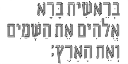
- Prismatic Spirals Pro by MMC-TypEngine,
$182.00 PRISMATIC SPIRALS PRO FONT! The Prismatic Spirals PRO is a Decorative Type-System and ‘Assembling Game’, itself. Settled in squared pieces modules or tiles, embedded by unprecedented Intertwined Prismatic Structures Design, or intricate interlaced bars that may seem quite “impossible” to shape. Although it originated from the ‘Penrose Square’, it may not look totally as an Impossible Figures Type of Optical Illusions. More an “improbable” Effect in its intertwined Design, that even static can seem like a source of Kinetical Sculptures, or drive eyes into a kind of hypnosis. Prismatic Spirals Pro has two related Typefaces both more basic or easier to use versions, the Default Family plus its “bold” braided version Prismatic Interlaces… PRO provides a more advanced, complex, and twisted Design, plus requires to be typed alternating caps. Instructions: Use the Map Font Reference PDF as a guide to learn the 'tiles' position on the keyboard, then easily type and compose puzzle designs with this font! All alphanumeric keys are intuitive or easy to induce, you may easily memorize it all! Plus, often also need to consult it! *Find the Prismatic Spirals Pro Font Map Reference PDF Here! (!) Is recommended Print it to have the Reference or open the PDF to also copy and paste, when consulting is required or when it may be difficult to access, depending on the keyboard script or language. The 2 glyphs sets are separated in colors for facilitating. Also use the Map Font with key captions or switch to it for ensure that the characters are alternating between both uppercase and lowercase letters as other Keys as numbers, marks, and punctuation along the strings, holding Shift one by one or actually two by two. As a Tiles Type-System, the line gap space value is 0, this means that tiles line gaps are invisibly grouted, so the user can compose designs, row by row, descending to each following row by clicking Enter, same as line break, while advances on assembling characters. Background History: The first sketches of my Prismatic Knots or Spirals Designs dates back then from 2010, while started developing hand-drawn Celtic Knots and Geometric Drawings in grid paper, while engage to Typography, Sacred Geometry and the “Impossible Figures” genre… I started doing modulation tests from 2013, until around 2018, I got to unravel it in square modules or tiles from the grid, then idealized it as fonts, along with other Type projects. This took 13 years to come out since the first sketches and 6 months in edition. During the production process some additional tiles or missing pieces were thought of and added to the basic set, which firstly had only the borders, corners, crossings, nets, Trivets connectors or T parts and ends, then added with nets and borders integrations. Usage Suggestions: This type-system enables the user to ornate and generate endless decorative patterns, borders, labyrinthine designs, Mosaics, motifs, etc. It can seem just like a puzzle, but a much greater tool instead for higher purposes as to compose Enigmas and use seriously. As like also to write Real Text by assembling the key characters or pieces, this way you can literarily reproduce any Pixel Design or font to its Prismatic Spirals correspondent form, as Kufic Arabic script and further languages and compose messages easily… This Typeface was made to be contemplated, applied, and manufactured on Infinite Decorative Designs as Pavements, Tapestry, Frames, Prints, Fabrics, Bookplates, Coloring Books, Cards, covers or architectonic frontispieces, storefronts, and Jewelry, for example. Usage Tips: Notice that the line-height must be fixed to 100% or 1,0. In some cases, as on Microsoft Word for example, the line-height default is set to 1,15. So you’ll need to change to 1,0 plus remove space after paragraph, in the same dropdown menu on Paragraph section. Considering Word files too, since the text used for mapping the Designs, won't make any literal orthographical sense, the user must select to ignore the Spellcheck underlined in red, by clicking over each misspelled error or in revision, so it can be better appreciated. Also unfolding environments as Adobe Software’s, the Designer will use the character menu to set body size and line gap to same value, as a calculator to fit a layout for example of 1,000 pts high with 9 tiles high, both body size and line gap will be 111.1111 pts. Further Tips: Whenever an architect picks this decorative system to design pavements floor or walls, a printed instruction version of the layout using the ‘map’ font may be helpful and required to the masons that will lay the tiles, to place the pieces and its directions in the right way. Regarding to export PNGs images in Software’s for layered Typesetting as Adobe Illustrator a final procedure may be required, once the designs are done and can be backup it, expanding and applying merge filter, will remove a few possible line glitches and be perfected. Technical Specifications: With 8 styles and 4 subfamilies with 2 complementary weights each (Regular and Bold) therefore, Original Contour, Filled, Decor, with reticle’s decorations and 2 Map fonts with key captions. *All fonts match perfectly when central pasted for layered typesetting. All fonts have 106 glyphs, in which 96 are different keys with 2 versions of each of both caps and shift keys, plus a few repeated for facilitating. It was settled this way in order for exchanging with its Prismatic relative fonts which has only 48 different keys repeated twice. Concerning tiles manufacturing and Printed Products as stickers or Stencils, any of its repeated pieces was measured and just rotated in different directions in each key, so when sided by other pieces in any direction will fit perfectly without mispatching errors. Copyright Disclaimer: The Font Software’s are protected by Copyright and its licenses grant the user the right to design, apply contours, plus print and manufacture in flat 2D planes only. In case of the advent of the same structures and set of pieces built in 3D Solid form, Font licenses will not be valid or authorized for casting it. © 2023 André T. A. Corrêa “Dr. Andréground” & MMC-TypEngine.
 - Arista 2.0 - Personal use only

- Karisma Stencil - Unknown license

- plasma poodle - Unknown license

- Primal Signature by Lemonthe,
$14.00 Primal Signature is a perfect signature font, with a natural & stylish flow. Primal Signature Font is perfect for many different project such as logos & branding, invitation, stationery, wedding designs, social media posts, advertisements, product packaging, product designs, label, photography, special events or anything.
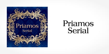
 - Priamos Serial by SoftMaker,
$-


Page 1 of 7Next page