10 search results
(0.01 seconds)
- Pompeji - Unknown license

- Pompeii by ITC,
$29.99 - Pompei by Monotype,
$29.99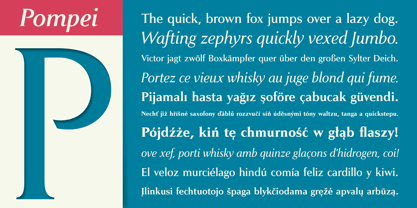
- Pompeii Caps - Unknown license

- Pompei New by Monotype,
$29.99 - Herculanum by Linotype,
$36.99Herculanum is a part of the 1990 program “Type before Gutenberg”, which included the work of twelve contemporary font designers and represented styles from across the ages. Herculanum is a work of Swiss typeface designer Adrian Frutiger. It takes its name from the city of Herculaneum, an ancient Roman resort town destroyed by volcanic pyroclastic flows from Mt Vesuvius in 79 AD (the same eruption that destroyed the nearby city of Pompeii). Herculaneum's ruins are located today in the commune of Ercolano, Campania, Italy. Ancient Roman writings of the 1st century influenced the font's design. Herculanum is distinguished by its broad characters with narrow strokes and its willful character. - Pompeijana by Linotype,
$29.99Pompeijana is a part of the 1990 collection Type before Gutenberg 2’, which includes twelve contemporary typefaces each representative of a particular era. Pompeijana is Adrian Frutiger’s contribution to the project Type before Gutenberg’. He based the forms of this capital typeface on the writing of the Romans in Pompei. The decorative look of the alphabet is achieved by purely graphic means, placing the emphasis of the top and foot of the letters with heavy horizontals and diamond-shaped serifs. Frutiger completed his typeface with the weight Borders, a font consisting of numerous ornaments true to the style of the alphabet. The ornaments can be combined to form different borders and offer an optimal addition to the elegant Pompeijana. Pompeijana is best combined with modern sans serif typefaces. - RRollie by Eurotypo,
$38.00 RRollie is a typeface family inspired on the proportions of the Roman capital in the Augusto's age, some of them can be seen in inscriptions of Pompeii; in this particular case, it has taken an inscription from a tomb of the year 15 AD. The subtlety of the serif is hardly insinuates, helping to strut the terminals of the stems. Ascenders and descenders are very short. The thickness variation is presented quite delicate, highlighting the light-dark passage and even the agile counterblocks of the typeface. These fonts can be used in many kind of graphic works by its strong personality, visual impact and readability. This font family include OpenType features: Standard and discretionary ligatures, small caps, case sensitive from, old style figures, tabular, diacritics for western languages and many others. Roberto Rollie (1935-2003) was an outstanding professional of Graphic Design, Photography and Visual Artist. He was involved in the creation of the career of Visual Communication Design at the Faculty of Fine Arts (National University of La Plata, Argentina), in the late '60s; he was a pioneer and great teacher too, who loved the Roman Capitals for its subtle and balanced design, especially for high readability and clever design. Those who, like me, knew him as a person and teacher, we are deeply grateful for having received their warmth and enthusiasm for graphic design.
 - Rufolo by Eurotypo,
$22.00 Rufolo is a family of fonts that can be considered both aesthetic and utilitarian. It has an apparent serif, barely hinted at, whose clear past reference is a beautiful epigraphic script on the marble plate placed at the southern entrance of the Roman amphitheatre, in Pompeii. Perhaps its origin dates back to Ugarit's cuneiform writing (as Morrison suggests as the origin of the serif in "Politics and Scripts") whose characteristic triangular-shaped incision footprint produces a powerful trait that not only gives character to the writing but also facilitates its support and visual compensation of sizes with neighboring signs. Other clear inspirational references have been Robert Hunter Middleton's Stellar (1929); Albertus (1932) by William A. Dwiggins; Optima (1952) by Hermann Zapf; And more recently RRollie (2016) by our foundry. Rufolo collects the attractive characteristic of the stroke endings but the proportions of its structure becomes much more regular, the capitals are in line with a constant square module, while the above references retain the proportions of the Roman Trajan. Some endings strokes have slightly baroque reminiscence with the intention of giving it greater plasticity and aesthetic enrichment, but absolutely controlled, taking special care of the aspects of readability and expressive neutrality. Rufolo Family comes in four weight: Light, Regular, Bold and Black, accompanied by its corresponding Italic versions.
 - Stabia by Eurotypo,
$29.00 Stabia is a multi-purpose typeface with large wedge-angular serifs. It is delicate and highly readable at very small sizes but reveals all its strength and personality when used at big sizes. The contrast of the sharped serifs provides a fresh and very contemporary look. The family has 5 weights, ranging from Light to Black (including italics) and is ideally suited for advertising and packaging, book text, editorial and publishing, logo and branding, small text as well as web and epub. Stabia provides advanced typographical support with features such as ligatures, small capitals, alternate characters, case-sensitive forms, fractions, and super- and subscript characters. It comes with a complete range of figure set options – oldstyle and lining figures, each in tabular and proportional widths. As well as Latin-based, the typeface family also supports Central European languages. Stabiae was an ancient Roman town, located close to the modern town of Castellammare di Stabia approximately 4.5 km southwest of Pompeii. According to the account written by his nephew, Pliny the Elder was at the other side of the bay in Misenum when the Mount Vesuvius eruption started. He travelled by galley ship across the bay, partly to observe the eruption more closely, and partly to rescue people from the coast near the volcano. Pliny died at Stabiae the following day, probably during the arrival of the sixth and largest pyroclastic surge of the eruption caused by the collapse of the eruption plume.

