23 search results
(0.012 seconds)
- Piranha by Elemeno,
$15.00 - Kiranna by Ably Creative,
$10.00 Kiranna is a classic handwritten font nd combination with Hand Lettering style. we make with personality touch every single curve. I hope this can make inspire you from your work. and a very bouncy. Ideal for logos, handwritten quotes, product packaging, header, poster, merchandise, social media & greeting cards.. This font is suitable for wedding invitation, branding, invitation, t-shirt, mailing and other suitable design you can think of. To enable the OpenType Stylistic alternates, you need a program that supports OpenType features such as Adobe Illustrator CS, Adobe Indesign & CorelDraw X6-X8. There are additional ways to access alternates, using Character Map (Windows), Nexus Font (Windows), Font Book (Mac) or a software program such as PopChar (for Windows and Mac).
 - Miranda by Tim Rolands,
$19.00A mysterious beauty hidden away on a secret island by her eccentric wizard father? No: An elegant display face influenced by Aldine old-style letterforms, Miranda brings classic sophistication to any project. The family includes regular and bold weights. - Pirata by W Type Foundry,
$39.00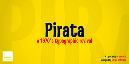
- Miranda Wright by Din Studio,
$29.00 Miranda Wright is a captivating serif font designed in an exquisite and elegant style. Each letter is meticulously crafted with fine details, evoking a sense of sophistication and grace. What sets Miranda Wright apart are the last few letters, which feature graceful circular swings that add a touch of charm and uniqueness to the font.. The circular swings at the end of certain letters infuse this serif with a delightful flair. These subtle and graceful details add an air of playfulness and individuality to the font, setting it apart from conventional serif typefaces. The circular swings give the font a distinctive personality, making it ideal for creative projects that seek to stand out. Its legible and elegant letterforms make it suitable for both body text and headings, while the circular swings add a touch of character that enhances the overall visual appeal. Enjoy the available features here. Features: Stylistic Sets Ligatures Multilingual Supports PUA Encoded Numerals and Punctuations Miranda Wright fits in headlines, logos, posters, flyers, invitations, greeting cards, branding materials, print media, editorial layouts, website headers, and many more. Find out more ways to use this font by taking a look at the font preview. Thanks for purchasing our fonts. Hopefully, you have a great time using our font. Feel free to contact us anytime for further information or when you have trouble with the font. Thanks a lot and happy designing.
 - Silver Miranda by Asenbayu,
$15.00 Silver Miranda is a sans serif font with an elegant and classy. Each typeface is crafted to produce a vintage modern font. This font features can direct you to access unique typeface collections. You can make works with clean elegant and professional writing, or make attractive decorative with alternative and ligature styles. This font is great for creating any desired projects such as logos, posters, headlines, albums, quotes, clothes and many more. This font is perfect for you if you want to come up with something interesting! Please see the pictures provided. I would like to know how you can get creative with this font. Thank you!
 - Miranda Pro by Tim Rolands,
$29.00 An elegant display face influenced by Aldine oldstyle letterforms, Miranda Pro brings the early successful Tim Rolands font Miranda into the OpenType era. Miranda Pro now includes numerous extended ligatures, alternate forms, small capitals and support for a wider range of languages. Use it as a companion display for classic text fonts or on its own as a refined but stylish messenger for all sorts of projects.
 - Birana MF by Masterfont,
$59.00 The beauty is in the subtle curves of this font. So clear so elegant.
 - Pianka Brush by DYSA Studio,
$19.00 Pianka Brush is a new Handwritten Script Font. This another collection of handwritten is perfect for your next branding project, excellent for your business. Pianka Brush have a natural edges, so this font gives an authentic handcrafted feel style.
 - Praha Nouveau by Matt Frost,
$30.00 I found this type specimen on the statue of Jan Hus in Prague’s Old Town Square. The statue was designed in 1903 by Ladislav Saloun, and its writing is the cutest Nouveau font I've ever seen. Filling in the blanks, I realized the need for a standard lower case because the caps are so wild. The result is a very type-able and dynamic Nouveau. I encourage you to mix up your upper and lower cases for curious results. Use the lower case for running type. Go to http://facebook.com/frostfoundry to share this and see more!
 - Prana Pro by URW Type Foundry,
$49.99 Prana Pro is a modern, young and fresh slab serif created by Christoph Ulherr during his studies with Prof. Gertrud Nolte at the faculty of design of the Hochschule Würzburg under the direction of Volker Schnebel, URW's type director. Prana Pro is an excellent headline and display font while, at the same time, very well readable at small sizes. It can be used for any kind of publication including posters and book covers.
 - Praha Deco by Deniart Systems,
$20.00 Praha Deco was inspired by the Prague art deco movement at the turn of the 20th century. Spiced with our own creative blend, this is our tribute to that wonderful era in architecture. The Praha Deco typeface contains a large assortment of extended characters to support many of Europe's languages, including Czech, Danish, Dutch, Esperanto, Finnish, French, German, Italian, Hungarian, Polish, Portuguese, Romanian, Spanish, Swedish, Turkish & Welsh.
 - Birana Plus MF by Masterfont,
$59.00 - Presswork JNL by Jeff Levine,
$29.00 Sheet music for the 1939 song “On the Paraña” featured Art Deco hand lettering in a classic “thick and thin” style, with many stylized characters. The publisher of the song was the Theodore Presser Company of Philadelphia, so the name “Presswork” aptly fit this typographic design. Presswork JNL is available in both regular and oblique versions. For trivia buffs, the Paraña is a river in Brazil.
 - Firefly by Canada Type,
$24.95 Firefly was designed by Miranda Hopper during her time in Patrick Griffin's type design class of 2010 at Humber. It is a light, narrow alphabet that works well in casual, leisurely design.
 - Sampa by BRtype,
$52.00The project aims to represent icons through the city of São Paulo. The image selection method prioritized elements of history culture and daily life. The claim is that the set of graphic symbols help disseminate one of the most important cities of Brazil and the southern hemisphere. See the sights of São Paulo: Edifício Copan, Avenida Paulista, Bairro da Liberdade, Mercado Municipal, Catedral da Sé, Estádio do Pacaembu, Sala São Paulo, Pátio do Colégio, Vale do Anhangabaú, Estação da Luz, Memorial da América Latina, Museu do Ipiranga, Teatro Municipal, Masp, Edifício Banespa, Monumento às Bandeiras, Obelisco do Ibirapuera, Auditório do Ibirapuera, Pinacoteca, Oca – Ibirapuera and Monumento Ayrton Senna. - Oak Street by Three Islands Press,
$39.00 There's a little restaurant in an old house on a sidestreet in town (Rockland, Maine, USA) called Cafe Miranda. The staff is friendly, the setting intimate, and the appetizer a basket of hot bread fresh from a brick oven. Its ample menu features such entries as "Quasi-Cassoulet" and "Gentle Sole." It's among my favorite local places to dine out. But the menu got photocopied once too often, and Cindy's personable handlettering got faded and broken. So I took matters into my own hands. And here's what I delivered to the newly computerized folks at the little restaurant on Oak Street. You, too, can travel in rather heavy felt-tip style.
 - LTC Athena by Lanston Type Co.,
$29.95 LTC Athena brings a somewhat “lost” hot-metal typeface back from obscurity into digital Opentype format. In fall 2012, printing historian Rich Hopkins contacted P22 type foundry regarding some inked type drawings he had just uncovered from his acquisition of the Baltimore-based “Baltotype” company some 20 years ago. It is a rare face whose original matrices were destroyed and thought fully lost. The drawings included a full upper and lower case set, numerals, basic punctuation, and alternate forms of some letters. The design is a narrow deco-flavored design from the 1950s with a curious avoidance of straight lines in the stems and main strokes. The face has been expanded to over 340 characters by Miranda Roth and includes ligatures as well as a full Pan-European character set. It is released through the Lanston division of P22 in consideration of its earlier incarnation as a metal typeface.
 - Looking Flowers by Sudtipos,
$49.00 Lu Nolasco, also known as Lunol, is a fresh representative of a new generation of Souther American lettering artists. She was born in Lima, Peru. After learning from some of the region’s best teachers and exploring the pointed nib on her own, she became a prolific lettering workshop instructor herself. Miraflores is one of Lima’s main tourist attractions. An upscale district with a great window on the Pacific ocean, it is the place where Lu looks for inspiration. It particularly inspired this “Looking flowers” (Miranda las flores), Lunol’s first typeface, designed in collaboration with Ale Paul. It is a comprehensive informal script that comes with many alternates, swashes and ligatures, along with small cap and quite a few ornaments. The fonts cover an expansive range of Latin languages, and are intended for use in stationery, menus, packaging, and general design where the main objective is to relay a sense of fun, playfulness and sensibility.
 - LTC Goudy Initials by Lanston Type Co.,
$24.95LTC Goudy Initials has been a best-seller since it was reformatted to font format by P22 in 2005. We decided that while it works very well at medium sizes, when it was used extra large, the outlines were not as true to Frederic Goudy’s 1917 drawings as they could be. We decided to redraw from the ground up—and here we have the NEW LTC Goudy Initials! Meticulously redrawn by Miranda Roth, these ornaments referenced original proofs of large sizes of Cloister Initials. In our quest for artwork for this project, we even arranged a quickly sold out recasting of the 120 point size and have produced a limited edition letterpress print from this casting This new digital version features two additional layers to allow for quick colorizing of the central letter and/or the floriated background. Registered users of the previous version of LTC Goudy Initials may upgrade to the set at a discount. - Dsert by Latinotype,
$26.00 D Sert—based on the Pirata typeface—is inspired by 70s Chilean constructivist design and the political propaganda posters artwork of La Unidad Popular (Chilean political coalition). D Sert is the result of the combination of the Chilean graphic art revival with new trends, such as the handmade movement and super font families. The super family comprises 47 weights and comes with two versions: D Sert and D Sert Alt, plus extras. Diagonal strokes are significantly different between the two versions: diagonals of the Alt version are much more logical than the diagonals of the normal version. Another difference is the bowls of the capitals: in the D Sert version, they slightly project above the cap height, making it a more daring version and bringing it closer to calligraphy; contrarily, in the Alt version, bowls do not project above the cap height, which makes it a more tidy font. This way, the combination of the two versions and extras provides the user with the freedom to create any kind of artwork.
 - Kiperman by Harbor Type,
$29.00 🏆 Selected for Tipos Latinos 9. 🏆 Selected for the 13th Biennial of Brazilian Graphic Design. 🏆 Hiii Typography 2018 Merit Award. Kiperman is a text typeface designed in honor of Henrique Leão Kiperman, founder of the publishing house Artmed, now Grupo A. Its forms are simple and straightforward, with no unnecessary embellishments that could disturb the reading. The fonts are slightly narrower than normal, which yields higher efficiency without compromising reading comfort. Besides that, its italics are not just a slanted version of the romans, but rather a separate drawing. With a slope of 8°, its calligraphic structure provides the right amount of emphasis when necessary. The Kiperman typeface works best when setting books, magazines, ebooks and websites. It will also work very well in branding and packaging projects where a sober typeface is needed. The inspiration for the design came from the personality of the honoree. Just as Henrique always wanted to stay away from spotlights, the Kiperman typeface was designed so that it would not call attention to itself or impose any obstacles in the understanding of the text. In this way, the fonts revere Henrique’s legacy by respecting and honoring the published content. Henrique Leão Kiperman began his career in 1958, selling medical books in travels through the interior of the Brazilian states of Paraná and Santa Catarina. In 1973, he opened a bookstore in downtown Porto Alegre, the Artes Médicas Sul, and a few years later edited his first book. Since then, his company has grown to become one of the most important publishers in Brazil in the area of scientific, technical and professional books, with more than 2400 active titles distributed among the McGraw Hill, Bookman, Artmed, Penso and Artes Médicas imprints. Henrique passed away in 2017 at the age of 79. The Kiperman type family has been commissioned by Grupo A and is available for licensing. This was the way found for the fonts to be read by more people, spreading some of his spirit around the world.
 - Lido STF - Personal use only

