31 search results
(0.012 seconds)
- Pipeline by URW Type Foundry,
$39.99 Pipeline is a futuristic and technical looking typeface. But as the name suggest it’s also earthly, (literally). Deep down underneath villages, city’s everywhere and even oceans there’s a network of pipelines. Providing us all sorts of supplies, like water and oil. Sewers wash fluid waste away. They are never to be looked upon as pretty or beautiful but purely functional. The soil peeled off and looked upon from above, a greater industrial infrastructure is revealed, cluttered like spaghetti, complex as the maze of corridors of termite colonies. I present two pipelines to you; one naked and one dressed. This typeface is very suitable for graphic, logo and poster design. It is quadratic shaped with round curves. It is modern and classic at the same time. It could be appealing for young, technical, digital, inventive and urban (sub) culture (at any age).
 - Pipeline by Red Rooster Collection,
$45.00An original design. - Hopeline by Aminmario Studio,
$20.00 This is a playful child-like typeface perfect for any fun quirky design work! This font can be used for anything such as T-Shirt designs, phone cases, greeting cards, invitations, mugs and so much more! Get creative! Thanks for checking out this font. I hope you enjoy it!
 - Sideline by Jonahfonts,
$42.00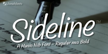
- Pureline by Cititype,
$12.00 Pureline is a modern signature font full of life. Get inspired by its unique charm! Available in regular and italic style. Pureline: is perfect for branding projects, logo, social media posts, advertisements, product packaging, product designs, label, photography, watermark, stationery, and any projects that need handwriting taste.
 - Paveline by Greater Albion Typefounders,
$19.95 Paveline is a punctuated script; by which we mean it has the look and character of handwriting, but the glyphs are discrete entities to aid legibility. It is actually based on a moderately stylized adaptation of our chief designer's handwriting. Use it to give a handwritten touch to your work. Paveline works well as small handwriting or large scale poster captions.
 - Mifelin by Nathatype,
$29.00 Mifelin is a well-defined serif font. Serifs are small ornaments that appear at the ends of the lines of letters, giving them a neater, more structured appearance. The well-defined serifs in this font create an elegant and professional impression. This serif font has a balanced and harmonious proportion of height and width. The proportions ensure that each letter looks proportional and easy to read. The line of letters in this font has a smoothness and clarity that distinguishes each character. Sharp, clear lines give off a professional and organized impression. This clarity also helps strengthen the legibility of the font in a variety of design settings. This serif font with an elegant look has a classic style that remains relevant in modern designs. Despite having strong roots in traditional typographic design, this font is able to adapt to more contemporary design contexts and give it a touch of elegance and class. Even though it has a touch of elegance, this serif font still prioritizes good readability. Each letter is carefully designed to ensure that the text remains easy to read and understand for the reader. Prominent readability is the hallmark of this font. Enjoy the various features available in this font. Features: Stylistic Sets Ligatures Multilingual Supports PUA Encoded Numerals and Punctuations Mifelin is suitable for any designs that require a formal and official impression. This font is can be used in the design of books, magazines, reports, formal invitations, brand identities, and other design projects that require elegance and professionalism. Find out more ways to use this font by taking a look at the font preview. Thanks for purchasing our fonts. Hopefully, you have a great time using our font. Feel free to contact us anytime for further information or when you have trouble with the font. Thanks a lot and happy designing.
 - Zipline by Device,
$39.00 Zipline is a geometric sans built from a folded line or ribbon. Contemporary and stylish, with a certain decorative flair. There are three variants that can can be freely mixed for effect - a solid version, a decorative lined version, and a half-solid version. Most effective used in short words or phrases at larger sizes, where the details can be appreciated.
 - Piolin by JVB,
$13.00 Piolin So new. So different. Piolin is a memorable display font inspired by the circus universe. This typeface, which has the same name of the most renowned brazilian clown, is full of magical tricks like several characters alternates, swashes and discretionary ligatures. Please, explore the opentype features included in this typeface at their best and go deep inside the circus imaginary. Piolin is suitable for brand identities, book design, editorial design, campaigns, exhibitions and other promotional materials that seek a special flavour to stand out an astonishing message. If used in big sizes, Piolin reveals its marvellous details which make us feel bewitched by how carefully it is designed. Feel the magic up close!
 - Pippin by Wilton Foundry,
$29.00 - Pitlines by Mevstory Studio,
$20.00 Pitlines is a display fonts collection. Pitlineswill perfect for many project: fashion, magazines, logo, branding, photography, quotes, blog header, poster, advertisements, etc. Files Includes: Pitliness Regular.otf Pitlines Italic.otf What's Included? Uppercase & alternate uppercase letters, numbers, punctuation Multilingual support
 - Pelin by Koray Özbey,
$9.00 The design of Pelin, which began as an experiment, inspired by the harmony created by the contrast between the soft, flowing movements and sharp movements found in Circassian dances. To capture this harmony, both curved and sharp lines were used along with stems that contrasting angles.
 - Wireline JNL by Jeff Levine,
$29.00 Inspired (in part) by a vintage photo of a storefront neon sign for Cushman’s Furs, Wireline JNL is a thin monoline font with the appearance of bent wire characters. The font is available in both regular and oblique versions.
 - Elle by Device,
$39.00 Elle is a geometric sans in three weights with rounded stroke terminals and circular forms. Classy, elegant and modern, with just a hint of the future. Inspired by a single-weight Typositor headline typeface from the early 1970s called Pipeline.
 - Bitelephant by Kah Khiong Design,
$13.00 Bitelephant is a type of pixel font with Slab Serif. It's unique pipeline characteristic, result a bold & simple font. It's bitmap give a retro game looks, but with a futuristic feel. Suitable for any fun, sci-friction, techno, game & digital theme.
 - Xctasy Sans by Red Rooster Collection,
$45.00 Influenced by the 1960’s typeface, Design Fineline.
 - Corvone by Greater Albion Typefounders,
$16.95 Corvone is a heavy bullnosed display family, inspired by the post war era's ideas of modernity. Two faces are offered, plain—a solid black face, and regular—which employs a three-dimensional pipeline effect to add real emphasis. Use Corvone to give work a retro feel, and/or where you want to really drive your point home.
 - Italix by Punch,
$45.00 Italix is an easygoing font family with mainly 4 script styles (Fineliner, Brushpen, Marker & Fatstick) and 7 supportive AllCaps fonts. Each script has its own unique personality, and come with optional ink splatters. These are attached to several ligatures, so don’t forget to activate the “OpenType Features” and the “World Ready Composer” in the application settings. The cool thing about Italix is that you can have a lot of creative fun with it, and its multiple features. Brushpen has a more classic look, Fineliner is a bit quirky, Marker is the chill one, and Fatstick is a total badass!
 - Public Secret by Hanoded,
$15.00 A Public Secret (or Open Secret) is something that is widely known, although it is not supposed to be. Public Secret is a hand drawn font (I used a fineliner) that I made in between building a shower, a toilet and a laundry room… Yes, it’s all in a day’s work! ;-)
 - Beanstalker by Hanoded,
$15.00 I’m not particularly fond of beans. I do eat them, but they’re not my idea of a delicacy… But this font has ‘fairy tale’ feeling to it, and I liked the name Beanstalker. Beanstalker is a hand made font (I used a fineliner to draw the glyphs). It is quite neat and organized, but does come with some rough edges and a bit of texture.
 - Grasond by Just Font You,
$19.00 A new reopening of an Art-Deco gate. Different vibes of the Gatsbyesque era, sculpted with the touch of lavish modernism for an everywhere and every timeline of the multiverse purpose. Inspired by the purpose above, here's an attempt to resurrect the great from the past. Please welcome, GRASOND. A vintage art-deco display sans serif fonts. Perfectly fit for your luxury branding, logo, vintage design, beer labels, signage, anytime you need a massive throwback, please, be my guest, oldsport.
 - Meowtant Kittens by Hanoded,
$16.00 My youngest son Boris has his birthday in a week. He turns 8, and he loves to play with those Danish building blocks - you know what I’m talking about. Last year he developed an interest in Star Wars n(no idea how that came to be), so we bought him some Star Wars-themed blocks for his birthday. I am now watching the movies with him and it is fun to witness his enthusiasm. The only drawback is the fact that we now seem to have a Chewbacca in our home… Meowtant Kittens is a font I drew with a fineliner and then digitised. Of course the name was influenced by the movies I am watching with Boris, even though they don’t feature any Meowtant Kittens.
 - Dokument Pro by Canada Type,
$29.95 Jim Rimmer aptly described his Dokument family as a sans serif in the vein of News Gothic that takes nothing from News Gothic. Building on that internal analysis, Dokument Pro is the thoroughly reworked and expanded of the original main set released in 2005, with different widths still in the pipeline. This new version updates Jim’s work to six Pro weights and their italic counterparts, each of which takes advantage of OpenType stylistic sets to introduce different degrees of graduation from gothic to humanist. Dokument Pro is now a unique text sans family, with an adaptable personality suitable for the kind of edgy, uncompromising corporate and media typography that just tells it like it is, instead of having to resort to the common contemporary luring and baiting tactics. Dokument Pro’s range of weights, styles and features (over 775 glyphs per font, built-in small caps, alternates galore, and support for over 45 Latin languages) allows for multi-application versatility and clear, precise emotional delivery. This is the kind of straight-shooter sans that should be in every designer’s toolbelt. For more details on the fonts' features, text and display specimens and print tests, consult the Dokument Pro PDF availabe in the Gallery section of this page. 20% of Dokument Pro’s revenues will be donated to the Canada Type Scholarship Fund, supporting higher typography education in Canada.
 - FranklinGothicHandLight by Wiescher Design,
$39.50 FranklinGothicHandLight is part of a series of hand-drawn fonts from way back in time – before computers changed the way we worked. When I was in advertising – before computers – a very time consuming part of my daily work was sketching headlines. I used to be able to sketch headlines in Franklin Gothic, Times, Futura, Helvetica and several scripts. We had a kind of huge inverted camera – which we called Lucy. We projected the alphabet onto a sheet of transparent paper, outlined the letters with a fineliner and then filled them in. It was very tedious work, but the resulting headline had its own charm and we had a permanent race going on who was best and fastest. I won most of the time! They used to call me the fastest "Magic Marker" this side of the Atlantic. Great days, just like today! Your sentimental type designer from the past Gert Wiescher
 - FranklinGothicHandDemi by Wiescher Design,
$39.50 FranklinGothicHandDemi is part of a series of hand-drawn fonts from way back in time – before computers changed the way we worked. When I was in advertising – before computers – a very time consuming part of my daily work was sketching headlines. I used to be able to sketch headlines in Franklin Gothic, Times, Futura, Helvetica and several scripts. We had a kind of huge inverted camera – which we called Lucy. We projected the alphabet onto a sheet of transparent paper, outlined the letters with a fineliner and then filled them in. It was very tedious work, but the resulting headline had its own charm and we had a permanent race going on who was best and fastest. I won most of the time! They used to call me the fastest "Magic Marker" this side of the Atlantic. Great days, just like today! Your sentimental type designer from the past Gert Wiescher
 - FranklinGothicHandCond by Wiescher Design,
$39.50 FranklinGothicHandCond is another part of a series of hand-drawn fonts from way back in time – before computers changed the way we worked in advertising. When I was in advertising – before computers – a very time consuming part of my daily work was sketching headlines. I used to be able to sketch headlines in Franklin Gothic, Times, Futura, Helvetica and several scripts. We had a kind of huge inverted camera – which we called Lucy. We projected the alphabet onto a sheet of transparent paper, outlined the letters with a fineliner and then filled them in. It was very tedious work, but the resulting headline had its own charm and we had a permanent race going on who was best and fastest. I won most of the time! They used to call me the fastest "Magic Marker" this side of the Atlantic. Great days, just like today! Your sentimental type designer from the past, Gert Wiescher.
 - Wonky by Ana's Fonts,
$16.00 The Wonky Font family is a set of 3 handmade fonts, made using three different materials: a pencil, a thin fineliner and a bold marker. Each font includes 3 variations for each letter and number, accessible through contextual alternates, for extra realism and fun. The pencil font is a SVG font, which allows for the texture of the pencil to be captured in a more authentic way, and is complemented with an extra doodles font. Wonky Font looks good at small sizes and will also look great in all caps texts. Use Wonky Font in designs such as postcards and notes, posters, logotypes, social media posts, branding and packaging. This font includes: a Wonky Pencil SVG font, with a vector alternative that preserves the texture a Wonky Thin font a Wonky Bold font a Wonky SVG Extras font, with 26 pencil doodles Software requirements for the SVG font: Photoshop CC2017+ // Illustrator CC2018+
 - FranklinGothicHandBold by Wiescher Design,
$39.50 FranklinGothicHandBold is another part of a series of hand-drawn fonts from way back in time – before computers changed the way we worked in advertising. When I was in advertising – before computers – a very time consuming part of my daily work was sketching headlines. I used to be able to sketch headlines in Franklin Gothic, Times, Futura, Helvetica and several scripts. We had a kind of huge inverted camera – which we called Lucy. We projected the alphabet onto a sheet of transparent paper, outlined the letters with a fineliner and then filled them in. It was very tedious work, but the resulting headline had its own charm and we had a permanent race going on who was best and fastest. I won most of the time! They used to call me the fastest "Magic Marker" this side of the Atlantic. Great days, just like today! Your sentimental type designer from the past Gert Wiescher
 - Life Support, a captivating creation by the imaginative foundry dustBUSt Fonts, stands as a testament to the innovative edge and creative spirit that characterizes the world of typography. At its cor...
- Ganz Egal, masterfully crafted by the enigmatic designer Nihilschiz, is not just a font; it's an adventure in typography that refuses to take itself too seriously. Picture this: if fonts were people,...
- Burgues Script by Sudtipos,
$99.00 Burgues Script is an ode to the late 19th century American calligrapher Louis Madarasz, whose legendary pen has inspired schools of penmanship for over 100 years. His talent has caused some people to call him “the most skillful penman the world has ever known.” I use the word ‘ode’ in a colloquially ambitious manner. If I was an actual poet, my words would be about things I desire but cannot attain, objects of utter beauty that make me wallow in humility, or people of enormous talent who look down at me from the clouds of genius. But I don’t write poems. My work consists of letters drawn to fit together, that become an element of someone’s visual poetry. I am the poet’s assistant, so to speak. Once in a while, the assistant persists on what the subject of the poem will be. And occasionally, the poet gives in to the persistence. I hope you, visual poet, find my persistence justified in this case. The two main sources for Burgues were the calligraphy examples shown in Zaner Bloser’s The Secret of the Skill of Madarasz: His Philosophy and Penmanship Masterpieces, and C. W. Jones’s Lessons in Advanced Engraver’s Script Penmanship by L. Madarasz. These two references were the cornerstone for the concept I was trying to work with. I did have to change many of the letters in order to be able to produce digital calligraphy that can flow flexibly and offered the user a variety of options, while maintaining its attractive appearance. To this end, many ligatures and swashes were made, as well as full flourished sets of letters for use at the beginnings or endings of words and sentences. All of this has been tied together with OpenType and tested thoroughly within today’s standard design and desktop publishing software. After working with digital scripts for so long, at one point I thought that Burgues Script would become a bit of a chore to complete. I also thought that, like with most other scripts, the process would regularize itself after a while and be reduced to a mechanical habit. Surprisingly, and fortunately for me, this did not happen. The past holds as many surprises as the future. Madarasz’s method of penmanship was fascinating and challenging to translate into the strict, mathematically oriented language of the computer. It seems that the extremely high contrast of the forms, coupled with the required flow and connectivity of such lettering, will always be hard work for any visual artist to produce, even with the aide of a powerful machine. I can only imagine what steady nerves and discipline Madarasz must have had to be able to produce fully flourished and sublimely connected words and sentences on a whim. When I think of Madarasz producing a flourished calligraphic logotype in a few seconds, and try to reconcile that with the timelines of my or my colleagues’ work in identity and packaging design, the mind reels. Such blinding talent from over a hundred years ago. Burgues is the Spanish word for Bourgeois. In the end, I hope Burgues Script will serve you well when a flourished word or sentence is required for a design project. One of the wonders of the computer age is the ability to visually conjure up the past, serving both the present and the future. With Burgues, you have a piece of “the most skillful penman the world has ever known,” at your service. Burgues received important awards such as a Certificate of Excellence TDC2 2008 and a Certificate of Excellence at the Bienal Tipos Latinos 2008.