256 search results
(0.026 seconds)
- Cerita Cinta by Aminmario Studio,
$20.00 Introducing Cerita Cinta Font Cerita Cinta is a casual handwriting font. Its charm makes it appear wonderfully, readable, and, ultimately, incredibly versatile. Comes in Regular and Italic styles. Equipped with beginning and ending tail. This font will look outstanding in any context, whether it’s being used on busy backgrounds or as a standalone headline! Thank you for the purchase. Happy creating design :)
 - Pejuang Cinta by Stringlabs Creative Studio,
$25.00 Pejuang Cinta is a Script Font with Handwritten Style. The Pejuang Cinta font made with digital brush pen strokes that making this font look authentic. This font is perfect for fashion brand, wedding invitation, business card, logo brand, signature, and then calligraphy.
 - Sonata Allegro Hebrew by Tamar Fonts,
$35.00 “The Emperor Has Clothes” Like in music — the Allegro Sonata form consists of three main sections—the Exposition (section), the Development, and the Recapitulation — so in regard to this Allegro Sonata font family — there is an Exposition (font), a Development, and a Recapitulation—in which each theme is restated alongside its development material. While the Recapitulation font is perfect for titling and branding, the Exposition is perfect for branding {as demonstrated in the Inspiration Gallery pertaining this font} as well as being a comfortable read in long runs of text. The Exposition rounded, mono-line, with great x height, contemporary—A Synthesis Between Geometric & Hand-drawn—font, is at times geometric and at times hand drawn; in the end it all came down to finding the balance in a typeface between the robustness needed to function as a text face and enough refinement to look good as a display font. Following the Exposition, comes the Development (section), decorative, botanic-like, exuberant and playful font, signifying ABUNDANCE [of possibilities] & BENEVOLENCE—in regard to each theme/character, and to demonstrate—that 'structures' in music, are solid structures—like architecture {contrary to the words of J. W. von Goethe, who said: “Music is liquid architecture; Architecture is frozen music”}, just in some spiritual domain that is far beyond one's physical senses to grasp. Like in my art and music works in which I consider its 'Texture' element of vital importance, so is the case when it comes to type, as apparent in my previous Phone Pro/Polyphony font, as well as in this current Sonata Allegro/Development font. Each glyph has its own uniqueness, and when meeting with others, will provide dynamic and pleasing proximity. And due to the [individualistic] nature of this Development font, just a minimal amount of kerning/pairing were necessary... The development font is an extravagant design that looks best when used at large sizes—perfect for titling, logo, product packaging, branding project, wedding, or just used to express words against some [light or dark] background. Finally, “The (Exposition Font) Emperor Has (the Development Font) Clothes!” As said, there are three fonts/styles altogether in this Sonata Allegro type family, designed with the intention of harmonizing between Latin and Hebrew, which makes it an ideal font for the side-by-side use of Latin and Hebrew characters. However, they are being sold separately (kindly search for “Sonata Allegro Hebrew” on this MyFonts site), so they are economical for those interested just in either one of them. My aim is to shake up the type-design world with a range of distinctive fonts which break away from the generic letterforms, to make your design projects stand out—as a graphic designer, add this font to your most creative ideas for projects. This typeface has [lots of ligatures /] OpenType features, to enhance your designs even more — happy designing! Sonata Allegro Features: · 3 Weights/Styles · Multilingual Support · Proportional Figures & Ligatures While using this product, if you encounter any problem or spot something we may have missed, please don't hesitate to write to us; we would love to hear your feedback—in order to further fine-tune our products. Copyright Tamar Fonts/Hillel Glueck 2022 ALL RIGHTS RESERVED Any unauthorized distribution of my work is strictly prohibited, and will be prosecuted; do the right thing, and do not participate in the piracy of my typefaces; if you appreciate my work, then please pay for it and help me prosper — thank you!
 - Pivnaya-Cyrillic Greek by Roman Type,
$35.00 This is the Latin+Cyrillic+Greek version of poster/display font Pivnaya designed and published by Roman Type. It works for Afrikaans, Albanian, Azerbaijani, Belarusian, Bosnian, Bulgarian, Catalan, Croatian, Czech, Danish, Dutch, English, Estonian, Finnish, French, German, Greek, Hungarian, Icelandic, Italian, Latvian, Lithuanian, Macedonian, Maltese, Norwegian, Ossetic, Polish, Portugese, Romanian, Russian, Serbian, Slovak, Slovenian, Spanisch, Swedish, Turkish, Ukrainian, Uzbek, Vietnamese, Zulu. The International Phonetic Alphabet (IPA) makes it fit for a wider range of purposes.
 - ITC Nova Lineta by ITC,
$29.99The ITC Nova Lineta™ design is the first commercial typeface from Slobodan Jelesijevic. As with many typeface designs, it began as simple sketches. “I was working on a packaging design project,” recalls Jelesijevic, “and wanted an informal, slightly cursive design for the type. I could not find anything that matched my need, so I began sketching.” The preliminary design had an elegant yet fresh quality that, once developed, turned out to be perfect for Jelesijevic’s project. After its first use, however, Nova Lineta lay dormant for over a year. Other projects came and went, and new typeface ideas filled Jelesijevic’s notebook. Although Nova Lineta continued to tickle the creative crevices of his mind, no more work was done on the face. Then, in a period between projects, Jelesijevic began to polish the design – and, in the process, created extended and condensed versions to complement the normally-proportioned original. Born in Gornji Milanovac, Serbia in 1951, Jelesijevic graduated with a degree in graphic communication and lettering from the Faculty of Applied Arts in Belgrade. These days, Jelesijevic is sought out not only as a typeface designer, but also as a graphic designer and illustrator. When not working on design projects, he teaches graphic communication at the Faculty of Art in Niš, Serbia. Although it is a casual and inviting design, Nova Lineta has been carefully constructed and refined. As a result, it performs exceptionally well within a wide range of sizes and in a wealth of applications. An ample x-height, open counters and distinctive character shapes also ensure a high level of legibility. And, although at first glance Nova Lineta may appear to be a sans serif design, subtle serifs make their presence known at large sizes. Nova Lineta emanates warmth when used for extensive text, and it has a fresh quality at display sizes. The small family’s range of proportions also provides added flexibility. The result is a friendly yet powerful communication tool in a remarkably modestly-sized package. - Pina Colada by Larin Type Co,
$12.00 Pina Colada this beautiful handwritten font duo is a smooth script and playing sans, they perfectly combine and complement each other, they will bring their unique style to any design project and make it unique. It is as sweet as Pina Colada, fall in Love with its incredibly versatile and simple style and use it to create gorgeous wedding invitations, beautiful stationery, greeting cards, attractive social media messages and more! This font is easy to use, has OpenType features, and supports PUA encoding.
 - Pata Slab by In-House International,
$10.00 Pata Slab: the ultra-heavy optimism we all need in 2020 Pata Slab is the type equivalent of a catwalk stomp down a city sidewalk, a font that’s assertive, funky and more than a little sexy. Named after a colloquialism for ‘feet’, Pata features ultra-heavy slabs and contrasting hairline centers that rise from its chunky footprint. The resulting, retro-inspired vertiginous curves add instant attitude to any design. Developed in 2020, Pata is a type of its time.Pata is all upside, as it is a typeface with no descenders — one that elevates all characters to grow upward from the baseline (because, c’mon, we could all use something uplifting right now!) All uppercase characters were built to fit precisely inside a square, so they’re all the same width and height. The lowercase alphabet, eñes, cedillas, punctuation, numbers and symbols all follow the same height restrictions. Despite all that confinement, Pata sports standard-height terminals that connect seamlessly so there’s nearly endless options for modular ligatures. The upshot of all this meticulous awesomeness is that laying out, customizing and stacking text super simple. Pata Slab was created by In-House International, designed Alexander Wright in collaboration with Rodrigo Fuenzalida. It's available for Opentype format (.otf) compatible with Mac and PC.
 - Pirate Keg Italic - Unknown license

- Iwata Kyokasyo Pro by IWATA,
$199.00 児童教育のためにトメ、ハネ、ハライ、筆順や画数を明確にした書体です。 教育用書籍だけでなく、様々な書籍にもご使用いただけます。
 - Iwata Kyokasyo Std by IWATA,
$149.00 児童教育のためにトメ、ハネ、ハライ、筆順や画数を明確にした書体です。 教育用書籍だけでなく、様々な書籍にもご使用いただけます。
 - Iwata Kaisho Std by IWATA,
$149.00 書の基本を生かし、美しく格調高いデザインの筆書系書体です。伝統的な正/中太/特太楷書体に加え「力強さ」「伸びやかさ」「整然とした読みやすさ」を意識した「新楷書」「新楷書かなA」があります。
 - Iwata GMincho Pro by IWATA,
$199.00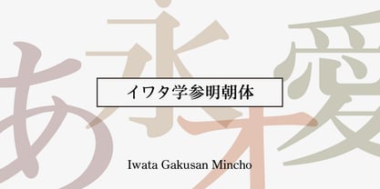 教科書や参考書、問題集などの教育教材作成のために開発された明朝体です。 筆やペンの入り、押さえ、ハネ、トメ、筆順などを理解しやすいようデザインしています。
 - Palo Pinto NF by Nick's Fonts,
$10.00Here’s a typeface with a stance as big as Texas. It’s based on Vincent Pacella’s 1960s oeuvre for Photo-Lettering, Inc. called Pacella Vega Extended 10, and named for a county in Central Texas, home of Possum Kingdom Lake. Both versions of this font include the complete Unicode Latin 1252 and Central European 1250 character sets. - Oro y Plata by Lamatas un Slazdi,
$28.00 The collection Oro y Plata (Gold and Silver) is a Mexican style blackletter, dedicated to the three big silver cities – Taxco, Zacatecas and Guanajuato. Taxco is more angular compared to rounded Zacatecas and elaborate Guanajuato. The fonts contain small capitals, ligatures, initial forms, contextual alternates and other OpenType features. The special feature is a stylistic set of superscript caps with possibility to underline them. It supports all the European languages using Latin alphabet.
 - Iwata Reisho Std by IWATA,
$149.00 中国で古くから使用されていた伝統的な隷書を源流にする「イワタ隷書体」と、 新しい感覚の「イワタ新隷書体」の2種類があります。
 - Iwata Mincho Std by IWATA,
$149.00 フトコロが広くシンプルなエレメントで構成され、可読性に優れたオーソドックスな明朝体です。本文から見出しまで、様々な用途に使用できる書体です。
 - Kembara Cinta Outline by Fargun Studio,
$12.00 Kembara Cinta Outline is a new, fresh, and modern hand lettered font, decorative characters and a dancing baseline! So beautiful on handicrafts, greeting cards, branding materials, business cards, quotes, posters, and more. Features: Unique ligatures Stylistic sets Basic Latin A-Z and a-z Numbers International Symbols included Punctuation Need help? If you need help or advice, please contact me by e-mail "fargunstudio@gmail.com" Thank you for your purchase
 - Hebrew Rinat Kids by Samtype,
$34.00 This is font to help children read. The Diacritic Marks (Nikud) are 25% bigger.
 - Iwata Mincho Pro by IWATA,
$199.00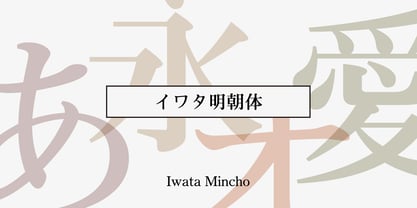 ??????????????????????????????????????????????????????????????????????
 - Iwata Souchou Pro by IWATA,
$199.00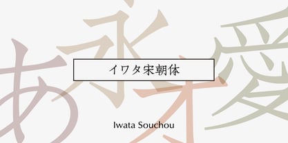 金属活字の「方宋体」をもとに開発した書体です。活字時代の漢字、仮字を再現した「宋朝体」と、仮字デザインを現代風にアレンジした「宋朝体新がな」の2書体があります。
 - Iwata Gyousho Pro by IWATA,
$199.00 楷書と草書の中間的な筆法の書体です。 字体を崩しすぎず、読みやすくなるようデザインしています。
 - Pirates And Robbers by URW Type Foundry,
$39.99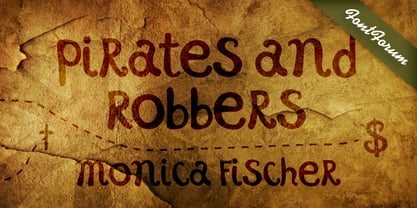
- Iwata New Gothic by IWATA,
$149.00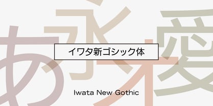 漢字・仮名とも天地左右を広くとり、 均整のとれたデザインのゴシック体です。 縦組み横組みどちらでもきれいにラインが揃い、 バランスがとれた美しい組版を実現します。
 - Iwata Kaisho Pro by IWATA,
$199.00
- Iwata Reisho Pro by IWATA,
$199.00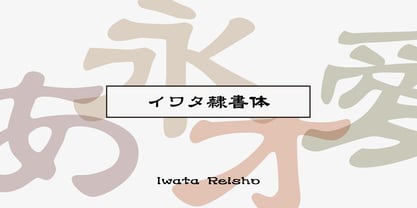 中国で古くから使用されていた伝統的な隷書を源流にする「イワタ隷書体」と、 新しい感覚の「イワタ新隷書体」の2種類があります。
 - Iwata Gyousho Std by IWATA,
$149.00 楷書と草書の中間的な筆法の書体です。 字体を崩しすぎず、読みやすくなるようデザインしています。
 - Pinot Grigio Modern by Alan Meeks,
$45.00 A modern update of the unique sans display font Peignot originally designed in 1937 by A. M. Cassandre. The font has been modernised by making all the terminals soft and making a larger x height and lessening the contrast between thick and thin.
 - Pirates De Luxe by Intellecta Design,
$22.90 Dingbats based on authentical and historical pirate's flags and other devices in your universe.
 - Iwata GKyoukasho Pro by IWATA,
$199.00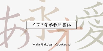 2010年に改定された常用漢字表に対応し、教科書、学習書、参考書などのあらゆる教材に使用できます。 筆やペンの入り、押さえ、ハネ、トメ、筆順などが理解しやすいようデザインしています。
 - Pirates Gold Pro by CheapProFonts,
$10.00 This stylish swashbuckling typeface had a very limited character set, but with the CheapProFonts treatment this buried treasure is ready to be rediscovered. Character map included. "Arrr! Shiver me timbers!" ALL fonts from CheapProFonts have very extensive language support: They contain some unusual diacritic letters (some of which are contained in the Latin Extended-B Unicode block) supporting: Cornish, Filipino (Tagalog), Guarani, Luxembourgian, Malagasy, Romanian, Ulithian and Welsh. They also contain all glyphs in the Latin Extended-A Unicode block (which among others cover the Central European and Baltic areas) supporting: Afrikaans, Belarusian (Lacinka), Bosnian, Catalan, Chichewa, Croatian, Czech, Dutch, Esperanto, Greenlandic, Hungarian, Kashubian, Kurdish (Kurmanji), Latvian, Lithuanian, Maltese, Maori, Polish, Saami (Inari), Saami (North), Serbian (latin), Slovak(ian), Slovene, Sorbian (Lower), Sorbian (Upper), Turkish and Turkmen. And they of course contain all the usual "western" glyphs supporting: Albanian, Basque, Breton, Chamorro, Danish, Estonian, Faroese, Finnish, French, Frisian, Galican, German, Icelandic, Indonesian, Irish (Gaelic), Italian, Northern Sotho, Norwegian, Occitan, Portuguese, Rhaeto-Romance, Sami (Lule), Sami (South), Scots (Gaelic), Spanish, Swedish, Tswana, Walloon and Yapese.
 - Hello Pirates - Personal Use - Personal use only

- Iwata News Mincho Std by IWATA,
$199.00 数多くの新聞社で使われてきた伝統ある「岩田新聞明朝体」を再現した「イワタ新聞明朝体」と、かなを現代風にアレンジした「イワタ新聞明朝体新がな」があります。
 - Iwata UD R Gothic by IWATA,
$199.00 - Iwata News Gothic Pro by IWATA,
$309.00
- Iwata Mincho Old Pro by IWATA,
$199.00 ?????????????????????????????????????????????????????????????????????????????????????
 - Iwata Souchou NK Pro by IWATA,
$199.00 金属活字の「方宋体」をもとに開発した書体です。活字時代の漢字、仮字を再現した「宋朝体」と、仮字デザインを現代風にアレンジした「宋朝体新がな」の2書体があります。
 - Iwata Mincho Old Std by IWATA,
$149.00 活字書体「岩田明朝体」のデザインを引き継ぐ、伝統ある明朝体です。起筆、終筆部のアクセントで表現された活字特有の文字の力強さ、小さめにデザインされたかなは可読性を高めます。
 - Iwata Maru Gothic Pro by IWATA,
$199.00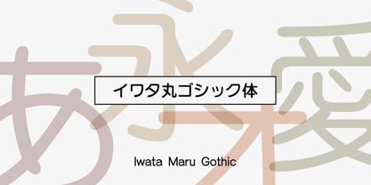 書き文字のような柔らかみのある丸ゴシック体です。字面が大きくラインが揃うデザインです。あたたかさや優しさ、親しみやすさを表現しやすい書体です。
 - Iwata GNew Gothic Pro by IWATA,
$199.00 教科書や参考書、問題集などの教育教材作成のために開発された新ゴシック体です。 筆やペンの入り、押さえ、ハネ、トメ、筆順などを理解しやすいようデザインしています。
 - Iwata GMaru Gothic Pro by IWATA,
$199.00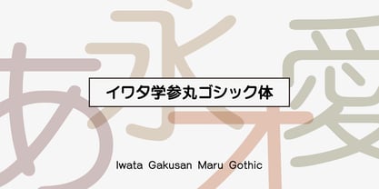 教科書や参考書、問題集などの教育教材作成のために開発された丸ゴシック体です。 筆やペンの入り、押さえ、ハネ、トメ、筆順などを理解しやすいようデザインしています。

