1,224 search results
(0.006 seconds)
- Verve - Unknown license

- Perles by Volcano Type,
$19.00Perles ignores all important typographic acutenesses in order to represent a consistently geometrical typeface. Nevertheless it communicates a lot of fun and is suitable in particular for providing trademarks. - Verve by Altered Ego,
$65.00Called by some the "Archetype of the millennium", Verve is a seven-weight typeface family. It features a complete Adobe character set with kerning and fit to match. The alternate characters offer some variations on s,f,h,j,k,S,T,Y and others, plus this font has the Euro symbol. Verve is the fourth in an on-going series of condensed typefaces that I’ve been designing since 1989. My concept was to create an elegant condensed typeface that would be a "typeface for the millennium," in style and functionality. At the very core of all my designs is a typographic problem I wanted to solve, or a market niche that I think needs filled. Verve addresses both of those concerns, without copying or borrowing from its predecessors. There’s the challenge of creating a rich and interesting typeface with an austerity of line and elegance of form. I’m a minimalist by nature – but I wanted Verve to have a sensuous feel in certain respects – yet have that sensuality balanced by the uniformity of the uniform character widths. Gottfried Pott always stresses "theme and variation," and "point and counterpoint," and that’s what I’m doing in Verve. What one finds in musical composition is evident in Verve. Perfect for book covers, CD packaging, club flyers, retail packaging (especially bottles!), identity design and multimedia. The adventurous can try it in text, but it will give you a headache. The beauty of Verve is in thesize and weight variations which create a rich typographic texture in this font. - Pero by Dharma Type,
$24.99 Pero is a condensed rounded sans-serif family designed by Ryoichi Tsunekawa and the whole family consists of 7 weights from ExtraLight to ExtraBold.The range of styles provides flexibility for title, headline and body text. And the large x-heights add to legibility. The basic skeleton of the letterform was designed modularly and minimalized by removing unnecessary stems and ends were rounded out. The minimalized modular design gives this family contemporary urbane taste and rounded corners make this family warm and friendly. This rounded feature will also accentuate your design work moderately. Pero supports almost all European languages: Western, Central, South Eastern Europeans and afrikaans. And superior figures, inferior figures, denominators, numerators and fraction can be accessed by using OpenType features.
 - Perva by Eller Type,
$30.00 Perva is a suite of three eye-catching fonts inspired by display types from the 19th century. This unconventional family has three different font styles that can be used individually or combined to build a playfulness multi-typeface design system. It is suitable for titling, posters headlines, book covers, packaging, social media, and branding. Perva brings together a Slab serif font, a.k.a Antique or Egyptian; a Reverse-contrast or Italian; and an Old English Blackletter. The design is inspired by the display types listed as “Typographic monstrosities” in Thomas C. Hansard’s book Typographia (1825). What he found absurd was understood here as interesting and enjoyable to introduce a contemporary approach of the types widely sold by foundries such as Bruce’s New York Type-Foundry and Caslon Foundry. Each of the three fonts holds around 400 glyphs, covering the languages of Northern, Western, Central, and Southern Europe. Opentype features include case-sensitive forms and a couple of alternates for the Blackletter style.
 - Nerve Agent - Personal use only

- Highland Perk - Unknown license

- Nerve Tonic - Unknown license

- Rhinos Pero by Sipanji21,
$20.00 "Rhinos Pero" is a quirky graffiti font that embodies a playful and unconventional style. Fonts in this category often feature eccentric and unique letterforms, incorporating creative elements that deviate from traditional typographic norms. This particular font might showcase irregular shapes, whimsical characters, or unconventional design traits, offering a distinct and unconventional appearance. With its quirky attributes, "Rhinos Pero" is suitable for designs aiming to convey a fun and offbeat visual impression. It could be applied in various creative projects seeking a playful and distinct graffiti-inspired typographic style. **Uppercase
 - Soft Serve by Sentinel Type,
$24.90Looking like happy frosting on a cupcake at a twiddle bug party, this bouncy food entry from Canadian designer Haley Fiege turns the original Jellybrush type into organic happiness you can spread on pancakes, ice-cream, sorbets, sauces and condements, oh peanut butter! Yeah, all kinds of sandwich fillings. Anything really. What else? People who own rubber factories. Anybody in the food business, like green grocers or your local bakery. Thrift stores. Falling somewhere between cushions and cat food, this flexible and inviting letter mixes simplicity with organic character and humor for a wide range of uses. Soft Serve’s compact cursive forms and bouncy friendliness draw on artbrush scripts and the typo-italic model of Renaissance Vatican scribe Ludovico Arrighi. A versatile workhorse ideal for: * Dairy & beverage * Sweets & soft drink * Five minute food & sauces * Pet food & accessories * Bathroom & kitchen * Cushions, pillows, rubber & swimming pool, etc. - Nerve Brush by Create Big Supply,
$15.00 Invention is a sans serif brush font that has bold, strong, bold characters. This will add a very unique and powerful touch to your design. This font is PUA encoded which means you can access all the glyphs and sweeps easily Features: All Uppercase Numbers and punctuation Multilingual PUA Encoding
 - Nerves of Steel BB by Blambot,
$9.00 Here's a deluxe comic book dialogue font with a vintage feel! Nerves of Steel BB comes with Regular, Italic, Bold, and Bold Italic. Contextual Alternates and Auto-ligatures enable six versions of every letter, and three versions of each number, the exclamation point and question mark. Barred-I correction is included as well as bouncy baselines when three or more duplicate letters are typed. To top it off, you get glyphs included for manga letterers, and a large European set of characters!
 - 101! Your FontZ Are Served - Unknown license

- Escoffier Capitaux by steve mehallo,
$19.23 Escoffier Capitaux is named for culinary legend Auguste Escoffier (1846-35) and inspired by lettering used in vintage French advertising – including the work of commercial illustrator/fashion designer Ernst Dryden (1887-1938) WITH a hearty serving of 1960s ligatures influenced by the work of Herb Lubalin (1918-81) as well as a twist of Claude Garamond (1480ish-1561) AND featuring many alternate characters and extravagant extras, Escoffier Capitaux is enough to fill out your menu, add zest to your cook book, greeting card, resume or just the right amount of sauce to your blog. DINNER IS SERVED No substitutions, please. Minimum service per person. Warning: May taste gamey.
 - P22 Bangersfield by IHOF,
$29.95 Bangersfield is a four-member font family from Robby Woodard. With line treatments clearly inspired by cased meat products, these fonts function as a healtier alternative to Comic Sans. The casual hand lettering works well for light-hearted design and comic lettering. These fonts are stuffed with opentype features, extra ornaments, and a full Central European character set—over 400 characters per serving. Satisfy your hunger for a fresh take on a stale genre!
 - Agudal MF by Masterfont,
$59.00 Fresh text font that will serve as title, signage etc.
 - Altemus Kitchen by Altemus Creative,
$11.00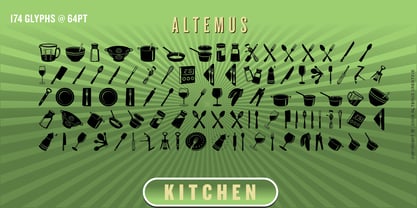 A collection of 174 kitchen and serving equipment icons and designs.
 - Afarsemon MF by Masterfont,
$59.00 High legible and rounded font family to serve all your need from short text to signage.
 - Drum Shake by PizzaDude.dk,
$16.00 Drum Shake is my friendly, all-caps comicbook font - ready to serve and protect your next design!
 - Uptown Residence JNL by Jeff Levine,
$29.00 The title card for the 1940 film "Too Many Husbands" served as the inspiration for Uptown Residence JNL.
 - Mergansers by Tyler Jamieson Moulton,
$11.00 Merganser is a Typeface intended for text and copy and was inspired to serve the avid community of Birders. Birders and birding material historically have a lot to say. Merganser serves that tendency because its designed legible at small scales. The Natural world also inspires the slightly humanist strokes of Merganser. Merganser was created as part of the Type@Cooper winter certificate in Type Design.
 - WTF - Unknown license

- Claim Check JNL by Jeff Levine,
$29.00A page from an old manual for sign painters yielded the hand-lettered alphabet that served as a model for Claim Check JNL. - Slabserif Wood JNL by Jeff Levine,
$29.00 Vintage wood type with a strong Clarendon influence served as the model for Slabserif Wood JNL, which is available in both regular and oblique versions.
 - Flatbush Beanery JNL by Jeff Levine,
$29.00Serve up a generous portion of nostalgia with this retro font inspired by lettering in old diners, drive-ins and eateries of the 40s and 50s. - DEATHE MAACH by The Fontry,
$15.00 There's a war starting; you just didn't notice because you were too busy fighting to realize what was happening. Take your sides. Pick your battles. Choose a face that stands ready to defend, enforce and police. All who are ready to serve, please step forward. Deathe Maach is a six-font family of descending weights with the strength and stamina to face all comers in the approaching conflict. Armor on. Pistols out. Barrels forward. Enforce and serve.
 - Querida by Autographis,
$39.50 Querida is an elaborate, elegant, constructed script with intertwining swashes and a timeless appearance. It will serve you well for all kind of high class package design challenges.
 - Dear Sans by Stiggy & Sands,
$24.00 The Dear Sans Collection is comprised of four widths ranging from Condensed, Regular, Expanded, and Wide; each of which are comprised of a three font family of weights: Book, Regular & Bold. Cleanly readable, with just a slight hint of silliness, the Dear Sans Collection brings adds the perfect level of lightheartedness to your designs. The Dear Sans Collection comes with: - Approx. 367 Character Glyph Set per font - including standard & punctuation, international language support, and basic “fi fl” ligatures per font. - 3 Weights per family including: Book, Regular, and Bold. - Loads of Personality for your designs.
 - Obscure Stencil JNL by Jeff Levine,
$29.00 A bold, handmade stencil alphabet from the book “Lettering” by Harry B. Wright (1950) served as the model for Obscure Stencil JNL – available in both regular and oblique versions.
 - Monthly Meeting JNL by Jeff Levine,
$29.00 A set of plastic pin-back letters served as the model for Monthly Meeting JNL. Pin-back letters were primarily used on cork bulletin boards for changeable notices and announcements.
 - DF Tapa by Dutchfonts,
$39.00 DF Tapa is a typeface based on the vernacular, popular graphics used in Spain. They proudly announce the daily fresh snacks which are homemade and served in every proper bar.
 - Flourishes A by Wiescher Design,
$39.50 FlorishesA are a set of flourishes, that serves well for frames and other elegant embellishments, they are beginning of last century American. Your I-found-them-somewhere type-designer, Gert Wiescher
 - Tacora by Volcano Type,
$19.00Bounded on its western flanks by the Peru-Chile frontier, Tacora is the northernmost volcano in Chile and is the youngest and most southerly of a twin system with Co. Chupiquina. - Parallel by Typedepot,
$19.00 Parallel is unique quite thin and pretty "expressive" typeface, designed in order to serve the fashion industry. It also works pretty well as a typeface for print, headlines and identity issues.
 - Movie Screen JNL by Jeff Levine,
$29.00 The hand lettered opening titles from the 1944 Laurel and Hardy comedy “The Big Noise” served as the inspiration for Movie Screen JNL, which is available in both regular and oblique versions.
 - Dilectus by TeGeType,
$29.00 Inspired by Paleochristian engravings and writings, this font has a timeless aspect while keeping a real monumentality. It was originally designed to serve as a visual identity for a group of museums.
 - Stage Play JNL by Jeff Levine,
$29.00 Vintage sheet music for Earl Carroll's dramatic mystery-comedy production "Murder at the Vanities" has its title hand-lettered in the Art Deco style which served as the basis for Stage Play JNL.
 - Option Sans by Cadson Demak,
$29.00 Option Sans is a rework of Anuthin Wongsunkakon's Coupe. The popular font originally sold by T26 has now been humanized. Improved legibility from the original Coup to serve better as fine text font.
 - Tryout Nouveau JNL by Jeff Levine,
$29.00 The hand lettered Art Nouveau title on the sheet music for “Why Don't You Try” (1905) served as the inspiration for Tryout Nouveau JNL, which is available in both regular and oblique versions.
 - Junior Printer JNL by Jeff Levine,
$29.00 The hand-lettered name of the "Junior Showcard Printer" (a 1930s-era rubber stamp printing set manufactured by the Superior Marking Equipment Company of Chicago) served as the prototype for Junior Printer JNL.


Page 1 of 31Next page