42 search results
(0.006 seconds)
- Nirma by madeDeduk,
$15.00 Introducing Nirma Display Typeface, use this font for any branding, product packaging, invitation, quotes, t-shirt, label, poster, logo etc. Feature Uppercase & Lowercase Number & Symbol International Glyphs Multilingual support Feel free to drop us a message any time and follow my shop for upcoming updates Shoot me on email at: dedukvic@gmail.com and find more previews on my Instagram here : https://www.instagram.com/acekelgondolayu/?hl=en Hope you enjoy it.
 - Sigma by Wiescher Design,
$30.00 »SIGMA« is the name for the Greek voiceless »S«. It is also called the »Lunar Sigma«, in Hellenistic times the letter was simplified to »C«. I thought SIGMA was a nice name for my new, very readable and friendly Sans typeface. »SIGMA« has that classical Sans beauty with friendly touches that make it unique. You will love this font. It is a great everyday workhorse with seven weights from Thin to Bold and all the necessary weights in between. Great for body copy and headlines! With 875 Glyphs it is a truly European font designed for all Central European and Latin using countries. »SIGMA« has a set of Cyrillic that is – besides Russia – also good for Serbia, Macedonia and Ukraine. It has oldstyle- and lining-, tabular- and tabular-oldstyle-figures, many ligatures. »SIGMA« comes in Normal and Oblique, I made it Oblique instead of Italic which would have been too playful for this friendly font. Enjoy!
 - Nima by Naghi Naghachian,
$64.00 I dedicate this font family to Nima Yooshij (1896-1960), the great poet and innovator of Persian poetry. Nima is a new creation of Naghi Naghashian. Nima design fulfills the following needs: A. Explicitly crafted for use in electronic media fulfills the demands of electronic communication. B. Suitability for multiple applications. Gives the widest potential acceptability. C. Extreme legibility not only in small sizes, but also when the type is filtered or skewed, e.g., in Photoshop or Illustrator. Nima's simplified forms may be artificial obliqued in InDesign or Illustrator, without any loss in quality for the effected text. D. An attractive typographic image. Nima was developed for multiple languages and writing conventions. Nima supports Arabic, Persian and Urdu. It also includes proportional and tabular numerals for the supported languages. E. The highest degree of calligraphic grace and the clarity of geometric typography. This typeface offers a fine balance between calligraphic tradition and the Roman aesthetic common in Latin typography.
 - KT Nirma by Kotivoro Lab,
$14.00 KT Nirma Sans Nirma is a typeface with 9 Weight Sans Serif from thin to Black, inspired by Founders Grotesk, This project start from April 2022 and start from the stretch until shaped the solid character to represent the Dynamic Sans Serif. Nirma has total 462 glyph and 218 Support language. Nirma support Latin Basic, Latin-1 Supplement, Latin Extended A-B, Spacing Modifier Letters, and Combining Diacritical Marks. The Solid Character has multi function Display Sans & Body text based on Display Grotesk. Especially in te Thin to Regular is more legible for body text and the black one good for Display Sans, with dinamyc shape and more wide.
 - Sigma Condensed by Wiescher Design,
$30.00 »SIGMA« is the name for the Greek voiceless »S«. It is also called the »Lunar Sigma«, in Hellenistic times the letter was simplified to »C«. I thought SIGMA was a nice name for my new, very readable and friendly Sans typeface. »SIGMA« has that classical Sans beauty with friendly touches that make it unique. You will love this font. It is a great everyday workhorse with seven weights from Thin to Bold and all the necessary weights in between. Great for body copy and headlines! With 875 Glyphs it is a truly European font designed for all Central European and Latin using countries. »SIGMA« has a set of Cyrillic that is – besides Russia – also good for Serbia, Macedonia and Ukraine. It has oldstyle- and lining-, tabular- and tabular-oldstyle-figures, many ligatures. »SIGMA« comes in Normal and Oblique, I made it Oblique instead of Italic which would have been too playful for this friendly font. Enjoy!
 - Enigma Heights by Supfonts,
$15.00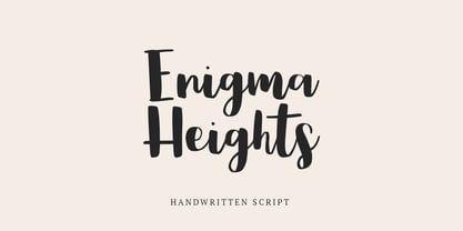 Enigma Heights it is cute handwritten chick font with exquisite accents. This font is perfect for branding, cricut projects, wedding invitations, logos, vinyl, svg files, stickers, cards, signs and more!
 - Saffron_Cyr - 100% free

- Bulblamp by Popskraft,
$9.00 Layered font set 3D Bulb lamp Bulblamp is a 12 component font system that can be layered in different ways to create endless classic titling effects used commonly in signage by skilled sign painters and sign makers and any who interested in simple and flexible ways to make graphic design. Examples of how to use this you can see on the images. Moreover, You can start fast in Figma, Illustrator and Photoshop with predefined downloadable package. ! Download free predesigned Figma, Illustrator and Photoshop sets for this fonts here: https://drive.google.com/open?id=17ogdSIjPuLA5-CUaAO1TlqJGbRPWy5iA&authuser=popov_av%40koriphey.ru&usp=drive_fs Each file is named according to its purpose. The number indicates the recommended order of the layers. 1 below, 5 on top. 1 means you should place it first. Of course, you do not have to use all the fonts, and vice versa - you can repeatedly use the same font style with different styles. What is Layered font? In fact, these are common fonts located in a stack strictly one above the other. This allows quickly create unique text effects using ordinary fonts. Where can you use this? These fonts can be used in any program that allows you to stack fonts as objects strictly one above the other, however it is recommended to work in professional programs such as Illustrator, Photoshop, Figma and so on ... How to use this font set quickly? For quick use, I recommend using ready designs for Figma, Photoshop or Illustrator. Download fonts and Install all fonts. Go to the link https://drive.google.com/open?id=17ogdSIjPuLA5-CUaAO1TlqJGbRPWy5iA&authuser=popov_av%40koriphey.ru&usp=drive_fs which has contained pre-made solutions for this font applicable in Figma, Photoshop or Illustrator and download presets. Follow the recommendations on the pages. Basically, you will need to replace the words in the template with your own, then edit colors and transfer the result to your design. In that’s all, it's easy.
 - Typex by Device,
$39.00 Based on the lettering used on Alan Turing’s famous code-breaking machine at Bletchley Park, the “Bombe”, and the subsequent British answer to the German Enigma machine, the Typex. Research done at Bletchley Park on their restored and antique machines provided the inspiration. The unusual shapes for the capitals have all been retained - the square O, the monospaced characters and other eccentricities that make it unique. This reference material was then extended to the numerals (which did not exist in the original) and a full international character complement. The initial design of the bombe was produced in 1939 at the UK Government Code and Cypher School (GC&CS) at Bletchley Park by Alan Turing, with an important refinement devised in 1940 by Gordon Welchman. It was based on a device that had been designed in 1938 in Poland at the Biuro Szyfrów (Cipher Bureau) by cryptologist Marian Rejewski, and known as the "cryptologic bomb" (Polish: bomba kryptologiczna). The Bombe was used to break the German Enigma code on a daily basis, and was a vital part of the Allied war effort. The British “Typex" (alternatively, Type X or TypeX) machines were an adaptation of the commercial German Enigma with a number of enhancements that greatly increased its security. It was used from 1937 until the mid-1950s, when other more modern military encryption systems came into use.
 - Arum Sans by Australian Type Foundry,
$40.00 A humanist sans-serif family which displays subtle influences of the edged writing tool. Inspired by modern faces such as Chaparral and Enigma, Arum Sans is versatile enough to be used for high-end text setting as well as display purposes. A full international glyph set, extended for European use, allows Arum Sans to play on the field with the big boys.
 - Ecatherina by BlessedPrint,
$23.00 Hi! It took me almost a year to design Ecatherina script. Finally it is available to purchase! Ecatherina script is an opentype font-family (15 fonts: 5 styles for 3 line thickness) with a bonus (editable wedding invitations, menu, quotes, letters, and more) HOW TO GET ACCESS TO ALTERNATES? Absolutely easy, just type a number after any letter: a1, a2, a3 etc Capital letters have 3-4 options and more. So just type E1, E2, E3 etc and find your favourite one! I found this method the most useful when you need to experiment with design very fast. All characters are available through Glyph panel as well, even more each of the alternate letter has it’s own unicode (PUA) so you can copy/paste from Apple Font Book or Windows Character Map. Total amount of glyphs 1436. Compatible with SILHOUETTE & CRICUT DESIGN SPACE WHAT IS INCLUDED BP-Ecatherina OTF & TTF It goes with 5 weights: Thin, Medium, Regular, Bold, UltraBold BP-Ecatherina-Ex1 The only difference between previous font is that thin line is a bit thicker. BP-Ecatherina-Ex2 Even more thicker line. Help.pdf Help file with most common questions. Bonus - Ecatherina.fig with editable wedding invitations (10+ designs 5x7 inches), menu, quotes, letters. Important! You need to install Figma application (it is free) to access files. With Figma application you can import bonus files and edit the text, export as png, pdf, svg and print it. Bonus - help.pdf file with general information how to work with Figma if you are new. It is very easy application and I recommend it to you! It works with MS Word, I included example.docx file so you can understand how to work.
 - Chamelton by Alex Khoroshok,
$9.99 Chamelton, a vast layered font family, provides a creative spectrum through layers, colors, and weights, including 109 Sans Serifs, 3 script weights, + 198 extras. You can use the family as a complete design kit or a component of your work. Most styles are stand-alone fonts, but some layers work only in combination. Creating a multi-colored layered font is simple and compatible with any layer-supporting graphic software, including Adobe Suite, Sketch, Figma, etc. See Specimen PDF for more details.
 - Keithey by Enigma Lettering Studio,
$16.00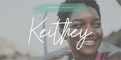 Introducing by Enigma Lettering Studio Proudly Present, Keithey Kithey is a Signature Style Font Keithey is perfect for product packaging, branding project, megazine, social media, wedding, or just used to express words above the background. Keithey also come with Multi-Lingual Support. We highly recommend using a program that supports OpenType features and Glyphs panels like many of Adobe apps and Corel Draw, so you can see and access all Glyph variations. Enjoy the font, feel free to comment or feedback, send me PM or email.
 - Abyssal Gothic by Abyssal Graphics,
$25.00 Introducing "Abyssal Gothic Textura," a hauntingly elegant blackletter font that reimagines medieval dark-fantasy with a modern twist. This font captures the allure of ancient calligraphy while preserving its historical aura. Meticulously crafted, each character exudes gothic grandeur, appealing to both traditionalists and forward-thinking designers. Ideal for sophisticated projects, it lends enigmatic allure to book covers, posters, and invitations. With support for multiple languages and stylistic alternates, "Abyssal Gothic Textura" empowers creativity in diverse designs. Let it guide you into the dark-fantasy realm, where it unveils hidden depths, bridging ancient charm and contemporary allure. Embrace the enigma of history with this captivating typographic gem.
 - Cracked Dream by IbraCreative,
$9.00 Cracked Dream is an enchanting and imaginative fantasy display typeface that transports us to a world of otherworldly wonder. With its intricate and mystic letterforms, Cracked Dream evokes the feeling of stepping into a realm where reality blends with the fantastical. The ornate cracks and intricate details on each letter conjure images of ancient spells and hidden secrets, making it a perfect choice for fantasy book covers, magical-themed designs, and mystical event posters. Cracked Dream’s unique design adds a touch of mystique and allure, inviting viewers to explore the depths of their imagination. Whether used for gaming graphics or ethereal illustrations, this typeface effortlessly weaves a sense of enigma and adventure, truly embodying the essence of a captivating fantasy world.
 - Delicato Pro by MAC Rhino Fonts,
$59.00 In many aspects, built in a traditional way. Still, some modern details have been implemented which classic designs sometimes lack. The prime goal was to make a strong text font for books and longer texts in general. This fact does not exclude the possibilites for use elsewhere. Throughout history existing designs have often been the source of inspiration for newer ones. Delicato is no exception and looking closely, similarities can be found in the lowercase of Jeremy Tankard’s Enigma and the stems of Petr van Blokland’s Proforma. The goal is to respect these sources and turn the the typeface into something new with a unique and personal touch. Most text faces carry a basic set of weights like Regular, Italic, Bold and Small Caps. MRF wanted to expand that a little bit further and added a Medium, Alternates and a set of Ornaments to make the family complete and versatile.
 - Arbus by Popskraft,
$18.00 When we think of a child's font, random scribbles often come to mind, but I thought, why not make a child's font fun, spontaneous, and at the same time simple and readable. This is how the Arbus font was born. This font is perfect for anyone looking for a light, free-style font that will last a long time. In addition, the font has a number of undeniable advantages: The Arbus font is perfectly balanced, which allows you to use it both in headings and for large amounts of text. Thus, you can completely design your products with one font family. The Arbus font family has nine font weights. The font supports all European languages and of course the Latin alphabet. Works on PC & Mac This beautiful Arbus font can be installed on any operating system, it can also be used in professional programs like Figma or Addobe Crative Cloud, as well as in other simpler software like Canva.
 - Mistery Brush by Ditatype,
$29.00 Mistery Brush is a captivating script font that exudes an air of intrigue and enigma. Designed in large letters with a thick weight, this typeface commands attention and makes a powerful statement. Each letter is meticulously crafted with brush-like strokes, adding a touch of handcrafted artistry to the font. The brush details in Mystery Brush lend the font an organic and dynamic feel, as if the letters were painted with the strokes of an enigmatic artist. These artistic details add depth and character, making every word a work of art. For the best legibility you can use this font in the bigger text sizes. Enjoy the available features here. Features: Multilingual Supports PUA Encoded Numerals and Punctuations Mistery Brush fits in headlines, logos, movie posters, flyers, invitations, greeting cards, branding materials, print media, editorial layouts, headers, and many more. Find out more ways to use this font by taking a look at the font preview. Thanks for purchasing our fonts. Hopefully, you have a great time using our font. Feel free to contact us anytime for further information or when you have trouble with the font. Thanks a lot and happy designing.
 - Ostad Arabic by Naghi Naghachian,
$64.00 Oustad Arabic is designed by Naghi Naghashian. It is a Bold headline font, in 1 weight. This font is a contribution to modernisation of Arabic typography, gives the font design of Arabic letters real typographic arrangement und provides more typographic flexibility. Oustad Arabic supports Arabic, Persian and Urdu. It also includes proportional and tabular numerals for the supported languages. OstadArabic design fulfills the following needs: A Explicitly crafted for use in electronic media fulfills the demands of electronic communication. B Suitability for multiple applications. Gives the widest potential acceptability. C Extreme legibility not only in small sizes, but also when the type is filtered or skewed, e.g., in Photoshop or Illustrator. Nima’s simplified forms may be artificial obliqued in InDesign or Illustrator, without any loss in quality for the effected text. D An attractive typographic image. Kasha was developed for multiple languages and writing conventions. Nima supports Arabic, Persian and Urdu. It also includes proportional and tabular numerals for the supported languages. E The highest degree of calligraphic grace and the clarity of geometric typography.
 - Agatized Informal by ULGA Type,
$26.00 Agatized Informal is a rough-edged stencil typeface with chunky letterforms and tight spacing. Designed primarily for display use, it’s ideal for posters, logos, advertising, book cover designs or small chunks of text such as pull-out quotes. The design is something of an enigma, a curious mish-mash of genres – imagine splicing Uncle Buck and Deadpool into a horror movie – it’s big, bold and funny although has a dark side. But what really makes this typeface a joy to drive is its boot full of alternative characters and ligatures. There is a saying: Use sparingly. Not on this street! Make your Glyphs palette burn rubber. Set your OpenType to full throttle: crank up your style and get those liga-tyres screeching. Agatized is a souped-up old campervan spinning doughnuts on the beach. The design started life as a piece of lettering for a book design that didn’t progress past the sketch stage. I liked the rough, dense character shapes, so during some down time I started drawing more characters and the lure of a new typeface pulled me in from there. Although this is a single-weight typeface it has a younger sibling, Agatized Formal, a neater, more dapper brother, smoother round the chops and smartly dressed – certainly no less fun though.
 - Polias by Esintype,
$23.00 Polias is an all-caps uniwidth typeface inspired by an ancient inscription carved on a monoblock stone in hybrid characters — between no-contrast linear sans to low-contrast flared serif. The inspiring inscription is the dedication by Alexander the Great, discovered in the Temple of Athena Polias in the ancient Ionian city of Priene. Stanley Morison mentioned this inscription in one of his lectures: “The distinctive feature of this inscription consists of a consistent thickening towards the ends of perpendiculars and horizontals.” … “We have not the right to say that the serif was invented for Alexander the Great's inscription, only that this is its first datable appearance.” The letter proportions are almost identical to the original, but the stroke features have been reinterpreted and characterized. Serif-like nodes at the end of the strokes are subtle extensions that serve to accentuate rather than break its monoline elegance. With an analogy, they are not flowers, but like blooming buds. Polias is a flared sans typeface which is closer to sans-serif forms on the spectrum between sans and serif. It’s especially light looking by design to convey rather thin and white typographic color of its original monumental look. It comes in eight weights and a variable font, scaled from Thin to Bold. It is multiplexed, so the weights do not affect text lengths. Light weights are closely based on the actual carving of the inscription. Thicker weights can be used on smaller typesettings to compensate for the weight difference of larger letters’ strokes, and to keeping the monoline appearance of the entire text block intact. This method can be used for any purpose, such as setting a hierarchy between the lines or to justify their lengths. Some of the original letterforms have been preserved and stylistic alternatives such as Ionic four-bar Sigma, dotted Theta, palm Y are provided as open type feature. Some of the other ancient forms, such as the three-bar Sigma (S), the pointed U, were also added for both the Greek and Latin scripts. Polias is preferable for big type settings such as logos and headlines as a modern representation of perennial classical forms. Its a fine fit for product branding, movie posters, book covers, packaging materials, and more, which require an epic look to attracting attention with a distinctive elegance. Polias can be considered for distinctiveness wherever Roman Capitals work. As a noun, Polias is one of the epithets of Athena / Minerva, and in this case referring to her role as the protector of the city of Priene. Polias is one of the seven typeface designs in Esintype's ancient scripts of Anatolia project, Tituli Anatolian series.
 - Polias Varia by Esintype,
$140.00 Polias Varia is an all-caps uniwidth variable weight typeface inspired by an ancient inscription carved on a monoblock stone in hybrid characters — between no-contrast linear sans to low-contrast flared serif. The inspiring inscription is the dedication by Alexander the Great, discovered in the Temple of Athena Polias in the ancient Ionian city of Priene. Stanley Morison mentioned this inscription in one of his lectures: “The distinctive feature of this inscription consists of a consistent thickening towards the ends of perpendiculars and horizontals.” … “We have not the right to say that the serif was invented for Alexander the Great’s inscription, only that this is its first datable appearance.” In Polias Varia, the letter proportions are almost identical to the original, but the stroke features have been reinterpreted and characterized. Serif-like nodes at the end of the strokes are subtle extensions that serve to accentuate rather than break its monoline elegance. With an analogy, they are not flowers, but like blooming buds. Polias Varia is a flared sans typeface which is closer to sans-serif forms on the spectrum between sans and serif. It’s especially light looking by design to convey rather thin and white typographic color of its original monumental look. It comes in eight weights and a variable font, scaled from Thin to Bold. It is multiplexed, so the weights do not affect text lengths. Light weights are closely based on the actual carving of the inscription. Thicker weights can be used on smaller typesettings to compensate for the weight difference of larger letters’ strokes, and to keeping the monoline appearance of the entire text block intact. This method can be used for any purpose, such as setting a hierarchy between the lines or to justify their lengths. Some of the original letterforms have been preserved and stylistic alternatives such as Ionic four-bar Sigma, dotted Theta, palm Y are provided as open type feature. Some of the other ancient forms, such as the three-bar Sigma (S), the pointed U, were also added for both the Greek and Latin scripts. Polias Varia is preferable for big type settings such as logos and headlines as a modern representation of perennial classical forms. Its a fine fit for product branding, movie posters, book covers, packaging materials, and more, which require an epic look to attracting attention with a distinctive elegance. Polias Varia can be considered for distinctiveness wherever Roman Capitals work. As a noun, Polias is one of the epithets of Athena / Minerva, and in this case referring to her role as the protector of the city of Priene. Polias (family) is one of the seven typeface designs in Esintype’s ancient scripts of Anatolia project, Tituli Anatolian series.
 - FS Silas Sans by Fontsmith,
$80.00 The great enigma There are hidden depths to FS Silas Sans. First impressions are of a functional, multi-purpose typeface with a cool, edgy, angular character. Gaze into its eyes a little longer, though, and you'll detect a more nuanced, colourful personality, with full, open, satisfyingly squarish forms balancing the abruptness of the sharply-angled terminals and ascenders. Authoritative, official and stern on the outside; amiable and welcoming on the inside. You’re so Dane The designers, led by Phil Garnham, were trying to capture something straight-talking, authentic, and a little... Scandinavian. ‘We were thinking about some of the characters in Danish dramas that were on in the early stages of the font’s development, like The Killing and The Bridge,’ says Phil. ‘The police officers, that is, not the psychopathic killers. Smart and a bit cool, but with a warm heart.’ For a good Danish name, we settled on Silas. It was that or Hans-Christian. The finer points Silas Sans rewards close inspection. Study, if you will, its amply squarish forms, the roomy ‘o’ and ‘e’, in particular. Observe the angular ascenders and terminals of, for example, the ‘L’, ‘I’, ‘d’ and ‘i’, inferring the movement and lift of a pen. Consider the cuts to the ‘A’ and ‘v’ that create harmony with adjacent letters. And scrutinise the subtle ink traps set within the ‘A’ and ‘Y’ for reproduction at small sizes. A fine subject, we think you’ll agree, and available in a versatile range of weights to make (with FS Silas Slab) a typographic system with a comprehensive hierarchy.
 - Devil Inside by Ditatype,
$29.00 Devil Inside is a spine-chilling display font that will send shivers down your spine. Designed in a large, bold font, this typeface demands attention and exudes an aura of darkness. Each letter is meticulously crafted with a square shape, high contrast, and haunting brush details, adding an eerie and sinister touch to the font. The large size of the letters enhances the font's ominous presence, making it impossible to ignore. The square shape of each letter adds a sense of rigidity and sharpness, while the high contrast brings an element of drama and intensity. These design choices contribute to the font's unsettling and sinister look, immersing the viewer into a world of darkness and fear. The brush details in Devil Inside give the font an organic and handcrafted appearance, as if it were inscribed with ancient symbols by a malevolent force. These haunting details add a sense of craftsmanship and enigma, creating an atmosphere of mystery and foreboding. For the best legibility you can use this font in the bigger text sizes. Enjoy the available features here. Features: Alternates Multilingual Supports PUA Encoded Numerals and Punctuations Devil Inside fits in headlines, logos, movie posters, flyers, invitations, branding materials, print media, editorial layouts, headers, and any horror-themed project. Find out more ways to use this font by taking a look at the font preview. Thanks for purchasing our fonts. Hopefully, you have a great time using our font. Feel free to contact us anytime for further information or when you have trouble with the font. Thanks a lot and happy designing.
 - Imagine a font that stepped out of a gothic noir film, one that would be right at home on the marquee of a mysterious underground club where the 1970s met the supernatural. That's BN Manson Nights fo...
- Ah, the elusive font EMILKOZAK.COM | fartdeco, a typographical enigma that caters to the refined taste of those who appreciate a good giggle alongside their graphic design. Picture this: the roaring ...
- The Parasight font, designed by Clearlight Fonts, embodies a unique and captivating blend of creativity and artistic exploration, tailor-made for the digital age. This typeface stands out through its...
- Oh, the enigma that is Rusted Plastic, a font straight out of the dystopian DIY workshop of Last Soundtrack, a name that hints at its creator's possible final act in the font-making saga—an exclamati...
- The Illuminati font by Iconian Fonts is a unique and intriguing typeface that seems to possess a certain mystique, reflecting the mystery and secrecy often associated with the name 'Illuminati'. This...
- Ah, Inspector 39! If fonts were guests at a soiree, Inspector 39 would saunter in with the mysterious allure of a noir detective, blending the charm of classic cinema with the intrigue of a whodunit....
- Ah, the font named "Immoral," a typographical riddle wrapped in an enigma, dressed scandalously in serifs and swashes. This is not your grandmother's font, oh no. It's the font that sneaks out at nig...
- Ah, LaPerutaFLF, the font that decided it was too cool for the mainstream yet not quite ready for the underground indie scene. Picture this: if fonts had personalities, LaPerutaFLF would be that quie...
- Ah, the elusive Font called Font, a font so enigmatic and self-referential it has become the meta of all typography. Picture, if you will, a typeface caught in an identity crisis, perpetually ponderi...
- Ah, Lelim 200, a typographic enigma birthed from the creative chambers of Stefan Motzigemba's mind! If fonts were people, Lelim 200 would be that effortlessly cool friend who knows all the best coffe...
- Archeologicaps by Manfred Klein is a tryst with history, wrapped in the enigma of typography that takes you back to the cradle of civilization. Designed by the adept typographer Manfred Klein, this f...
- Ah, COM (sRB) by sRB-Powers, a true enigma wrapped in a digital font file. Imagine if a group of pixels woke up one day, decided to become fonts, and then went on a wild, adventurous spree guided by ...
- Once upon a paragraph, in the mythical realm of typography, there emerged a legend from the creative foundry of deFharo – The Black Box. Picture this: if fonts were a grand dinner party, The Black Bo...
- The 5 Fingered Goth SWTrial font by Astigmatic One Eye stands out as a unique and captivating typeface that carries an unmistakable gothic charm. Crafted by the intriguingly named Astigmatic One Eye ...
- Cryptocurrency by Bülent Yüksel,
$14.00 "Crypto Currency - Block Chain" quickly entered our lives and its use is increasing day by day. Blockchain became more popular in web, TV and printed works. It is necessary to use their logos when defining "Crypto Currencies". But it is not easy to access these logos fast. "Cryptocurrency Font Family" which I prepared for you, is a resource that you can reach without searching for too many logos. Cryptocurrency Font Family contains 200+ logos. These are the most popular "Block Chain" logos in recent years. The popularity rankings changed over time and you can contact me if you need new logos and changing logos. I can create the "Block Chain" logo you need or apply the changes. You can send your new logo and logo change requests to me at "buyuksel@hotmail.com". Subsequent corrections and additions will be completely free. After the first purchase, there is no additional payment for updates. When using Cryptocurrency Font Family, "Cryptocurrency No.00 Guide Map" is absolutely free to download and use. This will help you a lot to define coins. "Guide Map" contains the letter and the Unicode numbers. --- Contents --- Ardor ARDR, Bitcoin BTC, Bitcoin Cash BCH, Bitcoin SV BSV, Bitcoin Gold BTG, Bitcoin Diamond BCD, Bitcoin Private BTCP, Bitcoin Plus ZBC, Bitcoin Z BTCZ, Etherium ETH, Etherium Classic ETC, Xrp Ripple XRP, Ripple, Teher USDT, Litecoin LTC, Litecoin Cash LCC, Eos EOS, Binance Coin BNC, Monero XMR, Cardano ADA, Steller XLM, Tron TRX, Tezos XTZ, Unus Sed Leo LEO, Chain Link LINK, Cosmos Atom ATOM, Huobi Token HT, Neo NEO, Hedge Trade HEDG, Crypto.com CRO, Iota MIOTA, Dash DASH, Maker MKR, Usd Coin USDC, Ontology ONT, Nem XEM, Ve Chain VET, Dogecoin DOGE, Basic Attention BAT, Z Cash ZEC, Paxos Standard PAX, Ftx Token FTT, Decred DCR, Qtum QTUM, Syntehetix Network SNX, True Usd TUSD , Raven Coin RVN, Ox ZRX, Okex OKB, Algorad ALGO, Holo HOT, Centrality CENZ, Augur REB, ZB Token ZB, Seele SEELE, Omisego OMG, Swipe SXP, Waves WAVES, Horizen ZEN, Kucoin Shares KCS, Theta THETA, Nano NANO, Nervos Network CKB, Byton BTM, Lisk LSK, Molekular Futures MOF, Digibayt DGB, Bittorent BTT, Icon ICX, V Systems VSYS, Iost IOST, Abbc Coin ABBC, Komodo KMD, Nexo NEXO, Siacom SC, Monacoin MONA, Luna LUNA, Enjin ENJ, DxChain Token DX, Hyper Cash HC, Verge XVG, Bytecoin BCN, Steem STEEM, Zilliqa ZIL, Maidsafe Coin MAID, Energi NRG, Bitshares BTS, Digixdo DGD, Rif Taoken RIF, Aeternity AE, Block Stamp BST, Zcoin XSC, Matic Network MATIC, Quart QNT, Silverway SLV, Kyber Network KNC, Iexec Rlc RLC, Electironeum ETN, Ren REN, Status SNT, Status Euro EURS, Single Colleteral SAI, Nash Exchange NEX, Grin GRIN, Decentraland Mana MANA, Stratis STRAT, Solve SOLVE, Kick Token KICK, Aelf ELF, Golem GLT, Pumdi X NPXS, Enigma ENG, Metaversa Etp ETP, Digitex Futures DGTX, Elastos ELA, Gxchain GXC, Chiliz CHZ, Ripio Credit RCN, Aion AION, Fetch Ai FET, Loopring LRC, Dragon Coin DRG, Wayki Chain WICC, Thunder Token TT, Iotex IOTX, Nebulas NAS, Hedera Hashgraph HBAR, Bread BRD, Hyperion HYN, Ignis IGNIS, True Chain TRUE, Wax WAX, Tierion TNT, Wanchain WAN, Reddcoin RDD, Wink WIN, Gatechain Token GT, Diamond Platform DPT, Nuls NULS, Yap Stone YAP, Vertcoin VTC, Project Pai PAI, Denta Coin DCN, Ark ARK, Fun Fair FUN, Loom Network XMX, Edu Care EKT, Aragon ANT, Factom FCT, Populous PPT, Revain R, Harmony ONE, Qash QASH, Groestl Coin GRS, Civic CVC, Fantom FTM, Swiss Borg CHSB, Santiment Network SAN, Moeda Loyalty MDA, GoChain GO, Dent DENT, Edc Blockchain EDC, Storj STORJ, Divi DIVI, Pivx PIVX, Bancor BNT, Metal MTL, Loki LOKI, Wirex Token WXT, Bitkan KAN, Gnosis GNO, Network NEW, Thorchain RUNE, Odem ODE, Bibox Token BIX, Bosagora BOA, Oceon Protocol OCEON, Celer Network CELR, Chimpion BNANA, Mixin XIN, Veritasium VERI, Mine Bee MB, Bankera BNK, Bitcoin2 BTC2, Casino Coin CSC, Bitforex Token BF, Dynamic Trading DTR, Poseidon Network QQQ, Obyte GBYTE, Cloak Coin CLOAK
 - Prismatic Spirals by MMC-TypEngine,
$93.00 PRISMATIC SPIRALS FONT! The Prismatic Spirals Font is a decorative type-system and ‘Assembling Game’, itself. Settled in squared pieces modules or tiles, embedded by unprecedented Intertwined Prismatic Structures Design, or intricate interlaced bars that may seem quite “impossible” to shape. Although it originated from the ‘Penrose Square’, it may not look totally as an Impossible Figures Type of Optical Illusions. More an “improbable” Effect in its intertwined Design, that even static can seem like a source of Kinetical Sculptures, or drive eyes into a kind of hypnosis. Prismatic Spirals has two related families, its “bold” braided version Prismatic Interlaces and the Pro version. While the default is simpler or easier to use, as all piece’s spin in same way, PRO provides a more complex intricate Design which requires typing alternating caps. Instructions: Use the Map Font Reference PDF as a guide to learn the 'tiles' position on the keyboard, then easily type and compose puzzle designs with this font! All alphanumeric keys are intuitive or easy to induce, you may easily memorize it all! Plus, often also need to consult it! *Find the Prismatic Spirals Font Map Reference Interactive PDF Here! (!) Is recommended to Print it to have the Reference in handy or just open the PDF while composing a design with this typeface to also copy and paste, when consulting is required or when it may be difficult to access, depending on the keyboard script or language. As a Tiles Type-System, the line gap space value is 0, this means that tiles line gaps are invisibly grouted, so the user can compose designs, row by row, descending to each following row by clicking Enter, same as line break, while advances on assembling characters. Background History: The first sketches of my Prismatic Knots or Spirals Designs dates back then from 2010, while started developing hand-drawn Celtic Knots and Geometric Drawings in grid paper, while engage to Typography, Sacred Geometry and the “Impossible Figures” genre… I started doing modulation tests from 2013, until around 2018, I got to unravel it in square modules or tiles from the grid, then idealized it as fonts, along with other Type projects. This took 13 years to come out since the first sketches and 6 months in edition. During the production process some additional tiles or missing pieces were thought of and added to the basic set, which firstly had only the borders, corners, crossings, nets, Trivets connectors or T parts and ends, then added with nets and borders integrations. Usage Suggestions: This type-system enables the user to ornate and generate endless decorative patterns, borders, labyrinthine designs, Mosaics, motifs, etc. It can seem just like a puzzle, but a much greater tool instead for higher purposes as to compose Enigmas and use seriously. As like also to write Real Text by assembling the key characters or pieces, this way you can literarily reproduce any Pixel Design or font to its Prismatic Spirals correspondent form, as Kufic Arabic script and further languages and compose messages easily… This Typeface was made to be contemplated, applied, and manufactured on Infinite Decorative Designs as Pavements, Tapestry, Frames, Prints, Fabrics, Bookplates, Coloring Books, Cards, covers or architectonic frontispieces, storefronts, and Jewelry, for example. Usage Tips: Notice that the line-height must be fixed to 100% or 1,0. In some cases, as on Microsoft Word for example, the line-height default is set to 1,15. So you’ll need to change to 1,0 plus remove space after paragraph, in the same dropdown menu on Paragraph section. Considering Word files too, since the text used for mapping the Designs, won't make any literal orthographical sense, the user must select to ignore the Spellcheck underlined in red, by clicking over each misspelled error or in revision, so it can be better appreciated. Also unfolding environments as Adobe Software’s, the Designer will use the character menu to set body size and line gap to same value, as a calculator to fit a layout for example of 1,000 pts high with 9 tiles high, both body size and line gap will be 111.1111 pts. Further Tips: Whenever an architect picks this decorative system to design pavements floor or walls, a printed instruction version of the layout using the ‘map’ font may be helpful and required to the masons that will lay the tiles, to place the pieces and its directions in the right way. Regarding to export PNGs images in Software’s for layered Typesetting as Adobe Illustrator a final procedure may be required, once the designs are done and can be backup it, expanding and applying merge filter, will remove a few possible line glitches and be perfected. Technical Specifications: With 8 styles and 4 subfamilies with 2 complementary weights each (Regular and Bold) therefore, Original Contour, Filled, Decor, with reticle’s decorations and 2 Map fonts with key captions. *All fonts match perfectly when central pasted for layered typesetting. All fonts have 106 glyphs, in which 48 are different keys repeated twice in both caps and shift, plus few more that were repeated for facilitating. It was settled this way in order for exchanging with Prismatic Spirals Pro font which has 96 different keys or 2 versions of each. Concerning tiles manufacturing and Printed Products as stickers or Stencils, any of its repeated pieces was measured and just rotated in different directions in each key, so when sided by other pieces in any direction will fit perfectly without mispatching errors. Copyright Disclaimer: The Font Software’s are protected by Copyright and its licenses grant the user the right to design, apply contours, plus print and manufacture in flat 2D planes only. In case of the advent of the same structures and set of pieces built in 3D Solid form, Font licenses will not be valid or authorized for casting it. © 2023 André T. A. Corrêa “Dr. Andréground” & MMC-TypEngine.

Page 1 of 2Next page