18 search results
(0.013 seconds)
- Neuropol - Unknown license
- Neuropol X by Typodermic,
$11.95In the world of graphic design, there are some typefaces that stand the test of time and become ingrained in the collective creative consciousness. Neuropol is one of those typefaces, and Neuropol X is the enhanced version that takes things to the next level. With its broad, futuristic letterforms, Neuropol X is a true classic of the Y2K design era. The smooth, plastic strokes evoke images of a time when technology was exploding with possibilities, and designers were eager to incorporate these visions into their work. The truncated, rounded strokes of Neuropol X bring to mind the shapes of lasers, circuit boards, and oscilloscope vectors—all hallmarks of the Y2K design aesthetic. This expanded version of the original Neuropol, first released in 1996, comes in a bigger family, with five weights, three widths, and italics. This range of options allows designers to create a diverse array of looks, from sleek and modern to bold and attention-grabbing. Whether you’re creating a website, a brochure, or a brand identity, Neuropol X has the versatility and timeless appeal to elevate your design to the next level. If you’re looking to tap into the iconic design trends of the Y2K era, look no further than Neuropol X. It’s a typeface that’s been tried and tested by generations of designers and has stood the test of time for a reason. So why not add it to your toolbox and see how it can help take your designs to new heights? Most Latin-based European, Vietnamese, Greek, and most Cyrillic-based writing systems are supported, including the following languages. Afaan Oromo, Afar, Afrikaans, Albanian, Alsatian, Aromanian, Aymara, Azerbaijani, Bashkir, Bashkir (Latin), Basque, Belarusian, Belarusian (Latin), Bemba, Bikol, Bosnian, Breton, Bulgarian, Buryat, Cape Verdean, Creole, Catalan, Cebuano, Chamorro, Chavacano, Chichewa, Crimean Tatar (Latin), Croatian, Czech, Danish, Dawan, Dholuo, Dungan, Dutch, English, Estonian, Faroese, Fijian, Filipino, Finnish, French, Frisian, Friulian, Gagauz (Latin), Galician, Ganda, Genoese, German, Gikuyu, Greenlandic, Guadeloupean Creole, Haitian Creole, Hawaiian, Hiligaynon, Hungarian, Icelandic, Igbo, Ilocano, Indonesian, Irish, Italian, Jamaican, Kaingang, Khalkha, Kalmyk, Kanuri, Kaqchikel, Karakalpak (Latin), Kashubian, Kazakh, Kikongo, Kinyarwanda, Kirundi, Komi-Permyak, Kurdish, Kurdish (Latin), Kyrgyz, Latvian, Lithuanian, Lombard, Low Saxon, Luxembourgish, Maasai, Macedonian, Makhuwa, Malay, Maltese, Māori, Moldovan, Montenegrin, Nahuatl, Ndebele, Neapolitan, Norwegian, Novial, Occitan, Ossetian, Ossetian (Latin), Papiamento, Piedmontese, Polish, Portuguese, Quechua, Rarotongan, Romanian, Romansh, Russian, Rusyn, Sami, Sango, Saramaccan, Sardinian, Scottish Gaelic, Serbian, Serbian (Latin), Shona, Sicilian, Silesian, Slovak, Slovenian, Somali, Sorbian, Sotho, Spanish, Swahili, Swazi, Swedish, Tagalog, Tahitian, Tajik, Tatar, Tetum, Tongan, Tshiluba, Tsonga, Tswana, Tumbuka, Turkish, Turkmen (Latin), Tuvaluan, Ukrainian, Uzbek, Uzbek (Latin), Venda, Venetian, Vepsian, Vietnamese, Võro, Walloon, Waray-Waray, Wayuu, Welsh, Wolof, Xavante, Xhosa, Yapese, Zapotec, Zarma, Zazaki, Zulu and Zuni. - Neuropol Nova by Typodermic,
$11.95Neuropol Nova is more than just a typeface, it’s a portal to a world of hard sci-fi design. Inspired by Neuropol X, this typeface transports us to a chilling and distant future, one where letterforms are stripped down to their most essential components. The stark, almost clinical aesthetic of Neuropol Nova is reminiscent of a high-tech laboratory or the sterile environment of a spaceship’s bridge. Neuropol Nova pushes the boundaries of letterform recognition to levels that are truly ultra-futuristic. The sparsely connected patterns that make up the letters evoke a sense of ancient cuneiform markings, or perhaps even the language of a highly advanced alien civilization from a distant, unknown future. The choice of three widths, three weights, and italics only adds to the versatility of this incredible typeface. With its strategic overtones, Neuropol Nova is ideal for any designer looking to create a design that screams of a dystopian future. Whether you’re working on a sci-fi novel cover or a video game interface, Neuropol Nova is the perfect typeface to transport your audience to a world of cutting-edge design. In conclusion, Neuropol Nova is more than just a typeface, it’s a masterful creation that seamlessly blends the past, present, and future of typography. So if you’re looking for a font that will truly set your design apart, look no further than Neuropol Nova. Most Latin-based European writing systems are supported, including the following languages. Afaan Oromo, Afar, Afrikaans, Albanian, Alsatian, Aromanian, Aymara, Bashkir (Latin), Basque, Belarusian (Latin), Bemba, Bikol, Bosnian, Breton, Cape Verdean, Creole, Catalan, Cebuano, Chamorro, Chavacano, Chichewa, Crimean Tatar (Latin), Croatian, Czech, Danish, Dawan, Dholuo, Dutch, English, Estonian, Faroese, Fijian, Filipino, Finnish, French, Frisian, Friulian, Gagauz (Latin), Galician, Ganda, Genoese, German, Greenlandic, Guadeloupean Creole, Haitian Creole, Hawaiian, Hiligaynon, Hungarian, Icelandic, Ilocano, Indonesian, Irish, Italian, Jamaican, Kaqchikel, Karakalpak (Latin), Kashubian, Kikongo, Kinyarwanda, Kirundi, Kurdish (Latin), Latvian, Lithuanian, Lombard, Low Saxon, Luxembourgish, Maasai, Makhuwa, Malay, Maltese, Māori, Moldovan, Montenegrin, Ndebele, Neapolitan, Norwegian, Novial, Occitan, Ossetian (Latin), Papiamento, Piedmontese, Polish, Portuguese, Quechua, Rarotongan, Romanian, Romansh, Sami, Sango, Saramaccan, Sardinian, Scottish Gaelic, Serbian (Latin), Shona, Sicilian, Silesian, Slovak, Slovenian, Somali, Sorbian, Sotho, Spanish, Swahili, Swazi, Swedish, Tagalog, Tahitian, Tetum, Tongan, Tshiluba, Tsonga, Tswana, Tumbuka, Turkish, Turkmen (Latin), Tuvaluan, Uzbek (Latin), Venetian, Vepsian, Võro, Walloon, Waray-Waray, Wayuu, Welsh, Wolof, Xhosa, Yapese, Zapotec Zulu and Zuni. - Neuropolitical - Unknown license
- Metropole by Greater Albion Typefounders,
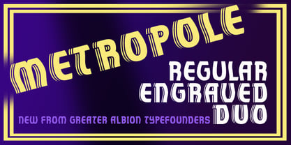
$12.00Metropole is an exercise in combing the curvaceous lines of the Art Nouveau with the solid character and simplicity of Art Deco. The resulting three display faces combine the spirit of the 20s and of the thirties, creating lively fun display faces for headings, signage and banners. These characterful faces with clear simple outlines are also ideal to lend a distinctive air to your web pages, or to create a distinctive 'house-style' for lettering. - Nerdropol by Typodermic,
$11.95As I perused the latest offerings in the realm of graphic design, I chanced upon a curious creation that caught my discerning eye. Nerdropol, an offspring of the Neuropol X typeface, is a simulated bitmap typeface that touts a bevy of striking effects. This digital wonder is designed to capture the essence of original pixel fonts, rendering each character with precision and attention to detail. As I delved deeper into Nerdropol’s aesthetic, I couldn’t help but marvel at its distinctly industrial feel. Indeed, this font exudes a hard-edged, high-tech vibe that is sure to turn heads and captivate the senses. Every letter, meticulously crafted to evoke a sense of raw, unadulterated power, is sure to make an impact in any project. Nerdropol takes things to a whole new level by limiting kerning to full pixel increments, further emphasizing its digital origins. This meticulous attention to detail serves to heighten the overall effect of the font, resulting in a truly unique and visually stunning experience. In conclusion, if you seek to infuse your graphic design projects with a touch of cyberpunk flair, look no further than Nerdropol. With its daring aesthetic and unrivaled attention to detail, this font is sure to take your creations to new heights of digital excellence. Most Latin-based European writing systems are supported, including the following languages. Afaan Oromo, Afar, Afrikaans, Albanian, Alsatian, Aromanian, Aymara, Bashkir (Latin), Basque, Belarusian (Latin), Bemba, Bikol, Bosnian, Breton, Cape Verdean, Creole, Catalan, Cebuano, Chamorro, Chavacano, Chichewa, Crimean Tatar (Latin), Croatian, Czech, Danish, Dawan, Dholuo, Dutch, English, Estonian, Faroese, Fijian, Filipino, Finnish, French, Frisian, Friulian, Gagauz (Latin), Galician, Ganda, Genoese, German, Greenlandic, Guadeloupean Creole, Haitian Creole, Hawaiian, Hiligaynon, Hungarian, Icelandic, Ilocano, Indonesian, Irish, Italian, Jamaican, Kaqchikel, Karakalpak (Latin), Kashubian, Kikongo, Kinyarwanda, Kirundi, Kurdish (Latin), Latvian, Lithuanian, Lombard, Low Saxon, Luxembourgish, Maasai, Makhuwa, Malay, Maltese, Māori, Moldovan, Montenegrin, Ndebele, Neapolitan, Norwegian, Novial, Occitan, Ossetian (Latin), Papiamento, Piedmontese, Polish, Portuguese, Quechua, Rarotongan, Romanian, Romansh, Sami, Sango, Saramaccan, Sardinian, Scottish Gaelic, Serbian (Latin), Shona, Sicilian, Silesian, Slovak, Slovenian, Somali, Sorbian, Sotho, Spanish, Swahili, Swazi, Swedish, Tagalog, Tahitian, Tetum, Tongan, Tshiluba, Tsonga, Tswana, Tumbuka, Turkish, Turkmen (Latin), Tuvaluan, Uzbek (Latin), Venetian, Vepsian, Võro, Walloon, Waray-Waray, Wayuu, Welsh, Wolof, Xhosa, Yapese, Zapotec Zulu and Zuni. - Neuropolitical by Typodermic,
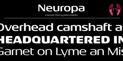
$11.95The world of graphic design is a vast and diverse space, with an array of tools, techniques, and resources at the disposal of a designer. However, one crucial aspect of any designer’s arsenal is their choice of typography. The right typeface can elevate a design from mediocre to magnificent, and Neuropolitical is a prime example of just that. Neuropolitical is an ultramodern display typeface that exudes a technical appearance, making it the perfect choice for designs that require an industrial edge. The wide, square curves and sharp ends of the letterforms give your message a voice of efficiency, making it ideal for conveying complex concepts and ideas. Inspired by the iconic 1990s techno typeface, Neuropol, Neuropolitical takes things to the next level. With seven weights and italics, this typeface offers a versatile range of options to fit a multitude of design scenarios. The typeface’s wider design allows for a greater emphasis on the individual characters and the space they occupy, enabling designers to create impactful and memorable designs with ease. But Neuropolitical is not just a tool for the masses, it is a statement of its own. Its wider design embodies the spirit of industrialism and precision, giving designers a new level of control over their designs. The carefully crafted letterforms of Neuropolitical are a testament to the dedication and skill of its designers, resulting in a typeface that is both visually stunning and highly functional. So, whether you’re looking to create a poster, a logo, or a website, Neuropolitical is the typeface for you. It will give your message the power and presence it deserves, leaving a lasting impression on your audience. In a world where first impressions are everything, Neuropolitical is the perfect choice for designers looking to make an impact. Most Latin-based European writing systems are supported, including the following languages. Afaan Oromo, Afar, Afrikaans, Albanian, Alsatian, Aromanian, Aymara, Bashkir (Latin), Basque, Belarusian (Latin), Bemba, Bikol, Bosnian, Breton, Cape Verdean, Creole, Catalan, Cebuano, Chamorro, Chavacano, Chichewa, Crimean Tatar (Latin), Croatian, Czech, Danish, Dawan, Dholuo, Dutch, English, Estonian, Faroese, Fijian, Filipino, Finnish, French, Frisian, Friulian, Gagauz (Latin), Galician, Ganda, Genoese, German, Greenlandic, Guadeloupean Creole, Haitian Creole, Hawaiian, Hiligaynon, Hungarian, Icelandic, Ilocano, Indonesian, Irish, Italian, Jamaican, Kaqchikel, Karakalpak (Latin), Kashubian, Kikongo, Kinyarwanda, Kirundi, Kurdish (Latin), Latvian, Lithuanian, Lombard, Low Saxon, Luxembourgish, Maasai, Makhuwa, Malay, Maltese, Māori, Moldovan, Montenegrin, Ndebele, Neapolitan, Norwegian, Novial, Occitan, Ossetian (Latin), Papiamento, Piedmontese, Polish, Portuguese, Quechua, Rarotongan, Romanian, Romansh, Sami, Sango, Saramaccan, Sardinian, Scottish Gaelic, Serbian (Latin), Shona, Sicilian, Silesian, Slovak, Slovenian, Somali, Sorbian, Sotho, Spanish, Swahili, Swazi, Swedish, Tagalog, Tahitian, Tetum, Tongan, Tshiluba, Tsonga, Tswana, Tumbuka, Turkish, Turkmen (Latin), Tuvaluan, Uzbek (Latin), Venetian, Vepsian, Võro, Walloon, Waray-Waray, Wayuu, Welsh, Wolof, Xhosa, Yapese, Zapotec Zulu and Zuni. - Neuropa by Device,
$39.00 - Neuropol X Free - Unknown license
- HKI metropol - Unknown license
- Metropol Noir by Device,
$29.00 - Outdoor Cafe JNL by Jeff Levine,
$29.00 - Press Gothic by Canada Type,
$24.95Press Gothic is a revival of Aldo Novarese's Metropol typeface, released by Nebiolo in 1967 as a competitor to Stephenson Blake's Impact (designed by Goeffrey Lee). Though Metropol enjoyed a few short months of popularity and use in Italy, Germany and France, Impact won the technological outlasting battle by moving on to film type then to computer outlines bundled with mainstream software, while Metropol never made it past the metal state until now. Too bad really, since this is one of the few faces that could have played well with all the horrendous stretch'n'squeezing of the 1970s. Just like its inspiration, Press Gothic aims to be a fresh alternative to big economical poster fonts with clear sans serif forms and an urgent, strong, yet elegant design appeal. In the summer of 2008, Press Gothic underwent a major linguistic and aesthetic reworking for an international publishing company. The result of this on the retail side are new small capitals and biform/unicase additions to the main font, as well as expanded language support that includes Cyrillic, Greek, Turkish, Baltic, Central and Eastern European, Maltese, and Esperanto. Press Gothic Pro, the OpenType version, combines all three fonts into one, taking advantage of the small caps feature, and the stylistic alternate feature for the biform shapes. - Grand Hotel Pro by Stiggy & Sands,
$39.00Our Grand Hotel Pro finds its inspiration from the title screen of the 1937 film “Cafe Metropole” starring Tyrone Power. This condensed upright connecting script has a classic flair and weight to it that feels subtly tied to Holiday and Bakery themed designs, even though it can work outside that genre. Stylistic Alternates offer a non-swash set of Capitals, and a SmallCaps feature gives this upright script an exciting visual twist. Elegant, reserved, sophisticated, and yet festive all at once. Grand Hotel Pro is a style revival that still finds a strong visual appeal today. Opentype features include: - SmallCaps. - Full set of Inferiors and Superiors for limitless fractions. - Tabular, Proportional, and Oldstyle figure sets. - Stylistic Alternates for less stylized traditional Capitals. - Contextual Alternates for some initial and final forms. - Gaultier by Borutta Group,
$39.00Gaultier is the result of over 5 years of work on a typeface inspired by my favourite creators in European typography – Claude Garamond, Robert Granjon and Eric Gill. The main idea of the project was to create a sans-serif antiqua with all features reserved for serif typefaces. In addition to the rich set of characters, Neuropa includes: Small Caps, Superscript, Subscript, Ligatures, Discretionary Ligatures, Contextual Alternates, Swash Variants and 5 different styles of digits. Upright styles with delicate contrast corresponds with the expressive form of italics inspired by Granjon italic construction. Gaultier will work wherever we want to emphasize modernity without forgetting tradition. The sharp character of the whole family is perfect for longer texts, visual communications and branding purposes. - Grand Hotel is a captivating font that exudes a timeless charisma, embodying the essence of classic elegance with a contemporary twist. Designed by the Astigmatic One Eye Typographic Institute, this ...
- Etrusco Now by Italiantype,
$39.00Etrusco Now is the revival of a lead typeface originally cast in lead by Italian foundry Nebiolo in the early 1920s. Heavily inspired by the design of the Medium weight of Schelter & Giesecke's Grotesk, Etrusco was, like Cairoli, an early precursor of the modernist grotesque superfamilies: a solid, multi-purpose "work-horse" typeface family that could solve a wide range of design problems with its range of widths and weights. When designing the new incarnation of Nebiolo's Etrusco, the Italiantype team directed by Cosimo Lorenzo Pancini and Mario de Libero decided to extend the original weight and width range to keep this "superfamily" approach. Etrusco Now has twenty-one styles widths in three widths of seven weights each, with matching italics; the original weights for the typeface have been collected in the Etrusco Classic subfamily. Etrusco Now new widths allowed the team to include in the design many nods and homages to other vintage classics of Nebiolo. The lighter weights of the normal width have been heavily influenced by the modernist look of Recta, while the heavy condensed and compressed widths refer to the black vertical texture of Aldo Novarese's Metropol. This infuses the typeface with a slightly vintage mood, making Etrusco at the same time warmly familiar and unexpected to eyes accustomed to the formal and cold look of late modernist grotesques like Helvetica. Contemporary but rich in slight historical quirks, Etrusco Now is perfect for any editorial and branding project that aims to be different in a subtle way. Etrusco Now's deviations from the norm are small enough to give it personality without affecting readability, while its wide range of open type features (alternates, stylistic sets, positional numbers) and language coverage make it a problem solver for any situation. Like its cousin Cairoli, Etrusco is born out of love for lost letterforms and stands like its lead ancestor from a century ago, at the crossroads between artsy craftsmanship and industrial needs. - Roundabout by URW Type Foundry,
$35.99Roundabout is a typeface that is extracted from an ellipse shape. Each and every character started at the same geometrical figure. By cutting it up in sections, twist and rotate the separate characters could be build. The ellipse provides this typeface with evident and smooth looking features. The name Roundabout is misleading, an ellipse is not round. But the word Roundabout has a nice ring to it and it seems to fit this typeface perfectly. The Roundabout as we know it is a place where the traffic circles. Sometimes in the greater metropoles it jams like clotting veins. Various exits are presented for those who know which way to go, for those who don’t it seems an eternal treadmill. Unlike my typeface, that seems rather careless, light weighted and knows her way around. A roundabout in a child’s mind is a playful carrousel or a merry go round. Merry go round has the sweetest sound and a match is found. My Roundabout is a joyful, optimistic and open typeface, which can be used over and over and over again for many or any purposes. ----- Roundabout ist eine Schrift die aus der Form einer Ellipse entstand. So teilen alle einzelnen Zeichen denselben geometrischen Ursprung. Durch das zerteilen, verdrehen und verflechten der elliptischen Grundform konnten die separaten Zeichen so geformt werden, dass sie einen klaren und weichen Charakter erhielten. Der Name Roundabout scheint auf den ersten Blick etwas irreleitend - ist eine Ellipse ja nicht wirklich rund. Er hat aber einen schönen Klang und doch eine tiefe Verbindung zu dieser Schrift. In unseren Gedanken ist Roundabout ein Kreisverkehr: Manchmal, in großen Städten, kann er blockieren, so wie eine verstopfte Ader. Verschiedenste Auswege zeigen sich denen, die ihr Ziel kennen; für alle anderen erscheint dieser Ort wie eine endlose Schlaufe. Dieses Bild widerspricht dem Auftreten meiner Schrift, welche eher sorglos und leichtfüßig ist; sie kennt ihren Weg. In dem Kopf eines Kindes jedoch ist ein Roundabout ein verspieltes Karussell, ein „merry go round“. ,,Merry go round“ klingt bezaubernd und so fiel die Entscheidung. Meine Roundabout ist eine fröhliche, optimistische und offene Schrift, die immer und immer wieder genutzt werden kann, zu jedem erdenklichen Zweck.


