10,000 search results
(0.015 seconds)
- High Hopes by Ana's Fonts,
$15.00 High Hopes is a quirky handmade serif font with variations that show up "randomly" through contextual alternates, true italics and ornaments. Use this font in designs such as postcards and notes, posters, logotypes, social media posts, branding and packaging. High Hopes includes: Regular font with three contextual alternates for each letter Italic font with three contextual alternates for each letter Ornaments font with swashes and frames
 - Just Hopes by Maulana Creative,
$12.00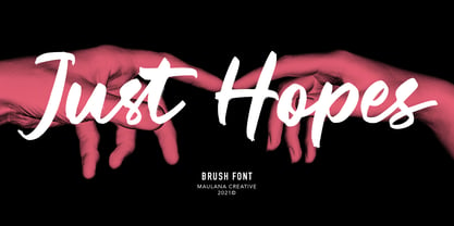 Just Hopes is an script font. With natural feel brush stroke, slanted and fun character with a bit of ligatures and vector version. To give you an extra creative work. Just Hopes font support multilingual more than 100+ language. This font is good for logo design, Social media, Movie Titles, Books Titles, a short text even a long text letter and good for your secondary text font with sans or serif. Make a stunning work with Just Hopes font. Cheers, MaulanaCreative
 - Bubble Dope by Arendxstudio,
$13.00 Bubble Dope - Groovy Display Font is a font with distinctive handwritten characters perfect for branding projects, logos, wedding designs, media posts, advertisements, product packaging, product designs, labels, photography, watermarks, invitations, stationery, and any project who need handwritten dishes. Features : • Character Set A-Z • Numerals & Punctuations (OpenType Standard) • Accents (Multilingual characters) • Ligature Multilingual Support : Afrikaans, Albanian, Asu, Basque, Bemba, Bena, Catalan, Chiga, Cornish, Danish, English, Estonian, Faroese, Filipino, Finnish, French, Friulian, Galician, German, Gusii, Icelandic, Indonesian, Irish, Italian, Kabuverdianu, Kalenjin, Kinyarwanda, Low German, Luo, Luxembourgish, Luyia, Machame, Makhuwa-Meetto, Makonde, Malagasy, Malay, Manx, Morisyen, North Ndebele, Norwegian Bokmål, Norwegian Nynorsk, Nyankole, Oromo, Portuguese, Romansh, Rombo, Rundi, Rwa, Samburu, Sango, Sangu, Scottish Gaelic, Sena, Shambala, Shona, Soga, Somali, Spanish, Swahili, Swedish, Swiss German, Taita, Teso, Vunjo, Zulu
 - Horst More by MIX.Jpg,
$10.00 Horst More is a retro soft serif typeface comprising 18 fonts. It can handle most typographic applications from branding to body copy with its range of weights and inherent legibility. Whatever you type will have a friendly message, but it really comes into its own when you start applying some of the additional ligatures and alternates that are built into this type family. You’ll soon be creating distinctive typographic compositions that are pleasing to the eye. There are 18 fonts, 9 weights altogether. It has an extensive character set that covers all Latin European languages. Key features: 9 weights in Roman and Italic Alternates Ligatures Thanks for visiting and purchasing my font! Ekayasa Mix.Jpg
 - Moving Forward by Crumphand,
$20.00 Introducing, Moving Forward a Slab Serif Font. inspired by vintage and modern letterforms with alternate characters and full symbol sets. Moving Forward can be used for posters, web headers, and display text of all kinds. good kerning and readable.
 - 36 Dope by Power Type,
$- 36Dope is a display typeface with an experimental serif design. It draws from the event ’36DaysOfType’ held in 2023. Created as part of the ’36DaysOfPower’ theme, this font showcases unique and unconventional serifs, reflecting the creative and powerful spirit of the event. With its bold and experimental look, 36dope is well-suited for attention-grabbing headlines, titles, or graphic design projects that aim to convey a sense of strength and artistic innovation. This font is intended for eye-catching headlines, titles, or other graphic design projects that require a bold and experimental look.
 - Black boys on mopeds - Unknown license

- KG Only*Hope - Personal use only

- More than Enough - Personal use only

- More than Enough - Personal use only

- Eat More Chocolate - Personal use only

- More than human - Unknown license

- KR Moving Day - Unknown license

- KR More Holidays - Unknown license

- Four More Years - Unknown license

- AT Move Altera by André Toet Design,
$39.95 ALTERA a typeface based on a logotype André Toet made for a dutch broadcast company. This typeface is in fact carries a transformation in itself: it’s composed of three different weights and shapes. In our humble opinion the possibilities are endless ! So be a sport and use this typeface for logo’s and headings. Kick the can ! Concept/Art Direction/Design: André Toet © 2017
 - AT Move Wyggle by André Toet Design,
$39.95 WYGGLE is a dynamic (capital) font taken from my Alphatool project. It’s an interesting typeface which can be used for interior and/or exterior (3D projects). Concept/Art Direction/Design: André Toet © 2017
 - Moving Message JNL by Jeff Levine,
$29.00 A vintage printer's cut for the masthead of the "Fed-O-Gram" (a monthly publication of the Farm Bureau Federation, Inc.) had its title set in letters that emulated a moving message board. This design formed the basis for what is Moving Message JNL.
 - AT Move Powerplay by André Toet Design,
$39.95 POWERPLAY a monospace lowercase alphabet with a 3D twist. Designed by André Toet in 1976 (during his study at Central School of Art & Design, London, UK) and he redesigned this in 2011. The name Powerplay is based on the Battersea Power Station, London. The remarkable architecture of the building is also used as a decor for films and for one of the covers by Pink Floyd (Animals, the flying pig). Concept/Art Direction/ Design: André Toet © 2017
 - AT Move Nath! by André Toet Design,
$75.00 NATH !* Is a peculiar typeface. It’s design came by the fascination of Optical Illusions and 3D on a flat surface, like with Holborn and Powerplay. The typeface is named after a girlfriend of André Toet. *Made in the UK, 1974, London (Central School of Art & Design). (Redesigned 2013 by André Toet / Jasper Terra). Concept/Art Direction/Design: André Toet © 2017
 - EF More Kaputt by Elsner+Flake,
$35.00 - Rithalica Jope Babes by Akrtype Studio,
$19.00 Presenting Riethalica Jope Babes luxury chic handwritten font Handwriting that is light and made as natural as possible to give the impression of pure digitalized handwriting, So that in its use it can give the true beauty of handwriting. And suitable for use in various media such as advertisements, web templates, invitations, social media templates, posters, weddings, and many more Riethalica Jope Babes luxury chic handwritten font include ligatures, capital letters and alternate letters. You need a program that supports OpenType features like Adobe Illustrator, Adobe Photoshop CC, Adobe Indesign and Corel Draw. and you can also access alternative flying machines via Font Book (Mac users) or Windows Character Map (Windows users).
 - ZP Monsterz More by Illustration Ink,
$3.00 This adorable, blocky font features monster elements and fur on each letter. Great for Halloween or just fun projects for kids.
 - AT Move Decoupe by André Toet Design,
$39.95 Découpé Based on a French children’s play from 1906. In a car boot sale André Toet found a funny looking box containing a lot of cut out cardboard figures, in fact it looked a bit like a geometric puzzle! He played around a bit and succeeded to create a workable typeface with it ! The interesting thing about this particular font is, that in fact it’s organized chaos. The 26 letters of the alphabet are a mix between caps and lowercases, so within one word caps and lowercases will be used next to each other. It’s a very useful font for different projects. Concept/Art Direction/Design: André Toet © 2017
 - AT Move Specx by André Toet Design,
$39.95 SPECX This is my #11/12 Font a slabserif typeface. In fact it’s a very, very basic and extreme strong typeface! We gave this new Font a special touch by adding an extra family-member: a stencil-version of the SPECX. My inspiration for the SPECX is based on the cover of a 1955 French School-Notebook. Concept/Art Direction/Design: André Toet © 2017
 - San de More by Kereatype,
$12.00 San de More is a Variable family Serif font. A Hype of summer-themed brings us to express a thirst for creating a product that can help you to choose fonts for your creations. Like as we are on the preview above, how the fonts can "stand" within your design. San de More is created on a 5 weight with italics style. You won’t be worried about which one fits your creative design. Also, You can Mix it up all of it without worrying about design collision. No special software is required to type out the standard characters of the Typeface. To access the Opentype Ligatures and Alternates you will need software that supports Opentype features in fonts. San de More Features: Multilanguage Alternates PUA Encoded Ligatures Very easy to use in any software (Instructions included). If you have any questions, please feel free to get in touch. Thank you
 - More Than Life by Ronny Studio,
$19.00 The More Than Life Bubble graffiti tag font is a typography style commonly used in street art and graffiti culture. It features rounded and inflated letters that create a three-dimensional, bubble-like effect. This style is often used for tagging, a form of graffiti in which an artist writes their name or a stylized chosen word to mark their territory or establish their presence. This font is perfect for your design needs with a graffiti theme. Features : - All Caps - numbers and punctuation - multilingual - PUA encoded Please contact us if you have any questions. Enjoy Crafting and thanks for supporting us! :) Thank you
 - One More Typewriter by Ana's Fonts,
$15.00 One More Typewriter font is a monospaced typewriter font in two styles: Regular and Italic, and two weights: Regular and Bold. This makes it versatile and ready to use in modern and vintage designs alike. This font is also very legible at a wide range of sizes and looks great in both long or short texts, in digital collages, branding and packaging, social media posts, logotypes, etc.
 - AT Move Frutta by André Toet Design,
$39.95 FRUTTA (Fruit) is a new typeface made with the ever expanding food industry in mind. But don’t let that deter you from using our font on the cover of the forthcoming cd of the Black Keys or Beady Eye or Damon Albarn or Paul Weller or Daft Punk or Whatever... Concept/Art Direction/Design: André Toet © 2017
 - AT Move Straw by André Toet Design,
$39.95 STRAW The inspiration for this capital alphabet came from those beautiful haystacks you see in summer and the old fashioned Mikado game! We wanted to create a light, fragile and airy typeface with an optical effect. And here it is ... it’s just STRAW ! Concept/Art Direction/Design: André Toet © 2017
 - More Or Less by Hanoded,
$15.00 More Or Less was made with a permanent marker pen on thin Japanese paper. It is a handwritten note-style font with an uneven baseline and zippy glyphs. Comes with bells & whistles and a whole bunch of diacritics.
 - AT Move Wolfszn by André Toet Design,
$39.95 WOLFSZN Anniversary! WOLFSZN is the tenth Font of André Toet. The inspiration for this capital alphabet came from the trails of an agricultural machine (think tractor) leaves in the soil after working the land. But it’s not meant to be ‘like a heavy workload’, in fact to us it seems like a very useful Font for headings, logotypes, advertising or films. We hope WOLFSZN will be happily and wisely used by my dear colleagues. Concept/Art Direction/Design: André Toet © 2017
 - AT Move Bulky by André Toet Design,
$39.95 BULKY is the 19th Font of André Toet. It’s Unusual, it’s Heavy, it’s Irregular, it’s Rough, it’s Stripy, it’s Angular, it’s BULKY. But it has character and extremely useful for headings, posters and even logotypes. Just-Use-It! Concept/Art Direction/Design: André Toet © 2017
 - AT Move PiPi by André Toet Design,
$39.95 PiPi is named after a happy Italian cat with a remarkable pattern, color and attitude. Designed by Andre Toet in 2011. Every letter is a different expression in itself although it has an identical base. It gives a joyful feeling to use this font in all your designs whether they be graphic or digital. M E O O O W ! Concept/Art Direction/Design: André Toet © 2017
 - Moving Headlines JNL by Jeff Levine,
$29.00 For decades, visitors to Times Square could look up and read the up-to-the-minute news flashes that moved across a giant electric sign on the face of the old New York Times Building (now known simply as One Times Square). According to Wikipedia's article on OneTimes Square: "On November 6, 1928, an electronic news ticker known as the Motograph News Bulletin (colloquially known as the "zipper") was introduced near the base of the building. The zipper originally consisted of 14,800 light bulbs and a chain conveyor system; individual letter elements (a form of movable type) were loaded into frames to spell out news headlines. As the frames moved along the conveyor, the letters themselves triggered electrical contacts which lit the external bulbs (the zipper has since been upgraded to use modern LED technology)." An example of this was seen in the 1933 Warner Bothers film "Picture Snatcher" starring James Cagney. This example inspired Moving Headlines JNL.
 - AT Move Holborn by André Toet Design,
$39.95 HOLBORN Aptly named after ‘High Holborn’, a high-street in London where the Central School of Art & Design was based. A font, just in capitals, based on the original design and the earlier sketches (1976) by André Toet. The strong optical illusion in this alphabet makes it an outstanding typeface. Concept/Art Direction/Design: André Toet © 2017
 - AT Move MMM by André Toet Design,
$75.00 MMM is a sturdy Typeface, the design is based on a old Soap-Powder advertisement. MMM is very useful for headings and/or logotypes. André Toet his 17th Font Caps, Lowercase. With Numbers, Glyphs and the normal Punctuation. Use this Font well, it’s made with the greatest care. Concept/Art Direction: André Toet © 2017 - Design: André Toet / Jasper Terra
 - AT Move Quipo by André Toet Design,
$39.95 QUIPO is a typeface based on my recent survey (Freeflow) on hand drawn logotypes used by American and English pop groups in the 60-70s. We thought it an interesting project and a free flow exercise to design this particular font just in capitals and well... yes it’s rather ‘bulky’. Needless to say it comes with numbers and the normal punctuations ! Concept/Art Direction/Design: André Toet © 2017
 - More Than Enough by Kimberly Geswein,
$5.00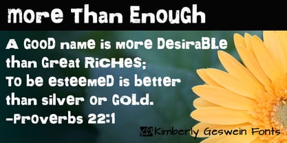
- More Modern Flow by T-26,
$19.00


