67 search results
(0.012 seconds)
- Sella Mella by Crowntype Studio,
$12.00 Sella Mella is a script type family of four fonts. It is inspired by Lovely Fonts and has a soft and welcoming look. Sella Mella can be used for branding, packaging and wherever you need a script font that is easy to read and smooth. Sella Mella has many ties, strokes, and alternative characters that will make your designs unique and beautiful. You can also purchase Sella Mella as a Font Family and adjust the weight of Sella Mella seamlessly between Italic and Bold weights. Note that you need design software that supports the Font Family. Thank You...
 - Mielle CF by Connary Fagen,
$25.00 Flowing like warm honey, Mielle® CF is a playful cursive script perfect for logos, signage, and posters. Automatic ligatures and contextual letters flow across Mielle's six weights. Mielle® CF pairs well with simple, elegant typefaces that won’t compete for visual attention, such as Artifex CF and Artifex Hand CF. Please note that some contextual glyphs may not appear in the generated previews, but will work correctly in the full typeface. All typefaces from Connary Fagen include free updates, including new features, and free technical support.
 - Milla Grace by LABFcreations,
$12.00 Milla Grace is a modern & classic font. This font is ideal for creating logos and branding. With original ligatures. It works perfect for creating sites, logos, striking editorials, invitations, graphic quotes, and more. Uppercase Characters & Discretionary Ligatures. Multilingual support for various languages. For presentation image, pairing script font: Carphe | Modern Luxury Duo font Follow me by Instagram: @labfcreations Made in France with LOVE. © LABFcreations
 - Mischstab Umbrella Patina - Unknown license

- Under My Umbrella by Hanoded,
$15.00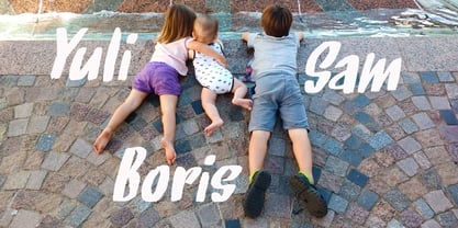
- Milla Cilla - Personal Use - Personal use only

- Bumbershoot by Ingrimayne Type,
$9.00 Bumbershoot is a typeface for a rainy day. A letterbat font constructed of umbrellas, it does not have true lower-case letters. Rather it has two mostly different sets of upper-case characters.
 - Diagonal ND by Neufville Digital,
$29.60 Inspired by Barcelona’s Diagonal street, Antoni Morillas designed Diagonal ND in 1970. A sans that alternates straight and inclined lines, with a strong rhythm and its own personality. Its range of possible usages are very varied: signage, headlines, packaging, etc. Diagonal is a Trademark of BauerTypes SL
 - Bellucci by Re-Type,
$45.00 Bellucci is the redesign of Ramiro Espinoza's first typeface, Mabella. Being not happy with the original design, he decided to redraw it completely and add 3 new weights. Bellucci is a constructivist, modular, compressed family intended for headlines and posters. The name is an homage to Mabel Bellucci, an Argentinian feminist activist.
 - Party Doodles Too by Outside the Line,
$19.00 Party Doodles Too is the companion font to the popular font Party Doodles. 29 fun icons including a tray of champagne glasses, appetizers, balloons, pinwheel, stork with a baby, ace of hearts playing card, top hat and tunes, dice, bowling ball and pins, gifts, party umbrellas, cakes, cupcakes, ice cream, lollipop, drinks, corkscrew, noise makers, banners and candy.
 - Surfoid by astroluxtype,
$20.00 Surfoid is a bold, soft, hazy, lazy and sleepy font-dude that is most happy under an umbrella at the beach holding a drink with an umbrella in the glass. It’s fun, fun, fun until daddy takes the T-Bird away because of the problems that too much fun creates. It’s a rounded off, a little blurry on the lazy edges and would never want to be a serif font. Serif is not the style of Surfoid. Dressed up and sophisticated, this font never wants to be in a suit and tie. Happy is to be in tie dye t-shirt…with its feet dug deep into the cool sand. This is a display headline font best seen at sizes greater than 36 points. It is a full glyph set with upper and lowercase forms. Very Stoked.
 - Diaper Bag by Bellafonts,
$25.00 Diaper Bag is a ding bat font providing images related to baby: bottles, pacifiers, rattles, cribs, bassinets, safety pins, and some random things like umbrellas (for a baby shower), expecting moms, storks, baby feet, teddy bear, rubber duckey, booties, teething ring, etc. You can use these to make baby shower invites, baby announcements, and anything you can customize with your own design. Bellafonts' user license allows for commercial use so you can make products for re-sale, including services offering graphic design.
 - Kelly by Kaligra.co,
$29.00 Kelly is Sans serif Version of Mikela Typeface. It is a Bold Minimalist Elegant Modern vintage font with beautiful ligatures, tons of special alternative glyphs, ornament and multilingual support. It's a very versatile font that works great in large and small sizes. Perfect for branding projects, Logo design, Clothing Branding, product packaging, magazine headers, or simply as a stylish text overlay to any background image. HOW TO ACCESS ALTERNATE CHARACTERS Open glyphs panel: In Adobe Photoshop go to Window - glyphs In Adobe Illustrator go to Type - glyphs
 - Mene One Mexicali by Handselecta,
$38.00This style mimics the flare or upward fade that comes with the use of a spray paint can, as the tops of the letters flare, and become wider. An original font style, named after the border town of Mexicali, this font style falls under the larger umbrella of what is called Cholo-graffiti style. Originally from New Jersey, MENE has made his home in, New York City. He had a brief albeit satisfying career of street bombing in the late 90s that saw its end with a brief encounter with the Vandal Squad. Now a family man, Mene has dedicated himself to the preservation and education of style in its many forms. - Linotype Sicula by Linotype,
$29.99Linotype Sicula, from German designer Roberto Manella, is part of the TakeType Library, chosen from the entries of the Linotype-sponsored International Digital Type Design Contest 1999 for inclusion on the TakeType 3 CD. It is available in two weights, regular and oblique. Linotype Sicula will quickly win over any nostalgic spirits. Ornamental and sweeping, the figures line up on the paper, their contrasting strokes and playfully irregular forms giving them an exuberant, decorative character. The careful details of each figure come to light best when used in larger point sizes. Linotype Sicula is therefore best for headlines and can easily inspire typographic experiments and its capitals can serve as initials combined with other typefaces, especially sans serif. - Mozer by Fontfabric,
$29.00 Mozer is a semi-condensed neo-grotesque type family of 16 styles ranging from Thin to Black matched with true italics. With a generous x-height, economical width, moderate contrast and overall solid appearance this typeface shows an uncompromising legibility merged with a contemporary spirit that has not lost its individuality, even in the small details like the discreet ink traps. Mozer covers Extended Latin, Cyrillic and Greek and is suited with plenty of OpenType features, such as localisations, ligatures; four type of numerals including figures and tabular; case-sensitive forms; alternatives etc. Mozer comes accessible and closer to all designer’s needs. Features: • Over 790 glyphs in 16 styles (Thin to Black); • Extended Latin, Cyrillic and Greek scripts for more than 130 languages; • Tall and balanced x-height; • Semi-condensed width proportions; • Moderate contrast and vertical stress; • Neo-grotesque characteristics and terminals with humanistic flavor. Designers: Ani Petrova, Mirela Belova, Nikolay Petroussenko
 - Tita Script by Latinotype,
$59.00 Tita is dedicated to my grandmother Hebe, witty and arrabalera 1. The font is inspired by Milonga 2 music and the fileteado porteño 3. I picture it at The Moulin Rouge, sparkling, provocative, loving. It evokes Tita Merello and my grandmum singing her music. Tita is Argentinean to its very core. A font to shout goal and dulce de leche 4 with passion! Its curves originate from polirhythmic calligraphy, which I learnt from my mentor Silvia Cordero Vega. Tita is a pedigree script that is based on hand lettering and Sandra Biondi’s calligraphy works. Font digitalisation by Daniel Hernández. Edited by Javier Quintana / Programmed by Manuel Corradine. 1. A person from the arrabal (a working class neighborhood on the outskirts of the city of Buenos Aires) 2. Musical genre originated in the Río de la Plata areas of Argentina and Uruguay 3. Decorative hand lettering and artistic style that is frequently spotted in Buenos Aires 4. Sweet milk sauce
 - Waialua by insigne,
$24.99 Aloha to Waialua! Put on your lei and grab a drink umbrella as you kick back and start designing with this island beauty of a font. Soak in the unprecedented potential of this new font. Waialua is one of insigne’s first variable fonts. Avoid the font limbo with a set number of options from Thin to Black. Go with the flow and see where you feel the innumerable amount of weights taking you as you slide your design options along a spectrum of stunning possibilities. There's more, too. Waialua’s auto-replacing terminators allow you never to need connectors at the end of your words. Or if you want, you can dial up your design with optional swash endings. So set your course for the islands and get ready for a fun time with the tropical beauty of Waialua. This is one font vacation your work--and your reader--will never want to end. Production assistance from Lucas Azevedo.
 - The Milla Cilla font by Typhoon Type - Suthi Srisopha is a charming and visually engaging script font crafted with a personal touch in mind. Designed to reflect a hand-drawn aesthetic, it exudes warm...
- Amorie by Kimmy Design,
$12.00 Amorie is a tall and skinny hand drawn font. It comes in various weight and styles, and with an array of opentype options. Built to appear completely hand crafted, different designers could produce completely different results, selecting either Modella (classic and chic), Nova (fun and fancy) or SC (Small Caps and all business.) Each style comes in light, medium and bold and has an accompanying italics version. Opentype for this font includes Contextual Alternatives, which produces three versions of each character, making sure no two identical letters appear next to each other thus giving your design a fully authentic look. There are also stylistic alternatives, which offer different style to a select few characters, including capital letters: A, K, R, Q, Y and lowercase letters: a, e, k, t, y. Lastly, is a large set of swashes, 3 for each letter they accompany. For the most part this includes the whole uppercase alphabet as well as lower case letters with an ascender or descender. Amorie includes a large set of graphic extras, including stylish frames, arrows, line breaks, corners, flourishes and more. The complete package gives you one unbeatable font family. If you do not use Opentype but are using a program that includes a full glyph panel, you will be able to access each of the style variations you want.
 - LT Beverage is the life of the font party, showing up fashionably late with a pineapple hat and a coconut bra! Its letters are like little party animals, dancing on the page and leaving a trail of co...
- Brass by HiH,
$8.00 The Brass Family has a lineage that extends into English history. About five hundred years ago a devout, but anonymous Englishman gave glory to the God he worshipped by designing the capital letters and decorations of these two fonts. Originally recorded in The History Of Mediaeval Alphabets And Devices by Henry Shaw (London 1853), they are described by Alexander Nesbitt in his Decorative Alphabets And Initials (Mineola, NY 1959) as “Initials and stop ornaments from brasses in Westminster Abbey.” I wish I could say I remember seeing them when I was there, but that was forty-two years ago and all I remember was seeing the tomb of Edward the Confessor. One definition of “stop” as a noun is a point of punctuation. I have heard people from the British Isles speak of a “full stop” when referring to a period. Some may remember a 19th century form of communication called a telegram being read aloud in an old movie, with the use of the word “stop” to indicate the end of a sentence or fragment. A full dozen of these stop ornaments are provided. They occupy positions 060, 062, 094, 123, 125, 126, 135, 137, 167, 172, 177 & 190. The Brass Family consists of two fonts: Brass and Brass Too. Both fonts have an identical upper case and ornaments, but paired with different lower cases. Although the typefaces from which the lower cases were drawn are both of modern design, both are interpretations of the textura style of blackletter in use in England when the upper case and ornaments were fashioned for the Abbey. Brass is paired with Morris Gothic, which matches the color of the upper case quite well. Brass Too is paired with Wedding Regular, which is distinctly lighter than the upper case. I find it very interesting how each connects differently. The resulting fonts are unusual and most useful for evoking an historic atmosphere.
 - PF Tempesta Seven Condensed is a striking font crafted by the talented Yuusuke Kamiyamane, a font that embodies both functionality and aesthetic allure within its compact design. This font falls unde...
- Skullbats by Canada Type,
$24.95Patrick Griffin's sister is a really annoying individual sometimes. Not only is she into theater, but she thinks everyone else in the universe is into it as well. So once in a while tickets to local or provincial Shakespearean plays get delivered to the mailbox or dropped off on the living room's table. And once in a while the tickets just cannot be "lost" or ignored. Three or four times a year, Patrick must be subjected to Olde Englishe Speake, umbrella dresses and squeezetops, featherhats and men in leggings, rhyme and treason, mortality and immorality, drama inflicted by some mama, and it never ends. Last June it was Hamlet. Again. Someone's (wink wink) idea of a good time. There he goes, the Prince of Denmark, holding that skull with the tips of his fingers like it's an alien egg. Alas, poor Yorick! Yadda yadda boop-bop-a-loo-bop. And so the idea of a font made of skulls was born. And what can we possibly be but conduits for such abhorring ideas? Where be our gibes, our songs, our flashes of merriment? Skullbats has more skulls than you'll ever see in your lifetime. At least we hope so. Scary skulls, funny skulls, evil skulls, strange skulls, pixel skulls, fiery skulls, surprised skulls, happy skulls, sad skulls, cow skulls, sketched skulls, profiled skulls, light bulb skulls, cartoon skulls, techno skulls, alien skulls, expressionist skulls, pirate skulls, horned skulls, and skulls with whacky headgear. You name it, it's there. There's even a disco skull there for you. We lost count at 90 skulls, but there's a few more in there. For a complete showing of the skulls in the font, consult the image in the MyFonts gallery. Patrick's sister didn't turn out to be so bad after all. After making this font, he couldn't help but notice that her skull was a bit small compared to his. So now he takes every opportunity to remind her that the size of the cranium is relative to what it houses. Her upcoming halloween present will be a shirt with guess-what on it. Shirts, now there's putting Skullbats to good use! - TT Ricordi Marmo by TypeType,
$29.00 TT Ricordi Marmo useful links: Specimen | Graphic presentation | Customization options TT Ricordi Marmo extends the series of experimental projects within the TT Ricordi fonts collection. The main goal of the TT Ricordi project is to look for gems in old signs and on stone and bringing those inscriptions back to life in the form of contemporary fonts with the umbrella name TT Ricordi. TT Ricordi Marmo is an original experimental project by Eugene Tantsurin inspired by inscriptions at Basilica di Santa Croce in Florence. Working on it, we wanted to create a contemporary typeface that would unite the elements of a Florentine sans-serif mixed with more traditional visual solutions typical for the period's serifs. As a result, we got a bright and somewhat provocative typeface with irregular serif distribution, some unusual contours and a free spirit. In small body size TT Ricordi Marmo makes a neutral impression, but as the size gets bigger, the user is taken on a playful quest to search for interesting moves, graphic peculiarities and unusual solutions. TT Ricordi Marmo is great for poster design, packaging, and setting large and medium-sized inscriptions. Thanks to its idiosyncrasy, the typeface may look nice both at a poster in a grand academic theater and at an acid rave party. You can find a set of icon patterns that can be used in several ways. First, you can substitute letters with these patterns, thus getting an inscription with a visible graphic element. Then you can also construct borders and interval marks, or just use them as icons. All patterns are perfectly adapted to the design of letters in the font. TT Ricordi Marmo consists of 2 styles and one variable font. Each of the styles contains over 630 glyphs and 18 OpenType features. As we have conceived TT Ricordi Marmo as a poster typeface from the very beginning, it features small capitals instead of lowercase characters. In addition, the typeface has a set of interesting ligatures, stylistic alternates, pointers, hands, and pattern icons. TT Ricordi Marmo OpenType features list: AALT, CCMP, LOCL, NUMR, ORDN, TNUM, PNUM, CASE, SS01 (Alternative latin E), SS02 (Alternative Eszett), SS03 (Alternative Cyrillic I), SS04 ( Alternative Amper- sand), SS05 (Romanian Comma Accent), SS06 (Dutch IJ), SS07 (Catalan Ldot), DLIG, CALT, SALT.
 - Arsenica by Zetafonts,
$39.00 Arsenica is a serif typeface designed by Francesco Canovaro for Zetafonts, and developed by a design team including Mario De Libero, Andrea Tartarelli and Cosimo Lorenzo Pancini. The design of Arsenica takes its inspiration from Italian poster design at the beginning of the century, a time where typography, lettering and illustration where closely interwoven. Dawning nationalist movements, rather than using the modernist language, pushed on traditional Old Style letterforms often imbued with Art Nouveau and Deco sensibility. Artists like Giorgio Muggiani not only illustrated posters for Cinzano, Pirelli and Rinascente, but also provided logo design for newspapers, like "Il Popolo d'Italia". Starting from this mix of eclectic influences, Canovaro first developed the Arsenica Antiqua family, designed as display typeface that keeps the original Old Style low-contrast, wide proportions and quirky stylistic inventions. These where then distilled in a high contrast, Arsenica Display family, expanding the weight range to include both poster, ultra-bold weights and lighter weights that give the design a distinct calligraphic flavour. Bringing the letterforms into contemporary taste meant also developing alternate letterforms that were included in the Arsenica Alternate family, that drops the art nouveau details in favour of a more controlled modern serif aesthetic. Finally, Arsenica Text was developed by expanding the design space in the optical size axis, creating a low contrast, strongly readable old style typeface family, with a reduced weight set, oriented for long body copy typesetting. The final result is a superfamily of 41 weights, covering the design space with an expanded charset of over 900 glyphs, with full coverage of over 200 languages using latin and Cyrillic alphabets. All the weights of Arsenica come with a full set of open type features allowing to explore its vintage-inspired visual inventions thanks to stylistic sets, discretionary ligatures, contextual alternates and positional numbers. Two variable typefaces are included in the full family, allowing you to explore the design space and precisely control not only the weight but also the optical size design variations. • Suggested uses: perfect for elegant modern branding and logo design, fascinating editorial design, expressive packaging and countless other projects. • 43 styles: 7 weights + 7 italics, 4 different styles + 2 variable fonts. • 942 glyphs in each weight. • Useful OpenType features: Access All Alternates, Contextual Alternates, Case-Sensitive Forms, Glyph Composition / Decomposition, Discretionary Ligatures, Kerning, Lining Figures, Localized Forms, Mark Positioning, Mark to Mark Positioning, Oldstyle Figures, Ordinals, Stylistic Alternates, Stylistic Set 1, Stylistic Set 2, Stylistic Set 3, Stylistic Set 4, Stylistic Set 5, Stylistic Set 6, Stylistic Set 7, Stylistic Set 8, Stylistic Set 9, Slashed Zero. • 216 languages supported (extended Latin and Cyrillic alphabets): English, Spanish, Portuguese, French, Russian, German, Javanese (Latin), Turkish, Italian, Polish, Afaan Oromo, Azeri, Tagalog, Sundanese (Latin), Filipino, Moldovan, Romanian, Indonesian, Dutch, Cebuano, Igbo, Malay, Uzbek (Latin), Kurdish (Latin), Swahili, Hungarian, Czech, Haitian Creole, Hiligaynon, Afrikaans, Somali, Zulu, Serbian, Swedish, Bulgarian, Shona, Quechua, Albanian, Catalan, Chichewa, Ilocano, Kikongo, Kinyarwanda, Neapolitan, Xhosa, Tshiluba, Slovak, Danish, Gikuyu, Finnish, Norwegian, Sicilian, Sotho (Southern), Kirundi, Tswana, Sotho (Northern), Belarusian (Latin), Turkmen (Latin), Bemba, Lombard, Lithuanian, Tsonga, Wolof, Jamaican, Dholuo, Galician, Ganda, Low Saxon, Waray-Waray, Makhuwa, Bikol, Kapampangan (Latin), Aymara, Zarma, Ndebele, Slovenian, Tumbuka, Venetian, Genoese, Piedmontese, Swazi, Zazaki, Latvian, Nahuatl, Silesian, Bashkir (Latin), Sardinian, Estonian, Afar, Cape Verdean Creole, Maasai, Occitan, Tetum, Oshiwambo, Basque, Welsh, Chavacano, Dawan, Montenegrin, Walloon, Asturian, Kaqchikel, Ossetian (Latin), Zapotec, Frisian, Guadeloupean Creole, Q’eqchi’, Karakalpak (Latin), Crimean Tatar (Latin), Sango, Luxembourgish, Samoan, Maltese, Tzotzil, Fijian, Friulian, Icelandic, Sranan, Wayuu, Papiamento, Aromanian, Corsican, Breton, Amis, Gagauz (Latin), Māori, Tok Pisin, Tongan, Alsatian, Atayal, Kiribati, Seychellois Creole, Võro, Tahitian, Scottish Gaelic, Chamorro, Greenlandic (Kalaallisut), Kashubian, Faroese, Rarotongan, Sorbian (Upper Sorbian), Karelian (Latin), Romansh, Chickasaw, Arvanitic (Latin), Nagamese Creole, Saramaccan, Ladin, Palauan, Sami (Northern Sami), Sorbian (Lower Sorbian), Drehu, Wallisian, Aragonese, Mirandese, Tuvaluan, Xavante, Zuni, Montagnais, Hawaiian, Marquesan, Niuean, Yapese, Vepsian, Bislama, Hopi, Megleno-Romanian, Creek, Aranese, Rotokas, Tokelauan, Mohawk, Onĕipŏt, Warlpiri, Cimbrian, Sami (Lule Sami), Jèrriais, Arrernte, Murrinh-Patha, Kala Lagaw Ya, Cofán, Gwich’in, Seri, Sami (Southern Sami), Istro-Romanian, Wik-Mungkan, Anuta, Cornish, Sami (Inari Sami), Yindjibarndi, Noongar, Hotcąk (Latin), Meriam Mir, Manx, Shawnee, Gooniyandi, Ido, Wiradjuri, Hän, Ngiyambaa, Delaware, Potawatomi, Abenaki, Esperanto, Folkspraak, Interglossa, Interlingua, Latin, Latino sine Flexione, Lojban, Novial, Occidental, Old Icelandic, Old Norse, Slovio (Latin), Volapük.
 - Made For Japan by Font Aid V,
$20.00 In March 2011, the Society of Typographic Aficionados began organizing a collaborative project that would unite the typographic and design communities. The goal of Font Aid V: Made for Japan was to raise funds to expedite relief efforts after the devastating earthquake and tsunami in Japan. Nearly 300 contributors from 45 countries sent in over 500 glyphs in a single week. Behind the scenes, volunteers Neil Summerour, Silas Dilworth, Delve Withrington, and Grant Hutchinson were up to their elbows in Adobe Illustrator and Fontlab assembling the typeface. The sheer number of submissions coupled with the complexity of some of the designs caused unforeseen delays in completing the typeface. The team not only managed the immense influx of submissions, it also had several technical hurdles and multiple content reviews to mitigate before the final font could be produced. Several months after the project was initiated, Font Aid V: Made for Japan was finally ready for distribution. With the help of Sogo Japan, all proceeds from sales of this typeface will be delivered directly to organizations in Japan, such as Second Hand and AMDA International (Association of Medical Doctors of Asia). Sogo Japan strives to help circumvent regular international charity channels and the inefficiencies associated with them. Thanks to everyone who participated and helped us spread the word about the Font Aid V: Made for Japan project. In particular, we would like to acknowledge the following individuals and groups for their participation and involvement: Jonathan Abbott, Rui Abreu, Frank Adebiaye, Tim Ahrens, Anonymous, Eero Antturi, Leonardo Aranda, Hector Carrillo Aspano, Danielle Atnip, Alejandro Cabrera Avila, Christophe Badani, Joanne Gyo Young Bae, Ben Balvanz, Cynthia Bataille, Priyanka Batra, Donald Beekman, Hannes Beer, David Berlow, Kevin Beronilla, Fabian Bertschinger, Nicole Bittner, Bart Blubaugh, Dathan Boardman, Andrew Boardman, Joel Vilas Boas, Konstantin Boldovskiy, Scott Boms, Michael Browers, Vickie Burns, Matt Burvill, Daniele Capo, Seymour Caprice, Mauro Caramella, Matevž Čas, Eli Castellanos, Sarah Castillo, Tom Censani, Pinar Ceyhan, Ivette Chacon, Hin-Ching Chan, Sarah Charalambides, Karen Charatan, Sinde Cheung, Todd Childers, Justin Chodzko, Felipe Coca, Antonio Coelho, Jefferson Cortinove, Alan Lima Coutinho, Nick Cox, Nick Curtis, Girish Dalvi, Christopher DeCaro, Thomas C Dempsey, Matt Desmond, Chank Diesel, Anum Durvesh, Suzie Eland, Engy Elboreini, Craig Eliason, Emi Eliason, James Elliott, Grace Engels, Exljbris, Hillary Fayle, Carol Fillip, Jeff Fisher, Scott Fisk, John Foley, Stuart Ford, Mathias Forslund, Brock French, Anina Frischknecht, Eric Frisino, Chiyo Fujimori, Kaela Gallo, Ayesha Garrett, Harald Geisler, Alfonso Gómez-Arzola, Adriana Esteve González, Richard Gregory, James Grieshaber, Grupoingenio, Kemie Guaida, Carlos Fabián Camargo Guerrero, Rachel Han, Erin Harris, Stefan Hattenbach, Magnus Hearn, Marissa Heiken, Georg Herold-Wildfellner, Jamie Homer, Ed Hoskin, Dav[id Hubner], Jonathan Hughes, Rian Hughes, Grant Hutchinson, Xerxes Irani, Masayuki Izumi, Jan Janeček, Hyun Kyung Jang, Julien Janiszewski, Dušan Jelesijevic, Cal Jepps, Meghan Jossick, Evamaria Judkins, July Twenty Fourth, Erica Jung, William K, Claes Källarsson, Kapitza, Asutosh Kar, Arno Kathollnig, Sami Kaunisvirta, Hajime Kawakami, Scott Kaye, Richard Kegler, Anna Keroullé, Bizhan Khodabandeh, Lara Assouad Khoury, Ilona Kincses, Becky King, Sean King, Megan Kirby, Max Kisman, Keith Kitz, Romy Klessen, Akira Kobayashi, Kokin, Kozyndan & Silas Dilworth, Atushi Kunimune, Andreas Kuschner, John Langdon, Ray Larabie, Jess Latham, Kelly D Lawrence, Matic Leban, Chien-Hao Lee, Bryan Levay, Enrico Limcaco, Andreas Lindholm, Andrew Loschiavo, Chris Lozos, Ian Lynam, John Lyttle, Gustavo Machado, Jonathan Mak, Ricardo Marcin, Jeannie Mecorney, Steve Mehallo, Cristina Melo, Martin Mendelsberg, The Midnight Umbrella Studio, Goro Mihok, Ojasvi Mohanty, Ahmed Mohtadi, Alixe Monteil, Veronica Monterosso, Dani Montesinos, Masanobu Moriyama, Misa Moriyama, Pedro Moura, John Moy Jr, Marc Marius Mueller, Shoko Mugikura, Joachim Müller-Lancé, Diane Myers, John Nahmias, Yoshihisa Nakai, Hiroshi Nakayama, Reiko Nara, Nathoo, Titus Nemeth, Nathanael Ng, Ngoc Ngo, Antoninus Niemiec, James Ockelford, Kunihiko Okano, Naotatsu Okuda, Toshi Omagari, Onikeiji, Ozlem Ozkal, Jason Pagura, Hrant Papazian, Brian Jongseong Park, John Passafiume, Patrick Griffin, Alejandro Paul, Vian Peanu, Dylan Pech, Rebecca Penmore, Peter Brugger, Jean François Porchez, Carolyn Porter, Andrew Pothecary, James Puckett, Rachel Hernández Pumarejo, James Random, Liam Roberts, Tom Rogers, David Jonathan Ross, Sumio Sakai, Sana, Stuart Sandler, Rafael Saraiva, Riccardo Sartori, Ai Sasaki, Yee Wen Sat, Agnes Schlenke, Giovanna Scolaro, Roland Scriver, Alessandro Segalini, Shawn Semmes, Jane Sheppard, Josh Sherwood, Paulo Silva, Mark Simonson, Luis Siquot, Greg Smith, Owen Song, James L. Stirling, Nina Stössinger, Tanya Turipamwe Stroh, Kevin Strzelczyk, Neil Summerour, Superfried, Shiho Takahashi, Shuji Takahashi, Yusuke Takeda, Naoyuki Takeshita, Bruno Tenan, Chung-Deh Tien, Tom, Ryoichi Tsunekawa, Alex Tye, Matthew Tyndall, TypoVar, Virginia Valdez, Beatriz Valerio, Tom Varisco, Brayden Varr, Catarina Vaz, Andy Veale, Yvette Claudia Velez, Marie-Anne Verougstraete, Abbie Vickress, Ray Villarreal, Pat Vining, Courtney Waite, Hoyle Wang, Viola Wang, Jim Ward, Grace Watling, Terrance Weinzierl, Robert Weiss, Stuart Weston, Kevin Wijaya, Dave Williams, Beau Williamson, Delve Withrington, Katherine Wood, Neil Woodyatt, Jesvin Yeo, Yokokaku, Kazuhi Yoshikawa, YouWorkForThem, Matt Yow, Charlton Yu, Yuriko, Ron Za, Jayson Zaleski, Víctor Zúñiga


PreviousPage 2 of 2