100 search results
(0.007 seconds)
- FF Meta Variable by FontFont,
$344.99The FF Meta® design is a sans serif, humanist-style typeface that was designed by Erik Spiekermann for the West German Post Office (Deutsche Bundespost). It was subsequently released in 1991 by Spiekermann's company FontFont The FF Meta family, initially released as a commercial font in 1991, now comprises over sixty fonts. The FF Meta 2 family was released in 1992, the FF Meta Plus family in 1993, and in 1998 a facelift of the complete font family reclassified the FF Meta series and combined them into family-sets named FF Meta Normal, FF Meta Book, FF Meta Medium, FF Meta Bold and FF Meta Black. These are all available in Roman, italic, small caps and italic small caps. Between 1998 and 2005, further light stroke weights and a condensed family were introduced by Tagir Safayev and Olga Chayeva and were named: FF Meta Light and FF Meta Hairline. The last addition to the growing FF Meta font family is FF Meta Serif released by FSI in 2007. FF Meta Variable Roman is a single font file that features two axes: Weight and Width. For your convenience, the Weight and Width axes have preset instances. The Weight axis has a range from Hairline to Black. The Width axis provides a range of condensed values. This Roman (upright) font is provided as an option to customers who do not need Italics, and want to keep file sizes to a minimum. FF Meta Variable Italic is a single font file that features an italic design with two axes: Weight and Width. For your convenience, the Weight and Width axes have preset instances. The Weight axis has a range from Hairline to Black. The Width axis provides a range of condensed values. This Italic font is provided as an option to customers who do not need Roman (uprights), and want to keep file sizes to a minimum. FF Meta Variable Set is a single font file that features three axes: Weight, Width and Italic. For your convenience, the Weight and Width axes have preset instances. The Weight axis has a range from Hairline to Black. The Width axis provides a range of condensed values. The Italic axis is a switch between upright and italic - Mesa Verde NF by Nick's Fonts,
$10.00A travel poster from the 1940s for Mexican tourism provided the inspiration for this voluptuous font with a strong architectural feel. A few unexpected idiosynracies in the letterforms add to its charm. Both versions of this font contain the Unicode 1252 Latin and Unicode 1250 Central European character sets, with localization for Romanian and Moldovan. - Strata by Just My Type,
$25.00 Big, expansive and flat on top; that’s a land formation called a mesa. “Mesa” was the first name for Strata Bold Rounded Serif, but it turns out it’s someone else’s registered trademark; in any case, if you need a bold, extended mono-height font that’s great for logotype, you could, as we used to say in the Mid-West, do a whole lot worse. SBRS is the final generation of an evolution that started with Mesa begating Mesa Bold which begat Mesa Bold Rounded which culminated in this evolutionary superior product. Use it!
 - MC Robo City by Maulana Creative,
$17.00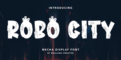 Robo City mecha display font. Heavy stroke, fun character with a bit of ligatures. To give you an extra creative work. Robo City mecha display font support multilingual more than 100+ language. This font is good for logo design, Social media, Movie Titles, Books Titles, a short text even a long text letter and good for your secondary text font with script or serif. Make a stunning work with Robo City mecha display font. Cheers, Maulana Creative
 - Amecane by designdefontes,
$24.00 Amecane is a mecane. (Mecanes are slab Fonts) inspired by old style typography introduced in the early nineteenth century. Amecane is a slab serif font - designed by Loïc Choquet. The Amecane font family consists of 16 fonts, 2 widths and 8 weights, with italics. Well-suited for editorial projects, logotypes, posters, packaging, etc. The font contains 348 glyphs with a wide range of flexibility for Latin language support for every typographical needs.
 - Regional News JNL by Jeff Levine,
$29.00 A roughened and worn version of Daily Tabloid JNL was originally created as a non-exclusive custom font for a client. The design emulates the look of old letterpress wood type and has now been released commercially as Regional News JNL; available in both regular and oblique versions. A special acknowledgement goes to Michael Hagemann of Font Mesa Fonts who partnered with Jeff Levine Fonts for the original project. His creativity and skill resulted in the textured look needed for the typeface. For some beautiful antique typefaces or fine text face collections, please visit Font Mesa Fonts.
 - MBF Kromium by Moonbandit,
$19.00 Kromium is a wide modern futuristic scifi sans serif display font. This typeface is heavy on the cyberpunk mecha theme with a minimalist approach. Best use as logo, poster, display, headline, t-shirt design and many more.
 - Mate by Ferry Ardana Putra,
$29.00 Introducing "Mate" - a modern mecha font that pushes the boundaries of typographic design. Inspired by the sleek aesthetics of mecha machinery, this font combines hexagonal formations with a futuristic and cyberpunk visual language, giving your projects a bold and captivating edge. The "Mate" font captures the essence of the future with its hexagonal shapes meticulously integrated into each character. The geometric precision and interconnectedness of these forms create a visually striking and dynamic appearance. The carefully crafted letterforms evoke a sense of advanced technology and mechanical elegance, making them perfect for projects seeking a contemporary and cutting-edge look. With its cyberpunk-inspired design, "Mate" transports your audience into a world where technology and imagination intertwine. The font's sleek lines, sharp angles, and futuristic elements capture the essence of a dystopian future, adding an air of intrigue and sophistication to your designs. The unique hexagonal feels of "Mate" create a sense of interconnectedness and harmony within the letterforms. Each character seamlessly integrates into the next, forming a unified and visually captivating composition. Whether used in titles, logos, or headlines, this font demands attention and conveys a sense of progress and innovation. Unleash the power of "Mate" in your design projects to evoke the spirit of mecha aesthetics. Whether you're working on sci-fi book covers, gaming interfaces, futuristic posters, or branding for technology-driven companies, this font will effortlessly infuse your creations with a modern, cyberpunk-inspired charm. With "Mate," you have the perfect tool to unleash your creativity and redefine the boundaries of typographic expression. Let this modern mecha font propel your designs into a realm where imagination meets technology, and the future is brought to life in stunning visual form. This font is perfect for Logo designs, Gaming branding, Technology magazines, Sci-fi book covers, Cyberpunk posters, Futuristic product packaging, Robotics company branding, Virtual reality interfaces, Futuristic event invitations, Mecha-inspired apparel branding, Tech-themed websites, Dystopian novel covers, Futuristic movie titles, Cybernetic-themed party invitations, Gaming convention banners and many more! Mate features: A full set of uppercase Numbers and punctuation Multilingual language support PUA Encoded Characters OpenType Features Cyber Mecha Style +298 Total Glyphs
 - Raxon by Product Type,
$15.00 RAXON is a futuristic mecha typeface. Highly inspired by industrial vibes and future-themed mecha-robots. Font design will make your project more powerful and inspiring. Perfect for headlines, billboards, magazines, websites, titles, posters, branding, thumbnails, creative logos, and many others. We are always passionate about bringing new futuristic typography to market. This time we present a special futuristic font for you. **What’s Included:** - File font - All glyphs Iso Latin 1 - Ligature, Alternate - We highly recommend using a program that supports OpenType features and Glyphs panels like many Adobe apps and Corel Draw, so you can see and access all Glyph variations. - PUA Encoded Characters – Fully accessible without additional design software. - Fonts include Multilingual support Thank you for your purchase!
 - Aero Flux by Ferry Ardana Putra,
$19.00 Introducing "Aero Flux", the cyber mecha font that will take your designs to the next level. This font is designed with a perfect blend of modern and squared feel, giving it a unique and futuristic aesthetic that is perfect for a wide range of applications. The bold and sleek design of Aero Flux makes it an ideal choice for logos, headlines, and branding materials. It's all-caps design with punctuation, numerals, and foreign support allows for flexibility in creating unique and engaging visual designs. Aero Flux's squared feel makes it perfect for projects that require a strong and sturdy look, such as designing video game or movie titles, product packaging, or creating futuristic posters. This font's bold, industrial look is perfect for capturing the essence of the mecha genre, with its sharp angles and futuristic design. The squared feel of Aero Flux adds a sense of strength and solidity to your designs, making it the perfect choice for projects that require a bold, commanding look. Moreover, Aero Flux's industrial, mecha-modern design makes it the perfect font for creating digital interfaces and user interfaces (UIs), especially those that require a futuristic or high-tech feel. In summary, Aero Flux is a highly versatile font that is perfect for a wide range of applications, from logos and branding to digital interfaces and futuristic posters. With its modern, squared feel and unique design, Aero Flux is the perfect font to add a touch of futurism to your projects and captivate your audience. Aero Flux features: A full set of uppercase Numbers and punctuation Multilingual language support PUA Encoded Characters OpenType Features Cyber Mecha Style +246 Total Glyphs
 - Yorka by Huruforia,
$5.00 Yorka is a mecha style display sans serif font, this font only consists of Uppercase Letters & multilingual support. Yorka is perfect for Logotype, Print Design, Label, Product, and more. OTF format fonts are also easy to install and support for Mac or Windows. Hopefully, our work is useful for you.
 - Hoofer by Scholtz Fonts,
$15.00 Light and flexible, slightly retro, casual and readable, Hoofer combines 28 brush script, mono line script and sans-serif styles with ornaments into one Mega-Family. The different styles of the Hoofer Mega-family have been chosen to work together and to harmonize in a pleasing way. The Hoofer Mega-Family of fonts can be divided into three sub-families: Hoofer BRUSH subfamily: An eclectic group of five fonts. These are mainly joined scripts. Hoofer LINE subfamily: Seven mono-line scripts with joined letters in a number of weights, widths and styles. Hoofer SANS subfamily: Sixteen casual, Sans-Serif fonts. They are very readable and in a variety of weights & styles The mood of the Hoofer mega-family is light and flexible, slightly retro, casual and readable. It combines script and many sans-serif styles with ornaments into one Mega-Family. The different styles of the Hoofer Mega-family have been chosen to work together and to harmonize in a pleasing way. The Brush Sub-Family is designed for titling, packaging and display purposes, The Line Sub-Family can also be used for titling, packaging and display, however, it is less “showy”, and conveys an air of informality. The Sans Sub-Family is designed to shine as sub-heads and as body text. The wide range of Hoofline styles gives you, the designer, great flexibility in creating just the mood or impression that you want. Most of the fonts can use one or more OpenType Features. These can be accessed in a number of ways. The reason for this is that the major software producers provide different (and often conflicting) ways of accessing OpenType Features. In some cases such software manufacturers provide NO way of accessing certain OpenType Features. We have tried to remedy this by providing a highly flexible family of fonts. OPENTYPE (these OpenType features are only available in the “otf” fonts and not in the “ttf” fonts.) OpenType features that Hoofer makes use of are: Swashes (Word-Begin and Word-End Features); Alternate Numerals; and True Small Caps. ORNAMENTS In addition the Hoofer family has a font containing 94 ornaments. ALTERNATE NUMERALS You can access two sets of figures (numbers) in Hoofer Sans fonts. Both sets are tabular and lining but they differ in the height (but not the width) of the figures. The height of the alternate figures has been chosen so that they are compatible with the small caps. However, these alternate figures are available in ALL Hoofer Sans fonts, whether they feature small cap fonts or not. Hoofer has all the features usually included in a fully professional font. Language support includes all European character sets, Greek symbols and all punctuation. Opentype features include automatic replacement of some characters and discretionary replacement of stylistic alternatives.
 - Mechacore by takoliko,
$9.00 Mechacore is a variable modern sans serif display typeface designed by Takoliko Studio. It comes with regular and stencil style, it have 5 weights and expanded width. Its inspired by a mecha cyberpunk sub genre. the modern and unique characteristics makes it suitable for attention grabbing design projects such as a engineering, technology, cyber media, army stuff, headlines, posters, social media displays and editorials.
 - Jx Tabe by Jetsmax Studio,
$- Jx Tabe is New techno sans serif typeface with super family. inspired by robotic, mecha and aethetic machine - a font suited for the future technology. This multi-purpose typeface will grab reader's attention with its stylish and neat design. With 9 Weight + Italic and 2 Axis Condensed and Expanded, With total 54 styles its a timeless workhorse for many possible application from branding to editorial.
 - Rincho by Inumocca,
$25.00 Rincho Modern Futuristic Font Minimalist typeface with feels Futuristic Letterforms and eyecatching. Inspiration by neon lights,Synthwave, Mecha, Modern Technology, Sci-fi Movie Poster, science and Space Theme. Really great font to covering your Project, like Lettering, Website Interface, Magazine, Branding, Poster, wedding invitations, Quotes Lettering, Logos, and more your project design. - Unique glyphs - Multilingual Characters - UPPERCASE - Lowercase - Numeric - Symbol - Punctuation Character - Stylistic Alternates (SS01,SS02,SS03,SS04) inumoccatype
 - Pokland by Inumocca,
$12.00 POKLAND Modern Family Font, Come with 3 Style, Reguler One, Stencil Two and Stencil Three, Modern Futuristic, Minimalist and unique Glyphs Construction. Inspiration from Synthwave, Mecha, Modern Technology, Sci-fi Movie Poster, science and Space Theme. Really great font to covering your Project, like Lettering, Website Interface, Magazine, Branding, Poster, wedding invitations, Quotes Lettering, Logos, and more your project design. - Unique glyphs - Multilingual Characters - UPPERCASE - Lowercase - Numeric - Symbol - Punctuation Character - Stylistic Alternates inumocca type Studio
 - As of my last update in April 2023, I should note that there isn't a widely recognized or prominent font specifically named "Robotech Complete" in mainstream typography or design discussions. It's po...
- Movida by ROHH,
$39.00 Movida™ is a 101-font mega family - modern, spurless, with geometric flat-sided nature. Its versatile character and huge choice of styles let it serve as a charismatic display typeface as well as clean contemporary tool for setting paragraph text. Its dynamic personality fits perfectly to such industries as sports, gaming, technology, streetwear, automotive. Movida works great for logo design & branding, magazine editorial use, web design, user interfaces and mobile applications. Movida features a super-flexible 3-axis variable font allowing fluent adjustments to width, weight and italic angle. This single font contains all the styles and features of the whole mega family. Main features: 5 widths (Narrow, Condensed, Normal, Expanded, Wide) 10 weights for each width (from Hairline to Black) + 10 corresponding italic styles 1 variable font (3 axes: weight, width, italic angle) modern, slick & sharp spurless design large x-height improving legibility in small sizes flattened oval shapes, adding vertical rhythm and elegance to narrow styles extended latin language support OpenType features (case sensitive forms, standard and discretionary ligatures, stylistic sets, contextual alternates, lining, oldstyle and tabular figures, slashed zero, fractions, superscript and subscript, ordinals, currencies and symbols)
 - Elida JNL by Jeff Levine,
$29.00 Elida JNL was modeled from an image of some wood type for sale online. Although the type design most likely has its roots in the classic Bodoni, there were a few characters in the original wood type that had a bit of a square or block shape to them. Those characters were modified in order to keep with the overall roundness of the other characters. The name Elida JNL comes from a small town in New Mexico. Available in six styles: Regular, Oblique, Extra Condensed, Extra Condensed Oblique, Ultra Condensed and Mega Condensed.
 - Gekomach by Keristyper Studio,
$14.00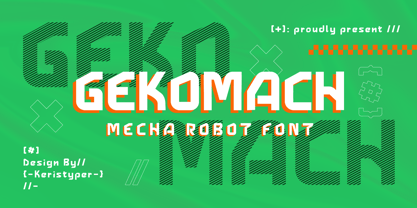 Gecomach robotic mecha typeface is inspired by a modern futuristic. This font is good for logo design, Social media, Movie Titles, Books Titles, short text even long text letters, and good for your secondary text font with sans or serif. **Featured:** * Standard Uppercase & Lowercase * Numeral & Punctuation * Multilingual : ä ö ü Ä Ö Ü ß ¿ ¡ * Alternate & Ligature * PUA encoded We recommend programs that support the OpenType feature and the Glyphs panel such as Adobe applications or Corel Draw. so you can use all the variations of the glyphs. Hope you enjoy our fonts!
 - Odaiba Script by Hanoded,
$15.00 I have been to Japan many times, but I have to admit that I have not (yet) been to Odaiba, so this font is a reminder that I should go there one day. Odaiba is a large artificial Island in the bay of Tokyo. It is a popular shopping and sightseeing destination and its sights include a copy of the Statue of Liberty and a mega-sized Gundam Robot. Odaiba Script is a handwritten font. I used a Sharpie pen on paper, so it is nice and thick. It comes with double letter ligatures and all diacritics.
 - Hagemann JNL by Jeff Levine,
$29.00 One of the most enduring type styles of the Art Deco era is Huxley Vertical. Its clean lines and stylish appeal have transcended changing times and tastes. Many typefaces have been inspired by the original, including the model used to create this font. The design was found in the book "Lettering and Alphabets", first published in 1946 by J. Albert Cavanagh. By re-drawing it from scratch, the missing numerals, punctuation, special characters and accents were added. Hagemann JNL and its oblique version are named in honor of one of Jeff Levine's friends within the type design community -- Michael Hagemann of Font Mesa.
 - Hyperloopa2104 by Andrew Tomson,
$10.00 Hello, friends! I recently bought myself an old game console, the SEGA Mega Drive 2. For a long time I couldn't understand why, when I was a kid, it seemed incredible to play it. Nowadays there are a lot of games with stunning graphics and realism, but still there is something warm and light in old games. Maybe it's just a memory of a carefree childhood. After playing it, I decided to create this font so that everyone could do something in the style of old games that an army of designers and programmers hadn't worked on yet. Good luck and love to you!
 - MetroBots by Our House Graphics,
$- MetroBots is a fun loving, non-traditional but very functional family of 6 fonts made of big city skies, the long tropical morning shadows of ancient ziggurats and entire pueblo villages, nestled into the steep cliff-sides of sage-topped mesas in south western deserts. This is a good solid, but kind of whacky looking display type family borrowing from the heft of good old-fashioned children�s wooden building blocks and the look and feel of both modern and ancient pueblo architecture. With a bit of the not-so-subtle expressiveness of a comical robot on a WD-40 high on the side.
 - The Sonic Mega Font, crafted by David Martin, is a unique typeface inspired by the vibrant and dynamic world of the Sonic the Hedgehog video game series, developed by Sega. This font captures the ess...
- Andron 2 ABC by SIAS,
$44.90 Andron 2 ABC is a product developed especially for children’s literature. It is an ideal choice for primers and other books for the age when children are learning to read. The typeface has the same peak typographic quality as any other font of the praised Andron series—the very best is just good enough for our kids, is it not? As a difference from the normal glyph set (as in Andron 1 Latin or Andron Mega), the letters a, g and y have those simpler single-story shapes that resemble the forms usually taught in writing, which are sometimes called infant letterforms. Now, Andron 2 ABC is available in a full four-font family set.
 - Blue Parrot JNL by Jeff Levine,
$29.00The original inspiration for Blue Parrot came from a short scene in the classic film Casablanca. For just a few seconds, the exterior of Ferrari's Blue Parrot night club is shown, complete with a wonderful hand-lettered sign... all in capital letters. Blue Parrot JNL was originally released in 2006, and it wasn't long before a few people noted that the font would also look good with a lower case alphabet. The idea of adding in lower case kicked around for a couple of years until Jeff Levine finally completed a revision of the font. In this version there's also an expanded character set thanks to the creative input of Michael Hagemann of Font Mesa. - Algerian Rnd by FontMesa,
$29.00 It's finally here, Algerian Rnd is an all new version of our Algerian Mesa font with rounded soft corners and serifs. Imagine the impact Algerian Rnd will have on your product label and packaging. Algerian Rnd is a new timeless beauty that you'll find many uses for in your logos and advertising. Algerian Rnd is for every generation, put it to work in your next project, you're going to love this font. Algerian Rnd does include some alternate glyphs which you'll need an Opentype aware application to access the alternates in Algerian Rnd. Algerian Rnd is ideal for product logos, labels, packaging, t-shirt designs and other merch. Algerian Rnd is a trademark of FontMesa LLC
 - Transport by Monotype,
$29.99The idea of Transport originates from text found on the large wooden boxes used for transport. Such text is still stencilled on them in the same way as the companies have done for decades, at least. That explains the typeface's name, too. If you find some similarities with Devin, you are right. Transport is nothing other than a special variant of Devin. But since the two are aimed for totally different uses, I decided to use two different names for them. Transport is a mecane and its use is primarily as a headline typeface. But in small quantities it can be used even for body setting, if special effects are desired. Transport was released in 1994. - Novecento Slab Rough by Synthview,
$22.00 Novecento Slab Rough adds a letterpress / analog effect to its Slab Serif parent. Each letter has a different pattern and gives you a truly realistic effect. Even accented variants of any base character are all different. This font has also a built-in feature that automatically displays a texture variant for the 2nd occurrence of a letter or a number when they appear close one to each other. For instance: AA OO TT ÜÜ. But also: AOA NON TXT etc. And don't forget alternate glyphs design such as N I J Q Y and all other features present in the Novecento mega family: 32 styles, 76 latin languages supported, 590 glyphs and 16 stylistic opentype features for advanced typography.
 - Transport by Linotype,
$29.99The idea of Transport originates from text found on the large wooden boxes used for transport. Such text is still stencilled on them in the same way as the companies have done for decades, at least. That explains the typeface's name, too. If you find some similarities with Devin, you are right. Transport is nothing other than a special variant of Devin. But since the two are aimed for totally different uses, I decided to use two different names for them. Transport is a mecane and its use is primarily as a headline typeface. But in small quantities it can be used even for body setting, if special effects are desired. Transport was released in 1994. - Joane by W Type Foundry,
$25.00 Joane mixes the elegancy of French didones, calligraphic endings and glyphic serifs, thus its features convey a warm unique style. Moreover, its curves have been beautifully designed, and it also comes with both and engraved and deco versions, which add more versatility to the way it can be used. Joanes is perfectly suited for magazines, branding, advertising, labels, web and packaging. Joane is my first typeface to be published worldwide. To achieve this goal, I received essential help from W team and friends. I personally want to say thanks to Diego Aravena for the patience, good will and learning; for the friendship and support to Franco Jonas and Raúl Meza. Because of their help I could find the treasures at the end of the process. Ale Navarro
 - Akwe Pro by ROHH,
$40.00 Akwe Pro™ is a professional, ultra versatile sans serif typeface characterized by excellent legibility and modern design perfect for all design purposes. It is designed for use in long and short paragraphs of text, headlines and user interfaces. Its distinctive character and carefully crafted proportions make it a great option for brand identification and logo design. Akwe Pro™ mega family consists of 164 fonts - each weight in uprights, italics and small caps versions. It has extended language support and true italics, as well as broad number of OpenType features, such as small caps, case sensitive forms, standard and discretionary ligatures, stylistic sets, contextual alternates, lining, old style, tabular and small cap figures, slashed zero, fractions, superscript and subscript, ordinals, currencies and symbols.
 - Grafex by Mysterylab,
$22.00 Grafek is a unique reverse-contrast font with tapered vertical strokes and heavier horizontals on the top and bottom. This typeface is loaded with individual character, bolstering its excellent legibility with a moderately extended width. It’s a strong choice for large headlines, web banner graphics, and branding/logo usages. It’s got a high-end and elegant flair on shorter words, especially when choosing an all lowercase lettering design, for example on a logo treatment. It has a whiff of a nautical, antique map vibe, and even conjures up a hint of Oceania and Tiki-style graphics. Grafek will prove to be a great choice on book and magazine titles, and its width lends itself easily to wide mega-scaled outdoor marquee graphics and billboards.
 - Macahe by Rômulo Gobira,
$10.00 Macahe is a modern slab serif with dynamic and irregular shapes. It comes with 7 weights, 3 widths and matching (true) italics. The typeface was inspired and name after the city I was born (Macaé-RJ, Brazil), turning the mixture between nature/beach life and the chaotic urban growth into typography. The options (weight, width and true italics) make the font useful both for web and print in multiple occasions; think websites, posters, logos, signage, packaging and etc. Macahe covers multiple languages, including a wide range of Latin and some Cyrillic languages. It also includes a full range of numerals (included old style figures, numerators, denominators), small caps, standard & discretionary ligatures and stylistic alternates. Those features and variations make Macahe a useful tool for any graphic designer.
 - Bimbo by Zetafonts,
$39.00 Bimbo is a monoline script font family created in 2018 by Francesco Canovaro for Zetafonts as an extension & redesign of the original Arsenale White typeface created with italian illustrator Jonathan Calugi. Bimbo expands the original design with six new weights and over 300 new characters to cover over 70 languages using the latin, greek and cyrillic alphabets, while keeping the handmade aesthetic that made successful the original font. Bimbo is essentially a display font, born for minimal lettering and logos, with a handwritten sensibility enhanced by the built-in letter swapping open type feature that makes sure double letters are always different one from another. Open counters and a monoline design allow for great readability at small sizes, making Bimbo the ideal font for creating fake handwritten notes and meta-textual jokes.
 - Noemi Slab by Brackets,
$22.00 Noemí is a broad typeface based on a formally classic skeleton, but with a strong Meccano character, where its quadrangular serifs are the protagonists of the slab style. It is a typeface designed to solve the basic problems of newspaper printing, adapted to a novel and strong communication, in the case of a wide typeface and with generous ink traps making the impression. Noemí was born from the need to create a broad, functional typeface family with a strong compact character intended for use in the press. Intended for editing and layout in a newspaper / magazine with a wide range of subfamilies thought and designed to achieve a diverse graphic functionality; designed from the same common skeleton, with a style based on the mix between the Mecan characters of traditional typewriter fonts and Roman fonts.
 - Fuse by W Type Foundry,
$25.00 This font is inspired by two typographic styles, incorporating (both) geometry and humanism. It combines the rhythm of such typefaces as Meta Pro and The Sans, as well as terminations and structures from fonts like Din and Futura. This results in a font that plays with condensation and a parallel rhythm, simple and functional. Fuse is perfectly equipped with Opentype, it contains alternative glyphs, fractions, modern and old numbers, superscripts and subscripts, ligatures and Small Caps. We always kept the idea of having Fuse be humanistic, rational and universal, which makes it ideal for graphic design, printed publications, web design, motion graphics, interaction design and branding. Learn about upcoming releases, work in progress and get to know us better! On Instagram W Type Foundry On facebook W Type Foundry wtypefoundry.com
 - Istoria by Hooper Type,
$12.00 New foundry on the block, Hooper Type, kicks off it's catalogue with a versatile, story-telling serif font. With a love of the magical and a yearning for adventure, Istoria pushes away from the static, drawing in whisps and whirls that entice and excite, without distracting. Unassuming in it's long form, with delicate strokes that draw the eye, it commands attention when used in short punchy titles, or set in caps. Istoria (meaing both history and story in Greek) delights in having unusual curves, curvy straights and twisty feet which emulate those adventures and myths from days gone by. Type shouldn't interfere with the content, but it absolutely can enhance it. Hope you enjoy it!
 - Syntachron by Mofr24,
$11.00 Syntachron is an extraordinary monospaced font that stands out with its futuristic and mecha-inspired design. What sets this font apart is its unique ability to combine simplicity, modernity, and boldness, resulting in a visually captivating typeface. It is the perfect choice for those seeking to create impactful posters, eye-catching marketing materials, captivating logos, attention-grabbing headlines, and engaging book and magazine layouts. One of the distinguishing features of Syntachron is its compatibility with the Cyrillic alphabet, offering versatility and style for a wide range of design projects. Whether you're working on international branding campaigns or multi-language publications, this font seamlessly integrates with the Cyrillic characters, ensuring consistency and cohesiveness across different languages. In terms of typeface pairing, Syntachron harmonizes exceptionally well with related families and typefaces that share its sleek aesthetics and futuristic vibe. It complements and enhances other fonts, enabling designers to create stunning combinations that amplify the impact of their designs. Beyond its striking appearance, Syntachron excels in its functional aspects. The font comes in a variety of styles, allowing for versatility in design choices. Its monospaced nature ensures consistent character widths, making it ideal for code snippets, technical documentation, and typewriter-style layouts. Furthermore, Syntachron offers a comprehensive character set with special features, enabling the seamless creation of diverse and engaging designs. The design concept behind Syntachron was to capture the essence of a futuristic world and merge it with the mechanical elements of mecha-inspired aesthetics. The result is a font that exudes a sense of cutting-edge technology and boldness, empowering designers to create visually striking and impactful designs that captivate their audience. Syntachron was meticulously created to fulfill the need for a font that seamlessly merges modern simplicity with futuristic design elements. Its purpose is to provide designers with a versatile tool that sparks creativity and enables them to craft stunning visual experiences. With its sleek aesthetics, support for the Cyrillic alphabet, and functional aspects, Syntachron is an indispensable asset for any design project seeking to embrace the future.