10,000 search results
(0.009 seconds)
- Losta Bonita by Creativemedialab,
$20.00 Introducing Losta Bonita A modern, vintage, and retro serif family. Consists of 9 weights from thin to black and variable format. The stylistic alternates allow many different unique shapes that give your lettering idea a well-looking look.
 - Helmswald Post by Sharkshock,
$125.00 Helmswald Post is a handsome Blackletter that's been years in the making. There's a mix of wispy terminals, flamboyant caps, and the use of negative space to create contrast. Elements from High German, Old English, and many other styles make their way into this gorgeous display font. The result is a medieval looking script with cleaner, more modern feel. In addition to European accents Helmswald Post is equipped with Cyrillic, alternates and ligatures. Old world numerals are present by default but may be substituted by accessing the stylistic sets. Use it for a book cover, web headings, or a restaurant logo.
 - Rosting Gapertas by Mega Type,
$18.00 Rosting Gapertas is a soft and elegant yet sturdy serif family that mixes retro casual undertones with a modern feel. Designed to convey a sense of tenderness and natural expression with a sense of the present to function as a bold tool and a beautiful communicator. Morning Georgian comes in 9 different weights from Thin to Black with 2 styles (Standard & Italic). Rosting Gapertas is perfect for branding, editorial, packaging or logos and more.
 - Last Vinyl by Hatftype,
$15.00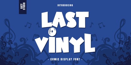 Is a comic display font with distinctive handwritten characters perfect for branding projects, logos, clothing designs, media posts, advertisements, product packaging, product designs, labels, photography, watermarks, invitations, stationery, and any project who need handwritten dishes. Feature : Symbol Number Punctuation Multilingual support Support in Mac and Windows OS Support in design application (photoshop, illustrator, and more) I really hope you enjoy it.
 - Lust Pro by Positype,
$50.00 Confident and versatile, Lust Pro™ is an exercise in indulgence—an attempt to create something over the top and vastly useful. If Lust Pro seems both new and familiar, that’s because it is. The series unapologetically channels Herb Lubalin, but produced with a deliberate, contemporary twist. There is an intentional slyness infused in the letterforms—the extreme thick and thin lines flow effortlessly without becoming gratuitous. It’s always just enough, not too much. What makes the type series so appealing? The curves. When asked to describe the letterforms, most people unwittingly allude to the human form, using adjectives usually reserved for describing physical traits… creating all-too-familiar comparisons. Summerour has grown to accept this as unavoidable and reasonable given his acknowledgement of its influences and has provided nuances within the letterforms to accentuate that. Intended to be set large, the typeface boasts 3 widths and 5 weights and matching italics for both the Regular and Didone variants (that’s 60 fonts in total), making it perfect for editorial use and a highly flexible solution for any display need.
 - Listing Packs by Jehansyah,
$9.00 Listing Packs family this is a font family with a bold and large appearance, this font is perfect for all types of displays that look unique and bold, there are several variants of the character you use, and make sure you don't miss it, very suitable for all types of design, crafts, social media , magazines, books, banners, and this design is very potential for you to have
 - March Loft by Maulana Creative,
$11.00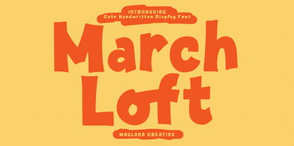 March Loft is a casual fun handwritten display font. With bold stroke, fun character. To give you an extra creative work. March loft font support multilingual more than 100+ language. This font is good for logo design, Social media, Movie Titles, Books Titles, a short text even a long text letter and good for your secondary text font with sans or serif. Make a stunning work with March Loft font. Cheers, Maulana Creative
 - Lust Stencil by Positype,
$39.00 When you hear that name, you likely ask yourself, ‘why?!’ I did too, but the number of requests could not be ignored. Once I finally decided to move forward with it, the only way to solve the offering would be to adhere to the same theme of indulgence, I planned for the same number of optical weights AND Italics. Yeah, italic stencils… ok, why not? It’s not a new concept. One thing to note and a creative liberty I assumed during the design. Lust Stencil would not be just a redaction or removal of stress to produce a quick stencil. To do that, would just be a cheap solution. Strokes had to resolve themselves correctly and/or uniquely to the concept of the stencil format. And, it had to be heftier. For it it to look correctly, it needed about 8% additional mass to the strokes for it to retain the effervescent flow of the curves and the resolute scalloped lachrymals. The Lust Collection is the culmination of 5 years of exploration and development, and I am very excited to share it with everyone. When the original Lust was first conceived in 2010 and released a year and half later, I had planned for a Script and a Sans to accompany it. The Script was released about a year later, but I paused the Sans. The primary reason was the amount of feedback and requests I was receiving for alternate versions, expansions, and ‘hey, have you considered making?’ and so on. I listen to my customers and what they are needing… and besides, I was stalling with the Sans. Like Optima and other earlier high-contrast sans, they are difficult to deliver responsibly without suffering from ill-conceived excess or timidity. The new Lust Collection aggregates all of that past customer feedback and distills it into 6 separate families, each adhering to the original Lust precept of exercises in indulgence and each based in large part on the original 2010 exemplars produced for Lust. I just hate that it took so long to deliver, but better right, than rushed, I imagine. It would have taken even longer if not for font engineer and designer, Potch Auacherdkul. Thanks Potch.
 - West Most by Maulana Creative,
$14.00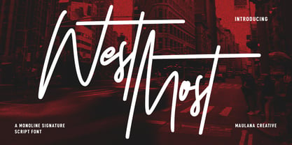 West Most is an expressive casual script font. With clean mono-line stroke, tall and fun character with a bit of ligatures and alternates. To give you an extra creative work. West Most font support multilingual more than 100+ language. This font is good for logo design, Social media, Movie Titles, Books Titles, a short text even a long text letter and good for your secondary text font with sans or serif. Make a stunning work with West Most font. Cheers, MaulanaCreative
 - Lust Sans by Positype,
$39.00 Lust Sans is the penultimate exploration of producing a high-contrast sans wholly influenced by its bracketed ancestor. The aspect of this endeavor I enjoyed the most was finding sneaky ways to infuse warmth and whimsy into the letterforms when you least expect it. The result, however, is subtle and uniquely balances against Lust and Lust Didone without becoming cold and overbearing. To accomplish this, Lust Sans has 6 weights. What I found during development was, based on any setting where Lust or Lust Didone were in the same layout, the amount of contrast shown with Lust Sans needed to be adjusted. Expanding the weight offering, produces opportunities for Lust Sans to modulate the rhythm of the layout comfortably while keeping contrast—this is even more obvious with the Italics. I love those. You will too. If you don’t, you do not have a soul. Not sorry. The Lust Collection is the culmination of 5 years of exploration and development, and I am very excited to share it with everyone. When the original Lust was first conceived in 2010 and released a year and half later, I had planned for a Script and a Sans to accompany it. The Script was released about a year later, but I paused the Sans. The primary reason was the amount of feedback and requests I was receiving for alternate versions, expansions, and ‘hey, have you considered making?’ and so on. I listen to my customers and what they are needing… and besides, I was stalling with the Sans. Like Optima and other earlier high-contrast sans, they are difficult to deliver responsibly without suffering from ill-conceived excess or timidity. The new Lust Collection aggregates all of that past customer feedback and distills it into 6 separate families, each adhering to the original Lust precept of exercises in indulgence and each based in large part on the original 2010 exemplars produced for Lust. I just hate that it took so long to deliver, but better right, than rushed, I imagine.
 - Post Box by Great Scott,
$16.00 Written in a ballpoint pen style POST BOX is a neighborly sans serif is slightly condensed and slanted. Scribbled quickly but readable. Exact but still human. Perfect for print, package and display use. You can also use it in shorter paragraph text.
 - Pigeon Post by Hanoded,
$15.00 I have no particular love for pigeons, but I read an interesting article about war pigeons being used to send messages to an fro. One pigeon (called William of Orange) even saved more than 2000 soldiers during the Battle of Arnhem. Pigeon Post is a lovely cartoon and kids font. It comes in a sans and a serif style, so there’s really no excuse for not using it!
 - Last Beyond by Reyrey Blue Std,
$12.00 Last Beyond is stylish signature font made with a modern and elegant touch to give your any project to a unique design. This font is perfect for your creative ideas, both formal and informal. It has a modern style with a touch of creative ideas that is very suitable to be applied anywhere that requires creative ideas such as invitation cards, letterheads, website logos, social media, banners, advertisements, brochures, packaging products, leather products, and any product that requires writing. Features : · All Uppercase and Lowercase · Number & Symbol · Supported Languages · Alternates and Ligatures · PUA Encoded Hope you enjoy with our font!
 - Last Bastion by Joe Hewitt Design,
$10.99 Last Bastion is a strong, resolute serif typeface. The original inspiration came from the idea of an impenetrable medieval fortress that has stood the test of time and defended generations of hardened soldiers. Large stone towers and fortifications are reflected in the font's bold stems. The sans serif font offers a more modern and clean look, while the Gothic font shows the typeface's darker side. All three fonts include alternates for all letters and numbers in both caps and small caps. Last Bastion lends itself to branding, billboards, signage and industry to name a few. The glyph set includes all languages covered in Basic Latin, Latin-1 Supplement and Latin Extended-A scripts.
 - Lust Didone by Positype,
$49.00 Lust Didone’s character set was expanded as well during the redraw and update, the Italics were separated and reimagined anew from the universal italics in the original offering. Lust Didone also includes the new Fine optical size with complementing Italics for each size as well. And, yes, more swashes. The Lust Collection is the culmination of 5 years of exploration and development, and I am very excited to share it with everyone. When the original Lust was first conceived in 2010 and released a year and half later, I had planned for a Script and a Sans to accompany it. The Script was released about a year later, but I paused the Sans. The primary reason was the amount of feedback and requests I was receiving for alternate versions, expansions, and ‘hey, have you considered making?’ and so on. I listen to my customers and what they are needing… and besides, I was stalling with the Sans. Like Optima and other earlier high-contrast sans, they are difficult to deliver responsibly without suffering from ill-conceived excess or timidity. The new Lust Collection aggregates all of that past customer feedback and distills it into 6 separate families, each adhering to the original Lust precept of exercises in indulgence and each based in large part on the original 2010 exemplars produced for Lust. I just hate that it took so long to deliver, but better right, than rushed, I imagine.
 - Losta Nova by Creativemedialab,
$20.00 Minimal and modern sans serif consists of 10 weights from hairline to black as well as variable versions. Works great for branding, fashion, modern, and casual valentine design theme. Designing a logo is made easy with lots of alternates to play with.
 - Last Dance by Wing's Art Studio,
$10.00 Last Dance: Redux - The 80s Feel-Good Script Font - Updated! Welcome to Last Dance: Redux, a new and improved version of my popular brush-script font inspired by 80s movie posters, VHS covers and Friday nights at the video store! This hand-drawn script aims to capture the feel-good vibes of movie blockbusters that won our teenage imaginations, while serving as the go-to font for recreating this unique and nostalgic period. The original Last Dance font features a gritty, hand-drawn texture that looks equally at home on an aerobics competition poster or steamy urban thriller - making great titles that look distinctly cinematic. Last Dance: Redux takes that original design and strips it back to it’s bare essentials resulting in a clean, uniform look that improves letter flow and readability. It’s also much lighter on system resources making it the preferred choice when using extensively across print and web projects. Both versions come with upper and lowercase characters along with punctuation, numerals and language support, plus two full sets of alternatives and a selection of underlines. Check out the visuals to see it in action!
 - Losta Masta by Creativemedialab,
$15.00 Losta Masta - fun and playful serif family. Unique, playful and versatile serif family with 40+ ligatures and 100+ alternates that you can combine to get curves and beautiful shapes just in seconds. Play with the ornaments to create a more stunning display. This font is suitable for use in many design forms, for example magazines, postcards, logos, vintage look, old classic ,60s, 70s, 80s era, wedding projects and many more. We recommend using Adobe Illustrator or Photoshop.
 - Lost at sea GM - Unknown license

- Last N Line - 100% free

- GOST type A - Unknown license

- GOST type B - Unknown license

- The Last Soundtrack - Unknown license

- Post Production JNL by Jeff Levine,
$29.00 A title card listing the supporting cast of the 1950 Humphrey Bogart and Gloria Grahame drama “In a Lonely Place” provided the hand lettered slab serif type design that served as the model for Post Production JNL – available in both regular and oblique versions.
 - Last Date JNL by Jeff Levine,
$29.00 A typographic conundrum presented itself with the hand lettered title on the cover of the 1919 song "I Am Always Building Castles in the Air". The capitalized portion ["Castles in the Air"] was a hybrid mix of a few Art Nouveau-influenced rounded letters, yet along with this were squared letters with rounded corners (reflecting the upcoming Art Deco movement to take place in about another decade). As a complete alphabet, it didnít mix as well as in those few short words. What to do? It was decided to go with the squared look and save the rounder characters for a future project. The end result became Last Date JNL; available in both regular and oblique versions.
 - Lamp Post JNL by Jeff Levine,
$29.00 Lamp Post JNL is a digital interpretation of a design popular in the early 1900s called Post Old Style; no doubt inspired by a certain Saturday periodical with a similar name. There is an intrinsic charm to lettering that evokes a hand-made look, and this design is a perfect example of the genre. Available in both regular and oblique versions, it will add the nostalgia of simpler times to any print or web project.
 - Fence Post JNL by Jeff Levine,
$29.00 The inspiration for Fence Post JNL comes out of an early 1900s manual for sign writing. A number of changes were made to make the design more aesthetically pleasing, but it retains its novelty effect of evoking the look of wooden fence posts or Western-themed typography.
 - MC Most Haunted by Maulana Creative,
$16.00 Most Haunted is a western display typeface font. Heavy stroke, fun character with a bit of ligatures and alternates. To give you an extra creative work. Most Haunted font support multilingual more than 100+ language. This font is good for logo design, Social media, Movie Titles, Books Titles, a short text even a long text letter and good for your secondary text font with script or serif. Make a stunning work with Most Haunted font. Cheers, Maulana Creative
 - Gift List JNL by Jeff Levine,
$29.00 It's bold, it's blocky, it has rounded corners and was inspired by hand lettering on a vintage booklet for children's craft gift projects. It has regular and oblique versions. It's Gift List JNL.
 - Kids Book olst by Olexstudio,
$8.00 KIDS BOOK olstd Font will look gorgeous on all your designs, kids invitation, kids poster design, kids book design, branding materials, kids logo's, and all project design other. WHAT'S INCLUDED KIDS BOOK olstd Font contains standard characters, Uppercase, Lowercase, numbers, punctuation, ligatures and international glyphs. Happy Designed.! regard olexstudio
 - Lasting Impression JNL by Jeff Levine,
$29.00Lasting Impression JNL was rendered from scans of a 1930s rubber stamp printing set. At small sizes it has the look of hand-stamped lettering. At larger sizes, the user will see jagged and angular lines giving the font a kind of retro-grunge look. This typeface was the model for the more cleanly-drawn Casual Friday JNL, also by Jeff Levine. There is a limited character set, and both the spacing and kerning have been intentionally omitted so that the results will more closely resemble the uneven letter spacing of rubber stamps on paper. - Lust Pro Didone by Positype,
$50.00 Confident and versatile, Lust Pro™ is an exercise in indulgence—an attempt to create something over the top and vastly useful. If Lust Pro seems both new and familiar, that’s because it is. The series unapologetically channels Herb Lubalin, but produced with a deliberate, contemporary twist. There is an intentional slyness infused in the letterforms—the extreme thick and thin lines flow effortlessly without becoming gratuitous. It’s always just enough, not too much. What makes the type series so appealing? The curves. When asked to describe the letterforms, most people unwittingly allude to the human form, using adjectives usually reserved for describing physical traits… creating all-too-familiar comparisons. Summerour has grown to accept this as unavoidable and reasonable given his acknowledgement of its influences and has provided nuances within the letterforms to accentuate that. Intended to be set large, the typeface boasts 3 widths and 5 weights and matching italics for both the Regular and Didone variants (that’s 60 fonts in total), making it perfect for editorial use and a highly flexible solution for any display need.
 - Last Tango JNL by Jeff Levine,
$29.00 The hand lettered title found on the 1924 sheet music for the tango “Sentimiento Gaucho” (“Sentimental Gaucho”) offered a different take on the thick-and-thin lettering that permeated the late 1920s through the Art Deco age. A ‘slash’ or ‘swipe’ is cut through the characters (similar to “Directa JNL” – another take on this type of design). Last Tango JNL is the digital recreation of this novelty lettering and is available in both regular and oblique versions.
 - The Bouquet List by Nasir Udin,
$16.00 Introducing the Bouquet List - an ultimate handwriting script font. Inspired by the beauty of flower bouquets and the aesthetic of handwriting when you write some bucket list or itinerary on your journal while you travel. The Bouquet List is a handwritten font featuring 70+ ligatures that gives you beautiful typographic in organic, authentic, and natural handwriting style. Perfect for magazines, social media posts, travel blog, travel vlog, signatures, sticky notes, journal, quotes, restaurant menus, websites, women products, calendar marks, book covers, advertisements, wedding designs, even for a logo and branding! Its OpenType Features provides you an easy swash and magic underline (please see the instruction in the last two preview images). • How to add swash easily: type space three times after the word. • How to add underline: type underscore 2 or 3 or 4 times.
 - The Last Shuriken by Arterfak Project,
$26.00 Konichiwa! Introducing our brand new font "The Last Shuriken" a Japanese-style typeface. Inspired by modern Japanese food branding and anime title. Designed in a bold stroke, this font is an all-caps font that has the same cap height and different shapes. The Last Shuriken is perfect for display, especially for Japanese food, title, logo, poster, short quote, movie, games, apparel. Complete with stylistic alternates and PUA Encoded with multilingual support! Thank you. Ramz.
 - DB Post Master by Illustration Ink,
$3.00DB Post Master combines the vintage feel of history with a unique style. This DoodleBat makes great adornments to cards, letters, or just a fun scrapbook page. - DB Post Stamp by Illustration Ink,
$3.00DB Post Stamp is a fun DoodleBat designed after a post office stamp and the distressed look gives it a unique style. - Lots of Frames - 100% free

- Case Lot JNL by Jeff Levine,
$29.00 A style example found within the pages of a vintage type foundry catalog inspired Case Lot JNL. The design is a classic early 20th Century sans with chamfered corners.
 - Printers Lot JNL by Jeff Levine,
$29.00 Printers Lot JNL is another eclectic mix of cartoons, ornaments, catch words, decorations and embellishments re-drawn from vintage source material used in the days of letterpress printing. For those who like to assemble their own larger borders, a set of elements is on the 2-9 keystrokes, but it must be noted that some manual adjustment is necessary to line up all of the parts in a complete border pattern. From a Happy New Year greeting to whimsical cartoon characters; from singular ornamental design elements to beautiful brackets, this mix of subjects is a great overview of the kinds of cuts found in printers' job case drawers in years gone by.


