379 search results
(0.043 seconds)
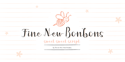
- Fine New Bonbons by Tour De Force,
$25.00 - Les Bonbon Boutique PW by Patty Whack Fonts,
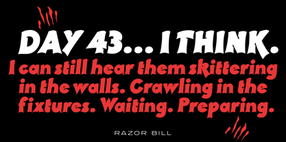
$29.98Reminiscent of vintage Paris. Think Tea Parties, Sweet Treats, Candy Shoppes, Boutiques, Fine China, Couture, Cakes and Pastries. This font is perfect for cards, menus, signage, and much more. Les Bonbon Boutique PW is intended and suitable for Display use and Titles. It's not suitable for long paragraphs of text. This font is meant for display, titles, beautiful signage, cards, etc. Les Bonbon Boutique PW is available in OpenType, and TrueType format. - Razor Bill by Red Rooster Collection,
$45.00 - Southwark by Hanoded,
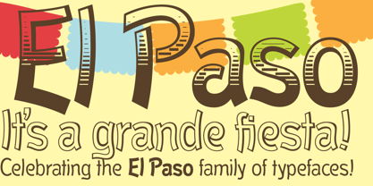
$15.00London is one of my favourite cities, so it was about time I named a font after it. Well, technically, I named a font after one of London’s districts. Southwark comes from the Anglo-Saxon word Suthriganaweorc, which means ‘Fort of the men of Surrey’. The font Southwork is a handmade Clarendon. I used a Japanese brush pen to create the outlines. I gave the glyphs texture by filling them in with a brush and Chinese ink. Southwark, therefore, has an uneven look and a brushy texture. It looks good on just about anything, but posters, greeting cards and product packaging come to mind. - El Paso Pro by Red Rooster Collection,
$60.00 - LMS Lily Of The Valley - Unknown license
- Docklands by Hemphill Type,
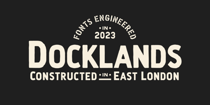
$22.00An authentic collection of engineered fonts, constructed in East London. Docklands is a handmade font family inspired by the creation of the London docks in the early 18th century. The rough edged sign written style is evocative of the era when iron works and boatbuilding wharfs lined the River Thames. - Conradasaur - Unknown license
- Conrads Cows - Unknown license
- Rykers Pram - Unknown license
- Thorne Shaded - Unknown license
- The London font, designed by the talented Jovanny Lemonad, is a distinctive typeface that captures the essence of modernity and elegance. Envision a font that effortlessly combines the historic charm...
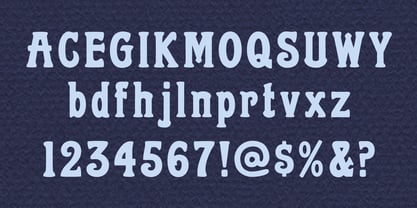
- Dawson by Solotype,
$19.95Redrawn from an old wood type we picked up in London. The original manufacturer is unknown. We added the lowercase to increase is usefulness. - LMS Letterbat Friends - Unknown license
- AT Move Powerplay by André Toet Design,
$39.95POWERPLAY a monospace lowercase alphabet with a 3D twist. Designed by André Toet in 1976 (during his study at Central School of Art & Design, London, UK) and he redesigned this in 2011. The name Powerplay is based on the Battersea Power Station, London. The remarkable architecture of the building is also used as a decor for films and for one of the covers by Pink Floyd (Animals, the flying pig). Concept/Art Direction/ Design: André Toet © 2017 - Picadilly by Borutta Group,
$- - Metropolitan by Alias Collection,
$60.00 - Brick Lane by kapitza,
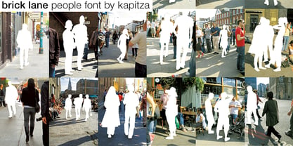
$99.00Brick Lane is an picture font consisting of 52 detailed, hand drawn illustrations of people seen on Brick Lane, a street in the heart of the Bangladeshi community in the East End of London. It has over the last few years become the home of parts of the creative industries in London, mainly media, fashion and graphics. All illustrations are based on photographs taken on location over a period of time. The photographs are then hand traced to create high quality, detailed silhouettes. - Camden Queen by Asterisk,
$33.00 - MPI Atlas by mpressInteractive,
$5.00 - Fantazija - Unknown license
- FS Benjamin by Fontsmith,
$80.00Stone and steel FS Benjamin is a flared serif typeface designed by Stuart de Rozario. Consisting of 12 styles ranging from Light, Book, Regular, Medium, SemiBold and Bold with Italics it has clear, delicate letterforms, punctuated with brutal chiselled angles. With a pure and crafted feel to the forms the typeface has traditional roots but has been designed to work in a contemporary setting. Archetypal proportions in terms of x-height to cap height and ascender to descender ratio, allow the typeface to feel familiar and be legible in all platforms. Delicate brutalism Inspired by the contrasts of London and named after Big Ben, FS Benjamin was designed by Stuart de Rozario and founder, Jason Smith. Walking around London Jason was inspired by the juxtaposition of the old and the new. Glass and steel architecture can often be found amongst traditional signage and coats of arms seen around the City. These surroundings sparked an idea to create a modern design based on an alphabet that would traditionally be carved from stone. “Much of the typography we see today is so similar. I thought what if we created a typeface with traditional roots but modernised it to sit amongst the punk and noise of the streets of London? Old with new. Business with busyness. This is what London is all about.” Jason Smith - Worthington Arcade by Device,
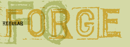
$39.00Worthington Arcade is a classically-proportioned capitals-only type incorporating a selection of ligatures and alternates. It loosely resembles the hand-painted architectural lettering of the 30s to the 50s, exemplified by the likes of Percy Smith’s interior signage for the BBC or George Mansell’s lettering for the University of London and the signs found on London’s bridges. However, rather than a slavish copy of any historical model, it is more an examination and evocation of certain idiosyncratic quirks of civic lettering of the period, and an attempt to create a peculiarly English titling typeface. The round letters, for example the O, Q and C, are wider than the perfect circle usually found in such designs, while the straight-sided characters, usually drawn on a square, are narrower. This lends the whole a subtle elegance that is also emphasized by the raised crossbars on the H, E and F and extended lower leg of the E. Includes old-style numerals. - Forge by Device,
$39.00 - ITC Johnston by ITC,
$29.00ITC Johnston is the result of the combined talents of Dave Farey and Richard Dawson, based on the work of Edward Johnston. In developing ITC Johnston, says London type designer Dave Farey, he did “lots of research on not only the face but the man.” Edward Johnston was something of an eccentric, “famous for sitting in a deck chair and carrying toast in his pockets.” (The deck chair was his preferred furniture in his own living room; the toast was so that he’d always have sustenance near at hand.) Johnston was also almost single-handedly responsible, early in this century, for the revival in Britain of the Renaissance calligraphic tradition of the chancery italic. His book Writing & Illuminating, & Lettering (with its peculiar extraneous comma in the title) is a classic on its subject, and his influence on his contemporaries was tremendous. He is perhaps best remembered, however, for the alphabet that he designed in 1916 for the London Underground Railway (now London Transport), which was based on his original “block letter” model. Johnston’s letters were constructed very carefully, based on his study of historical writing techniques at the British Museum. His capital letters took their form from the best classical Roman inscriptions. “He had serious rules for his sans serif style,” says Farey, “particularly the height-to-weight ratio of 1:7 for the construction of line weight, and therefore horizontals and verticals were to be the same thickness. Johnston’s O’s and C’s and G’s and even his S’s were constructions of perfect circles. This was a bit of a problem as far as text sizes were concerned, or in reality sizes smaller than half an inch. It also precluded any other weight but medium ‘ any weight lighter or heavier than his 1:7 relationship.” Johnston was famously slow at any project he undertook, says Farey. “He did eventually, under protest, create a bolder weight, in capitals only ‘ which took twenty years to complete.” Farey and his colleague Richard Dawson have based ITC Johnston on Edward Johnston’s original block letters, expanding them into a three-weight type family. Johnston himself never called his Underground lettering a typeface, according to Farey. It was an alphabet meant for signage and other display purposes, designed to be legible at a glance rather than readable in passages of text. Farey and Dawson’s adaptation retains the sparkling starkness of Johnston’s letters while combining comfortably into text. Johnston’s block letter bears an obvious resemblance to Gill Sans, the highly successful type family developed by Monotype in the 1920s. The young Eric Gill had studied under Johnston at the London College of Printing, worked on the Underground project with him, and followed many of the same principles in developing his own sans serif typeface. The Johnston letters gave a characteristic look to London’s transport system after the First World War, but it was Gill Sans that became the emblematic letter form of British graphic design for decades. (Johnston’s sans serif continued in use in the Underground until the early ‘80s, when a revised and modernized version, with a tighter fit and a larger x-height, was designed by the London design firm Banks and Miles.) Farey and Dawson, working from their studio in London’s Clerkenwell, wanted to create a type family that was neither a museum piece nor a bastardization, and that would “provide an alternative of the same school” to the omnipresent Gill Sans. “These alphabets,” says Farey, referring to the Johnston letters, “have never been developed as contemporary styles.” He and Dawson not only devised three weights of ITC Johnston but gave it a full set of small capitals in each weight ‘ something that neither the original Johnston face nor the Gill faces have ‘ as well as old-style figures and several alternate characters. - Blandford Woodland NF by Nick's Fonts,
$10.00The chapbook Pen & Brush Lettering and Practical Alphabets, published by Blandford Press, Ltd., London, in 1929 averred that these letterforms suggested a lightface version of Neuland. And so they do, with the added bonus that this typeface, unlike its inspiration, includes lowercase characters. - Millrich Reading NF by Nick's Fonts,
$10.00The 1918 specimen book of the Miller and Richard Type Foundry of London and Edinburgh featured this endearing typeface. Both versions of this font include the complete Latin 1252 and Central European 1250 character sets, as well as a very tasty f_f_i ligature. - Chamfer Engraved JNL by Jeff Levine,
$29.00 - Message Of The Birds by chicken,
$14.00 - Zorro by Solotype,
$19.95A reasonably accurate rendering of an old favorite font from Victorian times. Quite readable in lowercase, and very eye-catching in all-caps. We got the proof for this in London many years ago, but neglected to learn the name. Zorro sounds good. - NewJune by Hubert Jocham Type,
$39.00 - Millrich Moravian NF by Nick's Fonts,
$10.00Originally called Bohemian in the 1918 specimen book of the Miller and Richard Type Foundry of London and Edinburgh, this Jugendstil typeface still retains its freshness and quaint charm. Both versions of this font include the complete Latin 1252 and Central European 1250 character sets. - Clarendon Jordan by Wooden Type Fonts,
$25.00 - Chicago Doodles by Outside the Line,
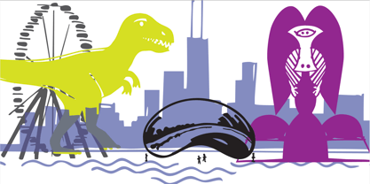
$19.00Armchair travel to the Windy City with Chicago Doodles. 31 illustrations of buildings, skylines, transportation, food, Chicago landmarks, signs and a script word Chicago. For other city, state and country doodles take a look at Paris, London, Waikiki and New Orleans Doodles. Also Cowboy and Lake Vacation Doodles too. - NewJune Serif by Hubert Jocham Type,
$39.00 - Snooty Fox NF by Nick's Fonts,
$10.00This casually elegant typeface is based on an unnamed offering from Pen & Brush Lettering and Practical Alphabets, published by Blandford Press, Ltd., London, in 1929. Good taste dictates that, because of the ornate and unusual letterforms of the uppercase letters, the font never be used as all caps. - Olympukes 2012 by Barnbrook Fonts,
$30.00Released on the occasion of the 2012 London Olympics, Olympukes 2012 was a new set of pictograms telling the ‘real’ story of the Olympics and extending the unofficial project that began in 2004. The occasion of the London games provided an opportunity to revisit the complex contradictions of the modern Olympics and to acknowledge the geopolitical shifts of the intervening eight years. The 2012 games arrived at a time of great economic and political uncertainty for the nation and Europe. Greece – the host of the 2004 games – was now located at Ground Zero of a disintegrating Eurozone and the United Kingdom was two years into a programme of austerity enacted by the coalition government of Conservatives and Liberal Democrats. Given that the previous London Olympics had been held in 1948, in a climate of recovery and austerity after a devastating World War (1948’s Olympiad was dubbed the ‘Austerity Games’) there was a sick irony to the 2012 games' arrival. The suppression of human rights in order to deliver the perfect games for PRoC’s Beijing games shocked no-one and yet, in London, the security measures seemed grossly excessive. Then again, in a country with an estimated 1.8 million cctv cameras, perhaps we shouldn’t have been so surprised. Another aspect of the Olympics that returned for 2012 was the unfettered commercialism – if you think the Games are about pure sport, about noble human endeavour, think again. Please note that Barnbrook Fonts is in no way affiliated with, or has received any endorsement from, the International Olympic Committee, the organising committees of the Olympic Games, or any national Olympic committee. - DigiBo by Volcano Type,
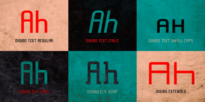
$29.00Inspired by a scoreboard of the public transport in London our best selling font family is the basic font for the german magazine Starshot and even earned feedback from Sports Illustrated. The technical look of the entire DigiBo family is making the font a worthy member of the Eurostile / DIN -league. - Coliseo by Greater Albion Typefounders,
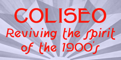
$16.50Coliseo is a lively and fun Art Nouveau inspired typeface, inspired by stone lettering seen on facade of the Coliseum Theatre in London. It's beautifully characterful let legible making it ideal for poster work or anything where it's useful to combine Roman display faces with a feeling of life and energy. - Memorial by Solotype,
$19.95The Fredrick Ullmer Co. in London acted as agent for many typefoundries, and this was one of their offerings. Some of the letters were rather outlandish, so we fearlessly decided to improve them. The result is this dated but pleasant font. The original didn't have a lowercase, so we added it.
