2,751 search results
(0.02 seconds)
- I hate you - Unknown license

- Lane Posh Light - Unknown license

- Dearest Friend lite - Unknown license

- Blind Date MF by Masterfont,
$59.00A practical handwriting font for all your day by day fresh and crazy design needs: headlines, signage etc. - Iron Lake Rough by Alphabet Agency,
$15.00 Iron Lake Rough is a pioneer era inspired slab serif font. The font works great in western, rustic and outdoor related themes.
 - Stove Plate JNL by Jeff Levine,
$29.00 An old printer's advertising cut for Red Star Oil Stoves yielded a typeface that was both vintage and somewhat techno at the same time. Originally drawn as a slanted logo, the individual letters had an array of chamfered, angled and flat sides combined with a bold outline. This font is available in both vertical and oblique versions.
 - Lite On Condensed by Factory738,
$15.00 LiteOn Condensed is the perfect font family for designers who want to achieve a sleek and refined look. This sans serif font is both lightweight and elegant, with a smooth and contemporary feel that is sure to make any project stand out. With a variety of weights to choose from, LiteOn Condensed provides ample options to suit any design need. Choose LiteOn Condensed for your next project and take your design to the next level! 6 Weights 2 Styles (Regular and Italic) Basic Latin A-Z and a-z Numerals & Punctuation Stylistic Ligatures and Alternate glyps Multilingual Support for ä ö ü Ä Ö Ü … Thanks for looking, and I hope you enjoy it.
 - Weekend Date JNL by Jeff Levine,
$29.00 Sheet music from 1910 with another one of those ridiculous thirteen word titles (“I Love My Steady but I’m Crazy for My “Once-in-a-While’”) had the lengthy verbiage hand lettered in a bold serif typeface with slightly spurred serifs. This has been recreated in a digital typeface with a much shorter name: Weekend Date JNL, which is available in both regular and oblique versions.
 - Last Date JNL by Jeff Levine,
$29.00 A typographic conundrum presented itself with the hand lettered title on the cover of the 1919 song "I Am Always Building Castles in the Air". The capitalized portion ["Castles in the Air"] was a hybrid mix of a few Art Nouveau-influenced rounded letters, yet along with this were squared letters with rounded corners (reflecting the upcoming Art Deco movement to take place in about another decade). As a complete alphabet, it didnít mix as well as in those few short words. What to do? It was decided to go with the squared look and save the rounder characters for a future project. The end result became Last Date JNL; available in both regular and oblique versions.
 - Hate Your Writing by Crumphand,
$15.00 Introducing the new font "Hate Your Writing". This font written by my daughter. Easy to read. Make your design looks stuning. What's Character Included ? Uppercase Lowercase Numerals Symbols Multilingual Language. Thank you, Regards!
 - Drury Lane NF by Nick's Fonts,
$10.00Blackfriars, a Victorian-era release from the Stephenson Blake Type Foundry, provided the basis for this rough-hewn gem. Slightly clumsy yet eager to please, this typeface adds a cheerful warmth to any project it graces. The PC PostScript, TrueType and OpenType versions contain the complete Latin language character set (Unicode 1252) plus support for Central European (Unicode 1250) languages as well. - Sea Gate JNL by Jeff Levine,
$29.00 Sea Gate JNL is a hybrid font creation based in part on a 1930s-era WPA (Works Progress Administration) poster and the addition of slab serifs as well as a few modifications to some of the characters in the original design. The typeface is available in both regular and oblique versions.
 - Maple Lane Cursive by Okaycat,
$29.95 Okaycat presents "Maple Lane Cursive". You can mix and match with Forest Cursive and Maple Lane from Okaycat. Maple Lane Cursive is a wonderful connected letter cursive script arriving with fancy & upright styles. Maple Lane Cursive features beautiful style & luxurious curves. Maple Lane Cursive is extended, containing West European diacritics & ligatures, making it suitable for multilingual environments & publications.
 - TT Lakes Neue by TypeType,
$39.00 Introducing TT Lakes Neue in version 2.0! Please note that the TT Lakes font has been removed from platforms, but you can still order it by sending a request to the studio's commercial department: commercial@typetype.org We have released a continuation of the geometric sans serif inspired by Finnish functionalism. The new version provides more opportunities, because we not only increased the character set and improved the font technically, but also reworked its visual character. What changed? Font character. TT Lakes Neue 2.0 has become calmer, as we have removed the display details in the characters of the main set, making the font more versatile. New stylistic sets were created, thanks to which the nature of the font can be controlled, making it more expressive. Changed the forms of the characters "Кк", "ЖЖ", "Дд", "Лл", lowercase "b" and alternative "g". Added alternative forms for all types of the number "1", for the characters "Mm", "DD", "Ll". Added technological character sets, with which the font looks stylish and expressive. You may notice that in these sets, the forms of lowercase characters with arches (r, m, n) are changed, and there are gaps in the places of infusions and connections of all characters. Scope of application. The scope of TT Lakes Neue 2.0 have become even more diverse, because the sans serif has become more neutral in character and more functional. TT Lakes Neue 2.0 is the perfect font for the gaming industry. Suitable for game interfaces of different genres. Technological sets can be used in architectural projects, in the headlines of posters and magazines, on outdoor signs. The font is suitable for logo design, looks great in branding. Character set and technical characteristics. We have significantly improved the set of the font, increasing the number of characters from 736 to 921. The font has become more functional due to the updated technical stuffing and new features, of which there are now 36 instead of 24. Added characters of extended Latin, fractions, arrows. Created new kerning and hinting. Updated variable font. Added new OpenType features. The TT Lakes Neue font has 5 subfamilies: Compressed, Condensed, Regular, Extended, Expanded. In total, there are 91 styles in the font: 9 upright and 9 slanted in each subfamily and 1 variable font. Each style has 921 characters and 36 OpenType features.
 - Kate Greenaway's Alphabet by Wiescher Design,
$49.50 Some time ago I bought my smallest book ever: Kate Greenaway’s Alphabet* 57 x 72 mm. I thought it was the sweetest little book I had ever seen. Not knowing about the fame of the designer Kate Greenaway (1846-1901), I put it in some dark drawer and looked at it from time to time. Kate’s books were all outstanding successes in English publishing history; she was an icon of the Victorian era. Some of those books are still being reprinted today. This little gem I had accidentally acquired has become very rare and I have not found any reprints yet. So I thought maybe I could adapt her drawings for use on today’s computers. I ventured to redraw her delicate illustrations, blowing them up 300 percent, being forced to simplify them without losing her touch. It took quite some time! While redrawing them, I discovered that she most certainly drew them in at least three different sessions as well. Then I scanned my drawings and put them in a font. To make the font more usable, I added the ten numerals in Kate’s style; the original does not have those. I hope she would have liked my adaptations. Yours in a very preserving mood, Gert Wiescher. * Kate Greenaway’s Alphabet, edited by George Rutledge & Sons, London and New York, ca. 1885.
 - Date Night JNL by Jeff Levine,
$29.00 The opening title card for 1931's pre-code movie drama "Other Men's Women" (with Mary Astor, Regis Toomey, James Cagney and Joan Blondell amongst the cast members) is the basis for the Art Deco type face Date Night JNL.
 - Nouveau Date JNL by Jeff Levine,
$29.00 The hand lettered title on the cover of the 1914 tune “I Want you to Meet My Mother” served as the inspiration for Nouveau Date JNL, which is available in both regular and oblique versions.
 - Letters And Lace by Celebrity Fontz,
$24.99 Letters and Lace is a replica of hand-crafted lace letters. Delicate and artistic, these letters will give warmth to any text. Comes with a full set of accented characters.
 - Lake Vacation Doodles by Outside the Line,
$19.00 Lake Vacation Doodles for your camping, sailing, picnicking Summertime vacation needs. With these little graphics your party invitations just design themselves. Add an Outside the Line hand lettered font and you are good to go.
 - Eagle Lake Pro by Stiggy & Sands,
$29.00 A Practical Calligraphic Hand. Eagle Lake Pro is based on the calligraphic lettering style known based on the practical Running Book Hand. It has shorter capitals that create a visually taller x-height lending to high legibility and fluidity. Classic, clean, and casual, Eagle Lake Pro fits a lot of design uses. The SmallCaps and extensive figure sets only work to further expand the usefulness of the typeface across a wider breadth of applications. See the 5th graphic for a comprehensive character map preview. Opentype features include: - SmallCaps. - Full set of Inferiors and Superiors for limitless fractions. - Tabular, Proportional, and Oldstyle figure sets (along with SmallCaps versions of the figures). - Stylistic Alternates for Caps to SmallCaps conversion.
 - Date Book JNL by Jeff Levine,
$29.00 The pen lettered opening credits for the 1937 film “The Awful Truth” inspired Date Book JNL, which is available in both regular and oblique versions. A hybrid of both Art Nouveau and Art Deco influences, this casual type design is perfect for any project that wants to convey its message in a pleasant, informal manner.
 - Stencil Plate JNL by Jeff Levine,
$29.00 A brass stencil hand cut to mark the tops of oil drums yielded the lettering for Stencil Plate JNL. The font emulates the retro feel of the unique letter forms found in the original antique design.
 - Chantilly Lace NF by Nick's Fonts,
$10.00This little charmer combines an uppercase designed by American lettering artist J. M. Bergling with a lowercase designed by English architect Roland W. Paul. The result has a wiggle in its walk and a giggle in its talk: oh, baby, that’s what I like! Both versions of the font include 1252 Latin, 1250 CE (with localization for Romanian and Moldovan). - Save The Date by Latinotype,
$40.00 A wedding begins long before the "I Do's" on the big day—everyone works together throughout the process to make sure that everything happens as planned: details, color combinations, decorations, the way we convey the magic of the visual elements and deliver our message of love. Through this beautiful font, we would like to deliver to you that very message, you make it your own and express yourself in your own way—through the perfect invitation on your wedding day. No matter how sweet or wild your invitation looks, try to be yourself. Save the Date is a font collection consisting of 9 styles and 4 variants: Script, Sans, Serif and Small. The font set is intended to provide users with a wide range of choices for any design project. Save the Date was designed by Paula Nazal and Daniel Hernández. Digital editing by Rodrigo Fuenzalida. Photos by Mónica Muñoz. Mónica specializes in wedding photography. You can find more of her work here: www.thewildbrides.com
 - Oven Plate JNL by Jeff Levine,
$29.00 Oven Plate JNL solidifies the outline lettering of Stove Plate JNL; based on the logo for Red Star Oil Stoves and found on an old letterpress cut.
 - KG Skinny Latte by Kimberly Geswein,
$5.00 This cute, slightly tall unicase handwriting has a slightly bubbly personality while still being completely legible and neat.
 - Lateral Incised NF by Nick's Fonts,
$10.00Gravure was designed by Morris F. Benton in 1927 for American Type Founders and was also released in 1929 by the London foundry of C. W. Shortt. This luminous face has a slightly naïve charm seldom found in incised typefaces. Ornamental and engaging, it’s a perfect choice for headlines with warmth and grace. Both versions of the font include 1252 Latin and 1250 CE (with localization for Romanian and Moldovan) character sets. - Ginger Mate MS by Redcollegiya,
$8.00 Ginger Mate is a handwritten funny font duo which makes it great for Christmas cards or advertising, as well as for any children's design. Each of these fonts include latin and cyrillic characters, diacritics, numbers and punctuation.
 - Eerie Lake County by The Design Speak,
$100.00 This is another scary font by the good fellows at The Design Speak. Meant to be eerie but also had a stylistic rock and roll vibe. We have you covered for things like thriller book covers and movie posters. Or anything you want to have an eerie feel. This was a hand-crafted font using a Wacom tablet and adobe illustrator.
 - Gate Keeper AOE by Astigmatic,
$19.95 The GateKeeper typeface was inspired by old horror movies, and the various poster typography that went with some of them. A loose and pointy typestyle, GateKeeper embodies the dark side of typography and life, with a creepy and on edge feeling. With large and small capitals, it is easy to exchange cases in events of double characters, which can lend for a very interesting offbeat quality. Usable for any ocassion, but most suitable for dark matter. Learn about the GateKeeper, study his methods, and pass his test. Get the GateKeeper typeface today, and you are on your way!
 - Andron Freefont LAT - Personal use only

- d puntillas A Lace - Personal use only

- Sevil alias Esra Lite - Unknown license

- I hate Comic Sans - Unknown license

- Three Dates, One Night - Unknown license

- See You Later JNL by Jeff Levine,
$29.00 The sheet music cover of Lew Brown and Albert Von Tilzer's 1917 wartime song "Au Revoir, But Not Goodbye (Soldier Boy)" had its title hand-lettered in a condensed sans serif design with the influence of Art Nouveau styling. This has now been re-drawn digitally as See You Later JNL.
 - City By The Lake by PizzaDude.dk,
$20.00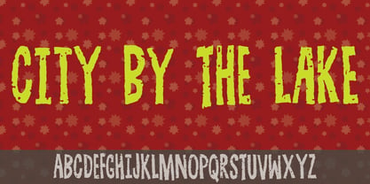
- Great Lakes Shadow NF by Nick's Fonts,
$10.00Handlettering on a 1930s travel poster for the Canadian Pacific Railway provided the pattern for this distinctive Deco typeface. A strong dropshadow treatment has been added so you can create can't-miss headlines easily. Both versions of the font contain characters to support all major European languages. - Miss Le Gatees Pro by Sudtipos,
$45.00 The Charles Bluemlein Script Collection is an intriguing reminder of the heady days of hand lettering and calligraphy in the United States. From the early 1930s through World War II, there were about 200 professional hand letterers working in New York City alone. This occupation saw its demise with the advent of photo lettering, and after digital typography, became virtually extinct. The odd way in which the Bluemlein scripts were assembled and created - by collecting different signatures and then building complete alphabets from them - is a fascinating calligraphic adventure. Because the set of constructed designs looked nothing like the original signatures, fictitious names were assigned to the new script typefaces. The typeface styles were then showcased in Higgins Ink catalogs. Alejandro Paul and Sudtipos bring the Bluemlein scripts back to life in a set of expanded digital versions, reflecting the demands of today’s designer. Extreme care has been taken to render the original scripts authentically, keeping the fictitious names originally assigned to them by Bluemlein.
 - Kate Slab Pro Expanded by Monday Type,
$19.00 Kate Slab Pro Expanded is a sophisticated and robust modern Slab Serif Typeface that works in a variety of design scenarios. It is designed to work in big attention grabbing headlines as well as in smaller text and even body text. The recognition value of Kate Slab Pro Expanded is its biggest asset in world of uniformity. Ranging from “100 Thin” all the way to “900 Black” makes Kate Slab Pro Expanded such an amazing and versatile font family that stands out. Kate Slab Pro Expanded doesn’t only work great in lifestyle and fashion related contexts but will also look amazing for restaurants, coffee shops or and other use cases that ask for character and identity. To fill all the gaps of a designer’s needs, Kate Slab Pro Expanded comes with an italic style with every weight. Those italics are equipped with unique and real italic characters and will make you love it. Being a Slab Serif Kate Slab Pro Expanded manages to remind you of a classic Font Family with a modern and timeless approach that will make you happy for decades. Monday Type can’t wait to see the beautiful designs you are going to create with our Kate Slab Pro Expanded.


