10,000 search results
(0.04 seconds)
- Pricing Labels JNL by Jeff Levine,
$29.00 - Draughtsman Label Hand by Greater Albion Typefounders,
$35.00
- Library Book Initials JNL by Jeff Levine,
$29.00
- Dutch Mediaeval Book ST by Canada Type,
$39.95
- KR Boo! - Unknown license

- Angel Boos by Struggle Studio,
$12.00
- Bat Boo by AEN Creative Studio,
$15.00
- Dysiu Boo by Intellecta Design,
$24.90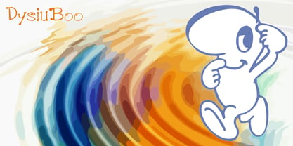
- Baby boo by Sipanji21,
$13.00
- Red Border Labels JNL by Jeff Levine,
$29.00
- H74 Black Label Whiskey by Hydro74,
$25.00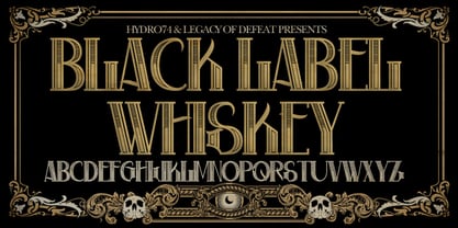
- Ful • Fruitful & Universal Labels by S P I C I O,
$88.88
- Look sir, droids! - Unknown license

- KR Ookie Bookie - Unknown license

- Hooked Up 101 - Unknown license

- KR Look Closely - Unknown license

- All Hooked Up - Unknown license

- A Truly Hook by Javanice Studio,
$16.00
- Boom Pang Pow by TypoGraphicDesign,
$9.00
- Boot Hill NF by Nick's Fonts,
$10.00
- Boot Camp JNL by Jeff Levine,
$29.00
- Biff Bam Boom by Comicraft,
$19.00
- Look Like Coffee by HIRO.std,
$17.00 - Good Looking Karma by Gassstype,
$25.00
- Under Boom Graffiti by Sipanji21,
$15.00
- Ripped Bam Boom by Comicraft,
$19.00
- Tickety Boo NF by Nick's Fonts,
$10.00 - Boo Meringue NF by Nick's Fonts,
$10.00 - Sis Boom Bah NF by Nick's Fonts,
$10.00 - LD Kiss The Cook by Illustration Ink,
$3.00 - Johnny The Hook Roman by Letterhead Studio-VV,
$29.99
- EvilGenius BB - Personal use only

- Psiphoon BB - Personal use only

- Embossing Tape 2 (BRK) - Unknown license

- super danger - Unknown license

- ShockTherapy BB - Personal use only

- SF Wonder Comic - Unknown license

- Fudd - Unknown license

- Anime Ace - Personal use only

- Bionic Comic Condensed - Unknown license


