7,494 search results
(0.026 seconds)
- Pea Jean - Unknown license

- John Doe - Unknown license

- John 315 - Unknown license

- John Speed by Scriptorium,
$18.00John Speed is an ornate, decorative calligraphic titling font based on the hand lettering of 17th century English mapmaker John Speed. It features extraordinary decorated letters, variant character forms and other unique features. - Loose Jeans by Epiclinez,
$18.00 Loose Jeans is a fun, playful, and quirky display font. It has a modern yet whimsical style an it will undoubtedly immerse your designs into a magical world. So what's included : Basic Latin A-Z & a-z Numbers, symbols, and punctuations Accented Characters : ÀÁÂÃÄÅÆÇÈÉÊËÌÍÎÏÑÒÓÔÕÖØŒŠÙÚÛÜŸÝŽàáâãäåæçèéêëìíîïñòóôõöøœšùúûüýÿžß Thank you
 - Nichole Jean by Throndsen,
$19.99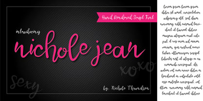
- John Yoko by Amelia Studio,
$12.00 John Yoko with the kind of modern calligraphy font, I hope you are interested in this font, if you want to use for your work this font can be used easily and simply because there are a lot of features in it to contain a complete set of letters lower and uppercase letters, assorted punctuation, numbers, and multilingual support. font also contains several ligatures and alternate style Stylistic Sets for those of you who have software that is able to work OpenType (Photoshop / Illustrator / InDesign). John Yoko is suitable use for market design developed at this time, this font has a model Trendy, natural and gentle, with this font you can take advantage of the opportunity in every moment of one wonderful way to highlight the celebration of the feast of your best, because this font will be advocates for purposes such as wedding invitations, party, graduation, birthday, gathering, etc.
 - John Davidson by Mindtype Co.,
$35.00 Introducing the John Davidson, a beautiful modern calligraphy font with handwritten, sophisticated flows. John Davidson offers beautiful typographic harmony for a diversity of design projects, including logos & branding, wedding designs, social media posts, advertisements & product designs.
 - JoAnne Display by JMA,
$24.95JoAnne Display is an elegant, open face, display font in 1 weight. - Hi Joana by Beary,
$14.00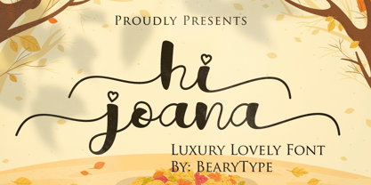 Hi Joana feels equally charming and elegant. It looks stunning on wedding invitations, thank you cards, quotes, greeting cards, logos, business cards and every other design which needs a handwritten touch. This font is PUA encoded which means you can access all of the glyphs and swashes with ease!
 - Ginger John by Fenotype,
$25.00 Ginger John is a strong and expressive sign painting style brush script family with three weights. Ginger John is equipped with automatic Contextual Alternates and Standard Ligatures that add variety in the flow and keep connections smooth. If that isn’t enough, there’s Swash, Stylististic and Titling Alternates for every standard uppercase and lowercase character. Ginger John Extras is a pack of strokes and swashes that can be used as underlining endings for words. Ginger John is an outstanding display font that works great for any display use, from branding to packaging to logotype.
 - SP Jean by Remote Inc,
$39.00I met her in a saloon called Little Texas. I was drinking mescal like it was vodka. She, tossing midgets like they were lawn darts. When the betting was closed, she launched an extra from The Wizard of Oz an impressive five meters, grabbed her margaritta and sat down. - Friday Jeans by PizzaDude.dk,
$19.00 Got a favourite pair of jeans? I do, and I wear them every Friday when it's time to PAAAARTYYYY! Well, that was 30-something years ago, but the memory of those jeans lives happily in my mind :) The font, Friday Jeans is a happy-go-lucky sans font with inky edges and lively lines. Playful as a Friday night out!
 - Dearest John by Outside the Line,
$19.00 Dearest John is the first font in the Love Letters series from Outside the Line. It is a bouncy hand lettered font. If you type caps and lower case you get one look. If you type all caps you get another look. Kind of 2 fonts for the price of one. I prefer to type caps and lower case and then go back in and tweak the headline a little to get the look I want. Dearest John was seen in the 2011 Typodarium Page-A-Day Calendar on 12-9-2011.
 - Building & Loan by K-Type,
$20.00 A slightly rustic font with horizontal shading, Building & Loan evokes hand-crafted solidity and hands-on reliability.
 - Joined Tightly by Jehansyah,
$9.00This is a very unique font, because of its cute appearance, will give your designs a very modern look. use this design for any design that smells retro or futuristic, suitable for any appearance of any media design, and supported by unique ligatures, very easy to use - Pearl Jean by Maulana Creative,
$18.00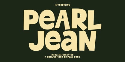 Pearl Jean is a casual handwritten display font. With medium low contrast stroke, fun character with a bit of ligatures and alternates. To give you an extra creative work. Pearl Jean font support multilingual more than 100+ language. This font is good for logo design, Social media, Movie Titles, Books Titles, a short text even a long text letter and good for your secondary text font with sans or serif. Make a stunning work with Pearl Jean font. Cheers, Maulana Creative
 - John Sans by Storm Type Foundry,
$49.00 The idea of a brand-new grotesk is certainly rather foolish – there are already lots of these typefaces in the world and, quite simply, nothing is more beautiful than the original Gill. The sans-serif chapter of typography is now closed by hundreds of technically perfect imitations of Syntax and Frutiger, which are, however, for the most part based on the cool din-aesthetics. The only chance, when looking for inspiration, is to go very far... A grotesk does not afford such a variety as a serif typeface, it is dull and can soon tire the eye. This is why books are not set in sans serif faces. A grotesk is, however, always welcome for expressing different degrees of emphasis, for headings, marginal notes, captions, registers, in short for any service accompaniment of a book, including its titlings. We also often come across a text in which we want to distinguish the individual speaking or writing persons by the use of different typefaces. The condition is that such grotesk should blend in perfectly with the proportions, colour and above all with the expression of the basic, serif typeface. In the area of non-fiction typography, what we appreciate in sans-serif typefaces is that they are clamorous in inscriptions and economic in the setting. John Sans is to be a modest servant and at the same time an original loudspeaker; it wishes to inhabit libraries of educated persons and to shout from billboards. A year ago we completed the transcription of the typefaces of John Baskerville, whose heritage still stands out vividly in our memory. Baskerville cleverly incorporated certain constructional elements in the design of the individual letters of his typeface. These elements include above all the alternation of softand sharp stroke endings. The frequency of these endings in the text and their rhythm produce a balanced impression. The anchoring of the letters on the surface varies and they do not look monotonous when they are read. We attempted to use these tricks also in the creation of a sans-serif typeface. Except that, if we wished to create a genuine “Baroque grotesk”, all the decorativeness of the original would have to be repeated, which would result in a parody. On the contrary, to achieve a mere contrast with the soft Baskerville it is sufficient to choose any other hard grotesk and not to take a great deal of time over designing a new one. Between these two extremes, we chose a path starting with the construction of an almost monolinear skeleton, to which the elements of Baskerville were carefully attached. After many tests of the text, however, some of the flourishes had to be removed again. Anything that is superfluous or ornamental is against the substance of a grotesk typeface. The monolinear character can be impinged upon in those places where any consistency would become a burden. The fine shading and softening is for the benefit of both legibility and aesthetics. The more marked incisions of all crotches are a characteristic feature of this typeface, especially in the bold designs. The colour of the Text, Medium and Bold designs is commensurate with their serif counterparts. The White and X-Black designs already exceed the framework of book graphics and are suitable for use in advertisements and magazines. The original concept of the italics copying faithfully Baskerville’s morphology turned out to be a blind alley. This design would restrict the independent use of the grotesk typeface. We, therefore, began to model the new italics only after the completion of the upright designs. The features which these new italics and Baskerville have in common are the angle of the slope and the softened sloped strokes of the lower case letters. There are also certain reminiscences in the details (K, k). More complicated are the signs & and @, in the case of which regard is paid to distinguishing, in the design, the upright, sloped @ small caps forms. The one-storey lower-case g and the absence of a descender in the lower-case f contributes to the open and simple expression of the design. Also the inclusion of non-aligning figures in the basic designs and of aligning figures in small caps serves the purpose of harmonization of the sans-serif families with the serif families. Non-aligning figures link up better with lower-case letters in the text. If John Sans looks like many other modern typefaces, it is just as well. It certainly is not to the detriment of a Latin typeface as a means of communication, if different typographers in different places of the world arrive in different ways at a similar result.
 - Dear John by TypeArt Foundry,
$45.00 Typewriter simulation with slight inking imperfections.
 - Juan Carlos by Homelessfonts,
$49.00 Homelessfonts is an initiative by the Arrels foundation to support, raise awareness and bring some dignity to the life of homeless people in Barcelona Spain. Each of the fonts was carefully digitized from the handwriting of different homeless people who agreed to participate in this initiative. A biography/story of each homeless person captures their story, to help raise awareness and bring some dignity to the life of homeless people. Monotype is pleased to donate all revenue from the sales of Homelessfonts to the Arrels foundation in support of their mission to provide the homeless people in Barcelona with a path to independence with accommodations, food, social and health care. Juan Carlos was born in Barcelona, Spain 46 years ago. Since the age of 17 – and during eleven years – he worked double shifts of eight hours every day in a factory. Excessive work and family problems debilitated his health and he lost his job. He then faced a dilemma: to spend unemployment benefits to pay for rent or for food. For a few years, he worked helping in the kitchens of different restaurants while he lived on a pension, until he was definitively left without work and ended up living in the street for 10 years. “In the street I tried to find rest in the ATMs of banks. I preferred to be alone, and if I ran into conflictive people, I looked for somewhere else” he explains. Living in the street he was the victim of an aggression. Since then, with the help of Arrels he moved into a pension. Today, Juan Carlos is a volunteer in the shower service of Arrels, the same showers he used during years. He also collaborates with the maintenance team, helps prepare hygienic and cleaning material, and participates in activities such as the theatre group and the football team.
 - John Handy by ITC,
$29.99John Handy is the work of British designer Timothy Donaldson and based on his own handwriting. Part of the ongoing trend for casual letterforms in display typography, John Handy is an excellent choice for letters, greeting cards, menus, wherever an elegant yet personal look is desired. - John Doe by Fonthead Design,
$19.00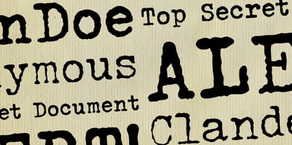
- Blue Jeans by Resistenza,
$29.00 Blue Jeans, is a new unconnected brush script font designed with Pentel brush sign. More about Opentype Features: https://bit.ly/opentype-rsz
 - Selfish Jeans by Bogstav,
$16.00 The song "Selfish Jean" by Travis inspired me to name this font, and a runny pen made me draw the letters. Actually, I started making the font while listening to that particular song - and the whole atmosphere about that situation, suited me perfect to make this handmade font! :)
 - John Brown by Hanoded,
$15.00 I realized I didn't have that many serif fonts, so I started sketching and came up with John Brown. John Brown is named after the sheriff in the Bob Marley song 'I Shot The Sheriff'. It is an all caps font, but upper and lower case can be freely interchanged for that great 'natural' look.
 - Corvallis by ITC,
$29.99 - Cormac by Typedepot,
$19.00 Cormac is a humanist typeface characterized with it's large x-height and slightly flared stems. The word that best describes our ideas in the beginning of the project is "simple" - the idea behind it was to strip the letter forms of everything unnecessary, and yet keep the typeface interesting. The typeface is friendly without being too cheezy thanks to its humanistic character, flared ascenders and stems reminding of its calligraphic origin. The proportions are closer to the traditional old style typefaces. Cormac is open and readable typeface coming in 7 weights plus their matching 'true' italics - from Extra Thin to Bold. The family comes with Cyrillic support, great range of numerals, fractions, ligatures, alternates and a lot of special characters making Cormac a great solution for greate range of design work - branding, editorial, web, wayfinding, etc.
 - Norway by pentagonistudio,
$19.00 Norway Is Authentic Display Font Inspired By Classic Characters. SOFTWARE REQUIREMENTS : Fonts and alternate : No special software required they may be used in any basic program /website apps that allows standard fonts That's it folks! You can go ahead and get cracking :) Follow My Shop For Upcoming Updates Including Additional Glyphs And Language Support. And Please Message Me If You Want Your Language Included or If There Are Any Features or Glyph Requests, Feel Free to Send me A Message. Have a Good Day !
 - NORWALKE by Unitype Studio,
$19.00 Introducing NORWALK - Modern Serif Font. Our latest digital modern serif font - a sleek and sophisticated typeface perfect for any creative project. With clean lines and elegant curves, this font is sure to make your designs stand out. Get your hands on it today and elevate your designs to the next level! Ready to take your design game to the next level? Whether you're creating a logo, website, or printed materials, this font is the perfect choice for adding a touch of class and sophistication.
 - Mortale by Letterhend,
$17.00 Mortale is a display font a typeface which is inspired by vintage lettering. Very suitable for for headline, logotype, apparel, invitation, branding, packaging, advertising etc with old school / vintage as well as modern theme. Features : Uppercase & lowercase Numbers and punctuation Alternate & Ligatures Multilingual PUA encoded We highly recommend using a program that supports OpenType features and Glyphs panels like many of Adobe apps and Corel Draw, so you can see and access all Glyph variations.
 - Normande by Bitstream,
$29.99A French form of Fat Face, derived from the British; matrices survive at Berthold in Berlin. - Norwill by Din Studio,
$29.00 Norwill is a modern display font. Made for any professional project especially that related to the sports. Beside that, this font can be used for printing, branding and quotes. Features: PUA Encoded Multilingual Support Numerals and Punctuation Thank you for downloading premium fonts from Din Studio
 - Sarmal by Ahmet Altun,
$19.00 The sarmal font contains ligatures that are functional and useful. It can be a stylish font choice for your posters, t-shirts, prints and many more works.
 - Dorsal by Wordshape,
$20.00 Dorsal is a display typeface that is based on a rare bit of lettering from a 1910 German lettering book.
 - Normaliq by Differentialtype,
$12.00 Normaliq is a geometric and modern sans serif family that exudes a unique and minimalist charm. comes in nine weights, ranging from Thin to Black, combined with an Italic style, as well as the addition of Black Outline and Black Italic Outline. The balance of hard lines and subtle curves provides strength and eye-catching for every weight of the family. Each font in the family can stand alone, dynamic and authoritative. This font family offers versatility for a variety of design needs, designed specifically for looks such as titles, branding, logos, books, branding and other impactful editorial work.
 - Zornale by Eurotypo,
$20.00 The "Zornale", is an original manuscript that contains a large amount of data, providing a daily record of the books acquired by the Venetian bookseller Francesco de Madiis, between 1481 and 1488. Zornale is a family of text fonts in five weights that can be combined with the variant Caption with short ascenders and descendants. The family is completed with true italics in two weights (light italics and italics) specially designed for use in reading texts. These fonts have been designed with precise kerning and full OpenType features: Small caps, old-style numbers, Swashes, stylistic and contextual alternates, ligatures and case-sensitive forms. Each font contains 549 glyphs for complete control and enhance typographic refinement.
 - Portal by Fontfabric,
$25.00 Portal is a custom font which is applicable for any type of graphic design - web, print, motion graphics etc and perfect for t-shirts and other items.
 - Throrian Formal - 100% free

- Nickley-NormalA - Unknown license

- Laconick-NormalA - Unknown license


