3,286 search results
(0.007 seconds)
- Awesome - Personal use only

- Urania Czech - Personal use only

- Barbecue by Gaslight,
$20.00
- Tenby Five - Unknown license

- Bread Crackers by Jehansyah,
$9.00
- Bagusih by Twinletter,
$15.00
- Facegraph by hiroki kanda,
$14.00
- Paperclip Reg - Unknown license

- The PUNCHER by PAC Font Corner,
$120.00
- Sarcasticity by Thomas Käding,
$10.00
- FG Erin by YOFF,
$14.95 - Xero by Megami Studios,
$12.50
- Kreis by Kateryna Korolevtseva,
$19.00
- Bramare by Sylvestre Studios,
$25.00
- Diskojuice by PizzaDude.dk,
$20.00 - Remarkably Dressed by Bogstav,
$12.00
- Rafine by Fontmachine,
$9.00
- Rosa Stencil by Schriftgestaltung,
$19.00 - MHF Headbanger by MetalHead,
$14.95
- Boredom by Invasi Studio,
$17.00
- Besign - 100% free

- Kamaboko by Fype Co,
$14.00
- Honey Love by Dhan Studio,
$15.00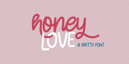
- Urban Vibe by DainType,
$15.00
- Bacchus MF by Masterfont,
$59.00
- Disgusting Behavior - 100% free

- HopefulGrasshopper by JBFoundry,
$5.00
- MHF Gothic by MetalHead,
$14.95
- Gitenn by SteerFonts,
$7.50
- Alt Exline by ALT,
$4.00
- ALT Breo by ALT,
$6.00
- Compact Hebrew MF by Masterfont,
$59.00
- Blikfang by Bogstav,
$17.00
- Set Theory by Haiku Monkey,
$10.00 - Japan Stamp by Pavel Boog,
$26.00
- Monotype Sabon by Monotype,
$34.99 - Tirade by Fontosaurus,
$19.95 - Metzada MF by Masterfont,
$59.00
- Lagniappe by Funk King,
$5.00
- Filature by JBFoundry,
$16.00


