44 search results
(0.008 seconds)
- Linja - Unknown license

- Ninjas - Unknown license

- Linja by Fenotype,
$14.95 Linja is an elegant ultra condensed font. It's best for display use in magazines, books & posters. Linja font was originally designed in 2002. Now it's been remade with the complete character set and six different versions.
 - Inka by CarnokyType,
$49.00 Inka is the name by which the closest-ones called my partner. Inka is also the name of a text typeface – in its form very friendly and welcoming. The same way as relationships develop through the life, text typefaces develop, too. I had started the work on this typeface about the same time as I met Inka, while reaching the final output has been a long and progressive process. Inka is a modern serif typeface with wide universality in functions (various editorial usages as books, magazines, annual reports…). The concept and the scope of the complete type family are based on the principle of optical sizes of the typeface designed for the particular use of the size of typesetting. Inka consists of several drawing variations for the typesetting of small sizes (Small), text typesetting (Text), larger typesetting sizes (Title), and headlines sizes (Display). Two constructive alternatives, differing in the height of the construction of the font signs, further extend the variability of the usage of the typeface. Inka A has classical proportions ideal for book typesetting. Inka B has lower ascenders and descenders, lower uppercase glyphs and numbers. Typeface with such construction allows us to use the typesetting efficiently while using tighter leading and still looking more contemporary. Each of the font set (Display, Title, Text, Small) consists of four weights (Regular, Medium, Bold, Black), each has wide character set and a lot of OpenType features. “Inka is dedicated to Inka.”
 - Anja Eliane - Unknown license

- Last Ninja - Unknown license

- Ninja Penguin - Unknown license

- Death Ninja - Unknown license

- Ninja Quest by Arendxstudio,
$13.00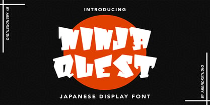 Ninja Quest – Japanese Display Font is a font with distinctive handwritten characters perfect for branding projects, logos, wedding designs, media posts, advertisements, product packaging, product designs, labels, photography, watermarks, invitations, stationery, and any project who need handwritten dishes. Features : • Character Set A-Z • Numerals & Punctuations (OpenType Standard) • Accents (Multilingual characters) • Ligature Multilingual Support : Afrikaans, Albanian, Asu, Basque, Bemba, Bena, Catalan, Chiga, Cornish, Danish, English, Estonian, Faroese, Filipino, Finnish, French, Friulian, Galician, German, Gusii, Icelandic, Indonesian, Irish, Italian, Kabuverdianu, Kalenjin, Kinyarwanda, Low German, Luo, Luxembourgish, Luyia, Machame, Makhuwa-Meetto, Makonde, Malagasy, Malay, Manx, Morisyen, North Ndebele, Norwegian Bokmål, Norwegian Nynorsk, Nyankole, Oromo, Portuguese, Romansh, Rombo, Rundi, Rwa, Samburu, Sango, Sangu, Scottish Gaelic, Sena, Shambala, Shona, Soga, Somali, Spanish, Swahili, Swedish, Swiss German, Taita, Teso, Vunjo, Zulu
 - Ninja Hirosi by Yoga Letter,
$16.00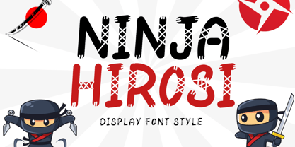 "Ninja Hirosi" is a very unique and cute display font. This font is equipped with uppercase, lowercase, numerals, punctuation, and multilingual support. Very suitable for comics, book titles, promotions, business branding, stickers, banners, branding, logos, film titles, and others.
 - Ninja District by Hatftype,
$15.00 Ninja District - Japanese Font Style is a font with distinctive handwritten characters perfect for branding projects, logos, wedding designs, media posts, advertisements, product packaging, product designs, labels, photography, watermarks, invitations, stationery, and any project who need handwritten dishes. Features : • Character Set A-Z (Only caps)• Numerals & Punctuations (OpenType Standard) • Accents (Multilingual characters) • Ligature. Multilingual Support : Afrikaans, Albanian, Asu, Basque, Bemba, Bena, Catalan, Chiga, Cornish, Danish, English, Estonian, Faroese, Filipino, Finnish, French, Friulian, Galician, German, Gusii, Icelandic, Indonesian, Irish, Italian, Kabuverdianu, Kalenjin, Kinyarwanda, Low German, Luo, Luxembourgish, Luyia, Machame, Makhuwa-Meetto, Makonde, Malagasy, Malay, Manx, Morisyen, North Ndebele, Norwegian Bokmål, Norwegian Nynorsk, Nyankole, Oromo, Portuguese, Romansh, Rombo, Rundi, Rwa, Samburu, Sango, Sangu, Scottish Gaelic, Sena, Shambala, Shona, Soga, Somali, Spanish, Swahili, Swedish, Swiss German, Taita, Teso, Vunjo, Zulu. There it is. I really hope you enjoy it. Comments & likes are always welcome and accepted.
 - Ninja Dingbats by Andinistas,
$29.95 - NINJA Japan by WAP Type,
$15.00 Ninja japan style font is a handcrafted brush font, its have an asian and oriental looks, a perfect companion for your creative project that has an asian niche. Fujimaru can be used as horror effect or even the fun title for cartoon movie, just pick your style. Ninja is doing his best at the heading title,movie poster,quotes text,and so on.. Product Content : Features : • Character Set A-Z • Numerals & Punctuations (OpenType Standard)
 - Ninja 1 by Andinistas,
$29.95 - Ninja 2 by Andinistas,
$29.95 - Squid Ninja by Epiclinez,
$18.00 Squid Ninja is a bold, fun display font with unique characters and playful vibes. It's a good choice for creating exciting logotypes, eye-catching headlines, catchy titles, and more. Squid Ninja offers a wide range of possibilities to make your work look dynamic and more enjoyable. Squid Ninja font includes : Basic Latin Uppercase and Lowercase Numbers, symbols, and punctuations Multilingual Support. Simple Installations & Works on PC & Mac Thank You and happy designing!
 - Turtles - Unknown license

- Heleodora by Andinistas,
$39.95The unconventional structure of this typographic family was inspired in my fonts: Rosadelia, alcira, Navaja, Ninja 1, and Ninja 2. - Obdulia by Andinistas,
$39.9520g Rosadelia + 200g Alcira + 2 tablespoons Heleodora + 1 cup ninja stock + 100g Lucrecia + 2 tablespoons lirrot. REDUCE to a medium heat and melt the grunge. Add the photo and color and sauté for 5 minutes or until softened. Add the design, stock and andinistas and simmer until slightly thickened. Serve immediately with Dingbats and handwriting South America. - Arequipa by Alan Meeks,
$45.00 Arequipa is a Latin font with serifs generally top left. The style is influenced by Aztec and Inca designs the Bold weight is excellant for Headline and the lighter weights work well in limited text. The geometric shape of the serifs, ij dots, full point, comma and cap Q give the font an unusual and distinctive look.
 - Kaindra by Sipanji21,
$15.00 Kaindra is a Theme display font that has a Japanese Ninja Looks. Kaindra is a good font to use for various graphic designs, such as poster titles, banners, advertisements, logotypes, and is good for combining various types of icons. This font is also good for packaging, crafting, children's and adult clothing. apply this font for your various designs to make it more powerful
 - Shard by Device,
$39.00 Shard was originally commissioned for Nickelodeon’s 3D reboot of the Teenage Mutant Ninja Turtles franchise. It complemented the show’s new angular logo, which Rian Hughes also designed. There are alternative versions of many letters available in the upper and lower case keys, and a selection of around 90 ligatures that automatically substitute themselves in running text to give a tight, interlocked fit.
 - Mixcoatl Mono by URW Type Foundry,
$19.99 The Typeface «Mixcoatl» by Elia Salvisberg was developed as a part of a course at the Lucerne School of Design and Art in 2016. Based on the book «The Empire of the Inca», a display-font has been created, which is inspired by the graphic language of the South American Empire of the Incas. At the beginning, only capital letters were designed but there was the desire for a complete typeface – which is why the missing signs were added. The font is based on a grid, so the characters are constructed equivalently and a uniform geometric font arose. The name was adopted from the god of hunting who plays an important role in the mythology of the Aztecs and appears in various forms. The uppercase letters can also be represented and combined in two alternative character-sets, so there are a lot of opportunities to combine uppercase words in different forms.
 - Cream Cake - Personal use only

- Klein Rough Gemein by TypoGraphicDesign,
$19.00 The typeface Klein Rough & Gemein(e) is designed from 2020 for the font foundry Typo Graphic Design by Inga Luft and Manuel Viergutz. The display font based on original old german rubber stamps and is inspired in the past and present. 4 font-styles (Rough, Rougher, Roughest, Rough Mix) + 1 icon-style with 432 glyphs (Adobe Latin 2) incl. 100+ decorative extras like icons, arrows, dingbats, emojis, symbols, geometric shapes, catchwords, decorative ligatures (type the word #LOVE for ❤ or #SMILE for ☺ as OpenType-Feature dlig) and stylistic alternates (7 stylistic sets). For use in logos, magazines, posters, advertisement plus as webfont for decorative headlines. The font works best for display size. Have fun with this font & use the DEMO-FONT (with reduced glyph-set) FOR FREE! ■ Font Name: Klein Rough & Gemein(e) ■ Font Weights: 4 + 1 (Icons) + DEMO (with reduced glyph-set) ■ Font Category: Display for headline size ■ Font Format:.otf (Mac + Win, for Print) + .woff (for Web) ■ Glyph Set: 432 glyphs (Adobe Latin 2) incl. 100+ decorative extras like dingbats ■ Design Date: 2020 ■ Type Designer: Manuel Viergutz und Inga Luft
 - Last Ninja by Freaky Fonts is an evocative and character-rich typeface that captures the essence of mystery and agility associated with the ancient warriors it is named after. At first glance, Last N...
- The Linja font, crafted by the prolific font foundry Fenotype, is a testament to modern design principles, encapsulating simplicity, elegance, and functionality. At its core, Linja is designed to cat...
- defatted milk - Personal use only

- Bluset Now Mono by Elsner+Flake,
$35.00 Bluset Monospaced enlarges the re-worked and expanded text- and headline typeface family Bluest Now with 6 new cuts. The concept for Bluest Now was based, in its original form, on a corporate design typeface by Elsner+Flake in 2004, ordered by the Landor Agency for a large German energy corporation. Regularly re-worked and brought up to modern standards, the typeface is still used to this day. Because of its large x-height and its well-balanced appearance, Bluset Now Mono is also excellent for use in small typesizes. The three Roman cuts, Regular, Medium and Bold, and the corresponding obliques, allow a clear differentiation of base- and display applications for every typesize. The character complement has been created for 72 Latin-based language areas and thus allows a neutral text exchange across language borders. Translation Inga Wennik
 - The Anja Eliane font is a delightful embodiment of elegance and grace, intertwining classic charm with contemporary flair. This typeface has a distinctive character, resonating with the personality o...
- Bigticy by Présence Typo,
$36.00Bigticy is a typeface with a "new-retro" feeling. Its square outline is tempered by rounded angles. This makes it suitable for a large range of applications in the domains of magazine headlines and posters. The Narrow version has been drawn from a title found in an example (dated from the 50's) of the French newspaper "Le Dauphiné Libéré". For the Maxi style, I have tried to reduce to their minimum the inner white spaces. I had in mind those amazing stone walls that one can see in the antique Inca cities in Peru. The stones are so tightly joined that it is impossible to slip a sheet of paper between them. The Plain version is an interpolation of the two other ones. It is a very useful style since I keeps the main quality of each parent: the weight of the Maxi and the narrowness of the Narrow. - Garamond Rough Pro by Elsner+Flake,
$59.00 With its animated contours, and set in an appropriate size, the Garamond Rough typeface attempts to simulate printed hot metal typesetting. Its roughened edges make it appear softer and less crisp, and, thus, takes the harshness out of the type image. The size of the offered type complement as well as the number of its affiliated symbols makes it ideal for differentiated text setting. Furthermore, its display types make surprising visual accents possible. The origins of the design of Garamond Rough go back to the middle of the 16th century. They are ascribed to Claude Garamond who was one of the first typographers who designed typefaces specifically for the setting of books. During the course of the past centuries and decades, many different variations and new design interpretations of the Garamond typeface were developed to accommodate the most diverse typesetting and printing practices in many different countries. As such, today’s designers can take advantage of a comprehensive digital repertoire for text and display applications. Translation Inga Wennik
 - Omega Pixel by João Henrique Lopes,
$- OmegaPixel Font Description I created this font for the game Hyper Ninja Blast (but made it useful to all kinds of games!). While creating the game, I searched for pixel fonts, but could not find a suitable one. The fonts were generally ugly and lacking the basic variations (italic and bold). So I decided to create my own pixel font. Just as pixel art can be better than a high-resolution painting, so pixel fonts don’t need to be always worse than traditional fonts. In OmegaPixel I tried to achieve elegance, readability and flexibility within the limitations of a 6 pixel x-height. With 4 versions (regular, italic, bold and bold italic), and a neutral feel, OmegaPixel can be used in any genre of games. Considering the general lack of money among indie game devs, I’m giving the regular version for free! For inspiration, I often remebered Minion’s lowercase ‘a’, Galliard italic lowercase ‘g’, and the calligraphy of Chinese emperor Huizong.
 - Ulga Grid Solid by ULGA Type,
$19.00 ULGA Grid Solid is the sharp, blockier sibling of ULGA Grid and ULGA Grid Rounded. The typeface consists of three weights, regular, medium and bold, with corresponding oblique styles. Every character in the extended ULGA Grid family shares the same width. Forged from a box full of ninja throwing stars – props from the now-forgotten 1976 Japanese film, Gridzilla, Revenge of King Gridorah – the solid shapes and sharp, chamfered corners give the characters a hard, cut-from-metal feel. A versatile display typeface that can be used for a wide range of purposes including CD covers, posters, packaging, advertising, nameplates for tractors, brochures and film titles. Mix and match with ULGA Grid and ULGA Grid Rounded, use the alternatives, sneak in an oblique style to spice things up, but most of all this is a fun typeface family. But, please, don’t use the characters as throwing stars. That’s just dangerous, someone will get hurt and you’ll regret it. The character set supports Western Europe, Vietnamese, Central/Eastern Europe, Baltic, Turkish and Romanian.
 - The Angelina font, crafted by Anja Denali, is a testament to the beautiful amalgamation of creativity and emotion that can be conveyed through typography. This font stands out for its handwritten, ca...
- Mather Laord by Twinletter,
$17.00 Mather Laord is the perfect hero font for those who want to create powerful and unforgettable hero branding. Its sharp and pointed serif exudes a sense of strength and precision that is perfect for heroes who wield swords or are ninjas. The font’s 143 alternate characters for uppercase and 34 ligatures offer a wide range of options to create unique and memorable typography designs. Not only does Mather Laord have a stunning appearance, but it also supports multilingual characters, making it a versatile font that can be used globally. Whether designing a logo for a hero-themed brand, creating merch for your favorite hero, or designing a poster for a hero movie, Mather Laord can help you create an impactful and unforgettable design. So, if you want to stand out from the crowd and make a lasting impression on your audience, Mather Laord is the perfect choice for your next hero design project. What’s Included : - File font - All glyphs Iso Latin 1 - Alternate, Ligature - Simple installations - We highly recommend using a program that supports OpenType features and Glyphs panels like many Adobe apps and Corel Draw so that you can see and access all Glyph variations. - PUA Encoded Characters – Fully accessible without additional design software. - Fonts include Multilingual support
 - Street Punks by Wing's Art Studio,
$10.00 Street Punks: Graffiti Inspired Marker Pen and Paint Brush Font A hand-drawn font inspired by graffiti and skate culture that comes in two pen and paint styles. Plus a shed-load of alternatives for designs that come straight off the pen (or brush). What happens when you combine graffiti, skate culture and 80s movies? You get Street Punks; a gritty, no-nonsense design that's equally at home on a ripped t-shirt or opening a horror movie (with ninjas!) Choose the slick look of marker pens or the textured roughness of paint brushes. Mix them up, play around and have fun. It's up to you! Street Punks comes with a complete set of alternatives and underlines with each style, so you’ll never have to repeat an E or an I; the tale-tell signs that give away other hand-made fonts. It also features all-caps uppercase and lowercase characters, along with numerals, punctuation and language support. It's a font that gives you tools to create some truly unique designs with just a little bit of work. The perfect choice for t-shirts, posters, stickers, movie titles, YouTubers and more! Street Punks: Marker and Paint Marker Regular Marker Alternative Marker Underlines* Paint Regular Paint Alternative Paint Underlines* *Underlines are assigned to keys: ABCDEFGHIJKLMNOP Find more from The Video Store Collection at Wingsart Studio
 - NT Gagarin by Novo Typo,
$26.00 Anna Gagarin is the loving matriarch of the Gagarin Family. Her life was full of love and passion. She had several affairs with Futurist and Contstructivist artist in the beginning of the 20th century. She was in love with the Russian poet Vladimir Majakovski (born on July 19th, 1893 and died in Moscow on the April 14th, 1930). She gave birth to his son Boris. She called him 'a cloud with trousers'. After this love story, Anna Gagarin met the designer and artist Gustav Klucis in Italy. His radical and political ideas were much too childish for her. After a period of love and passion Anna gave birth to his son. At that time they were in Italy, which explains his italic forms. After her return to Moscow in the beginning of the 1920's Anna was introduced by Alexander Rodchenko. They were heavenly in love but Ilja Stepanova was very jealous on her husband. Anna once said that 'Alexander fills mine construction with love...' That phrase can be an explanation for the term Constructuvism as an art movement. Alexander was the great love of Anna. She gave birth to their love-baby Dimitri Gagarin. That night Alexander designed his most famous poster. A decade before that Anna told it was 'a time for a change'. In a local bar in Sint Petersburg she met Gregory Rasputin. At that time Rasputin was a well known person and a respected member of the Sint Petersburg upper class.His diabolic character influenced Anna and after several months she gave birth to their son Kurt. He inherited the main characteristics of his father. The Gagarin Family wants to give love and wants be loved...
 - Getty Dubay by Handwriting Success,
$9.00 The Getty-Dubay® family of fonts has been 500 years in the making — so that you can make your handwriting worksheets in seconds. These fonts are modern descendants of the chancery handwriting style (now called “Italic”) from the Italian Renaissance, when master scribes designed a fluid and graceful hand, inspired by the proportions of the golden rectangle and Roman capitals. The Italic style has been in constant use since then. In modern times, it has been celebrated by Alfred Fairbank, Lloyd Reynolds and many others including authors Barbara Getty and Inga Dubay in their Getty-Dubay® Italic method. The Getty-Dubay® monoline handwriting fonts provide a replete resource to effectively model the highly-legible and beautiful Italic handwriting style. These are the official fonts of Getty-Dubay® Italic. Download the Getty-Dubay® Font Guide for everything you need to know about the Getty-Dubay® fonts. The Getty-Dubay® Joined fonts produce a clean cursive handwriting with join-as-you-type ease. Four join options are included: Standard, Pointed (altered joins into m, n and r), e k (utilizing the two-stroke e and one-stroke k), and Beginning (easiest joins only). The Getty-Dubay® Basic fonts provide sans-sarif clarity suitable for young writers. The Getty-Dubay® Precursive fonts add serifs to the lowercase letters, while retaining the pure Roman capitals of Basic Italic. The Getty-Dubay® Smallcaps fonts make mixed capitals easy to use. All Getty-Dubay® fonts come with scaffolds such as dashed contours, ruled lines, directional arrow and starting dots (for Basic and Smallcaps). They support multiple Latin-based languages from around the world. Getty-Dubay® is a registered trademark in the United States.
 - Oh, the Kanna-W4 font by Flop Design is like the chameleon of the design world, smoothly blending into its surroundings while still managing to stand out, much like a ninja in a tuxedo at a high scho...


Page 1 of 2Next page