16 search results
(0.018 seconds)
- Gameboy Gamegirl - Unknown license

- Homeboy - Unknown license

- Gamesome by Mevstory Studio,
$20.00 Gamesome is SPORTY, FUTURISTIC, and SHARP font. It will make your design looks sporty and also futuristic design. Gamesome Really fit for retro, futuristic, automotive, and gaming themed designs. Just look how it performs on the preview that I have provided, you will see its capabilities. But it will also work well with other themes. I can’t wait to see what you guys will come up with with using this font!
 - Gamboge by Hanoded,
$15.00 Gamboge is a deep saffron to mustard yellow pigment which is extracted from a tree. Its name comes from gambogium, the latin word for the pigment. Gambogia font is a beautiful all caps typeface with a pre-war feeling to it. Upper and lower case differ and can be mixed freely. Use Gamboge for your product packaging, book covers and websites.
 - Gamebred by Alphabet Agency,
$15.00 Alphabet Agency proudly present Gamebred. Gamebred font is all caps with many alternatives letter characters within. The font also contains numbers, punctuation and international (latin) letters. The original inspiration behind the font is vintage lettering used on tobacco products. The initial inspiration developed into Gamebred that uses more elaborate and unorthodox character styles to real make it uniquely dope.
 - Amboy by Parkinson,
$20.00 Amboy is a two-font family. Amboy Inline and Amboy Black. Amboy Black is a recent addition. It can be used alone, but it is carefully tailored to fit behind the Inline font to add color to the inline. There are alternate characters: A, M & N in the caps and lowercase key positions. Amboy is a square gothic style typical of Mid-20th Century Showcard Lettering. A lettering genre known as “Gaspipe.” Signage samples similar to this still exist on buildings in my home town, Oakland, California. I have designed over a half dozen variations of this form over the years. Including Golden Gate Initials, Matinee, Motel, Hotel and Fresno. Designed in 2001 by Jim Parkinson, Amboy has been refreshed, enhanced, and re-released.
 - Gamby by Nathatype,
$29.00 Gamby is an attractive, vintage, playful display font for your customers. Its main character is the round, thick letters in thin outlines. Gamby provides two versions, regular and italic to use for bigger-sized texts to be legible. Features: Ligatures Multilingual Supports PUA Encoded Numerals and Punctuations Gamby fits for any design projects, such as posters, logos, book covers, headings, printed products, merchandise, social media, etc. Find out more ways to use this font by taking a look at the font preview. Feel free to contact us for further product information or trouble complaints. Thank you and happy designing.
 - Guyon Gazebo by Alifinart Studio,
$19.00 Introducing Guyon Gazebo, the luxurious display font that will elevate your designs to new heights. Get ready to make a bold statement with its unique style, perfect for captivating headlines, branding that stands out, eye-catching promotional materials, or adding a touch of elegance as a stylish text overlay to any background image. With its high contrast strokes, slender stem, and pointed terminals, Guyon Gazebo exudes sophistication and charm. Let your creativity flow as you explore the extensive collection of standard and discretionary ligatures, ensuring your designs are irresistibly attractive and visually stunning. Embrace the jovial spirit of "Guyonan" as this font's name suggests, originating from the Javanese language. Inspired by the traditional rural gazebo, where locals gather to exchange jokes, Guyon Gazebo infuses a sense of lightheartedness into your designs. Included in the package are Guyon Gazebo Regular and Italic styles, along with a full set of basic Latin characters, ligatures, numerals, and punctuation marks, providing you with all the tools you need to bring your vision to life. Don't miss out on this opportunity to enhance your design projects with Guyon Gazebo. Take your typography to the next level and let your creativity shine. Get Guyon Gazebo today and unlock a world of endless possibilities. Ready to make a statement? Purchase Guyon Gazebo now and let your designs speak volumes! What’s included: Guyon Gazebo Regular & Italic Full set of basic Latin+ Ligatures Numeral & punctuation Multilingual Support: Afrikaans, Albanian, Basque, Bemba, Bena, Breton, Catalan, Chiga, Colognian, Cornish, Croatian, Czech, Danish, Dutch, Embu, English, Esperanto, Estonian, Faroese, Filipino, Finnish, French, Friulian, Galician, German, Gusii, Hungarian, Indonesian, Irish, Italian, Kabuverdianu, Kalaallisut, Kalenjin, Kamba, Kikuyu, Kinyarwanda, Latvian, Lithuanian, Lower Sorbian, Luo, Luxembourgish, Luyia, Machame, Makhuwa-Meetto, Makonde, Malagasy, Maltese, Manx, Meru, Morisyen, North Ndebele, Norwegian Bokmål, Norwegian Nynorsk, Nyankole, Oromo, Polish, Portuguese, Quechua, Romanian, Romansh, Rombo, Rundi, Rwa, Samburu, Sango, Sangu, Scottish Gaelic, Sena, Serbian, Shambala, Shona, Slovak, Soga, Somali, Spanish, Swahili, Swedish, Swiss, German, Taita, Teso, Turkish, Upper Sorbian, Uzbek (Latin), Volapük, Vunjo, Walser, Zulu. Typeface Story: The name "Guyon" derives from the Javanese language and is often associated with humor or joking. In rural areas, there is a traditional gazebo called "Cakruk" where locals gather in the afternoon or evening to exchange jokes (known as "guyonan"). This font's name pays homage to the jovial atmosphere found in these communal spaces. Thank you for choosing Guyon Gazebo! If you have any questions or need assistance, feel free to reach out to us. ------------------------------ Alifinart Studio alifinart@gmail.com www.alifinart.com Instagram | Behance
 - Amebo & Oboni by Volcano Type,
$19.00 Oboni, how are you. I am fine, thank you! This little song is what you will hear in Ghana and Togo. The white people are called Oboni and the black people are the Amebo. We'll bring both cultures together!
 - The Amboy by Runsell Type,
$16.00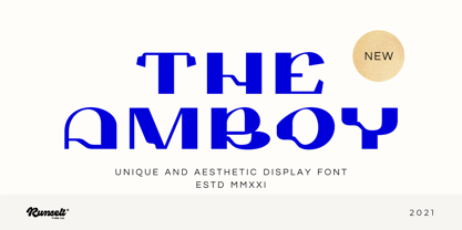 The Amboy font is perfect for many of your projects like logos & branding, photography, invitations, watermarks, advertisements, product designs, stationery, wedding designs, labels, product packaging, special events and much more.
 - Gingerline by Hanoded,
$15.00 I love learning new words. I stumbled upon the term Gingerline after I named an older font Gamboge. Like Gamboge, Gingerline is a name for a shade of orange - the color of ripe kumquats to be precise. Didn’t know that! Gingerline font is a handmade calligraphy font; nice and even, thick and thin and quite elegant if I may say so. Comes with an abundance of diacritics as well.
 - Waste Of Time by PizzaDude.dk,
$16.00Waste Of Time 1: The base version. Waste Of Time 2: The champagne bubble version! Waste Of Time 3: The alien version! Waste Of Time 4: The homeboy version! Waste Of Time 5: The shadow version! Waste Of Time 6: The zit version! Waste Of Time 7: The speedline version! - Paviljoen by Hanoded,
$15.00 Paviljoen (meaning Pavilion or Gazebo in Dutch) is an Art Deco typeface which was modeled on cast-iron lettering on some monumental buildings in Amsterdam. I only had a few glyphs to work with, so I designed the remaining ones myself. Paviljoen comes with extensive language support.
 - Escoffier Capitaux by steve mehallo,
$19.23 Escoffier Capitaux is named for culinary legend Auguste Escoffier (1846-35) and inspired by lettering used in vintage French advertising – including the work of commercial illustrator/fashion designer Ernst Dryden (1887-1938) WITH a hearty serving of 1960s ligatures influenced by the work of Herb Lubalin (1918-81) as well as a twist of Claude Garamond (1480ish-1561) AND featuring many alternate characters and extravagant extras, Escoffier Capitaux is enough to fill out your menu, add zest to your cook book, greeting card, resume or just the right amount of sauce to your blog. DINNER IS SERVED No substitutions, please. Minimum service per person. Warning: May taste gamey.
 - Fresno by Parkinson,
$15.00 Fresno is a two-font family. Fresno Inline and Fresno Black. Fresno Black is a recent addition. It can be used alone, and it is carefully tailored to fit behind the Inline font to add color to the inline. There are alternate characters: A, M & N in the caps and lowercase key positions. Fresno is a square gothic style typical of Mid-20th Century Showcard Lettering. A lettering genre known as “Gaspipe.” Signage samples similar to this still exist on buildings in my home town, Oakland, California. I have designed over a half dozen variations of this form over the years. Including Amboy. Golden Gate Initials, Matinee, Motel, and Hotel. Designed in 2001 by Jim Parkinson, Fresno has recently been refreshed, enhanced, and re-released.
 - Wakefield by Galapagos,
$39.00A gentle breeze caressed his face as his body took on the easy posture of a dancer on break. Flickering sparklets of light sprinkled the glass-smooth surface of the aqua liquid on which he floated. His mind wandered; he was only days away from his scheduled departure date. This day was no different from a hundred other days he had spent melded to his windsurfer, skittering along the breadth of the modest lake, soaking up the sun's rays and forgetting about the entire rest of the world. Lake Quannapowitt, and the town of Wakefield, Massachusetts, were familiar to Steve, a long-time resident of the picturesque New England town. This is where he grew up; this is where he married and lived for many years; and this is the place he was preparing to leave, not one week hence. Not generally prone to nostalgia, it was in just such a state he nonetheless found himself once Zephyrus retreated, as was his custom, periodically, while patrolling the resplendent lake. Steve was going to miss the lake, and he was going to miss the town. How many hours of how many days had he spent exactly like this, standing on his motionless board, waiting for his sail to fill, and staring at the lake's shores, its tiny beach, the town Common with its carefully maintained greenery, and equally well-tended gazebo, the Center church - its spire shadow piercing the water's edge, like a scissor-cut the better to begin a full-fabric tear? Yes, he was going to miss this place - this town which all of a sudden had become a place out of time, just as he was about to become a person out of place. Once this idea struck him, he couldn't shake it. He was transported back in time four score years, now watching his ancestors walk along the shore. Nothing in view belied this belief - not the church's century old architecture, not the gazebo frozen in time, nor the timeless sands of the beach, nor the unchanging Common. Everything belonged exactly where it was, and where it always would be. This, he decided, was how he would remember his hometown. And this is when it occurred to Steve to design a typeface that would evoke these images and musings - a typeface with an old-fashioned look, reflected in high crossbars, an x-height small in size relative to its uppercase, and an intangible quality reminiscent of small-town quaintness. Wakefield, the typeface, was born on Lake Quannapowitt in the town for which it was named, shortly before Steve moved away. It is at once a tribute to his birthplace and a keepsake.

