10,000 search results
(0.016 seconds)
- Cal Gothic Fraktur by Posterizer KG,
$16.00 Calligrapher Gothic Fraktur Font, is one of the calligraphic group of fonts called “21 alphabets for Calligraphers“. All graphemes are taken from calligraphic pages written in traditional Gothic Fraktur calligraphic style. This font is ideal for calligraphic sketches or for imitation of ancient manuscripts. The font contains all the Latin glyphs.
 - Walbaum Fraktur SH by Scangraphic Digital Type Collection,
$26.00 Since the release of these fonts most typefaces in the Scangraphic Type Collection appear in two versions. One is designed specifically for headline typesetting (SH: Scangraphic Headline Types) and one specifically for text typesetting (SB Scangraphic Bodytypes). The most obvious differentiation can be found in the spacing. That of the Bodytypes is adjusted for readability. That of the Headline Types is decidedly more narrow in order to do justice to the requirements of headline typesetting. The kerning tables, as well, have been individualized for each of these type varieties. In addition to the adjustment of spacing, there are also adjustments in the design. For the Bodytypes, fine spaces were created which prevented the smear effect on acute angles in small typesizes. For a number of Bodytypes, hairlines and serifs were thickened or the whole typeface was adjusted to meet the optical requirements for setting type in small sizes. For the German lower-case diacritical marks, all Headline Types complements contain alternative integrated accents which allow the compact setting of lower-case headlines.
 - Breitkopf Fraktur Pro by SoftMaker,
$10.99 Blackletter is the classic “German” printing type. Starting in the 16th century and lasting well into the 20th century, most works in Germany were printed using blackletter types. Today, blackletter fonts are mainly used decoratively. If you want to communicate a feeling of old-world quality or nostalgia, blackletter fonts are the preferred choice – use them on signs, in brochures or on invitation cards. Breitkopf Fraktur Pro is a classic blackletter font of its epoch which inspires you to create vintage-looking designs with ease.
 - Hans Fraktur Pro by SoftMaker,
$10.99 Blackletter is the classic “German” printing type. Starting in the 16th century and lasting well into the 20th century, most works in Germany were printed using blackletter types. Today, blackletter fonts are mainly used decoratively. If you want to communicate a feeling of old-world quality or nostalgia, blackletter fonts are the preferred choice – use them on signs, in brochures or on invitation cards. “Hans Fraktur Pro” is a classic blackletter font of its epoch which inspires you to create vintage-looking designs with ease.
 - Walbaum Fraktur EF by Elsner+Flake,
$35.00 - Theuerdank Fraktur Pro by SoftMaker,
$10.99 Blackletter is the classic “German” printing type. Starting in the 16th century and lasting well into the 20th century, most works in Germany were printed using blackletter types. Today, blackletter fonts are mainly used decoratively. If you want to communicate a feeling of old-world quality or nostalgia, blackletter fonts are the preferred choice – use them on signs, in brochures or on invitation cards. “Theuerdank Fraktur Pro” is a classic blackletter font of its epoch which inspires you to create vintage-looking designs with ease.
 - Featured Item - Personal use only

- Fear Factor - Unknown license

- Positive Feature by PizzaDude.dk,
$15.00 Positive Feature is a handmade, layered font. All layers come with contextual alternates, which means you have 4 different versions of each lowercase letter to play around with. What's cool about the two layer versions is that they mix in a lovely way! Try typing your text with layer 1, copy/paste layer 2 on top in a different color - perhaps even alter the transparency a bit...and all of a sudden a nice effect sees the light of day!
 - Braves Factor by Ditatype,
$29.00 Brave Factor is a display font mixture of the script font features providing capital letters in round, adorable proportions. Such round letters express so smooth, warm, friendly nuances that it is suitable to create attractive, fun nuances. In spite of the big, round shapes, this font maintains the original script font features, which are still legible, such as the smooth curves elements and the unique scratches flowing in some of the letters. Such script elements can add beauty and personal touches to the font. Some of the letters may have curvy curves, while the others have sharp ones to show you interesting visual dynamics and to liven up the font. Furthermore, the font’s letters have been carefully crafted to be as legible as possible without ignoring its aesthetic parts. In addition, you may enjoy the available features here as well. Features: Ligatures Multilingual Supports PUA Encoded Numerals and Punctuations Brave Factor fits best for any design projects requiring prominent, yet friendly displays such as titles, logos, posters, brandings, advertisements, and so on. Find out more ways to use this font by taking a look at the font preview. Thanks for purchasing our fonts. Hopefully, you have a great time using our font. Feel free to contact us anytime for further information or when you have trouble with the font. Thanks a lot and happy designing.
 - Wind Factor by Thaddeus Typographic Center,
$25.00Wind Factor is a display typeface with rough features and roman italic essences. This type features elements of crafting and design along with a bold elegance. Ideal for brochure design, menus, invitations, package design, and advertising. - Factor BF by Bomparte's Fonts,
$39.00 Factor BF takes inspiration from automotive lettering, and has elements of techno. It’s clean, strong and friendly, due to its overall soft, square, sturdy letterform construction. OpenType features include stylistic alternates for letters Q, a, e, f, y and ß; as well as automatic fractions, that are accessible in OpenType capable applications. Consider Factor BF for use in branding, signage, and logos to name just a few of its many areas of application.
 - Linear Fraktu by TeGeType,
$19.00 The basic idea of this type family was to keep the "ductus" of the fraktur calligraphy only. And to adapt it to draw a sans serif typography which still keep the magic rhythm and colour of the original letters.
 - Haigl Rapture by Viswell,
$26.00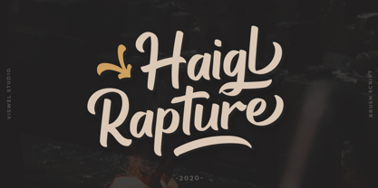 Haigl Rapture is a unconnected script with a varied brush style. This font is contains stylistic alternates, ligatures, and swashes. It is suitable for logos, branding, and another design projects.
 - Albrecht Duerer Fraktur Pro by SoftMaker,
$10.99 Blackletter is the classic “German” printing type. Starting in the 16th century and lasting well into the 20th century, most works in Germany were printed using blackletter types. Today, blackletter fonts are mainly used decoratively. If you want to communicate a feeling of old-world quality or nostalgia, blackletter fonts are the preferred choice – use them on signs, in brochures or on invitation cards. Albrecht Duerer Fraktur Pro is a classic blackletter font of its epoch which inspires you to create vintage-looking designs with ease.
 - Scoto Koberger Fraktur N9 by Intellecta Design,
$9.00a free digitization of ancient types of Ottaviano Scotus, from incunabula times, printed in Germany by Anton Koberger - Walbaum Fraktur No2 Pro by SoftMaker,
$10.99 Blackletter is the classic “German” printing type. Starting in the 16th century and lasting well into the 20th century, most works in Germany were printed using blackletter types. Today, blackletter fonts are mainly used decoratively. If you want to communicate a feeling of old-world quality or nostalgia, blackletter fonts are the preferred choice – use them on signs, in brochures or on invitation cards. “Walbaum Fraktur No2 Pro” is a classic blackletter font of its epoch which inspires you to create vintage-looking designs with ease.
 - Neue Luthersche Fraktur SB by Scangraphic Digital Type Collection,
$39.50 Since the release of these fonts most typefaces in the Scangraphic Type Collection appear in two versions. One is designed specifically for headline typesetting (SH: Scangraphic Headline Types) and one specifically for text typesetting (SB Scangraphic Bodytypes). The most obvious differentiation can be found in the spacing. That of the Bodytypes is adjusted for readability. That of the Headline Types is decidedly more narrow in order to do justice to the requirements of headline typesetting. The kerning tables, as well, have been individualized for each of these type varieties. In addition to the adjustment of spacing, there are also adjustments in the design. For the Bodytypes, fine spaces were created which prevented the smear effect on acute angles in small typesizes. For a number of Bodytypes, hairlines and serifs were thickened or the whole typeface was adjusted to meet the optical requirements for setting type in small sizes. For the German lower-case diacritical marks, all Headline Types complements contain alternative integrated accents which allow the compact setting of lower-case headlines.
 - Scoto Koberger Fraktur N11 by Intellecta Design,
$9.00digitization of autentic medieval blackletters from Anton Koberger and Otavia Scotus german typographers, from incunabula books - Neue Luthersche Fraktur EF by Elsner+Flake,
$35.00 - D3 Factorism Katakana - Unknown license

- D3 Factorism Italic - Unknown license

- D3 Factorism Alphabet - Unknown license

- Main Feature JNL by Jeff Levine,
$29.00 Main Feature JNL is patterned after the plastic letters found on theater marquees. As an extra bonus, the | (bar) key has the phrase "double feature", the ^ (ascii circumflex) has the word "and" and the ~ (ascii tilde) has the phrase "with" for anyone doing a theater marquee mock-up.
 - D3 Factorism Katakana Italic - Unknown license

- KlausBFraktur - 100% free

- Aunque by Cloud9 Type Dept,
$45.00 Aunque Medium is a modern take on historical fraktur typefaces. Aunque is an OpenType font with OpenType features such as standard and discretionary ligatures.
 - Dead Face by Eotype,
$12.00 Dead Face is an experimental black letter font that has a strong, abstract and segmentive appearance. Dead Face is a black letter font with unique fractures, where each fracture tends to be soft in synergy with thin strokes. Each glyph is crafted originally, so it can stand alone which can be used for logos or clothing designs. This font is also suitable for banners and posters. This font has alternate features and ligatures that are packaged in otf format. Have fun being creative using this font!
 - Dissonant - Unknown license

- Shaman by ITC,
$29.99 Shaman is the work of British designer Phill Grimshaw and you can almost hear the drums beating when you see it. It is a bold display typeface that features a unique, fractured effect and evokes a somehow primitive quality. Shaman is an all caps alphabet which comes complete with spot illustrations, graphic devices and a border system.
 - Darkstone by Sanchit Sawaria,
$40.00 Darkstone is a hybrid blackletter display font which combines features of the fraktur and old english. The level of detail in the glyph drawings enables the users to exploit the pure form of the letters in big sizes. Darkstone is great for labels, mastheads, branding, advertising, posters, etc.
 - Prinzess Gravur by RMU,
$35.00 In 1905 Berthold released an engraved blackletter font called Prinzess Kupferstichschrift. Based on an old printed remnant, I revived this beautiful open-face fraktur and enriched it with several OpenType features. As usual in my blackletter fonts, the round ‘s’ lies on the number sign key, and a traditional number sign can be accessed via the Discretionary Ligature feature and typing 'N-r-period'. In this font you have also the possibility to turn I, V, X, L, C, D, and M into Roman numerals by activating the Stylistic Alternates feature. And last but not least, various useful ligatures polish up this font.
 - Coop Blackletter by Alex Jacque,
$30.00 Coop Blackletter's core concept was to create a more friendly blackletter typeface by pulling together two very different sources of inspiration. The design is a synthesis of the rounded, affable features and heavier weight of Cooper Black with the underlying composition and calligraphic contrast of a Fraktur. It's kinda chunky, soft around the edges, and not entirely unreadable.
 - Hoelderlin by RMU,
$25.00 In 1938 the Frankfurt-based foundry Ludwig & Mayer released Eugen Weiss’ beautiful fraktur ‚Hoelderlin‘. Carefully redrawn and redesigned, this digitized version is intended to add another gem to the enthusiasts’ treasure drove of blackletter types. The font contains the historical long s which can be reached by the OpenType feature historical forms or by typing the integral sign [ ∫ ].
 - Elderich by Keristyper Studio,
$14.00 Introducing Elderich is a modern gothic typeface. Strong and geometric with a fraktur style inspired by the blackletter concept. This font is good for logo design, Social media, Movie Titles, Books Titles, short text even long text letters, and good for your secondary text font with script, sans, or serif. Featured: Standard Uppercase & Lowercase Numeral & Punctuation Multilingual : ä ö ü Ä Ö Ü ß ¿ ¡ Alternate & Ligature PUA encoded We recommend programs that support the OpenType feature and the Glyphs panel such as Adobe applications or Corel Draw. so you can use all the variations of the glyphs. Hope you enjoy our fonts!
 - Eskapade by TypeTogether,
$53.50 The Eskapade font family is the result of Alisa Nowak’s research into Roman and German blackletter forms, mainly Fraktur letters. The idea was to adapt these broken forms into a contemporary family instead of creating a faithful revival of a historical typeface. On one hand, the ten normal Eskapade styles are conceived for continuous text in books and magazines with good legibility in smaller sizes. On the other hand, the six angled Eskapade Fraktur styles capture the reader’s attention in headlines with its mixture of round and straight forms as seen in ‘e’, ‘g’, and ‘o’. Eskapade works exceptionally well for branding, logotypes, and visual identities, for editorials like magazines, fanzines, or posters, and for packaging. Eskapade roman adopts a humanist structure, but is more condensed than other oldstyle serifs. The reason behind this stems from the goal of closely resembling the Fraktur style to create harmony in mixed text settings. Legibility is enhanced by its low contrast between thick and thin strokes and its tall x-height. Eskapade offers an airy and light typographic colour with its smooth design. Eskapade italic is based on the Cancellaresca script and shows some particularities in its condensed and round forms. This structure also provided the base for Eskapade Fraktur italic. Eskapade Fraktur is more contrasted and slightly bolder than the usual darkness of a regular weight. The innovative Eskapade Fraktur italic, equally based on the Cancellaresca script previously mentioned, is secondarily influenced by the Sütterlin forms — an unique script practiced in Germany in the vanishingly short period between 1915 and 1941. The new ornaments are also hybrid Sütterlin forms to fit with the smooth roman styles. Although there are many Fraktur-style typefaces available today, they usually lack italics, and their italics are usually slanted uprights rather than proper italics. This motivated extensive experimentation with the italic Fraktur shapes and resulted in Eskapade Fraktur’s unusual and interesting solutions. In addition to standard capitals, it offers a second set of more decorative capitals with double-stroke lines to intensify creative application and encourage experimental use. The Thin and Black Fraktur styles are meant for display sizes (headlines, posters, branding, and signage). A typeface with this much tension needs to keep a good harmony between strokes and counters, so Eskapade Black has amplified inktraps and a more dynamic structure seen in the contrast between straight and round forms. These qualities make the family bolder and more enticing, especially with the included uppercase alternates. The Fraktur’s black weights are strident, refusing to let the white of the paper win the tug-of-war. It also won’t give away its secrets: Is it modern or historic, edgy or amicable, beguiling ornamentation or brutish presentation? That all depends on how the radically expanded Eskapade family is used, but its 16 fonts certainly aren’t tame.
 - Odd Times by Gleb Guralnyk,
$15.00 Introducing medieval blackletter typeface "Odd times". It's inspired by old fracture calligraphy.
 - Vestigia by Rodrigo Navarro Bolado,
$32.00 Vestigio m. Ing. & Fr. vestige: a trace, mark or visible sign left by something as an ancient city in a condition or practice vanished or lost. Vestigia is born by lost pieces of other typography, being then, Garbancera's descendant. It evolved to be seen in big point sizes and compete with other fierce competitors, while retaining some features of it ancient predecessor, navigates a gothic fraktur experimental style, existing between legible and illegible reading.
 - Kingslayer1875 by Factory738,
$15.00 Kingslayer1875 is a typeface inspired by German Blackletter Fraktur with a twist of Sweden. The elegant design was created by fusing modern and vintage elements. The available Ligatures provide a diverse range of characters to make your project design stand out. 5 Styles (Regular, Inline, Outline, Shadow, Simple) Basic Latin A-Z and a-z Numerals & Punctuation Stylistic Ligatures and Alternate glyps Multilingual Support for ä ö ü Ä Ö Ü ... Free updates and feature additions Thanks for looking, and I hope you enjoy it.
 - Rockner by Linotype,
$29.99Rockner is a family of fraktur typefaces designed by the calligrapher/designer Julius de Goede. Like all Blackletter styles, fraktur evolved out of Northern Europe's medieval manuscript tradition. Fraktur was the most used Blackletter variety between the sixteenth and twentieth centuries. Unlike many similar fraktur font families, Rockner is available in three weights: Regular, Medium, and Bold. This flexibility allows for richer design possibilities. The OT fonts contain the many alternate characters, such as the long s and historical ligatures, which are often necessary for the setting of historical documents.


