847 search results
(0.006 seconds)
- Durer Gothic - Unknown license

- Pro Dunex by Imoodev,
$20.00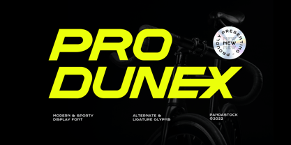 Pro dunex is modern typeface with visual elegance, smooth curves, and beautiful ligatures clear, making your work look true and attractive. A very versatile font that works in both large and small sizes. This font is suitable for a wide variety of projects such as invitations, logos, branding, magazine, photography, card, product packaging, mugs, quotes, poster, labels, signatures, and more. A font that is perfect for all business sectors including personal projects, studio, corporate, creative agency, industrial, company, etc.
 - Durer Display by iframe,
$28.00 Durer is a modern font, its soft curves and refined details create a sense of elegance. Inspired by the work of Albrecht Dürer (21 May 1471 – 6 April 1528), who was a German painter, printmaker, and theorist of the German Renaissance. Born in Nuremberg, Dürer established his reputation and influence across Europe in his twenties due to his high-quality woodcut prints. 551 Glyphs Upper / lower case, numbers, punctuation Language support: Latin / Greek Designed by iframe type foundry
 - Albrecht Durer Gothic by Scriptorium,
$18.00While browsing through a sourcebook on historic calligraphy and antique type I came on an interesting sample of a gothic style attributed to the legendary artist Albrecht Durer. I had previously seen fonts based on the peculiar style of lettering Durer used on prints for his signature and some captions, but this style was radically different and much more characteristic of the lettering and early printed types of the 'Northern Renaissance' which Durer was a big part of. Whether it's authentically Durer's work or not is up in the air, but it's a very nice example of early gothic type. We've called the resulting font Albrecht Durer Gothic and it's a very striking face well suited to titles and other contemporary uses where you need something heavy and eye catching. - 1525 Durer Initials by GLC,
$28.00 In 1525, Albrecht Dürer, the well known German great artist, was publishing the so-called “Underweysung der Messung mit dem Zirckel und Richtscheyt”, printed in Nuremberg. This handbook explained with numeral figures how to draw with a compass and ruler. A large part is devoted to the drawing of Roman characters, which can be used as decorative initials. We are offering two complete historical initial sets and also have entirely redrawn the missing letters: J, U and W, Eth, Lslash, Thorn and Oslash in the two forms, using the Dürer style. The font may be used with all our Humane and Garalde fonts, like 1543 Humane Jenson or 1592 GLC Garamond and others from the GLC foundry catalog.
 - P22 Durer Caps by IHOF,
$24.95 Durer Caps is three fonts in one. Based on master artist Albrecht Dürer’s 1525 geometric construction of Roman capitals, this font features A to Z as caps only. But there are three variations included: filled construction, unfilled construction, and the solid fill letters by themselves.The user can layer the unfilled and the solid fill letters to do two-color overlay effects.
 - World War Warplanes by Intellecta Design,
$29.95 Fighter planes in use during World War I and II.
 - Zoria by samokat,
$15.00 Zoria is cool modern typeface, designed by samokat during May 2010.
 - Springfield by ITC,
$29.99Springfield is a narrow, western-style display face from Bob McGrath. The design recalls wood types that were popular during the late 19th and early 20th centuries, but which also found resonance during the 1970s. Use Springfield to liven up otherwise dull headline and logo projects. - Questionable Things by Comicraft,
$29.00 Have you been marking your words quixotically lately? Can't choose between an interrogative and a questionnaire? It can be quite the problem during question time, so we've quickly rounded up a quality quorum of questionable characters so you'll never be short of a Q during a Q&A!
 - Kulli by Volcano Type,
$19.00This font is based on a simple sketch made during a phone call. - Coverack by Scriptorium,
$18.00Coverack was inspired by some hand lettering spotted by Dave Nalle on a pub menu blackboard during a recent trip to England. It's in the tradition of Celtic uncial lettering, but is extra bold and has some fantastical embellishments. The name comes from a lovely little town on the Cornish coast where the designer stayed during the trip. - Penny Wise JNL by Jeff Levine,
$29.00 The unusually-shaped hand lettering of Penny Wise JNL was modeled from the cover of the 1936 sheet music for "You Dropped Me Like a Red Hot Penny", and is available in both regular and oblique versions. Although it was drawn during the Art Deco period, this type of lettering design style was revived during the Hippie movement of the 1960s and 1970s.
 - Plasterboard by K-Type,
$20.00 Based on the blobby lettering printed on the sheets of plasterboard (drywall) used in a garage conversion during the summer of 2004.
 - Italienne by Linotype,
$29.99Inspired by the large American wood type of the Wild West, Richard Yeend created Italienne Std in 2002. Italienne Std is both very condensed and very decorative. It sports heavy, band like serifs, reminiscent of other italienne-style fonts, like Westside. Italienne-style fonts rose in popularity during the early 19th Century, when designers were first beginning to experiment with extreme contrast within letterforms, and across lines of text. Interestingly enough, letterforms with similar designs were just as common during the 1970s as during the 1870s, so you may use Italienne Std for applications ranging from country music concerts to disco parties. Italienne Std is part of the Take Type 5 collection from Liinotype GmbH." - Unremitting by Kraken,
$20.00This was created during experimentation with thin pencil lines and thus unremitting was created. This font works well with illustrations and gentle photography. - Outside by PintassilgoPrints,
$24.00 Alternates, ornaments, ligatures and two casual stylish faces. This is Outside. Where we'd absolutely rather be. * Released during the inside times of 2020 *
 - Bonhomme Richard by Three Islands Press,
$39.00 Bonhomme Richard evokes the cursive penmanship of Chevalier John Paul Jones (1747–1792), celebrated Continental Navy commander during the American Revolution, in letters from the late 18th century. The font’s name comes from Jones’s famous frigate, lost during his victorious engagement with the British in the Battle of Flamborough Head in 1779. During this battle Jones is said to have exclaimed, when urged to surrender, “I have not yet begun to fight!” (In fact, his likely words were, “I may sink, but I’ll be damned if I strike!” – i.e., surrender.) A legible script, Bonhomme Richard has an elegance about it while also conjuring the colonial era of its source material. Use to simulate historical handwriting in film props, games, formal invitations, product labels, and the like.
 - Nuclear Standard by Zang-O-Fonts,
$25.00Strong, hard lines inspired the name of this font, based on the "nuclear standard" set by the U.S. and the Soviets during the cold war. - Magnificent Ornaments by Gerald Gallo,
$20.00 Magnificent Ornaments was inspired by the ornamental styles produced during the Victorian era. There is an assortment of 47 ornaments all located under the character keys.
 - BD Pankow by Typedifferent,
$25.00 BD Pankow is inspired and designed during a stay in Berlin. It’s an uppercase alphabet with alternates. Bold, rock-solid, modern and ideal for branding and titling.
 - Fullfox Liberalism by Antonio Iaconesso,
$4.00 Liberalism is a sans-serif, grotesque and hybrid typeface that I created during the lockdown. Born as a pure design exercise, it has turned into something more.
 - Weekend Tabloid JNL by Jeff Levine,
$29.00Weekend Tabloid JNL is a classic sans serif wood type design that found its way into the setting of newspaper headlines during the pre-electronic age of publishing. - Victorian Ornaments by Gerald Gallo,
$20.00 Victorian Ornaments was inspired by the decorative borders and panels produced during the Victorian era. There is an assortment of 47 ornaments all located under the character set keys.
 - Rosette Ornaments by Gerald Gallo,
$20.00 Rosette Ornaments was inspired by the wide spectrum of ornamental styles produced during the Victorian era. There is an assortment of 47 ornaments all located under the character set keys.
 - Trafalgar Stencil JNL by Jeff Levine,
$29.00Trafalgar Stencil JNL gets its inspiration from a set of lettering stencils manufactured by Reese and Sons in Great Britain during the 1950s as does its counterpart, British Stencil JNL. - Nouveau Hippie JNL by Jeff Levine,
$29.00 The cover of the 1907 sheet music for "I'd Rather Twostep Than Waltz, Bill" was hand lettered in an Art Nouveau sans serif alphabet. During the hippie counter-culture movement of the 1960s, rock posters, album covers and other printed ephemera of the time embraced the styles of lettering and art made popular during the early 1900s. It seemed only fitting to name this type design Nouveau Hippie JNL as an homage to both eras. The font is available in both regular and oblique versions.
 - Carton Stencil JNL by Jeff Levine,
$29.00 Antique brass stencils hand-cut for shipping items during the early part of the 20th Century were for sale in an online auction; and are the basis for Carton Stencil JNL.
 - Firefly by Canada Type,
$24.95 Firefly was designed by Miranda Hopper during her time in Patrick Griffin's type design class of 2010 at Humber. It is a light, narrow alphabet that works well in casual, leisurely design.
 - Chamferwood JNL by Jeff Levine,
$29.00 Chamferwood JNL is another interpretation of the block lettering style most popular during the late 1800s and the early 1900s. The design was modeled from examples from a set of wood type.
 - Vododeo JNL by Jeff Levine,
$29.00 Vododeo JNL is directly named for the free-form sheet music title lettering from Jack Yellen and Milton Ager's "Vo-Do-De-O". The term itself was a catchphrase made popular during the era known as the "Roaring 20s". Yellen and Ager were responsible for such hits as "Ain't She Sweet" (1927) and "Happy Days Are Here Again" (1930) along with countless others. During his career, Jack Yellen provided lyrics to over 200 songs. As a side note, Yellen was married to a distant cousin of type designer Jeff Levine's late mother.
 - Rococo Titling by Three Islands Press,
$15.00Rococo Titling is a set of ornate titling caps based on work done by Jacques-Francois Rosart (1714-1777) and Pierre Simon Fournier (1712-1768) during the middle decades of the 18th century. - Display Inline JNL by Jeff Levine,
$29.00Display Inline JNL is a companion design to Jeff Levine's Signboard JNL font - both derived from die-cut display letters and numbers popular during the 1950s and 1960s for signs and show cards. - School Desk JNL by Jeff Levine,
$29.00 School Desk JNL is a block-style sanserif based on die-cut cardboard letters used in classrooms during the 1940s and 1950s for making various projects and teaching children the basic shapes of letters.
 - Western Railway JNL by Jeff Levine,
$29.00Western Railway JNL was inspired by sample lettering found in an old sign painter's reference book published during the early part of the 20th Century and modified for today's digital applications by Jeff Levine. - Restaurant And Lounge JNL by Jeff Levine,
$29.00 Restaurant and Lounge is a casual, brush-style type face based on hand lettering found on a 1940s matchbook for the Park Avenue Restaurant (a popular dining spot during the golden years of Miami Beach).
 - Lebensjoy by Monotype,
$29.99Lebensjoy was used by the Co-op chain stores in Sweden for a nationwide fortnightly flyer (called Livsgldje = Joy of Life) during 1993 and 1994. They wanted a simple but still lively and active letterform. - PL Davison by Monotype,
$29.99PL Davidson Americana is an all-capital typeface based on woodcut designs from the nineteenth century. The PL Davidson Americana font was designed by M. Davison in 1965, during the revival of American headline faces. - PL Davison Zip by Monotype,
$29.99PL Davidson Americana is an all-capital typeface based on woodcut designs from the nineteenth century. The PL Davidson Americana font was designed by M. Davison in 1965, during the revival of American headline faces. - ITC Korinna by ITC,
$40.99New York designers Ed Benguiat, Victor Caruso, and the staff at Photo Lettering, Inc. developed the ITC Korinna typeface family during the 1970s. ITC Korinna is based on an older German design that was originally cast at the beginning of the 20th century. That ITC Korinna was created speaks to the status that Art Nouveau had for designers during the 1960s and 70s. Thanks to their keen reviving of this ever-popular style, computer users can still use this type style today. ITC Korinna is perfect for display and advertising typography, as well as for headlines in newsletters and magazines.

Page 1 of 22Next page