85 search results
(0.005 seconds)
- JadeBud by Supfonts,
$14.00 JadeBud is a modern and elegant serif with incredible unusual lines that makes it far from the typical classic serif. Font is an open type with clean shapes and precise kerning. It includes ligatures encoded by the PUA. Language support: All European languages Don't forget to subscribe so you don't miss out on the new awesome fonts Dima
 - Rianna Pauls by Supfonts,
$12.00 Rianna Pauls is a beautiful signature font, fashionable appearance and elegant simplicity of lines. You will fall in love with this font Font is an open type with clean shapes and precise kerning. It includes ligatures encoded by the PUA. Language support: All European languages Don't forget to subscribe so you don't miss out on the new awesome fonts Dima
 - Mint Monday by Supfonts,
$12.00 Mint Monday is a beautiful handwritten font, fashionable appearance and elegant simplicity of lines. You will fall in love with this font Font is an open type with clean shapes and precise kerning. It includes ligatures encoded by the PUA. Language support: All European languages Don't forget to subscribe so you don't miss out on the new awesome fonts Dima
 - Iso 2.0 - Personal use only

- Aracne Ultra Condensed Regular - Personal use only

- Bruniquel by Supfonts,
$10.00 Bruniquel is a quirky handwritten font perfect for headings, flyer, greeting cards, product packaging, book cover, printed quotes, logotype, apparel design, album covers, etc., or just adding a handwritten touch to any project! Font is an open type with clean shapes and precise kerning. It includes ligatures encoded by the PUA. Language support: All European languages Don't forget to subscribe so you don't miss out on the new awesome fonts Dima
 - Another Thing by Supfonts,
$10.00 Another Thing is a cute handwritten font perfect for headings, flyer, greeting cards, product packaging, book cover, printed quotes, logotype, apparel design, album covers, etc., or just adding a handwritten touch to any project! Font is an open type with clean shapes and precise kerning. It includes ligatures encoded by the PUA. Language support: All European languages Don't forget to subscribe so you don't miss out on the new awesome fonts Dima
 - Picayune Intelligence BT by Bitstream,
$50.99The unusual name for this Deco style typeface comes from the playful and pun-laden 1960s Rocky & Bullwinkle TV show. It is the name of the newspaper in the mythical town of Frostbite Falls, MN, home of the two cartoon stars. The name, Picayune Intelligence, literally means “pretty dumb”, but we don’t think that describes Nick’s competent design at all. It is comforting to know that someone is still watching quality television. - Swift Sage by Supfonts,
$18.00 Swiftsage - a charming serif in retro style of the 80s and 90s with nostalgic notes! The dense structure will give an incredible retro vibe to your project. Come in two versions, one of which is strict and straight, and the second is playful and inclined Font is an open type with clean shapes and precise kerning. Language support: All European languages Don't forget to subscribe so you don't miss out on the new awesome fonts Dima
 - Orange Voyage by Supfonts,
$19.00 Orange Voyage is a modern serif family with vintage charm, fashionable appearance with a touch of retro Quick access - using the built-in OPEN TYPE functions. Just add "-" or "_" to the letter and instantly get an alternative. This feature works in most applications Font is an open type with clean shapes and precise kerning. It includes ligatures and alternations Language support: All European languages Don't forget to subscribe so you don't miss out on the new awesome fonts Dima
 - Retroscope by Supfonts,
$19.00 Retroscope - a charming serif in retro style of the 80s and 90s with nostalgic notes! The dense structure will give an incredible retro vibe to your project. Come in two versions, one of which is strict and straight, and the second is playful and inclined Font is an open type with clean shapes and precise kerning. Language support: All European languages Don't forget to subscribe so you don't miss out on the new awesome fonts Dima
 - Radellin by Supfonts,
$15.00 Radellin is a modern serif with vintage charm, fashionable appearance with a touch of retro Quick access - using the built-in OPEN TYPE functions. Just add "-" or "_" to the letter and instantly get an alternative. This feature works in most applications Font is an open type with clean shapes and precise kerning. It includes ligatures encoded by the PUA. Language support: All European languages Don't forget to subscribe so you don't miss out on the new awesome fonts Dima
 - Centola by Supfonts,
$12.00 Centola - a perfect clean modern serif Font is an open type with clean shapes and precise kerning. Centola Font Features: - Full Set of standard alphabet and punctuation - Ligatures - PUA Encoded - no special software needed to access extra characters - Language support: All European languages - Multilingual Characters AÁĂÂÄÀĀĄÅÃÆBCĆČÇĊDÐĎĐEÉĚÊËĖÈĒĘẼFGĞĢĠḠHĦIIJÍÎÏİÌĪĮĨJKĶLĹĽĻŁMNŃŇŅÑ OÓÔÖÒŐŌØÕŒPÞQRŔŘŖSŚŠŞȘẞTŤŢȚUÚÛÜÙŰŪŲŮŨVWẂŴẄẀXYÝŶŸỲỸZŹŽŻ aáăâäàāąåãæbcćčçċdðďđeéěêëėèēęẽfgğģġḡhħiıíîïìijīįĩjȷkķlĺľļłmnńňņñoóôöòőōøõœpþ qrŕřŗsśšşșßtťţțuúûüùűūųůũvwẃŵẅẁxyýŷÿỳỹzźžż Thanks so much for checking out my shop, and please get in touch if you have any questions! Don't forget to subscribe so you don't miss out on the new awesome fonts Dima
 - Fabejan by Supfonts,
$12.00 Fabejan a perfect mixed calligraphy and modern serif Font is an open type with clean shapes and precise kerning. Fabejan Font Features: - Full Set of standard alphabet and punctuation - PUA Encoded - no special software needed to access extra characters - **Language support**: All European languages - Multilingual Characters AÁĂÂÄÀĀĄÅÃÆBCĆČÇĊDÐĎĐEÉĚÊËĖÈĒĘẼFGĞĢĠḠHĦIIJÍÎÏİÌĪĮĨJKĶLĹĽĻŁMNŃŇŅÑ OÓÔÖÒŐŌØÕŒPÞQRŔŘŖSŚŠŞȘẞTŤŢȚUÚÛÜÙŰŪŲŮŨVWẂŴẄẀXYÝŶŸỲỸZŹŽŻ aáăâäàāąåãæbcćčçċdðďđeéěêëėèēęẽfgğģġḡhħiıíîïìijīįĩjȷkķlĺľļłmnńňņñoóôöòőōøõœpþ qrŕřŗsśšşșßtťţțuúûüùűūųůũvwẃŵẅẁxyýŷÿỳỹzźžż Thanks so much for checking out my shop, and please get in touch if you have any questions! Don't forget to subscribe so you don't miss out on the new awesome fonts Dima
 - Marseille by Louise Fili Ltd,
$35.00 Marseille is an Art Deco-inspired typeface which is based on Louise Fili’s iconic cover design for the hauntingly beautiful Marguerite Duras novel, The Lover. The font is available in six irresistible weights: thin, light, regular, medium, semibold, and bold. Each weight features both caps and lower case, and supports over 200 languages. Marseille will satisfy all your typographic needs, from book jackets to monograms to packaging, logos, and even wedding invitations—timelessly elegant, with a distinctive flair that exudes La Belle France.
 - Movere by Supfonts,
$14.00 Movere is a modern serif family with vintage charm, fashionable appearance with a touch of retro Quick access - using the built-in OPEN TYPE functions. Just add "-" or "_" to the letter and instantly get an alternative. This feature works in most applications Font is an open type with clean shapes and precise kerning. It includes ligatures encoded by the PUA. Language support: All European languages Don't forget to subscribe so you don't miss out on the new awesome fonts Dima
 - Wairel by Supfonts,
$14.00 Wairel is a modern serif family with vintage charm, fashionable appearance with a touch of retro Quick access - using the built-in OPEN TYPE functions. Just add "-" or "_" to the letter and instantly get an alternative. This feature works in most applications Font is an open type with clean shapes and precise kerning. It includes ligatures encoded by the PUA. Language support: All European languages Don't forget to subscribe so you don't miss out on the new awesome fonts Dima
 - PGY - Personal use only

- Carson by Supfonts,
$15.00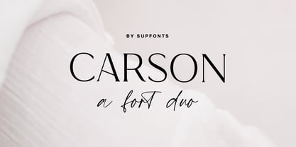 Carson Font Duo is a combination of a sophisticated serif typeface and a relaxed handwritten script. It has a contemporary and uncomplicated design that adds an elegant and tidy touch to various projects such as websites, logos, branding, social media quotes, wedding stationery, and more. I appreciate you visiting my shop. Don't hesitate to contact me if you have any inquiries. -Dima Carson Font Features: - Full Set of standard alphabet and punctuation - Ligatures - PUA Encoded - no special software needed to access extra characters - Language support: All European languages - Multilingual Characters AÁĂÂÄÀĀĄÅÃÆBCĆČÇĊDÐĎĐEÉĚÊËĖÈĒĘẼFGĞĢĠḠHĦIIJÍÎÏİÌĪĮĨJKĶLĹĽĻŁMNŃŇŅÑ OÓÔÖÒŐŌØÕŒPÞQRŔŘŖSŚŠŞȘẞTŤŢȚUÚÛÜÙŰŪŲŮŨVWẂŴẄẀXYÝŶŸỲỸZŹŽŻ aáăâäàāąåãæbcćčçċdðďđeéěêëėèēęẽfgğģġḡhħiıíîïìijīįĩjȷkķlĺľļłmnńňņñoóôöòőōøõœpþ qrŕřŗsśšşșßtťţțuúûüùűūųůũvwẃŵẅẁxyýŷÿỳỹzźžż
 - Magique by Supfonts,
$15.00 Magique is a modern serif with vintage charm, fashionable appearance with a touch of retro Quick access - using the built-in OPEN TYPE functions. Just add "-" or "_" or "+" to the letter and instantly get an alternative. This feature works in most applications Fonts is an open type with clean shapes and precise kerning. It includes ligatures and alternations with a total of 515+ characters encoded by the PUA. Language support: All European languages Don't forget to subscribe so you don't miss out on the new awesome fonts Dima
 - ENYO Serif Light - Personal use only

- Aracne Regular - Personal use only

- Wonder Magnolia by Supfonts,
$15.00 Wonder Magnolia is a modern serif with vintage charm, fashionable appearance with a touch of retro Quick access - using the built-in OPEN TYPE functions. Just add "-" or "_" to the letter and instantly get an alternative. This feature works in most applications Font is an open type with clean shapes and precise kerning. It includes ligatures and alternations with a total of 522 characters encoded by the PUA. Also in the package you will find a list of all ligatures and alternatives Language support: All European languages Don't forget to subscribe so you don't miss out on the new awesome fonts Dima
 - Montu by Supfonts,
$12.00 Montu is an elegant, modern sans serif font family. It includes upright and Italic style, each of them has five weights from thin to bold. This is a multi-functional font that is perfect for any project Montu Font Features: - Full Set of standard alphabet and punctuation - PUA Encoded - no special software needed to access extra characters - Language support: All European languages - Multilingual Characters AÁĂÂÄÀĀĄÅÃÆBCĆČÇĊDÐĎĐEÉĚÊËĖÈĒĘẼFGĞĢĠḠHĦIIJÍÎÏİÌĪĮĨJKĶLĹĽĻŁMNŃŇŅÑ OÓÔÖÒŐŌØÕŒPÞQRŔŘŖSŚŠŞȘẞTŤŢȚUÚÛÜÙŰŪŲŮŨVWẂŴẄẀXYÝŶŸỲỸZŹŽŻ aáăâäàāąåãæbcćčçċdðďđeéěêëėèēęẽfgğģġḡhħiıíîïìijīįĩjȷkķlĺľļłmnńňņñoóôöòőōøõœpþ qrŕřŗsśšşșßtťţțuúûüùűūųůũvwẃŵẅẁxyýŷÿỳỹzźžż Thanks so much for checking out my shop, and please get in touch if you have any questions! Don't forget to subscribe so you don't miss out on the new awesome fonts Dima
 - Comica Brush by Letteralle,
$23.00 Introducing, Comica Brush! An attractive, bold, and playful display font. Inspired by comic books and cartoons. This font gives a charming and strong impression. Comica Brush datang dengan dua versi (textured and solid), serta multilingual support dan underline swash. Untuk mengakses underline swash anda hanya perlu mengetik _1 - _4. So simple. Comica Brush is very suitable for various design needs such as merchandise, packaging, social media, ads, T-shirts, logos, events, and many more. Enjoy Designing. Thank you!
 - Soup Du Jour by PizzaDude.dk,
$18.00 "Soup Du Jour" is French and simply means "Soup Of the Day" - may not sound interesting, but I can tell you that I have had several tasty soup of the day served. I wanted to make a font that resembles that feeling of not really knowing what you get served, but you got a feeling that it is something good! The font has got 6 different versions of each letter, and they automatically changes as you type - it makes your text organic and lively, and probably quite tasty too! :) "Soup Du Jour" is also a well-known quote from one of my favourite movies: "Dumb and dumber"
 - Smiling Cat by Hanoded,
$15.00 Smiling Cat is a cute little font. It is an adaptation of and older font of mine: Harimau Dua. I have had many requests for a bold version of Harimau, so I started working on it, changed a few glyphs, redid the kerning and cleaned it up. Rather than adding it as an extra bold style to my existing font, I thought it’d be better to launch it as a new one. Smiling Cat is handmade, cute and quirky, it would be ideal for Children’s Book Covers. Comes with a litter of diacritics.
 - Bapalopa by Okaycat,
$24.50 Bapalopa is inspired by classic graffiti "blockbuster" letter forms. These letters are made to look as big and as wide as possible. Bapalopa's linework is kept very loose & relaxed, mostly smooth with some distressed edges. Viewed up-close, there is lots of texture from the individual pen strokes which gives Bapalopa it's cool freehand drawn look. Use "Bapalopa" and "Bapalopa Pa" together to create eye catching designs. To make it extra fun, a handful of the largely useless alternates, (like that dumb "currency" symbol) were replaced with big blocky hearts, stars, and arrows. Check it out! Bapalopa is extended, containing the full West European diacritics & a full set of ligatures, making it suitable for multilingual environments & publications.
 - 3D Fantablock Beveled by Okaycat,
$24.50Fantablock is a bold, high impact text. The edges are beveled to create the illusion of 3D raised text. The bevel effect makes it easy to create an embossed or engraved look. Punchy outlines make Fantablock perfect for headlines, or any project you want to be really eye catching. It is intended for larger sizes, but with care can be set small too. To make it extra fun, a handful of the largely useless alternates, (like that dumb “currency” symbol) were replaced with big blocky hearts, stars, arrows, and even a crown. Check it out! Fantablock is extended, containing the full West European diacritics & a full set of ligatures, making it suitable for multilingual environments & publications. - Jandys by Alit Design,
$10.00 Introducing Jandys Typeface which has a fast dry brush and elegant style. So it looks natural, like handwritten. This font is best used for your design project that has the concept of elegant, cool and fun. Can also be applied to the design of a logotype, header website, make some lettering a quote, t-shirt design, wedding card design etc. Jandys has two font styles that are similar but different, namely Jandys Dua and Jandys Swash, a dry brush formatted like a used font. Jandys Typeface deserve to be in your fonts collections, because it is unique, elegant and has many options of alternative glyphs.
 - Billy Ohio by Alit Design,
$10.00 Introducing Billy Ohio Typeface which has a fast dry brush style. So it looks natural like a handmade. This font is best used for your design project that has a concept of fun, brave and sporty. Can also be applied to the design of a logotype, header website, make some lettering a quote, t-shirt design etc. Billy Ohio has two font styles that are similar but different, namely Billy Ohio Dua and Billy Ohio Swash of dry brush formatted like a used font. Billy Ohio Typeface deserve to be in your fonts collections because it is unique and has many options of alternative glyphs.
 - Lotto by Canada Type,
$24.95 Designed by expert ad artist Herbert Thannhaeuser for East German foundry Typoart in 1955, Lotto was until now one of the long lost gems of European sign and brush lettering faces. Unlike in Kurier (Thannhaeuser’s other brush face digitized by Canada Type as Puma), the forms’ brush construct uses a series of strokes that are mostly sudden, whimsical, and at times even look like great genius being born out of simple afterthought or straight-forward idiosyncracy. For instance, check out the simple brush pause that is the top of the f, the confident yet welcoming serifs on the T, the similarly-themed C/E and O/Q relationship, and much more. Lotto comes with over 400 glyphs, contains a few alternates and ligatures sprinkled throughout the character set, and includes support for the majority of Latin languages.
 - Hunter by Canada Type,
$24.95Many of the fonts available from Canada Type are revivals of historic brush scripts (such as Bruschetta, Coffee Script, Puma, Tiger Script). Hunter is a deserved addition to the collection. Imre Reiner's Mustang design from 1956 now enters the digital realm to continue living in this world of new typography. Hunter has a wilder streak than other brush scripts. Its irregular terminals give it an almost wooden appearance and a most natural, hand-made expression. This natural look was extended by the expansion of the original design and the addition of some alternates and ligatures, built within the font and easily accessible from any program's glyph palette. Hunter was also slightly modified to accommodate not only sentence- and lowercase-setting, but also all-capital setting, which is a flexibility hardly ever found in most brush scripts. So if you have been looking for a natural, quirky brush script for your designs, Hunter is your type! - Ongunkan Old Latin by Runic World Tamgacı,
$40.00 The Latin, or Roman, alphabet was originally adapted from the Etruscan alphabet during the 7th century BC to write Latin. Since then it has had many different forms, and been adapted to write many other languages. According to Roman legend, the Cimmerian Sibyl, Carmenta, created the Latin alphabet by adapting the Greek alphabet used in the Greek colony of Cumae in southern Italy. This was introduced to Latium by Evander, her son. 60 years after the Trojan war. There is no historical evidence to support this story, which comes from the Roman author, Gaius Julius Hyginus (64BC - 17AD). The earliest known inscriptions in the Latin alphabet date from the 6th century BC. It was adapted from the Etruscan alphabet during the 7th century BC. The letters Y and Z were taken from the Greek alphabet to write Greek loan words. Other letters were added from time to time as the Latin alphabet was adapted for other languages.
 - Yacimiento - Personal use only

- Calcis by Eurotypo,
$24.00 “Chalkís” or “Chalkida” was the capital of the Euboea island in old Greece. The name derived from the Greek and it means copper - bronze. Colonist from this area founded several important cities in the Magna Graecia, such as Cumae (coastal area of Southern Italy), where our alphabet come from. At the beginning, first scribes draw the signs in mono-line, but later on, the influence of materials, tools and the skill of calligraphers, developed the refinement of the lettering. “Calcis” is a family of sans serif fonts, characterized by its austere, functional and clear style, emerged from straight lines and primary shapes; but enriched by the contribution of countless anonymous calligraphers who have polished and embellished their forms over the years. “Calcis” is presented in five weights and italic style. It has good legibility in small sizes, elegance and strong visual impact in headlines as well. Each font of the family contain 377 glyphs with accurate kerning pairs careful controlled, and advanced typographical support with OpenType features such as: old style numerals, ligatures, discretional ligatures and case-sensitive forms. It also contain diacritics for Central European languages.
 - Tescellations by Ingrimayne Type,
$9.95 Though there are many thousands of digital typefaces available, none seem to be made exclusively of letters that tessellate, a complete tessellating alphabet. This void is now filled with not one typeface, but a group of typefaces, the Tescellations kinship group. Even though I am aware of only one use for this typeface--writing about tessellations--that does not mean there are not hundreds or perhaps thousands of other uses. These typefaces are a byproduct of two maze books I designed, Puzzling Typography and Puzzling Typography A Sequel. I found the challenge of making mazes from tessellations, including letter tessellations, intriguing and these typefaces are a byproduct that endeavor. There are seven members of this typeface kinship group. I tried to select the the glyphs that fit together best to form Tescellations; it is the most readable of the lot. The reason for an Italics version is that I needed one for the maze project. In constructing it, I tried to include as many different lower-case glyphs as I could rather than just skew the regular version. A purist might insist that the tessellation deal with the counters. My approach was to worry only about the exterior of any letter that has an interior, but for anyone who who might object to the counters, versions with filled counters are included. What did not fit into Tescellations was dumped into Tescellations Two, which is somewhat of a ransom-note type of face. It comes in two styles, a regular version and a version in which the counters are removed. TescellationPatterns shows how many of the characters in these typefaces tessellate. It has over 100 tessellation patterns, each on only one character. Simply type several lines with any character and make sure the leading is the same as the font size, and you have an instant tessellation pattern of a letter.
 - Zigfrida by Anderson Ruda,
$20.00 Zigfrida Typeface was born from a process of re-designing a logo where, through a grid created, I was developing all its main characters. As the project grew, it was noted that it was necessary not only to limit itself to the Latin alphabet, but also to develop Cyrillic characters. Its possibilities of use are endless, can be used in projects for your favorite sport, signs, posters, large formats, advertising projects, architectural, packaging, titles, among others. The result of all this was the development of a font that has up to 747 glyphs that can understand 100% of Latin languages and the vast majority of countries that use the Cyrillic alphabet. It has unique personality and characteristics that bring a differential to any project it is part of. ----- A Zigfrida Typeface nasceu a partir de um processo de re-design de um logotipo onde, através de um grid criado, fui desenvolvendo todos os seus principais caracteres. A medida que o projeto foi crescendo, observou-se que era preciso não apenas se limitar ao alfabeto latino, mas também desenvolver os caracteres cirílicos. Suas possibilidades de uso são infinitas, pode ser utilizada em projetos para seu esporte favorito, sinalizações, cartazes, grandes formatos, projetos publicitários, arquitetônicos, embalagens, títulos, entre outros. O resultado de tudo isso foi o desenvolvimento de uma fonte que possui até 747 glifos capaz de compreender 100% dos idiomas latinos e a grande maioria dos países que utilizam o alfabeto cirílico. Tem personalidade e característica únicas que trazem um diferencial para qualquer projeto que ela fizer parte.
 - Datura - Unknown license

- RePublic by Suitcase Type Foundry,
$75.00In 1955 the Czech State Department of Culture, which was then in charge of all the publishing houses, organised a competition amongst printing houses and generally all book businesses for the design of a newspaper typeface. The motivation for this contest was obvious: the situation in the printing presses was appalling, with very little quality fonts existing and financial resources being too scarce to permit the purchase of type abroad. The conditions to be met by the typeface were strictly defined, and far more constrained than the ones applied to regular typefaces designed for books. A number of parameters needed to be considered, including the pressure of the printing presses and the quality of the thin newspaper ink that would have smothered any delicate strokes. Rough drafts of type designs for the competition were submitted by Vratislav Hejzl, Stanislav Marso, Frantisek Novak, Frantisek Panek, Jiri Petr, Jindrich Posekany, and the team of Stanislav Duda, Karel Misek and Josef Tyfa. The committee published its comments and corrections of the designs, and asked the designers to draw the final drafts. The winner was unambiguous — the members of the committee unanimously agreed to award Stanislav Marso’s design the first prize. His typeface was cast by Grafotechna (a state-owned enterprise) for setting with line-composing machines and also in larger sizes for hand-setting. Regular, bold, and bold condensed cuts were produced, and the face was named Public. In 2003 we decided to digitise the typeface. Drawings of the regular and italic cuts at the size of approximatively 3,5 cicero (43 pt) were used as templates for scanning. Those originals covered the complete set of caps except for the U, the lowercase, numerals, and sloped ampersand. The bold and condensed bold cuts were found in an original specimen book of the Rude Pravo newspaper printing press. These specimens included a dot, acute, colon, semicolon, hyphens, exclamation and question marks, asterisk, parentheses, square brackets, cross, section sign, and ampersand. After the regular cut was drafted, we began to modify it. All the uppercase letters were fine-tuned, the crossbar of the A was raised, E, F, and H were narrowed, L and R were significantly broadened, and the angle of the leg and arm of the K were adjusted. The vertex of the M now rests on the baseline, making the glyph broader. The apex of the N is narrower, resulting in a more regular glyph. The tail of Q was made more decorative; the uppercase S lost its implied serifs. The lowercase ascenders and descenders were slightly extended. Corrections on the lower case a were more significant, its waist being lowered in order to improve its colour and light. The top of the f was redrawn, the loop of lowercase g now has a squarer character. The diagonals of the lowercase k were harmonised with the uppercase K. The t has a more open and longer terminal, and the tail of the y matches its overall construction. Numerals are generally better proportioned. Italics have been thoroughly redrawn, and in general their slope is lessened by approximatively 2–3 degrees. The italic upper case is more consistent with the regular cut. Unlike the original, the tail of the K is not curved, and the Z is not calligraphic. The italic lower case is even further removed from the original. This concerns specifically the bottom finials of the c and e, the top of the f, the descender of the j, the serif of the k, a heavier ear on the r, a more open t, a broader v and w, a different x, and, again, a non-calligraphic z. Originally the bold cut conformed even more to the superellipse shape than the regular one, since all the glyphs had to be fitted to the same width. We have redrawn the bold cut to provide a better match with the regular. This means its shapes have become generally broader, also noticeably darker. Medium and Semibold weights were also interpolated, with a colour similar to the original bold cut. The condensed variants’ width is 85 percent of the original. The design of the Bold Condensed weights was optimised for the setting of headlines, while the lighter ones are suited for normal condensed settings. All the OpenType fonts include small caps, numerals, fractions, ligatures, and expert glyphs, conforming to the Suitcase Standard set. Over half a century of consistent quality ensures perfect legibility even in adverse printing conditions and on poor quality paper. RePublic is an exquisite newspaper and magazine type, which is equally well suited as a contemporary book face.


