42 search results (0.013 seconds)
  1. Motorway by K-Type, $20.00
    MOTORWAY is the companion typeface to TRANSPORT, the British road sign lettering. The Motorway alphabet was created for the route numbers on motorway signage, and is taller and narrower than the accompanying place names and distances which are printed in Transport. However, for Motorway Jock Kinneir and Margaret Calvert created only the numbers 0 to 9, the capitals A, B, E, M, N, S and W, ampersand, slash, parentheses and a comma. So, although the lettering made its first appearance on the Preston bypass in 1958, K-Type Motorway is the first complete typeface and contains all upper and lower case letters, plus a full complement of punctuation, symbols and Latin Extended-A accented characters. As with the Transport alphabet the starting point was Akzidenz Grotesk, Motorway taking inspiration from condensed versions. Changes were mainly driven by a quest for legibility, resulting in some reduced contrast between horizontal and vertical strokes, and Gill-esque straight diagonal limbs on the 6 and 9, and high vertex for the M. Kinneir and Calvert designed the limited range of characters in two weights; a SemiBold 'Permanent' weight for use as white letters on blue motorway signs, and a Bold 'Temporary' weight for heavier black letters on yellow non-permanent signage. In addition to creating full fonts in both original weights, the K-Type family adds a new Regular weight, plus a set of italics, completing a highly usable condensed typeface which, while rooted in history, is fully functional for both print and web usage. The K-Type fonts are spaced and kerned normally, simply increase the tracking to recapture the generous spacing of motorway signage.
  2. Korowai by ErlosDesign, $19.00
    KOROWAI - DISPLAY MODERN SERIF FONT by erlosDESIGN KOROWAI is a display serif font with modern style. It includes uppercase letters, numeral, ligatures, a large range of punctuation and also multilingual support. Perfects for poster, web design, magazine cover, album cover , branding and many more.
  3. Norway by pentagonistudio, $19.00
    Norway Is Authentic Display Font Inspired By Classic Characters. SOFTWARE REQUIREMENTS : Fonts and alternate : No special software required they may be used in any basic program /website apps that allows standard fonts That's it folks! You can go ahead and get cracking :) Follow My Shop For Upcoming Updates Including Additional Glyphs And Language Support. And Please Message Me If You Want Your Language Included or If There Are Any Features or Glyph Requests, Feel Free to Send me A Message. Have a Good Day !
  4. The Doorman - Unknown license
  5. DOORLEY HAND by John Doorley & Associates Pty. Ltd., $25.00
    Doorley Hand is a unique new font based on the handwriting of Australian advertising man and creatist John Doorley. The font's character and personality sits somewhere between charming child-like handwriting and classic contemporary calligraphy. It pays homage to simpler times when more organic and personalised forms of communication reigned. A perfect counterpoint to the fast-forward, hi-tech world today.
  6. H74 Norway Black by Hydro74, $15.00
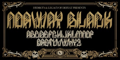
  7. Ornaments of Paris by Outside the Line, $19.00
    The Ornaments of Paris were inspired by a recent trip to Paris. Each tiny Paris icon is distilled from a church, a fence, a doorway, a railing, the Louvre, graphics in a store window, a feeling, a rainy day, a glass of wine... For more of the similar see Fleurons of Paris.
  8. Flax JY by JY&A, $39.00
    David Philpott was inspired by the flax growing on the side of the motorway out of Wellington, New Zealand, and crafted this very distinctive, natural typeface family based on the plants.
  9. Ongunkan Norwegian Futhark by Runic World Tamgacı, $40.00
    THE NORWEGIAN RUNES The oldest runes discovered in Norway date from 400 AD. They were based upon the 24 - rune Elder Futhark of Germanic origin. Two of the runes in the Elder Futhark, Pertra and Eoh, have never been found in any Norwegian rune text. From 550 AD to 700 AD there was a transition period between the older 24-rune Futhark and the newer 16-rune Futharks. By the end of this period, the 24-rune Futhark went completely out of use and the 16-rune Futharks had prevailed. Then, about 900 AD, the Shorttwiggs-runes were introduced from Sweden. Shortly thereafter, from 1000 AD, Futharks with more than 16 runes became more prevalent, as these were more consistent with the Latin alphabet. These types of runes were used in Norway up to 1800 AD.
  10. Crowfeather by Hanoded, $15.00
    I first wanted to call this family Crowbone, after Olaf Tryggvason, the legendary Viking king from Norway. Somehow I changed my mind and went for Crowfeather, because this is not a Viking font and the name ‘felt’ better. Crowfeather is a family of two distinct fonts: a classic Serif and an old school script font. They work really well together!
  11. Pusekatt by Hanoded, $15.00
    Pusekatt means Pussycat in Norwegian. It was finished on a rather gloomy monday, which reminded me of Norway and I just like cats. There you have it: the naming of fonts explained. It ain't rocket science for sure! There is nothing gloomy about Pusekatt font: it is a very lively, happy and useful poster face. It comes with extensive language support, one alternative (yes, one) and a lot of feline grace.
  12. Nastaleeq Asc by Ascender, $155.99
    Nastaleeq (Nasta?l?q) ASC is a script font supporting Urdu. Urdu is the nation language of Pakistan. The Nastaleeq ASC font is Unicode encoded. The Nastaleeq ASC font requires an application program which supports Arabic fonts (right-to-left composition). Urdu is also spoken in Afghanistan, Bahrain, Bangladesh, Botswana, Fiji, Germany, Guyana, India, Malawi, Mauritius, Nepal, Norway, Oman, Qatar, Saudi Arabia, South Africa, Thailand, the UAE, the UK and Zambia.
  13. Numpty by Hanoded, $15.00
    Numpty is a word of Scottish origin and means ‘someone who, by speech or action, demonstrates a lack of knowledge’. I use this word quite often (as this world, unfortunately, seems to be full of numpties). And guess what? Now you know what it means, you can use it too! Hooray! Numpty is a fat, rounded display font. A little uneven, a little weird, but with enough panache to make your designs stand out.
  14. DT Partel by Dragon Tongue Foundry, $9.00
    DT Portal: This stylised, partially serifed font, made with a slightly rounded square form, may have been inspired initially by old cathode ray tubes and computer screens. Although not intended to be purely a ‘tech’ font, it can have a strong tech feel to it. More suited to being a headline font than body text. It also appears to have a monospaced look to it, since most letters, (other than letters like ‘i, l and t’), do have the same width. There is some automatic contextual shape adjustment happening in places, to avoid taking up too much space, so contextual ligatures should be turned on. As is the case with most of my fonts, when given the choice, ‘metric’ spacing should be used in preference to ‘optical’. Initially this font was going to be called ‘DT Portal’, because its form was similar to that of a window or doorway. But due to other fonts already having that name, I chose to rename it as ‘DT Partel’, for no reason other than it is only a very small change visually.
  15. P22 Ornes by IHOF, $24.95
    Ornes is inspired by the runic alphabet with ornamentation based on the woodcarvings of the Urnes Stave Church (Norway), an old wooden church from approximately 1150 CE. The woodcarvings and their symbolism reach back to the pre-Christian era. The Ornes Pro styles each contain the runic alphabet, ornamented caps, small caps, ornamented small caps and other pro OpenType features (as shown on the "Pro" tab). Ornes Ornamented Rustic Pro features a subtle uneven lowercase, but does not include a set of regular uppercase characters.
  16. Foot Print by Bureau Bunk, $14.95
    While Walking along the shore of our Main Port to Europe in Rotterdam, The Netherlands, my 14 year old son Jules first hardly dared to step in the mud for he was wearing his brand new sneakers. Concentrating in where he put his feet, he noticed he made a character! The FootPrint-Regular was born! The FootPrint-Regular is a powerful header-typeface, but funny enough it's usable as small copy too! Blaze your Trail! Anything you can imagine on Police investigations, Bloodhound Thrillers, Trails, Tracks and Traces, anything about Outdoor Stores, Tracking or even maybe Pedestrian Clubs, or things like Survival Sports, Walking Events or Hiking Gear; Blaze'm your FootPrint-Regular Trail on all Banners, Blimps, Ads and Doormats!
  17. Route Du Soleil by Hanoded, $15.00
    Probably everyone living in Europe has heard of the (in)famous Route Du Soleil. The Route Du Soleil (Motorway Of The Sun) is a stretch of road from Paris to Lyon (in the south). It is THE route holiday makers take to reach southern France, so they can get there before everyone else does. The result: endless traffic jams, overheated engines and people and more toxic exhaust fumes than your average petroleum distillery. Route Du Soleil is also a very nice hand written font that comes with swashes and ligatures. If you happen to find yourself in a traffic jam on your way to southern France, then I hope you have downloaded this font. Just one look at it and you’ll forget your problems! ;-)
  18. Målestok by Wilton Foundry, $39.00
    The Målestok family (Light, Light Italic, Bold, Bold Italic) is an eclectic solution for a broad range of applications. The rounded outer corners combined with select stencil effects makes for an interesting and friendly face. In large sizes, the bold version is strong and engaging, while the lighter weights are stylish and friendly. Thanks to its distinctive slightly technical style, both print and interactive designers will find that Målestok provides a multitude creative options with the perfect solution to draw attention with style. Målestok family his ideal for branding, collateral, advertising and packaging design. Målestok also fits comfortably in fashion , retail and sport related categories. Målestok family was designed in Norway, The Netherlands and USA.
  19. Ongunkan Sweden Futhark by Runic World Tamgacı, $40.00
    Prior to 500 AD the 24-rune Elder Futhark was used in Sweden. From 500 AD until 800 AD there were many Futharks which were transitions from the 24-rune Futhark to one of the 16-rune Futharks. By the end of this period the 24-rune Futhark was completely out of use , and only 16-runes Futharks were in use. By 900 AD two different types of Shorttwigs-Futharks had been born. One was popularized in Norway and the other was used in the west (the British islands). By 1000 AD the adjustment of the runes to the Latin alphabet had begun, and several versions are found up until the Dalrunes, about 1700-1800 AD.
  20. Telemark by Juri Zaech, $20.00
    Telemark is a monolinear slab serif influenced by the wide serif typefaces of the 19th century. The name refers to the vintage form of skiing which was introduced in Norway at the same period of time and allowed more fluid turns. After the Telemark style was replaced by newer techniques in the Alpine countries it has experienced a rise in popularity in recent years. The Telemark type family features the three weights in an additional label style which allows an uncomplicated creation of editable pointers, banners and cartouches. Different combinations of end pieces result in a great variety of designs. Telemark is suitable for headlines and logotypes and complements script typefaces as well as any neutral grotesque. Details include 207 characters in three weights, a total of six styles and manually edited kerning.
  21. Sancoale Slab Soft by insigne, $24.75
    Ready for the designs of today, the Sancoale superfamily takes a softer turn with a rounded slab serif. Crafted from Sancoale’s simple geometry, new softened slab serifs provide a lively typeface that conveniently enhances its cousins: Sancoale Softened--a sans with blunted terminals; Sancoale Slab; and, certainly, the first Sancoale. The weights of each and every member are balanced diligently to be compatible with one another. When used alongside one another, the combination makes for robust and tight design. With weights starting with the slender thin ranging to the juicy black, Slab Soft opens the doorway to the vary of uses. Its design is legible and neutral enough for bodies of copy--both in print and on your website. The web font also stands out perfectly as a headline or a display face. Slab Soft carefully places a foot ahead, and doesn't overpower like many slabs. This font’s the choice to seize the day and get the job done. All insigne™ fonts are absolutely loaded with OpenType options. Sancoale Slab is geared up for pro typography, together with alternates with stems, compact caps and lots of alts, together with “normalized” capitals and lowercase letters. The font features many numeral sets, with fractions, old-style and lining figures with superiors and inferiors. OpenType-capable programs like Quark or the Adobe suite allow you to quickly change ligatures and alternates. You can see these options shown in the .pdf brochure. Bundled are compact caps, fractions, old-style and lining quantities, scientific superior/inferior figures, entire ordinal and inferior alphabet. The Sancoale superfamily also features the glyphs to aid a variety of languages, together with Central, Eastern and Western European languages. In all, Sancoale Slab supports around forty languages that utilize the Latin script, earning Sancoale the pick for for multi-lingual publications and packaging.
  22. Eigerdals Slab by insigne, $30.00
    Introducing Eigerdals Slab - the ultimate font for creating a cozy and inviting atmosphere in your designs. This slab-serif font family captures the essence of the mountains of Norway and the streets of Stockholm, making it the perfect choice for design projects that need a touch of Hygge. With its top-heavy characters, Eigerdals Slab has a more approachable and warm feel that sets it apart from other font choices. Plus, its tall x-height, brushed and smooth look makes it both readable and stylish. But that's not all, Eigerdals Slab comes loaded with practical OpenType features like ligatures, unicase alternates, and a set of upright italic swash alternates, that can be fully utilized in software like Quark and Adobe suite. Not only that, it also includes support for a wide range of languages. Eigerdals Slab is an extension of the Eigerdals family, and its distinctive look pairs perfectly with other text faces. Whether you're using it for display work or longer blocks of text, Eigerdals Slab is the perfect font for adding warmth and friendliness to your designs. Don't wait any longer, try Eigerdals Slab today and elevate your work to the next level!
  23. Ministry by Device, $39.00
    A 14-weight sans family based on the original British ‘M.O.T.’ (Ministry of Transport) alphabet. A capitals-only, single-weight design was drawn up around 1933 for use on Britain’s road network, and remained in use until Jock Kinnear and Margaret Calvert’s ‘Transport Alphabet’ was introduced for Britain's first motorway in 1958. The identity of the original designer is not preserved; however, Antony Froshaug in a 1963 ‘Design’ magazine article mentions Edward Johnston as an advisor. Speculation that it was based on Johnston’s London Transport alphabet is discussed in archived government documents from 1957: “So far as I am aware, the Ministry alphabet was not based on Johnston’s design; indeed, it has been suggested that Gill got his idea from Johnston. Our alphabet was based on advice from Hubert Llewellyn-Smith (then chairman of the British Institute of Industrial Art) and Mr. J. G. West, a senior architect of H. M. Office of Works.” A 1955-57 revision of the alphabet which polished the somewhat mechanical aspects of the original may be the work of stone carver and typographer David Kindersley. For the digitisation, Rian Hughes added an entirely new lower case, italics and a range of weights. The lower case mimics the forms of the capitals wherever possible, taking cues form Gill and Johnston for letters such as the a and g, with single-tier versions in the italic. A uniquely British font that is now available in a versatile family for modern use.
  24. Transport New by K-Type, $20.00
    Transport New is a redrawing of the typeface designed for British road signs. In addition to the familiar Heavy and Medium weights, Transport New extrapolates and adds a previously unreleased Light weight font originally planned for back-lit signage but never actually applied. Version 3.0 of Transport New features significant improvements including numerous outline and spacing refinements, and a full complement of Latin Extended-A characters. Also, to align Transport New with the 2015 release of Motorway, the other typeface used for UK road signage, Italic fonts for all three weights have been added. Originally designed by Jock Kinneir and Margaret Calvert beginning in 1957 and first published on the Preston bypass in 1958, the original Transport font has subtle eccentricities which add to its distinctiveness, and drawing the New version involved walking a tightrope between impertinently eliminating awkwardness and maintaining idiosyncrasy. The Grotesk roots of the glyphs were investigated and cheekily fine-tuned – uncomfortably close terminals of characters such as 5, 6, C, G, and e were shortened, the S and s were given a more upright aspect and their protruding lower terminals tucked in, overly wide glyphs like the number 4 were narrowed, and some claustrophobic counters were slightly opened up. The question mark was redesigned and parentheses given some stroke contrast. The x height was edged fractionally even taller. The Heavy font is actually more of a Bold, and the Light is pretty much a regular weight, but the original nomenclature has been retained for old times’ sake.
  25. Really No 2 W2G by Linotype, $124.99
    Really No. 2 is a redesign and update of Linotype Really, a typeface that Gary Munch first designed in 1999. The new Really No. 2 offers seven weights (Light to Extra Bold), each with an Italic companion. Additionally, Really No. 2 offers significantly expanded language support possibilities. Customers may choose the Really No. 2 W1G fonts, which support a character set that will cover Greek and Cyrillic in addition to virtually all European languages. These are true pan-European fonts, capable of setting texts that will travel between Ireland and Russia, and from Norway to Turkey. Customers who do not require this level of language support may choose from the Really No. 2 Pro fonts (just the Latin script), the Really No. 2 Greek Pro fonts (which include both Latin and Greek), or the Really No. 2 Cyrillic Pro fonts (Latin and Cyrillic). Each weight in the Really No. 2 family includes small capitals and optional oldstyle figures, as well as several other OpenType features. Really No. 2's vertical measurements are slightly different than the old Linotype Really's; customers should not mix fonts from the two families together. As to the design of Really No. 2's letters, like Linotype Really, the characters' moderate-to-strong contrast of its strokes recalls the Transitional and Modern styles of Baskerville and Bodoni. A subtly oblique axis recalls the old-style faces of Caslon. Finally, sturdy serifs complete the typeface's realist sensibility: a clear, readable, no-nonsense text face, whose clean details offer the designer a high-impact selection.
  26. Really No 2 Paneuropean by Linotype, $103.99
    Really No. 2 is a redesign and update of Linotype Really, a typeface that Gary Munch first designed in 1999. The new Really No. 2 offers seven weights (Light to Extra Bold), each with an Italic companion. Additionally, Really No. 2 offers significantly expanded language support possibilities. Customers may choose the Really No. 2 W1G fonts, which support a character set that will cover Greek and Cyrillic in addition to virtually all European languages. These are true pan-European fonts, capable of setting texts that will travel between Ireland and Russia, and from Norway to Turkey. Customers who do not require this level of language support may choose from the Really No. 2 Pro fonts (just the Latin script), the Really No. 2 Greek Pro fonts (which include both Latin and Greek), or the Really No. 2 Cyrillic Pro fonts (Latin and Cyrillic). Each weight in the Really No. 2 family includes small capitals and optional oldstyle figures, as well as several other OpenType features. Really No. 2's vertical measurements are slightly different than the old Linotype Really's; customers should not mix fonts from the two families together. As to the design of Really No. 2's letters, like Linotype Really, the characters' moderate-to-strong contrast of its strokes recalls the Transitional and Modern styles of Baskerville and Bodoni. A subtly oblique axis recalls the old-style faces of Caslon. Finally, sturdy serifs complete the typeface's realist sensibility: a clear, readable, no-nonsense text face, whose clean details offer the designer a high-impact selection.
  27. Really No 2 by Linotype, $29.99
    Really No. 2 is a redesign and update of Linotype Really, a typeface that Gary Munch first designed in 1999. The new Really No. 2 offers seven weights (Light to Extra Bold), each with an Italic companion. Additionally, Really No. 2 offers significantly expanded language support possibilities. Customers may choose the Really No. 2 W1G fonts, which support a character set that will cover Greek and Cyrillic in addition to virtually all European languages. These are true pan-European fonts, capable of setting texts that will travel between Ireland and Russia, and from Norway to Turkey. Customers who do not require this level of language support may choose from the Really No. 2 Pro fonts (just the Latin script), the Really No. 2 Greek Pro fonts (which include both Latin and Greek), or the Really No. 2 Cyrillic Pro fonts (Latin and Cyrillic). Each weight in the Really No. 2 family includes small capitals and optional oldstyle figures, as well as several other OpenType features. Really No. 2's vertical measurements are slightly different than the old Linotype Really's; customers should not mix fonts from the two families together. As to the design of Really No. 2's letters, like Linotype Really, the characters' moderate-to-strong contrast of its strokes recalls the Transitional and Modern styles of Baskerville and Bodoni. A subtly oblique axis recalls the old-style faces of Caslon. Finally, sturdy serifs complete the typeface's realist sensibility: a clear, readable, no-nonsense text face, whose clean details offer the designer a high-impact selection.
  28. "Martians Spacewarped My Dad" is a distinctive and imaginative font created by GemFonts | Graham Meade, an artist known for their unique and captivating typeface designs. This font draws its inspirat...
  29. Storybook is an enchanting typeface that seems to be plucked straight from the pages of a classic fairy tale. Its design embodies a nostalgic elegance, reminiscent of the times when stories were hand...
  30. Dustismo by Dustin Norlander is a font that encapsulates both charm and versatility. Created by the talented Dustin Norlander, this typeface stands as a testament to the blend of creativity and funct...
  31. The AddamsRegular font is a captivating and distinctive typeface that stands out due to its unique characteristics, drawing inspiration from the whimsical and macabre world of the Addams Family. This...
  32. The font named "BLUSH BEAR" by SpideRaY is a charming and playful typeface that captures the essence of fun, creativity, and warmth. Designed with a gentle nod to whimsical storytelling and the light...
  33. Exotica, created by West Wind Fonts, is a distinctly stylized font that stands out for its unique character and flair. At a glance, Exotica exudes an air of mystery and adventure, reminiscent of dist...
  34. Neverwinter is a captivating display font designed by Neale Davidson that draws its inspiration from the realm of fantasy and adventure, echoing the mystique and grandeur of ancient times and legenda...
  35. By Starlight is a captivating font that seems to have been delicately woven from the whispers of evening dreams and the shimmering light of distant stars. It embodies a graceful blend of elegance and...
  36. Project Z is a unique and captivating font that immediately grabs attention with its distinctive characteristics and design choices. Crafted by the talented David Kerkhoff, Project Z transcends the c...
  37. Alright, let's dive into the enchanting world of the Dark Crystal Outline font, crafted by the talented folks over at Sharkshock Productions. Picture this: as you gaze upon the letters, it's as if yo...
  38. The "Harry P" font, created by GemFonts under the direction of Graham Meade, is a striking typeface that has carved its own niche in the world of typography. It's a font that immediately catches the ...
  39. Marsh Gas, crafted by the talented Levi Halmos, is a font that seems to rise from the depths of fantasy and enchantment, encapsulating the essence of mystery and peculiar charm. At first glance, Mars...
  40. Wolf's Bane, crafted by the talented Iconian Fonts, emerges as a distinctive and dynamic font that captures the essence of both adventure and mystery. Iconian Fonts, known for their vast portfolio of...
Looking for more fonts? Check out our New, Sans, Script, Handwriting fonts or Categories
abstract fontscontact usprivacy policyweb font generator
Processing