581 search results
(0.012 seconds)
- Didoni by URW Type Foundry,
$35.99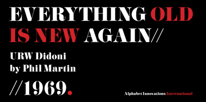
- Didona by ParaType,
$30.00 Designed at ParaType (ParaGraph) in 1992 by Vladimir Yefimov. Based on letterforms of Firmin Didot, a French typographer from the 18th century, ITC Didi, of 1970, by Herb Lubalin and Tom Carnase, and Russian typefaces of the 18th-19th centuries. A little extragerrated decorative stylization of letterforms in the spirit of Modern Serif, with elements of an irony. For use in headlines, in advertising and display typography. Improved and added with Extra Bold, old style figures, ligatures and other symbols in 2010 by the same author.
 - Divona - Unknown license

- Divona by Scriptorium,
$18.00 - Bodoni by Linotype,
$29.99 Giambattista Bodoni (1740–1813) was called the King of Printers and the Bodoni font owes its creation in 1767 to his masterful cutting techniques. Predecessors in a similar style were the typefaces of Pierre Simon Fournier (1712–1768) and the Didot family (1689-1836). The Bodoni font distinguishes itself through the strength of its characters and embodies the rational thinking of the Enlightenment. The new typefaces displaced the Old Face and Transitional styles and was the most popular typeface until the mid-19th century. Bodoni’s influence on typography was dominant until the end of the 19th century and, even today, inspires new creations. Working with this font requires care, as the strong emphasis of the vertical strokes and the marked contrast between the fine and thick lines lessens Bodoni’s legibility, and the font is therefore better in larger print with generous spacing. The Bodoni of Morris F. Benton appeared in 1911 with American Type Founders.
 - Bodoni by URW Type Foundry,
$35.00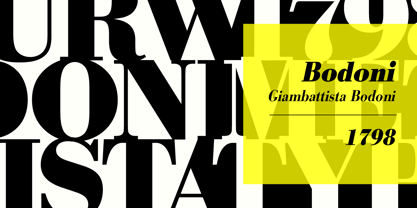
- Bodoni by Bitstream,
$29.99 Morris Fuller Benton started the Bodoni revival with this version for ATF in the early years of the 20th century. We consider it the first accurate revival of a historical face for general use. Sturdy and a little mechanical in the 19th century tradition, this is the Bodoni series familiar to us all.
 - Ladoni by Diogo Pisoeiro,
$15.00 This typeface is inspired on Bodoni, but this is like his gross sister, because it has angles instead of curves. Is a typeface with personality, strong and robust but at the same time sweet with his italics. This typeface has 5 weights, regular, italic, bold, poster and poster italic.
 - Badoni by Chank,
$49.00"Grunge Typography? I invented it!" claims Chank Diesel. Badoni was created in 1993 for use in CAKE, a fanzine that reveled in grunge music. As creative director of CAKE, Chank wanted the magazine's design to reflect the music it glorified. Kurt Cobain was alive and miserable. Soundgarden had long hair. Seattle was everywhere. Chank's answer was Badoni, a gritty and distressed typeface that is a sign of the grunge glory years. - Bodoni by ParaType,
$30.00 Designed at ParaType in 1989 by Alexander Tarbeev. A modern replica of the typeface by Giambattista Bodoni, the Italian punchcutter and typographer of the late 18th century. Bodoni was a director of printing house of Duke of Parma in Italy. His early types were based on those of Fournier and Didot, but he developed the designs to become what are now considered to be the first modern typefaces. His letters have strong vertical stress, sharply contrasting thick and thin strokes and unbracketed hairline serifs. The contrast of thick and thin in Bodoni typefaces can produce a sparkling effect on a page: should be carefully used in texts; good for headlines and display. Condensed and decorative styles were added in 1993–97.
 - Povetarac Didone by Tour De Force,
$25.00 Povetarac Didone font family is part of Povetarac Superfamily together with Povetarac Sans and Povetarac Display. Available in 6 weights with matching italics, Povetarac Didone relays on lively uppercase proportions that took inspiration from vintage typefaces. It is well balanced family, elegant and fully recognizable. One of its characteristics are straight and wide terminals without usual serifs for this kind of typefaces. Playful and harmonic italics are one more uniqueness of Povetarac Didone. They were gently crafted to fulfil they role not just for editorial use, but as display typeface as well. Comes with Fractions and extended Latin character map.
 - Price Didone by Eclectotype,
$25.00 PUBLIC SERVICE ANNOUNCEMENT: Price Didone has inspired a full alphabetic font - Mastadoni, so if you're after more than numerals, head over there! Price Didone is a font with a singular purpose: The setting of elegant, stylish price tags. As such it is non-alphabetic, featuring instead numerals, a large array of currency symbols, and a smattering of typographic niceties such as quotes, brackets, pilcrow, daggers and a very curvaceous ampersand. Certain currency symbols that are not independent glyphs (Q, Ft, kr etc.) are included as their constituent letters, some of which also have automatic ligatures for that little something extra. There are currency symbols included which have not (yet) been accepted to unicode, such as the Russian Ruble and Bitcoin symbols. For ease of access, these can be typed using the standard ligatures feature. See features below for the full list. Features: Automatic Fractions - with fractions feature engaged, arbitrary fractions are a doddle. Stylistic Sets: SS01 - an alternate look for 4 SS02 - a double stroked dollar symbol SS03- the # sign becomes a stylish numero Stylistic Alternates - for software that doesn't support stylistic sets, the above three features are grouped into the one SALT feature. Standard Ligatures - certain typed combinations automatically change to different glyphs: B|| = Bitcoin symbol P- = Russian Ruble RM = Malaysian Rimgit symbol Rp = Indonesian Rupiah Rs = Rupees Ft = Hungarian Forint kr = Kroner symbol % off;%off;%ff = Special percent off ligature Discretionary Ligatures - this feature sets decimal prices like $5.95 with the numerals after the period smaller and raised from the baseline, underlined by a nice swoosh. It also shrinks the dollar, sterling, and Euro symbols for a more authentic look. While intended for one sole purpose, Price Didone could nevertheless be quite versatile. Quote marks and typographic symbols can be used for decoration. Everybody loves a nice ampersand and this is one I'm really proud of. Or you might just want some pretty numbers for your house, or sports jersey, or just to stand out a little from the rest of your text. Whatever use you may have in mind, go for it. And do let me know if your currency symbol isn't included, and I'll quickly add it to the glyph set in future versions.
 - Heimat Didone by Atlas Font Foundry,
$50.00 Heimat Didone is the high contrast serif typeface family within the Heimat Collection, also containing Heimat Display, Heimat Sans, Heimat Mono and Heimat Stencil. Heimat Didone is a neo-classical typeface family designed for contemporary typography, especially for use in headlines and on posters, but also for reading purposes. It combines an idiosyncratic appearance with the feeling of a grid-based letter construction of the late 20s. Since the design might be too extreme for some applications, Heimat Didone’s character set provides two alphabets, the regular one plus an alternate design that comes across as less suspenseful. Heimat Didone [872 glyphs] comes in 72 styles and contains 6 optical weights, extra sets of alternate glyphs, many ligatures, lining figures [proportionally spaced and monospaced], hanging figures [proportionally spaced and monospaced], positive and negative circled figures for upper and lower case, superior and inferior, fractions, extensive language support and many more OpenType features.
 - Cabrito Didone by insigne,
$- A graceful kid if ever you’ve seen one, Cabrito Didone joins the Cabrito family of fonts--a family designed to provide young infants with clear recognition of letter forms. The original letters were released as part of the children’s book about fonts, The Clothes Letters Wear. Now, this latest addition brings a new Didone flavor to the table. But don’t judge the book by its cover. While Didones can be stodgy in the way they deliver a sense of luxury, this stubborn goat of a Didone bucks the stodgy stereotypes with its high-contrast, carefree, flowing fun, taking a more calligraphic direction than most. Cabrito Didone joins structure and handwriting to create a flowing balance of both characteristics. It’s a unique combination of functional and friendly. Its 42 well-designed fonts give you plenty of easy-going, highly readable options to work with as you craft your design. The typeface has unique serifs that give the sense of ink pooling slightly at the points, drawn with a sharp nib. Cabrito Didone supports OpenType features and is packaged with upright obliques, alternates, ligatures, old-fashioned figures, and compact caps. Preview any and all of these features in the interactive PDF manual. The family member font also includes glyphs for 72 languages; over 600 glyphs per font await. Cabrito Didone is an excellent choice for websites as well as flyers and packaging. Like Cabrito, which is currently used by a number of visible brands, Cabrito Didone is also a great option for defining your brand. Grab a taste of the Cabrito Didone flavor--and those of the other Cabrito members: Sans, Semi and Inverto.
 - Belda Didone by insigne,
$25.00 Belda Didone: the elegant strokes of Belda, now with higher contrast. A sleek Didone fusing graceful motion with an elegant typeface, this family offers new versatility. Belda Didone is a refined gem of a font that provides an unmatched level of luxury. Belda Didone is the child of Belda, offering new opportunities for a brave new world. The high contrast strokes reference the delicate shapes, curves, and sharp serifs of the original. The design of Belda Didone represents a unique balance of harmony and elegance. The architecture is robust and elegant. Belda’s forms have an intense luster and sparkle that captivates the reader’s eye. Belda Didone has plenty of OpenType alternates, including small capitals, titling, and a wealth of weights and widths. This font has the potential to serve as both text and titling. It’s an excellent choice for book jackets, advertising, packaging, and other luxury applications.
 - Mandrel Didone by insigne,
$24.00 A new family has sprung from the world of insigne. Mandrel Didone is his name. The face is well-liked by those with whom it seeks an audience because of its courtly demeanor and exquisite look. Mandrel Didone conducts itself beautifully in front of each set of eyes with a confident attitude, never wavering or tripping in its polished step. But, despite it’s gentility, this exquisite family is not weak in the face of adversity. Mandrel Didone is a powerful and conspicuous typeface that has towering x-heights, great contrast, confident bends, and sharp serifs. It is well-crafted for high-impact resistance. It uses its sharp serif ends deftly, cutting through opponents' clumsy clutter in the battle for the reader's attention. This noble family consists of nine weights and their matching italics, ranging from Thin to Black. Mandrel Didone also comes with a plethora of OpenType options to let you embellish your text. The family's 500 glyphs and support for more than 70 languages are accompanied with ligatures, old-style figures, and stylistic sets. Raise your glass in honor of the new Mandrel Didone! This champion, with its powerful serifs and great contrast, is ready to take on your challenge in many tests to come.
 - Pauline Didone by insigne,
$22.00 An Art Deco, script inspired typeface for 'modern' times, Pauline Didone is a full type family with a unique and flavorful design. It has a sense of femininity and naïveté that comes from its predecessor, Pauline. It's a typeface useful for short bits of copy, logotypes and interesting titling. This typeface family of 10 different fonts includes 5 weights and their italics and a wide range of OpenType alternates. The original Pauline was inspired by and has a strong influence from retro scripts. The typeface is geometric, formed with deliberate contrasting brush strokes and a ostentatious flair. Pauline Didone's high contrast strokes give it a very interesting look that is up to date with latest design trends and very useful for today's design environment. Pauline Didone pairs nicely with the original sans-serif Pauline. The typeface family also includes a full array of alternate forms, including over 150 alternate characters. These alternates can be accessed by activating OpenType features and style sets. Note: In order to use these OpenType features, you will need a program with advanced typography capabilities such as the Adobe Suite or Quark. These alternates also include a group of ball terminals that can be accessed under the swash alternates. Pauline Didone is the latest in a trusted line of typefaces from insigne. Why settle for the ordinary when you can choose Pauline Didone to lend its unique look to your art work?
 - Senlot Didone by insigne,
$35.00 Senlot Didone enchants with this fresh and cutting-edge sequel. It’s a modern interpretation of Senlot that says glamor and seduction. The typeface adds to the original high contrast sans serif with it’s modern high contrast shape, and features a new beauty with the distinctive sinuosity of contrasting forms. Senlot Didone is the sleek, serifed, high contrast follow-up to Senlot, and it's low contrast sequel, Senlot Sans. A serif typeface suitable for text and display work joined in 2019. Senlot Didone includes a wide range of OpenType features, including titling capitals, superscripts and subscripts, and oldstyle figures. Senlot Didone is composed of 3 widths: Condensed, Normal, and Extended, with 9 weights and their italics for a total of 54 fonts with more than 800 glyphs. Senlot Didone is a great display typeface for logos, branding, packaging, and advertising. With its broad palate of options, the font covers over 72 Latin-based languages. Dress your text in any of nine separate styles from Thin to Bold. With Senlot Didone, there's no need to compromise on another font with fewer features. Simple, elegant, and versatile, Senlot Didone now makes perfect more possible. Take the show by storm with this high contrast serif. The seductive figure of Senlot Didone is here to entice your viewer.
 - Lust Didone by Positype,
$49.00 Lust Didone’s character set was expanded as well during the redraw and update, the Italics were separated and reimagined anew from the universal italics in the original offering. Lust Didone also includes the new Fine optical size with complementing Italics for each size as well. And, yes, more swashes. The Lust Collection is the culmination of 5 years of exploration and development, and I am very excited to share it with everyone. When the original Lust was first conceived in 2010 and released a year and half later, I had planned for a Script and a Sans to accompany it. The Script was released about a year later, but I paused the Sans. The primary reason was the amount of feedback and requests I was receiving for alternate versions, expansions, and ‘hey, have you considered making?’ and so on. I listen to my customers and what they are needing… and besides, I was stalling with the Sans. Like Optima and other earlier high-contrast sans, they are difficult to deliver responsibly without suffering from ill-conceived excess or timidity. The new Lust Collection aggregates all of that past customer feedback and distills it into 6 separate families, each adhering to the original Lust precept of exercises in indulgence and each based in large part on the original 2010 exemplars produced for Lust. I just hate that it took so long to deliver, but better right, than rushed, I imagine.
 - Aviano Didone by insigne,
$24.99 First released in 2009, Aviano Didone has been completely remastered and expanded with new weights and optical sizes. Aviano Didone's high contrast forms lend elegant beauty, luxury and romance to your designs and it's extended letterforms provide strength and power. Aviano's foundational classical forms give the face a look that is unique for Didone faces. Aviano Didone is a bold interpretation of vertically contrasted type. Aviano Didone comes in eight different weights and is packed with OpenType features. Want ball terminals for that logotype or headline? Flat serifs? Swash forms? Aviano Didone includes 102 alternate characters. Five style sets are available, and Art Deco inspired alternates, small forms, swash, titling and stylistic alternates. Aviano Didone also includes 40 discretionary ligatures for artistic typographic compositions. The new optical sizes allow Aviano Didone to be used on the web or in print without losing detail. Be sure to check out the rest of the Aviano series which can be used as complementary faces, including Aviano, Aviano Serif, Aviano Sans and Aviano Flare.
 - Adonis by ParaType,
$30.00PT Adonis™ was designed by Natalia Vasilyeva and licensed by ParaType in 2002. An original typeface, its characters have slightly oblong proportions, with rounded serifs and generally soft letterforms. The face is both space-saving and quite legible in small sizes. For use in text and display typography. - Midon by Khoir,
$15.00 Midon font type is a thick serif with an elegant appearance. Having a personality that dares to create feelings and expressions that are firm but gentle so that they can be used as work tools so that the communication conveyed will easily feel beautiful. Midon Uppercase 75+ Language Alternate & Ligature So what are you waiting for? immediately purchase this font, feel free to comment, or send me my PM or email at khoirtypework@gmail.com Thank you for seeing
 - Liony by Tkachev,
$20.00 Liony is a pixel font with four font styles. Liony is an experiment to convert the script-style calligraphy into bitmap format. It looks great in display sizes and also works well when used smaller.
 - Bodoni Hand - Unknown license

- Bodoni Slapp - Unknown license

- Bodoni Antiqua by URW Type Foundry,
$89.99
- TS Bodoni by TypeShop Collection,
$24.80 - FF Fudoni by FontFont,
$41.99 Dutch type designer Max Kisman created this display FontFont in 1991. The family contains 3 weights and is ideally suited for festive occasions, film and tv, music and nightlife as well as poster and billboards. FF Fudoni provides advanced typographical support with features such as ligatures and case-sensitive forms. It comes with proportional lining figures.
 - Bodoni Ultra by Wooden Type Fonts,
$15.00 A classic bold face.
 - Bodoni SH by Scangraphic Digital Type Collection,
$26.00Since the release of these fonts most typefaces in the Scangraphic Type Collection appear in two versions. One is designed specifically for headline typesetting (SH: Scangraphic Headline Types) and one specifically for text typesetting (SB Scangraphic Bodytypes). The most obvious differentiation can be found in the spacing. That of the Bodytypes is adjusted for readability. That of the Headline Types is decidedly more narrow in order to do justice to the requirements of headline typesetting. The kerning tables, as well, have been individualized for each of these type varieties. In addition to the adjustment of spacing, there are also adjustments in the design. For the Bodytypes, fine spaces were created which prevented the smear effect on acute angles in small typesizes. For a number of Bodytypes, hairlines and serifs were thickened or the whole typeface was adjusted to meet the optical requirements for setting type in small sizes. For the German lower-case diacritical marks, all Headline Types complements contain alternative integrated accents which allow the compact setting of lower-case headlines. - Bodoni M by URW Type Foundry,
$35.00
- Poster Bodoni by Bitstream,
$29.99A slightly more refined revival of the Fat Face, as supervised by Chauncey Griffith at Mergenthaler one year after ATF’s Ultra Bodoni. - Bodoni Classico by Linotype,
$40.99Giambattista Bodoni (1740–1813) was called the King of Printers and the Bodoni font owes its creation in 1767 to his masterful cutting techniques. Predecessors in a similar style were the typefaces of Pierre Simon Fournier (1712–1768) and the Didot family (1689–1836). The Bodoni font distinguishes itself through the strength of its characters and embodies the rational thinking of the Enlightenment. The new typefaces displaced the Old Face and Transitional styles and was the most popular typeface until the mid-19th century. Bodoni’s influence on typography was dominant until the end of the 19th century and, even today, inspires new creations. The Bodoni Classico of Franco Luin displays less stroke contrast than the original and is therefore also appropriate for smaller point sizes. - JH Diwani by JH Fonts,
$120.00 JH Diwani simplified black is an advanced Arabic font simulating the Diwani Calligraphy with its finest details. Its typical usage: Wedding / greeting cards , headlines, poetry, and books. Please note that Arabic Kashida is not available for this font.
 - Bodoni Elegant by Alan Meeks,
$45.00 Whenever I went to use Bodoni I could never quite find a version I was happy with, so I designed my own incorporating, hopefully, the best of all the others. I decided to make a slight curve on the uprights, rather like Optima, because I thought this added touch of elegance which many of the others lacked....hence the name.
 - Bauer Bodoni by URW Type Foundry,
$39.99 Giambattista Bodoni of Parma designed and cut his typefaces circa 1790. The Bodoni types were the first of the Modern type designs in which hairlines contrast sharply with bolder stems, and serifs are unbracketed. The Bauer Bodoni font family derives from a cutting for metal type in 1926, retaining many of the original features. As with all versions of this typeface, the contrast between thick and thin strokes of Bauer Bodoni should be taken into consideration as the thin strokes can appear to fade out under certain printing processes.
 - Bodoni Z37 by Typodermic,
$9.95 Indulge in the timeless elegance of Bodoni Z37—a typeface that captures the essence of European sophistication. Designed with the mid-21st century in mind, this Didone font offers a dynamic range of weights and widths, allowing you to create captivating typography that is truly one-of-a-kind. Bodoni Z37’s Deco design with flat edges and geometric lines sets it apart from other fonts in its genre. It’s an exceptional choice for creating headlines, posters, and invitations. The razor-thin lines are enticing at larger sizes but can be challenging to handle when you need to go extremely small. Thankfully, the font is available in three optical sizes—large, medium, and small, making it versatile enough to use in any design scenario. The Bodoni Z37 family includes four weights, four widths, and italics, giving you a staggering 96 font options to choose from. The cute, curly italics are perfect for adding emphasis and flair to your text, while the lining numerals are kerned and proportionally spaced for effortless readability. With open-type fractions, numeric ordinals, and old-style numerals, Bodoni Z37 is a complete package that allows you to experiment with typography to your heart’s content. Whether you’re designing a book cover or a branding package, Bodoni Z37’s exceptional versatility and elegant design are sure to make your work stand out. Most Latin-based European, Vietnamese, Greek, and most Cyrillic-based writing systems are supported, including the following languages. Afaan Oromo, Afar, Afrikaans, Albanian, Alsatian, Aromanian, Aymara, Azerbaijani, Bashkir, Bashkir (Latin), Basque, Belarusian, Belarusian (Latin), Bemba, Bikol, Bosnian, Breton, Bulgarian, Buryat, Cape Verdean, Creole, Catalan, Cebuano, Chamorro, Chavacano, Chichewa, Crimean Tatar (Latin), Croatian, Czech, Danish, Dawan, Dholuo, Dungan, Dutch, English, Estonian, Faroese, Fijian, Filipino, Finnish, French, Frisian, Friulian, Gagauz (Latin), Galician, Ganda, Genoese, German, Gikuyu, Greenlandic, Guadeloupean Creole, Haitian Creole, Hawaiian, Hiligaynon, Hungarian, Icelandic, Igbo, Ilocano, Indonesian, Irish, Italian, Jamaican, Kaingang, Khalkha, Kalmyk, Kanuri, Kaqchikel, Karakalpak (Latin), Kashubian, Kazakh, Kikongo, Kinyarwanda, Kirundi, Komi-Permyak, Kurdish, Kurdish (Latin), Kyrgyz, Latvian, Lithuanian, Lombard, Low Saxon, Luxembourgish, Maasai, Macedonian, Makhuwa, Malay, Maltese, Māori, Moldovan, Montenegrin, Nahuatl, Ndebele, Neapolitan, Norwegian, Novial, Occitan, Ossetian, Ossetian (Latin), Papiamento, Piedmontese, Polish, Portuguese, Quechua, Rarotongan, Romanian, Romansh, Russian, Rusyn, Sami, Sango, Saramaccan, Sardinian, Scottish Gaelic, Serbian, Serbian (Latin), Shona, Sicilian, Silesian, Slovak, Slovenian, Somali, Sorbian, Sotho, Spanish, Swahili, Swazi, Swedish, Tagalog, Tahitian, Tajik, Tatar, Tetum, Tongan, Tshiluba, Tsonga, Tswana, Tumbuka, Turkish, Turkmen (Latin), Tuvaluan, Ukrainian, Uzbek, Uzbek (Latin), Venda, Venetian, Vepsian, Vietnamese, Võro, Walloon, Waray-Waray, Wayuu, Welsh, Wolof, Xavante, Xhosa, Yapese, Zapotec, Zarma, Zazaki, Zulu and Zuni.
 - Bauer Bodoni by Bitstream,
$34.99Firmin Didot cut the first modern face about 1784 in Paris; Giambattista Bodoni followed prolifically on his heels; his punches and matrices survive in Parma. Bauer has produced the most faithful and delicate contemporary version of his types. - Bodoni SB by Scangraphic Digital Type Collection,
$26.00 Since the release of these fonts most typefaces in the Scangraphic Type Collection appear in two versions. One is designed specifically for headline typesetting (SH: Scangraphic Headline Types) and one specifically for text typesetting (SB Scangraphic Bodytypes). The most obvious differentiation can be found in the spacing. That of the Bodytypes is adjusted for readability. That of the Headline Types is decidedly more narrow in order to do justice to the requirements of headline typesetting. The kerning tables, as well, have been individualized for each of these type varieties. In addition to the adjustment of spacing, there are also adjustments in the design. For the Bodytypes, fine spaces were created which prevented the smear effect on acute angles in small typesizes. For a number of Bodytypes, hairlines and serifs were thickened or the whole typeface was adjusted to meet the optical requirements for setting type in small sizes. For the German lower-case diacritical marks, all Headline Types complements contain alternative integrated accents which allow the compact setting of lower-case headlines.
 - Bodoni Highlight by Image Club,
$29.99Giambattista Bodoni (1740-1813) was called the King of Printers; he was a prolific type designer, a masterful engraver of punches and the most widely admired printer of his time. His books and typefaces were created during the 45 years he was the director of the fine press and publishing house of the Duke of Parma in Italy. He produced the best of what are known as modern" style types, basing them on the finest writing of his time. Modern types represented the ultimate typographic development of the late eighteenth and early nineteenth centuries. They have characteristics quite different from the types that preceded them; such as extreme vertical stress, fine hairlines contrasted by bold main strokes, and very subtle, almost non-existent bracketing of sharply defined hairline serifs. Bodoni saw this style as beautiful and harmonious-the natural result of writing done with a well-cut pen, and the look was fashionable and admired. Other punchcutters, such as the Didot family (1689-1853) in France, and J. E. Walbaum (1768-1839) in Germany made their own versions of the modern faces. Even though some nineteenth century critics turned up their noses and called such types shattering and chilly, today the Bodoni moderns are seen in much the same light as they were in his own time. When used with care, the Bodoni types are both romantic and elegant, with a presence that adds tasteful sparkle to headlines and advertising. This version of Bodoni was done by Morris Fuller Benton for American Typefounders between 1907 and 1911. Although some of the finer details of the original Bodoni types are missing, this family has the high contrast and vertical stress typical of modern types. It works well for headlines, logos, advertising, and text."


Page 1 of 15Next page