23 search results (0.013 seconds)
  1. Deltoid - Unknown license
  2. Delusoid by Flawlessandco, $9.00
    Delusoid, a Blackletter font with an authentic and unique style on each character that gives a bold touch to any design you create. There's some connected letters and some alternates that suitable for any graphic designs such as branding materials, t-shirt, print, business cards, logo, poster, t-shirt, photography, quotes .etc This font support for some multilingual. Also contains uppercase A-Z and lowercase a-z, alternate character, numbers 0-9, and some punctuation. If you need help, just write me! Thanks so much for checking out my shop!
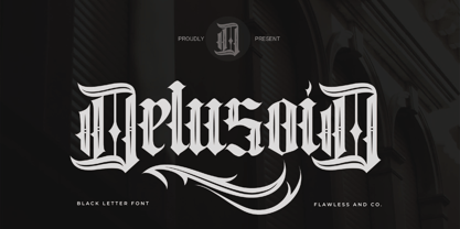
  3. Deltona by Thaddeus Typographic Center, $49.00
  4. Deloise - Unknown license
  5. Devoid by Dropper, $35.00
    Devoid is a sans serif typeface with a no frills stripped down design. The design has all the features of the neo grotesk typeface, horizontally cut endings, modern capitals, oval counters, with a bare bones appearance. The typeface comes in three subtle widths, Devoid Slim, which is spaced most narrowly, Devoid and Devoid Set, which have a wider letterspacing. There are regular, medium and bold weights with accompanying italics. The vertical metrics align across weights and widths, this allows for optical size adjustment as well as adjusting for same size text fit. Dutch designer Pier Taylor designed the typeface in 2020 for use in catalogs, lists and registers.
  6. Deloire by Almarkha Type, $29.00
    Deloire Modern & Luxury Sans Family Our latest product inspired by the famous logo is simple but classy, made with precision and measured. very good for combining your design work with a clear line and a circle with several different weights that are very comfortable in the design area you are easy to read and as a title on a blog or magazine page. Deloire has symbols and punctuation and unique alternative letters perfect for logos & branding, photography, invitation, watermark, advertisements,product designs, stationery, wedding designs,label ,product packaging.
  7. Pacifista by Suitcase Type Foundry, $39.00
    Pacifista takes advantage of the well-tested structure of our constructed typefaces, the directness and simplicity of which are by far the best suited to stencils. Straight lines, regular arcs and purity of drawing facilitate maintaining the maximum possible legibility even in a typeface that is practically devoid of any joining of strokes.
  8. Skarpa Condensed by Aga Silva, $23.99
    This is condensed and more visually compact version of Skarpa font. All kerning has been thoroughly revised and manually adjusted. The font is based on geometric forms devoid of excessive flourishing. Would suit modern designs either in fashion, technology or laboratory setting. Would look good on door plaques in pharmacy or simple drawer plaques - especially Medium or Bold specimen. Lighter specimens would look good in leaflet & magazine print (see presented posters).
  9. Scandilover by Katsia Jazwinska, $19.00
    Scandilover Family was inspired by monochrome Scandinavian style kid rooms full of handwritten graphics, black and white accessories and prints. Scandilover is a playful display font with its personal charisma. Each letter in the font perfectly combines with another and all in all creates a text that is an entire illustration itself. Scandilover Script is a thin delicate font which isn’t devoid of playfulness too. Together with contrasting Scandilover they make funny lively combinations. Just try!
  10. MVB Calliope by MVB, $39.00
    Gayle Sato, longtime friend of MVB Fonts, has amazing handwriting. It’s a natural, simple hand, with perfect rhythm. Devoid of flourishes, it doesn’t try to be beautiful. It’s just genuine, quick, and clean — the handwriting we all wish we had. The digitization by Mark van Bronkhorst captures these qualities. Retaining the roughness of a felt pen, MVB Calliope is a handwriting typeface that feels much more authentic than most, highly legible but still raw. The Regular was released in 2005, with the other weights shortly thereafter.
  11. Squoosh Gothic by Thinkdust, $10.00
    Squoosh Gothic is a serious new contender in the arena of headline fonts. Upright and condensed, Squoosh’s whimsical name belies its true nature. Though, that’s not to say it’s totally devoid of a sense of merriment – it just values a more orderly, regulated kind of tomfoolery. Mad-libs for instance, or The Times cryptic crossword. Its mature but unmistakably witty attitude can go a great distance to lending a sense of culture and an air of scintillation to your designs. Don’t miss out on this sanguine new font, Squoosh Gothic from Thinkdust, available now.
  12. Skarpa by Aga Silva, $23.99
    This is long awaited thorough revision to Skarpa family. The revision has inculded both another look at letter shapes as well as kerning and metrics of the files. The shapes encapsulated in this font stem from old time architectural drawings hand executed at drawing board with tracing paper and rapidographs. Think of lettering stencils sliding across the tracing paper and craftily exectuted drawing descriptions. The font is based on geometric forms devoid of excessive flourishing. Would suit modern designs either in fashion, technology or laboratory setting. Would look good on door plaques in pharmacy or simple drawer plaques - especially Medium or Bold specimen.
  13. Ragik Sans by Hurufatfont, $29.00
    Ragik; It is a low-contrast sans serif font family with two accents. The letters are designed with a clear and simple elegance, devoid of ornaments. The open terminals of the letters “S, C, G, s, a, c, e” are elegant and legible with their large open areas. It consists of 16 styles, from thin to heavy, with true italics. Ideal for modern typographic posters, packaging and branding designs. It comes with rich OpenType features. Alternating glyphs, elegant and functional ligatures. All number sets (tnum, onum, lnum, numr, denom, sinf, sups etc.) have a rich symbol library with ornaments and arrows.
  14. Minehead by Hanoded, $15.00
    As a family, we love to go camping. We have a big Norwegian tunnel tent (4 season - with room for a wood stove), some really warm down sleeping bags and a primitive field kitchen. Even though our camping trips are usually devoid of luxury, the kids love them! We always choose campsites that are close to nature, like a national park or in the mountains. A couple of years ago, we toured the southern part of England and one of our camping stops was in Exmoor National Park. Minehead is a small coastal town, not far from where we camped, so I named this font after a fond memory! Minehead is a handmade display font. It was loosely based on Haettenschweiler. Use it for your packaging, your tourist information leaflets and your book covers. And do visit Minehead one day!
  15. Deloise is a captivating font that stands out for its seamless blend of classical elegance with a twist of modernity. This font exhibits characteristics that make it versatile and appealing for a wid...
  16. MVB Diazo by MVB, $59.00
    Mundane information—the sort you might ignore—often appears in the form of very simple, utilitarian lettering, devoid of personality, the sort of industrial lettering you find on old blueprints, park restrooms, and electrical boxes. MVB Diazo is such a thing. It looks like lettering done earnestly with a plastic template. The monoline caps—constructed from straight lines and simple curves—have rounded details as if rendered by a blunt pen on a topographical survey or by a router on a rustic campground sign. The MVB Diazo fonts are compact, available in two widths: Condensed and Extra Condensed. Each width offers four weights from Light to Black. The fonts are perfect for wherever plain and boring letterforms are required. All widths and weights are also available in two distressed textures (#1 and #2) that accentuate the industrial character of the design. Rough #1 is gritty, with finer texture for use at larger sizes. Rough #2 exhibits more damage, the roughness apparent when used at smaller sizes. The Rough fonts include alternates of a number of glyphs so that variation of texture is possible when letters repeat in a word.
  17. Mexica by Sudtipos, $39.00
    Mexica is a typographic tribute to Nahuatl, the tongue of the Aztecs, but also the lingua franca of ancient Mexico. ‘Mexica’ is not only the feminized, latinized form of the word ‘Mexico’, but also the name of the inhabitants of this place: the Me-xic-cah. Nahuatl, when composed in the Latin alphabet, abounds in diagonal letter shapes: XYZ are ubiquitous in its classic orthography, just as KW are in its modern one. This visual feature is further enhanced by the absence of some rounded letters such as BDG that depict inexistent sounds in this millenarian tongue. Besides, Nahuatl is language with a tendency to form very long words that give the text quite a distinct appearance, unlike English, for instance, with its abundance of short words. Mexica was designed to look well in all these contexts, and to perform as well as a contemporary, daring, stylish serif type family, with several weights for text and display composition. Further, its terminals and general structure —devoid almost completely of straight lines—are inspired by the angled architecture and ornamentation of the ancient city of Mexico- Tenochtitlan. Mexica received an Award of Excellence at the Type Directors Club of New York annual competition.
  18. TE Nastaaliq by Tharwat Emara, $59.00
    TE Nastaaliq Font It is one of the Persian calligraphy or ta'liq line that appeared in Persia in the seventh century AH (thirteenth century AD), as it was extracted from the lines of naskh, patch and thuluth. It is a beautiful font whose letters are distinguished by precision and extension. It is also characterized by its ease, clarity and lack of complexity. It does not tolerate diacritics, despite its difference with the line of the patch, as it is one of the best fonts in the world and the best without a competitor and admires many Arab calligraphers, and no cultural or literary exhibition is devoid of a painting written in Persian script. It is one of the most beautiful lines that has a special character that distinguishes it from others, as it is characterized by gracefulness in its letters, so it appears as if it descends in one direction, and its beauty is increased by the soft and rounded lines in it, because it is more flexible in drawing and more flexible, especially if it is drawn with precision, elegance and good distribution, and the calligrapher may baptize In his use of decoration to reach strength in expression by taking advantage of arches and circles, in addition to the grace of painting, the artist may link the letters of one word and the two words to reach the composition of a frame or curved and wrapped lines in which he shows his genius in imagination and creativity.
  19. The Hooge 05_55 Cyr2 font, designed by Nikolay Dubina, is a distinctive and impactful typeface that commands attention through its bold, minimalist aesthetic. Crafted with precision and sharp geometr...
  20. SimpleType by Fenotype is an artful embodiment of minimalist aesthetics blended with pragmatic functionality in the realm of typography. Crafted by the esteemed Fenotype, a foundry known for their in...
  21. Alright, prepare yourself for a typographic voyage to the land of "Rational Integer" by Tepid Monkey Fonts, where numerals and letters coexist in a harmonious utopia devoid of irrationality. Ration...
  22. As of my last update in April 2023, "Clawless" is not a widely recognized or standard font available in major font libraries or typographic resources. However, crafting a conceptual description for a...
  23. RNS Baruta Black is part of the RNS Fonts collection, crafted by RNS Foundry, which has been known for offering a diverse array of typeface designs that cater to various aesthetic and functional need...
Looking for more fonts? Check out our New, Sans, Script, Handwriting fonts or Categories
abstract fontscontact usprivacy policyweb font generator
Processing