1,412 search results
(0.007 seconds)
- Alph Deco by Morganismi,
$15.00 Alph Deco is an artistic font designed to satisfy devoted friends of art deco. It supports West and Central European tongues as well as Baltic, Turkish and Romanian languages.
 - Deco Pro by Throndsen,
$10.00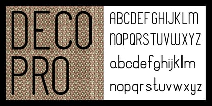
- Deco Metro by Greater Albion Typefounders,
$20.00 Deco Metro is a 1920s and 30s inspired display family, ideal for posters, banners, book covers and other promotional work. Two weights, regular (with an incised centre line) and bold (without the centre line) are offered. The family has an extensive range of features including discretionary ligatures, old-style numerals, Swash Letter and numeral forms, small capitals, Roman numerals and fractions.
 - Dwiggins Deco by MADType,
$21.00 This typeface was originally designed in 1930 by W.A. Dwiggins as the cover for the book American Alphabets by Paul Hollister. Only the 26 letters of the alphabet were included on the cover, so the rest of the numbers, punctuation, symbols, and accented characters have been crafted in a matching style. This strongly geometric Art Deco lettering style has been lovingly revived and is now available as an OpenType font. Over 3,300 kerning pairs are included.
 - Deco Donut by Just My Type,
$20.00 On the very northern edge of South Tucson lies an Old Pueblo institution, Le Caves Bakery, Home of the Vegetable Donut. That’s what they were called when Le Caves opened; now you’d say Vegan Donut, or No Animal Products Used. Radical concept in the Brave New World of 1935. I started with the letters from their sign and extrapolated the rest of the font from those. Deco Donut Fat is extrapolated from Deco Donut. If you want a donut, type a 0 (zero).
 - Saxo Deco by Eurotypo,
$35.00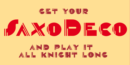
- Deco Pimp by Hanoded,
$15.00 Deco Pimp is a trashy, handwritten font with a deco-look to it. It has some unusual letters, but is very legible nonetheless.
 - Deco Sans by Alan Ronn,
$30.00This font was created while looking at the various shapes my handwriting consistently took, especially in the ways that letters would have breaks in them. Over the course of a few months I continually tweaked the letter forms and shapes, and lo and behold, I developed Deco Sans. This family currently only includes a thin weight, as I'm only one person, and very busy with college. I'm continuing work on a regular, bold, and possibly a future italic weight, but these may not be released for many months to come. As this is a very thin font, it should be used at sizes no smaller than around 16 or 18pt as it tends to get lost in whitespace, and looks best at large sizes. As such, this weight should be considered more of a display font than a text font, however, I predict a regular weight to be very readable and much more useable for the everyday. - Geometa Deco by Wiescher Design,
$39.50 Geometa Deco is based on Paul Renners Futura Classic. The design is timeless, but I always missed some decorative characters. So I sat down and did some. The type-designer for surprising solutions, Gert Wiescher
 - Praha Deco by Deniart Systems,
$20.00 Praha Deco was inspired by the Prague art deco movement at the turn of the 20th century. Spiced with our own creative blend, this is our tribute to that wonderful era in architecture. The Praha Deco typeface contains a large assortment of extended characters to support many of Europe's languages, including Czech, Danish, Dutch, Esperanto, Finnish, French, German, Italian, Hungarian, Polish, Portuguese, Romanian, Spanish, Swedish, Turkish & Welsh.
 - Deco Inline by BA Graphics,
$45.00A hot revival of the 60s and 70s a great headline face with that retro look. - Reynold Art Deco - Personal use only

- Diehl Deco - Alts - Unknown license

- KR Deco Frames - Unknown license

- Rio Art Deco - Unknown license

- Flat10 Art Deco by Dharma Type,
$14.99 This 8-bit pixel font is designed with respect for 80s game designers and the pixel font pioneers in middle 90s. Use at size 10 pixels or multiples of 10 and anti-alias off is recommended. List of our Pixel Font Project. ·Flat10 Antique ·Flat10 Artdeco ·Flat10 Arts&Crafts ·Flat10 fraktur ·Flat10 Holy ·Flat10 Holly ·Flat10 Segments ·Flat10 Stencil ·Flat20 Gothic ·Flat20 Headline ·Flat20 Hippies ·Flat20 Streamer ·Behrensmeyer Vigesimals ·Civilite Vigesimals
 - French Deco JNL by Jeff Levine,
$29.00 A wide and thin hand lettered Art Deco design from the vintage French lettering book "L'Art du Tracé Rationnel de la Lettre" was the inspiration for French Deco JNL; available in both regular and oblique versions.
 - EF Euro Deco by Elsner+Flake,
$35.00 - Deco Days JNL by Jeff Levine,
$29.00 The hand lettered pre-Deco style title and songwriters' credits on the cover of the sheet music for 1929s "The Love Parade" were the models for Deco Days JNL, which is available in both regular and oblique versions.
 - Polytype Art Deco by Prime Graphics,
$45.00 - New Year Deco by Wing's Art Studio,
$9.00 New Year Deco: An Art Deco Font for Festive Celebrations! Raise a glass to the New Year with this elegant, vintage inspired Art Deco header font. This first edition of New Year Deco is the introduction to an experimental design that I hope will evolve into the ultimate in Art Deco fonts. Starting with 4 alternative styles with varying degrees of decorative flourish, this all-caps design is tailor-made for invitations, award ceremonies, elegant title designs and logos. It includes unique uppercase and lowercase characters, along with numerals, punctuation and language support. And also includes a variety of illustrated symbols, underlines and icons for an extra graphic touch. See the visuals for more. For the future development of this font I encourage my customers to contact me with suggestions and requests. If you would like to see a bolder, thinner, fatter, taller or wider version, contact me and I’ll add it to the next update!
 - Deco Hotel JNL by Jeff Levine,
$29.00 Hand lettering on the Art Deco-era sheet music for a song entitled "Rosemary" was the model for this delicate monoline design called Deco Hotel JNL.
 - Western Deco JNL by Jeff Levine,
$29.00 The cover of the 1938 sheet music for "Treasure Island March" had its title hand lettered in a rough-hewn Western style with overtones of Art Deco influence. All of the characters were "cleaned up" for the digital font, but still retain the basic designs with their irregular, eccentric look. The result is Western Deco JNL, which is available in both regular and oblique versions.
 - Naive Deco Sans by S&C Type,
$8.00 Naïve Deco Sans is a layered sans serif handwritten font designed by Fanny Coulez and Julien Saurin in Paris. Our goal was to draw a font with finely irregular lines that give a human and whimsical feeling. It is available in two versions: double or triple lines. The font is also decomposed in three different parts that you can use to improve your designs with multiple colors, giving to the font a deco touch. To do so, you can simply superimpose the parts with a compatible software like Photoshop and choose a color for each. This font is part of our Naïve superfamily that contains lot of variations: Line, Inline, Serif, Sans Serif... Just click on our foundry name to see them all! We hope you will enjoy our work. Merci beaucoup!
 - Deco Diva JNL by Jeff Levine,
$29.00 The title hand lettered onto the 1933 sheet music cover for “Yours is My Heart Alone” represents the classic Art Deco typographic features of unusual character shapes and widths, yet at the same time it projects simplicity in geometric design. This served at the basis for Deco Diva JNL, which is available in both regular and oblique versions.
 - Deco Signage JNL by Jeff Levine,
$29.00 Deco Signage JNL was inspired by the cast metal letters of a German wall sign “Kaspar Stanggasinger-Haus” in an online display of European signage photography - and is available in both regular and oblique versions. Although the original age of the sign is unknown, the tall, thin monoline font it’s based on evokes a definite 1940s Art Deco design influence.
 - Bodoni Classic Deco by Wiescher Design,
$39.50 Bodoni Classic Deco is against all rules. Giambattista Bodoni himself would probably hate me for doing it; he was a real purist. The whole idea of the Bodoni typeface is no embellishments and here I go and decorate those nice clear letters. Shame on me! But I find this is a very nice and useful typeface for all kinds of cards and certificates. So I just did it for all of you out there that are not born purists, but want a little embellishment to their lives. And to make things worse, I added a Small Caps cut. I even decorated it. Enjoy! Yours, breaking all the rules, Gert Wiescher
 - Hollywood Deco SG by Spiece Graphics,
$39.00 This is yet another Willard T. Sniffin deco-inspired original. Created for the American Type Foundry, Hollywood Deco remains a classic that is still as contemporary today as when it first appeared in 1932. Use this novelty gothic typeface on announcements and stationery. It is also well-suited for many advertising situations where a stylish retro look is desired. A useful set of alternate characters (including the illustrious “Overlapping O's”) is included with this version. Hollywood Deco Medium with Alternates is also available as an OpenType font. This version now contains small caps, lining and oldstyle figures, prebuilt fractions, stylistic alternates, word buttons and a wide assortment of f-ligatures. These advanced features currently work in Adobe Creative Suite InDesign, Creative Suite Illustrator, and Quark XPress 7. Check for OpenType advanced feature support in other applications as it gradually becomes available with upgrades.
 - Hybrid Deco JNL by Jeff Levine,
$29.00 Squared letters with rounded corners – Deco stylized letter forms – some characters with ‘hook’ semi-serifs – such is the mixed styles that comprise the hand lettered title “United We Stand” on a 1940s-era piece of sheet music. This unusual conglomeration of character shapes inspired the aptly named Hybrid Deco JNL, which is available in both regular and oblique versions.
 - Ornamental Deco 2D by 2D Typo,
$36.00 This font was inspired by Lviv ArtDeco architecture dominating in 1920s-30s. This collection of ornaments is a graphic representation of building decorative elements, mostly of metal tracery elements and wall bas-relief. This font can be used for a variety of purposes, in graphic design as well as in industrial design.
 - Deco Romance JNL by Jeff Levine,
$29.00 From the cover of the 1932 sheet music for “A Great Big Bunch of You” comes a hand-lettered Art Deco type design; boldly hand lettered with contrasting angled lines and varying character widths. Deco Romance JNL is available in both regular and oblique versions.
 - Deco Experiment 6 by Intellecta Design,
$11.00a naive family of art deco inspiration - Deco Redux JNL by Jeff Levine,
$29.00 A long-set aside Art Deco typeface design begun (but not completed) may or not have been from a vintage source, but its roots go well back into Art Deco lettering. Taking the existing letters and thickening their weights, removing the counters and ending up with a completely new, solid alphabet design resulted in Deco Redux JNL, which is available in both regular and oblique versions.
 - Deco Wide JNL by Jeff Levine,
$29.00 A unique and stylized type design with Art Deco influence was found within the French publication “Modèles de lettres modernes par Georges Léculier” (“Models of Modern Letters by Léculier”). This lettering is now digitally available as Deco Wide JNL in both regular and oblique versions.
 - Deco Revival JNL by Jeff Levine,
$29.00 Some time back, a few basic characters were drawn out (possibly inspired by some vintage sheet music) and set aside for a future font project. Despite being incomplete for a few years, this once-forgotten design is now available as Deco Revival JNL, in both regular and oblique versions.
 - Deco Experiment 3 by Intellecta Design,
$9.00Note: The Decorative style is no longer available due its complexity and the resulting memory and performance issues. - Totally Deco JNL by Jeff Levine,
$29.00 The hand lettered title found on the sheet music for 1938’s "So Help Me (If I Don't Love You)" was the basis for Totally Deco JNL, which is available in both regular and oblique versions. A classic mix of widely rounded letters and condensed letters typifies the design style of the Art Deco era.
 - Casual Deco JNL by Jeff Levine,
$29.00 The hand lettered sans serif title on the1931 sheet music for “(Potatoes are Cheaper-Tomatoes are Cheaper) Now’s the Time to Fall in Love” presented another opportunity to create a typeface from the wealth of unusual alphabets found on the covers of vintage and antique song sheets. However, it seems that even as late as the 1930s, song writers had the urge to pen long-worded titles for their musical compositions. This thirteen word verbal excursion became the model for Casual Deco JNL, which is available in both regular and oblique versions.
 - Salzmann Deco NF by Nick's Fonts,
$10.00This seriously styling family of typefaces is based on Dolmen and Zierdolmen, designed by Max Salzmann for the J. G. Schelter & Giesecke foundry of Leipzig in 1922 and 1923. Unlike previous revivals, these fonts remain true to Salzmann’s original designs. The plain version also features all of the standard German ligatures, accessible through the hlig feature, included in the original release. Both versions feature the complete Latin 1252, Central European 1250 and Turkish 1254 character sets, with localization for Lithuanian, Moldovan and Romanian. - Deco Eccentrique JNL by Jeff Levine,
$29.00 The inspiration for Deco Eccentrique JNL was initially hand drawn contoured lettering from a mid-1920s piece of sheet music; the style of the letters showing influences of the upcoming Art Deco movement. This was made into a digital font entitled Poster Contoured JNL. Once all of the excess parts of the previous design were stripped away to only the inner letters, the pre-Art Deco influences remained along with characters of varying stroke widths and shapes. This non-conformist type face is available in both regular and oblique versions.


