692 search results
(0.006 seconds)
- Curlz by Monotype,
$40.99Curlz is designed to look like bent, twisted metal. The Curlz font is best used for impudent, carefree titles. Curlz is appropriate for menus, signage and greetings cards. - Curly - Unknown license

- Klang MT by Monotype,
$29.99Will Carter, well known in connection with his private press in Cambridge, has combined the skills of a calligrapher with a practical knowledge of printing. His mastery of pen-drawn letterforms was put to practical use in the design of Klang. Klang is a slightly inclined and calligraphically shaped sans serif with short ascenders and descenders. The Klang font is useful for informal applications, such as invitations, greetings cards and posters, but can also be used in advertising. - Levenim MT by Monotype,
$50.99 - Kino MT by Monotype,
$29.99Kino font was designed in 1930 by Martin Dovey for the Monotype Corporation. Heavy in weight with the letters clipped at the top and bottom, Kino is unique among display types. Display typefaces with triangular serifs are sometimes called Latins and Kino is referred to as a serifless Latin. Use Kino font sparingly in informal display situations." - Bembo MT by Monotype,
$45.99 The origins of Bembo go back to one of the most famous printers of the Italian Renaissance, Aldus Manutius. In 1496, he used a new roman typeface to print the book de Aetna, a travelogue by the popular writer Pietro Bembo. This type was designed by Francesco Griffo, a prolific punchcutter who was one of the first to depart from the heavier pen-drawn look of humanist calligraphy to develop the more stylized look we associate with roman types today. In 1929, Stanley Morison and the design staff at the Monotype Corporation used Griffo's roman as the model for a revival type design named Bembo. They made a number of changes to the fifteenth-century letters to make the font more adaptable to machine composition. The italic is based on letters cut by the Renaissance scribe Giovanni Tagliente. Because of their quiet presence and graceful stability, the lighter weights of Bembo are popular for book typography. The heavier weights impart a look of conservative dependability to advertising and packaging projects. With 31 weights, including small caps, Old style figures, expert characters, and an alternate cap R, Bembo makes an excellent all-purpose font family.
 - Ehrhardt MT by Monotype,
$29.99 The Ehrhardt name indicates that this typeface is derived from the roman and italic typefaces of stout Dutch character that the Ehrhardt foundry in Leipzig showed in a late-seventeenth-century specimen book. The designer is unknown, although some historians believe it was the Hungarian Nicholas Kis. Monotype recut the typeface for modern publishers in 1937 to 1938. Ehrhardt has a clean regularity and smooth finish that promote readability, as well as a slight degree of condensation, especially in the italic, that conserves space. Ehrhardt is a fine text face, especially for books.
 - Falstaff MT by Monotype,
$29.99 Falstaff first appeared with Monotype in 1931, an alphabet in the style of a wide, bold antiqua that was especially popular in the first third of the 19th century. Such typefaces distinguished themselves through their consistent basis in the transitional antiqua style. They are characterized by their extremely fine unflexed serifs with no curve connecting them to the thick strokes. The numerals with their generous curves and ball-like stroke endings and beginnings are particularly decorative. The vertical strokes are dominant and give lines of this typeface a column-like and therefore static look. Falstaff is today often used for book titling, especially for mystery novels. It is best used sparingly in middle and larger point sizes.
 - MT Zephyr by Monotype,
$29.99 - Strayhorn MT by Monotype,
$29.99 Strayhorn is a sans serif development of the popular typeface family, Ellington. Although classified as a sans serif, the Strayhorn font family has markedly flared stems and calligraphic terminal treatment. A fairly condensed face with vigorous letter shapes, Strayhorn makes an eye-catching display face and an economical, legible text type. The contrast between thick and thin strokes is more apparent than in most sans serif designs, resulting in an open, rather striking appearance on the page. Strayhorn is ideal for use in advertising, flyers, labels and packaging. It will also make a refreshing alternative to the more monotone sans serifs used in magazines, periodicals, newsletters etc.
 - Castellar MT by Monotype,
$29.99 Castellar is a capital letter typeface from John Peters, named after a location in the Alps. It first appeared in 1957 with Monotype. Peters modelled the design on the Roman script Scriptura Quadrata as it was used in the first two centuries of the Roman Empire. One distinguishing characteristic is the quadratic proportions of many letters, which are however mixed with circular and narrow forms. The original script was called Scriptura Quadrata because the ancient engravers used rectangular stone plates for their work. Castellar is a typical title typeface and is best used in large and very large point sizes to highlight its classic elegance.
 - Bell MT by Monotype,
$39.00 Monotype’s hot metal Bell series from 1931 was based on original types made by the punchcutter Richard Austin for the foundry of John Bell in the 1780s. The different sizes of Monotype’s series were not all based on the same model. As type historian James Mosley wrote on Typophile, “For 18 point and above (the metal type was cut in sizes up to 36 point) Monotype’s model was a larger type [than the model used for the text sizes], the ‘Great Primer’ cut by Austin. This has greater contrast in the capitals and a flat foot to letter a.” The digital Bell closely follows the design of the hot metal 18pt version, and is therefore somewhat lighter in color than the text sizes of Monotype’s original metal face. James Mosley’s Typophile article can be found here.
 - Compacta MT by Monotype,
$29.00 Compacta is the work of Fred Lambert and is reminiscent of the extremely narrow, sans serif stencilled fonts of the 1920s, then intended as titles or headlines for magazines and posters. The characters of all cuts are narrow and the space between letters is very small. The white spaces between strokes are perceived almost as only small white stripes and dots which stand out from the black bands of the lines of text. Compacta is not meant for longer texts but is impressive in titles and headlines.
 - Coronet MT by Monotype,
$29.99
- Hashira Mt by MotionTail,
$20.00 Give your designs an authentic handcrafted feel. "Hashira Mt" is perfectly suited to signature, stationery, logo, typography quotes, magazine or book cover, website header, clothing, branding, packaging design and more. Files included: - uppercase letters - multilingual symbols - numerals - punctuation
 - Ellington MT by Monotype,
$29.99 Ellington was designed by jazz lover, Michael Harvey for Monotype in 1990, and named after the great band leader, Duke Ellington. From experience gained carving letters in stone and drawing them for book jacket designs, Michael Harvey has created a condensed typeface combining the clear-cut sparkle of a modern face with some of the lively features of the broad-edged pen. Ellington has a fresh elegance that is particularly effective in display, while its compressed forms will prove economical in text settings. The Ellington font family has narrow characters with strong vertical strokes and angular calligraphic traits. Ellington is a lively face and an appropriate font choice for advertising and book work. Ellington has a sans serif companion family, Strayhorn.
 - MT Crisiant by MysticalType,
$10.00 MT Crisiant is a new, minimalistic, elegant, and professional font. This font is suitable for making, titles, taglines, logos, and products to be printed. MT Crisiant is a sans serif typeface that is a blend of geometric and humanist. Make it more interesting and dynamic. MT Crisiant is designed for display and body text. Maximizes thickness while maintaining balance in each shape. This makes it perfect for all kinds of creative projects. The MT Crisiant comes with 18 weights and tilts to match.
 - Curly Coryphaeus - Unknown license

- Kristen Curly - Personal use only

- Curly Millie by Typesthetic Studio,
$12.00 Curly Millie is modern & fresh signature style script font. This font looks natural, classy and perfect for any awesome projects that needs a handwriting taste. With exaggerated strokes and a bouncy baseline, Curly Millie has an unmistakable charm; perfect for logos, wedding stationery, cards, gift designs, photography, watermark, product packaging and handwritten quotes.
 - Curly Q by Outside the Line,
$19.00 CurlyQ new from Rae Kaiser and Outside the Line. A curly, swirly, girly kind of font. A delightful headline font for your next garden party or note to the kids from the tooth fairy.
 - Curly Keken by Putracetol,
$15.00 Introducing a new retro font called “Curly Keken“. Inspired from retro typography and lettering in the 70’s and 80’s combine with bold typography style. With a total of 534 glyphs with 359 alternate, you can make letter combinations for lettering with a lot of options. Come with open type feature ( a lot of alternates and end swash), its help you to make great lettering. Curly Keken best uses for Logotype, heading,cover, poster, logos, quotes, product packaging, header, merchandise, social media & greeting cards and many more. This font is also support multi language. To access the alternate glyphs, you need a program that supports OpenType features such as Adobe Illustrator CS, Adobe Photoshop CC, Adobe Indesign and Corel Draw.
 - Sweet Curly by Inumocca,
$19.00 Sweet Curly inspired from Girls handlettering, more unique character decorative, fancy, powerfull and beautiful. Really Beautiful font to covering your Project, like For logos, Poster art, Magazine, Branding, Sticker and more your project design. - Unique glyphs - Multilingual Characters - UPPERCASE - Lowercase - Numeric - Symbol - Punctuation Character - PUA encoded inumoccatype
 - Curly Jane by Deniart Systems,
$20.00 Curly Jane is a whimsical typeface combining straight lines with a little curl at the ends. Great for headlines, humorous notes, greetings, whatever hits your whimsy because simply said, it's simply Curly. Curly Jane includes a large assortment of extended characters to support many of Europe's languages, including Czech, Danish, Dutch, Esperanto, Finnish, French, German, Italian, Hungarian, Polish, Portuguese, Romanian, Spanish, Swedish, Turkish & Welsh.
 - Curly Babe by Forberas Club,
$16.00 Curly Babe is handwritten font. Recommended to use for children theme, funny theme, comics, cartoon, simple write, poster and display.
 - Curly Gloom by Heyfonts,
$15.00 Curly gloom is an experimental font adapted from a combined groovy font and graffiti that makes its unique character as a display font, this font is very suitable to use as your project design such as a graphic template or clothing.
 - Curly Lady by URW Type Foundry,
$39.99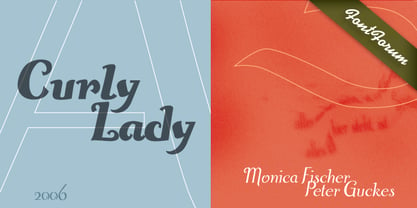
- Love Curly by Goodigital13,
$20.00 Perfect use for a logo for branding, typography design, christmas card, product packaging, invitation, quotes, t-shirt design, label poster, special events and anything that need elegant taste. great for Logotype, Branding Design, Logo Design, Digital Lettering Arts, T-Shirt/Apparel, Poster, Magazine, Signs, Advertising Design, and any vintage design needs. Caps only Fonts
 - Curly Luly by FontHaus,
$19.95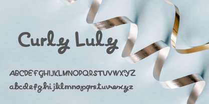
- Quirky Kurlz by Scholtz Fonts,
$22.00 Quirky Kurlz is a cute, curly, vintage font. It's light hearted and funny, rounded and retro. Rounded characters, curly loops and undulating baseline work together to give a lively, look-at-me impression. Use Quirky Kurlz for branding, packaging, girls stuff, kids fashion, greeting cards, party invitations, retro postcards and advertising. Quirky Kurlz has all the features usually included in a fully professional font. Language support includes all European character sets, Greek symbols and all punctuation. Quirky Kurlz makes use of OpenType features to avoid the mechanical look caused by two identical characters side by side.
 - Curly Valentine by Yoga Letter,
$20.00 "Curly Valentine" is a beautiful and unique curly display font. Equipped with uppercase letters, lowercase letters, numerals, punctuation, and multilingual support. Very suitable for posters, banners, valentines, weddings, gifts, invitations, branding, stickers, Christmas, spring, winter, and others.
 - Letter Gothic MT by Monotype,
$29.99Letter Gothic font was designed by Roger Roberson for IBM sometime between 1956 and 1962. Inspired by Optima, the typeface originally had flared stems. A monospaced sans serif font designed for use on an IBM Selectric typewriter, Letter Gothic font is a good choice for tabular material. - Monotype Script MT by Monotype,
$29.99 - Monotype Modern MT by Monotype,
$29.99 Monotype Modern, the first typeface produced by Lanston Monotype, was released in 1896, the same year the company introduced its hot metal typeseting machine. It is a Victorian variation on the vertically stressed, high-contrast Bodoni model.
 - Goudy Ornate MT by Monotype,
$29.99Over the course of 50 years, the charismatic and enterprising Frederic W. Goudy designed more than 100 typefaces; he was the American master of type design in the first half of the twentieth century. Goudy Old Style, designed for American Type Founders in 1915-1916, is the best known of his designs, and forms the basis for a large family of variants. Goudy said he was initially inspired by the cap lettering on a Renaissance painting, but most of the flavor of this design reflects Goudy's own individualistic style. Recognizable Goudy-isms include the upward pointing ear of the g, the diamond-shaped dots over the i and j, and the roundish upward swelling of the horizontal strokes at the base of the E and L. The italic was completed by Goudy in 1918, and is notable for its minimal slope. Goudy Bold (1916-1919) and Goudy Extra Bold (1927) were drawn not by Goudy, but by Morris Fuller Benton, who was ATF's skillful in-house designer. Goudy Catalogue was drawn by Benton in 1919-1921 and was meant to be a medium weight of Goudy Old Style. Goudy Heavyface was designed by Goudy for Monotype in 1925, and was intended to be a rival to the successful Cooper Black. Goudy Modern was designed by Goudy in 1918; its small x-height, tall ascenders and shorter caps impart a spacious and elegant feeling. Benton designed Goudy Handtooled, the shaded version that has just a hairline of white through its bold strokes. The Goudy faces, especially the bolder weights, have long been popular for display and advertising design. They continue to pop up all over the world, and still look reassuring to our modern eyes." - Dorchester Script MT by Monotype,
$29.99Dorchester Script font, released in 1939 by Monotype, was widely accepted by high society for calling cards, announcements, and invitations. Dorchester Script is nearly upright with lowercase letters that have loops and generous ascenders and descenders and capitals with delicate, curly flourishes. Besides the usual job work, such as letterhead and business cards, Dorchester Script font can be used sparingly for serious display work. - New Berolina MT by Monotype,
$29.99 Martin Wilke designed the dynamic calligraphic typeface New Berolina in 1965. The light line of the strokes and the strong stroke contrast lets New Berolina dance across the page. Broad, generous capitals complement beautifully the narrower lower case characters with their low x-height. The capitals can also be used as initials. Used carefully and with generous line spacing, New Berolina will lend any text a fresh, lively look.
 - Gill Sans MT by Monotype,
$45.99 Gill Sans is a humanistic sans serif family that, while is considered by many to be quintessentially British in tone and concept, has been used in virtually every country and in nearly every application imaginable. Gill Sans has reached this level of near-ubiquity for one simple—and very good—reason: it is an exceptionally distinctive design with a potential range of use that is almost limitless. This toolkit family includes a wide range of styles including the standards such as Light—which is open and elegant—and a Regular that, with its flat-bottomed d, flat-topped p and q and triangular-topped t, has a more compact and muscular appearance. Its Bold styles tend to echo the softer, more open style of the light while the extra bold and ultra bold have their own vivid personalities, but each of them would make for an eye-catching headline. Take into account the family’s many weights, including condensed and extra condensed designs, and extended language support and you have yourself a tool you’ll be thrilled to return to, time and again. Gill Sans was designed by Eric Gill: a versatile, brilliant, and prolifically successful designer of the early part of the last century. One of the main reasons for the enduring success of his namesake design is that it is based on Roman character shapes and proportions, making it unlike virtually any other sans serif out there. Gill also worked his own warmth and humanity into his design, resulting in a typeface in which each weight retains a distinct personality of its own. Pair with serif fonts like Gill's own Joanna; or more modern offerings like Frutiger® Serif, Malabar™, Syntax® Serif, FF Scala®, or DIN Next™ Slab.
 - Robam Khmer MT by Monotype,
$142.99 - Jheri Curls - Personal use only


Page 1 of 18Next page