96 search results
(0.014 seconds)
- Crucial by Jehoo Creative,
$17.00 Sharp and bold are the right words to describe Crucial Typeface. Crucial is a serif typeface that has a pointed tip so that each piece of character gives a bold and elegant impression. Having 8 weights and each weight packaged in an elegant Italic set, this typeface will add boldness and elegance to your designs. Crucial can be used for a variety of design styles. It is suitable for strong-spirited designs as well as for a more striking and classy editorial look. ?There are many useful features in this typeface including aalt, frac, league, lnum, locl, onum, ordn, salt, sinf, ss01, ss02, ss03, subs, sups, kern.
 - Cruxially by Proportional Lime,
$19.99 Religious symbols are endless much like that amazing variety of types of religion. This font contains nearly 500 glyphs. Many are crosses, but there are other treasures besides. 50% of the profits from this font will be donated to the restoration fund of the historic Beckerath Organ at Trinity Lutheran in Cleveland, Ohio which radically changed the course of organ building in the western hemisphere.
 - MC Crucio by Maulana Creative,
$21.00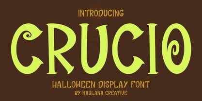 Crucio display font. Bold stroke, fun character with a bit of ligatures and alternates. To give you an extra creative work. Crucio font support multilingual more than 100+ language. This font is good for logo design, Social media, Movie Titles, Books Titles, a short text even a long text letter and good for your secondary text font with script or serif. Make a stunning work with Crucio display font. Cheers, Maulana Creative
 - Crucis Ornaments by Greater Albion Typefounders,
$5.95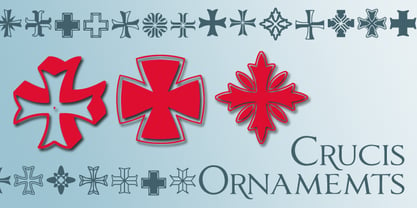
- Borealis by Elemeno,
$25.00Borealis has an over-bitmapped, whimsical quality, but retains the strength and lines of the underlying design. It's ideal for designs in which a grunge font might be desired, but legibility is crucial. - Sassoon Montessori by Sassoon-Williams,
$48.00 Typefaces following Montessori Institute guidelines for reading and handwriting. With these fonts, the crucial stages of letter formation are made easier for parents and teachers to produce consistent worksheets. Children should then progress towards an efficient and mature joined-up handwriting. Free to download resources: How to access Stylistic Sets of alternative letters in these fonts
 - Cry Uncial - Unknown license

- FT Aessthetique by Foxys Forest Foundry,
$24.00 FT Aessthetique is a modern classic serif font that effortlessly combines delicate lines with bold strokes. Its aesthetic captures a beautifully romantic style, blending vintage elements with nostalgia. FT Aessthetique goes beyond being a font; it's a crucial brand element that seamlessly complements other fonts, imparting a sophisticated appearance to any project. Its professional characteristics make it appealing for expressing individuality across various endeavors. The font is perfect for large headlines and titles. FT Aessthetique features 65 ligatures and 35 alternative letters, expanding its versatility and providing creative possibilities. It supports most Latin-based languages and includes an extended set of symbols, punctuation, and diacritical marks.
 - Showmanship JNL by Jeff Levine,
$29.00 Despite the racially demeaning 1906 sheet music for "The Ghost of the Banjo Coon", the title's lettering provided an interesting hand-lettered sans serif that has been re-drawn digitally as Showmanship JNL in both regular and oblique versions.
 - Galiba by Juraj Chrastina,
$29.00 Give your voice an eye-catching hand-drawn look thanks to this playful font family. You'll get three styles, along with OpenType features including alternates, ligatures and stylistic sets. Galiba Regular works very well with his small brothers Light and Thin. In addition Galiba Light can be used at smaller size along with the other styles to keep the same line thickness. To achieve a random-like effect, the regular style is packed with 4 different variants of each glyph, that automatically cycle if stylistic alternates are turned on. Also you can choose from 5 stylistic sets to easily change the look of a given string, or pick alternates by hand. Not to mention that we've attentively fine-tuned the kerning that’s crucial for this kind of typeface.
 - Stolzl Display by Inhouse Type,
$33.78 Stolzl Display is an original font family designed for headlines, titles and subtitles. Based on the combination of contrasting shapes, the harmony of form and rhythm is fundamental to the design. Inspired by Bauhaus, Stolzl represents, not just the significant influence of this “crucible of modernism”, but aims at capturing its original idealism, commitment to creativity and experiment driven philosophy. Details include six weights, Cyrillic, 480 characters, alternative glyphs, manually edited kerning and Opentype features. Named after Gunta Stölzl, the Bauhaus’s only female master, Stolzl Display is the first subfamily of the Stolzl font collection to be released this year.
 - Verdana by Microsoft Corporation,
$49.00The Verdana™ Family of fonts was created specifically to address the challenges of on-screen display. Designed by world renowned type designer Matthew Carter, and hand-hinted by leading hinting expert, Tom Rickner, these sans serif fonts are unique examples of type design for the computer screen. The generous width and spacing of Verdana's characters is key to the legibility of these fonts on the screen. Despite the quality of the Verdana font family at small sizes it is at higher resolutions that the fonts are best appreciated. In the words of Tom Rickner, ‘My hope now is that these faces will be enjoyed beyond just the computer screen. Although the screen size bitmaps were the most crucial in the production of these fonts [their] uses should not be limited to on screen typography. Character Set: Latin-1, WGL Pan-European (Eastern Europe, Cyrillic, Greek and Turkish). - Khimany by Twinletter,
$17.00 Welcoming you to the dynamic and distinctive world of typography! A genuinely distinctive serif display typeface is Khimany. Khimany is the ideal option if you're seeking a bold and distinctive look for your numerous visual design tasks. What sets Khimany apart from other people? has incredible characteristics. Khimany provides you with the versatility to create distinctive and varied letter designs by making ligatures and alternates readily available. This is your chance to give each of your projects a unique touch. Khimany offers various languages since we realize how crucial it is to communicate with a worldwide audience. Your message will reach a global audience in a powerful and clear way with Khimany. So, are you prepared to differentiate your designs? Khimany is prepared to support your success. Get this font right away and see how Khimany can turn any of your projects into unforgettable works of visual art.
 - Verdana Ref by Microsoft Corporation,
$29.00The Verdana™ Family of fonts was created specifically to address the challenges of on-screen display. Designed by world renowned type designer Matthew Carter, and hand-hinted by leading hinting expert, Tom Rickner, these sans serif fonts are unique examples of type design for the computer screen. The generous width and spacing of Verdana's characters is key to the legibility of these fonts on the screen. Despite the quality of the Verdana font family at small sizes it is at higher resolutions that the fonts are best appreciated. In the words of Tom Rickner, ‘My hope now is that these faces will be enjoyed beyond just the computer screen. Although the screen size bitmaps were the most crucial in the production of these fonts [their] uses should not be limited to on screen typography. Character Set: Latin-1, WGL Pan-European (Eastern Europe, Cyrillic, Greek and Turkish). - Egovu by Twinletter,
$17.00 "Welcome to the distinctive world of typography! A genuinely distinctive sans-serif display typeface is Egovu. Egovu is the ideal option if you want a bold and distinctive style for your many different visual design tasks. What is so unique about Egovu? has incredible characteristics. Egovu allows you to be as creative as you like with its selection of ligatures and alternatives. Every project may simply be given a distinctive, personalized touch by using different letter combinations. Since we understand how crucial it is to communicate with a worldwide audience, Egovu supports numerous languages. Your message will be efficiently and clearly heard by individuals all across the world. Are you prepared to advance your design, then? Egovu is prepared to advance your initiatives. Egovu is ready to take your projects to the next level. Get this font now and see how Egovu turns every design into an unforgettable work of art.
 - PF Eef by Parachute,
$35.00 First conceived as the upper-and lowercase “e” for the logotype of independent publishers Elemental Editions, the letterforms were so well received that they were extended to an entire typeface and formed the basis for a bespoke font – Eef. The type design draws inspiration from the basic elements, the periodic table, functionalist vintage lettering and influences from other classic geometric typefaces with condensed cuts such as Futura and Trade Gothic. The extended set is now developed into a family consisting of three weights – Regular, Medium and Bold. While developing Eef it has been crucial to maintain the integrity of the geometrical shape in each glyph as much as possible, but also add subtle optical adjustments to make the forms more balanced and harmonic. Due to its detailed balance of simplicity, aesthetics and playfulness Eef works perfectly well in a corporate context as it does in editorial use or poster design. Eef feels most comfortable with text ranging from display to medium size.
 - Clarkson by Krafted,
$10.00 Whether you’re promoting your business, designing merchandise, or creating a new social media campaign, good presentation is crucial. The font you choose plays a key role – it completely shapes your audience’s reaction. Introducing Clarkson – A Retro Brush Script Font. Perfectly balanced between power and refinement, this handcrafted font delivers your message with style. The modern take on the retro design makes it ideal for branding, business cards, presentations, logos, clothing, packaging, banners, ads, and much, much more. What you’ll get: Multilingual & Ligature Support Full sets of Punctuation and Numerals Compatible with: Adobe Suite Microsoft Office KeyNote Pages Software Requirements: The fonts that you’ll receive in the pack are widely supported by most software. In order to get the full functionality of the selection of standard ligatures (custom created letters) in the script font, any software that can read OpenType fonts will work. We hope you enjoy this font and that it makes your branding sparkle! Feel free to reach out to us if you’d like more information or if you have any concerns.
 - Futura PT by ParaType,
$30.00 Futura is a classic geometric sans serif, one of the crucial typefaces of the 20th century. It remains relevant today and is widely used in logos, headings, web and print. Futura was designed by Paul Renner for Bauersche Gießerei (Bauer) in 1927. The typeface is based on simple geometric forms and is close in the aesthetics to 1920s-30s constructivism and the Bauhaus. Futura PT is the most complete Cyrillic version of Futura. It’s a type system of 25 styles: 16 regular and 9 narrow, from Thin to Extrabold. Futura PT has linear and old style figures, subscripts and fractions. The typeface supports more than 100 languages: Western and Central European Latin and the Cyrillic-extended. The Cyrillic version of Futura was designed by Vladimir Yefimov in 1991–1995. He partially redesigned the typeface in 2007, making it a wholesome consistent system, and Isabella Chaeva added new styles. The typeface was released under the name Futura PT. Isabella Chaeva returned to work on Futura in 2022. The typeface has three new styles, old style figures and extended Cyrillic support.
 - Guanabara Sans by Plau,
$20.00 Guanabara is the third release of Plau Type Foundry. It started from the need of a wayfinding typeface that had personality enough to be the brand typeface for a city. The city of Rio de Janeiro, with its never-ending curves and all year long summer weather provided the constraints and requirements of this typeface. From there, it evolved to be a workhorse, with 8 weights from Thin to Black and matching true italics. It just had to have the features that all us designers have grown to love, such as alternate letters (a, g and r for the romans), tabular and proportional figures in lining and oldstyle set-ups as well as small caps, fractions and all that jazz (I mean, samba). And it needed to be recognizable and distinct. For that, design features like tapered R legs, capitals with classic proportions and calligraphic finishes on the terminals proved crucial. And last, but not least, like Rio, it had to welcome many cultures. We came to think of it as the “Typeface from Ipanema”, with a classic, timeless look, swinging elegance and joyful attitude.
 - Bonfires by Ditatype,
$29.00 Bonfires is an elegant font in beautiful handwriting styles interconnected to each other to create smooth, continuous flows. The letters are shaped in curvy, smooth pen lines and the low letter contrasts can express smooth nuances. Details of this font are crucial as each curve and connection must look equal and proportional to create visually balanced, solid displays. Furthermore, its smooth, connected texts are able to let readers’ eyes stay warm and comfortable. In addition, you may enjoy the available features here. Features: Ligatures Multilingual Supports PUA Encoded Numerals and Punctuations Bonfires fits best for any design projects requiring casual, personal displays such as greeting cards, merchandise designs, and any casual-related designs. In web designs, this script font is perfectly applicable for blogs and sites to show intimate and personal nuances to the contents. Find out more ways to use this font by taking a look at the font preview. Thanks for purchasing our fonts. Hopefully, you have a great time using our font. Feel free to contact us anytime for further information or when you have trouble with the font. Thanks a lot and happy designing.
 - Big Mock by Yumna Type,
$15.00 A font is a crucial element of a design, but it can be a complicated challenge to choose a proper font for your project. An improper design will likely damage your whole designs and make your hard work useless. That is why Big Mock is the perfect font for you. Big Mock is a display font with strong characters and unique styles to assist you to pop up your messages easily. It exists in uppercases and thick weights to show bold, prominent displays. The similar letters’ proportions and the low contrasts will affect the legibility rates. You can use such a font for big text sizes to be greatly legible. Big Mock gives you an extra clipart as a bonus. You can also make use of the available features here. Features: Ligatures Multilingual Supports PUA Encoded Numerals and Punctuations Big Mock fits best for various design projects, such as brandings, posters, banners, headings, magazine covers, quotes, printed products, merchandise, social media, etc. Find out more ways to use this font by taking a look at the font preview. Thanks for purchasing our fonts. Hopefully, you have a great time using our font. Feel free to contact us anytime for further information or when you have trouble with the font. Thanks a lot and happy designing.
 - Scream Explode by Ditatype,
$29.00 It is crucial to pick a perfect font for your project designs as they should be as great as your fonts to help you deliver your messages and feelings accurately. We would like to introduce you to our display font to help you create dazzling, unique designs. This is the Scream Explode. It is designed in firm characters and unique styles to help you deliver your messages quickly. This capitalized, thick weight font creates a bold, prominent display. Moreover, the uneven edge lines on our display font will give extra creativity touches to show a unique, attractive display. In addition, you can apply this font for big text sizes to be legible and you can enjoy the available features here as well. Features: Alternates Ligatures Multilingual Supports PUA Encoded Numerals and Punctuations Scream Explode fits best for various design projects, such as brandings, posters, banners, headings, magazine covers, quotes, printed products, merchandise, social media, etc. Find out more ways to use this font by taking a look at the font preview. Thanks for purchasing our fonts. Hopefully, you have a great time using our font. Feel free to contact us anytime for further information or when you have trouble with the font. Thanks a lot and happy designing.
 - Change Serif by Borutta Group,
$39.00 Change Serif is a typeface family designed as a part of Mateusz Machalski's PhD project, carried out in 2015-2021. The main goal was to create a typeface allowing for the typesetting of complex humanistic texts, containing many historical letterforms. The starting point was the preparation of most of the glyphs provided in unicode for Latin, Cyrillic and Greek. From the formal point of view, the Change family is based on Renaissance proportions with contemporary details. Classic upright version is paired with expressive and calligraphic italics, inspired by the works of Robert Granjon. Each of the styles contains about 4,000 characters, allowing for a broad range of typesetting capabilities – multiscript publications, historical translations, and texts transcription. The crucial aspect was to treat all scripts equally. All OpenType features, such as swashes, final forms, decorative ligatures, can be found in Latin, Cyrillic and also Greek. The name of the typeface refers to the design process in which there are constant changes and corrections. On the other hand, it means to convey how this project influenced my perception of typography and allowed me to embrace it as a medium of artistic expression. Due to its similar proportions, Change works perfectly with the Gaultier typeface.
 - Tropicane by Heyfonts,
$18.00 Tropicane - Stylish Typeface refers to a font that possesses a distinct and attractive aesthetic, often characterized by unique design elements, creative flair, and an overall fashionable or contemporary look. Stylish typefaces are crafted to make a visual impact and are frequently chosen for design projects where the typography plays a crucial role in conveying a specific mood, personality, or brand identity. Here's an in-depth explanation of the characteristics and significance of a stylish typeface: - Distinctive Design Elements: Stylish typefaces stand out due to their distinctive design features. This may include unique letterforms, creative ligatures, elegant serifs, or modern sans-serif shapes. The goal is to create a visually appealing and memorable set of characters. - Contemporary Aesthetic: The term "stylish" implies a modern and fashionable design. Stylish typefaces often incorporate contemporary design trends, keeping up with current aesthetics to ensure that they remain visually relevant and appealing. - Versatility: Stylish typefaces are often versatile, suitable for a variety of design applications. Whether used for branding, editorial design, websites, or marketing materials, these typefaces maintain their stylish appeal across different contexts. - Attention to Detail: A stylish typeface is characterized by meticulous attention to detail. Designers pay close attention to the shapes, proportions, and spacing of individual characters to create a harmonious and visually pleasing overall appearance. - Expressive Characters: Stylish typefaces can convey a sense of expressiveness and personality. This expressiveness can be achieved through unique letter shapes, playful elements, or the incorporation of design features that evoke a particular mood or emotion. Applicability to Branding: Brands often use stylish typefaces to create a distinctive visual identity. A stylish font can contribute to the overall brand image, helping to communicate the brand's values, tone, and style to the target audience. - Innovative Typography: Stylish typefaces are often at the forefront of typographic innovation. They may push the boundaries of traditional letterforms, experimenting with new shapes, styles, and arrangements to create a sense of novelty and creativity. - Readability and Functionality: Despite their emphasis on style, these typefaces generally maintain a balance between visual appeal and readability. Clear and legible letterforms are crucial, ensuring that the text remains accessible while still making a stylish statement. - Adaptability to Trends: Stylish typefaces are often designed with an awareness of design trends. This adaptability allows them to stay relevant over time, making them a popular choice for designers who want their projects to reflect a contemporary and stylish aesthetic. - Customization Options: Some stylish typefaces come with additional features, such as alternative characters, ligatures, or stylistic sets, offering designers the flexibility to customize the appearance of the text for specific design needs. In summary, a stylish typeface is a carefully crafted font that goes beyond mere functionality, aiming to enhance the visual appeal and expressiveness of the text.
 - Axiforma by Kastelov,
$55.00 Axiforma was designed with the single idea of creating a font that starts with the letter A, because let's face it, this is the best letter. For those of you who didn't see it coming, Axiforma is a /drum roll/ geometric sans in 20 weights. If you are thinking "Oh boy, another geometric sans", you clearly know your stuff. Yet, Axiforma is different in at least three crucial ways: 1) It's made by me 2) It's not free 3) It's polite and humble Additionally, Axiforma is packed with Opentype such as oldstyle numbers, fractions, case sensitive alternates, localized forms, stylistic sets, cyrillic alphabets (Bulgarian & Russian) and many more. Basically it's quite extensive and kinda great. Upon using Axiforma, clients will start to behave differently around you and may even start paying you. Your spouse will start working out again just to gain your attention and your kid will become instantly popular at school. After all you are using Axiforma and rumors do spread quickly. That's what we are talking about - raw font power. With Axiforma regular typed text is suddently transformed into first class design. That includes branding, posters, headlines, display, presentation materials, websites, logotypes, etc. The world will now be your playground. To sum it up, Axiforma is badass, thus you should have it and use it everywhere.
 - Nexa Slab by Fontfabric,
$35.00 Nexa Slab is a geometric slab serif font whose design is based on the already popular best-seller Nexa . The font family contains 3 basic forms: italics, obliques and uprights, each of which has 8 different weights. This visual richness makes it the ideal slab serif font family for the web as well as for print, for motion graphics, logos, t-shirts and so on. It is also great for headings, fitting nicely with both small and large typesetting text blocks. Nexa Slab draws from the rich traditions of the classic Neo-Grotesque slab serif fonts such as Lubalin Graph, Rockwell and Memphis, which conceal the richness of typesetting text in its crucial advertising function. Just like these fonts, it’s design is subject to rational, carefully thought-out, thick and thin bars with a low contrast between them. The letters are characterized by the strict geometry and square proportions of the original, extra-fortified by suitably balanced slab serifs. Nexa Slab is serious without being rigid and inflexible, finished and lacking in nothing, systematic without being monotonous, and though it may seem at first glance to be more suitable for short, direct messages; in the hands of a master designer... it can build and create exquisite and harmonic designs. Open Type Features: Lining figures (proportional and tabular) The “f” ligature set Alternate characters (a, g, y) Automatic fractions Automatic numerators Automatic denomerators Automatic subscript and superscript Automatic ordinals Extended language support (most Latin-based scripts supported)*
 - Karita by Nathatype,
$29.00 Your design project is your brand’s introduction to the public, so it is crucial to do it in the right way. An inappropriate font can totally change your messages and damage your work. For that reason, Karita is here to assist you with your needs. Karita is a classic, elegant, professional display serif font to increase the product and brand values promoted. This font looks more prominent than the others and shows strong, yet elegant impressions to attract customers. Continuity elements on every little scratch of the letters’ edges lead your eyes to follow one letter to another in line with serif font characters. Besides, this font type has thick lines and strong contrasts to attract customers and to show firm impressions. For a legibility reason, you can use this font for big text sizes. You can enjoy the available features here as well. Features: Stylistic Sets Ligatures Multilingual Supports PUA Encoded Numerals and Punctuations Karita fits best for various design projects, such as brandings, posters, banners, headings, magazine covers, quotes, invitations, name cards, printed products, merchandise, social media, etc. Find out more ways to use this font by taking a look at the font preview. Thanks for purchasing our fonts. Hopefully, you have a great time using our font. Feel free to contact us anytime for further information or when you have trouble with the font. Thanks a lot and happy designing.
 - Stay Calm by Nathatype,
$29.00 A typography can often be a deniable, yet crucial factor in designs’ displays and nuances. Additionally, it may be hard to find prominent, elegant, catchy fonts, whereas customers can easily forget designs without the right typography and remember nothing about your brands. Even the most interesting designs will look dull and too ordinary with inappropriate fonts. Therefore, we would like to introduce you to the Stay Calm, the perfect font option to create prominent designs. Stay Calm is an elegant, prominent display serif font to attract everybody's attention. It has bigger and thicker font proportions than the other ordinary serif fonts as its character to ease people to see it in big text sizes. Such unique characters as curvy thin lines and big, protruding dots, make this font suitable to create unique, interesting designs and applicable for bigger text sizes. You may also enjoy the available features here. Features: Ligatures Multilingual Supports PUA Encoded Numerals and Punctuations Stay Calm fits best for various design projects, such as brandings, posters, banners, headings, magazine covers, quotes, invitations, name cards, printed products, merchandise, social media, etc. Find out more ways to use this font by taking a look at the font preview. Thanks for purchasing our fonts. Hopefully, you have a great time using our font. Feel free to contact us anytime for further information or when you have trouble with the font. Thanks a lot and happy designing
 - Charter BT by Bitstream,
$50.99 Originally released in 1987, Charter incorporates three important features: compact set width to give economical copyfit; generous x-height to give readability at small point sizes; and sturdy open letterforms to give reliable reproduction at both typesetter and laser printer resolutions. The design brings a clarity and freshness to everyday documents, such as newsletters, textbooks, directories and technical manuals, where the reader’s concentration must not be interrupted by unfamiliar letterforms but where typographic dullness can itself impair comprehension. The Italic has cursive letterforms - so is instantly distinguishable, while being readable enough in its own right for continuous text. The Charter BT Pro Pack features 6 fonts: roman, italic, bold, bold italic, black, and black italic. The fonts include characters originally developed for expert sets, such as ligatures, ornaments, old style figures, small caps, and superiors. The Pro Pack fonts support Western, Central European, and Eastern European languages. OpenType fonts are a cross-platform font format. The same OpenType font can be installed on Mac OS X, Windows, Linux, and Unix systems. Mac OS X and Windows 2000, XP, and Vista have built-in support for OpenType. OpenType fonts also work on Linux, Unix, and earlier versions of Windows, where they are recognized as TrueType fonts. OpenType includes many more features than the standard TrueType and PostScript formats, including the ability to install the same font on different platforms, crucial for document portability. OpenType fonts boost productivity because graphic designers and business professionals do not have to wrestle with many different fonts. With OpenType, customers have larger character sets to work with and fewer font files to deal with.
 - Eksja by Protimient,
$29.00 Eksja is a modern slab serif available in four weights, each with a corresponding italic. All the fonts in the family have small caps, the extended latin character set, diacritical f-ligatures, enclosed numerals (numbers in circles) and case-sensitive punctuation. The general design of the typeface has been with a strong human touch in mind. The ends of the serifs have been given a subtle rounding, just enough to take the edge off which, when coupled with the largely humanist structure of the design, creates an open, friendly and approachable design, abandoning the usual geometric severity commonly associated with slab serif typefaces. Eksja contains quite a comprehensive numerals system. Obviously, each font has the standard proportionally and tabularly spaced lining and old-style figures but, crucially, the tabular numerals share the exact same width in each font variant. That means that you can choose to use the thin, regular, bold, black and their italic forms all in the same setting and they will always line up. In addition to the 'normal' numerals there are super-script and sub-script numerals and OpenType fractions that can be automatically composed as you type. There are also the enclosed numerals, numbers inside a circle, that are useful for numerically listing items and, thanks to the wizardry of OpenType, they can contain any number of digits (typically, enclosed numerals are precomposed single digits, only encompassing the 0–9 range, the enclosed numerals in Eksja can go to double digits, triple digits or, in fact, any number of digits*). *The automation of the enclosed numerals is accessed via either "Stylistic Set #1" or "Stylistic Alternates" which requires the use of an application that supports OpenType stylistic sets or stylistic alternates, such as Adobe's InDesign or Photoshop.
 - Circulo by MMD Fonts,
$6.29 Bound to rules, unbound in the usage. Hyper geometric, and minimal contrast. Circulo V1 is based on a font project I originally started because of a client I had. I wanted to create a display and text font for their product design brand, which is all about reducing the amount of necessary materials and production steps. Before I started the course at tipo-g it was called -“REDUCE“ and was more or less finished. The concept was based on the name. How far can letter shapes be reduced to their core geometric concepts and still be identified as letters? But in a way, it lacked a unique approach and was just a generic geometric Sans Serif with a lack of finesse. There was already a glimpse of characteristics visible which would later define Circulo V1. The high focus on geometric shapes was not of the same severity, and the angle on the stems was less intense. Those, as I call them, fake serifs turned out to be a significant factor in legibility and the characteristic of the font. Besides those changes and improvements, I decided to implicate a new feature to the concept, a condensed style. I quickly realised that it is impossible to keep my perfect circles and half-circles in this style without breaking my rules for the font. This „problem“ turned out to be the most crucial feature of the condensed set. Circular-based Letters will ignore the rules and boundaries of the condensed style and stay as they are. This feature allows the user to create a unique rhythm in their texts, and if you use the variable font, you can decide how intense this rhythm will be. In this situation, the user can choose which letters are allowed to keep their shapes and which will be put in their condensed corset. All, some or none of them, you decide.
 - Tussilago by Typodermic,
$11.95 In a world full of conventional typefaces, Tussilago stands out with its sturdy and extended sans-serif design that defies standard geometric models. This mid-twentieth-century typeface exudes a distinct personality that speaks volumes through its wide letterforms and unique details. Tussilago’s robust letterforms offer a cool-headed but unabashed voice of power that can elevate any message. Whether you’re designing a poster, a logo, or a website, Tussilago’s seven weights and italics will provide you with the perfect blend of sophistication and modernity. But that’s not all. Tussilago’s versatility is evident in its offering of two numeral options—lowercase (old-style) or lining—for each weight and style. This feature makes Tussilago an excellent choice for any project where numbers play a crucial role. With Tussilago, you’re not just choosing a typeface; you’re choosing a design that speaks to your audience with an erudite voice. So, whether you want to make a bold statement or convey a subtle message, Tussilago is the perfect choice for designers who want to stand out from the crowd. Most Latin-based European writing systems are supported, including the following languages. Afaan Oromo, Afar, Afrikaans, Albanian, Alsatian, Aromanian, Aymara, Bashkir (Latin), Basque, Belarusian (Latin), Bemba, Bikol, Bosnian, Breton, Cape Verdean, Creole, Catalan, Cebuano, Chamorro, Chavacano, Chichewa, Crimean Tatar (Latin), Croatian, Czech, Danish, Dawan, Dholuo, Dutch, English, Estonian, Faroese, Fijian, Filipino, Finnish, French, Frisian, Friulian, Gagauz (Latin), Galician, Ganda, Genoese, German, Greenlandic, Guadeloupean Creole, Haitian Creole, Hawaiian, Hiligaynon, Hungarian, Icelandic, Ilocano, Indonesian, Irish, Italian, Jamaican, Kaqchikel, Karakalpak (Latin), Kashubian, Kikongo, Kinyarwanda, Kirundi, Kurdish (Latin), Latvian, Lithuanian, Lombard, Low Saxon, Luxembourgish, Maasai, Makhuwa, Malay, Maltese, Māori, Moldovan, Montenegrin, Ndebele, Neapolitan, Norwegian, Novial, Occitan, Ossetian (Latin), Papiamento, Piedmontese, Polish, Portuguese, Quechua, Rarotongan, Romanian, Romansh, Sami, Sango, Saramaccan, Sardinian, Scottish Gaelic, Serbian (Latin), Shona, Sicilian, Silesian, Slovak, Slovenian, Somali, Sorbian, Sotho, Spanish, Swahili, Swazi, Swedish, Tagalog, Tahitian, Tetum, Tongan, Tshiluba, Tsonga, Tswana, Tumbuka, Turkish, Turkmen (Latin), Tuvaluan, Uzbek (Latin), Venetian, Vepsian, Võro, Walloon, Waray-Waray, Wayuu, Welsh, Wolof, Xhosa, Yapese, Zapotec Zulu and Zuni.
 - Kindah by Eyad Al-Samman,
$30.00 “Kindah” is a Yemeni ancient tribe with evidence of its existence going back to the second century B.C.E. The kings of Kindah exercised an influence over a number of associated tribes more by personal prestige than by coercive settled authority. The Kindites were polytheistic until the 6th century CE, with evidence of rituals dedicated to the gods Athtar and Kahil found in their ancient capital in south-central Arabia. It is not clear whether they converted to Judaism or remained pagan, but there is a strong archaeological evidence that they were among the tribes in Dhu Nuwas' forces during the Jewish king’s attempt to suppress Christianity in Yemen. They converted to Islam in the mid-7th century CE and played a crucial role during the Muslims' conquests of their surroundings. Among the most famous figures from Kindah known as Kindites are Imru' al-Qays (526-565?), al-Ash'ath ibn Qays (599-661), Hujr ibn 'Adi al-Kindi (?-660), al-Miqdad Ibn Aswad al-Kindi (589-653), and Abu Yusuf Yaíqub ibn Ishaq as-Sabbah al-Kindi (805-873) known as the Philosopher of the Arabs. "Kindah" font is a modern Kufic font comes in three weights (i.e., bold, regular, and thin) which is mainly designed to be used as a display Arabic font. The main feature of this typeface is the mixture of curves and rectangular shapes used in the designed Arabic characters. Kindah font was inspired by the design of the Yemeni modern windows of houses in which only top part of the arc is used for building such windows which reflects the originality of the architecture preserved in this part of the world. "Kindah" font is extremely outstanding when used in printed materials with big sizes especially for headline, titles, signs, and names of brands. Hence, it is suitable for books' covers, advertisement light boards, and titles in magazines and newspapers. It has also a Latin character set and it also supports several Arabic character sets which makes it proper for composing alphabetical and numerical words in Arabic, Urdu, and Persian.
 - Adelle Sans by TypeTogether,
$45.00 The Adelle Sans font family by José Scaglione and Veronika Burian provides a more clean and spirited take on the traditional grotesque sans. As is typical with TypeTogether typefaces, the most demanding editorial design problems were taken into consideration during its creation. The combination of lively character and unobtrusive appearance inherent to grotesque sans serifs make it an utterly versatile tool for every imaginable situation. Whether for global branding, screens, signage and advertising, or UI, the keyword behind Adelle Sans’s use is flexibility. To save space and keep legibility high, Adelle Sans is available in eight weights with matching italics and includes a condensed width of seven weights with their matching italics. Each of these 30 styles hits the perfect tone as a headline punch or subdued background hum, and the condensed widths are adept at setting short texts while retaining the expected personality. Rooted in the belief that broad language support is crucial to modern global type design, the Latin-matching variants are yet another push in TypeTogether’s ongoing multilingual efforts. The Latin script may have been first, but Adelle Sans has thus far been expanded into an exhaustive nine script family with extensive language support. Careful research and close collaboration with type experts yielded typographic consistency, legibility, and cultural awareness among all scripts, as well as filling the need for quality editorial typefaces in Arabic, Armenian, Chinese, Cyrillic, Devanagari, Latin Extended, Greek, and Thai, with more planned for the future. In addition to the 30 Latin styles, all other scripts have between seven and fourteen styles, each of which has been engineered to optically match the proportions of its counterparts. And each script comes bundled with the Latin script to ensure an harmonious fit amongst any two or more Adelle Sans families in the same block of text. The full Adelle Sans family delivers consistent, flexible, and personable results in multilingual documents, in apps, and multicultural branding worldwide. Its wide character set includes typographic niceties, small caps, several sets of figures, icons, and support for over 245 Latin-based languages. Be sure to check out the companions for Adelle Sans: Adelle, for a versatile and authoritative slab serif with no shortage of personality; and Adelle Mono, a two-width family flexible enough for developers and graphic designers alike.
 - Sassoon Handwriting Starter by Sassoon-Williams,
$45.99 Sassoon fonts package for handwriting starters The three upright "infant" fonts developed to meet the demand for letters to produce pupil material for handwriting as well as for reading. Letters have extended ascenders and descenders ideal on screen and print. They facilitate word recognition. The exit strokes link words together visually, also crucially, they space the letters for improved legibility. The "joined" font puts the skills gained into practice producing joined-up handwriting. Together these typefaces provide a valuable resource for Teachers to create consistent material across the curriculum. Sassoon Infant Tracker B font: This font with its direction arrows helps pupils to start in the correct place. Motor movements can be refined by keeping inside the line. When starting and direction is no problem, the arrow font can be dropped and the Dotted font used. Sassoon Infant Dotted B font: Writing over the dots of this font refines motor skills. The aim here is to give confidence by reinforcing starting points, exits and to now encourage fluidity. Sassoon Infant font: With some words in this font and a baseline beneath to copy onto, pupils can use their learned starting points and exit strokes to write freely along the baseline - still unjoined. Once learned, this leads to spontaneous joins along the baseline leading logically to a joined-up hand. Sassoon Joined font: Having learned to write letters with correct starts and exits, this is when the joined font for teaching handwriting can be used. With some words in this font and a baseline beneath to copy onto, pupils can use their learned starting points and simply extend their exit strokes to make joined-up writing. The default joins the font provides are recommended, however there are alternative letterforms that are so important for some Teachers which can be accessed. Create ‘pen lifts’ anytime too! NOTE: Fonts display unjoined by default on this website and are delivered that way - joining is controlled by your text editing application such as Word or TextEdit, read more for instructions… Free to download PDF resources: Stylistic Sets and how to access the alternative letters feature in these OpenType fonts. Using the separate letter fonts Using the joined font Teachers copybooks using these fonts: How to teach pre-cursive Copybook How to teach cursive handwriting Copybook
 - Octin Spraypaint by Typodermic,
$11.95 As a designer, it’s crucial to choose a typeface that not only complements the overall design, but also conveys the intended message. Octin Spraypaint, a typeface that exudes streetwise grit and toughness, is a perfect choice for projects that demand a bold and fearless statement. Octin Spraypaint boasts two distinct styles—sans and serif—each offering three weight options: regular, bold, and black. The sans style offers a sleek, modern aesthetic with sharp, angular lines, while the serif style offers a more classic and sophisticated feel with its clean and sharp serifs. Together, these styles and weights provide designers with the flexibility to create striking headlines that command attention. This typeface is the perfect choice for design projects that demand an edgy and daring look. From police and military themes to sports, prison, construction, and school, Octin Spraypaint is versatile enough to lend its tough appeal to various themes and contexts. Octin Spraypaint is a typeface that offers a distinctive look that’s hard to ignore. It’s ideal for projects that need to convey strength, power, and authority, and its bold, spray-painted style is sure to capture the attention of viewers. With its unique blend of streetwise design and raw power, Octin Spraypaint is a must-have tool for any designer looking to make a bold statement. Check out the rest of the Octin families: Octin Sports, Octin College, Octin Prison, Octin Stencil & Octin Vintage. Most Latin-based European writing systems are supported, including the following languages. Afaan Oromo, Afar, Afrikaans, Albanian, Alsatian, Aromanian, Aymara, Bashkir (Latin), Basque, Belarusian (Latin), Bemba, Bikol, Bosnian, Breton, Cape Verdean, Creole, Catalan, Cebuano, Chamorro, Chavacano, Chichewa, Crimean Tatar (Latin), Croatian, Czech, Danish, Dawan, Dholuo, Dutch, English, Estonian, Faroese, Fijian, Filipino, Finnish, French, Frisian, Friulian, Gagauz (Latin), Galician, Ganda, Genoese, German, Greenlandic, Guadeloupean Creole, Haitian Creole, Hawaiian, Hiligaynon, Hungarian, Icelandic, Ilocano, Indonesian, Irish, Italian, Jamaican, Kaqchikel, Karakalpak (Latin), Kashubian, Kikongo, Kinyarwanda, Kirundi, Kurdish (Latin), Latvian, Lithuanian, Lombard, Low Saxon, Luxembourgish, Maasai, Makhuwa, Malay, Maltese, Māori, Moldovan, Montenegrin, Ndebele, Neapolitan, Norwegian, Novial, Occitan, Ossetian (Latin), Papiamento, Piedmontese, Polish, Portuguese, Quechua, Rarotongan, Romanian, Romansh, Sami, Sango, Saramaccan, Sardinian, Scottish Gaelic, Serbian (Latin), Shona, Sicilian, Silesian, Slovak, Slovenian, Somali, Sorbian, Sotho, Spanish, Swahili, Swazi, Swedish, Tagalog, Tahitian, Tetum, Tongan, Tshiluba, Tsonga, Tswana, Tumbuka, Turkish, Turkmen (Latin), Tuvaluan, Uzbek (Latin), Venetian, Vepsian, Võro, Walloon, Waray-Waray, Wayuu, Welsh, Wolof, Xhosa, Yapese, Zapotec Zulu and Zuni.
 - The font D3 Littlebitmapism Square, created by the entity known as D3, is a distinctive typeface that evokes the essence of early digital graphics and retro gaming aesthetics. As its name suggests, i...
- Breviary by Heyfonts,
$18.00 Breviary - Display Typeface "UNIQUE serif modern font" likely refers to a typeface that combines elements of traditional serif design with contemporary and distinctive features. Serif fonts have small lines or strokes attached to the ends of characters, which can contribute to a more formal or traditional appearance. The term "modern" in this context typically implies a contemporary or updated style. Here's an explanation of the characteristics and significance of a UNIQUE serif modern font: -Serif Elements: Serifs are the small lines or strokes at the ends of characters, and they are a hallmark of traditional typography. In a UNIQUE serif modern font, these serif elements are likely to be present but may have a distinctive shape or style that sets them apart from more conventional serif fonts. -Contemporary Design: The "modern" aspect of the font suggests a contemporary or updated design. This may involve a departure from the more classical serif styles seen in traditional typefaces, incorporating modern design principles, cleaner lines, and a more minimalist aesthetic. -Distinctive Characters: A UNIQUE serif modern font is likely to feature characters with unique and individual design elements. This could include unconventional serifs, letter shapes, or other stylistic details that make the font stand out and contribute to its uniqueness. -Versatility: While serif fonts are often associated with formality and readability, a UNIQUE serif modern font may offer versatility suitable for a range of design applications. It could be used in both traditional and modern contexts, providing flexibility for various design projects. -Applicability to Branding: Fonts play a crucial role in branding, and a UNIQUE serif modern font could be an excellent choice for businesses or projects that want to convey a sense of tradition and reliability while maintaining a contemporary and innovative image. -Digital and Print Design: Modern serif fonts are often designed with both digital and print applications in mind. The clarity of the typeface, even at smaller sizes, and its aesthetic appeal make it suitable for a variety of design projects, from websites and apps to print materials like brochures and posters. -Attention to Detail: The uniqueness of the font may be reflected in the careful attention to detail in each character. This could include refined curves, balanced proportions, and other design elements that contribute to the overall visual appeal and readability of the font. -Available Features: Unique serif modern fonts may come with additional features, such as alternative characters, ligatures, or stylistic sets, allowing designers to customize the appearance of the text for specific design needs.
 - Youre Gone by Typodermic,
$11.95 Typography is the art of crafting letters and shaping language, and for designers, selecting the right font is crucial. Every typeface has its unique personality and can evoke different emotions, which is why selecting the right one for your project is essential. With that in mind, we introduce to you the You’re Gone typeface—a true gem in the world of typography. This rounded techno typeface with an industrial vibe from the 1980s is the perfect way to add a unique, technical edge to your message. Its dauntless strokes and mellow, rounded edges create an industrial look with a contemporary twist, making it the ideal choice for designers looking for something fresh and modern. With its distinct, detached letterforms, You’re Gone is perfect for capturing attention and leaving a lasting impression. This typeface is ideal for all kinds of design projects, from branding and packaging to websites and social media graphics. Its bold, techno look is perfect for businesses in the technology, manufacturing, and industrial sectors. You’re Gone is a versatile typeface that can be used in a variety of ways. Its rounded edges and thick strokes create a distinctive and memorable look, while its technical vibe adds a sense of professionalism and expertise to your message. It’s the perfect way to stand out in a crowded marketplace and make a bold statement with your design. Overall, if you’re looking for a typeface that combines industrial vibes with a contemporary twist, then You’re Gone is the perfect choice. With its bold, rounded strokes and detached letterforms, it’s sure to make a lasting impression and give your message the edge it needs to stand out. Most Latin-based European writing systems are supported, including the following languages. Afaan Oromo, Afar, Afrikaans, Albanian, Alsatian, Aromanian, Aymara, Bashkir (Latin), Basque, Belarusian (Latin), Bemba, Bikol, Bosnian, Breton, Cape Verdean, Creole, Catalan, Cebuano, Chamorro, Chavacano, Chichewa, Crimean Tatar (Latin), Croatian, Czech, Danish, Dawan, Dholuo, Dutch, English, Estonian, Faroese, Fijian, Filipino, Finnish, French, Frisian, Friulian, Gagauz (Latin), Galician, Ganda, Genoese, German, Greenlandic, Guadeloupean Creole, Haitian Creole, Hawaiian, Hiligaynon, Hungarian, Icelandic, Ilocano, Indonesian, Irish, Italian, Jamaican, Kaqchikel, Karakalpak (Latin), Kashubian, Kikongo, Kinyarwanda, Kirundi, Kurdish (Latin), Latvian, Lithuanian, Lombard, Low Saxon, Luxembourgish, Maasai, Makhuwa, Malay, Maltese, Māori, Moldovan, Montenegrin, Ndebele, Neapolitan, Norwegian, Novial, Occitan, Ossetian (Latin), Papiamento, Piedmontese, Polish, Portuguese, Quechua, Rarotongan, Romanian, Romansh, Sami, Sango, Saramaccan, Sardinian, Scottish Gaelic, Serbian (Latin), Shona, Sicilian, Silesian, Slovak, Slovenian, Somali, Sorbian, Sotho, Spanish, Swahili, Swazi, Swedish, Tagalog, Tahitian, Tetum, Tongan, Tshiluba, Tsonga, Tswana, Tumbuka, Turkish, Turkmen (Latin), Tuvaluan, Uzbek (Latin), Venetian, Vepsian, Võro, Walloon, Waray-Waray, Wayuu, Welsh, Wolof, Xhosa, Yapese, Zapotec Zulu and Zuni.
 - Silentina by Typodermic,
$11.95 Silent films evoke a sense of nostalgia that is as timeless as the era itself. While the stars of silent cinema may have faded into the past, their influence is still felt in modern-day art, fashion, and design. Silentina is a typeface that embodies the spirit of the silent film era, inspired by the intertitles that were used to convey crucial information to audiences during these films. Buster Keaton, Mary Pickford, Clara Bow, and Rudolph Valentino all graced the silver screen with their emotive faces during the silent film era. These icons used their expressions to convey a range of emotions that captivated audiences and made them fall in love with the magic of cinema. Intertitles, the brief messages that would appear on-screen during the film, were just as essential in conveying information to moviegoers. Silentina is a typeface that pays homage to the unsung heroes of the silent film era—the intertitles. It channels the glitz and glamour of the roaring twenties, taking us back to a time of flapper dresses, jazz music, and speakeasies. But Silentina isn’t just a typeface—it’s a portal to another era. It transports us to a time when movies were an escape from reality, and each trip to the cinema was a chance to lose ourselves in a world of adventure and romance. With Silentina, you can project your message in the same way that the stars of silent cinema projected theirs. This typeface captures the essence of a bygone era, bringing it to life in the modern world. Use it to convey plot information, set the scene, or add a touch of vintage charm to your design. Whatever your message, Silentina will help you communicate it in the same glitzy way as the intertitles of the silent film era. Most Latin-based European writing systems are supported, including the following languages. Afaan Oromo, Afar, Afrikaans, Albanian, Alsatian, Aromanian, Aymara, Bashkir (Latin), Basque, Belarusian (Latin), Bemba, Bikol, Bosnian, Breton, Cape Verdean, Creole, Catalan, Cebuano, Chamorro, Chavacano, Chichewa, Crimean Tatar (Latin), Croatian, Czech, Danish, Dawan, Dholuo, Dutch, English, Estonian, Faroese, Fijian, Filipino, Finnish, French, Frisian, Friulian, Gagauz (Latin), Galician, Ganda, Genoese, German, Greenlandic, Guadeloupean Creole, Haitian Creole, Hawaiian, Hiligaynon, Hungarian, Icelandic, Ilocano, Indonesian, Irish, Italian, Jamaican, Kaqchikel, Karakalpak (Latin), Kashubian, Kikongo, Kinyarwanda, Kirundi, Kurdish (Latin), Latvian, Lithuanian, Lombard, Low Saxon, Luxembourgish, Maasai, Makhuwa, Malay, Maltese, Māori, Moldovan, Montenegrin, Ndebele, Neapolitan, Norwegian, Novial, Occitan, Ossetian (Latin), Papiamento, Piedmontese, Polish, Portuguese, Quechua, Rarotongan, Romanian, Romansh, Sami, Sango, Saramaccan, Sardinian, Scottish Gaelic, Serbian (Latin), Shona, Sicilian, Silesian, Slovak, Slovenian, Somali, Sorbian, Sotho, Spanish, Swahili, Swazi, Swedish, Tagalog, Tahitian, Tetum, Tongan, Tshiluba, Tsonga, Tswana, Tumbuka, Turkish, Turkmen (Latin), Tuvaluan, Uzbek (Latin), Venetian, Vepsian, Võro, Walloon, Waray-Waray, Wayuu, Welsh, Wolof, Xhosa, Yapese, Zapotec Zulu and Zuni.

Page 1 of 3Next page