10,000 search results
(0.04 seconds)
- Regatta Condensed by ITC,
$29.00Regatta is a bold, narrow sans serif designed by Alan Meeks in 1987. Its strong, robust figures makes it a particularly good font for headlines in larger point sizes. Regatta is distinguished by its diamond shaped dots on i and j as well as the slanted strokes of several figures. These characteristics relax the closed, static image of Regatta and let the font seem cheerful and friendly. - Supra Condensed by Wiescher Design,
$29.00 »Supra-condensed« – designed by Gert Wiescher in 2013 – is the condensed version to this new sans typeface family of eight weights with matching italics. The condensed version is designed for space-saving typography but with high legibility in mind. The light and normal weights and the dominant x-height with its high ascenders make for easy reading of long copy. The heavy and x-light weights are great for elegant headlines. Supra is an OpenType family.
 - Contact Pro by RMU,
$35.00 Based on the letterforms of Matheis' Contact, this font was completely redrawn, digitized and extended to include Central European glyphs.
 - Connect Christmas by Seemly Fonts,
$12.00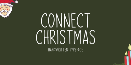 Connect Christmas is a clean and simple lettered handwritten font that can be used for all chalkboard quotes or teaching material! Its authentic look will add a personal and realistic feel to your designs.
 - Magneta Condensed by Positype,
$25.00 To describe what inspired Magneta would be to add a little Dwiggins, throw in some Benton with a hint of Austin, wrap it up in a crisp, contemporary package and serve. The skeleton of the family is a Garalde (like my earlier Epic) but with a desire to produce something much more transitional and contemporary, I sought to simplify, simplify, simplify. Cap and ascenders share the same height, the x-height is slightly larger than expected which should make a functional typeface for editorial, headlines or where more visually complex systems are needed. The modulation is much more intentional than historical and creates some interesting interactions between the various weights. There are both Normal and Condensed widths available with 6 different weights and matching italics, small caps, oldstyle figures, swashes, stylistic and discretionary ligatures (that includes some fun majuscule ligatures in the roman styles), there is no lack of typographic goodness for the designer. To add some spice, a set of Decorative Ornaments have been created that include geometric, floral, curvilinear patterns and much more.
 - Valentia Condensed by Eurotypo,
$59.00
- Mono Condensed by ParaType,
$30.00The typeface was designed at ParaType (ParaGraph) in 1990 by Alexander Tarbeev based on Pragmatica typeface, 1989 by Vladimir Yefimov. A monospaced condensed sans serif. - Otis Condensed by Australian Type Foundry,
$30.00The name Otis arose from an incident in a shopping mall in which, realising my shoelace was undone while on an escalator, I bent down to tie it, became aware of the approaching end, panicked, fell over, and in the process happened to notice the escalator's brand name. - Clio Condensed by LeType,
$75.00 Clio, Clio XS and Clio Condensed is a big family of 72 fonts. They were designed by Gabriel de Souza in 2012. They are simple and stylish and they have the ideal appearance to your work. Furthermore, features such as italics, obliques, great language support and flexibility. They can be applied in many different forms but their primary use is indicated to display use and luxurious trade mark creation and also available for Clio Icons.
 - Andes Condensed by Latinotype,
$29.00 Andes, designed by Daniel Hernández, is a display typeface that has neo-humanist characteristics. Its different terminals, among other elements, give it a look of mixed typography. Andes is a typeface with 10 Upright weights ,10 Italics & Condensed version, ranging from Ultra Light to Black, each of the same x-height. This typeface contains additional italic glyphs (a, y, z, g) that help to emphasise text or words. Andes is based on the design of Merced and both of them share several features.
 - Antique Condensed by Wooden Type Fonts,
$15.00 A revival of one of the popular wooden type fonts of the 19th century, suitable for text or display, medium and bold weights.
 - Urbane Condensed by Device,
$39.00 Urbane Condensed is an addition to the popular Urbane series, a versatile all-purpose sans-serif family of six weights plus italics. Perfect for headlines and running text, it is clear, classic and authoritative. It explores the same idea-space as early geometric modernist sans such as Futura, Erbar, Spartan and Elegant Sans, with a single-story a, a contemporary high x-height and very slightly condensed bowls. Unusually for a geometric moderne sans, letter-widths are optically balanced, giving an even colour in setting. Includes a full international character set, lining, tabular and old-style numerals.
 - Convert Light by Mindtype Co.,
$5.00 Convert Light is something unique and interesting to display and can be used for various media needs, such as social media, brochures, posters, movies, cartoons, horrors, and more.
 - Aracne Condensed by Antipixel,
$15.00 The all-caps Aracne collection features tall, slightly scrawled letterforms, and is available in regular, condensed and ultra condensed styles for maximun functionality. With a spiritted quality and casual character, it will add a personal style to your work. Aracne Condensed was created as an extended version of the font Aracne, a regular full of energy handwritten font, with light and regular styles, including italics. It provides a wide range of possibilities, including the Aracne Soft and Stamp, which offer softer and cleaner edges. Its glyph coverage supports languages such as English, Spanish, French, German, Polish, Czech, among many others. It’s recommended usage is for display titles, and small ammount of text, because of its good legibility and quality of glyphs. Check out her sisters Aracne and Aracne Ultra Condensed!
 - Heroic Condensed by TypeTrust,
$30.00Heroic Condensed is an idealized narrow grotesque: a fusion of clean geometry and optical balance. Its constructed framework exudes technical refinement tempered by humanist curves across a family of eight weights. Heroic Condensed includes small caps, tabular figures, and stacked fractions. - Orka Condensed by S6 Foundry,
$60.00 Orka Condensed Sans is a stylistic font developed within a set grid that creates harmony and form through elegant forms, for use at both text and display sizes. Orka Condensed is perfectly suited for headlines, large-format prints, brand identities, social media, advertising, editorial design, posters, magazines, logos, headings, body copy, digital and more. Multi-language support.
 - Gothiks Condensed by Blackletra,
$50.00 This is the condensed version of Gothiks , a 6-weight display sanserif influenced by Texturas. It is ideal for everything big, compact and powerful. This family has an extensive character set — with extensive language support — and many OpenType features like fractions, small capitals and different figure sets. Default figures align with lowercase.
 - Clarendon Condensed by Wooden Type Fonts,
$15.00A revival of one of the popular wooden type fonts of the 19th century; suitable for text. - Sigma Condensed by Wiescher Design,
$30.00 »SIGMA« is the name for the Greek voiceless »S«. It is also called the »Lunar Sigma«, in Hellenistic times the letter was simplified to »C«. I thought SIGMA was a nice name for my new, very readable and friendly Sans typeface. »SIGMA« has that classical Sans beauty with friendly touches that make it unique. You will love this font. It is a great everyday workhorse with seven weights from Thin to Bold and all the necessary weights in between. Great for body copy and headlines! With 875 Glyphs it is a truly European font designed for all Central European and Latin using countries. »SIGMA« has a set of Cyrillic that is – besides Russia – also good for Serbia, Macedonia and Ukraine. It has oldstyle- and lining-, tabular- and tabular-oldstyle-figures, many ligatures. »SIGMA« comes in Normal and Oblique, I made it Oblique instead of Italic which would have been too playful for this friendly font. Enjoy!
 - Swissra Condensed by Abjad,
$- Following the great success of Swissra, the condensed cut was designed on the same principles of Swiss graphic design. Originally Swissra was designed to create a neutral and carefully crafted Arabic font family that can be used on many different applications. Now it creates even more possibilities to help designers in applications such as signage and editorial design where the condensed cut is needed. The typeface is one of very few Arabic condensed typefaces. Swissra Condensed comes in eight weights which range from Ultralight to Black.
 - Dylan Condensed by Wiescher Design,
$29.00 Dylan is a Sans typeface in the best American tradition. In order to keep corners open and to make the font more readable in small sizes it has deep cuts where curves join straights. I designed 8 finely tuned weights with fitting italic sets. The fonts includes full smallcaps, language support for most European languages plus Turkish, many fractions, nominator and denominators, Greek mathematical signs and many currency symbols. It is a versatile font that is well suited for many occasions, even for signage.
 - ITC Connectivities by ITC,
$29.99Some words from the designer... West coast artist Teri Kahan developed a "design font" of 68 pictographs capturing the sentiments of relationship, connection and synchronicity. Many of the characters were created with phrases in mind like, "handing you the world on a platter", "howling at the moon", and "message in a bottle". Others represent life experiences. The clean, simple illustration style originates from the look of hand-carved rubber stamps, and lends itself beautifully to logos and graphics. - Din Condensed by ParaType,
$30.00 Designed at ParaType (ParaGraph) in 1997 by Tagir Safayev. Based on a condensed style of DIN type family (Linotype Staff designers). That is a group of sans serif faces made to conform to the German Industrial Standard. Based on geometric style, they vary in width but not in weight. Light style was added in 2014 by Manvel Schmavonyan. Demi Bold style was added in 2020 by Isabella Chaeva.
 - Comment Below by Supfonts,
$9.00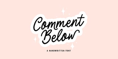 Comment Below will be perfect for wedding lettering, beautiful frame for your home, book covers, greeting cards, logos, marketing, magazines or anything that requires cute handwritten lettering :) What's inside: Comment Below Script Multilingual support Cricut support If you have any questions, please contact me directly or in instagram @superdizigner
 - Quebra Condensed by Vanarchiv,
$55.00 Quebra Cond is an extend display sans-serif font family, available with four widths (Extra Condensed, Condensed, Normal and Expanded) and ten weights, italics versions are available. The main strokes contain small breaks simulating modulated variations on the letterforms, these details are more present on large body sizes. All font versions contain Latin and Cyrillic encoding characters and also ligatures, case-sensitive forms, fractions, oldstyle and finally tabular figures.
 - Obvia Condensed by Typefolio,
$29.00 'Obvia' appeared as a result of direct observation on typefaces classified as geometric and the plan to explore for the first time width axes Expanded, Wide, Normal, Narrow and Condensed The idea behind 'Obvia's design was to create a distancing from geometrically pure shapes, in this case, square shapes. Then some details were added, such as subtle inktraps, concave endings of the stems and carefully drawn alternate characters, giving a 'geohumanist' tone to the font. This first family of 'Obvia' has 9 weights ranging from Thin to Black, delivering a strong typographic identity, from the paper to the pixel.
 - Manchester Condensed by Vástago Studio,
$23.90 Every day we are faced with designing on small screens and new formats; This is where condensed fonts have great potential, as they make the most of tight spaces in big headlines. Manchester Condensed is a typeface family designed by Vástago to be applied in large headlines in different formats, such as web, editorial or packaging. Just to mention a few. Different Manchester weights enhance performance at large type sizes, providing hierarchy and imposing style with its elongated shapes. Its use in capital letters is remarkable and fits perfectly into very precise diagramming spaces.
 - Connected Neon by Ditatype,
$29.00 Connected Neon is a mesmerizing display font that encapsulates the vibrant glow of neon lights, fusing it with a unique twist of connected letterforms. With its bold and uppercases design, this typeface commands attention, drawing the viewer into a captivating visual experience. The defining feature of Connected Neon lies in its elegant lines that seamlessly connect each letter, creating a unified and harmonious composition. These delicate lines flow effortlessly from one character to the next, accentuating the connectivity between them. As a result, the letters appear to dance with an electric energy, forming an enchanting tapestry of illuminated artistry. The neon-inspired style of Connected Neon is a nod to the retro-futuristic aesthetics of the 80s, reminiscent of the vibrant signage that adorned the bustling city streets. The font's luminous glow radiates with an otherworldly aura, casting a vivid hue that is both nostalgic and contemporary, evoking a sense of vibrant energy and modernity. Each character in Connected Neon has been meticulously crafted to strike the perfect balance between legibility and decorative flair. The bold letterforms boast a sleek, sans-serif design, ensuring clarity even in the midst of the dynamic interplay of lines. The seamless connections between letters create a sense of continuity and fluidity, enhancing the visual appeal without compromising readability. Enjoy the various features available in this font. Features: Multilingual Supports PUA Encoded Numerals and Punctuations Connected Neon is ideal for a range of creative projects that demand a touch of charismatic flair. From eye-catching headlines on posters and advertisements to striking branding elements, this font adds a touch of electrifying allure to any design. Whether you're designing a captivating logo, crafting an attention-grabbing title, or bringing a digital artwork to life, Connected Neon will effortlessly infuse your creations with a radiant glow and a sense of interconnectedness. Find out more ways to use this font by taking a look at the font preview. Thanks for purchasing our fonts. Hopefully, you have a great time using our font. Feel free to contact us anytime for further information or when you have trouble with the font. Thanks a lot and happy designing.
 - Kontext H by Elster Fonts,
$20.00 Imagine a font that is easier to read the smaller it is – or the further away the text is. There are already many line screen fonts, I wanted to take it to the extreme and use as few lines as possible, while keeping the grid of the fonts metrics. The result is a typeface that lives up to its name. Each individual line makes no sense on its own; individual letters are only recognisable in the context of all associated lines, individual letters are most likely to be recognised in the context of whole words. Attached to a building wall, text would be readable from a great distance and become increasingly difficult to decipher the closer you get to the building. Placed on the ground or on a large flat roof, text would only be readable from an aeroplane or - depending on the size - in Google Earth. Kontext has old style figures, superscript numerals, case-sensitive questiondown and exclamdown and an alternative ampersand, 390 glyphs at all. Use the same value for font size and line spacing to keep the lines in the grid, or change the line spacing in 10% steps. Change the spacing in 100-unit or 25-percent increments increments to keep the grid. The »H« in the font name stands for horizontal (lines). The numbers in the font name refer to the brightness of the background and letters themselves, with the first number describing the background and the second the letters. Starting with »00« (white) to »200« (dark) See also my Family Kontext Dot
 - Brannboll Connect by Mans Greback,
$59.00 Brannboll Connect is a script sport typeface. The baseball-style lettering was drawn by Måns Grebäck in 2020. It is a specialist connected typeface: Each character and all their parts are physically connected, making it a lettering perfect for laser cutting, signs, jewelry, woodworking and embroidery. It also comes with the additional, decorative style Brannboll Connect Swash, which contains ten cool swashes to give the graphic extra expression. It has a very extensive lingual support, covering all European Latin scripts. The font contains all characters you'll ever need, including all punctuation and numbers.
 - Americane Condensed by HVD Fonts,
$40.00 “It’s all about Soul!” – Strong, decided and edgy. The Americane super family is inspired by the old wood type specimen books. Delivering some glorious vibes of the handcrafted values from the pioneers AND keeping one eye on todays demands and technology, Americane is made for high professional use. Americane Condensed & Americane is a super family of 24 fonts in total – a normal and a condensed width in six weights with matching italics. Made for complex, professional typography, the OpenType fonts feature five variations of numerals, alternate letters, arrows and an extended character set to support Central and Eastern European as well as Western European languages.
 - Moderna Condensed by Los Andes,
$16.00 Moderna Condensed is a modern condensed Sans-serif font, simple and neutral, especially for short texts, headlines, and sub-headlines, logos, posters and branding, includes some alternate characters, arrows and labels.
 - Matita Connected by Trine Rask,
$12.00 Warning: works with contextual alternate-feature, which is not showing here. Matita Connected is part of a larger type family developed from 2005-2019 with handwriting in mind. A solid script face in two weights and a dotted instructional version. With alternative glyphs based on different writing habits. For teaching, teaching material or just typography. An unchildish handwritten type family for many purposes.
 - Van Condensed by Vanarchiv,
$30.00
- Keiss Condensed by DSType,
$50.00 The Keiss type family is our interpretation of the popular nineteen century Scotch Roman typefaces. We intended to keep a very classic approach while introducing a couple of new elements that differentiate this type family from it’s ancestors. This design, with short descenders and ascenders, along with three very distinct optical sizes makes this type family well suited for contemporary newspapers. The Title and Big versions range from Thin to Heavy, with matching italics, in order to be used in big sizes and stand out in the design. The Text ranges from Thin to ExtraBold and is a standalone type family for text usage, with narrow proportions and wider and open italics for improved text setting. The Condensed versions, ranging from Thin to Bold, don’t have italics, although they can be matched with the italics of the Title and Big versions, due to the fact they are very condensed.
 - Sanchez Condensed by Latinotype,
$- Sánchez, designed by Daniel Hernández, is a serif typeface belonging to the classification slab serif, or Egyptian, that bears a strong resemblance to the iconic Rockwell, but with rounded edges— offering contrast and balance to the square structure. Sánchez & Sánchez Condensed comprises 12 variants, ranging from extra light to black, each of the same x-height. Regular and Italic variants are available for free.
 - Rehn Condensed by moretype,
$40.00 With all the features of its wider relative, Rehn Condensed has been specifically designed for those situations where space is a premium. Rehn and Rehn Condensed together offer a complete package suitable for a wide range typographic applications.
 - Wasabi Condensed by Positype,
$20.00 Remastered in 2019. Wasabi is the re-imagining of my very first release, Iru. Like Iru, Wasabi was heavily influenced by the monument lettering style, Vermarco. The simple, geometric forms allowed for small lettering sizes to be sandblasted cleanly and has been a monument lettering workhorse for decades… the only issue centered around the lack of a lowercase or any other letters beyond the 26 uppercase glyphs and the numerals. Wasabi solves this with the same simple, efficient line reminiscent of the old Vermarco while bringing it into the 21st century. Visual and optical incongruities of the original uppercase were replaced with new interpretations for the capital letters, a new lowercase and small caps were produced and the original single weight alphabet was replaced with six new weights. Wasabi has several ‘lighter’ weights primarily because the thin lines and simple transitions produce very elegant relationships… and I wanted to make sure those relationships could be explored regardless of the scale of letter. Stylistic Alternates show up through the upper, lowercase and small cap glyphs that attempt to simplify these shapes even more when the opportunity arises. Wasabi is as much a utilitarian typeface as it is a headline face. This realization led to the decision to produce a companion Condensed version shortly after the initial regular weights were developed and tested; so, try them all!
 - Homage Condensed by GarageFonts,
$49.00 Paying homage to the 1960s and 1970s designs of Tom Carnase and Herb Lubalin, Homage Condensed is a digital revival and recutting of LSC Condensed in two weights along with italics and numerous stylistic alternate characters.
 - Magallanes Condensed by Latinotype,
$29.00 Say hello to the new Magallanes Condensed Family, a contemporary neo-humanist sans serif font designed by Daniel Hernández. Its strokes and terminals are related to the calligraphic strokes from humanist typefaces. It comes with 8 styles, from Ultra Light to Black, each with its true italics. Every weight comes with alternative glyphs for a more dynamic use. Magallanes is the perfect titling font to complement text faces in magazines, logotypes, etc. Languages supported include Basic Latin, Western European, Euro, Catalan, Baltic, Turkish, Central European, Romanian, Pan African Latin.