1,418 search results
(0.032 seconds)
- CHOP!!!!! - Unknown license

- Chop Chop PB by Pink Broccoli,
$19.00 Inspired by an old matchbook which read: "Chop Suey: Finest Chinese and American Cooking". Chop Chop recreates that matchbook printed feel with soft rounded edges on what one would normally expect to be a sharp and pointy typeface. The typeface has two versions of each capital form, one in the capitals and one in the lowercase positions. The Contextual Alternates feature auto-magically swaps every other character with the alternative version allowing you to easily type you message, while creating a little diversity as well.
 - Chopped Black by Tipo Pèpel,
$24.00 This typeface was inspired by the font Pabst Heavy, designed by Chauncey Hawley Griffith in 1928 for Linotype. Because of its formal characteristics, recalls the popular Cooper Black and probably was the reaction of Linotype to counter the popularity of this font distributed by the "American Type Founders" was acquired. It's a heavy typeface, ideal for headlines or for use in creating logos, rounded shapes and gestures evoke dynamism and make it perfect to highlight specific words or phrases.
 - Chop Crap by Flawlessandco,
$9.00 Introducing "Chop Crap" - a lively and humorous handwritten font that combines boldness with a playful twist. There's some connected letters and some alternates that suitable for any graphic designs. This font support for some multilingual. Also contains uppercase A-Z and lowercase a-z, alternate character, numbers 0-9, and some punctuation. If you need help, just write me! Thanks so much for checking out my shop!
 - Chop Phooey by Pink Broccoli,
$14.00 An offbeat typeface inspired by the titling of the 1969 Pink Panther cartoon starring the Aardvark, "Technology, Phooey". It contains an alternate H and T, as well as a handful of ligature swap outs for doubles like EE OO SS TT, etc.
 - Pork Chop by Font Kitchen,
$9.99 Order a platter of sizzling Pork Chop, a sans serif from Font Kitchen. Rounded squared contours and horizontal terminals give this serif typeface a futuristic feel, while still remaining readable at smaller sizes. 10 weights are available with obliques, weighing in at 20 styles, each fresh cut and farm-raised. This font family is served with sides of expansive ligatures, kerning pairs, stylistic alternates, proportional and tabular figures, and versatile fractions. Pork Chop is a great way to add a calculated, futuristic, yet still approachable feel to your next project.
 - Choc - Unknown license

- Chip by Holland Fonts,
$30.00Chip 01 was originally designed for a high tech transparent anniversary telephone card, to give this card its own identity with a slight technological reference. Chip 02 is an adapted version with slightly increased legibility. - Choc by ITC,
$29.99 Choc font is the work of French designer Roger Excoffon, based on the traditions of Japanese brush calligraphy, thick yet graceful. Choc light font was designed by Phil Grimshaw, who had to redraw many times in different weights before finding one that worked as a text face and remained true to the original.
 - Chups by Jafar07,
$15.00 Chups is a retro groovy font with rounded corners that is perfect for designing with a retro style. With bold style and unique shapes, Chups brings a touch of retro and grooviness to any design project. The Chups characters are carefully crafted to provide a strong and striking appearance and give a consistent and appealing look. Whether for poster designs, book titles, or product designs, Chups is the perfect choice for those seeking a retro font that will create eye-catching and memorable designs.
 - Crop by Thinkdust,
$10.00 Crop is the guy who works till 3am, striving for greatness. Crop is the one in the gym at six in the morning, pushing harder every time. Taking no for an answer, just isn't part of the deal. Crop is the one with fire in his heart and eye intense enough to achieve the unthinkable. If you've never stopped pushing boundaries, if you think second place isn't worth getting out of bed for, if you can stand on the top of the world and ask, 'What's next?' - Crop might just be the one for you!
 - Chipping by Greater Albion Typefounders,
$13.95 Chipping is a brand new face inspired by Edwardian and 1920s letterforms. It's good for clear and legible headings which need a gentle and unobtrusive period touch, and is the latest is Greater Albion's line of faces to explore the 'small capitals' idea. You will see a broad similarity with our Chipperly family, and the two work well together in combined projects. Four faces are offered: regular and bold, as well as Black with a heavy drop shadow and white which explores the idea of 'whitespace' design.
 - Choc by Linotype,
$29.99Choc is the work of French designer Roger Excoffon, based on the traditions of Japanese brush calligraphy, thick yet graceful. Choc light was designed by Phil Grimshaw, who had to redraw many times in different weights before finding one that worked as a text face and remained true to the original. - Choc by Mecanorma Collection,
$45.00 - Choc by URW Type Foundry,
$35.99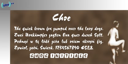
- coop deville - Unknown license

- Barber shop - Unknown license

- Chow Fun - Unknown license

- MW CHIPS - Personal use only

- Donut Shop by Surplus Type Co,
$9.00 Donut Shop is a chunky and fun retro rounded serif font. It features soft corners, multilingual support and a selection of ligature options. Inspired by the easy going 70's, this font is great for large display projects, branding elements, package designs & much more!
 - Bargain Shopping by Jeff Levine,
$29.00 F.W. Woolworth was once one of the giants of the variety store chains, along with the likes of Kress, S.S. Kresge, McCrory’s, Neisner Brothers, Ben Franklin and others. In 1960, the company brought out a new corporate logo with a type design harking back to the Art Deco style of the 1930s and 1940s. A photo of one of their old store fronts (despite having only eight letters to work with) inspired the digital interpretation of the signage as Bargain Shopping JNL, which is available in both regular and oblique versions.
 - Barbar Shop by WAP Type,
$20.00 Something New, a serif blackletter, has been designed with logo designers and typographers firmly in mind. This display font is a perfect addition to your design studio, ready for your next logotype, barber shop, coffe shop label. A modern mix of serif and blackletter with a touch or vintage
 - Choco Chips by Fikryal,
$16.00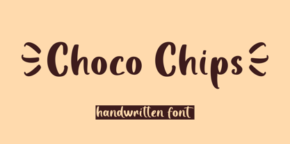 Choco Chips is a handwritten font perfect for crafting, branding, invitation, stationery, wedding designs, social media posts, advertisements, product packaging, product designs, label, photography, watermark, special events, or anything. Choco Chips comes with full set of uppercase and lowercase letters, multilingual symbols, numerals and punctuation.
 - Chip Tunes by Pisto Casero,
$14.00 Chip Tunes font family is a geometric 3d pixel display typeface. It was inspired by–and designed while–listening to the chip tunes and 8bit styles of music. Designed in the UCLM, Cuenca in 2011.
 - Chocolate Chipped by Vintage Type Company,
$9.00 VTC Chocolate Chipped is a modern and minimalist homage to exaggerated woodblock typefaces of the past. It's the perfect little font collection for loud and in-your-face messaging, with 3 different weights in standard and oblique flavours. Adobe Latin 1 & Basic Cyrillic language support are also included.
 - Osaka Chips by Ergibi Studio,
$15.00 Osaka Chips is a unique all uppercase characters font equipped with extrude effects that make this font look more attractive and very suitable for a variety of funny needs such as chips packaging, snack and food packaging, quotes, needs of school children, and more.
 - Coop Blackletter by Alex Jacque,
$30.00 Coop Blackletter's core concept was to create a more friendly blackletter typeface by pulling together two very different sources of inspiration. The design is a synthesis of the rounded, affable features and heavier weight of Cooper Black with the underlying composition and calligraphic contrast of a Fraktur. It's kinda chunky, soft around the edges, and not entirely unreadable.
 - Cutie Shop by Goodigital13,
$20.00 This font can be used Such as logo branding, editorial design, stationery design, blog design, modern advertising design, card invitation, art quote, home decor, book/cover title, special events and any more. font suitable for logo, branding, greeting card, poster and any design that you create.
 - Mr Chips by The Ampersand Forest,
$35.00 Mr Chips is a love letter to modern text serif families like Century Schoolbook and Scotch Romans of all kinds. There's nothing precious about Mr Chips. He's built sturdily, but with a less upright stance than his forebears, with a lower, more relaxed x-height. Mr Chips is dependable and true, with recognizable shapes that make him a pleasure to read. He's a Clarendon, but without the bulkiness that makes Clarendons difficult in text. Mr Chips has character sets for Western Europe, Cyrillic, and monotonic Greek. He has a full set of true small caps for versatility and hierarchy, and some fun and functional ligatures. His alternate characters include a one-story a and g in the upright versions, straight and curly Ka's and Zhe's in Cyrillic, and two styles of ampersand. He's an all around usable, agreeable guy! Mr Chips is a companion typeface to Miss McGee, also from The Ampersand Forest!
 - Chip Dip by PizzaDude.dk,
$10.00 A simple and uneven handmade brush seriffed font. Great for that extra dip your handmade looking designs need! ;)
 - Candy Shop by Gleb Guralnyk,
$15.00 Candy Shop is a vintage decorative font. It has a classic elegant look, perfect for food packaging and label design. Additional curly swashes can help you to create a unique lettering compositions. Five additional swashes can be found in "Glyphs" panel.
 - Chocolate Shop by Elemeno,
$32.00Inspired by the unique lettering style of a poster seen in a well-known chocolate shop in San Diego. Unusual display font that's easy to read even at small sizes. - Puffy Chips by Say Studio,
$15.00 Hallo everyone, puffy chips! puffy chips - it's groovy,retro, bold, chubby, and playful, chubby typeface of circle in groovy style. Perfect for make any project like header, quote, layout magazine and other. Even better if you use it on 60s and 70s design project Embracing the psychedelia era combine with groovy style, open type features such as stylistic alternates and multilingual support What's you get? - Unique letterforms - Works on PC & Mac - Accessible in the Adobe Illustrator, Adobe Photoshop, Microsoft Word even work on Canva! - PUA Encoded Characters - Fully accessible without additional design software. Have a wonderful day, *Say Studio*
 - Tire Shop by Albatross,
$19.95 - Shopping Script by Roland Hüse Design,
$15.00 Shopping Script is designed after and inspired by my handwritten shopping list that was originally a lot less stylish, I have written each words multiple times to achieve the organic and natural flow with a bit spaced out style. This font is an existing work of mine that came in only one weight. Now I added multiple weights I as well as expanded and condensed instances, along with a weight and width variable font file that can be set to anything in between Thin Condensed to Heavy expanded. There are standard ligatures for it, jt, ll and tt, stylistic alternates for uppercase "A" and lowercase "e". For lowercase r and s there are contextual/initial variants when they are first letter of a word. A guide of open type features and how to activate them is available at https://drive.google.com/file/d/1q4j4X8ZntqgEUB8gUmflUNtmlX4IVQBq/view?usp=sharing Most latin based languages are covered from Western European to Eastern.
 - Chili Chips by Epiclinez,
$18.00 Chili Chips is a playful handwritten font. Looks great on a children's craft, teaching material, quotes, or any other design that needs a splash of cuteness! This font is supporting 66 languages, from English to Zulu. It is also PUA encoded and has open-type features such as ligatures to help you create that authentic handwritten look. Thanks, hope you enjoy our fonts.
 - Shopping Guide by Jeff Levine,
$29.00 While watching the 1947 holiday classic “Miracle on 34th Street”, one scene in particular presented a chance to develop a retro type design. ‘Kris Kringle’ suggests to a mother visiting with her child in the Macy’s toy department to try Gimbel’s for a toy she couldn’t find at the store. The news of this behavior reaches Mr. Macy himself, who embraces the practice as a brilliant marketing strategy. A number of departments are then presented with reference books containing competitor ads, and the visual of the cover stating “R.H. Macy & Co. Shopping Guide for the Convenience of Our Customers” shows on screen. The thin, Art Deco sans serif monoline with a few serif-like hooks added onto some characters became the basis for Shopping Guide JNL, which is available in both regular and oblique versions.
 - Chips Snack by Omotu,
$16.00 Chips Snack! A hand-written font with 2 styles, regular (brush texture) and solid. Chips Snack is perfect for short typography, logotype, apparel, T-shirt, Hoodie, product packaging, quotes, flyer, poster. Whats Include? 1. Uppercase and lowercase characters 2. Supports international languages 3. Numerals, punctuations 4. Accessible in the Adobe Illustrator Glyphs panel, or under Stylistic Alternates in the Adobe Photoshop OpenType menu, Adobe InDesign, Corel Draw, even work on Microsoft Word 5. Multilingual support Please message me if you're unsure of any language support. Thanks for looking, and I hope you enjoy it! Please don't hesitate to drop me a message if you have any issues or queries.
 - Crop Circles by T-26,
$10.00 - Cake Shop by Chank,
$20.00 Cake Shop has a lengthy history. Originally designed during the Eighties by Aussie artist David Art Wales, the font was inspired by the awkward but charming hand-lettered signs in a Maltese cake shop near his Sydney home. "These signs were hand-drawn by someone who clearly had no experience but who'd really put their heart and soul into the job. There was a real sincerity to the characters that I wanted to capture." For a brief time during the early Nineties, MTV used Cake Shop for all their on-air interstitials. Since then, it's become a go-to font for everything from children's books to album covers and ice cream branding. In a recent update, Wales added airier spacing to more closely resemble the original signs the font was based on.


Page 1 of 36Next page