54 search results
(0.005 seconds)
- Calamity - Unknown license

- Carat by Hoftype,
$49.00 Carat is a contemporary interpretation of a classic serif type. Fresh and clean in appearance. Straight, unsentimental and objective. Ideally suited for text but also with crisp details in display. Well-equipped for ambitious typography, the Carat family consists of 12 styles, comes in OpenType format with extended language support for more than 40 languages. All weights contain small caps, proportional lining figures, tabular lining figures, proportional old style figures, lining old style figures, matching currency symbols, fraction- and scientific numerals.
 - Carade by Din Studio,
$29.00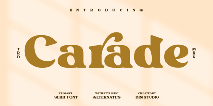 Carade is a elegant serif font. Made for any professional project branding. It is the best for logos, branding and quotes. Every letter has a unique and beautiful touch. Includes: Carade (OTF) Features: Beautiful Alternates Stylistic Set Swashes Multilingual Support PUA Encoded Numerals and Punctuation Thank you for downloading premium fonts from Din Studio
 - Arame by DMTR.ORG,
$20.00 This font with the technical feel of movies and games, was featured in Iron Man Avengers, Halo 4 and Game Reaktor Magazine. Version 1.2 features Cyrillic, arrows and reorganized family (Monospaced in all variations) and a new weight.
 - Calamity Wayne by explogos,
$24.99 Calamity Wayne is a reverse-contrast slab serif, inspired by the ‘wild west’ French Clarendons (aka Italians or Egyptians) of the late-1800s. Despite the idiosyncrasies that make it ideal for display and headline uses, it is also surprisingly legible in text settings. Calamity Wayne supports Latin, Cyrillic and Greek, and is available in OTF and TTF formats. Acknowledgement: I am very grateful to David Jonathan Ross (https://djr.com) for his support and encouragement.
 - Caralance Signature by UICreative,
$23.00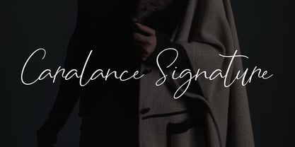 Introducing our new product the name Caralance Signature Font. Modern Serif font that feels beautiful classy, elegant, and modern. This font is perfectly suited for a wide variety of projects, such as signature, stationery, logo, wedding, typography quotes, magazine or book covers, website headers, clothing, branding, packaging design, and more. Also for fashion-related branding or editorial design and displays both masculine and feminine qualities.
 - ITC Aram by ITC,
$29.99Jana Nikolic was finishing her degree program at the Faculty of Applied Arts, in Belgrade, with a final project that would combine her two majors: type and book design. Three stories from William Saroyan's My Name Is Aram would provide the text for the book, to be set in a typeface that Nikolic would design. Nikolic knew something special was happening the moment she put pen to paper. The letters just emerged," she recalls. "I started to explore a few new pens and found one I loved. I was able to make its tip bend with pressure." Like the family Saroyan writes about, the design flowing from Nikolic's pen would be simple but a little quirky. "When there were a whole bunch of little black letters around me," continues Nikolic, "I saw that this was going to be a very interesting typeface family." Nikolic drew Latin and Cyrillic letters, lowercase and capital letters, wide letters and narrow letters. She was surprised at how quickly and easily the design came. "There were no badly written letters," she says. "I hardly had to rework them and they fit together remarkably well." ITC Aram's standard character complement consists of one set of lowercase letters and two sets of capitals: one narrow and the other wide. The wide caps can be used with the standard lowercase, or mixed with the narrow caps for a variation on "cap and small cap" copy. The ITC Aram create the opportunity to mix and combine the letters into playful typographic expressions. Words and sentences that twinkle; text that seems light and alive - one runs the risk of creating work that is both delightful and charming when setting copy in ITC Aram." - GHEA Aram by Edik Ghabuzyan,
$40.00 GHEA Aram is a super family font. It has 10 upright weights and their Italics. GHEA Aram supports Central European, Armenian and Cyrillic language systems. The weights from Regular to Bold and their Italics can be used as text fonts. The weights thinner than Regular and thicker than Bold can be used as Display fonts. It is an easily readable two side serif high contrast font but the eyes don't get tired while reading.
 - Calamity Jane NF by Nick's Fonts,
$10.00This typeface is an amalgam of Edwardian and Art Deco letterforms: the lowercase letters come from a turn-of-the-twentieth-century typeface named Amsterdam, and the uppercase letterforms come from a 1930s logotype for the Théâtre Moderne in Paris. Like its namesake, this typeface is not easily overlooked. This font contains the complete Latin language character set (Unicode 1252) plus support for Central European (Unicode 1250) languages as well. - Pea Cara in TX - Unknown license

- Cheval by Solotype,
$19.95Formalized from some hand lettering by the multifaceted Jugendstil designer Bruno Mauder, perhaps better known for his work in glass and ceramics. - Lobo by chicken,
$17.00 A juicy, mighty-morphing, modular font extracted from the crevices and convolutions of the brain, with nifty coding to cram every gap with tails and curlicues.
 - Maiolica by Struvictory.art,
$14.00 We would like to introduce a new font Maiolica. We were inspired by Italian ceramics and floral patterns on square tiles. We decorated the empty space of letters with geometric patterns. That's how this font turned out! Maiolica typeface includes three fonts: Decorative, Inline, Symbol. Mix and match them to get interesting design. The font is suitable for menu design, wedding invitations and cards, craft products branding and packaging (ceramics, floristics, soap making, natural cosmetics ect). You can create trendy lettering posters for your social media, photo overlays, printing clothes. Also use individual letters and symbols to create logos and monograms.
 - Lawabo by Schriftlabor,
$30.99 The original Lawabo was started many years ago by Rainer Scheichelbauer. Its minimalistic and rounded shapes are reminiscent of bathroom ceramics, hence the name. Schriftlabor designer Miriam Surányi added bold and italic shapes, and produced the family.
 - Nicotine by Chank,
$99.00 Need to cram a zillion words on to a single page? Nicotine is your vice. Cram it. Nicotine Jazz is a bit more musical as it trades uppercase and lowercase letters for an interesting unicase effect. Italic can be used for extra emphasis. The condensed nature of the Nicotine fonts allows for impressive use at larger, poster sizes. Another interesting tidbit? The I in Nicotine is a silhouette of a traditional filtered cigarette; that's how the font got its name.
 - Movie Night JNL by Jeff Levine,
$29.00 Movie Night JNL was modeled from one of a number of ceramic home movie titling kits on the market that were popular during the 1950s and 1960s. The camera buff would set up the letters against a colored background and photograph clever titles to describe their 8mm home movies of vacations, sightseeing or their darling children (or grandchildren).
 - Sign Shop JNL by Jeff Levine,
$29.00Sign Shop JNL was inspired by a set of ceramic titling and display letters similar to those used to model Entitled JNL and made by the Mitten's Display Letter Company of Redlands, California. The distinctive retro feel adds a great touch to any project. Bold, Deco and Oblique versions were created by Jeff Levine for extra visual impact. - Potbank by Asdesign,
$50.00 Like many cities in the Midlands and North of England, Stoke-on-Trent has a rich history linked to making and industry. In Stoke’s case it was pottery. In the early 1900s bottle kilns could be seen covering the landscape of the six towns making up Stoke-on-Trent with hundreds of factories producing some of the best ceramics in the world. But by the 1990s most of these had gone. Torn down for development of housing or just left to rot. During the next few decades Stoke continued to change. The industry was in a decline and Stoke itself was seen as another poor midlands city with a dwindling industry. Then in 2008, Spode, one of the largest and most famousceramics factories in Stoke entered into administration. Pens cast aside, drawings left half finished, designs left in the turned-off kilns; Spode factory was abandoned. This was a real shock and the way everything was getting thrown into skips to be put on the tip was heartbreaking. Thankfully people salvaged some of the technical drawings, sketch design, old sample pieces and ceramics that people hard worked so hard on. Potbank has been in development over a number of years taking inspiration from the heritage and designs from the ceramics industry. It has a mixed Clarendon and Antiqua style structure with its main purpose to be used as a printed type.
 - Show Biz JNL by Jeff Levine,
$29.00 The lettering style of Show Biz JNL is a classic sanserif with Art Deco influences. Slight variations in some letter shapes set it off from similar releases. The basic inspiration for this font was a set of ceramic letters and numbers used for home movie titling, but a few touches were added to give the font its own style and flavor.
 - Terracotta Bohemian by Struvictory.art,
$16.00 Terracotta is a modern display font with mystical and Art Nouveau motives. The font is created in Bohemian style and decorated with swirls and peaks. Terracotta is suitable for the design on the theme of tarot, mysticism, spirituality, fortune-telling, handcrafts (ceramics, creating candles, soap making ect). Terracotta has extensive language support, it includes English, French, German, Italian, Spanish, Portuguese, Danish, Norwegian, Swedish, Finnish, Estonian, Turkish.
 - Ajoure by Struvictory.art,
$14.00 Ajoure is a modern thin sans serif font inspired by folk aesthetics and decorated with geometric patterns. The typeface includes Decorative and Symbol styles. Ajoure Decorative is represented by thin line lowercase and ornate uppercase. Ajoure font family is suitable for craft products branding and packaging (needlework, ceramics, jewelry, handmade soap ect.), events design, modern typographic posters. Use individual letters and symbols to create logos and monograms.
 - Hutsulyandiya 2D by 2D Typo,
$36.00 Hutsulyandiya 2D family fonts comprise folk ornaments found on Hutsul ceramics of the mid 19th to early 20th centuries. Hutsulshchyna is an ethnic region in the Ukrainian Carpathian Mountains where folk art and indigenous culture preserve up to nowadays. All images are to the maximum approximated folk prototypes. The graphics are characterized with grotesque, stylization simplicity, surprising plot moves. The font cheers up and evokes positive emotions.
 - Yorklyn Stencil by House Industries,
$33.00 Yorklyn Stencil includes three fonts, each optimized for use at different size ranges. Grande has greater contrast and more delicate breaks designed to be used at larger sizes where finer details are more conspicuous. Medium and Petite are intended for smaller sizes where the breaks and contours must be more resilient. We embedded several OpenType layout features, including traditional fractions and nut fractions. We extensively tested Yorklyn Stencil in what might be the broadest range of media and conditions in the annals of Northwestern Delaware typefounding history. From the ceramic kilns of Heath Ceramics to our studio’s stucco facade, Yorklyn Stencil’s robust curves and deceptively delicate breaks will withstand a wide variety of harsh conditions with unprecedented aplomb. Whether you’re hand cutting a stencil to buzz your bespoke restaurant bar stools or simply looking for a practical yet illustrative display font, Yorklyn Stencil’s elegant efficacy will enhance any creative composition. Like all good subversives, House Industries hides in plain sight while amplifying the look, feel and style of the world’s most interesting brands, products and people. Based in Delaware, visually influencing the world.
 - Milk & Clay by loryn ipsum,
$15.00 Milk & Clay | handwritten sans serif font Meet Milk & Clay, the font that started it all. This font was inspired by a friend who is a ceramists. The smooth and soft bumpy edges of this font is influenced by the texture and shape of clay as you’re working with it - almost perfect letter or shapes but not quite there. The letters are unique and feel soft and handmade. Perfect for; handmade products, ceramics, branding, logos, instagram quote text.
 - Edits And Credits JNL by Jeff Levine,
$29.00Edits and Credits JNL is a cheerful sans serif typeface modeled from ceramic letters in a movie titling set from the late 40s or early 1950s. In the original kit, letters would be lined up accordingly against a contrasting background and photographed for home or professional movie and slide titles. Note: The cap height is slightly smaller than normal for the respective point size. This will give the effect of wider line spacing - similar to that of home movie titles. - Entitled JNL by Jeff Levine,
$29.00Way back before digital imaging, video tape and computer editing, the home movie enthusiast had to shoot on film his own titles using any one of a variety of movie titling kits on the market. One common approach was to arrange white ceramic letters on a colored background and film them. A set of such letters provided the inspiration for Entitled JNL from Jeff Levine. The classic, sleek Art Deco lines of this font makes it an all-purpose design for any headline needs. - Machete Pro by Sudtipos,
$39.00 Machete is the hulky, overfed distant cousin of Bayoneta. Enthusiastically in your face and full of humour, Machete is exactly the kind of big alphabet that takes a skinny actress camping at the top of a really tall building downtown. If you don't think this sort of date is interesting enough, try cramming these letters on your next tub of comfort food, road trip comedy, or assault rifle packaging and see. Machete don't text. Machete roars!
 - Precolombina by Juan I. Siwak,
$20.00 "Precolombina" consists on a series of graphic symbols native to South America, decorative trims, and a minimal set of typographic characters. The signs were taken from ceramic pottery, clothing, and petroglyphs from the southern cone of South America. We try to select a varied range of signs representing shamans, jaguars, rheas, monkeys, birds, and mythological beings. The decorative trims are taken from the same places and occupy the set of numbers. Finally, it contains the minimum characters of a font to achieve a brand or a title. They take place in the OpenType resources.
 - Ongunkan Phrygian by Runic World Tamgacı,
$50.00 Phrygia is the Greek name of an ancient state in western-central Anatolia (modern Turkey), extending from the Eskişehir area east to (perhaps) Boğazköy and Alishar Hüyük within the Halys River bend. The Assyrians, a powerful state in northern Mesopotamia to the south, called the state Mushki; what its own people called it is unknown. We know from their inscriptions that the Phrygians spoke an Indo-European language. Judging from historical records supported by ceramic evidence, settlers migrating from the Balkans in Europe first settled here a hundred or more years following the destruction of the Hittite empire (ca. 1200 B.C.). Most of what is known about Phrygian archaeology and its language derives from excavations at the capital city Gordion, located about 60 miles southwest of the modern Turkish capital of Ankara (also a Phrygian site). Gustav and Alfred Körte first excavated Gordion in 1900. The excavators did not reach Phrygian levels, but they did reveal burials dated to the late eighth century B.C. with Phrygian ceramic, metal, and wooden artifacts. From 1950 to 1973, Rodney S. Young of the University of Pennsylvania led excavations at Gordion. Archaeological work at the site resumed in 1988 and continues to the present.
 - Manises by Eurotypo,
$32.00 Located in the Valencian Community, Spain, Manises is very famous for its pottery. In the Middle Ages and the Renaissance, Manises was the most important production center for Spanish-Moresca ceramics, which was exported throughout Europe. At the beginning of the 16th century, Manises tiles were very commercially successful, especially of the heraldic type. Much appreciated by the Aragonese crown, Manises ceramics was also exported to France, Italy, and especially to Naples. As a big fan of Paterna and Manises ceramics, Naples influenced other Italian courts. Calixto III and Alejandro VI continuously commissioned Valencian pieces and tiles for the halls of the Vatican. The export also extended to Sicily, Venice, Turkey, Cyprus and even Flanders and the Baltic countries. The palaces of all the courts of Europe were enriched with this art. Many painters reproduced it in his paintings. It can be seen in the work of Hubert and Jan Van Eyck, and in the central panel of a triptych by Hugo Van der Goes (Uffizi Gallery, Florence). In this city there are also some frescoes by Domenico Ghirlandaio in which the Arabic-Valencian earthenware appears. Manises font is inspired by a text written on a 16th century tile, but adapting it to our times and giving it a very modern air. It is characterised by being able to combine uppercase and lowercase letters in a conventional manner, or use only capitals, or only lowercase letters, or, a random combination of both. It comes with an extra of many ligatures, stylistic alternates, and a set of very useful catchwords, to give more modernity to your text. This OpenType features may only be accessible via OpenType-aware applications, or the Character Map to view and copy any of the extra characters to paste into your favourite text editor/app. Manises looks lovely on wedding invitations, greeting cards, logos, posters, labels, t-shirt design, logos, children's material, in ink or water-colour based designs, fashion, magazines, food packaging and menus, book covers and whatever your imagination holds!
 - Nouveau Calendar JNL by Jeff Levine,
$29.00 Inspired by the lettering on Koloman Moser’s poster design for Fromme’s Calendar (circa 1912), Nouveau Calendar JNL is available in both regular and oblique versions. According to Wikipedia: “Koloman Moser (30 March 1868 – 18 October 1918) was an Austrian artist who exerted considerable influence on twentieth-century graphic art and one of the foremost artists of the Vienna Secession movement and a co-founder of Wiener Werkstätte. Moser designed a wide array of art works, including books and graphic works from postage stamps to magazine vignettes; fashion; stained glass windows, porcelains and ceramics, blown glass, tableware, silver, jewelry, and furniture.”
 - Julienne by Wiescher Design,
$39.50 Cooks call thinly cut - like matchsticks - vegetables "Julienne". I found that was a fitting name for this very narrow typeface. Julienne Slim is the extreme cut of the two. Personally I do not use narrow typefaces very often, but from time to time they come in handy if there is much text to be crammed into little space. I could make a typeface that was even narrower, but I will not do it. This is as narrow as my typefaces get. Enjoy what I cut for you, Gert Wiescher.
 - Indigena by Latinotype,
$29.00 Mapuche means ‘man of the land’ and it is also the name of a group of indigenous inhabitants in South America. During the southern Winter solstice, between June 21 and June 24, the We Tripantu, the Mapuche New Year fest, takes place with a magical rite in the middle of the nature. Indigena is a dingbat font that remakes the artistic expression of the Mapuche people in Chile, recovering the handmade stroke they used in textiles and ceramics, but with a fresh look. This dingbat is based on pre-Columbian iconographic drawings shown in the book Dibujos Indígenas de Chile (1929) by chilean art teacher Abel Gutiérrez.
 - Nylon and Draylon by Barnbrook Fonts,
$30.00 Nylon is an interpretation of pre-16th century letterforms, in particular those found in mediaeval portraits at the National Gallery, London. The source material contains many unusual and manic shapes—it appears as if these classical forms have, over time, become perverted, almost demonic. Draylon is the more restrained counterpart to Nylon; it is based on letterforms found on 18th century ceramics—some 200 years after the source material of Nylon. Nylon and Draylon have been designed so that they can be mixed together with ease. Both typefaces have been drawn with a kind of crude digital awkwardness—acknowledging the tool of the present moment, the computer, in the design process.
 - Trypillya 2D by 2D Typo,
$36.00 This ornamental font is the interpretation of ornaments of Trypillya culture. Trypillya culture, or Cucuteni-Trypillya is an archaeological culture of neolithic times. Its name derives from the name of the village of Trypillya nearby Kyiv. This culture experienced its culmination between 5500 and 2750 BC. The Trypillians lived in the territories between the Carpathian Mountains and the Dniper River of the modern Ukraine, Moldova and Romania. Many interesting ceramics decorated with original geometric ornaments survived to amaze us. Its heritage is still a little unknown to the public and therefore the patterns that are reproduced in this font have no analogues in the digital format.
 - VLNL Brokken by VetteLetters,
$35.00 'Brokken’ is the Dutch word for ‘chunks’. They are the hearty specialty of the house, prepared by the ship’s cook Donald DBXL Beekman. Nice'n'greasy and monospaced, you'll always find a decent way to cram the letters in. Brokken is straightforward, straight-lined with beveled corners, and all caps. For the ones who have to watch their weight, or who simple don’t like their fonts to be too fatty, DBXL designed a diet version called Brokken Light. With their big contrast, both weights combine very well and are great for making ultra-compact ribbon headlines or stacking vertically.
 - Wagner Grotesk by Canada Type,
$49.95 This is the elaborate digital version of Edel Grotesque Bold Condensed (also known as Lessing, Reichgrotesk, and Wotan Bold Condensed) a 1914 typeface by Johannes Wagner, which was later adopted by pretty much every European type foundry, exported into the Americas, and used on war propaganda posters on either side of the Atlantic. Bold, condensed, yet clear and legible, Wagner Grotesk is good for cramming information into tight spaces. Extended language support includes Western, Central and Eastern European character sets, as well as Greek, Cyrillic, Baltic, Esperanto, Maltese, Turkish, and Celtic/Welsh languages. Biform letters and small caps make Wagner Grotesk a most versatile and functional headline face.
 - Isla by Sudtipos,
$39.00 Eugene Grasset, the popular 19th-century Swiss graphic designer, dabbled in a multitude of disciplines such as ceramics, furniture, tapestry, jewelry and stamp design. Known mostly for his commercial posters and illustrations, he left a legacy of design that still fascinates scholars and professionals alike. One of the rarely mentioned Grasset treasures is the italic he designed in 1898 for use in two of his posters. Grasset's italic has an irregular quality that makes it seem much older than it is. It can be a very meaningful face in many contexts, such as map-related design or historical publications. Isla was digitized by Alfredo Graziani and completed by Alejandro Paul, maintaining the utmost respect for its historical flavor. The typeface includes a wealth of ligatures and alternates.
 - Thermal Shock by Hanoded,
$15.00 We used to have a composite worktop in our 'old' kitchen. It was cheap and the kitchen-guy warned us not to put any hot pans on the worktop, as it could crack due to Thermal Shock. Duh... When we installed our new kitchen, we opted for a ceramic worktop, which can handle hot pans being placed on it! Thermal Shock font is a very nice, handmade brush font. If you ever bought any brush fonts of mine, you will know that I almost always use Chinese ink and cheap brushes to create 'the look'. It is always a bit of a surprise how a Chinese ink brush font turns out: I created one the other day and it looked horrible, so it was banned.. Thermal Shock turned out to be a looker. Thermal Shock comes with one set of alternate glyphs, extensive language support (including Greek and Vietnamese) and a guarantee it won't crack in super hot designs.
 - Poeta by Tarallo Design,
$18.99 Poeta is an ornamental font for making patterns and text decoration. It contains floral and nature motifs. The symbols are versatile enough for simple decoration or festive holiday moods. Designers can use Poeta to make unique lines, fields, borders, or ornamentation within or around text. Try replacing a simple straight line with repeated symbols. Make a background to add visual interest to a design. Use the forms to decorate a chapter title or to mark the end of a magazine article. Replace a letter in a word with a symbol to create a memorable statement. Poeta will add visual poetry to any design project. This font began with sketches of patterns seen in ceramic tiles around Sicily. It is named Poeta because Sicily is an island rich in poetry traditions. Using this font is simple. Install it and type. Symbols will appear instead of letters. Choose the precise symbols through a software’s glyph palette. Use the type/character menu controls to vary the spacing and density of patterns.


Page 1 of 2Next page