24 search results
(0.012 seconds)
- Cardillac by Hoftype,
$49.00 Cardillac, named after E.T.A. Hoffmann’s literary figure, refers back to classical Didonesque, yet presents unique details which set it apart from historic models by adding a new flavour. Its clarity, noble appearance and cool elegance predestine it for magazines and newspapers. The Cardillac Family consists of 14 styles, provides many features which allow its application for ambitious typography. It comes in OpenType format with extended language support. All weights contain small caps, ligatures, superior characters, proportional lining figures, tabular lining figures, proportional old style figures, lining old style figures, matching currency symbols, fraction- and scientific numerals, matching arrows and alternate characters.
 - Cadillac Signature by Fikryal,
$18.00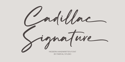 Cadillac Signature – is a modern handwritten font. This font is made in a modern style, very casual, and suitable for your various design needs. It’s perfect for logo, branding, title, social media posts, advertisements, product packaging, product designs, label, photography, watermark, special event, magazine, web designs, etc. Features : Cadillac Signature ( Uppercase, Lowercase ) Ending Swashes multilingual support Ligatures If you have any questions please don’t hesitate to contact me follow my Instagram: fkryall Thank you
 - Candillas by Forberas Club,
$16.00 This Candillas font is made with a marker that has a curve that looks beautiful to look at and can be used for a variety of purposes.
 - Fadilla by MrLetters,
$20.00 Fadilla Script is perfect for branding, wedding invitations, magazines, mugs, business cards, quotes, posters, and many more that you can use on your big project will be very beautiful. Fadilla Script is equipped with OpenType feature and has many glyphs, giving you the chance to choose letters to your liking, having lots of variations and choices for each letter, so you can customize your design choices. Fadilla Script also support other languages. You need a program that supports OpenType features such as Adobe Photoshop CS / Adobe Photoshop CC, Adobe Illustrator CS / Adobe Illustrator CC, Adobe Indesign and Corel Draw and many more programs that support OpenType. If you don't have a program that supports OpenType, you can access all the alternate glyphs using Font Book (Mac) or Character Map (Windows) If you have any question, don't hesitate to contact me by email.
 - Cardillac Text by Hoftype,
$49.00 Cardillac Text is the down to earth version of the subtle and high contrasted Cardillac family. More suitable for longer text and for strong headline applications. The Cardillac Text Family consists of 16 styles, provides many features which allow its application for ambitious typography. It comes in OpenType format with extended language support. All weights contain small caps, ligatures, superior characters, proportional lining figures, tabular lining figures, proportional old style figures, lining old style figures, matching currency symbols, fraction- and scientific numerals, matching arrows and alternate characters.
 - CADILLAC PERSONAL USE - Personal use only

- FG Camilla by YOFF,
$13.95FG Camilla is loveable. - Remora Camilla by Grezline Studio,
$20.00 Remora Camilla is a display script and unique sans font pair with a charming retro personality. They also have strong and bold characteristics. This font will be an appealing asset to your fonts’ library, as they have the potential to enhance any design project. Remora Camilla is perfect for headings, covers, posters, logos, quotes, product packaging, merchandise, social media and much more! Combine them to make your creation more spectacular! Feature : - A lot of Alternates ( With a Total of 700+ Glyphs ) - Multilingual Language - Works on PC & Mac - Simple installations - Accessible in the Adobe Illustrator, Adobe Photoshop, Adobe InDesign, even works on Microsoft Word.
 - Camilla Jennifer by Grezline Studio,
$19.00 Hello creative people! Let me introduce you my latest font creation called Camilla Jennifer! Camilla Jennifer is a playful groovy font with a lot of alternate glyphs. This font is designed to captivate attention and delivers a funky and psychedelic vibe. Camilla Jennifer font is also usable in a wide range of works such as logos, covers, posters, quotes, product packaging, merchandise, social media and much more! Use this font to add a touch of groovy style to your designs. Feature : - Ligature & Alternate glyphs - Multilingual Language - Works on PC & Mac - Simple installations - Accessible in the Adobe Illustrator, Adobe Photoshop, Adobe InDesign, even works on Microsoft Word. Thank you Akhmad Reza Fauzi - Grezline Studio
 - French Plug by HiH,
$8.00 Frank H. Atkinson was a popular Art Nouveau sign painter in Chicago, Illinois. He designed signs for the Cadillac Motor Car Co., Chicago Academy of Fine Arts and the department store Marshall Field. Oddly enough, he even designed signs for other sign painters. In 1908 he published a book, Sign Painting, which sold well. French Plug, a bold, rounded, all-cap design in an American Art Nouveau style from that book. It has a relaxed, easy-going informality that is useful for ads and flyers. It also would have fit very nicely with many French posters of the period.
 - The "CADILLAC PERSONAL USE" font by Billy Argel is a distinctive typeface that embodies elegance, sophistication, and a classic allure, reminiscent of the luxury and timeless beauty associated with i...
- Stamm by Tychographica,
$79.00 Based on Element by Max Bittrof, Stamm takes the next step in adaptation to modern environment. Using it's own construction logic it makes the design far more consistent and considerably expands the character set, supporting hundreds of languages, including Vietnamese and extended Cyrillic. Generous amount of OpenType features allows various localization options, automatic fractions, super- and subscripts, oldstyle and tabular figures, small caps and ligatures to suit almost every need. There are 15 Stylistic Sets available to customize the font (some of them duplicate locl-features in case they're not supported by applications): ss01 (Traditional glyphs): changes modern shapes used by default to old-style forms; ss02 (Alternate historical glyphs): changes the shape of several characters to a more obscure historical form; ss03 (Catalan middle dot): replaces middle dot between two l's by Catalan variant for better spacing; ss04 (German ligatures): activates historical ch, ck and tz ligatures used in German blackletter typesetting; ss05 (Dutch IJ-acute): replaces j after i-acute with j-acute; ss06 (Marshallese cedilla): replaces commas under certain letters with cedillas; ss07 (Romanian/Moldovan comma): changes cedilla-glyphs to comma-glyphs; ss08 (Turkish i): replaces regular i with dotted Turkish variant; ss09 (Cyrillic alternates): changes several Cyrillic glyphs to alternate variants; ss10 (Bulgarian Cyrillic): activates Bulgarian shapes; ss11 (Serbo-Macedonian Cyrillic): activates Serbo-Macedonian shapes; ss12 (Double-story a): replaces default glyph with it's double-story variant; ss13 (Alternate asterisk): replaces default asterisk with 5-pointed shape; ss14 (Enclosed figures): replaces standard figures with enclosed variants; ss15 (Slashed zero): replaces default zero with slashed variant.
 - Calaveras by Design is Culture,
$29.00 In August of 2009, I was commissioned by Zoo York, a New York City based skateboard company, to visit Buenos Aires to study and document street typography. As soon as my taxi driver took the bustling street Entre Ríos, it was clear that the city and I were going to be good friends. Many of the independently owned businesses on Entre Ríos are adorned with handmade signage. These signs are painted in a style called Fileteado which is a century-old Argentinian type of lettering and floral ornamentation. Nowadays, Fileteado is still a prominent part of the city’s landscape, coloring the façades of restaurants, bars and coffee shops. Calaveras and Diablitos are two new typefaces that were inspired by Fileteado. Stylistically, the fonts are a return to a rhythmic and playful sensibility reminiscent of Vitrina and Cuba, two fonts that I designed in 1996. Along with dynamism and dance, these new fonts incorporate a rigor and functionality essential to labelling any font a ‘workhorse.’ The names Calaveras and Diablitos, came from the name of a song by the infamous Buenos Aires rock band, Los Fabulosos Cadillacs. —Pablo A. Medina
 - Diablitos by Design is Culture,
$29.00 In August of 2009, I was commissioned by Zoo York, a New York City based skateboard company, to visit Buenos Aires to study and document street typography. As soon as my taxi driver took the bustling street Entre Ríos, it was clear that the city and I were going to be good friends. Many of the independently owned businesses on Entre Ríos are adorned with handmade signage. These signs are painted in a style called Fileteado which is a century-old Argentinian type of lettering and floral ornamentation. Nowadays, Fileteado is still a prominent part of the city’s landscape, coloring the façades of restaurants, bars and coffee shops. Calaveras and Diablitos are two new typefaces that were inspired by Fileteado. Stylistically, the fonts are a return to a rhythmic and playful sensibility reminiscent of Vitrina and Cuba, two fonts that I designed in 1996. Along with dynamism and dance, these new fonts incorporate a rigor and functionality essential to labelling any font a ‘workhorse.’ The names Calaveras and Diablitos, came from the name of a song by the infamous Buenos Aires rock band, Los Fabulosos Cadillacs. —Pablo A. Medina
 - Beyond Belief by Comicraft,
$19.00 Fact or Fiction? Are you troubled by strange noises in your font folder? Do you experience feelings of dread in Illustrator, Photoshop or Procreate? Have you or any of your family ever been haunted by an ampersand, cedilla or tilde? If the answer is yes, please don’t wait another minute. BEYOND BELIEF is ready to Believe YOU! Six weights of non-judgmental understanding and faith in everything you have to say -- even the most outrageous font conflicts and naming “coincidences”. Some say this font resembles our tall, friendly sans-serif font Tall Tales, but we don't know what they're talking about. Beyond Belief includes six fonts (Regular, Italic, Bold, Bold Italic, Heavy & Heavy Italic) with upper and lower case alphabets, automatic alternate letters, Crossbar I Technology and Western & Central European language support.
 - Edelgotisch by HiH,
$10.00 Edelgotisch is a bold Jugendstil design that shows its strong blackletter roots. This typeface, along with a set of initial letters, was released by Schelter & Giesecke of Leipzig, Germany about 1898 and is very similar to Eckmann-Schrift released by Rudhard'schen Giesserie (later Klingspor) during the same period. One suspects they may have been in direct competition. The decorative devises of the initial letters for Edelgotisch have a simpler, bolder line than for Eckmann. In the initial letter set, the ligatures aesc (AE) and ethel (OE) were generated by embedding the ‘A’ and ‘O’ respectively inside the upper left corner of the ‘E.’ The accented caps were given similar treatment, with the exception of the cedilla. Regarding the I-diaeresis, we considered rotating the accent ninety degrees to avoid and possible misconstruction. On further reflection however, we realized it was silly and unnecessary. No one would look at the accented letterform and see anything but what it is. We have also included four decorative ornaments and a frame with each font.
 - Undergrad by Thomas Käding,
$10.00 This font began its life as a project to design a T-shirt for a student group on a large midwestern university. It has now grown up into a unicode font, including Greek and Cyrillic. It has that look and feel of the T-shirts that are ubiquitous on the campuses of colleges and universities over the world. It would make an ideal tool for designing them, as well as posters and banners. Characters in these fonts include Latin, for English and other European languages; small a and c for names like MacDonald; many fractions, including 0/3 needed in baseball; Latin with diacritical marks for Eastern and Western European, Turkish, and Baltic languages; thorn, eth, cedilla, AE, OE, and sharp S for French, German, Icelandic; Latin extensions for clicks of some African languages; Greek (with tonos); Cyrillic for Russian and many other Slavic and Asian languages that use it; most Runes (the full Futhark plus a few more); six-point Brialle; currency symbols for dollar, cent, pound, yen, euro; and a few other extras like the peace sign. Available styles are regular block letters, outlines, and bold.
 - Adultometric Pro by CheapProFonts,
$10.00 This is the mature version of our previous release Infantometric Pro - The same basic skeleton, but with a more normal x-height. One feature is that no letters (except some accented letters - with cedillas, ogoneks and comma accents) go below the baseline, so this is one condensed font that is perfect for headlines! :) ALL fonts from CheapProFonts have very extensive language support: They contain some unusual diacritic letters (some of which are contained in the Latin Extended-B Unicode block) supporting: Cornish, Filipino (Tagalog), Guarani, Luxembourgian, Malagasy, Romanian, Ulithian and Welsh. They also contain all glyphs in the Latin Extended-A Unicode block (which among others cover the Central European and Baltic areas) supporting: Afrikaans, Belarusian (Lacinka), Bosnian, Catalan, Chichewa, Croatian, Czech, Dutch, Esperanto, Greenlandic, Hungarian, Kashubian, Kurdish (Kurmanji), Latvian, Lithuanian, Maltese, Maori, Polish, Saami (Inari), Saami (North), Serbian (latin), Slovak(ian), Slovene, Sorbian (Lower), Sorbian (Upper), Turkish and Turkmen. And they of course contain all the usual "western" glyphs supporting: Albanian, Basque, Breton, Chamorro, Danish, Estonian, Faroese, Finnish, French, Frisian, Galican, German, Icelandic, Indonesian, Irish (Gaelic), Italian, Northern Sotho, Norwegian, Occitan, Portuguese, Rhaeto-Romance, Sami (Lule), Sami (South), Scots (Gaelic), Spanish, Swedish, Tswana, Walloon and Yapese.
 - Pata Slab by In-House International,
$10.00 Pata Slab: the ultra-heavy optimism we all need in 2020 Pata Slab is the type equivalent of a catwalk stomp down a city sidewalk, a font that’s assertive, funky and more than a little sexy. Named after a colloquialism for ‘feet’, Pata features ultra-heavy slabs and contrasting hairline centers that rise from its chunky footprint. The resulting, retro-inspired vertiginous curves add instant attitude to any design. Developed in 2020, Pata is a type of its time.Pata is all upside, as it is a typeface with no descenders — one that elevates all characters to grow upward from the baseline (because, c’mon, we could all use something uplifting right now!) All uppercase characters were built to fit precisely inside a square, so they’re all the same width and height. The lowercase alphabet, eñes, cedillas, punctuation, numbers and symbols all follow the same height restrictions. Despite all that confinement, Pata sports standard-height terminals that connect seamlessly so there’s nearly endless options for modular ligatures. The upshot of all this meticulous awesomeness is that laying out, customizing and stacking text super simple. Pata Slab was created by In-House International, designed Alexander Wright in collaboration with Rodrigo Fuenzalida. It's available for Opentype format (.otf) compatible with Mac and PC.
 - Baroniene ML by HiH,
$12.00 Genovaite Baroniene is former school teacher and a native of Lithuania who loves fancy letters. When she writes, she likes to add extra flourishes to her handwriting and printing. It simply appeals to her to do so. While living in the United States a few years ago and working in the health care field, she put pen to paper to provide a specimen of her writing from which a font could be developed. The process has taken longer than either of us expected. Now we are finally able to present Baroniene ML, a stylishly unique example of what we call Lithuanian Folk Baroque. Baroniene ML has a total of 362 glyphs, including the Unicode Latin Extended-A glyphs (0100 to 017F), covering the more widely-used Central European languages. To resolve the cedilla/undercomma conundrum, we have chosen to design a hybrid disconnected accent for use with C, G, K, L, N, R, S & T. We hope this solution is acceptable to users of Albanian, Catalan, French, Latvian, Portuguese, Romanian and Turkish. Baroniene ML also comes with four ligatures: gh, Th, th and Ch (167, 172, 177 and 181). Baroniene ML is certainly not the polished script of a professional calligrapher. It is very personal. The human source is still visible in its form. The letter spacing is uneven. Some of the curves are not quite perfect. In sum, the individuality has not been refined out of it. That is why it is so charming. If you want for a font that has a very different look, perhaps Baroniene ML is what you need.
 - English Monarchs by Celebrity Fontz,
$24.99 English Monarchs is a unique font collection with accurate digital replicas of 84 signatures of English and British monarchs from Richard II through Elizabeth II, including many of the royal consorts. Also included in this font are the Stuart pretenders and Mary Queen of Scots and her consort. A must-have for autograph collectors, desktop publishers, history buffs, fans, or anyone who has ever dreamed of sending a letter, card, or e-mail "signed" as if by one of these famous nobles. This font behaves exactly like any other font. Each signature is mapped to a regular character on your keyboard. Open any Windows application, select the installed font, and type a letter, and the signature will appear at that point on the page. Painstaking craftsmanship and an incredible collection of hard-to-find signatures go into this one-of-a-kind font. Comes with a character map. This font includes signatures from the following noble figures: Richard II, Henry IV, Henry V, Henry VI, Margaret of Anjou, Edward IV, Elizabeth Woodville, Edward V, Richard III, Henry VII, Elizabeth of York, Henry VIII, Catherine of Aragon, Anne Boleyn, Jane Seymour, Anne of Cleves, Catherine Howard, Catherine Parr, Edward VI, Lady Jane Grey, Mary I Tudor, Elizabeth I, James I, Charles I, Henrietta Maria of France, Oliver Cromwell, Richard Cromwell, Charles II, Catherine of Braganza, James II, William III, Mary II, Anne, Prince George of Denmark, George I, George II, George III, George IV, William IV, Victoria, Prince Albert, Edward VII, George V, Edward VIII, Wallis Warfield Simpson, George VI, Elizabeth II, Prince Philip, Prince Charles, Princess Diana, Camilla Duchess of Cornwall, Prince James Edward Stuart, Prince Charles Edward Stuart, Mary Queen of Scots, Henry Stuart Darnley, Francis II of France.
 - Gelato Script by Eclectotype,
$40.00 The original Gelato Script has been updated and improved, not once, but twice. This version is kept here for legacy and compatibility issues, but I would encourage new users to check out Gelato Luxe or Gelato Fresco instead. Gelato Script is a smooth-flowing typeface with an air of familiarity. Influenced by both formal scripts and mid-Twentieth Century hand lettering. The power of OpenType is used with precision in the Contextual Alternate feature to make sure letters connect seamlessly, t’s cross where they can and swashes don't crash into neighboring glyphs. 781 glyphs make up this font, which is capable of speaking in many different languages. Alternate forms are grouped into stylistic sets to make it easy to change the mood of the text. For example, ss01 makes droopable letters drop below the baseline to break it up a little if required. I recommend using it sparingly, one glyph at a time, but if you do enable it for a whole chunk of text, the clever OpenType programming ensures that it doesn't go overboard. Sets 2, 3 and 4 bring about alternate forms of S, s, B and Q. Set 5 changes AE and OE to some perhaps controversial Upper/lowercase ligatures. Engage ss06 for the underline feature. After a word, simply type two or more underscores and a line extends backwards under the word you just typed. Don't worry if you have to break for a descender, the OpenType programming will take care of making sure it connects properly to the preceding character. Sets 7 and 8 are for alternate ampersands, and ss09 swaps the script r for a regular shaped r. There are swash capitals available for most uppercase letters, and the OpenType programming makes sure there is room for them under or over the following letters. There’s also a good amount of ligatures thrown in. The localised forms feature can be set for Polish, where acutes get steeper and lslash takes on its script form; Dutch, where IJ and ij digraphs become cool ligatured combinations; and Romanian and Moldovan, where cedillas are subsituted for comma accents. The stylistic alternates feature groups together a few of the stylistic sets for users that can't get to them directly. Gelato Script is a highly usable, powerful typeface. Perfect for everything from food packaging to wedding invitations, sports team logos to magazine headings. Use it however you see fit. Just one thing - it’s not designed for all-caps settings, so avoid that at all costs!
 - HiH Firmin Didot by HiH,
$10.00 Before Bodoni, there was Didot. With the publication by Francois Ambroise Didot of Paris in 1784 of his prospectus for Tasso’s La Gerusalemme Liberata, the rococo typographical style of Fournier de Jeune was replaced with a spartan, neo-classical style that John Baskerville pioneered. The typeface Didot used for this work was of Didot’s own creation and is considered by both G. Dowding and P. Meggs to be the first modern face. Three years later, Bodoni of Parma is using a very similar face. Just as Bodoni’s typeface evolved over time, so did that of the Didot family. The eldest son of Francois Ambroise Didot, Pierre, ran the printing office; and Firmin ran the typefoundry. Pierre used the flattened, wove paper, again pioneered by Baskerville, to permit a more accurate impression and allow the use of more delicate letterforms. Firmin took full advantage of the improved paper by further refining the typeface introduced by his father. The printing of Racine’s Oeuvres in 1801 (seen in our gallery image #2) shows the symbiotic results of their efforts, especially in the marked increase in the sharpness of the serifs when compared to their owns works of only six years earlier. It has been suggested that one reason Bodoni achieved greater popularity than Didot is the thinner hairlines of Didot were more fragile when cast in metal type and thus more expensive for printers to use than Bodoni. This ceased to be a problem with the advent of phototypesetting, opening the door for a renewed interest in the work of the Didot family and especially that of Firmin Didot. Although further refinements in the Didot typeface were to come (notably the lower case ‘g’ shown in 1819), we have chosen 1801 as the nominal basis for our presentation of HiH Firmin Didot. We like the thick-thin circumflex that replaced the evenly-stroked version of 1795, possible only with the flatter wove paper. We like the unusual coat-hanger cedilla. We like the organic, leaf-like tail of the ‘Q.’ We like the strange, little number ‘2’ and the wonderfully assertive ‘4.’ And we like the distinctive and delightful awkwardness of the double-v (w). Please note that we have provided alternative versions of the upper and lower case w that are slightly more conventional than the original designs. Personally, I find the moderns (often called Didones) hard on the eyes in extended blocks of text. That does not stop me from enjoying their cold, crisp clarity. They represent the Age of Reason and the power of man’s intellect, while reflecting also its limitations. In the title pages set by Bodoni, Bulmer and Didot, I see the spare beauty of a winter landscape. That appeals to a New Englander like myself. Another aspect that appeals to me is setting a page in HiH Firmin Didot and watching people try to figure out what typeface it is. It looks a lot like Bodoni, but it isn't!
 - Coming Together by Font Aid,
$20.00 Coming Together contains over 400 glyphs and is supplied as a single, cross-platform OpenType font. All glyphs are accessible using OpenType-savvy applications, Unicode-savvy utilities, the Character Map utility on Windows, and FontBook on Mac OS X. Nearly 400 designers contributed to “Coming Together”: Adam Humphries, Aditi Dilip, Adrien Midzic, Afraa Gutub, Al Insan Lashley, Alan Lima Coutinho, Alaric Garnier, Alejandro Cabrera Avila, Alejandro Lo Celso, Alejandro Paul, Alessandro Segalini, Alex Cameron, Alex Coblentz, Alexander Trubin, Alexandre Freitas, Alexey Murashko, Alicia Jabin, Aline Horta, Allison Dominguez, Amanda Postle, Amy Brown, Amy Papaelias, Anderson Maschio, Andrea Emery, Andres Perez, Andrew Boardman, Andrew Jesernig, Andrey Furlan, Andrij Shevchenko, Ann Tripepi, Antonio Gutierrez, Antony Kitson, Anushree Kapoor, Anya Cam, AP303 Estudio Design, Becky Krohe, Beejay, Ben Mitchell, Benjamin K. Shown, Benjamin Varin, Brad McNally, Brad Nelson, Bradley Trinnaman, Brady Baltezore, Brandon Horne, Breck Campbell, Brian J. Bonislawsky, Brian Jaramillo, Brian Jongseong Park, Brian Mueller, Brock French, Bruce Rodgers, Bruno Pugens, Bryan Angelo Lim, Buro Reng, Caitlin Martin-Frost, Calou, Carlos Fabián Camargo Guerrero, Carlos Vidal, Cayo Navarro, Cesar Puertas, Chank Diesel, Charles Williams, Chris Lozos, Chris Trude, Christophe Badani, Christy Lai, Claes Källarsson, Claire Coullon, Claudio Piccinini, Colby Cook, Craig Eliason, Cristina Pegnataro, Curve Doctor, Dan DiSorbo, Dan Liggins, Dan Rubin, Daniel Justi, Daniele Capo, Dav(id Hubner), Dave Bailey, Dave Cohen, David Jonathan Ross, David Sudweeks, David Thometz, Dawn Mercurio, Delve Withrington, Diana van de Blaak, Didier Mazellier, Diederik Corvers, Dino Santos, Dmytro Pobiedash, Donald Beekman, Dries Wiewauters, Duncan Bancroft, Ed Hoskin, Eddy Ymeri, Edineide Oliveira, Eduardo Manso, Eduardo Rodríguez Tunni, Eero Antturi, Eli Castellanos, Elias Bitencourt, Elias Stenalt Werner, Elman Padilla, Emery Miller, Emily Leong, Emily Maher, Enrico Limcaco, Eric Frisino, Eric Stine, Erik Brandt, Espen, Evan Moss, Evangeline Rupert, Fabiane Lima, Fabio Foncati, Fabrizio Schiavi, Farbod Kokabi, Felipe Lekich, Francisco Martin, Frank Riccio, Frans van Bellen, Gary Holmes, Gautam Rao, Gayle Hendricks, Gene Buban, Georg Herold-Wildfellner, George Aytoun, Gerd Wiescher, Giles Edwards, Gist Studio, Glen Barry, Glenn Parsons, Goro Mihok, Grace Engels, Grant Alexander, Grant Hutchinson, Greg Smith, Gunnar Swanson, Gustavo Machado, Hans Nieuwstraten, Harold Lohner, Hilary Salmon, Hillary Fayle, Hrant H Papazian, Hugo Gallipoli, Ian Drolet, Ian Lynam, Ilona Kincses, Isac Corrêa Rodrigues, Ivette Chacon, Ivo Federspiel, Jacques Le Bailly, Jae-hyoung Choi, Jaime Vasquez, James Edmondson, James Grieshaber, James L. Stirling, James Lukens-Gable, James Martin, James Ockelford, James Puckett, Jarbas Gomes, Jarett Knuth, Jason Adam, Jason Robinson, Javier Suzuki, Jay Chu, Jayson Zaleski, Jean Francois Porchez, Jeff Fisher, Jeff Jarvis, Jeffrey Vanlerberghe, Jelmar Geertsma, Jennifer Clarke, Jennifer Rutherford, Jens Kutilek, Jerry Allen Rose, Jess Latham, Jesse Ragan, Jessica Page, Jesvin Yeo Puay Hwa, Jim Ford, Jim Lyles, Jim Rimmer, Jin Ping, Jo De Baerdemaeker, Joachim Muller-Lance, Joanna Abbott Moss, Joe Francis, Joe VanDerBos, Joel Vilas Boas (J85), John Downer, John Flanagan, John Foley, John Langdon, John Lopez, John Lyttle, John Skelton, Johnny Dib, Jonathan Hughes, Jonathan Pierini, Jos Buivenga, Jose Luis Coyotl Mixcoatl, Juan Acosta, Judd Crush, Judith Lee, Julie Johnson, Julie Oakley, Julie Thomas, Juliet Shen, Jumin Lee, Jurgen Weltin, Justin Callahan, Justin Chodzko, Karel Piska, Karen MacKay, Karin Eberhardt, Karin van Soest, Karla Perez, Katie Parry, Katie Snape, Katri Haycock, Katy Brooks, Kelley Garrard, Kelly Redling, Kent Lew, Kevin D’Souza, Kevin J. Boynton, Kevin McDermott, Kim Arispe, Kokin, Kristen Caston, Kristen Hartman, Kristian Möller, Kristians Šics, Kyle Jones, L Bollinger, Lan Huang, Larry Van Dyke, Laura Ricker, Laura Worthington, Laurel Wilson, LeAndrea James, Lijklema Design, Linda McNeil, Lise Barreto, Louie Crumbley, Louis Duchesne, Luke Dorny, Luke Stouffer, Madison Cramer, Måns Björkman, Marc Salinas Claret, Marcus Leis Allion, Marcus Parker, Marcus Sterz, Marie-Anne Verougstraete, Mark Simonson, Martin Majoor, Matheus Barbosa, Mathias Forslund, Matt Desmond, Matt McInerney, Matt Millette, Matthew Jerauld, Max Kisman, Michael Browers, Michael Bundscherer, Michael Cina, Michael Doret, Michael G. Adkins, Michael Hernan, Michael Paul Young, Michael Wallner, Miguel Catopodis, Mikael Engblom, Mike Jarboe, Mike Petschek, Miriam Martincic, Moira Sheehan, Monica Pedrique, Nacho Gallego, Naomi Atkinson, Natanael Gama, Nathanael Ng, Neil Fox, Neil Patel, Neil Summerour, Neil Woodyatt, Ngoc Ngo, Nguyen Pham, Nicholas Curtis, Nicole Hudson, Nicole Sowinski, Nicolien van der Keur, Nina Stössinger, Noah Scalin, Ojasvi Mohanty, Oleg Macujev, Olivia Choi, Ong Fang Zheng, Pata Macedo, Patrick Gallagher, Patrycja Zywert, Paul Hunt, Paul Langman, Pedro Moura, Pedro Paz, Per Ohlsson, PJ Onori, Premm Design Ltd, Rae Kaiser, Rafael Carozzi, Rafael Cordeiro, Rafael Neder, Randy Jones, Ray Larabie, Raymond Forbes, Ressa McCray, Ricardo Esteves, Ricardo Martins, Riccardo Sartori, Richard Kegler, Richard Miller, Rob Keller, Roballo, Rose Coplon, Roy Rub, Rudo van der Velden, Russell McGorman, Ryan Rushing, Ryan Thorpe, Sander Neijnens, Sara Cross, Scott Boms, Scott Fisk, Sergio Jimenez, Shi-Min Chin, Sílvio Gabriel Spannenberg, Soohyen Park, Sorin Bechira, Stanley Friesesk, Stefan Hattenbach, Stefan Kjartansson, Stephen Lay, Steve Harrison, Steve Marsh, Steve Matteson, Steve Mehallo, Steve Zelle, Steven Bonner, Steven Wulf, Stuart Brown, Stuart Ford, Stuart Sandler, Sue Zafarana, Sulekha Rajkumar, Susan Surface, Tanya T Stroh, Taylor Loman, Ted Ullrich, Teja Ideja, Tena Letica, Terrance Weinzierl, Theo França, Thiago Martins, Tiffany Wardle, Tim Whalen, Titus Nemeth, Tom Plate, Tom Rickner, Tomato Košir, Tomi Haaparanta, Travis Kochel, Troy Leinster, Tyler Heron, Type Mafia, Vanessa Robertson, Veronika Burian, Victor Esteves, Victor Zuniga, Viktor Nübel, Viviana G, Wellinton Reis, Wilson Thomas, Wolfgang Homola, Xavier Dupre, Xerxes Irani, Zvika Rosenberg These designers represented the following countries: Argentina, Australia, Austria, Belgium, Brazil, Canada, Columbia, Croatia, Czech Republic, El Salvador, England, Finland, France, Germany, India, Ireland, Italy, Japan, Latvia, Lebanon, Mexico, New Zealand, Peru, Poland, Portugal, Scotland, Siberia, Singapore, Slovenia, Spain, Sweden, Switzerland, The Netherlands, Ukraine, United States, Venezuela, Vietnam
