95 search results
(0.006 seconds)
- Burra by Creativemedialab,
$18.00 Introducing Burra, a Variable display font. All capital alphabet with a wavy psychedelic look. Inspired by liquify and water strokes. Burra Consists of 3 widths and 5 weights on each, a total of 15 fonts. It is Variable font, officially known as Open-Type Font Variations. You can generate lots of width and weights with the two available slider axis. Burra will add fresh fun vibes to your designs. This font is perfect for clothing, book covers, titles, etc.
 - Burba by Gassstype,
$23.00 Hello Everyone, introduce our new product Font BURBA This Is All Caps Display Font.This is a Textured Natural Style and classy style with a clear style and dramatic movement. This font BURBA is great for your next creative project such as logos, printed quotes, invitations, cards, product packaging, headers, Logotype.
 - Burma by Runsell Type,
$25.00 Burma perfectly represents vintage aesthetics sans serif display typefaces. This project is inspired by beautiful lettering on old label. It come with 4 style (regular, soft, rough and outline). Some letters contain beautiful stylistic alternates characters (ss01 - ss04) and feature ligatures. Burma can be applied in designs such as logotypes, posters, packaging, branding, quotes, badge and more custom design. It features uppercase, lowercase, numeral, punctuation & symbol, ligatures, alternates, multilingual support, and is PUA encoded (fully accessible without additional design software). How to get access alternate glyphs with designing software to open type fonts check this link: http://adobe.ly/1m1fn4Y
 - Tragic Bureau - Unknown license

- Profonts Bureau by profonts,
$41.99 profonts Bureau is a modern, very legible typeface for business correspondence, memos, faxes, etc.
 - Bursa MF by Masterfont,
$59.00 Geometric shapes are the building blocks the construct these 2 fonts.
 - Bureau Grot by Font Bureau,
$40.00 Bureau Grot is now accepted as the essence of tooth and character in an English 19th-century sans. The current family was first developed by David Berlow in 1989 from original specimens of the grotesques released by Stephenson Blake in Sheffield. These met with immediate success at the Tribune Companies and Newsweek, who had commissioned custom versions at the behest of Roger Black. Further weights were designed by Berlow for the launches of Entertainment Weekly and the Madrid daily El Sol, bringing the total to twelve styles by 1993. Jill Pichotta, Christian Schwartz, and Richard Lipton expanded the styles further, at which point the family name was shortened from Bureau Grotesque to Bureau Grot; FB 1989–2006
 - KT Bureau by Kotivoro Lab,
$11.00 Beauty Feminine Serif on Bureau adapted from didot with a very narrow width and high contrast Serif. Our Goals was to make this font with double function which is Headline and Text. To achieve that goal we use all of our resource and start researching the archive and the typography history.
 - Buree Chalk by Nurf Designs,
$16.00 Buree Chalk is a unique handwritten font with a chalk texture. Fall in love with it and bring your projects to the highest levels!
 - Detective Bureau JNL by Jeff Levine,
$29.00 Traditional stencil type faces have always projected images of strength, power, police, military or industry. The hand-lettered title card for 1951's "Detective Story" (directed by William Wyler) is a perfect example of this. A bold Roman letter style, it was the perfect inspiration for Detective Bureau JNL.
 - La Brea Typist by Elemeno,
$- - H74 The Black Bureau by Hydro74,
$9.99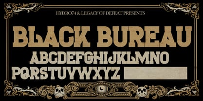 The Black Bureau is a slab structure. Uppercase only.
 - Harrington - Unknown license

- Raceway - Unknown license

- Johabu by Monotype,
$29.99Johabu is based on Gebrochene Fraktur, a lighter softer sort of type, compared to the German forms of the same period. Johabu was drawn by Johannes Bureus, around 1620, cut and cast by Peter van Selow in Stockholm. Johannes Bureus, archaeologist and linguist, designed and let Selow cast runes in 1598, and he became the first Swedish keeper, archivist, of the National Record Office State Archives. - Agency FB by Font Bureau,
$40.00 ATF Agency Gothic was designed by Morris Fuller Benton in 1932 as a lone titling typeface. In 1990, David Berlow saw potential in the squared forms of the narrow, monotone capitals. He designed a lowercase and added a bold to produce Font Bureau Agency, an immediately popular hit. Sensing its potential to be than just a useful condensed face, Font Bureau developed Agency into a major series offering five weights in five widths; FB 1990-95
 - HipHopDemi - Unknown license

- Ezzo by DSType,
$26.00First designed for a design bureau, Ezzo is now available in 6 weights with italics and alternates. Includes plenty of OpenType features, like SmallCaps, Alternates, Ligatures and Swashes. - TBS Greak by TypoBureau Studio,
$25.00 TBS Greak is an All Caps bold round font for display purpose inspired from 60s to 90s vibes Retro font, this font support multilingual languages and free update feature. published by Typo Bureau Foundry.
 - OCR One by ParaType,
$25.00Designed at ParaType in 1997 by Tagir Safayev. Based on OCR-A typeface (1968) of American Type Founders. A simple sans serif typeface designed to meet the requirements of the US Bureau of Standards for optical character recognition. - Quant Antiqua by ParaType,
$30.00 The typeface was designed at the Polygraphmash type design bureau in 1989 by Lyubov Kuznetsova. Based on the typeface Literanutnaya (Latinskaya) of the Berthold typefoundry (St.-Petersburg, 1901), a version of Lateinisch typeface of H. Berthold (Berlin, 1899). For use in text matter.
 - Moving Message JNL by Jeff Levine,
$29.00 A vintage printer's cut for the masthead of the "Fed-O-Gram" (a monthly publication of the Farm Bureau Federation, Inc.) had its title set in letters that emulated a moving message board. This design formed the basis for what is Moving Message JNL.
 - Standard Poster by ParaType,
$25.00 Designed at Polygraphmash type design bureau in 1986. Based on "English" bold styles of the Ossip Lehmann type foundry (St.-Petersburg), of mid-19th century. The digital version was developed at ParaType in 1992 by Vladimir Yefimov. For use in advertising and display typography.
 - Route 66 NF by Nick's Fonts,
$10.00 Statistics Prove. Near and Far. That Folks Who Drive Like Crazy. Are! Burma-Shave. In the days before the Interstate Highway system, you were likely to encounter a series of signs like this, somewhere in the backwoods between the large and small towns connected by the U.S. Highway system. The fonts in this series are based on the typefaces used on U.S. Highway signs from the 1930s to the 1950s. Included in each font are a sign shield in the backslash position, and a Burma-Shave logo in the section mark position. The Truetype and Opentype versions contain the complete Latin language character set (Unicode 1252) plus Central European (Unicode 1250) languages as well.
 - Infrastructure JNL by Jeff Levine,
$29.00 A 1930s-era poster to "See America - Welcome to Montana" was issued by the United States Travel Bureau; one of the WPA (Works Progress Administrations) projects promoting travel and tourism within the country. The hexagon-inspired angular lettering on the poster provided the inspiration for Infrastructure JNL.
 - OldeChicago - Unknown license

- Bachenas by ParaType,
$30.00 The typeface was designed for Polygraphmash type design bureau in 1963 by Lithuanian book and type designer Vitoldas Bachenas. There is a low-contrast Serif with some unusual elements. For use in text and display matter. The digital version was developed for ParaType in 2003 by Lyubov Kuznetsova.
 - Travel Brochure JNL by Jeff Levine,
$29.00 A vintage booklet from the Japan Tourist Bureau entitled "How to See Matsushima and Environs" had the title hand lettered in the Art Deco style which is the basis for Travel Brochure JNL. For those who prefer a more traditional 'E', it is located on the broken bar keystroke.
 - Izhitsa by ParaType,
$25.00 Designed at Polygraphmash Type Design Bureau in 1988 by Svetlana Yermolaeva. Based on Kirillitsa (1982), inspired by typographic poluustav of the Printing Office of the Russian Empire Academy of Science (late 19th century). Shadow style was added by Alexander Tarbeev in 1994. Latin alphabet was added by Oleg Karpinsky in 2009.
 - Lidia by ParaType,
$25.00 The decorative title typeface was designed at Polygraphmash type design bureau in 1967 by Iraida Chepil. It is a decorative variant ('open', or 'engraved') of classical serif typefaces. For use in magazine headlines, title and display typography. The revised and completed digital version was designed for ParaType in 2005 by Victor Kharyk.
 - Mysl by ParaType,
$30.00 The typeface was designed at the Polygraphmash type design bureau in 1986 by Isay Slutsker, Svetlana Yermolaeva, Emma Zakharova. Based on Polytizdatkaya type family, 1966, by Vera Chiminova, inspired by the typefaces of the French mid-16th century punchcutter Claude Garamond. The family was initially developed for Mysl Publishers, Moscow. For use in text matter.
 - Kudryashev by ParaType,
$30.00 The typeface (formerly known as Kudryashevskaya Entsiklopedicheskaya) was designed in 1960-1974 by Nikolay Kudryashev and Zinaida Maslennikova at Polygraphmash type design bureau for the Bol'shaya Sovetskaya Entsiklopedia (the Large Soviet Encyclopaedia) publishing house. New improved digital design and extention of character set was done by Natalia Vasilyeva and released by ParaType in 2008
 - Chica Mono - Unknown license

- SchoolBook by ParaType,
$30.00The typeface was designed at the Polygraphmash type design bureau in 1949-61 (project manager Elena Tsaregorodtseva). Based on Shkolnaya ('School') typeface, 1939 (project manager Evgeny Chernevsky), a version of Century Schoolbook of American Type Founders, 1915-1923 by Morris F.Benton. The low-contrast text typeface of the Ionic-Legibility group, it is designed expressly for schoolbooks and children books. - Bazhanov by ParaType,
$30.00 PT Bazhanov™ was designed at Polygraphmash type design bureau in 1961 by Michael Rovensky (1902-1996). Based on the lettering by Moscow book designer Dmitry Bazhanov (1902-1945). Old-fashioned flavor of this design recreates the Soviet hand-lettering style of the 1940s. For use in title and display typography. The digital version was developed for ParaType in 2001 by Lyubov Kuznetsova.
 - New Journal by ParaType,
$30.00The typeface was designed at the Polygraphmash type design bureau in 1951-53 by Lev Malanov, Elena Tsaregorodtseva et al. Based on Cyrillic version of Excelsior, 1931, of Mergenthaler Linotype, by Chauncey H. Griffith. Excelcior Cyrillic was developed in 1936 in Moscow by Professor Michael Shchelkunov, Nikolay Kudryashev et al. A low-contrast text face of the Ionic – "Legibility" group. - Skyline by Font Bureau,
$40.00 Skyline was commissioned from Font Bureau by Condé Nast specifically as a headline typeface for Traveler magazine. This strongly personal work by Imre Reiner from 1929 and 1934 was known in Europe as Corvinus. Skyline Black and Bold Condensed offer immediate headline recognition through Reiner’s variations on the themes found in the classical Modern structure. Both styles were adapted by Jane Patterson; FB 1992
 - Lazurski by ParaType,
$30.00 Designed at Polygraphmash type design bureau in 1984 by Vladimir Yefimov, with the addition of demi and demi italic. Based on a hot-metal typeface (1962) by Moscow book designer Vadim Lazurski (1909–1994), inspired by the early 16th century typefaces of Italian Renaissance. The typeface is useful for text and display composition, in fiction and art books. An 'expert set' was added by ParaType (ParaGraph) in 1997.
 - Belucian by Font Bureau,
$40.00 The Belucian series offers a distinguished text design supported by dynamic headline structure. In need of a distinctive display style, Smart magazine asked Font Bureau in 1990 to revise the work of Lucian Bernhard from 1925. David Berlow prepared Belucian Demi, now accompanied by Kelly Ehrgott-Milligan’s 1994 Demi Italic, added Book and Book Italic for text, and designed Ultra for dynamic impact in headlines; FB 1990–94
 - Belizio by Font Bureau,
$40.00 The eight-part Belizio series updates the first Font Bureau typeface. David Berlow’s family is based on Aldo Novarese’s Egizio, designed in 1955 for Nebiolo. It was first prompted by the popularity of Haas Clarendon, designed by Hoffmann and Eidenbenz, an impeccably Swiss revival of the traditional English letterform. Aldo Novarese was among the first to investigate a true italic designed in the Clarendon style; FB 1987–98


Page 1 of 3Next page