49 search results
(0.005 seconds)
- Bueno by FolkCraft Studio,
$21.42 Elevate your design game with the Bueno Font Family, a stunning creation by the talented team at FolkCraft Studio. From extra light to extra bold, each style boasts a unique, detailed, and handmade look that sets it apart. Dive into the world of possibilities with Bueno Font. Experience its captivating allure in all caps with wide spacing for a classy aesthetic, or let it shine in a mix of capital and lowercase letters for a timeless appeal that transcends trends. Envision the Bueno Font Family as the centerpiece of your creative projects. Its versatility makes it perfect for gorgeous logos, captivating displays, elegant headers, enchanting invitations, memorable save-the-dates, and timeless wedding designs. Imagine the impact it can have on titles, web layouts, and comprehensive branding strategies. Don't miss out on the opportunity to enhance your designs with the Bueno Font Family! Ideal for online uses and printing, this font collection is your ticket to creating sophisticated and stylish visuals that leave a lasting impression. Perfect for a wide range of applications, from logos to web layouts, this font family is a must-have for designers seeking to make a statement.
 - Sueno by Mix Fonts,
$13.00 Looking for a font that's chic, stylish, and oh-so-slightly handwritten? Look no further than MIX SUENO! This monoline semi-script was crafted with care using an iPad Pro and Apple Pencil, and is the perfect addition to any design project. Whether you're creating invitations, social media graphics, or just sprucing up your website, MIX SUENO will bring a touch of sophistication and personality to your work. So don't hesitate - give MIX SUENO a try today!
 - Buena by mazefonts,
$53.00 Hello Buena - From Wood to Digital Type Buena is the first word I read on a letterpress paper, printed by my colleague and friend Wolfgang Wick. I was fascinated by the power of this fat wooden letters at first glance. So I started to create a digital version of it and »Buena Black« was born. Due to the fact that the original punches had only upper- case glyphs, I created the lowercase characters by myself. After that it was time to design the family... Buena is full of OpenType features. To get fully acces, go to www.mazefonts.de and Download the Type Specimen.
 - Buenos Signature by Balpirick,
$15.00 Buenos Signature - a beautiful monoline script that's clean, elegant and perfect for a range of design projects! With its smooth, effortless lines and understated sophistication, this font is the perfect choice for those who want a modern look that's still timeless in its appeal. Crafted with precision and care, this font is incredibly versatile and can be used for a range of design projects, including logos, branding, invitations, packaging, and more. With its simple yet refined aesthetic, it's sure to make a lasting impression on anyone who sees it. - also multilingual support Enjoy the font! Feel free to comment or feedback! Thank you!
 - Bernat Burnoe by Muksal Creatives,
$12.00 Bernat Burnoe Modern Display Vintage Font, special glyphs, ornament and multilingual support. It's a very versatile font that works great in large and small sizes. Perfect for editorial projects, Logo design, Clothing Branding, product packaging, magazine headers, or simply as a stylish text overlay to any background image.
 - Buena Park JF by Jukebox Collection,
$32.99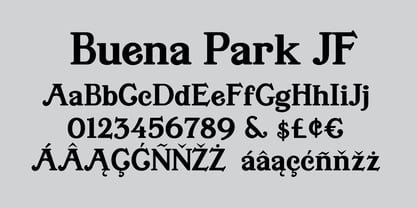
- Caminito by JVB Fonts,
$15.00 This fontface is inspired on Argentinean classic and traditional art craft named as Fileteado Porteño. Caminito is available in 10 layered styles for compose with multi combinations and a extra of ornaments. Highly recommended to be used for colorized titles and display texts. Fileteado Porteño is a type of artistic drawing, with stylized lines and flowered, climbing plants, typically used in Buenos Aires, Argentina. It is used to adorn all kind of beloved objects: signs, taxis, lorries and even the old colectivos, Buenos Aires’s buses. Filetes (the lines in fileteado style) are usually full of colored ornaments and symmetries completed with poetic phrases, sayings and aphorisms, both humorous or roguish, emotional or philosophical. They have been part of the culture of the Porteños (inhabitants of Buenos Aires) since the beginnings of the 20th century. One of the most highlighted and recognized artists nowadays is Alfredo Genovese, who does a great job of teaching and claim this art and craft. The name Caminito reminds the emblematic and iconic Buenos Aires neighborhood immortalized by Carlos Gardel in music, in the tango.
 - Mabella - Unknown license

- Olivia01 - Personal use only

- Violette01 - Unknown license

- Cilogie - Personal use only

- Dekers - Personal use only

- Frida01 - Personal use only

- Nolla - Personal use only

- Linea - Unknown license

- SL Gardel by Sudtipos,
$29.00SL Gardel is a tribute to the genial tango singer Carlos Gardel (1890-1935). Gardel was portraited with proverbial slenderness by Natalia Español in SL Gardel. SL Gardel synthezises the most outstanding facets of the "creole trush" (zorzal criollo) through its exclusive icons: his seduction, his tango, his magic, his style. His Buenos Aires. Integrally worked through the typical modulated trace style founded in Buenos Aires tango graphics, the SL Gardel's imaginery unfolds a singular fan of images-concepts. The tango spirit reflected trough an excellent developement. SL Gardel is an original iconographic illustration library in True Type format. SL Gardel takes part of the "Icons of Icons" Gallery, developed by SinergiaLab for Sudtipos. - Anabella by RNS Fonts,
$33.00 Anabella is a typeface made for the Master’s Degree in Typography at the University of Buenos Aires. It is inspired by the posters of pizzerias located in Naples, Italy; in order to be used in the pizza franchise Giuseppe in Buenos Aires, Argentina. The font preserves and rescues gestural features of these posters, adding a vertical axis and high contrast, typical of the Italian types that arrived in the city product of the immigration. The stroke with brush provides a more organic quality to the sign and provides connotative features. The family has three variables for the different applications that may be required in a pizza place: Italic for bodies greater than 16 pt, Roman for short texts up to 14 pt, and Stencil for use in brands and titles. Anabella was selected to participate in the eighth typography biennial Tipos Latinos.
 - Tita Script by Latinotype,
$59.00 Tita is dedicated to my grandmother Hebe, witty and arrabalera 1. The font is inspired by Milonga 2 music and the fileteado porteño 3. I picture it at The Moulin Rouge, sparkling, provocative, loving. It evokes Tita Merello and my grandmum singing her music. Tita is Argentinean to its very core. A font to shout goal and dulce de leche 4 with passion! Its curves originate from polirhythmic calligraphy, which I learnt from my mentor Silvia Cordero Vega. Tita is a pedigree script that is based on hand lettering and Sandra Biondi’s calligraphy works. Font digitalisation by Daniel Hernández. Edited by Javier Quintana / Programmed by Manuel Corradine. 1. A person from the arrabal (a working class neighborhood on the outskirts of the city of Buenos Aires) 2. Musical genre originated in the Río de la Plata areas of Argentina and Uruguay 3. Decorative hand lettering and artistic style that is frequently spotted in Buenos Aires 4. Sweet milk sauce
 - La Portenia by Sudtipos,
$69.00 La Portenia pays homage to the spirit of early 20th-century show card writers and type designers. This face has two variations: La Portenia de Recoleta is slightly more formal and polite, while La Portenia de la Boca has longer, more extravagant flourishes and indulges in more interletter space. This showier variant is reminiscent of signs found in Buenos Aires. Both have been designed by Diego Giaccone and Angel Koziupa, and engineered and expanded by Alejandro Paul.
 - Sopi by Tipo,
$40.00 Sopi is a typography of ornaments, borders and combined frames. It was inspired by the design of limestone tile floors, located in different places in Buenos Aires. All characters have the same measure, which enables the possibility of any desired combination. In the case of edges or combined frames, the typography was programmed in a way that is possible to generate textures with 2 or more colors, attempting to rescue the colorful designs that were original thought in the limetone tile floor.
 - Calaveras by Design is Culture,
$29.00 In August of 2009, I was commissioned by Zoo York, a New York City based skateboard company, to visit Buenos Aires to study and document street typography. As soon as my taxi driver took the bustling street Entre Ríos, it was clear that the city and I were going to be good friends. Many of the independently owned businesses on Entre Ríos are adorned with handmade signage. These signs are painted in a style called Fileteado which is a century-old Argentinian type of lettering and floral ornamentation. Nowadays, Fileteado is still a prominent part of the city’s landscape, coloring the façades of restaurants, bars and coffee shops. Calaveras and Diablitos are two new typefaces that were inspired by Fileteado. Stylistically, the fonts are a return to a rhythmic and playful sensibility reminiscent of Vitrina and Cuba, two fonts that I designed in 1996. Along with dynamism and dance, these new fonts incorporate a rigor and functionality essential to labelling any font a ‘workhorse.’ The names Calaveras and Diablitos, came from the name of a song by the infamous Buenos Aires rock band, Los Fabulosos Cadillacs. —Pablo A. Medina
 - Diablitos by Design is Culture,
$29.00 In August of 2009, I was commissioned by Zoo York, a New York City based skateboard company, to visit Buenos Aires to study and document street typography. As soon as my taxi driver took the bustling street Entre Ríos, it was clear that the city and I were going to be good friends. Many of the independently owned businesses on Entre Ríos are adorned with handmade signage. These signs are painted in a style called Fileteado which is a century-old Argentinian type of lettering and floral ornamentation. Nowadays, Fileteado is still a prominent part of the city’s landscape, coloring the façades of restaurants, bars and coffee shops. Calaveras and Diablitos are two new typefaces that were inspired by Fileteado. Stylistically, the fonts are a return to a rhythmic and playful sensibility reminiscent of Vitrina and Cuba, two fonts that I designed in 1996. Along with dynamism and dance, these new fonts incorporate a rigor and functionality essential to labelling any font a ‘workhorse.’ The names Calaveras and Diablitos, came from the name of a song by the infamous Buenos Aires rock band, Los Fabulosos Cadillacs. —Pablo A. Medina
 - Butan by Butan,
$30.00 Butan was originally designed as a typographic project for the Specialization in Typography Design at the University of Buenos Aires, during the years 2013 and 2014. The project was conceived as a “wayfinding” font, that would be functional for bilingual signage systems. The main guideline for its design was to create a font that could be readable from great distances and it could be potentially used in signage systems. Therefore the neutral aesthetics and clean shapes were very relevant in order to create this particular font.
 - Chivertta by Eurotypo,
$38.00 Chivertta combines elements of casual and modern aesthetics. The font is inspired by a logo discovered on the streets of Buenos Aires. One of Chivertta’s distinctive features lies in its careful design and its wide repertoire of ligatures and stylistic alternatives. This extensive collection offers a wealth of options, allowing designers to enhance their creative output, imbuing their designs with a greater sense of authenticity and realism. In essence, Chivertta transcends convention, offering a powerful tool for designers and resulting in designs that come out with authenticity and contemporary style.
 - Garrigos by Underground,
$- Set of ornaments based on the decorative motifs used by the first typographic workshop in Buenos Aires: “Imprenta de Niños Expósitos”, between 1780 and 1824. This set is the product of an extensive historical research that aims to identify the type that came from Europe to the City during colonial times, and during the first years of Argentina’s independence. This group has a lot of diversity, which fluctuates between organic baroque forms and geometric neoclassical. Its characters can be used in editorial design along with Roman typefaces, they work individually or grouped to form different figures, guards or frames. It was baptized in honor to the first printer who worked in the workshop: the Spanish Agustín Garrigós.
 - Parfumerie Script by Typesenses,
$64.00 Parfumerie Script is a sophisticated calligraphic font defined by its smooth curves, clean lines and the finest of fine strokes. Graceful and refined in its most basic script form, a range of Swash and Decorative alternates (including a unique local style called Filete Porteño, an ornamental form native to Buenos Aires) allows users to elevate their designs to higher levels of aesthetic beauty and elegance. Parfumerie Script Pro contains over 2500 glyphs, among which are swashes, ornaments and decorative alternates. Some alternatives are offered separately too. Use professional software that widely support Open Type features. Otherwise, you may not have access to some glyphs. For further information about features and alternates, see the User Guide
 - Provincial Railway by Fabio Ares,
$19.99 Provincial Railway is the first product of argentine typographic archeology project called "Tipografía Histórica Ferroviaria" (Fabio Ares & Octavio Osores, since 2012). Is about the signboards of the stations of the P1 line of the Provincial Railway of Buenos Aires (1907-1977). The letter of this signboards can be described as display type, with a tall box and a constructivist style, with elementary geometric shapes and without line modulation. Although without a doubt, its differential feature is provided by the rectangular shapes that it has towards the ascending and descending lines, which in some cases coincide with the stems, showing a curious rhythm in the composition of the text line. The family is completed with complementary fonts of different styles. The proceeds from the sale of the fonts will be used to finance the project.
 - Barata Display by Estudio Arellano Type Foundry,
$25.00 Barata Display is an all caps script family font inspired by the street vendors and informal commerce in Latin countries. A condensed defined and thick stroke evokes the chalk signs that are made in "tianguis", markets, greengrocers, barbecues and flea markets from Los Angeles to Buenos Aires. It is a typeface that "SCREAM" buy me, save money, discounted, almost Free, opportunity!. What distinguishes the New Barata Display from Estudio Arellano Type Foundry is the expressive power of its structure. The Alphabet is built on the geometric principle of free traces from freehand writing. Composed of 236 capital Roman characters, Barata Display includes most common accents and diacritics. Barata Display can be used in any kind of commercial or personal promotion, in graphic design, web, print, animation, etc. Perfect for price labels, tags and other applications such as posters and t-shirts. It is a typeface ideal for headlines and Lettering.
 - Découpe by Sudtipos,
$39.00 Sudtipos is proud to announce the release of Découpe, a display typeface program of eight fonts, designed by María Carla Mazzitelli and born during her Masters in Typography at the University of Buenos Aires (FADU-UBA). Inspired by gestural graphic expressions –like paper cut-outs (découpes) and spontaneous handwriting– from the most diverse postmodern and contemporaneous artists of the design world, Découpe has been created specifically to be used in big sizes. A little bit irreverent and effervescent from time to time, this gestural sans serif family reveals its contrasts and asymmetrical shapes when it breaks through display functions. From Light to Extra Bold, it reaches the most extreme weights, looking for power and impact. This program is meant to catch the eye in typographic compositions, to shout it out loud and clear. Definitely, to be seen. *Découpe has been recently selected to be part of different typography exhibitions such as Tipos Latinos and the Type Directors Club.
 - Bohemia by Linotype,
$29.99Argentinean designer Eduardo Manso created the Bohemia type family in 2003. Bohemia's cunning and elegant essence shows off refined letters that evoke the Transitional style typefaces like Baskerville, though most Baskerville-like designs tend not to be as curvaceous as Manso's! True to form, Bohemia shines in smaller text sizes, like 9 point and above, while still maintaining a unique character and spirit. Bohemia is a great alternative to better-known text faces. The critics have been raving. Bohemia came to Linotype via its fourth International Type Design Contest (ITDC) [Link] in 2003, where it received one of the three top awards. Under the name Argot, this typeface received a Certificate of Excellence in Type Design from the Type Directors Club of New York in 2004. Bohemia was also selected for inclusion in the 21st International Biennale of Graphic Design 2004 in Brno, Czech Republic, and was later named one of the most relevant works in the Bienal Letras Latinas 2004 exhibition, which traveled through Buenos Aires, San Paolo, Santiago, and Vera Cruz." - Ragazza Script by Latinotype,
$79.00 Ragazza Script isn’t just another display typeface. It honors the greatest handwriting skills but in a different way. Although It doesn't represent any traditional calligraphy style, it is still part of that expressive world. With more than 1000 glyphs, and taking advantage of the Opentype features, Ragazza is full of personality. When in use, it gives a feel very close to ornamental Copperplate mixed with some kind of modern 'high-contrast' typeface. Lots of alternates, swashes and initial capitals are the spine of this face, assuring almost infinite combination possibilities. The early forms that would eventually lead to what Ragazza is today, began as a college project –around 2006– in the context of the 'Hyperfuente' exercise developed during Typography 2, chair E. Longinotti, at the University of Buenos Aires. But that seed would never stop growing. Since then a lot of work had been made to take that initial project to a professional quality level. Ragazza Script is perfect for headlines and short phrases. It is the brand new modern script, designed by Guille Vizzari and published by Latinotype.
 - Newbery Sans Pro by Sudtipos,
$49.00 Newbery Sans is a new contrasted sans serif designed by Alejandro Paul and the Sudtipos team. As Paul has lately found inspiration from different German instructional books, Newbery Sans finds its initial inspirations from the lettering work of E. Nerdinger and invokes the spirit of German designs but is imbued with personality all its own. The idea was to make the letterforms more usable and suitable for everything from corporate branding to editorial. It is an elegant, functional family with contemporary detail that will effortlessly meet the demands of the screen and printed page. From a condensed thin to an expanded black, Newbery Sans provides a usable workhorse system of three widths and seven weights, each with the original design of real italics, a selection of alternate glyphs and a complete set of small caps. Each weight is professionally crafted and includes extended Latin support for Central, East and Western Europe languages. The font’s name nods to its imagined uses in airports and street signage: Jorge Newbery was one of the first Latin American aircraft pilots, Newbery is the street where I live and it is also the name of Buenos Aires’s local airport.
 - Speakeasy by Sudtipos,
$79.00 Speakeasy is a 5-font combo thematically built as a toolset for designing menus and liquor labels as well as coffees, restaurants and signs when the desire is to communicate with style. Originally put together to be used by the most famous speakeasy in Buenos Aires, this set contains a script, a minor (almost flat) wedge serif, a flare serif, a sans serif, and a bold Didone. The seed for the script was found in a German lettering book, and the other fonts reflect the familiar advertising and announcement styles of the early 20th century. The Speakeasy script comes with two different ways to connect the letterforms. Also included are many alternates, swashes, endings and flourishes — all accessible via OpenType features or glyph palettes. Speakeasy Modern and Speakeasy Flare are small cap fonts, and come with a few alternates. Speakeasy Sans and Speakeasy Gothic come with full sets of majuscules and minuscules, but contain small caps and a few alternates as well. A few rules and ornaments are also sprinkled throughout the set. This combination of fonts worked wonderfully for the project that called for it. Hopefully it will work just as well for your project.
 - Epica Pro by Sudtipos,
$49.00 Epica is a contemporary interpretation of the Venetian Renaissance types. A humanist type family with a contemporary design. This family encompasses different typographic scenarios with emphasis in style and functional equilibrium. Its letterforms show the visual richness of Epica that includes some calligraphic reminiscences perfectly legible in small and display sizes. Its strong personality makes it distinguish, because it perfectly combines the elegance of antique typographies and the forcefulness of contemporary ones. This family has been designed in two different moments. Epica Serif, which have a more classical design, was finished 5 years ago in its first version. The first sketches were drew 8 years ago during the Master of Type Design at the University of Buenos Aires. Through the years was re design in several times to the point of reaching its current version. On the other hand, Epica Sans was completed in 2020 and is the counterpart of Epica Serif. A complementary system designed to enrich the serif version and give new options for hierarchy and composition. This is a versatile type family perfectly fit for books, editorial, and usage in print and on screens. It possesses great legibility in body texts, which makes it ideal for extended reading and supports a variety of languages.
 - Abelina by Sudtipos,
$69.00 «Abelina» is a typeface that can be used in display sizes for titles where part of the central premise is to emulate certain features of gestural handwriting. Concepts like spontaneity, speed and fluidity, associated with the use of certain calligraphic tools – in this case the pointed brush – led to a typographic result based on the pattern-like structure coming from the chancery and italic calligraphic models. «Abelina» - initially designed by Yanina Arabena (Calligrapher, Graphic Designer and Typographer) - is reborn to make way for “Abelina Pro” through the solid work of Guillermo Vizzari working together with Ale Paul from Sudtipos. Throughout its use, “Abelina Pro” maintains the structure of a firm style, integrating a dynamic rhythm in the composition of short texts and offering personality to each of the words it builds. It has over a thousand glyphs, including several alternates, ligatures combination, initials and miscellaneous to reinforce the idea of the author of merging a calligraphic project in the typographic world; allowing new ways to capture this great universe of italic faces. «Abelina» project was initially born as a typographic project developed by Yanina Arabena – tutored by Ale Paul and Ana Sanfelippo – under completion of the Specialization in Typography Design at University of Buenos Aires, Argentina, during the years 2011 and 2012.
 - Replete Sans by Sudtipos,
$49.00 Sudtipos’ new sans serif font Replete is inspired by the mixture of aesthetics and philosophies found on the streets of metropolitan cities the world over. Buildings constructed throughout the twentieth century, including those made in the Art Deco style or influenced by the Bauhaus’s gospel, stand side-by-side as symbols of their time. Typography is one factor that bonds these vistas, and simultaneously further complexifies them. Art deco letters appear on storefronts and signage in Europe’s oldest cities and as remnants of the Golden Age of economic expansion for Latin America. Typography, like architecture, sometimes coexists in perfect harmony, and other times in ideological opposition. But it is these juxtapositions in places such as Shanghai, New York, London, Buenos Aires and Tokyo that shape each city’s identity. Replete is inspired by this mixture. We wanted to create a useful modern sans serif family – a set of 7 weights with playful geometric alternates – that allows you to combine characters including wide-width and filled letterforms. Replete is apt for long texts, and equally, for instances where letterforms can stand together like a cityscape. Replete means full, packed and abounding … it is a sans, it is grotesque, it is geometric and it is Deco. Replete is a new family that has a little of everything we like, equipped with everything you need to design anything you want.
 - Confitería by Sudtipos,
$39.00 Confitería is the Spanish word for a shop where sweets and chocolates are made and sold, which sometimes has a tea room. And now Confitería is also a font that brings to mind lettering piped on delicate cakes ... sweet but never sickly. This font captures something of that simple and innocent beauty of traditional confiterías, where good manners will never go out of fashion, menus are elegant and time comes to a standstill to make way for life’s little pleasures. A confitería is a perfect place to share sweet tidbits with a friend or date, eavesdrop on the conversation at the next table, read a book, or just people-watch from the window. I celebrated my last birthday at one. There is one iconic confitería in Buenos Aires that I love more than the rest because, some 60 years ago, it put up its marvellous sign and never took it down. Walking by it is sure to bring a smile to your face. It’s big. Very big. And the lettering in its name is written in a timelessly beautiful vertical script – the most attractive I have ever seen. I joined forces with Sol Matas – who worked with me to update the Montserrat font –to design this geometrical connected font with pleasant, even strokes. It is elegant and saccharine-free. And to top it off, it comes in several flavors. Welcome! What can we get you?
 - Mono To Go by buero bauer,
$20.00 Mono To Go is a monospace typeface with a constructed, grid-based body and a playful and quirky spirit. Built from circles and other simple geometric shapes, it sees itself as a contemporary interpretation of the early, consistently reduced typefaces of modernism. With its modular concept, the typeface invites you to "build" individually combined word pictures. Depending on your preference for the type of composition, stylistic alternatives and open typeface features offer you a wide range of possibilities. The rhythm of the glyphs and their distinctive ascenders and descenders give the typeface a confident character for bold designs. The typeface works best in larger sizes, e.g. for brands, poster and cover designs, film titles, exhibition displays or generally for striking headlines. The character set contains 600 glyphs, including full language support for Western, Central and Eastern Europe, digits and oldstyle figures, punctuation, currency and mathematical symbols, and the entire set as small caps. mono to go was designed by buero bauer (2019–2021). Special thanks to Franziska Weitgruber for her support.
 - Esmeralda Pro by Sudtipos,
$59.00 From the beginning “Esmeralda” was born with a strong influence of the classical “capitalis monumentalis”, carved in stone. In the same way, the origin of this majuscule writing emerged from the brush, from a way of writing made merely by hand. For this reason, these two universes were intended to lie beneath the shape of each letter, redefining them. And this combination of styles should also be reflected in a lower case set that also allows to open up the spectrum of usage possibilities. Foundational calligraphy represented a solid base for the development of lower case glyphs, ensuring proper interaction with the upper case letters. “Esmeralda” features a great number of ligatures that mix classic structures with a more contemporary impression. With more than eleven hundred glyphs, it provides a multiplicity of uses across a wide combinatory of ligatures, alternative signs, initial caps, miscellaneous and connectors; each one of them accessible through Open Type. “Esmeralda” is perfect to speak with a classical yet fresh, modern – and a little bit bold – tone of voice. Designed by Guille Vizzari, together with the tough and remarkable work of Ale Paul, in use “Esmeralda” stands out in a subtle and unexpected way that’s almost unnoticeable. Its delicate yet solid curves, serifs and endings give each composition a fine, elegant and exquisite feeling, along with a firm and sturdy look. “Esmeralda” was initially born as a typographic project developed by Guillermo Vizzari – tutored by Ale Paul and Ana Sanfelippo – under completion of the Specialization in Typography Design at University of Buenos Aires, Argentina, during the years 2011 and 2012.
 - Hot Script by Lián Types,
$49.00 Say hello to another of my hot and trendy scripts, Hot Script! I got the inspiration for this one in the world of sign painters. My neighbourhood, and more specifically the avenue were I live, is very well known for its ''parrillas'': For those who don't know what this means, well, it may be better to live the experience rather than reading these lines. Villa Urquiza is full of restaurants with an argentinian flavour, with a ''gauchezco'' feel. Here you can taste some of the best ''asados'' in the entire world. Ok, this made me hungry, let's go back to type: These amazing venues still mantain genuine elements from the past, and try to preserve the beauty of the handcrafted. Parrillas of Buenos Aires have all their walls, windows and doors lettered with chalk or paint. I've always wanted to make a font out of that, and Hot Script is my first attempt. I believe the results are great! Hot Script follows some rules of the flat brush (see terminals, and tails especially in caps) but its contrast of thicks and thins was manually altered to make the font better for a wider range of uses. Although the sexy curves and versatility of Hot seemed to be enough, I decided to spice it a little more by creating some layers for it: Hot Script Shine Solo or Hot Script Shades Solo combined with Hot Script will give outstanding results. (Look for them combined in the posters above and dare to deny it!) Go make your project more savory! This font is Hot, hot, hot!


Page 1 of 2Next page