10,000 search results
(0.024 seconds)
- Plasmatica Ext - Unknown license

- Plasmatica Ext - Unknown license

- EXT Unicase by Kevin Thrasher,
$5.00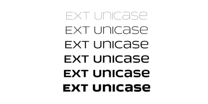
- Labelo Ext by T-26,
$19.00 - Exo - 100% free

- Exit by FSD,
$50.00Exit is my first typeface (designed in 1988). The relationship to Neville Brody's work is evident but with personal touch - Text by Alias Collection,
$60.00 Whereas blackletter types were hand written, Text letterforms are drawn using a series of graphic shapes that slot together in a series of permutations, one set for lower case and another for the upper case. As the link between the method of construction of the letterforms has been removed from the appearance (the quill pen with which they were written resulting in the angle and sharp stresses) there is no logic for these stylistic elements to work in any set way. As this fundamental rule of the blackletter style has been removed the typeface has become something other than a typical or derivative blackletter font.
 - Este by Michael Prewitt,
$20.00 Este is a modern sans serif typeface. The family has 7 weights, ranging from Thin to Bold and is suited for branding, logo, transportation, product design, advertising and packaging. The modern feel is complimented by alternative characters via the OTF stylistic sets.
 - Exited by Sensatype Studio,
$15.00 A Modern Sport Font that perfect for technology, sport, racing, action design project. A new Sans Serif Font that we created special for Headline, Title and more stand out typography needs that will add your variations. It's so perfect to add your style and headline overview. And specially for Headline font, we crafted for futuristic style and modern feels so enjoy to create any project that will show your main idea out. Exited Modern Sport Font ready with: Any options to get creative variations Preview as a inspirations that you can do with Exited font Ready with All Uppercase characters Wish you enjoy our font. :)
 - MTF Jumpin Jack EXT by Miss Tiina Fonts,
$10.00 Jumpin’ Jack Extended is a fun, cartoon-like display font capable of taking any product out of the ordinary! Use it on bold and bright creations such as banners, posters, covers, titles, magazines, etc. This bouncy fun font is a perfect addition to your collection!
 - Slab Four Rounded Ext by Wooden Type Fonts,
$15.00 An original slab serif design inspired by the slab serif designs of the 19th century, with a modern geometric look, bold version, extended.
 - LT Eat - Personal use only

- Neospace Exp - Personal use only

- Nuixyber Next - Personal use only

- AB Exp - 100% free

- Komika Text - Unknown license

- Let's Eat - Unknown license

- Covington Exp - Unknown license

- Next Star - Unknown license

- Exus Pilot - Personal use only

- Covington Exp - Unknown license

- Komika Text - Unknown license

- PanAm Text - Unknown license

- Komika Text - Unknown license

- Covington Exp - Unknown license

- Komika Text - Unknown license

- Next Star - Unknown license

- Covington Exp - Unknown license

- Medici Text - Personal use only

- Alethia Next by Pepper Type,
$40.00 Alethia Next is a grotesque sans-serif typeface with high contrast in all weights. It has been designed to serve as a display typeface in various editorial projects, such as magazines or corporate brochures, as a sans-serif pair to serif types of modern style. Alethia Next comes in 7 weights + matching italics and upright italics, each supporting numerous Latin-based languages as well as major Cyrillic languages including Bulgarian local forms. It is packed with OpenType features like ligatures, small caps, and numerous alternatives.
 - Konga Next by RodrigoTypo,
$25.00 Konga has gone through different changes, the first idea was born in 2014 with the help of Andrey Kudryavtsev, then some time passed and the Rough version was developed, and a long time passed and in 2022 the idea of redesigning was taken with Bruno Jara, in addition to making many styles such as Rough, Inline, Shadow, as well as dingbats which was based on Stefania Ahumada's graphics, which results in a family of 6 styles, with different Alternatives, perfect for informal titles.
 - Okomito Next by Hanken Design Co.,
$30.00 Okomito Next is a sans serif inspired by the classic typefaces that were imbued with a sense of functionality, boldness and industrial strength. OpenType features: Access All Alternates, Case-Sensitive Forms, Glyph Composition / Decomposition, Discretionary Ligatures, Fractions, Kerning, Standard Ligatures, Localized Forms, Mark Positioning, Mark to Mark Positioning, Ordinals, Proportional Figures, Stylistic Alternates, Stylistic Set 1, Superscript, Tabular Figures
 - Wedding Text by Tilde,
$39.75 - Faust Text by Solotype,
$19.95Barnhart Bros. and Spindler called this Faust Text when they introduced it in 1898. A quarter of a century later, they brought back a number of obsolete faces and renamed them. This one became Missal Text in their 1923 catalog. - Aaux Next by Positype,
$22.00 When the original Aaux was introduced in 2002, I intended to go back and expand the family to offer more versatility. Years went by before I was willing to pick it up again and invest the proper time into building a viable and useful recut. Just putting a new designation and tweaking a few glyphs here and there would not do the designer or the typeface justice; instead, I chose to redraw each glyph's skeleton from scratch for the four main subsets of the super family along with their italics. Each glyph across the super family is 'connected at the hip' with each style—each character carries the no frills, simple architecture that endeared so many users to it. The new recut expands the family to an enormous 72 typefaces! The original has spawned Compressed, Condensed and Wide subsets—all with corresponding weights—for complete flexibility. Additionally, all of the original weight variants have all been incorporated within the OpenType shell: Small Caps and Old Style Figures are there along with new tabular figures, numerators and denominators, expanded f-ligatures and a complete Central European character set.
 - Noam Text by TypeTogether,
$69.00 Adi Stern’s Noam Text shows that typographic progress is often in the small things — in the perfecting of familiar traditions and in staying loyal to the spirit of what came before. It can’t really be called progress unless it honours its history. In this way, TypeTogether is happy to introduce Noam Text: A Hebrew and Latin serif font that builds on its heritage with the twin tools of honour and progress. Since 1908, the Frank-Rühl fonts have dominated the Hebrew book and newspaper market. Noam Text’s design goal was to create a coherent family with both Latin and Hebrew serif text typefaces, each authentic to its own script, and which would serve as an alternative to last century’s predecessor. In short order, users will recognise Noam Text as a source of progress in its bilingual abilities. Hebrew and Latin have opposite reading directions, creating many issues: opposing directionality of the open counters; vertical stress in Latin, but horizontal in Hebrew; fewer extenders in Hebrew; and no Hebrew capital letters. All these have been taken into account in Noam Text’s modern design. Of unique importance — all punctuation marks have a Hebrew version, which makes each script complete and uncompromising. Among other technologically advanced details, Noam Text was programmed for all expected scenarios of mixing Hebrew, Latin, figures, and punctuation. Noam Text is intended mostly for setting long texts, so it strives to achieve maximum legibility in minimum space with its large x-height, short and fairly condensed Latin capitals, large and open counters, and low contrast. Originally derived from the Hebrew, the shallow horizontal curves and strong baseline serifs provide dynamism and enhance the reading flow. Noam Text Latin’s italic is rounded and reading friendly, is condensed to generate a lighter texture than the roman, and has a flowing stance. These virtues help it endure harsh printing conditions and subpar inks and paper. Noam Text’s three total weights provide a proper solution for integrating texts in both scripts, as well as a contemporary alternative for use in books, newspapers, and magazine design. Aligned with TypeTogether’s commitment to produce high-quality type for the global market, the complete Noam Text family displays an impressive amount of discretion, applying to wide use-cases by not edging too close to religious motifs or imbibing in secular indulgence. This means Noam Text can be the go-to family across the board and capitalise on the desire for clear typographic progress in this modern age.
 - Europa Text by Solotype,
$19.95This circa 1910 European face was introduced into the United States by a German type foundry traveling salesman during the great depression of the 1930s. We have used it quite successfuly in sizes as small as 10 and 12 point. - Jules Text by DSType,
$40.00 Jules Text is the perfect companion to the previously released Jules family.
 - Melville Text by Luhop Creative,
$27.00 Melville Family is a meticulously crafted font collection that falls under the transitional serif classification. It offers a variety of font styles, including italic and serif old style, with a total of 16 unique styles to choose from Melville is a versatile and flexible solution that can be used in various industries such as stationary office, newspaper, cover book, web design, and text. Discover how Neville can enhance your projects and meet your specific needs.
 - Placard Next by Monotype,
$50.99 Based on a Monotype 1930s condensed poster typeface, Placard Next is bursting with personality. Unexpected details appear throughout the design, from its wedged diagonals and single storey a to its round tittles – which would more ordinarily be square, and mechanical. The warmth and quirkiness of its character really shines through when set at larger sizes, making this a typeface for posters, headlines, and anywhere else designers need to make a statement. Designer Malou Verlomme has paid particular attention to the typeface's 'word images', further amping up its impact, and added some vintage flavor with Placard Next Round. As well as a striking display typeface, Placard Next's four widths and six weights – hairline to bold - mean it's a versatile design, that can be adapted for use in almost any environment. The complete family contains 48 fonts: 24 in Placard Next and 24 in Placard Next Round. It includes a large multilingual character set.


Page 1 of 250Next page