61 search results
(0.005 seconds)
- Bouh bouh - Unknown license

- Boule Plus by Ingo,
$33.00 CAPITALIZED, geometric, bold and round. If the typographer sees a font like that, it's enough to make his toes curl. But sometimes it just has to be that way. Geometrically constructed fonts do not necessarily have to be pointed and angular; It also works consistently around. And if I say it consistently, then in this case, that's done consistently. The basis for the BOULE is the circle. The letters are drawn with constant line width, the “corners“ and endings all have the same radius, the lines are all the same thickness. The BOULE consists only of capitals. There is only one difference in the use of uppercase and lowercase letters: in the uppercase letters, the round letters are circular, while the lowercase letters are narrow. The character set of the Boule contains all letters and accents to support the Western, Northern, Central and Eastern European languages with Latin alphabet. The BOULE is not only very fat, it also runs very tight; that is, the glyphs are very close to each other. To avoid "holes" due to unfortunate letter combinations, the BOULE contains ligatures for FT, ST, TT and TZ. There are also other versions of the font: BOULE Brillant on the one hand. In this version, simple highlights simulate a light incidence from the top right. These light edges give the font a decorative effect that makes it easy to think of wet sausages or balloons in some shapes. And finally the BOULE Contour. As the name implies, it is the outer contour of the letters, combined with a shadow at the bottom left. The name BOULE (French for ball) says it already: this font is globated. Therefore, it is also very suitable for all three-dimensional alienation effects. With simple light and shadow you can achieve a very convincing 3D effect with little effort.
 - Poum Boum by Larin Type Co,
$12.00 This is a fun font playful that is perfect for creating your project, it can be used to create a beautiful inscription for t-shirts, children's books, branding, small business, book magazine, stationery, marketing, blog, invitation and more.
 - The Bouns by Flawlessandco,
$9.00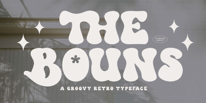 The Bouns is a Groovy Retro Font with fun and elegant style, so it's fitted for some retro project. There's some connected letters and some alternates that suitable for any graphic designs such as branding materials, t-shirt, print, business cards, logo, poster, t-shirt, photography, quotes .etc This font support for some multilingual. Also contains uppercase A-Z and lowercase a-z, alternate character, numbers 0-9, and some punctuation. If you need help, just write me! Thanks so much for checking out my shop!
 - Bou College - Personal use only

- Bow Tie by Pedro Teixeira,
$16.00 Bow Tie, a slight textured, organic and elegant signature. This modern, stylish but legible script is handy for logo, poster, headlines, invitations, cards and all display needs. The OpenType Features are: stylistic alternates that cover all latin language and cyrillic, ligatures and discretionary ligatures.
 - Gracious Bowing by Nathatype,
$29.00 Gracious Bowing is a meticulously designed display serif font to meet your design needs. It expresses formal yet simple nuances in modern, elegant designs. Its main characteristic is the consistent geometry, proportion, and line thickness on each letter to be legible. For this reason, you can use this font for any text sizes. In addition, you can improve your designs with the available features. Features: Stylistic Sets Ligatures Multilingual Supports PUA Encoded Numerals and Punctuations Gracious Bowing fits for various design projects, such as posters, banners, logos, magazine covers, quotes, headings, printed products, invitations, merchandise, social media, etc. Find out more ways to use this font by taking a look at the font preview. Thanks for purchasing our fonts. Hopefully, you have a great experience using our font. Feel free to contact us for further information when you have a problem using the font. Thank you. Happy designing.
 - Explosif - Unknown license

- Dramaminex by Emboss,
$12.40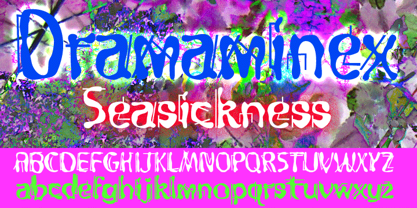 Designed after a bout with seasickness.
 - Shaltai by ParaType,
$25.00 Decorative font Shaltai was developed by young Russian designer Katya Galuyan. The letters slightly resemble rolling, falling and broken eggs. Egg-shaped appearance of the characters determines the name of the font. Shaltai Boltai is a Russian cousin of English Humpty Dumpty, French Boule Boule and Swedish-Norwegian Lille Trille. The font can be used for advertising and display works, children books and so on. Released by ParaType in 2008.
 - Kerb by Lebbad Design,
$24.95 Kerb is a contemporary sans serif font created with wide letterforms and subtle bowed vertical strokes. Fantastic font for logotype and headline use.
 - Amoebica by Hanoded,
$15.00 Amoebica font was created during a nasty bout of the flu. If you think it looks weird, well, I must have been hallucinating when I drew the glyphs! Amoebica is a fun, weird, unusual, happy, crazy kind of font which comes with all diacritics.
 - Breathless by Wiescher Design,
$39.50 Breathless was inspired by movie posters of the Nouvelle Vague era when Jean Seberg and Jean-Paul Belmondo were young and films where in black and white. So I named this very spiky affair after that phantastic movie of my youth A bout des souffle or like it was called in English, Breathless. -Your breathless type designer, Gert Wiescher
 - Wedding Doodles by Outside the Line,
$19.00A font of 31 wedding icons... bow tie, shoe, bouquet, cakes, invitation, cupcakes, bon bons, wedding dress, tux, ring bearer, flower girl, suitcases, congratulations banner, balloons, garter, gift, cuff links, wedding bands, diamond ring. Use for a wedding shower flyer or make your own gift card. - Soft Hits - Unknown license

- Adget Sans by wearecolt,
$14.00 Adget Sans is a modern, strong statement typeface with clean lines and big curves. Inspired by classic geometric grotesque typefaces, this sans serif typeface is perfect for adding a striking title to your portfolio or website. This set includes ten individual weight fonts plus a variable weight font, Adget Sans consists of 328 glyphs across upper and lowercase, numerals, all European characters, linked letters and ligatures plus some bouns stylistic alternative characters.
 - Keswick by Hanoded,
$15.00 Keswick is a beautiful small town in the English Lake District. It is a good place to hang out for a while and explore the surrounding National Park. During your stay you could visit the Keswick Pencil Factory - which brings us to this nice font… Keswick font was created using a 6B pencil (the crumbly, soft kind) and a lot of patience. I have to admit, the pencil used was not made in Keswick. Sorry 'bout that…
 - Carte Blanche by Hanoded,
$20.00 Carte Blanche literally means 'Blank Ticket'. Yeah, yeah, it is also a very 007-ish catchphrase, but I wanted to give this elegant font a 'stylish' name and Carte Blanche popped up. All glyphs were hand drawn on a rather expensive piece of heavy-weight paper and were put into the font in between changing nappies, bouts of the flu and the subsequent wiping of snotty noses. Carte Blanche speaks most Roman-based languages - albeit nasally…
 - Al Boulevard Signature by Aluyeah Studio,
$125.00 Hello Aluyeaholics! Boulevard Signature, an exclusive handwritten signature font. Coming with 100+ stunning and super easy to use alternates and ligatures. Very suitable for your wedding invitation, packaging, apps, magazine, headline, website, ads and all type of design project you have. Super Easy to Use alternates - You can easily call alternates using special combination like a.2 k.3 b.4 t.h c.c etc. To get results like the preview just type Boul.4evard.3 Sig.4nature
 - Love And Peace by Fenotype,
$25.00 What's so funny 'bout peace love & understanding? Nothing really. Love and Peace is an Art Nouveau style typeface inspired by Eckmann-Schrift by Otto Eckmann in 1900. Love and Peace is filled with ethereal elegance and it's great for posters, magazines and psychedelic LP covers. Love and Peace is equipped with few Contextual Alternates and Standard Ligatures to prevent characters from colliding. In addition it has Stylistic Alternates for lowercase a, k, r and s, and Swash Alternates for ampersand and dollar sign.
 - Linotype Afroculture by Linotype,
$29.99Like the name suggests, the pi font Afroculture from typeface designer Boule Yvan depicts symbols and figures from African folk art. Stylized masks with different expressions and a number of sculptures lend variety to this font. The figures are consciously simple but shown from different perspectives. The black and white surfaces contrast with another and suggest the interplay between shadow and light. The figures of Afroculture are perfect for illustrating texts in a related context and their details come through best in larger point sizes. - Basati by Blancoletters,
$33.00 Basati is a display typeface designed for headlines and hard-hitting messages. It is sharp, heavy, and hard as an axe. But don’t be fooled by its rough look or the impression of having been carved with a machete. Each character is precise and sharp as a scalpel, and in that perfectly cut informality lies her deliberately wild temperament. Perhaps because its design was conceived during a severe bout of lumbago, its strokes are heavy and provocative, as if trying to defy logic and gravity alike.
 - Be Bowtiful by One Line Design,
$19.99 Wrap it up by adding a little sweetness to your words. This is an addition to the Be Me font family, to give it a little flair and charm. Doll up announcements, posters and so much more. Letter alternates available so the placement of the bow is perfect for your word/s. Includes: Basic Latin Latin- 1 Supplement Latin extended-A Latin extended-B
 - Cassandra by Wiescher Design,
$49.50 Cassandra has two kinds of letters, wide Capitals on the (shift) capitals and narrow ones on the (no shift) lowercase. You can match them as you like. Take one narrow S and a wide one or two wide ones, whatever turns you on. It will almost always look good. Cassandra is my "bow" to Adolphe Mouron Cassandre. Yours sincerely mixing things up for you Gert Wiescher
 - Christmas Doodles by Outside the Line,
$19.00 The newest addition to the Outside the Line collection of picture Doodle fonts... Christmas Doodles. The perfect font for that quickie Christmas party flyer. It includes gifts, gift tags, gingerbread man, gingerbread house, candy canes, hot cocoa, bow, crackers, 2 kinds of trees, poinsettia, jingle bell, ornaments, snowflakes and a star. This font works well with Holiday Doodles and Holiday Doodles Too which have some Christmas icons in them.
 - Kticha by Typink,
$11.00 Excellent futuristic font with pretty rounded angles will fit any title or heading. It supports more than 20 European languages. This font is unique for it's elegant and thin letters. Font's idea came to the designer in the late autumn when tender yellow leaves fell to his hands. The combination of straight lines and bows had sparked a thought about the font, that could be used as awesome decoration.
 - MPI Tuscan Extra Condensed by mpressInteractive,
$5.00 Tuscan X Condensed (whose actual name is Gothic Concave Tuscan Extra Condensed) was first produced in wood type by William H. Page & Company around 1872. The design is derived from a Gothic Condensed typeface, but with vertical stokes bowing inwards at the center. We modified the weight of the uppercase characters (since the original wood type has a lowercase much thinner than the caps) to harmonize with the lowercase when used digitally.
 - FF Marselis Serif by FontFont,
$58.99FF Marselis crossbreeds geometric and humanistic forms, creating a freshly dynamic sans serif family. All of the counters in the typeface are open; this aids readers’ eyes quickly flow across lines of text, without experiencing hang-ups. Certain superfluous strokes have been eliminated – there are no spurs on the b or q, for instance. The alphabet’s diagonals all bow outwards slightly, adding flavor to the “A”, “K”, “R”, “V”, “W”, “X”, “Y” and “Z”. - Skala Display by Hazztype,
$20.00 Skala is a contemporary display, semi condensed, semi sans serif. It has unique diagonal stress, pointy bowls, and terminals, mixing straight and bowed stems. The unique style of Skala makes it look masculine, tough, and strong. Inspired by earlier semi-serif typefaces, Skala mixed and matched serif and sans serif characters that bring attention to any design which makes this display font a great option for logos, labels, signs, headlines, business cards, etc.
 - Slaphappy by Comicraft,
$29.00 Are you feeling a little dazed, silly, or light-headed? Are you talking incoherently as if you've received repeated blows to the head? Would you perhaps describe yourself as punch-drunk? Happy-go-lucky? Have you recently been sleep deprived or are experiencing excessive feelings of fatigue or tiredness? Have you become prone to inane semi-maniacal rambling? Have you been making strange and/or meaningless remarks? Are you demonstrating fits of random and inexplicable behavior? Did you just give yourself a wedgie? Experiencing bouts of uncontrollable laughter -- at your own jokes? Standing on a silver surfboard holding a hot dog and wondering why?! You're off your rocker, dude; Slaphappy!
 - Chaman by Cubo Fonts,
$29.00 Chaman is a “hybrid” font. On the one hand serifless, temperate and readable, and on the other hand quick and livily as a manual script, thanks to many unexpected ligatures. Letter design is plain and functional, punctuated by dynamic elements, mostly in ligatures and contextual glyphs, generated at the beginning and end of the word, thanks to your software’s OpenType features. It draws inspiration from the Tibetan alphabet, originally close to our own latin alphabet, as it stems from Bhram handwriting, itself derived from Phoenician alphabet. This alternation of stright vertical lines and regular bows makes Chaman’s design stand out.
 - Holografik by Valley Type,
$17.00 Holografik is a Neo-Grotesk sans serif font inspired by scientific progress, existential wonder, and social oneness. With its wide structure and light airy weights, Holografik is an optimistic take on a Grotesk font. The stark Swiss style of the characters is softened with playful curved details, such as a bowed descender in the lowercase y, connected descenders in the alt lowercase g and y, and the curved bottom serif in the alt uppercase B and D. Featuring three weights and italics, it is ideal for use at larger scales like headlines, packaging, editorial, branding, and posters. Includes punctuation, glyphs, diacritics, numerals, icons, and multilingual support.
 - Valet by Canada Type,
$29.95 Valet is deco moderne the way it was meant to be: Big, bold, classy, flashy, and clean at the seams. Its message is rich, strong, confident and reliable. Valet tells you that it’s used to thorns being part of every rose, that it can handle sharp objects just fine, and that it'd much prefer buying the tuxedo rather than renting it. This font grew out of an uncredited early 1970s all-cap film type called Expression. An appropriate deco lowercase was added, along with small caps, zippy titling caps, and Pan-European language support. With over 9250 glyphs, we bow our heads with the admission that we kind of got carried away with it.
 - Cassandra Plus by Wiescher Design,
$49.50 Cassandra Plus is my revised version of Cassandra, it can now be used all over Europe except Greece and Russia. I changed the weights a bit to make them more distinct. The Font has two widths of letters, wide Capitals on the (shift) uppercase-keys and narrow ones on the (no shift) lowercase-keys. You can match them as you like, but you should avoid having the same letter in one word in two different widths. But if yoyu are really daring you can use one narrow S and a wide one, it might still look good. It will almost always look good! Cassandra is my “bow” to Adolphe Mouron Cassandre. Yours sincerely mixing things up for you again Gert Wiescher
 - und4 by URW Type Foundry,
$39.99 The rasterized square (clear, therefore 4 as part of the font name) was the constructive basis. The intention was to put all characters within this grid and produce a highly structured, yet lively, resting in itself, display font. Relaxed but exciting, just. An absolutely noteworthy detail are the classical construction principles (based on a typography book from the 50's for poster designers), the so-called optical weighting, derived and slightly exaggerated character elements: The characters are not purely symmetrical and the curve shapes do not close justified with the surrounding square. Loops and tongues slightly hang over; the upper bows are slightly less protruding than lower ones, etc. The kerning is tuned to fit these design details: the white space between the characters match the same filling space.
 - Ah, Bou College, the font that decided it was time to put its varsity jacket on and strut through the halls of typographical academia with a sporty swagger. Picture this: the letters, muscular and fi...
- Girltalk by Scholtz Fonts,
$10.00 Cute, curly, & very "little missy", Girltalk was specially designed for the pre-teen & young-teen market. Its design was inspired by the kind of curly handwriting that junior school girls use for notes to each other, diary entries, autograph books etc. Pretty & feminine, with a large dose of cheek, Girltalk is a must for all marketing media aimed at the 7-14 age group: -- “girl style” stationery -- diary covers -- clothing hang-tags -- party invitations -- greeting cards -- book covers -- movie posters -- CD covers -- toy and game advertising media Girltalk can also be used for "big girls"! Great for hen parties, baby showers, pamper parties and other occasions that bring out the "girl in" women. Think pink, think hearts & flowers, think ribbons & bows, add Girltalk to the mix, and you have a winner! Girltalk has been carefully letterspaced and kerned. All upper and lower case characters, punctuation, numerals and accented characters are present.
 - Blue Goblet Christmas Ornaments by insigne,
$32.00 insigne is pleased to present new Christmas ornaments as the latest in the Blue Goblet series, a series of fonts and ornaments by artist Cory Godbey. This best-selling series has now been extended to include a new Christmas-themed member. Hand drawn by the artist, the Blue Goblet additions are a fun and lively take on Christmas ornaments. Expressive and spontaneous, these ornaments seem to dance their way across the page. They can be used in conjunction with the original Blue Goblet Ornaments and the Blue Goblet fonts, which include both a sans serif and serif member. Combine them to form interesting compositions, or insert them directly into your layout as chapter headings or illustrations. There are over 60 of the Christmas-themed ornaments, including Christmas trees, bows, ivy and more. Check out the .pdf or the promotional graphics to see all of these great options.
 - Petals BF by Bomparte's Fonts,
$39.00 Ooh so soft, so curvaceous, so voluptuous and so swash-buckling. Hey, I'm talking ’bout Petals BF! Here’s a design inspired by the work of Dave West and infused with a plethora of pleasingly plump letterforms, with swashes reminiscent of 60s and 70s types. But here’s the twist: where you might typically expect to find ball terminals, you'll experience some sensuous curls; and some playful letterforms such as lowercase h, k, m, and n, may even call to mind that groovy look of ’60s bell-bottoms. Spread across its capitals and lowercase are swash variants for beginning, middle and ending letterforms —candy for your eyes. Petals BF is where Didone style happily marries the organic and curvaceous forms of Art Nouveau. Strange I know, but so is a duckbill platypus —and somehow they all seem to work surprisingly well. Among the many typographic niceties you'll discover, are such Opentype features as Contextual and Stylistic alternates, Ligatures, Case-sensitive forms and Fractions. Please note: these magical features demand the use of opentype-savvy applications such as Adobe Creative Suite, QuarkXPress and etc. Petals BF is multilingual, and speaks the languages of Western, Eastern and Central Europe, in addition to Turkish and Baltic. It gets around. So let your creativity blossom with Petals in projects that involve headlines, magazine layouts, product packaging, logos, signage, branding and etc.
 - Ribbons by Positype,
$20.00 Ribbon type. Holy grail of complex-lettering-turned typeface or an elusive Loch Ness monster that is often teased, possibly seen in the wild, but never confirmed? From the amazing lettering artist and author Martina Flor and masterful type designer Neil Summerour, comes the aptly named Ribbons. Ribbons is a sincere and well-conceived approach to providing a reliable solution to ribbon and ribbon-styled type for creative professionals when a lettering artist just isn’t available. Ribbons provides both flat and ‘folded’ options with the Regular and Fold styles, but then raises the bar with separate layer styles that will allow you to easily create the elegant back and forth movements produced with ribbon-style lettering we have all come to appreciate. These layer options are provided in both ‘smooth’ and ‘pleated’ connected styles. Flor and Summerour didn’t stop there. Each typeface was expanded with a number of stylistic alternates, additional swashed and flourished letters, ligatures, and even more in order to provide as many decorative options as possible to the creative. To round out the nine fonts available in the typeface and to ‘put a bow on it’, they’ve added a separate Shadow style and two different color fonts (available exclusively with family purchases).


Page 1 of 2Next page