4,391 search results
(0.018 seconds)
- Bank Gothic by GroupType,
$29.00 If there was an American Typeface Hall of Fame, Bank Gothic, designed by the great Morris Fuller Benton would hold a place of special distinction considering this design has survived so many trends in typographic fashion since being introduced in 1930. Its just as desirable today as it was over eighty years ago; arguably more. Today, Bank Gothic is a very popular choice as a titling face for science fiction books, posters and countless television and movie titles. It is also a popular typeface for use in computer games and digital graphics. GroupType’s 2010 revival of this American classic is true to the design, the period, and Benton’s aesthetic. GroupType worked with some of the most talented and experienced type designers that were historically grounded and sensitive to this design project. Fortunately, Mr. Benton has left us a large selection of other great typefaces for insight and guidance. GroupType’s new revival includes the original three weights in regular and condensed style plus two new distressed fonts. All have a new small cap and lowercase in each font necessary for 21st century typography.
 - Bank Gothic by ParaType,
$30.00 Designed at American Type Founders in 1930-33 by Morris F. Benton. An all-capital sans serif featuring squared-off letters with rounded corners. For use in advertising and display typography. Cyrillic version was created at ParaType by Tagir Safayev in 1997.
 - Bank Gothic by Tilde,
$39.75 - Bank Gothic by Bitstream,
$29.99 A set of square capitals developing from the interest in geometric forms stimulated by the Bauhaus, Bank Gothic was designed by Morris Fuller Benton for ATF in 1930, the same year that Georg Trump designed City for Berthold.
 - Bank Borders by Keyborders,
$15.00 - Piggy Bank by Missy Meyer,
$12.00 PIGGY BANK is a casual handwriting font, smoothed and cleaned for cutting and crafting, but also sharp and crisp for print projects! It contains two uppercase sets of letters, so you can mix and match for a hand-written look. It's useful for everything from kids' designs to branding, from book covers to product packaging! The PIGGY BANK family contains two weights - regular and bold - so you have options that will be easy to read no matter how large or small your design will be. Plus, it has my usual 500+ glyphs, including tons of punctuation and over 300 accented characters for language support!
 - Bank Stencil by Apply Interactive,
$30.00 - Bank Script by URW Type Foundry,
$35.99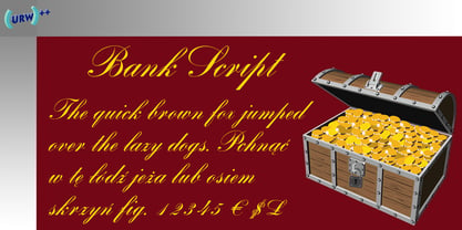
- Royal Banks by Putracetol,
$20.00 Royal Banks - Retro Bold Font. In Royal Banks, I try to combine retro style with luxury and aesthetics touch. So the Royal Banks can be used in various projects with retro/vintage and luxury themes or another project with bold font. Such as logos, branding, posters, packaging, book covers, clothes/apparel, quotes, titles and others. Royal Banks come with clean and rough font version. Come with Opentype feature with a lot of alternates, its help you to make great lettering. Royal Banks is also support multi language. To access the alternate glyphs, you need a program that supports OpenType features such as Adobe Illustrator CS, Adobe Photoshop CC, Adobe Indesign, Corel Draw, Microsoft Office.
 - Bank MF by Masterfont,
$59.00 You will distinguish these elegant strokes from a mile away.
 - Yank - Unknown license

- Bonk - Unknown license

- Bandes by Sealoung,
$20.00 Bandes is a bold, thick lettered, retro styled display font. Whether you use it for cartoon related designs, children games or just any creation that requires a lovely touch, this font will be an amazing choice.
 - Sanke by Gholib Tammami,
$17.00 Introducing a serif font that effortlessly encapsulates the essence of timeless beauty and enduring elegance. With meticulously crafted serifs and refined details, Sanke pays homage to classic design principles while seamlessly blending with modern sophistication.
 - Bangke by Typefactory,
$14.00 Bangke is a textured brush font with rough and casual letters. It’s great for logos, branding, print projects and any attention drawing headline.
 - Bant by Kufic Studio,
$15.00 Bant - A modern comic font that compliments any sort of graphic and web design. A doodly doodle font, this font is perfect for comics, doodle, whiteboard animation, branding, wedding invitations, magazines, business cards, quotes, posters, and websites. The complete font set includes; Bant will bring a unique and comic look to your overall design, as any typeface is a major part of the design. Kufic Studio is a platform that provides professional and high-quality designs & fonts to fill the gap that has been missing in the market.
 - Tanked by Typadelic,
$14.95 Tanked is one crazy and mixed up font, perfect for any fun project you can think of! Upper and lower case letters are dispersed throughout the font, no need to use caps...just bang away on your keyboard without regard for any typographic rules. Use as a headline font or short lines of body copy, scrapbooking titles/captions...whatever! Tanked is fun and will supply a burst of energy for your projects.
 - Tank by Typodermic,
$11.95 Are you tired of flimsy typefaces that can’t stand up to the rigors of modern design warfare? Then it’s time to enlist in the Tank army! Tank is a typeface that means business. With its heavy letterforms and industrial appearance, it commands attention and demands respect. The tight spacing and lack of negative space give it a robust precision that other typefaces can only dream of. It’s the perfect weapon for delivering a knockout blow with bold color blocks or as a photo cut-out effect. And don’t let the name fool you—this typeface may be called Tank, but it’s far from slow or clunky. It comes in a large Regular style that will leave your competitors in the dust, an ironically titled Light version that still packs a punch, and a pair of oblique styles that add a dynamic twist to your designs. So what are you waiting for? Show the world that you mean business with the heavy headline artillery of Tank. Most Latin-based European, and some Cyrillic-based writing systems are supported, including the following languages. A Afaan Oromo, Afar, Afrikaans, Albanian, Alsatian, Aromanian, Aymara, Bashkir (Latin), Basque, Belarusian (Latin), Bemba, Bikol, Bosnian, Breton, Bulgarian, Cape Verdean, Creole, Catalan, Cebuano, Chamorro, Chavacano, Chichewa, Crimean Tatar (Latin), Croatian, Czech, Danish, Dawan, Dholuo, Dutch, English, Estonian, Faroese, Fijian, Filipino, Finnish, French, Frisian, Friulian, Gagauz (Latin), Galician, Ganda, Genoese, German, Greenlandic, Guadeloupean Creole, Haitian Creole, Hawaiian, Hiligaynon, Hungarian, Icelandic, Ilocano, Indonesian, Irish, Italian, Jamaican, Kaqchikel, Karakalpak (Latin), Kashubian, Kikongo, Kinyarwanda, Kirundi, Komi-Permyak, Kurdish (Latin), Latvian, Lithuanian, Lombard, Low Saxon, Luxembourgish, Maasai, Macedonian, Makhuwa, Malay, Maltese, Māori, Moldovan, Montenegrin, Ndebele, Neapolitan, Norwegian, Novial, Occitan, Ossetian, Ossetian (Latin), Papiamento, Piedmontese, Polish, Portuguese, Quechua, Rarotongan, Romanian, Romansh, Russian, Sami, Sango, Saramaccan, Sardinian, Scottish Gaelic, Serbian, Serbian (Latin), Shona, Sicilian, Silesian, Slovak, Slovenian, Somali, Sorbian, Sotho, Spanish, Swahili, Swazi, Swedish, Tagalog, Tahitian, Tetum, Tongan, Tshiluba, Tsonga, Tswana, Tumbuka, Turkish, Turkmen (Latin), Tuvaluan, Uzbek (Latin), Venetian, Vepsian, Võro, Walloon, Waray-Waray, Wayuu, Welsh, Wolof, Xhosa, Yapese, Zapotec Zulu and Zuni.
 - Bang by ITC,
$29.00Bang was designed by David Sagorski in 1993 as a playful font of spirals. It consists of two capital alphabets which can be combined like the usual capitals and small caps, although both have the same height. They differ from one another only in the decorative forms which adorn them and the highly decorated characters of one set are complemented by the slightly more reserved characters of the second. Serious this font is not, rather, with its circles and spirals, Bang is best in point sizes 12 and larger and is meant for short texts and headlines. - Yanking by Sensatype Studio,
$15.00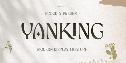 YANKING is Modern Display Ligature Font is a well-balanced contemporary font with a fancy, unique, and versatile Luxury serif, font that you can combine to get any variations and unique shapes easily just in seconds with choose alternates of them. It is a serif display font with moderate contrast that perfect for branding projects, logo, wedding designs, social media posts, advertisements, product packaging, product designs, label, photography, watermark, invitation, stationery, and any projects, it makes with a high level of legibility. What's Included: Character set A-Z Numerals & Punctuation Accented Characters (West Europe) Works on PC & Mac Recommended using Adobe Illustrator or Adobe Photoshop. Wish you enjoy our font. :)
 - Batke by Kostic,
$40.00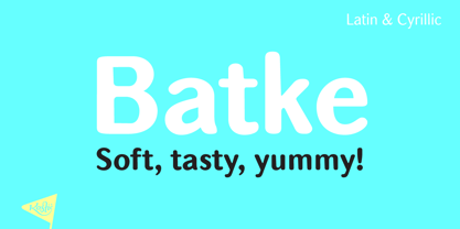
- BUNK by AdultHumanMale,
$20.00 BUNK is an 11 font system that can be layered in different ways to create various classic titling effects, think Old Timey signage 'COME IN WE'RE OPEN'. It's a display font that produces the different results by mixing and matching the various fonts together. Bunk's layer combos give you the control to create brilliant bevel, convex and 3-D styles. Each font contains the same metrics, so when your title is set, copy and paste-in-place to create layers of different weights/styles to build out your desired effect. Unlike other Layered Fonts out there, BUNK has upper case and lower case as well as currency symbols and lots of foreign characters too. Over 180 glyphs!. Five of the fonts (Shades 1,2,3,4,5) are clearly dependent on each other to create a complete font, so theses are only available in the Full family pack (11 fonts) or in the Layer Kit Family pack (7 fonts).
 - Basking by Din Studio,
$29.00 Dreaming to make your branding sparkle? Or maybe you’re looking for the perfect font to use on your invitations? Whatever you need - we’ve got the thing for you. Introducing Basking- A Serif Font A fabulous and elegant modern serif font that’ll engage your audience and make your branding stand out from the competition. This font can be used for a host of different content needs and projects. Perfect for social media branding projects, fashion designs, printed quotes, packaging, or even as a stylish text overlay to any background image. Our font always includes Multilingual option to make your branding globally recognized. Features: Alternates Standard Ligatures Swashes Multilingual Support PUA Encoded Numerals and Punctuation Thank you for downloading premium fonts from Din Studi
 - Banuk by Grontype,
$16.00 Banuk is a brand new techno font designed with slanted line accent, the fonts is rounded edges and little imminent space between fonts. This font is a regular bold font and all caps with different style between uppercase and lowercase. Banuk is perfectly used font in any project such as logo font, flyer header, name card, invitational header, movie poster, poster, website header and much more. Features: Uppercase and lowercase Numeral and punctuation More Alternates and Ligatures Multilingual Support What inside Main Files Banuk .ttf Banuk .otf webfont Thankyou for choosing this font, i hope you enjoy it. Regard, Grontype
 - Gothic Gothic by Typeco,
$29.00Gothic Gothic is a fusion of old and new that is both Gothic and Gothic. In typography Gothic can refer to German Blackletter or Old English styles. Gothic can also mean block or sans serif style lettering. By combining and balancing the elements from both of these ideas we have created a contemporary extended block letter typeface. The Gothic Gothic family contains 2 companion fonts. Gothic Gothic Text is a more minimal variation that has a more roman looking style while still retaining some Blackletter feel. Gothic Gothic Black is a bolder version designed to tend more toward the Blackletter style of Gothic with more contrast of stroke and a few of the more unusual Blackletter forms thrown in for flavor. Gothic Gothic has been honored with an award of Excellence in Type Design from Association Typographique International (ATypI) in 2001. Typeco has updated this font and has released it as an expanded family. Gothic Gothic is a crepuscular family of 3 fonts - OL Gotham Gothic by Dennis Ortiz-Lopez,
$40.00 - Gothic by Red Rooster Collection,
$45.00Digitally engineered by Steve Jackaman. Ludlow, circa 1939. - Gothic by Wooden Type Fonts,
$15.00 Gothic Bold Condensed, first shown in 1889 by Hamilton wooden type founders. With lowercase. Gothic Bold Expanded.
 - P22 Gothic Gothic by IHOF,
$24.95 The name says it all. Gothic from the old literary style and/or current subculture genre. And Gothic meaning a block or sans serif style of lettering. The concept was to take the classic German style lettering and create a contemporary extended block letter typeface. The result is a fusion of old and new.
 - Offshore Banking Business - Unknown license

- F25 Bank Printer - 100% free

- Bank Stencil EF by Elsner+Flake,
$35.00 - Bank Script SB by Scangraphic Digital Type Collection,
$26.00Since the release of these fonts most typefaces in the Scangraphic Type Collection appear in two versions. One is designed specifically for headline typesetting (SH: Scangraphic Headline Types) and one specifically for text typesetting (SB Scangraphic Bodytypes). The most obvious differentiation can be found in the spacing. That of the Bodytypes is adjusted for readability. That of the Headline Types is decidedly more narrow in order to do justice to the requirements of headline typesetting. The kerning tables, as well, have been individualized for each of these type varieties. In addition to the adjustment of spacing, there are also adjustments in the design. For the Bodytypes, fine spaces were created which prevented the smear effect on acute angles in small typesizes. For a number of Bodytypes, hairlines and serifs were thickened or the whole typeface was adjusted to meet the optical requirements for setting type in small sizes. For the German lower-case diacritical marks, all Headline Types complements contain alternative integrated accents which allow the compact setting of lower-case headlines. - Bank Of England by K-Type,
$20.00 Bank of England is loosely based on the blackletter lettering from Series F English twenty pound banknotes introduced in 2007. The font takes inspiration from German Kanzlei (Chancery) typefaces and the English calligraphers John Ayres and George Bickham. For designers using OpenType-aware applications, Bank of England includes Swash versions of all uppercase letters and ampersand, Alternates for nine lowercase letters and capital Z, and sixteen ornamental flourishes. Western European accented characters are included, and also a simplified St. Edward’s Crown (Elizabeth II’s coronation crown) at the Section (§) and PlusMinus (±) keystrokes (Windows Alt-0167 and Alt-0177).
 - Bank Statement AOE by Astigmatic,
$19.95A typeface made from vintage typewriter samples and meticulously compiled into a complete character set. - Bank Sans EF by Elsner+Flake,
$35.00 With its extended complement, this comprehensive redesign of Bank Gothic by Elsner+Flake offers a wide spectrum for usage. After 80 years, the typeface Bank Gothic, designed by Morris Fuller Benton in 1930, is still as desirable for all areas of graphic design as it has ever been. Its usage spans the design of headlines to exterior design. Game manufacturers adopt this spry typeface, so reminiscent of the Bauhaus and its geometric forms, as often as do architects and web designers. The creative path of the Bank Gothic from hot metal type via phototypesetting to digital variations created by desktop designers has by now taken on great breadth. The number of cuts has increased. The original Roman weight has been augmented by Oblique and Italic variants. The original versions came with just a complement of Small Caps. Now, they are, however, enlarged by often quite individualized lower case letters. In order to do justice to the form changes and in order to differentiate between the various versions, the Bank Gothic, since 2007 a US trademark of the Grosse Pointe Group (Trademark FontHaus, USA), is nowadays available under a variety of different names. Some of these variations remain close to the original concept, others strive for greater individualism in their designs. The typeface family which was cut by the American typefoundry ATF (American Type Founders) in the early 1930’s consisted of a normal and a narrow type family, each one in the weights Light, Medium and Bold. In addition to its basic ornamental structure which has its origin in square or rectangular geometric forms, there is another unique feature of the Bank Gothic: the normally round upper case letters such as B, C, G, O, P, Q, R and U are also rectangular. The one exception is the upper case letter D, which remains round, most likely for legibility reasons (there is the danger of mistaking it for the letter O.) Because of the huge success of this type design, which follows the design principles of the more square and the more contemporary adaption of the already existing Copperplate, it was soon adopted by all of the major type and typesetting manufacturers. Thus, the Bank Gothic appeared at Linotype; as Commerce Gothic it was brought out by Ludlow; and as Deluxe Gothic on Intertype typesetters. Among others, it was also available from Monotype and sold under the name Stationer’s Gothic. In 1936, Linotype introduced 6pt and 12pt weights of the condensed version as Card Gothic. Lateron, Linotype came out with Bank Gothic Medium Condensed in larger sizes and a more narrow set width and named it Poster Gothic. With the advent of photoypesetters and CRT technologies, the Bank Gothic experienced an even wider acceptance. The first digital versions, designed according to present computing technologies, was created by Bitstream whose PostScript fonts in Regular and Medium weights have been available through FontShop since 1991. These were followed by digital redesigns by FontHaus, USA, and, in 1996, by Elsner+Flake who were also the first company to add cursive cuts. In 2009, they extended the family to 16 weights in both Roman and Oblique designs. In addition, they created the long-awaited Cyrillic complement. In 2010, Elsner+Flake completed the set with lowercase letters and small caps. Since its redesign the type family has been available from Elsner+Flake under the name Bank Sans®. The character set of the Bank Sans® Caps and the Bank Sans® covers almost all latin-based languages (Europe Plus) as well as the Cyrillic character set MAC OS Cyrillic and MS Windows 1251. Both families are available in Normal, Condensed and Compressed weights in 4 stroke widths each (Light, Regular, Medium and Bold). The basic stroke widths of the different weights have been kept even which allows the mixing of, for instance, normal upper case letters and the more narrow small caps. This gives the family an even wider and more interactive range of use. There are, furthermore, extensive sets of numerals which can be accessed via OpenType-Features. The Bank Sans® type family, as opposed to the Bank Sans® Caps family, contains, instead of the optically reduced upper case letters, newly designed lower case letters and the matching small caps. Bank Sans® fonts are available in the formats OpenType and TrueType.
 - Banks and Miles by K-Type,
$20.00 K-Type’s ‘Banks & Miles’ fonts are inspired by the geometric monoline lettering created for the British Post Office in 1970 by London design company Banks & Miles, a project initiated and supervised by partner John Miles, and which included ‘Double Line’ and ‘Single Line’ alphabets. The new digital typeface is a reworking and extension of both alphabets. Banks & Miles Double Line is provided in three weights – Light, Regular and Dark – variations achieved by adjusting the width of the inline. Banks & Miles Single Line develops the less used companion sans into a three weight family – Regular, Medium and Bold – each with an optically corrected oblique. Although the ‘Banks & Miles Double Line’ and ‘Banks & Miles Single Line’ fonts are based on the original Post Office letterforms, glyphs have been drawn from scratch and include numerous adjustments and impertinent alterations, such as narrowing the overly wide Z and shortening the leg of the K. Several disparities exist between the Post Office Double and Single Line styles, and K-Type has attempted to secure greater consistency between the two. For instance, a wide apex on the Double Line’s lowercase w is made pointed to match the uppercase W and the Single Line’s W/w. Also, the gently sloping hook of Single Line’s lowercase j is adopted for both families. The original Single Line’s R and k, which were incongruously simplified, are drawn in their more remarkable Double Line forms, and whilst the new Single Line fonts are modestly condensed where appropriate, rounded letters retain the essentially circular form of the Double Line. Many characters that were not part of the original project, such as @, ß, #, and currency symbols, have been designed afresh, and a full set of Latin Extended-A characters is included. The new fonts are a celebration of distinctive features like the delightful teardrop-shaped bowl of a,b,d,g,p and q, and a general level of elegance not always achieved by inline typefaces. The Post Office Double Line alphabet was used from the early 1970s, in different colours to denote the various parts of the Post Office business which included telecommunications, counter services and the Royal Mail. Even after the Post Office was split into separate businesses in the 1980s, Post Office Counters and Royal Mail continued use of the lettering, and a version can still be seen within the Royal Mail cruciform logo.
 - Wolf's Bane - Unknown license

- Bonk Offset - Personal use only

- Bonk Italic - Unknown license


Page 1 of 110Next page