1,433 search results (0.006 seconds)
  1. curlyJoe - Unknown license
  2. joeHand 2 - Unknown license
  3. sinisterSam - Personal use only
  4. PKP - Unknown license
  5. fancyPens - Unknown license
  6. joeHand 1 - Unknown license
  7. brunoBook - Personal use only
  8. sideburnBob - Unknown license
  9. Qurve - Unknown license
  10. GlOrY - Unknown license
  11. Sanity - Unknown license
  12. QUBE - Personal use only
  13. Qurve Thin - Unknown license
  14. Qurve Wide - Unknown license
  15. Qurve - Unknown license
  16. Sanity Wide - Unknown license
  17. Qurve Hollow - Unknown license
  18. Qurve Hollow Wide - Unknown license
  19. Qurve Hollow - Unknown license
  20. Qurve Wide - Unknown license
  21. Qurve Hollow Thin - Unknown license
  22. Sanity - Unknown license
  23. Sanity - Unknown license
  24. Qurve Thin - Unknown license
  25. Evanescent - Unknown license
  26. Qurve Hollow Thin - Unknown license
  27. Sanity Wide - Unknown license
  28. Sanity Wide - Unknown license
  29. Sanity - Unknown license
  30. Qurve Hollow Wide - Unknown license
  31. Julius Thyssen - Unknown license
  32. Sanity Wide - Unknown license
  33. Frontline by TypeArt Foundry, $45.00
    Thrilling titler for grade-B movie poster.
  34. Bboy - Unknown license
  35. Weaver - Unknown license
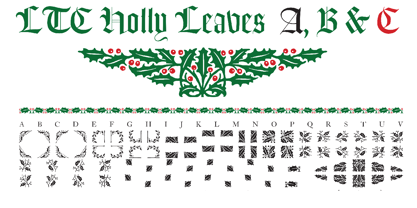
  36. LTC Holly Leaves by Lanston Type Co., $24.95
    LTC Holly Leaves consists of three ornament fonts. Holly Leaves A is a solid color set of holly leaves borders. LTC Holly Leaves B is the same ornaments but with just the leaves and LTC Holly Leaves C is just the berries. B & C can be overlayed for a two color effect.
  37. Corner by URW Type Foundry, $35.99
    A unique kind of type by Michael Herold: The 14 cuts of Corner are equally distributed to the two style variants A and B. From Thin to Extra Bold, variant A comes with technical and pure forms while B appears with a soft, more personal character. In combination, the two variants add up to a highly versatile family which is very well suited for branding purposes, thanks to its diverse forms of expression. Eine besondere Schriftfamilie von Michael Herold: Die 14 Schnitte der Corner sind auf die beiden Stilvarianten A und B verteilt. Von Thin bis Extra Bold kommt die Corner im Stil A mit technischen, reinen Formen und im Stil B mit weichem, persönlicherem Charakter. Als Kombination ergibt sich eine sehr vielfältige Familie, die sich mit ihren verschiedenen Ausdrucksformen besonders fürs Branding eignet.
  38. Diamond Braille by Echopraxium, $5.00
    Here is a "Decorative Braille font". The initial design was indeed drawn on a K.I.S.S digital sketchpad, the Windows default drawing tool (Microsoft Paint, classic version). A. Glyph Concept The Braille 2x3 dot matrix is weaved around a diamond-shape. a.1. Each "dot" is represented by a "right-angle isocel triangle". a.2. Braille dots in Diamond Braille a.2.I. "Dots" are outside the diamond for first Braille row (Braille dots 1, 4) and third Braille row (Braille dots 3, 6). a.2.II. "Dots" are inside the diamond for second Braillle row (Braille dots 2, 5). a.3. Diamond lattice Glyphs are connected horizontally (to/bottom diamond's corners) and vertically (left/right corners) to each other (see poster 5). a.4. Special Glyphs - Space: its is either empty ("Empty cell") or a "non Braille shape" { _, ° } depending on your display needs (as explained in b.3.II) - 6 dots: { £, =, û } - 6 empty dots: { ç, ¥ } B. Font user guide b.1. Lowercase glyphs { A..Z } In these glyphs the "dots" are represented as a white right-angle isocel triangle filled with a smaller black triangle. b.2. Uppercase glyphs { a..z } In these glyphs, the "dots" are represented as an empty triangle (this is an "empty dot"). b.3. 'Space' vs 'Empty Cell' b.3.I. 'Space' - 'Space' glyph is an empty shape - '¶' glyph (at the end of each line in Microsoft Word) is also an empty shape b.3.II. 'Empty cell' glyphs: _ (underscore), ° (degree). In these glyphs there are 2 "empty dots" at top and bottom corners of the diamond, which differentiates them from regular Braille glyphs (which dont have a "dot in the middle"). b.4. Diamond Lattice To display text as a 'diamond lattice', replace each 'Space' by an 'Empty cell' (as explained in b.3.II, see poster 5) b.5. Connectors The connector glyphs allow the creation of "circuit like" designs (see poster 1). Here are the connector glyphs: { µ, à, â, ä, ã, è, é, ê, ë, î, ï } b.6. Domino feature Some Glyphs represent numbers 1..6 in a way which is similar than on dominos (see poster 6) C. Posters Poster 1: the "Font Logo", it displays "Diamond Braille" text together with the Connectors feature. Poster 2: a pangram which is published on pangra.me ( "Adept quick jog over frozen blue whisky mix" ). Poster 3: an illustration of the Domino feature. Poster 4: a DiamondBraille version of the Periodic table. Poster 5: illustration of the Diamond lattice using only 6 dots ( û ) and 6 empty dots ( ç ) glyphs.
  39. monofur - Unknown license
  40. Elliottland J - Unknown license
Looking for more fonts? Check out our New, Sans, Script, Handwriting fonts or Categories
abstract fontscontact usprivacy policyweb font generator
Processing