62 search results
(0.005 seconds)
- Atman - Unknown license

- Arian by Linotype,
$187.99 For decades, the Persian-born Naghi Naghashian has been working as a graphic designer and illustrator in Germany. Arian™ is his first commercial Arabic typeface. Named after his mother, Naghi created the Arian typeface family after years of systematically analyzing the Arabic script. The Arian design is sought to fulfill the many needs and was developed for multiple languages and writing conventions. It's extremely legibilitable not only in small sizes, but also when the type is filtered or skewed. This typeface offers a fine balance between calligraphic tradition and the contemporary sans serif aesthetic now common in Latin typography.
 - Armin by Test Pilot Collective,
$29.00 - Harman by Ahmet Altun,
$19.00 Harman Font Family includes Seven fonts and their inline forms that have different styles from each other but at the same time compatible when used together. This font collection is completely hand-made. In addition it includes very useful extra elements. The word “Harman” is a Turkish word meaning the blend in English. Harman Font Family Collection was designed carefully to create elegant typographic works. It would be a perfect choice to design posters, affiches, logos, t-shirt and magazine prints, eye-pleasing typographic designs and more.
 - Armin Soft by W Type Foundry,
$25.00 As a graphic designer, sometimes it’s impossible not to be inspired by the Swiss Style, specifically the work of Armin Hofmann, who is one of its best exponents. Grids and grotesk and neo-grotesk typefaces are a fundamental part of the tools that make this aesthetic possible. A visual language that has caused full admiration since we were students. Therefore, we decided to design Armin as an homage to Hofmann’s work. Technically, we added stylistic sets applied to the letters –G, R, a, g, h, l, m, n, r, t, u, y– to make Armin more eclectic and suitable for the creation of any visual language. Armin Soft is the softest version of Armin Grotesk with its Variable file.
 - Armin Grotesk by W Type Foundry,
$25.00 As a graphic designer, sometimes it’s impossible not to be inspired by the Swiss Style, specifically the work of Armin Hofmann, who is one of its best exponents. Grids and grotesk and neo-grotesk typefaces are a fundamental part of the tools that make this aesthetic possible. A visual language that has caused full admiration since we were students. Therefore, we decided to design Armin as an homage to Hofmann’s work. Technically, we added stylistic sets applied to the letters –G, R, a, g, h, l, m, n, r, t, u, y– to make Armin more eclectic and suitable for the creation of any visual language.
 - Arcane Land by Fromletterel,
$12.00 This font will sparks childish energy which is cheerful and playful, but it still usable to any kind of design because its familiarity. Arcane Land is a neat casual handwritten. Despite its neatness, this font is still looked handmade because the stroke and the asymmetrical shape. Suitable for posters, logos, branding, and all designs that need natural text writing. Go get your ticket to the Arcane Land!
 - Armand Handwriting by SoftMaker,
$7.99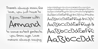 Digitized handwriting fonts are a perfect way to give documents the “very special touch”. Invitations look simply better when handwritten than when printed in bland Arial or Times New Roman. Short handwritten notes look authentic and appealing. There are numerous occasions where handwritten text makes a better impression. Armand Handwriting is a beautiful typeface that mimics true handwriting closely. Use Armand Handwriting to create stunningly beautiful designs easily.
 - Ariane Coachella by UICreative,
$23.00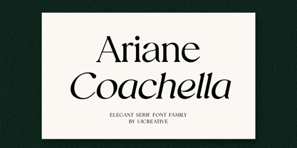 Introducing our new product the name Ariane Coachella Elegant Serif Font Family comes with 9 different weights. Modern Serif font that feels beautiful classy, elegant, and modern. This font is perfectly suited for a wide variety of projects, such as signature, stationery, logo, wedding, typography quotes, magazine or book covers, website headers, clothing, branding, packaging design, and more. Also for fashion-related branding or editorial design and displays both masculine and feminine qualities.
 - FF Amman Sans by FontFont,
$79.99 German type designer Yanone created this sans FontFont in 2010. The family has 14 weights, ranging from Thin to Black (including italics) and is ideally suited for advertising and packaging, logo, branding and creative industries as well as poster and billboards. FF Amman Sans provides advanced typographical support with features such as ligatures, small capitals, alternate characters, case-sensitive forms, fractions, and super- and subscript characters. It comes with a complete range of figure set options – oldstyle and lining figures, each in tabular and proportional widths. As well as Latin-based languages, the typeface family also supports the Arabic writing system. This FontFont is a member of the FF Amman super family, which also includes FF Amman Serif.
 - Armany Font Family by Lone Army,
$15.00 Sophisticated modern, our fluid Modern Sans Serif font family enhances your designs. Elevate with captivating headlines and branding. Experience elegance.
 - Artane Elongated BT by Bitstream,
$50.99Artane, Tony Fahy's first typeface for Bitstream Inc., has a specific philosophy at the core of it's creation. He decided he would try to create a Roman sans that would have the elegance of a serifed italic, such as Stempel Garamond, Bembo, or Baskerville. - FF Amman Serif by FontFont,
$79.99 German type designer Yanone created this serif FontFont in 2010. The family has 8 weights, ranging from Regular to Extra Bold (including italics) and is ideally suited for advertising and packaging, editorial and publishing as well as logo, branding and creative industries. FF Amman Serif provides advanced typographical support with features such as ligatures, small capitals, alternate characters, case-sensitive forms, fractions, and super- and subscript characters. It comes with a complete range of figure set options – oldstyle and lining figures, each in tabular and proportional widths. As well as Latin-based languages, the typeface family also supports the Arabic writing system. This FontFont is a member of the FF Amman super family, which also includes FF Amman Sans.
 - PF Arma Five - 100% free

- Half Cut - Unknown license

- Mellifluos - Unknown license

- Arcanum - Personal use only

- Senator by Emigre,
$39.00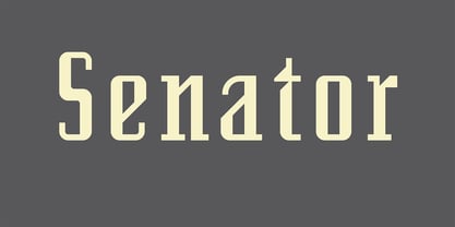 Greek version by Dimitris Arvanitis.
 - Bree - Personal use only

- Jaipur by Vic Fieger,
$7.99This font was designed to resemble the Indo-Aryan scripts of the Indian subcontinent. - Dark11 - Unknown license

- Hors by Dima Pole,
$21.00 Hors is name of Arian God, also it is an ancient name of Mercury. Hors is display font font family with 6 styles, including filled, outline, shadowed and others. Hors is a handmade type. Here are more than 500 glyphs and opentype features.
 - Wanax by Scriptorium,
$12.00Wanax is an original calligraphic font by Dave Nalle. It is a unique, freehand style, where each character is drawn in a single stroke without ever lifting the pen from the page. This gives it an unusual convoluted look rather reminiscent of an arcane or secret language. It also features a number of variant character forms. - DuPlay by Dutype Foundry,
$39.00 Duplay is a sans-serif designed and developed by darman kadir in this late 2023, influenced by famous Swiss-style typefaces like Helvetica and others. This sans-serif typeface will become an alternative solution to enhance your sports and apparel presence. It has a solid and fast appearance, harder in certain font families, and stronger characteristics that will make your image more prominent.
 - Quasaria by Linotype,
$29.99Linotype Quasaria is part of the Take Type Library, selected from contestants of Linotype’s International Digital Type Design Contests of 1994 and 1997. The font was designed by German artist Armin Retzko and the characters are composed of disjointed pieces. The eye tries to complete the symbols into the forms they are used to. Linotype Quasaria with its unique forms is intended exclusively for headlines and displays. - Haettenschweiler by Microsoft Corporation,
$39.00Haettenschweiler™ is a very condensed, very bold alphabet. Haettenschweiler was derived from a more condensed typeface, called Schmalfette Grotesk, first shown in the early 1960s in a splendid book called Lettera by Walter Haettenschweiler and Armin Haab. Haettenschweiler became popularized by the Paris Match magazine. Use this distinguished face in large sizes for headlines. Character Set: Latin-1, WGL Pan-European (Eastern Europe, Cyrillic, Greek and Turkish). - VLNL DBXLZX by VetteLetters,
$9.00 DBXLZX was inspired by the logo of the ZX Spectrum home computer, released in 1982 by Sinclair Research. For many designers the 8-bit pixel grid of the ZX Spectrum was one of the first steps into the realm of digital design. DBXLZX was initially developed by DBXL into a three weight family for use on the Armind record label of world famous trance deejay Armin van Buuren.
 - Valdemar by Scriptorium,
$18.00Valdemar is a hand-drawn font designed to have an unpleasant, otherworldly look. It originated as a combination of a set of bold hand-drawn capitals and some doodles for a font we have in development which uses elements of clockwork to form characters. The result is scary, arcane and eye-catching. The font includes three full sets of characters, with the more ornate alternate capitals accessed with the option or alt key. - Modula by Emigre,
$39.00 Modula was the first high resolution headline face that Zuzana Licko designed with the Macintosh computer. In 1985, the computer was very crude as far as being able to produce subtle curves, but it was outstanding at producing perfect geometric elements. As a guide, she used the proportions of her earlier Emperor Fifteen bitmap design and applied the precision of the computer's geometric elements. See also Modula Round and Ribbed. Greek version by Dimitris Arvanitis.
 - Ongunkan Armanen Runes by Runic World Tamgacı,
$50.00 The Armanen runes (or Armanen Futharkh) are a series of 18 runes, closely based on the historical Younger Futhark, introduced by Austrian mysticist and Germanic revivalist Guido von List in his Das Geheimnis der Runen (English: "The Secret of the Runes"), published as a periodical article in 1906, and as a standalone publication in 1908. The name Armanen runes associates the runes with the postulated Armanen, whom von List saw as ancient Aryan priest-kings. The Armanen runes continue in use today in esotericism and in currents of Germanic neopaganism.
 - CrEAtoR cAmpoTYPe SmcP - Personal use only

- Divided Highway JNL by Jeff Levine,
$29.00 The Narsinh Series (from the 1940 Gujarati Type Foundry of Bombay, India) is a modular metal font comprised of 32 basic shape pieces which would be assembled into any configuration to form various letters and numbers. Examples of the alphabet and numerals were set in an Art Deco, condensed sans serif and were the basis for this type revival. Strongly resembling a stencil design, the typeface was named after the revered 15th-century poet-saint of Gujarat, India Narsinh Mehta, and the foundry itself gets its name from the language and script of Gujarati [spoken by the Indo-Aryan residents of the Indian state of Gujarat]. Divided Highway JNL is the digital version of this design, and is available in both regular and oblique versions.
 - Parliament by Hoefler & Co.,
$49.99 The Parliament typeface was designed by Jonathan Hoefler beginning in 1995. A burlesque typeface in the Regency Blackletter style, Parliament was inspired by the ‘Four-line Pica Black No. 1’ typeface of William Caslon Jr (1821), whose enigmatic design for the letters E, G, I, N, V and Y hinted at a broader ambition to modernize the arcane shapes of the gothic alphabet’s capital letters. Parliament completes this project for the first time by including two sets of alphabets, one archaic and one modern, along with a third set of ‘small caps’ that restores to the blackletter the versatility of Roman type. Parliament was first used for the 1998 ATypI Conference in Lyon, and was published by Hoefler&Co in 2022.
 - Archemy by Sonic Savior,
$90.00Archemy is a restricted and obscure branch of Alchemy that deals specifically with the life, generation and transmutation of Metals. The Archemy font is primarily a magical and alchemical alphabet. It was created on initiative of Senior Zadith, in order to properly quote older alchemical manuscripts, without the need to insert handwritten symbols. The font combines a unique and elegant Roman alphabet with a set of the most frequently used planetary and alchemical symbols that are common in the Western Mystery Tradition, and as used by those involved in the Royal Art. The Archemy font contains a selection of symbols that are still used by practitioners of the Art today, and for the sake of completeness, a selection of less used and more arcane symbols that can be found in older alchemical texts. In addition a Hebrew Alphabet is included, which will supply practitioners of the Art with the glyphs related to Cabalistic studies. The Hebrew Alphabet in this font does not include vowel points, since they have no place in ancient Hebrew, nor in the Western Mystery Tradition. A selection of the most distinct glyphs as used in the Antediluvian font family - the Alphabet of the Ancients - is included for those that wish to include the archetypal and arcane quality of these glyphs from the dawn of history. By our knowledge there exists at this time no font that includes a selection of Alchemical symbols, let alone combines all of the above mentioned archetypal symbols of occult language in a single package. In that respect Archemy can be considered to be an “Arch” font. - Maribor by Dima Pole,
$30.00 Maribor is a slab serif font with nice shapes, they are both soft and angular. It is perceived calmly and with a twist. Maribor means "Mara`s pinery". The energy of the Universe, reflecting the modification, renewal and change for the better is called Mara; Ancient wise ancestors called it so. Today it is known as the goddess Mara in the Vedic worldview of the Slavic-Aryan peoples. Maribor is a multilingual font, it contains characters for 104 Latin languages and all Slavic, including all capitals for them. There are all major currency signs, including the ruble and the Euro. Many OpenType features allow you to make a variety of compositions; as well as to see the font from the new side thanks to the stylistic sets for the Slavic alphabets.
 - Vinneta by Dima Pole,
$27.00 Vinneta is a direct italic font. Its contours and graceful, and precise. Vinneta has a huge number of alternative variations of the glyphs, 20 stylistic sets, it allows you to create a variety of compositions. In addition Vinneta has 17 OpenType features, including oldstyle numbers, swashes, contextual alternates, historical forms, standard ligatures, discretionary and contextual ligatures, localized forms, stylistic alternates, and more others. For convenience here are two faces, one with stylized capitals (they are different from swashes), in another - classic capitals. Vinneta has characters of all European and Slavic languages. "Vinneta" it is an ancient city of the Venedi (Wends), the legendary highly developed Slavic-Aryan people that lent its name to Venice city, lake Bodensee in southern Germany, the land of Wendland in Lower Saxony; and besides, Lithuanians and Estonians even today, this name referred to the Slavs (Veneja and Vene).
 - Arkaim by Dima Pole,
$22.00 Arkaim is a modern typeface in traditional East-Slavic and GreatRussian style in typography. This style is not like any other style in the world. It combines elegance and brevity, depth and modernity, originality and convenience. This unique font is certainly eye-catching. Arkaim font is named after the ancient Slavic-Aryan city located in the South of Russia, which is a symbol of antiquity, wisdom, as well as the unexplored ancient world. Arkaim is not only a historical place, but also a place of Spiritual power. The font Arkaim has many Opentype features that will help to create interesting and unique compositions. An interesting and non-trivial solution is a kind of mixture of all caps and upper/lowercase characters. Arkaim contains symbols of all Slavic and European languages. There are fractions, superscripts and subscripts, and many others. There is a standard number and the old-style number, also Slavic numbers. There are all the historical characters Of the ancient Slavic script called Bukvitsa, today mistakenly called Cyrillic. In addition, here is a free demo font (only with Russian, Belarusian, Ukrainian, Bulgarian, Macedonian and Serbian characters) without Opentype features and other symbols. You can try it.. and love it.
 - American Revolution by Celebrity Fontz,
$24.99American Revolution is a unique collection of signatures of 84 key personalities from both sides of the American Revolutionary War, one of the supreme dramas in history. A must-have for autograph collectors, desktop publishers, history buffs, or anyone who has ever dreamed of sending a letter, card, or e-mail “signed” as if by one of these famous Revolionary War figures. This font includes signatures from the following American Revolutionary War personalities, from both sides: Ethan Allen, Charles T. Armand, John Armstrong, Benedict Arnold, Pudhomme de Borre, John Cadwalader, George Rogers Clark, George Clinton, James Clinton, Thomas Conway, William Davidson, Philippe du Coudray, The Chevalier Louis Lebegue dePresle Duportail, Chistopher Gadsden, Horatio Gates, Moses Hazen, John Glover, Mordecai Gist, Nathaniel Greene, William Heath, Edward Hand, John E. Howard, Robert Howe, Isaac Huger, William Irvine, Henry Knox, Baron Johann de Kalb, Tadeusz Kosciuszko, Marquis de Lafayette, Charles Lee, Henry Lee, Andrew Lewis, William Maxwell, Benjamin Lincoln, Francis Marion, James Moore, Daniel Morgan, William Moultrie, Peter Muhlenberg, Alexander McDougall, Lewis Nicola, Lachlan McIntosh, John Nixon, Hugh Mercer, Samuel H. Parsons, Thomas Mifflin, John Paterson, Richard Montgomery, Andrew Pickens, Charles Cotesworth Pinckney, Enoch Poor, Count Casimir Pulaski, Israel Putnam, Joseph Reed, Elisha Sheldon, Arthur St. Clair, William Smallwood, Philip Schuyler, John Stark, Charles Scott, Adam Stephen, John Sullivan, Jethro Sumner, Thomas Sumter, James Varnum, Baron Friedrich Wilhelm August Heinrich Ferdinand von Steuben, Lord Stirling, Artemas Ward, Joseph Warren, George Washington, Anthony Wayne, James Wilkinson, Otho H. Williams, John Paul Jones, William Woodford, David Wooster, John Burgoyne, Sir Guy Carleton, Charles Cornwallis, Sir Henry Clinton, Sir Thomas Gage, Richard, Earl Howe, Sir William Howe, Sir Banastre Tarleton. This font behaves exactly like any other font. Each signature is mapped to a regular character on your keyboard. Open any Windows application, select the installed font, and type a letter, and the signature will appear at that point on the page. Painstaking craftsmanship and an incredible collection of hard-to-find signatures go into this one-of-a-kind font. Comes with a character map. - Poliphili by Flanker,
$19.99 Hypnerotomachia Poliphili, which can be translated in English as “Dreaming Love Fighting of Poliphilus”, is a romance about a mysterious arcane allegory in which the main protagonist, Poliphilo, pursues his love, Polia, through a dreamlike landscape. In the end, he is reconciled with her by the “Fountain of Venus”. The author of the book is anonymous, however, an acrostic formed by the first, elaborately decorated letter in each chapter in the original Italian reads “POLIAM FRATER FRANCISCVS COLVMNA PERAMAVIT”, which means “Brother Francesco Colonna has dearly loved Polia”. Despite this clue, the book has also been attributed to many other authors. The identity of the illustrator is less certain than that of the author. It was first published in Venice, in December 1499, by Aldo Manutio. This first edition presents an elegant and unique page layout, with refined woodcut illustrations in an Early Renaissance style and a refined Roman font, cut by Francesco da Bologna, which is a revised version of the type used in 1496 for the De Aetna of Pietro Bembo. The print quality is very high for the time, but nevertheless it presents many inconsistencies and imperfections due to the non-ideal inking and adherence of the matrix to the paper. For that reason numerous samples of the original have been used to create every single glyph which will result in an appropriate reconstruction and not a mere and humble reproduction. Some letters like \J, \U and \W were extrapolated, because they are not part of the original alphabet of the period. Some letters like \Q, \X, \Y, \Z and \h have been updated to more modern variants, but the original shape is accessible by Stylistic Alternates Opentype Feature, which also changes the shape of the \V and the \v. The original numerals \zero, \one, \tree, \four and \six have been accompanied by reconstructions of the missing numbers and extended by modern figures. Finally, swashed lower cases and original scribal abbreviations were also included. The font has joined by a matching Italic variant, closely inspired from Aldo Manuzio's 1501 "Vergilius", the first book printed entirely in Italic type by Francesco da Bologna.
 - MVB Verdigris Pro by MVB,
$79.00 Garalde: the word itself sounds antique and arcane to anyone who isn’t fresh out of design school, but the sort of typeface it describes is actually quite familiar to all of us. Despite its age—born fairly early in printing’s history—the style has fared well; Garaldes are still the typefaces of choice for books and other long reading. And so we continue to see text set in old favorites—Garamond, Sabon®, and their Venetian predecessor, Bembo®. Yet many new books don’t feel as handsome and readable as older books printed in the original, metal type. The problem is that digital type revivals are typically facsimiles of their metal predecessors, merely duplicating the letterforms rather than capturing the impression—both physical and emotional—that the typefaces once left on the page. MVB Verdigris is a Garalde text face for the digital age. Inspired by the work of 16th-century punchcutters Robert Granjon (roman) and Pierre Haultin (italic), Verdigris celebrates tradition but is not beholden to it. Created specifically to deliver good typographic color as text, Mark van Bronkhorst’s design meets the needs of today’s designer using today’s paper and press. And now, as a full-featured OpenType release, it’s optimized for the latest typesetting technologies too. With MVB Verdigris Pro Text, Van Bronkhorst has revisited the family, adding small caps to all weights and styles, extensive language support, and other typographic refinements. Among the features: • Support for most Latin-based languages, including those of Central and Eastern Europe. • Precision spacing and kerning by type editor Linnea Lundquist. The fonts practically set beautiful text by themselves. • Proportional and tabular figure sets, each with oldstyle and lining forms with currency symbols to match. • Ligatures to maintain even spacing while accommodating Verdigris’ elegant, sweeping glyphs. • Numerators and denominators for automatic fractions of any denomination. • Useful, straightforward dingbats including arrows, checkboxes, and square and round bullets in three sizes. • Alternative ‘zero’ and ‘one’ oldstyle figures for those who prefer more contemporary versions over the traditional forms. • An alternative uppercase Q with a more reserved tail. • An optional, roman “Caps” font providing mid-caps, useful for titling settings, and for those situations when caps seem too big and small caps seem too small. __________ Sabon is a trademark of Linotype Corp. Bembo is a trademark of the Monotype Corporation.


Page 1 of 2Next page