137 search results
(0.014 seconds)
- Raceway - Unknown license

- Railway by Monotype,
$29.99 - Racesky by ZetDesign,
$20.00 Racesky is a racing-themed font but is still suitable for other purposes. This font is created in two bevel styles to give different choices to each user. This font is also accompanied by open type features in the form of kerning, ligature, and stylistic alternate to make it easier to choose styles and shapes. Consistent lettering is also an advantage that makes it easier for you to produce a perfect and stylish work. don't hesitate to choose this font as part of your collection ... happy working and enjoy your font ...!
 - Railway Station by Jeff Levine,
$29.00 The hand lettered title on the 1911 sheet music for “That Railroad Rag” was designed in a block style letter with spurred serifs. This simple typographic layout evokes the imagery of early rail transportation although the song itself is was a ‘modern’ composition of then-popular ragtime music. Railway Station JNL is available in both regular and oblique versions.
 - Holland Gateway by Stringlabs Creative Studio,
$25.00 Holland Gateway is a magical handwritten font carefully created with a touch of elegance. It will elevate a wide range of design projects to the highest level, be it branding, headings, wedding designs, invitations, signatures, logos, labels, and much more!
 - Correntino Railway by Fabio Ares,
$- Correntino Railway is a product of argentine typographic archeology project called “Tipografía Histórica Ferroviaria” (Fabio Ares & Octavio Osores, since 2012). Is about the signboards of the stations of the line of the Argentine Correntino Economic Railway (1892-1969). The letter of this signboards can be described as display type, with elementary geometric shapes, vertical line modulation and slight contrast.
 - Northeast Railway by Fabio Ares,
$9.99 Northeast Railway is a product of argentine typographic archeology project called "Tipografía Histórica Ferroviaria" (Fabio Ares & Octavio Osores, since 2012). Is about the signboards of the stations of the line of the Argentine North Eastern Railway Company Limited (1987-1948). The letter of this signboards can be described as display type, with elementary geometric shapes and without line modulation. The principal font of the resultant family is the bold. The family is completed with complementary fonts of different styles. The proceeds from the sale of the fonts will be used to finance the project.
 - Provincial Railway by Fabio Ares,
$19.99 Provincial Railway is the first product of argentine typographic archeology project called "Tipografía Histórica Ferroviaria" (Fabio Ares & Octavio Osores, since 2012). Is about the signboards of the stations of the P1 line of the Provincial Railway of Buenos Aires (1907-1977). The letter of this signboards can be described as display type, with a tall box and a constructivist style, with elementary geometric shapes and without line modulation. Although without a doubt, its differential feature is provided by the rectangular shapes that it has towards the ascending and descending lines, which in some cases coincide with the stems, showing a curious rhythm in the composition of the text line. The family is completed with complementary fonts of different styles. The proceeds from the sale of the fonts will be used to finance the project.
 - Railway Gank by IKIIKOWRK,
$17.00 Proudly Present Railway Gank - Street Marker Type, created by ikiiko The free-spirited brush strokes of hand lettering and the strong, urban attitude of street markings combine electrifyingly to create Railway Gank. This font effortlessly jumps out and attracts attention because it embodies the fervor of the streets and the unvarnished reality of graffiti. Railway Gank's brush-style aesthetics give it a handcrafted, real charm. Its flaws and differences give it a unique personality and capture the actual spirit of street art, where each stroke is distinctive. Railway Gank uppercase letters exude confidence and flare, while the lowercase letters give off a more laid-back and welcoming vibe. It is a versatile option for numerous design concepts because of the contrast's ability to create a pleasing equilibrium. This typeface is perfect for an poster event, book cover, movie title, streetwear stuff, magazine layout, quotes, or simply as a stylish text overlay to any background image. What's Included? Uppercase & Lowercase Numbers & Punctuation Alternates Multilingual Support Works on PC & Mac Get also a good offer & FREEBIE at our site : www.ikiiko.com Enjoy our font and if you have any questions, you can contact us by email : ikiikowrk@gmail.com
 - Railway Point by Melissa Lapadula,
$11.95This typeface has been influenced by the ongoing traffic congestion in Melbourne, and its lack of functional and reliable public transport as a possible solution. The font shapes are square-edged constrained angles, reflecting the way the Melbourne population feels when using the public transport system or roads. Use as headings and body copy in any graphic situation. - Gateway Heaven by Graphicxell,
$19.00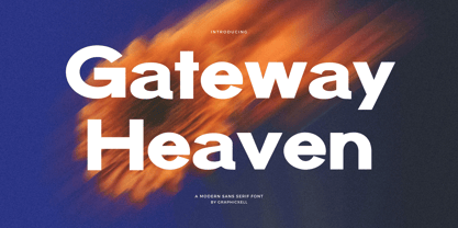 Gateway Heaven Modern Bold Sans serif Font inspired by the famous minimalist logo perfect for the purposes of designing templates, brochures, videos, advertising branding, logos, invitation, layout design, elegant crafting, beauty design and other What's Included : Standard glyphs International Accent Works on PC & Mac Simple installations Accessible in the Adobe Illustrator, Adobe Photoshop, Corel Draw. PUA Encoded Characters - Fully accessible without additional design software. Fonts include multilingual support Image used : All photographs/pictures/vector used in the preview are not included, they are intended for illustration purpose only. Thank You
 - Asian Railway JNL by Jeff Levine,
$29.00 A poster for the 1932 film “Shanghai Express” starring Marlene Dietrich has the films name is a semi-Asian lettering style. This bold poster font is now available as Asian Railway JNL in both regular and oblique versions.
 - Railway Depot JNL by Jeff Levine,
$29.00 A bold spur serif design found within the pages of the 1934 French lettering instruction book “L'Art du Tracé Rationnel de la Lettre” provided the inspiration for Railway Depot JNL, which is available in both regular and oblique versions.
 - Midwest Railway JNL by Jeff Levine,
$29.00 An antique, hand-cut metal stencil for the Chicago-Burlington rail route stating “CB&Q RR – Private Property” inspired the sans serif stencil design Midwest Railway JNL, which is available in both regular and oblique versions.
 - Western Railway JNL by Jeff Levine,
$29.00Western Railway JNL was inspired by sample lettering found in an old sign painter's reference book published during the early part of the 20th Century and modified for today's digital applications by Jeff Levine. - SK Shpala by Shriftovik,
$32.00 SK Shpala is a modern geometric display typeface inspired by the aesthetics of railways. The typeface is built on a system that includes a combination of wide lines and thin gaps, which creates a unique character pattern. The name of the typeface refers to the railway tie for a reason, as the text typed in this typeface really resembles the railway tracks from above. The typeface is multilingual and supports many languages of both Latin and Cyrillic. Despite the strong decorative component, the SK Shpala typeface is a powerful tool for working with typography and design. The typeface is also perfect for poster design and large headlines.
 - Corinthian by ITC,
$29.99Corinthian is the work of Colin Brignall, a clean sans serif which was inspired by Edward Johnston's Railway Type and Eric Gill's Gill Sans. - Stampede by FontMesa,
$25.00Stampede was created from a small sample of letters found on an old document dating back to 1902 from the Chicago, Indiana & Eastern Railway Co. - Capstone by Rivet Designworks,
$10.00 Capstone is a display typeface influenced by the bold angular features of stone architecture, especially that of cathedrals and archways. It works well for short bold titles or brands.
 - Blackletter Moderne JNL by Jeff Levine,
$29.00 Blackletter Moderne JNL was inspired by the original 1935 pencil drafts for “Deutsche Schrift” (German script); designed for the country’s railway system – and is available in both regular and oblique versions.
 - Koch Schrift by Ingo,
$42.00 A heavy blackletter; Rudolf Koch’s first type from 1909. On an old page full of type specimen from the 1930s, the type is described as ”Schwabacher (used by the Deutsche Reichsbahn [German Imperial Railway]).“ As a matter of fact, it is the first print of the Offenbach script master Rudolf Koch, who came out with this typeface in 1909. At that time, it was given the name ”Neudeutsch“ (New German). Later, it became very popular under the name Koch-Schrift, and was at times the official typeface of the Deutsche Reichsbahn (German Imperial Railway).
 - Gravesend Sans by Device,
$39.00 Smart, legible and elegant, Gravesend Sans is a based on the unique typeface used for the iconic grass-green signage for the Southern Railway. In existence from 1923 to 1948, when the network was nationalised, the Southern Railway linked London with the Channel ports, South West England, the South coast resorts and Kent. The same design was also used for the ‘hawkeye’ signs on the London, Midland and Scottish Railway, differentiated by black letters on a yellow background. Reference for each letter was taken from vintage ‘target’ station nameplates and other platform signage. The rarest letters were the Q, seen in Queens Road Battersea, the X, seen in East Brixton, and the Z, used in Maze Hill, site of an infamous train crash in 1958. Being hand-made, the letters often differ in width and thickness. There was no lower case. The Bluebell Railway, a heritage steam line, runs over part of the old Southern Railway network and uses a very similar type. The design of the numbers differed considerably, but here have been taken from the Device 112 Hours font Smokebox. As well identifying platforms, they were used on the front of the steam engine’s smokebox, hence the name, and stylistically are more in keeping with the letters than some of the squarer versions that can be seen in old photographs. William Caslon IV is credited with the first Latin sans-serif type, shown in a 1816 Caslon specimen book. ‘Two Lines English Egyptian’, as it was called, was caps-only, and there are several other correlations between that type design and this one. Includes a selection of authentic arrows and manicules, plus abbreviated ligatures such as ‘St.’ (Saint or Street) ‘Rd.’ (Road) and ‘Jn.’ (Junction). The Cameo version includes many graphic banner elements that can be freely combined.
 - Birmingham New Street by Greater Albion Typefounders,
$12.50 Birmingham New Street is the latest updated development of a typeface family inspired by the hand lettered title on a 19th century railway map. The map, prepared by the London and North Western Railway was headed "Birmingham and environs". New Street, meanwhile is the great 19th century commercial road linking the city centre of Birmingham with the train station of the same name. So, in a spirit of 19th century enterprise, we present "Birmingham New Street", a fun family of three display faces, laden with open type features and late Victorian charm, ideal for posters, book covers and any other high flown design you might have in mind.
 - Railyard Stencil JNL by Jeff Levine,
$29.00Railyard Stencil JNL is a stencil variant of Decal JNL that was set aside for a long time in a forgotten work folder. It's broad strokes and sharp serifs emulate the vintage look of old railway cars and other earlier forms of transportation. - Passenger Train JNL by Jeff Levine,
$29.00 A 1940s travel poster for the Florida East Coast Railway (which then carried passengers but is now a freight line) had the railroad’s name hand lettered in a bold Art Deco sans. This inspired Passenger Train JNL, which is available in both regular and oblique versions.
 - Great Lakes Shadow NF by Nick's Fonts,
$10.00Handlettering on a 1930s travel poster for the Canadian Pacific Railway provided the pattern for this distinctive Deco typeface. A strong dropshadow treatment has been added so you can create can't-miss headlines easily. Both versions of the font contain characters to support all major European languages. - MUNIficent - Unknown license

- Sprint by Linotype,
$29.99Sprint is a forward-leaning display face that was created by the noted Italian type designer Aldo Novarese. The font is a perfect match for 1970s era racecars, or 21st Century e-commerce start-ups. Get with the speed today, and try out Sprint in a headline or two. - Dining Car JNL by Jeff Levine,
$29.00 A 1929 German travel poster espoused the benefits of using a sleeping car with the caption “Wer Schlafwagen reist spart Zeit und Geld” (which translates to “Whoever travels in a sleeping car saves time and money”). Pictured on the poster is a passing train with the name "Mitropa" lettered on the side of a railway car in a bold, stylized font with thin slab serifs. "Mitropa" was an acronym of “Mitteleuropa” (German for Central Europe), and was used by a catering company than ran the sleeping and dining cars of numerous German railways for a good portion of the 20th Century. The lettering was modified and redrawn as Dining Car JNL, which is available in both regular and oblique versions.
 - Pardon Me Boy! by Greater Albion Typefounders,
$8.00 Pardon me boy, is that the Chattanooga Choo-choo? Well, not quite, but "Pardon Me Boy!" is a set of silhouette based ornaments capturing railway locomotives and rolling stock from around the world. Use it to form up trains to make suitable themed rules and borders, or just for fun anywhere a bit of locomotive power will add life and movement!
 - Cyhiru by Twinletter,
$13.00 Introducing "Cyhiru Font" - The Artistry of Handwriting Meets Contemporary Design. Cyhiru Font is your gateway to infusing a personal and distinctive touch into your creative projects. This font seamlessly marries the warmth of handwritten text with a modern aesthetic. What’s Included : File font All glyphs Iso Latin 1 Alternate, Ligature Simple installations PUA Encoded Characters – Fully accessible without additional design software. Fonts include Multilingual support
 - Letter Delivery JNL by Jeff Levine,
$29.00 The combination of some Bodoni extra-wide wood type letters and an image redrawn from a 1940s package label from the long-defunct Railway Express Agency form the characters in Letter Delivery JNL. These initials are perfect for personalizing notes, gift labels, personal stationery and other creative projects. For retail commercial products, please consult the information within the Font License Agreement and contact the font's author directly.
 - Three Horse by Alit Design,
$18.00 Introducing the "Three Horse" Vintage Letter Font Collection – a captivating journey into the artistry of yesteryears. This remarkable font family embodies the essence of vintage charm, offering 12 distinct font variations that encapsulate the character and nostalgia of classic letterforms. The "Three Horse" collection is your gateway to a world of timeless design, perfect for projects seeking to evoke the allure of eras gone by.
 - Teja by Eurotypo,
$59.00 “Teja” font was inspired in the lettering styles printed on enamel advertising signs. The enameled iron signs were, from 1880s until the 1950s, amongst the most striking features of streets and railway stations in most towns and villages around the world. “Teja” was designed specially for use in logotypes, advertising and packaging. It is interesting to note the use of free-flowing lettering to perform its own eye-catching.
 - Great Bromwich by Greater Albion Typefounders,
$14.95 Great Bromwich takes the ideas in Greater Albion's Bromwich family that little bit further. It can be used on its own, or as a compliment to Bromwich. Great Bromwich uses specially re-designed large and small capitals, to enable that bold headline statement to be made with impressive Edwardian flair. In the spirit of railway travel posters and illustrated news journals, its a wonderful font for poster design, or for book covers and other work with a period theme.
 - Hondo by Fontasmic,
$16.99 The Hondo fonts are a collection of ultrabold slab serif typefaces with a dynamic look. Accented with decorative and functional inktraps and complete with Slant and Backslant styles, this heavyweight has a high performance racey feel to it. Ideal for titling, poster work, logos, and small bits of copy.
 - Bahnhof by Storm Type Foundry,
$29.00Poster type faces from the twenties and thirties are enjoying a new wave of popularity. The summary, even rather hard principle of the sign is required for a view from a distance. The information appearing on the poster must be readable even from the opposite pavement. And, as is often the case with monumental type faces, these type faces are legible even in small sizes. The name Bahnhof suggests the hypothetical use of the type face on railway station buildings. - Dotage by ParaType,
$30.00 This decorative caps-only type family was designed in 2004 by Vladimir Pavlikov and licensed by ParaType. Its letterforms are imitating low resolution display letters used at railway stations, airports, and other public places. Regular, Inline, Shadow Left, and Shadow Right styles are available. An additional set of symbols and pictograms is included in each style to increase its decorative abilities. The face is good in magazine advertising, posters, and industrial graphic design in the fields of science and technology.
 - EraMax 123 by Our House Graphics,
$15.00 EraMax 123 is a multi-layered display geometric sans serif, meant to be set BIG, for large, colourful statements. It's the perfect face for packaging, posters & branding, where a strong, colourful voice is needed... Did I mention posters? The "Max" in EraMax comes from the ultra bold weight, but also, and mainly as a tip of the hat to Peter Max, the designer and artist, known for creating so many images which have come to be emblematic of the sixties and seventies. The bold gradient effects in some of his posters were the inspiration behind the dotted and striped layers. This font's vintage flavour truly stand out in a retro setting, but also has a modern flavour that lends it the flexibility to work well in a more contemporary context. This is the second of what is to be an extended family of typefaces based on the original hand painted signage found in the T. H. & B Railway station in Hamilton Ontario, a classic Art Moderne building, designed by the New York architectural firm of Fellheimer and Wagner for the Toronto Hamilton and Buffalo Railway line and completed in 1933.
 - Bromwich by Greater Albion Typefounders,
$14.95 Bromwich is a piece of brand new Edwardian fun. In the spirit of railway travel posters and illustrated news journals, it's a wonderful font for poster design, or for book covers and other work with a period theme. Need something for a menu or placecards for a period themed function? Designing a book cover for a period novel? Bromwich is the face for you. It's offered in regular and alternate forms, with additional true small capital forms of both. Bring a bit of period flare to everything you do!


Page 1 of 4Next page