38 search results
(0.003 seconds)
- Chornylo 2D by 2D Typo,
$32.00 A collection of images from an alcoholic subject.
 - Pyjpyvo 2D by 2D Typo,
$42.00 A set of pictures on the subject of beer.
 - Simeon 2D by 2D Typo,
$46.00 The font Simeon is based on a historic Armenian handwriting notrgir that was made popular in 1756-1757’s by Johann Michael Fleischman who used it for Johann Enschede’s typefoundry and Armenian handwritten capital letters from other European sources edited by a modern Armenian designer. It also contains style and time appropriate Bastardo-Latin and a stylized Cyrillic, complete with full set of Armenian characters and ligatures, required Latin ligatures.
 - Moreske 2D by 2D Typo,
$36.00 The name Moreske, Maureske, Morisca, Morisco comes from Spanish “Mauritanian”. This ornament is based on the greenery motif with strongly stylized stems and leaves fancifully interlacing. Such ornaments were widely used in the 16th century in various decorations from architecture to household goods, and book covers in particular. The font contains high quality vector graphics with elaborate attention to details. This collection consists of friezes (borders) and closed compositions in the shape of circles, squares, rectangles and triangles that can be organized into repeats (patterns). Morseke 2D can be easily used not only in a traditional approach, but also in grunge stylistics enriching your compositions.
 - Florentin 2D by 2D Typo,
$36.00 Angular Old Style by Viktor Kharyk is usable as display font, for non-formal texts, especially poetry, for children books and virtual games about adventures, history, and pirates and includes some original ornament set. By stylistic it connects with Italian Renaissance, Czechian types of the first half of 20th century and cut technology.
 - Mascaron 2D by 2D Typo,
$26.00 The ornamental font is based on original decorative paper cut masks by Iryna Korhcuk.
 - Ascetic 2D by 2D Typo,
$28.00 This decorative font is based on Cyrillic Vyaz of XV-XVI centuries. This type of letters were used as display faces in sacred texts. In Vyaz, the letters are characteristically fitted to each other so the letter sequences look as one solid ornamental frieze. The font is rich in discretionary ligatures which help to accentuate the style of Vyaz. In addition to letters and standard characters there is a number of monograms and Christian symbols. These and other features are available in OTF format.
 - Aztek 2D by 2D Typo,
$36.00 Aztek emerged as a custom face for an ethno-music festival, and gradually developed a more robust, geometric base. The original ethno roots can still be seen in some of the alternative caps, and the ease with which Aztek forms decorative elements and borders. There is also an alternative “Tall Caps” set, that goes alongside normal uppercase characters as if they were Small Caps. The font features Latin (extended to support German and Polish) and Сyrillic character sets. Though Aztek is an accidental face designed primarily for display work, it holds well at smaller sizes and can endure high ink gain printing found in letterpress and silk-screen processes.
 - Hutsulyandiya 2D by 2D Typo,
$36.00 Hutsulyandiya 2D family fonts comprise folk ornaments found on Hutsul ceramics of the mid 19th to early 20th centuries. Hutsulshchyna is an ethnic region in the Ukrainian Carpathian Mountains where folk art and indigenous culture preserve up to nowadays. All images are to the maximum approximated folk prototypes. The graphics are characterized with grotesque, stylization simplicity, surprising plot moves. The font cheers up and evokes positive emotions.
 - Trypillya 2D by 2D Typo,
$36.00 This ornamental font is the interpretation of ornaments of Trypillya culture. Trypillya culture, or Cucuteni-Trypillya is an archaeological culture of neolithic times. Its name derives from the name of the village of Trypillya nearby Kyiv. This culture experienced its culmination between 5500 and 2750 BC. The Trypillians lived in the territories between the Carpathian Mountains and the Dniper River of the modern Ukraine, Moldova and Romania. Many interesting ceramics decorated with original geometric ornaments survived to amaze us. Its heritage is still a little unknown to the public and therefore the patterns that are reproduced in this font have no analogues in the digital format.
 - Cranked Pipe 2D by 2D Typo,
$24.00 Font has Industrial motifs and simple geometric shapes. Best suited for large lettering. Font contains characters for all occasions, many ligatures, alternatives and exotic.
 - New Hotinok 2D by 2D Typo,
$36.00 The type family New Hotinok 2D continues Ukrainian tradition and in the same time connects it with Art Deco style. It is good for presentation, literary, arts and foods, especially sweets and coffee. Connection of geometry and ornamental effect can help in logo design. Includes four styles, Latin diacritics for many languages.
 - Depot Trapharet 2D by 2D Typo,
$- The Depot Trapharet 2D is based on lettering of Lviv tram stands describing the city tram routes. The font is characterized by brutal simplicity bordering with primitivity.
 - Ornamental Deco 2D by 2D Typo,
$36.00 This font was inspired by Lviv ArtDeco architecture dominating in 1920s-30s. This collection of ornaments is a graphic representation of building decorative elements, mostly of metal tracery elements and wall bas-relief. This font can be used for a variety of purposes, in graphic design as well as in industrial design.
 - Pressure Drop 2D by 2D Typo,
$18.00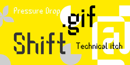
- Historism Border 2D by 2D Typo,
$36.00 Historism Border 2D is a collection of ornaments organized into four font files. The ornaments can be divided into two groups: Friezes (borders) and Rapports (patterns). All the ornaments attribute to the period of Historicism, which prevailed in art in the middle of the 19th century. The ornaments are based on elements of architectural decorations of Lviv buildings in Ukraine. The author personally collected the material and embodied it in the font. This makes the font exclusive and unique among other digital collections of ornaments. These patterns are perfectly suited to be used in the design of invitations, diplomas, certificates or other printed materials in classic-style design.
 - Rally Symbols 2D by 2D Typo,
$24.00 The Rally Symbols 2D font family has been developed for integrated graphical motor racing design. First of all that includes rally, rally raid, cross-country rally and hill climb. With the Rally Symbols 2D - Signs font one can create quality road maps with rally routes and various symbol books. The font also includes symbols that can serve as workpieces to create competition logos and other design solutions. The Rally Symbols 2D - Arrow font has been specially developed for building tulip diagram road books. It includes various ready-made combination of traffic direction indicators and individual elements that can be combined together. The Rally Symbols 2D - Picto font can be used for the same purposes but also contains a range of convention that can help to find one’s bearings on the ground. This is a a wide range of icons or pictograms of various scenery, for example: different buildings, churches, cemetery, bridges, tunnels, different types of trees, posts, etc.
 - Messy Linocut 2D by 2D Typo,
$24.00 Don't try to find logic in this font, nor the harmony of the forms. It is meant to be crank. All the letters were first cut in linoleum and then digitized. Hence, everything is alive. You will find no uniform elements. We think this font will find its use in the hands of a brave designer.
 - Old Depot by 2D Typo,
$24.00 Old Depot is a newly reworked idea for the Depot Trapharet 2D font. It supports more languages and is available in more lettering. Old Depot stands out with its industrial nature of archaic spirit. It is a wonderful choice for solid uncompromising inscriptions or slogans. Don't be afraid to be brutal!
 - Outr by Outerend,
$20.00 The fonts "Outr" were created with the concept of typography in motion. These display fonts look unique as movie titles, TV show logos, game titles, and many other products, especially with edgy and tech designs on screens. These are more suitable for and work very well in 2D and 3D motion graphics.
 - Core Magic Rough by S-Core,
$20.00 Core Magic Rough is a textured version of Core Magic which is a layered type family consisting of seven 3D effect layers, eight 2D effect layers and one shadow effect layer. Uppercase and lowercase letters are separated by such features that counters are opened or closed. Core Magic provides other closed counter styles such as numbers with opentype feature (Stylistic Alternatives). Using Core Magic Rough with Core Circus Rough could make your works more charming and special with endless combinations (at least 262,551 kinds). This family is really nice for book titles, headlines, logotypes and any artworks.
 - Fury by Canada Type,
$24.95 Get your goggles on. You're on your way to the Metaverse, where no subject is off limits, everyone has an avatar, and reality is subjective. The world can be turned off or on at your very whim. Never mind the markets, resource counters, national inflations, caviar-loaded barons, environmental surprise, or who will nuke whom first. In 2D it's all peace and understanding. This is the great escape, shell, shield, your real fury against furious reality. One fist in the air is the start of a revolution. Two fists are the end of a victory. You are in between. Be smooth. Stay sharp. Walk the line.
 - Kolm Keltek by 2D Typo,
$36.00 Kolm Keltek is a collection of ornaments organized into two font files. The ornaments can be divided into two groups: Friezes (borders) and Rapports (patterns). All ornaments belong to the Celtic culture. These ornaments are taken from manuscripts. This makes the font exclusive and unique among other digital collections of ornaments. These patterns perfectly suit to be used in the design of invitations, diplomas, certificates or other printed materials in historical style design. Kolm Keltek - Demo Guide contains basic examples of how to combine the ornaments that significantly facilitates the use of the collection. Kolm Keltek is one of the many high-quality ornamental fonts offed by the 2D Typo foundry.
 - Core Circus by S-Core,
$20.00 Core Circus is a layered type family consisting of seven 3D effect layers, eight 2D effect layers and one shadow effect layer. Uppercase and lowercase letters are separated by such features that counters are opened or closed. Core Circus provides other closed counter styles such as numbers with opentype feature (Stylistic Alternatives). Also available Core Magic (Slab- Serif version of Core Circus) and Core Circus Rough(Textured version) The shape of Core Circus is simple but the combinations of effect fonts are impressive. Core Circus makes your works charming and special with endless combinations (at least 262,551 kinds). This family is really nice for book titles, headlines, logotypes and any artworks.
 - Core Magic by S-Core,
$20.00 Core Magic is a slab-serif version of Core Circus which is a layered type family consisting of seven 3D effect layers, eight 2D effect layers and one shadow effect layer. Uppercase and lowercase letters are separated by such features that counters are opened or closed. Core Magic provides other closed counter styles such as numbers with opentype feature (Stylistic Alternatives). Using Core Magic with Core Circus could make your works more charming and special with endless combinations (at least 262,551 kinds). This family is really nice for book titles, headlines, logotypes and any artworks. Also available the rough version of this family - Core Magic Rough.
 - Core Circus Rough by S-Core,
$20.00 Core Circus Rough is a textured version of Core Circus which is a layered type family consisting of seven 3D effect layers, eight 2D effect layers and one shadow effect layer. Uppercase and lowercase letters are separated by such features that counters are opened or closed. Core Circus provides other closed counter styles such as numbers with opentype feature (Stylistic Alternatives). Also available Core Magic Rough (Slab-Serif version of Core Circus Rough) The shape of Core Circus is simple but the combinations of effect fonts are impressive. Core Circus makes your works charming and special with endless combinations (at least 262,551 kinds). This family is really nice for book titles, headlines, logotypes and any artworks.
 - Grippo by Canada Type,
$24.95 The first Grippo sketches were done in the 1980s, but only now does it see the light of day as a complete series of interchangeable, layerable fonts. The original single-font concept was simple enough: Double the stems so they become sturdy handles. But then we elected to add more playfulness and versatility to the idea. By separating the main idea’s layers and producing them as individual fonts, layerability is achieved, and endless possibilities of play and variation arise. In 2D or 3D, colourful or demure, in titling or as initials, Grippo is a great eye-catcher that emphasizes the big fun aspect of your design. Each font of the Grippo suite comes with a few built-in alternates, a glyphset of over 385 characters, and support for the majority of Latin-based languages.
 - Chordette for Education - Ukulele by Ukefarm,
$8.00 What is it? Chordette for Education is a ukulele chord font created specifically for schools and individual instructors. It can be used for creating song sheets, presentations, or adding chords to videos. This education version has a basic chord set for beginners which include finger positions and an option for 3D chords. It’s a favorite tool for teachers, music therapists, and musicians. What instruments are supported? Chordette for Education supports ukulele tuned GCEA. The fonts are available in black and white for Windows and Macintosh. The 2D chords include fingering numbers and the chords can be used for song sheets, presentation software, and video tutorials. Alternate chords and 3D chords for presentations are included. Is it free? Chordette for Education is priced at $8, which includes chord font sets for both Mac and Windows. How do I use it? For help and support, please visit https://ukefarm.com/chordetteEd/help.html
 - Metal Cry by Fabulous Rice,
$25.00 Metal Cry is a font family that was inspired by countless hours spent playing video games, watching old movies or reading comic books. And even more hours closely analysing the design of all these things. The art of creating beautiful letters has slowly declined with the rise of the digital age and its solid-colour, 2D fonts. And most of the time, the care given to typography in cultural products just isn't what it used to be anymore. This was the inspiration for Metal Cry, a family of 4 layerable fonts that can bring a feeling of depth to its letters, and offers endless possible combinations. Metal Cry Outlands is the basic shape of all the characters, it can be used as the bright side of the bevel. Metal Cry Front is the inline border font that can be used as the front side of the bevel. Metal Cry Shadow can be used as the dark side of the bevel. Metal Cry Depth can be used to flash out the inside shape of the letter. But of course, any font can be combined with any other font(s) to obtain various results. The planets in the above visuals are courtesy of 3D artist Thomas Veyrat / veyratom.com
 - Sworded by Fabulous Rice,
$35.00 Sworded is a font family of 8 fonts that was inspired by such diverse things as architecture, tombstones, video games, watching old movies or reading comic books. The art of creating beautiful letters has slowly declined with the rise of the digital age and its solid-colour, 2D fonts. And most of the time, the care given to typography in cultural products just isn't what it used to be anymore. This was the inspiration for Sworded, a family of 4 layerable fonts that can bring a feeling of depth to its letters, and offers endless possible combinations. Sworded Regular is the basic shape of all the characters. Sworded Deep gives an impression of depth to characters or acts on its own as an illusion. Sworded Bright can be used as the bright side of a bevel. Sworded Dark can be used to flesh out the dark side of a bevel. Sworded Shadowed is a contour font with a shadow effect. Sworded Wire is a wire font without depth indication. Sworded Outline is an outline font. Sworded Hatched is a variation of Sworded Shadowed with lines giving a gradient illusion. But of course, any font can be combined with any other font(s) to obtain various results. There are hundreds possible combinations with these eight fonts. Have fun!
 - FS Pele by Fontsmith,
$50.00 Iconic Conjuring memories of chunky typefaces from the late-60s and early-70s, and named after the world’s greatest footballer of that and probably any other era, FS Pele is one of a set of Fontsmith fonts designed specifically for headlines and other prominent applications. “We wanted to create fonts that could be integral to the design of posters, album covers and magazines,” says Jason Smith. Welcome to FS Pele, iconic, like its namesake (though, perhaps, a little less nimble). Big Pele, little Pele There was only one Pele. But there are two sizes of FS Pele. FS Pele One, with the finer counters and details, adds considerable weight and style at large sizes, especially in big block headlines on posters. FS Pele Two’s thicker “slots” make it a better choice for smaller-sized text. A load of blocks FS Pele began as an exercise by Phil Garnham in turning squares into legible letters, via the least means necessary. The idea extended his ideas about logo-making, and the search for a stamp-like brand mark that lends authority, stability and instant identification. “The thought that the type was a 2D/3D jigsaw of slotted, architectural pieces was almost an after-thought. I wanted to create a strong, stacking, block aesthetic for the most contemporary poster design. “At the time there were a lot of designers creating their own versions of the same thing but I wanted to take the blocker forms to the next step, and infer a more legible text without sacrificing the idea.”
 - FS Pele Variable by Fontsmith,
$199.99Iconic Conjuring memories of chunky typefaces from the late-60s and early-70s, and named after the world’s greatest footballer of that and probably any other era, FS Pele is one of a set of Fontsmith fonts designed specifically for headlines and other prominent applications. “We wanted to create fonts that could be integral to the design of posters, album covers and magazines,” says Jason Smith. Welcome to FS Pele, iconic, like its namesake (though, perhaps, a little less nimble). Big Pele, little Pele There was only one Pele. But there are two sizes of FS Pele. FS Pele One, with the finer counters and details, adds considerable weight and style at large sizes, especially in big block headlines on posters. FS Pele Two’s thicker “slots” make it a better choice for smaller-sized text. A load of blocks FS Pele began as an exercise by Phil Garnham in turning squares into legible letters, via the least means necessary. The idea extended his ideas about logo-making, and the search for a stamp-like brand mark that lends authority, stability and instant identification. “The thought that the type was a 2D/3D jigsaw of slotted, architectural pieces was almost an after-thought. I wanted to create a strong, stacking, block aesthetic for the most contemporary poster design. “At the time there were a lot of designers creating their own versions of the same thing but I wanted to take the blocker forms to the next step, and infer a more legible text without sacrificing the idea.” - Ah, "AddShade" – the mysterious, yet seemingly playful character in the grand narrative of typography. Picture this: Imagine you're walking down the street on a sunny afternoon. The sun is high, cast...
- Ganymede3D, ah, the font that decided it was too cool for the 2D world and literally popped out of the page to prove its point. This is not just a font; it's an adventure in typography that decided t...
- Ryzes by Ferry Ardana Putra,
$17.00 Introducing "Ryzes" – a font that plunges you into the immersive world of cyber graffiti with a distinct cyberpunk feel. This font is your gateway to a dystopian digital realm, combining edgy aesthetics with a futuristic vibe that speaks of rebellion and technology. "Ryzes" captures the very essence of the cyberpunk genre, offering a text that embodies the rebellious and high-tech spirit of a dystopian future. Each character resonates with the anarchic energy and unconventional style of cyber graffiti, making your designs pop with a captivating and distinctive edge. In our globalized world, language is a bridge that knows no borders. "Ryzes" is equipped with extensive multi-language support, ensuring that your message can be effectively communicated to audiences around the world, regardless of language or script. Complete Character Set: "Ryzes" boasts a comprehensive character set that includes both uppercase and lowercase letters, numerals, and a rich selection of symbols and punctuations. This versatility ensures that your text is not only visually stunning but also functionally adaptable. But that's not all. "Ryzes" takes your creativity a step further with an extruded version. This adds depth and dimension to your designs, allowing you to effortlessly create 3D text that embodies the cyberpunk aesthetic. The combination of the regular and extruded styles offers endless possibilities for crafting captivating 3D designs. Whether you're working on cyberpunk-inspired branding, futuristic posters, or any project that demands a cyber graffiti aesthetic, "Ryzes" is your ultimate companion for pushing the boundaries of design. Dive into a world where rebellion meets technology and let "Ryzes" be your creative tool in crafting designs that resonate with the electrifying spirit of the cyberpunk genre in 2D and 3D dimensions, bursting with color and pop culture excitement. ——— Ryzes features: A full set of Uppercase and Lowercase Numbers and punctuation Multilingual language support PUA Encoded Characters OpenType Features Layered Style +274 Total Glyphs ——— Ryzes Includes: Ryzes Regular Ryzes Extruded Left Ryzes Extruded Right
 - Prismatic Spirals by MMC-TypEngine,
$93.00 PRISMATIC SPIRALS FONT! The Prismatic Spirals Font is a decorative type-system and ‘Assembling Game’, itself. Settled in squared pieces modules or tiles, embedded by unprecedented Intertwined Prismatic Structures Design, or intricate interlaced bars that may seem quite “impossible” to shape. Although it originated from the ‘Penrose Square’, it may not look totally as an Impossible Figures Type of Optical Illusions. More an “improbable” Effect in its intertwined Design, that even static can seem like a source of Kinetical Sculptures, or drive eyes into a kind of hypnosis. Prismatic Spirals has two related families, its “bold” braided version Prismatic Interlaces and the Pro version. While the default is simpler or easier to use, as all piece’s spin in same way, PRO provides a more complex intricate Design which requires typing alternating caps. Instructions: Use the Map Font Reference PDF as a guide to learn the 'tiles' position on the keyboard, then easily type and compose puzzle designs with this font! All alphanumeric keys are intuitive or easy to induce, you may easily memorize it all! Plus, often also need to consult it! *Find the Prismatic Spirals Font Map Reference Interactive PDF Here! (!) Is recommended to Print it to have the Reference in handy or just open the PDF while composing a design with this typeface to also copy and paste, when consulting is required or when it may be difficult to access, depending on the keyboard script or language. As a Tiles Type-System, the line gap space value is 0, this means that tiles line gaps are invisibly grouted, so the user can compose designs, row by row, descending to each following row by clicking Enter, same as line break, while advances on assembling characters. Background History: The first sketches of my Prismatic Knots or Spirals Designs dates back then from 2010, while started developing hand-drawn Celtic Knots and Geometric Drawings in grid paper, while engage to Typography, Sacred Geometry and the “Impossible Figures” genre… I started doing modulation tests from 2013, until around 2018, I got to unravel it in square modules or tiles from the grid, then idealized it as fonts, along with other Type projects. This took 13 years to come out since the first sketches and 6 months in edition. During the production process some additional tiles or missing pieces were thought of and added to the basic set, which firstly had only the borders, corners, crossings, nets, Trivets connectors or T parts and ends, then added with nets and borders integrations. Usage Suggestions: This type-system enables the user to ornate and generate endless decorative patterns, borders, labyrinthine designs, Mosaics, motifs, etc. It can seem just like a puzzle, but a much greater tool instead for higher purposes as to compose Enigmas and use seriously. As like also to write Real Text by assembling the key characters or pieces, this way you can literarily reproduce any Pixel Design or font to its Prismatic Spirals correspondent form, as Kufic Arabic script and further languages and compose messages easily… This Typeface was made to be contemplated, applied, and manufactured on Infinite Decorative Designs as Pavements, Tapestry, Frames, Prints, Fabrics, Bookplates, Coloring Books, Cards, covers or architectonic frontispieces, storefronts, and Jewelry, for example. Usage Tips: Notice that the line-height must be fixed to 100% or 1,0. In some cases, as on Microsoft Word for example, the line-height default is set to 1,15. So you’ll need to change to 1,0 plus remove space after paragraph, in the same dropdown menu on Paragraph section. Considering Word files too, since the text used for mapping the Designs, won't make any literal orthographical sense, the user must select to ignore the Spellcheck underlined in red, by clicking over each misspelled error or in revision, so it can be better appreciated. Also unfolding environments as Adobe Software’s, the Designer will use the character menu to set body size and line gap to same value, as a calculator to fit a layout for example of 1,000 pts high with 9 tiles high, both body size and line gap will be 111.1111 pts. Further Tips: Whenever an architect picks this decorative system to design pavements floor or walls, a printed instruction version of the layout using the ‘map’ font may be helpful and required to the masons that will lay the tiles, to place the pieces and its directions in the right way. Regarding to export PNGs images in Software’s for layered Typesetting as Adobe Illustrator a final procedure may be required, once the designs are done and can be backup it, expanding and applying merge filter, will remove a few possible line glitches and be perfected. Technical Specifications: With 8 styles and 4 subfamilies with 2 complementary weights each (Regular and Bold) therefore, Original Contour, Filled, Decor, with reticle’s decorations and 2 Map fonts with key captions. *All fonts match perfectly when central pasted for layered typesetting. All fonts have 106 glyphs, in which 48 are different keys repeated twice in both caps and shift, plus few more that were repeated for facilitating. It was settled this way in order for exchanging with Prismatic Spirals Pro font which has 96 different keys or 2 versions of each. Concerning tiles manufacturing and Printed Products as stickers or Stencils, any of its repeated pieces was measured and just rotated in different directions in each key, so when sided by other pieces in any direction will fit perfectly without mispatching errors. Copyright Disclaimer: The Font Software’s are protected by Copyright and its licenses grant the user the right to design, apply contours, plus print and manufacture in flat 2D planes only. In case of the advent of the same structures and set of pieces built in 3D Solid form, Font licenses will not be valid or authorized for casting it. © 2023 André T. A. Corrêa “Dr. Andréground” & MMC-TypEngine.
 - Prismatic Interlaces by MMC-TypEngine,
$93.00 PRISMATIC INTERLACES TYPEFACE! Prismatic Interlaces is a decorative system and ‘Assembling Game’, itself. Settled in squared pieces modules or tiles, embedded by unprecedented Intertwined Prismatic Structures Design, or intricate interlaced bars that may seem quite “impossible” to shape. Although it originated from the ‘Penrose Square’, it may not look totally as an Impossible Figures Type of Optical Illusions. More an “improbable” Effect in its intertwined Design, that even static can seem like a source of Kinetical Sculptures, or drive eyes into a kind of hypnosis. Prismatic Interlaces has two related families, both as a kind of lighter weight versions Prismatic Spirals Default & Pro. While Default is simpler or easier to use, same way as Prismatic Interlaces, Pro provides a more complex intricate Design that requires typing alternating caps. Instructions: Use the Map Font Reference PDF as a guide to learn the 'tiles' position on the keyboard, then easily type and compose puzzle designs with this font! All alphanumeric keys are intuitive or easy to induce, you may easily memorize it all! Plus, often also need to consult it! *Find the Prismatic Interlaces Font Map Reference Interactive PDF Here! (!) Is recommended to Print it to have the Reference in handy or just open the PDF while composing a design with this typeface to also copy and paste, when consulting is required or when it may be difficult to access, depending on the keyboard script or language. As a Tiles Type-System, the line gap space value is 0, this means that tiles line gaps are invisibly grouted, so the user can compose designs, row by row, descending to each following row by clicking Enter, same as line break, while advances on assembling characters. Background History: The first sketches of my Prismatic Knots or Spirals Designs dates back then from 2010, while started developing hand-drawn Celtic Knots and Geometric Drawings in grid paper, while engage to Typography, Sacred Geometry and the “Impossible Figures” genre… I started doing modulation tests from 2013, until around 2018, I got to unravel it in square modules or tiles from the grid, then idealized it as fonts, along with other Type projects. This took 13 years to come out since the first sketches and 6 months in edition. During the production process some additional tiles or missing pieces were thought of and added to the basic set, which firstly had only the borders, corners, crossings, nets, Trivets connectors or T parts and ends, then added with nets and borders integrations. Usage Suggestions: This type-system enables the user to ornate and generate endless decorative patterns, borders, labyrinthine designs, Mosaics, motifs, etc. It can seem just like a puzzle, but a much greater tool instead for higher purposes as to compose Enigmas and use seriously. As like also to write Real Text by assembling the key characters or pieces, this way you can literarily reproduce any Pixel Design or font to its Prismatic Spirals correspondent form, as Kufic Arabic script and further languages and compose messages easily… This Typeface was made to be contemplated, applied, and manufactured on Infinite Decorative Designs as Pavements, Tapestry, Frames, Prints, Fabrics, Bookplates, Coloring Books, Cards, covers or architectonic frontispieces, storefronts, and Jewelry, for example. Usage Tips: Notice that the line-height must be fixed to 100% or 1,0. In some cases, as on Microsoft Word for example, the line-height default is set to 1,15. So you’ll need to change to 1,0 plus remove space after paragraph, in the same dropdown menu on Paragraph section. Considering Word files too, since the text used for mapping the Designs, won't make any literal orthographical sense, the user must select to ignore the Spellcheck underlined in red, by clicking over each misspelled error or in revision, so it can be better appreciated. Also unfolding environments as Adobe Software’s, the Designer will use the character menu to set body size and line gap to same value, as a calculator to fit a layout for example of 1,000 pts high with 9 tiles high, both body size and line gap will be 111.1111 pts. Further Tips: Whenever an architect picks this decorative system to design pavements floor or walls, a printed instruction version of the layout using the ‘map’ font may be helpful and required to the masons that will lay the tiles, to place the pieces and its directions in the right way. Regarding to export PNGs images in Software’s for layered Typesetting as Adobe Illustrator a final procedure may be required, once the designs are done and can be backup it, expanding and applying merge filter, will remove a few possible line glitches and be perfected. Technical Specifications: With 8 styles and 4 subfamilies with 2 complementary weights each (Regular and Bold) therefore, Original Contour, Filled, Decor, with reticle’s decorations and 2 Map fonts with key captions. *All fonts match perfectly when central pasted for layered typesetting. All fonts have 106 glyphs, in which 49 are different keys repeated twice in both caps and shift, plus few more that were repeated for facilitating. It was settled this way in order for exchanging with Prismatic Spirals Pro font which has 96 different keys or 2 versions of each. Concerning tiles manufacturing and Printed Products as stickers or Stencils, any of its repeated pieces was measured and just rotated in different directions in each key, so when sided by other pieces in any direction will fit perfectly without mispatching errors. Copyright Disclaimer: The Font Software’s are protected by Copyright and its licenses grant the user the right to design, apply contours, plus print and manufacture in flat 2D planes only. In case of the advent of the same structures and set of pieces built in 3D Solid form, Font licenses will not be valid or authorized for casting it. © 2023 André T. A. Corrêa “Dr. Andréground” & MMC-TypEngine.
 - Prismatic Spirals Pro by MMC-TypEngine,
$182.00 PRISMATIC SPIRALS PRO FONT! The Prismatic Spirals PRO is a Decorative Type-System and ‘Assembling Game’, itself. Settled in squared pieces modules or tiles, embedded by unprecedented Intertwined Prismatic Structures Design, or intricate interlaced bars that may seem quite “impossible” to shape. Although it originated from the ‘Penrose Square’, it may not look totally as an Impossible Figures Type of Optical Illusions. More an “improbable” Effect in its intertwined Design, that even static can seem like a source of Kinetical Sculptures, or drive eyes into a kind of hypnosis. Prismatic Spirals Pro has two related Typefaces both more basic or easier to use versions, the Default Family plus its “bold” braided version Prismatic Interlaces… PRO provides a more advanced, complex, and twisted Design, plus requires to be typed alternating caps. Instructions: Use the Map Font Reference PDF as a guide to learn the 'tiles' position on the keyboard, then easily type and compose puzzle designs with this font! All alphanumeric keys are intuitive or easy to induce, you may easily memorize it all! Plus, often also need to consult it! *Find the Prismatic Spirals Pro Font Map Reference PDF Here! (!) Is recommended Print it to have the Reference or open the PDF to also copy and paste, when consulting is required or when it may be difficult to access, depending on the keyboard script or language. The 2 glyphs sets are separated in colors for facilitating. Also use the Map Font with key captions or switch to it for ensure that the characters are alternating between both uppercase and lowercase letters as other Keys as numbers, marks, and punctuation along the strings, holding Shift one by one or actually two by two. As a Tiles Type-System, the line gap space value is 0, this means that tiles line gaps are invisibly grouted, so the user can compose designs, row by row, descending to each following row by clicking Enter, same as line break, while advances on assembling characters. Background History: The first sketches of my Prismatic Knots or Spirals Designs dates back then from 2010, while started developing hand-drawn Celtic Knots and Geometric Drawings in grid paper, while engage to Typography, Sacred Geometry and the “Impossible Figures” genre… I started doing modulation tests from 2013, until around 2018, I got to unravel it in square modules or tiles from the grid, then idealized it as fonts, along with other Type projects. This took 13 years to come out since the first sketches and 6 months in edition. During the production process some additional tiles or missing pieces were thought of and added to the basic set, which firstly had only the borders, corners, crossings, nets, Trivets connectors or T parts and ends, then added with nets and borders integrations. Usage Suggestions: This type-system enables the user to ornate and generate endless decorative patterns, borders, labyrinthine designs, Mosaics, motifs, etc. It can seem just like a puzzle, but a much greater tool instead for higher purposes as to compose Enigmas and use seriously. As like also to write Real Text by assembling the key characters or pieces, this way you can literarily reproduce any Pixel Design or font to its Prismatic Spirals correspondent form, as Kufic Arabic script and further languages and compose messages easily… This Typeface was made to be contemplated, applied, and manufactured on Infinite Decorative Designs as Pavements, Tapestry, Frames, Prints, Fabrics, Bookplates, Coloring Books, Cards, covers or architectonic frontispieces, storefronts, and Jewelry, for example. Usage Tips: Notice that the line-height must be fixed to 100% or 1,0. In some cases, as on Microsoft Word for example, the line-height default is set to 1,15. So you’ll need to change to 1,0 plus remove space after paragraph, in the same dropdown menu on Paragraph section. Considering Word files too, since the text used for mapping the Designs, won't make any literal orthographical sense, the user must select to ignore the Spellcheck underlined in red, by clicking over each misspelled error or in revision, so it can be better appreciated. Also unfolding environments as Adobe Software’s, the Designer will use the character menu to set body size and line gap to same value, as a calculator to fit a layout for example of 1,000 pts high with 9 tiles high, both body size and line gap will be 111.1111 pts. Further Tips: Whenever an architect picks this decorative system to design pavements floor or walls, a printed instruction version of the layout using the ‘map’ font may be helpful and required to the masons that will lay the tiles, to place the pieces and its directions in the right way. Regarding to export PNGs images in Software’s for layered Typesetting as Adobe Illustrator a final procedure may be required, once the designs are done and can be backup it, expanding and applying merge filter, will remove a few possible line glitches and be perfected. Technical Specifications: With 8 styles and 4 subfamilies with 2 complementary weights each (Regular and Bold) therefore, Original Contour, Filled, Decor, with reticle’s decorations and 2 Map fonts with key captions. *All fonts match perfectly when central pasted for layered typesetting. All fonts have 106 glyphs, in which 96 are different keys with 2 versions of each of both caps and shift keys, plus a few repeated for facilitating. It was settled this way in order for exchanging with its Prismatic relative fonts which has only 48 different keys repeated twice. Concerning tiles manufacturing and Printed Products as stickers or Stencils, any of its repeated pieces was measured and just rotated in different directions in each key, so when sided by other pieces in any direction will fit perfectly without mispatching errors. Copyright Disclaimer: The Font Software’s are protected by Copyright and its licenses grant the user the right to design, apply contours, plus print and manufacture in flat 2D planes only. In case of the advent of the same structures and set of pieces built in 3D Solid form, Font licenses will not be valid or authorized for casting it. © 2023 André T. A. Corrêa “Dr. Andréground” & MMC-TypEngine.