10,000 search results
(0.046 seconds)
- Andes Italic by Latinotype,
$29.00 Andes, designed by Daniel Hernández, is a display typeface that has neo-humanist characteristics. Its different terminals, among other elements, give it a look of mixed typography. Andes is a typeface with 10 Upright weights, 10 Italics & Condensed version, ranging from Ultra Light to Black, each of the same x-height. This typeface contains additional italic glyphs (a, y, z, g) that help to emphasise text or words. Andes is based on the design of Merced and both of them share several features. This type is well-suited for use in retail, magazines, logotypes, books, etc.
 - andre bold - Unknown license

- Spylord Bold Italic - Unknown license

- Grotesque Bold Italic by Wooden Type Fonts,
$15.00 Based on a revival of one of the popular type fonts of the 19th century, suitable for display, or text.
 - Hold Hand by Putracetol,
$16.00 Hold Hand - A Modern Display Font with Distinctive Charm Hold Hand is an exceptional modern display font that captivates with its unique and original design. This font sets the stage for contemporary creativity, making your projects stand out with its distinct flair. This font comes in two versatile versions, allowing you to choose between the regular and display styles. Additionally, both versions include a rough variant to add character and depth to your typography. Hold Hand is the ideal choice for logo designs, branding, invitations, packaging, posters, titles, businesses, greeting cards, magazines, headlines, and various modern display-themed designs. Whether you're looking to make a bold statement or add a touch of modern elegance to your projects, this font has you covered. Elevate your designs with the unique charm of Hold Hand, and watch your creative visions come to life.
 - Prescript Cn Bold Italic - Unknown license

- Spylord Bold Expanded Italic - Unknown license

- Year 3000 Bold Italic - Unknown license

- D3 Euronism Bold italic - Unknown license

- Land Whale Italic - Unknown license

- PTF NORDIC Rnd - Unknown license

- ATF Headline Gothic by ATF Collection,
$59.00 ATF Headline Gothic cries out to be used in headlines, and that is exactly how it was used after it was first created by American Type Founders in 1936 with newspapers in mind. It would be hard to imagine a better typeface for a shocking, front-page headline in a scene from an old black-and-white movie. With its all-caps character set, and its big, bold, condensed design, ATF Headline Gothic is the epitome of its name. “Extra! Extra!” The style of ATF Headline Gothic recalls the bold, condensed gothic display faces of the 19th century, but with more refinement in its details than many large types of the time (typically wood type). Its most recognizable trait is the restrained, high-waisted M, with short diagonal strokes that end with their point well above the baseline; this avoids the sometimes cramped look of a bold condensed M with a deep “V” in the middle, common in many similar headline faces. The digital ATF Headline Gothic comes in a single weight, all caps, like its predecessor, but offers two styles: one crisply drawn, and a “Round” version with softer corners, to suggest a more “printed” feel, reminiscent of wood type. Of course, in either style it includes a full modern character set, including symbols such as the Euro, Ruble, and Rupee, that didn’t exist in 1936.
 - ATF Wedding Gothic by ATF Collection,
$59.00 Sporting broad, unadorned caps and just a dash of flair, ATF Wedding Gothic is like an engravers gothic at a black tie affair. It comes from the same tradition as other social gothics from the turn of the twentieth century, such as Engravers gothic and Copperplate. But where these are the faces of business cards and common announcements, ATF Wedding Gothic is a special occasion. Its swaying ‘R’ and ‘Q’, its characterful figures, and spritely-yet-sturdy insouciance make ATF Wedding Gothic well suited for tasteful engagements of all sorts. Yet there is much more here than the name implies. Originally offered long ago as metal type in a single, wide weight, this digital interpretation expands what was once a novelty design into a surprisingly versatile family of nine weights. An additional, narrower, standard width brings the count to eighteen fonts. From Thin to Medium, ATF Wedding Gothic retains the airy elegance of its source, while the heavier side of the family takes on an altogether different feel, more reminiscent of wooden poster type.
 - ATF Alternate Gothic by ATF Collection,
$59.00 ATF Alternate Gothic is a new, significant digital expansion of Morris Fuller Benton’s classic 1903 type design. Originally available in one bold weight, the metal typeface came in three slightly different widths for flexibility in copy-fitting layouts. ATF Alternate Gothic has impact at any size. Its letterforms are instantly familiar: Benton’s original metal type family was used throughout the 20th century in newspapers, magazines, and advertising, providing “strong and effective display” in a compact space. Monotype issued its own metal version for machine typesetting, and Alternate Gothic likely served as inspiration for Linotype’s ubiquitous Trade Gothic® Bold and Bold Condensed. ATF Alternate Gothic expands on the characteristics that perhaps made Trade Gothic so popular, providing a wider range of weights and widths to address the needs of today’s designers and technologies. The space-saving clarity of ATF Alternate Gothic brings readability to the world of advertising typefaces. With its finely graded range of ten weights, with four widths of each weight (40 fonts total), this extensive type family can be used to pack a lot into a narrow space, and the range makes it easy to create variations of an advertisement or announcement for different formats and media. The tall x-height and narrow proportions, combined with a relatively low waist and springy, tension-filled forms, make ATF Alternate Gothic strong and effective in display. All ten weights have been carefully spaced for readability, caps and lowercase work well together, while attention-grabbing all-caps settings are clear and never crowded, no matter how narrow.
 - ATF Poster Gothic by ATF Collection,
$59.00 ATF Poster Gothic is an expansion of a typeface designed in 1934 by Morris Fuller Benton for American Type Founders. The one-weight design was a slightly condensed display companion to Benton’s ubiquitous Bank Gothic family. This new family of aggressively rectilinear headline types expands the design’s possibilities, offering 30 fonts. The all-cap design sports square corners in the counters, creating tension between angular and curved details; this feature, and the generally rectangular shape of the whole alphabet, makes ATF Poster Gothic distinctive on the page or screen, while its relationship to Bank Gothic makes it seem somehow familiar. Vertical strokes on the C, G, J, and S, as well as on several of the numerals, are cut off at an angle, which suggest the curves those strokes might typically display if the characters were less boxy in design and more along the lines of late-19th-century headline faces. Certain weights also recall the style of lettering used on athletic team jerseys, television crime dramas, action & adventure movie titles, and engraved stationery. With three widths and five weights, ATF Poster Gothic is distinctive and versatile at the same time. The full family is also available in a “Round” version, with corners subtly rounded for a softer, more “printed” feel.
 - ATF Railroad Gothic by ATF Collection,
$59.00 First introduced by the American Type Founders Company in 1906, Railroad Gothic was the quintessential typographic expression of turn-of-the-century industrial spirit—bold and brash in tone, and a little rough around the edges. A favorite for the plain speak of big headlines, Railroad Gothic quickly gained popularity among printers. Its condensed but robust forms were likely a source of inspiration for later families of industrial sans serifs. The design feels like a cleaned-up version of some earlier Victorian gothics, notable for their uneven proportions and awkward letterforms. ATF offered a number of sizes of Railroad Gothic as metal type, with cuts varying in design considerably from size to size. Creating this new digital version involved interpreting the characteristics of different sizes and making some aesthetic choices: where to retain the design’s familiar unstudied gawkiness, and where to make improvements. The new ATF® Railroad Gothic features a measured, harmonious interpretation of the original, and has been extended with four new weights (each bolder than the last). The heaviest weights are carefully designed to keep counters open, no matter how dense the overall effect may be, maintaining legibility at any display size. This contemporary rendition of a historic American design boasts a full Latin character set, including glyphs undreamed-of in the heyday of railroads.
 - ATF Franklin Gothic by ATF Collection,
$59.00 ATF Franklin Gothic® A new take on an old favorite Franklin Gothic has been the quintessential American sans for more than a century. Designed by Morris Fuller Benton and released in 1905 by American Type Founders, Franklin Gothic quickly stood out in the crowded field of sans-serif types, gaining an enduring popularity. Benton’s original design was a display face in a single weight. It had a bold, direct solidity, yet conveyed plenty of character. A modern typeface in the tradition of 19th-century grotesques, Franklin Gothic was drawn with a distinctive contrast in stroke weight, giving it a unique personality among the more mono-linear appearance of later geometric and neo-grotesque sans-serif types. Franklin Gothic has been interpreted into a series of weights before, most notably with ITC Franklin Gothic. But as the original type was just a bold display face (later accompanied by a few similarly bold widths and italics), how Benton’s design is expanded to multiple weights and styles as a digital type family can vary significantly. Benton designed several gothic faces that harmonize with one another, including Franklin Gothic, News Gothic, and Monotone Gothic, that can serve as models for new interpretations of his work. With ATF Franklin Gothic, Mark van Bronkhorst looked to Benton’s Monotone Gothic—originally a single typeface in a regular weight, and similar to Franklin Gothic in its forms—as the basis for lighter styles. ATF Franklin Gothic may appear familiar given its heritage, but is a new design offering a fresh take on Benton’s work. The text weights are wider and more open than some previous Franklin Gothic interpretations, and as a result are quite legible as text, at very small sizes, and on screen. ATF Franklin Gothic maintains the warmth and the spirit of a Benton classic while offering a suite of fonts tuned precisely for contemporary appeal and utility. The 18-font family offers nine weights with true italics, a Latin-extended character set, and a suite of OpenType features. Download the PDF specimen for ATF Franklin Gothic.
 - Andes - Unknown license

- Andes by Latinotype,
$29.00 Andes, designed by Daniel Hernández, is a display typeface that has neo-humanist characteristics. Its different terminals, among other elements, give it a look of mixed typography. Andes is a typeface with 10 Upright weights, 10 Italics & Condensed version , ranging from Ultra Light to Black, each of the same x-height. This typeface contains additional italic glyphs (a, y, z, g) that help to emphasise text or words. Andes is based on the design of Merced and both of them share several features. This type is well-suited for use in retail, magazines, logotypes, books, etc.
 - Hand Gothic by JCFonts,
$19.00 Hand Gothic is a condensed typeface with a hand-lettering feeling, available in two weights. The fonts, provided in OpenType format, include support for most European languages and some OpenType extras : ligatures, alternate “A” and “g”, case-sensitive forms and a handful of arrows and icons.
 - Bolded by We Make Font,
$16.00 Bolded is a new complete type family, designed and developed by creative professionals. Contains geometric and rounded features, optimized for both long texts and small screens and texts. The complete family offers seven weights divided between the basic, italic, condensed and condensed italic family. Created in 2022, Bolded has a modern and functional look, designed for the most diverse uses and projects. Bolded is a geometric rounded family that can meet the needs of the most varied professionals looking for a clean and elegant font family with a wide set of Latin characters.
 - Bolde by Figuree Studio,
$18.00 Bolde is a powerful sans serif font family with modern touches. A balance of hard lines and smooth curves makes them able to stand on their own dynamically Features: five all caps font, Numbers & Punctuation / Extensive Language Support Bolde works great in any branding, logos, magazines, film. The different styles give you the full range to explore a whole host of applications. Thanks for having a peek at Bolde. As always, if you have any questions just send me a message!
 - OL Gotham Gothic by Dennis Ortiz-Lopez,
$40.00 - WTF - Unknown license

- Stocks and Bonds JNL by Jeff Levine,
$29.00 The hand lettered opening title for the 1935 movie “Thanks a Million” is rendered in a condensed, thick and thin Art Deco sans serif design. It is now available as the digital typeface Stocks and Bonds JNL – in both regular and oblique versions.
 - HKF Gold Queen DLC by Harry Kasyanov,
$5.00 Gold Queen is a vintage font family with features opentype with extension svg. Perfect for the vintage tattoo studio logos, barbershops, alcohol labels and many other. Includes a full set of character A-Z, numerals, and punctuation. Product content: HKF Gold Queen Regular - (OTF) HKF Gold Queen Drop line - (OTF) HKF Gold Queen Drop shadow (B&W) - (OTF) Color fonts (available only with Adobe illustrator CC 2018 and Photoshop CC from 2017) HKF Gold Queen Drop line (color) - (OTF SVG) HKF Gold Queen Drop shadow (color) - (OTF SVG)
 - Intellecta Pointers And Hands by Intellecta Design,
$14.90
- Old Borders And Lines by RMU,
$15.00 A special offer by RMU Typedesign for those who like it old-style. Now finally with the possibility to create a Greek Meander frame.
 - Sign Gothic Bold Condensed by BA Graphics,
$45.00Strong Bold Condensed Gothic great for poster and display work. - Gothic Special Normal Italic by Wooden Type Fonts,
$15.00 A revival of one of the popular wooden type fonts of the 19th century, suitable for text or display, short descenders, tall ascenders, the narrow, italic version, completing the Gothic Special family of 5 fonts in total, sans serif.
 - Gothic Special Medium Italic by Wooden Type Fonts,
$15.00 A revival of one of the popular wooden type fonts of the 19th century, suitable for text or display, short descenders, tall ascenders, the narrow, italic version, completing the family of 6 fonts in total, sans serif.
 - Gothic XS Hand by UrbanPixel,
$18.00 This font is inspired by gothic woodtype fonts from the begining of the last century. Totally hand-drawn, every glyph is unique to improve the handwritten feeling. Different approaches are used to increase the human-hand look: many alternates, double letters, English bigrams, etc.
 - Copperplate Gothic Hand by Wiescher Design,
$39.50 The classic font as designed by F. W. Goudy for ATF in 1901, now in a hand-drawn version for a little bit of variation. Everybody else just offers another version of the same old Copperplate, but I now have a new rough one. Oh, just for the record, I have a couple of other versions of this font in my collection of the Copperplate Classic fonts. Your rough designer Gert Wiescher
 - Gothic Hand Dirty by TypoGraphicDesign,
$15.00 Headline Font | Display Font | Raw Handwritten Script Font Gothic Hand Dirty with 2 styles (regular, bold) & 58 glyphs.
 - Arts And Crafts Hand BA by Bannigan Artworks,
$19.95This is an original typeface designed in the Arts And Crafts style. It is similar to Arts And Crafts GS, but with a more organic hand lettering style true to the Arts and Crafts movement. It is loosely inspired by the decorative lettering of Jessie Marion King, and the Scottish style of Charles Rennie Mackintosh of the Glasgow School, from which Jessie received her training. - 123 and... - Unknown license

- And Then by Throndsen,
$10.00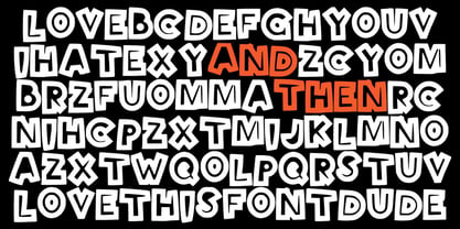
- Andes Neue by Latinotype,
$29.00 Unlike its predecessor, Andes Neue contains a larger character set of 759 glyphs which support 219 Latin-based languages from 212 countries. The font comes in 4 variants that provide a wide stylistic range. Andes Neue is the most similar to the original Andes design. The Alt1 character set bears some similarity to the old Andes's (yet cleaner); Alt2 uses the alternates in the font as default glyphs; and Alt3 is a mixture of the other three variants that offers a balanced set of characters. Andes Neue also includes new accents and glyphs for a wider language support, and a set of small caps (in each variant). All of these features give the font a strong personality that helps make text look more appealing. Andes Neue varied weights work well with both short and mid-length text sections, providing a wide range of choices for any design project.
 - Andes Condensed by Latinotype,
$29.00 Andes, designed by Daniel Hernández, is a display typeface that has neo-humanist characteristics. Its different terminals, among other elements, give it a look of mixed typography. Andes is a typeface with 10 Upright weights ,10 Italics & Condensed version, ranging from Ultra Light to Black, each of the same x-height. This typeface contains additional italic glyphs (a, y, z, g) that help to emphasise text or words. Andes is based on the design of Merced and both of them share several features.
 - Andes Rounded by Latinotype,
$29.00 Andes Rounded, designed by Daniel Hernández, is a display typeface that has neo-humanist characteristics. Its different terminals, among other elements, give it a look of mixed typography. Andes is a typeface with 10 Upright weights, 10 Italics & Condensed versions, ranging from Ultra Light to Black, each of the same x-height. This typeface contains additional italic glyphs (a, y, z, g) that help to emphasise text or words. Andes is based on the design of Merced and both of them share several features. This type is well-suited for use in retail, magazines, logotypes, books, etc.


Page 1 of 250Next page